- Words
- Lucy Bourton
- Illustration
- Alva Skog
- —
- Date
- 25 February 2019
- Tags
How two RCA graduates formed one design mind as Regular Practice
Share
Share
In partnership with

Style doesn’t have to be superficial; it can keep you warmer, cooler, drier. Uniqlo creates LifeWear by evolving the ordinary, producing innovations that benefit you every day.
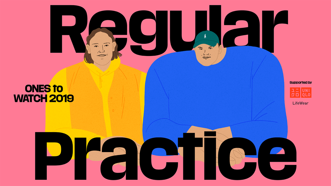
Back in July 2017, we spotted the graphic design portfolio of a recent Royal College of Art graduate, Tom Finn. We got in touch, wanting to write about his work, and an hour later we heard back: “As it happens, I’m launching a collaborative practice with Kristoffer Halse Sølling… Perhaps it will be interesting to feature the launch of this.” We agreed. It sounded like an article that would interest our readers – two new designers from the RCA launching a business together – and asked Tom and Kristoffer to have everything in for an article to be published on the following Monday. Almost two years later, the pair admit to us that the studio they formed, named Regular Practice, didn’t actually exist until we sent that first email.
You see, Tom and Kristoffer saw an opportunity. “You emailed Tom about covering a project and then it was like, maybe let’s do it about our work,” Kristoffer revealed to us when we chatted again in early 2019. “But we didn’t know what we were going to be called, or have a website. We didn’t know what it was going to be.” Tom chips in, laughing: “You emailed us on Monday and said you wanted to post it the next week, so we were like, ‘OK, let’s get our arses in gear.’ It was a good deadline.” And, in the week that passed, completely unknown to us, this pair of designers collated their work, thought of a name, built a website, and Regular Practice was launched on this very site the next week. Since then, with clients such as their alma mater, Serpentine Galleries and the publication Tinted Window under their belt, we’re very pleased to say Regular Practice hasn’t disappointed, making it a firm member of Ones to Watch not even two years after its formation as a studio.
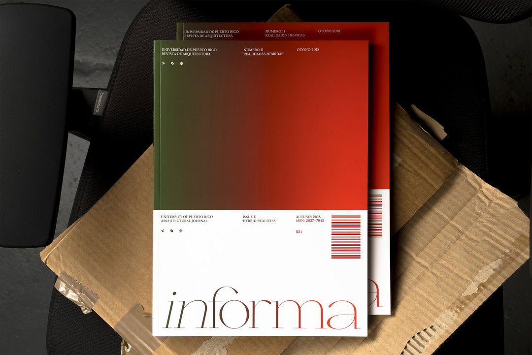
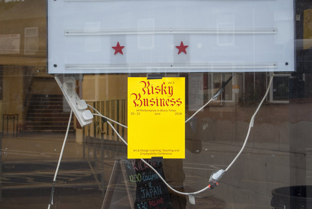
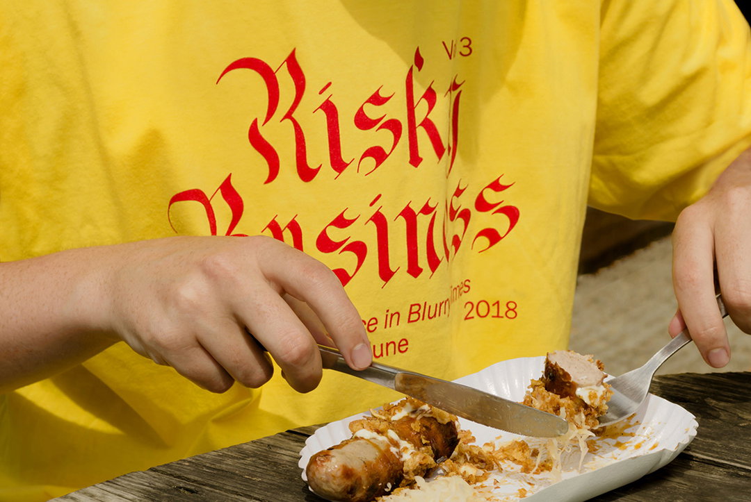
We should mention here, however, that it wasn’t as if Tom and Kristoffer magically decided to work together just because of It’s Nice That. Over the two years while they both studied at the RCA the idea was slowly coming together.
Both previous graphic design students in their bachelor’s – Tom at Sheffield and Kristoffer in Denmark – the pair decided to continue their design education, in the hope of feeling more settled and secure in their independent practices. “I was lacking a bit of confidence,” admits Kristoffer, who at this stage had just graduated and completed two internships where his employers were previous RCA grads. “I thought doing an MA would allow me to spend some more time figuring out what I might be,” agrees Tom, who was inspired to study at the institution after interning with Andy Stevens at Graphic Thought Facility, which formed at the RCA during the 1990s. The fact that the Royal College of Art is continuously named as the best art school in the world didn’t seem to come into play, but “it’s good to tell your nan that,” laughs Tom.
It was on their first day at the college that Tom and Kristoffer met, two new students lurking in the queue for registration, not sure what to do next. “I remember thinking it was a bit like Hogwarts. This beautiful old building that didn’t feel like an art school at all,” recalls Tom. “Tom was standing together with a friend from Sheffield so I assumed it was a friendly situation,” remembers Kristoffer. “It’s easier to join on to a two, isn’t it?” Tom adds. “I think we were both like, ‘Now what?’ and said, ‘Shall we go to the pub?’”
“It was a fun thing to do. Any kind of event that happened we were like, ‘Have you got £20 to pay for the paper and we’ll do the poster?’ We were quite active”
Regular Practice
Over the next year the pair didn’t directly work together; instead, they spent their time collaborating with other people on the course and “churning out work in our own practices,” says Tom. Tutors at the RCA impress on their students the importance of constantly questioning things. It’s an approach that was instilled in the pair from their interview, where the vibe was very much, “Right yeah, looks fine, but why should I give a fuck about anything you’ve just told me? Defend this idea you’ve got,” the pair explains. And so Tom and Kristoffer spent a year looking inwards, taking their time with projects. The decision to work together didn’t come as a result of this, but almost in reaction to it; a simple desire to produce some quick, classic graphic design: posters and flyers for anyone who asked.
“An email came through from Adrian Shaughnessy [a long-standing tutor at the RCA and founder of Unit Editions] saying I’ve got this idea for an exhibition about typography and we’re looking for someone who can design the identity and curate it,” explains Tom of the first proper project himself and Kristoffer embarked on. “We were printing something in the Riso room and said, ‘Shall we have a go?’”
One of the first projects Tom and Kristoffer worked on together was an exhibition with their tutor Adrian Shaughnessy titled Type Singularity. As well as curating and designing the identity for the exhibition, the pair also had to do the beer run for the opening night.
The directness of the request – and the fact it was relatively simple in comparison to the concept-led designs the pair were currently working on – was the main appeal. “In that environment, where everything you’re doing is very academic, conceptual and slow, those situations are an opportunity to breathe,” says Kristoffer. “It was a fun thing to do. Any kind of event that happened we asked, ‘Have you got £20 to pay for the paper and we’ll do the poster?’ We were quite active.” From there the pair started to produce work collaboratively – and fast. Initial projects included a series of posters for Tom’s sister, a jazz musician who wanted to play some shows at the RCA’s art bar. Another was a poster for a candidate of the student council. “I was fully convinced it was going to push him over the top,” remembers Tom. “The power of graphic design! But no, he didn’t win. By a landslide…”
“People are really intrigued by new studios, placing value in small studios to place their stamp on things, whereas ten years ago it was the big names”
Regular Practice
After graduating, Kristoffer and Tom’s main aim was to get a studio space. “We felt that if we were sat in a space more things would happen, say, than if we were sat opposite each other in a Costa Coffee,” they explain. It also puts pressure on to maintain the space and gain projects to pay themselves, and the rent. Since setting up shop, and considering Regular Practice’s formation is still relatively new, “there have been a lot of firsts”, points out Tom, referring to the projects that have formed the studio’s output.
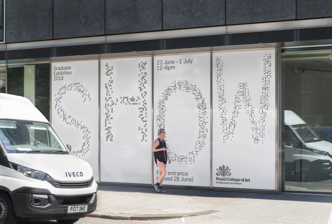
One first was Regular Practice’s identity for the RCA’s graduate shows, a pitch they won against other recent graduates which it completed in 2018, a project the studio is picking up again for 2019. It was one of the first times the pair had actually stood up and pitched to a room and their collaborative idea of creating a research tool “kickstarted an approach of tools and that’s led into other ways of working as well”. This is the way that Regular Practice approaches projects: “collaboratively designing something” rather than one being particularly good at one vertical of graphic design and the other having another skill set. It sees the duo approaching projects by researching into “strange type references and repurposing them” as well as getting hands-on. “That’s a basis for how we started to collaborate, working in some analogue way to distil an idea,” they explain.
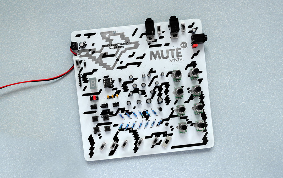
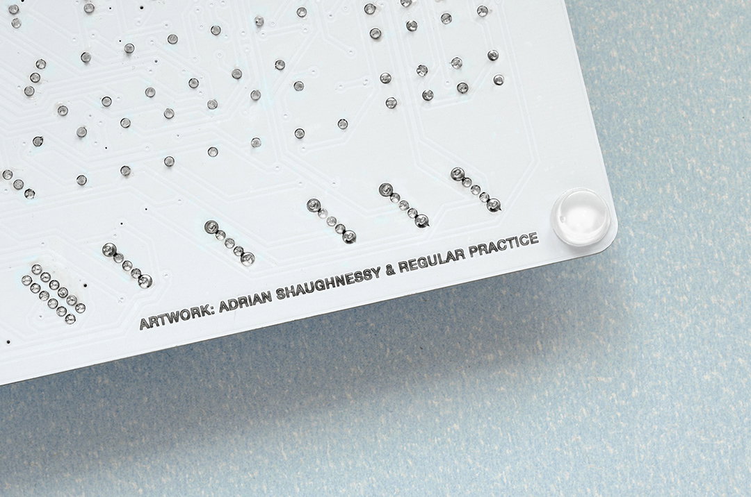
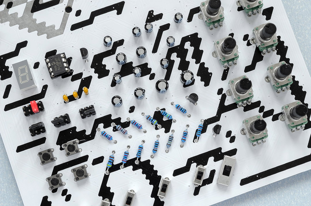
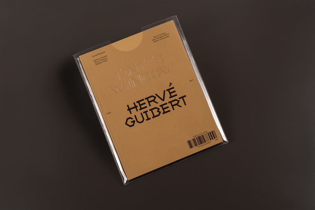
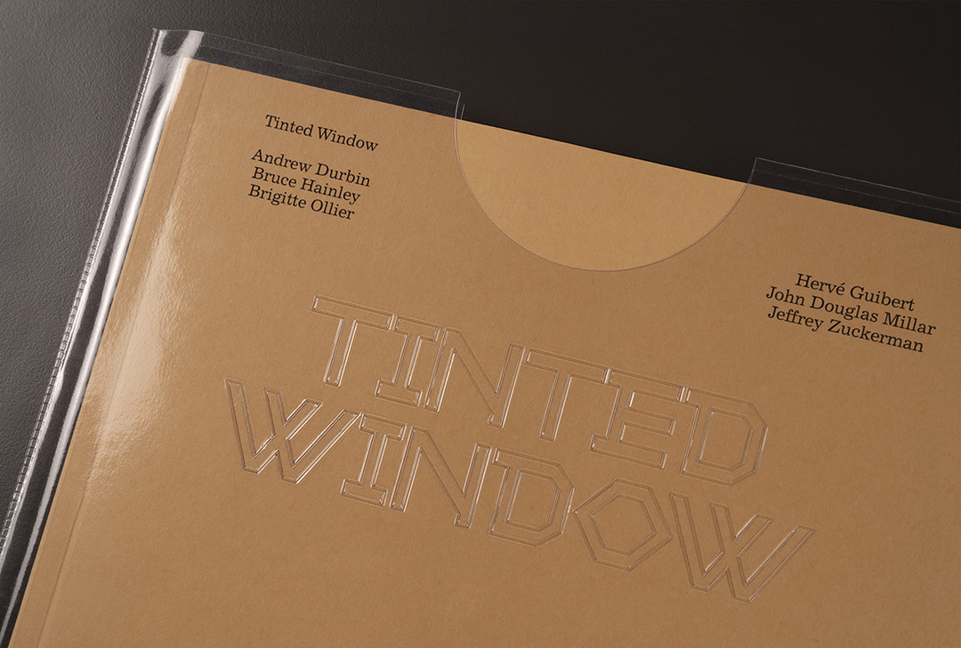
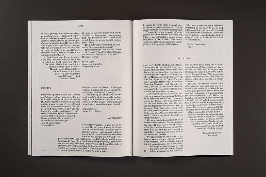
An apt utilisation of typography and lettering is consequently an easy attribute to spot in the rest of Regular Practice’s growing portfolio. Take its design for Tinted Window, for instance, which placed emphasis on the publication’s tendency to “examine the relationship of words and form” by “exploring and experimenting heavily with the way text is set, and how these interventions influence the experience of reading,” they explain.
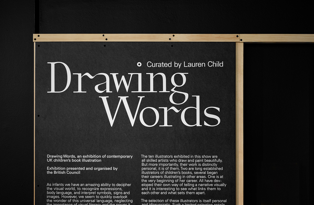
While some graphic designers are quick to hide their past portfolio of work, Tom and Kristoffer continuously mention and thank the RCA for getting them to the place Regular Practice is in today. Not only was the college obviously the reason for their formation, one from the north of England and the other from the continent, it’s also been the direct source of most of their work. For instance, Drawing Words, an exhibition identity the pair designed for a travelling show organised by the British Council, came as the result of one of the architecture students seeing one of the jazz posters they designed and dropping them an email. “Everything has a weird link back to it,” Tom remarks. It’s also seen them regularly collaborating with Adrian Shaughnessy too, the designer who indirectly pushed Tom and Kristoffer to be together in the first place, more recently working with him on a project for Mute Records.
And while the RCA doesn’t produce students with a particular graphic design aesthetic as is seen in certain European art schools, it has without doubt given this pair a leg up. It’s also, Regular Practice justify, “an exciting time” to be a graphic designer. “People are really intrigued by new studios, placing value in small studios to place their stamp on things, whereas ten years ago it was the big names.” And while Kristoffer and Tom’s speedy success so far may be a reflection of the industry, we’re confident it’s due to the fact that they’re a safe pair of hands. Thoughtful, knowledgeable, communicative, and gutsy enough to pull off forming a studio in just one week.
Share Article
Further Info
About the Author
—
Lucy (she/her) was part of the It’s Nice That team from 2016–2025, first joining as a staff writer after graduating from Chelsea College of Art with a degree in Graphic Design Communication, eventually becoming a senior editor on our editorial team, and most recently at Insights, a research-driven department with It’s Nice That.