




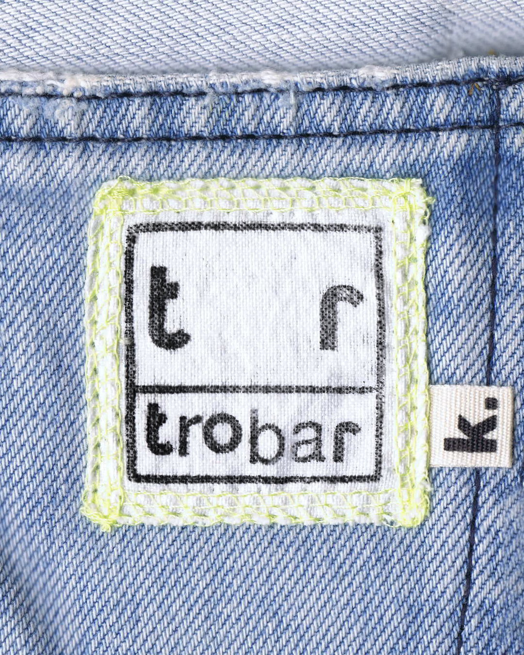
The letterforms for this Mallorcan bar’s logo were scavenged from secondhand bookshops and stationary stores
Crafted by the fresh new studio Design Office Fun©, the Trobar identity is anchored by a sense of boundless discovery.
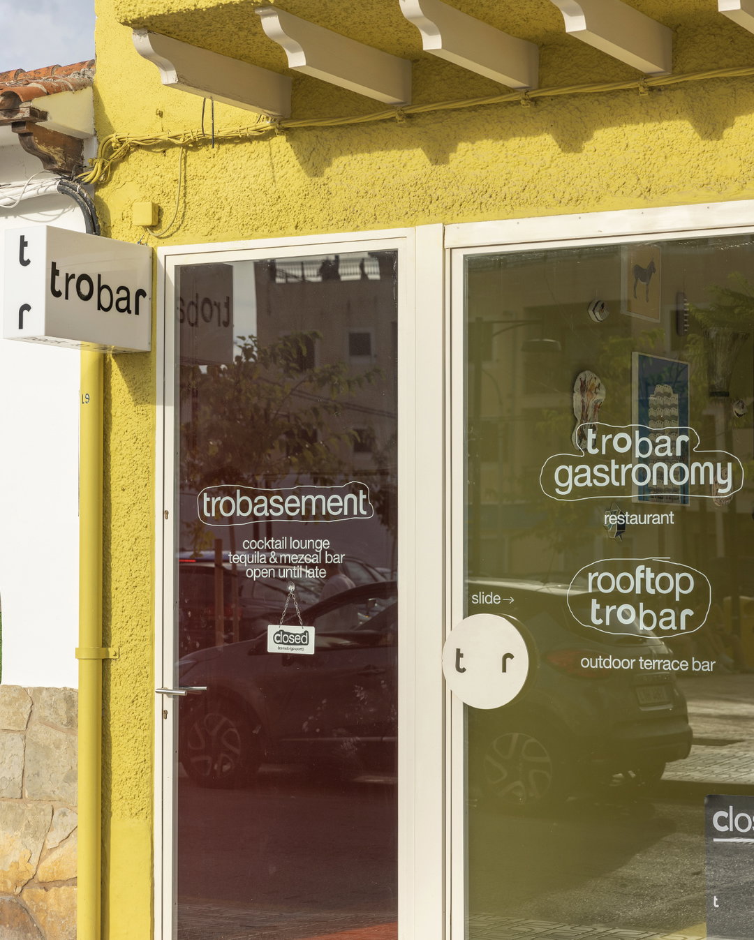
Trobar is a new bar-cum-cultural-space in sunny Mallorca. Its Catalan name translates in English to, “to find”, a message and ethos that has informed the whole direction of its identity, created by the design and creative services studio, Design Office Fun©. “Trobar is the kind of identity you begin without knowing how it will end, or without having a clear graphic idea from the moment the project and its needs are first presented,” says the studio’s founder Paula de Álvaro. “It’s a path that gradually forms, solid and coherent, allowing ideas and processes to unfold through design.”
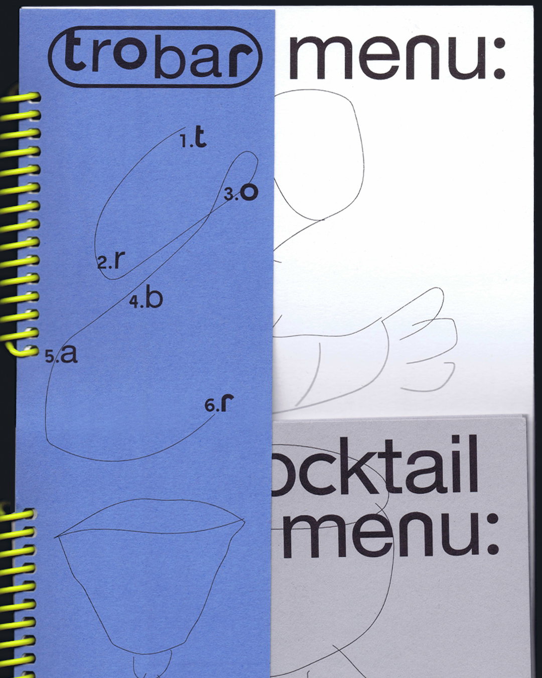
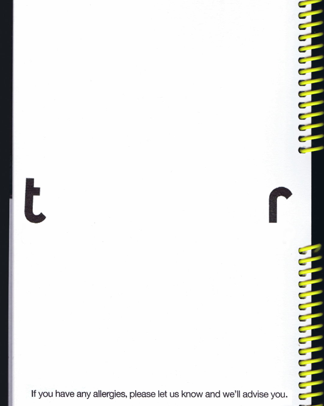
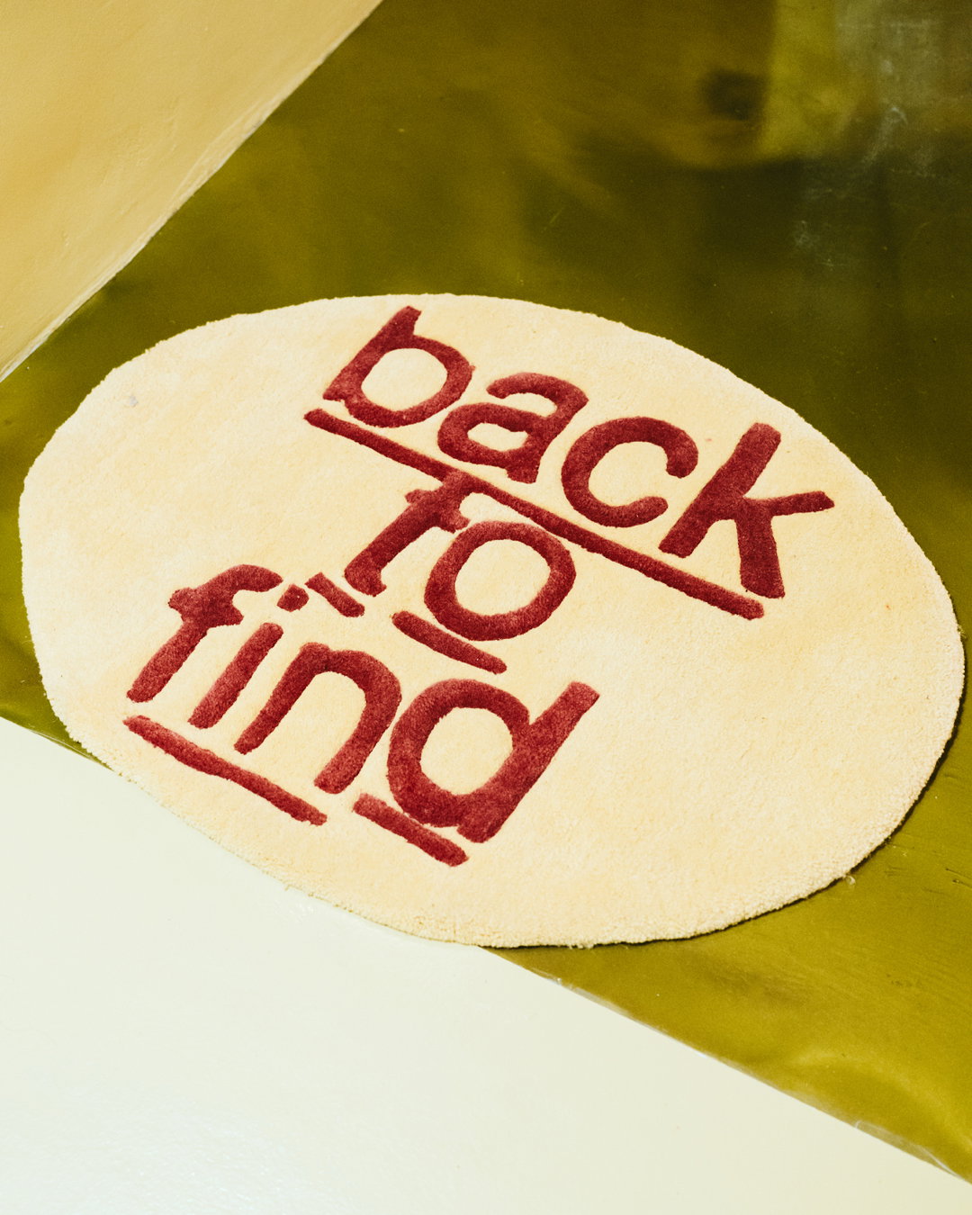
This ethos of seeking and discovery is perhaps best demonstrated in the identities logo. The letters of the wordmark have been scavenged and carefully curated (or, in Paula’s words “rescued”) from old Letraset transfers, found in second hand bookshops and stationary stores. “I collected, discovered, found and eventually discarded – many didn’t make it through the countless rounds of letter castings we held,” Paula says. The final logo is made up of two different Letraset typefaces, all aligned exactly as they were when first transferred from plastic to paper. “That’s why not all the letters are perfectly aligned – you can see that ‘bar’ sits slightly lower than the first three letters,” adds Paula. “It’s a distinction that also helps us to emphasise the word ‘bar’ that we find within the Trobar name itself.”
Design Office Fun©: Trobar (Copyright © Design Office Fun©, 2025)
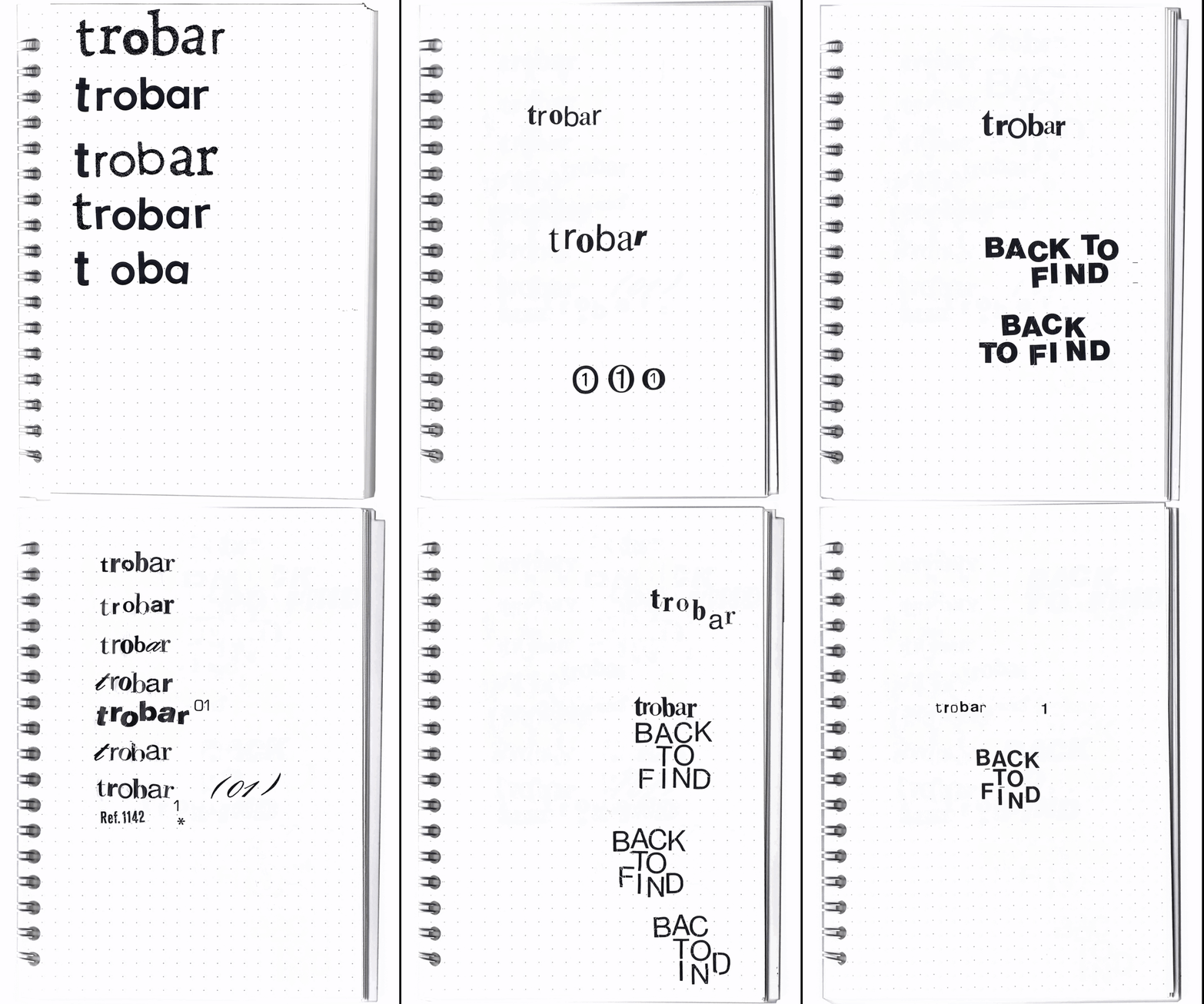
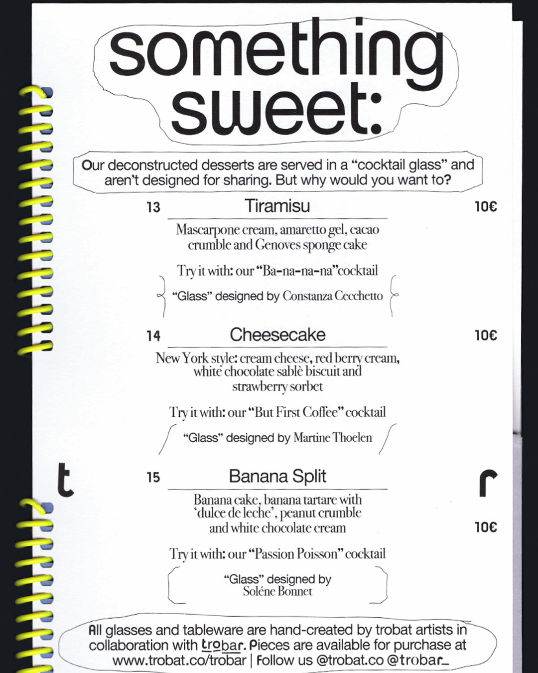
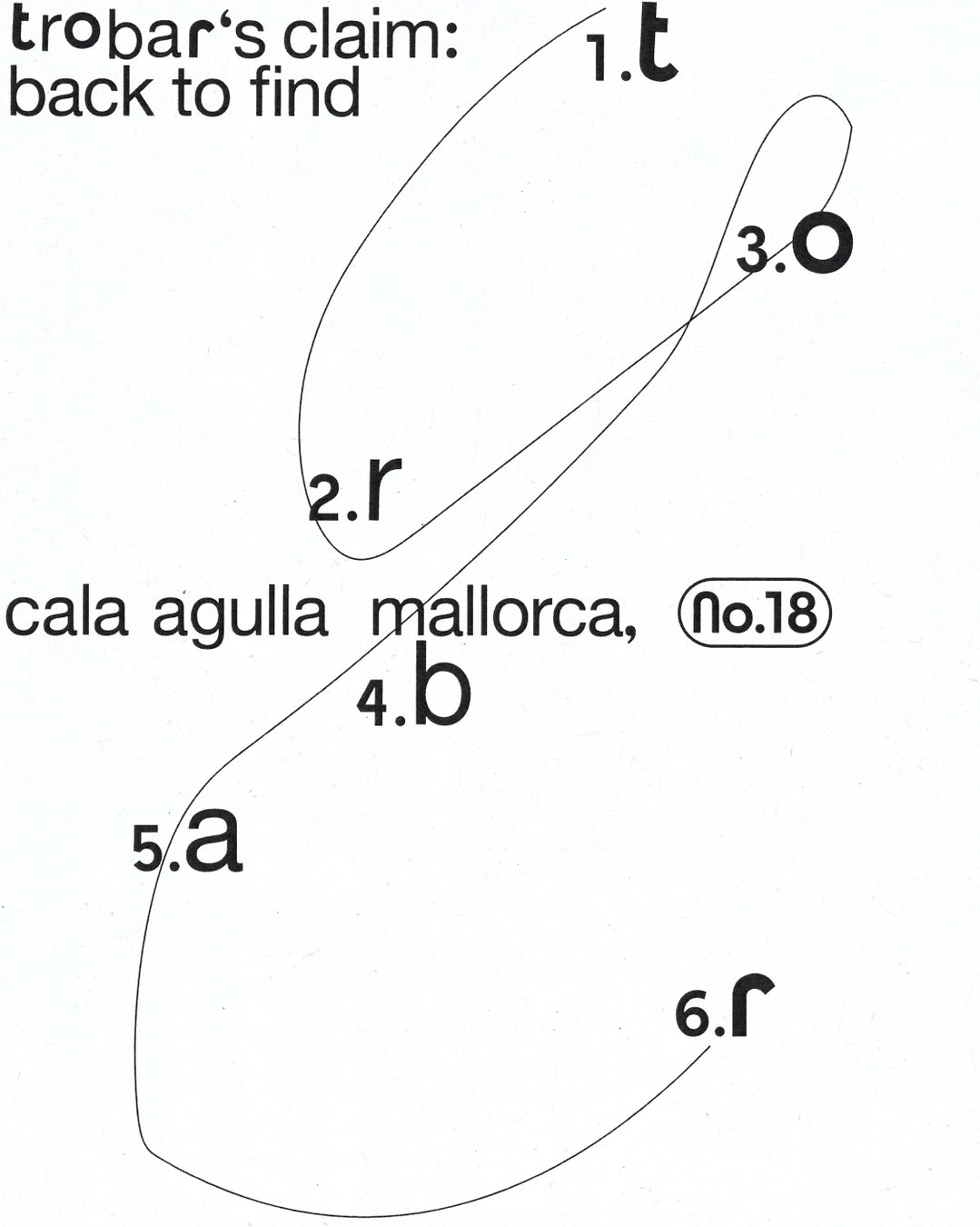
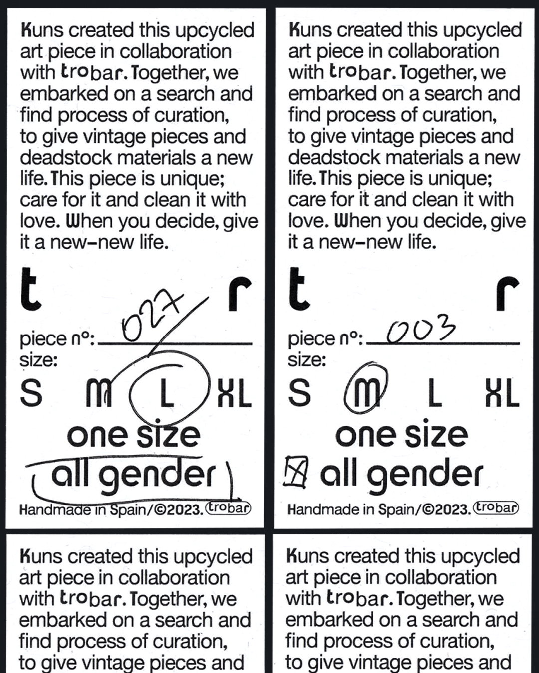
Elements of visual decoration and illustration also enhance this feeling of discovery, like the hand-drawn lines and strokes that adorn pages of menus and apparel labelling, connecting various elements. While these marks may initially come across as whimsical and random, there’s usually a logic to their application, as seen in a deconstructed version of the logo that links its letters in a numbered, dot-to-dot-like system.
The brief came to the studio via Mireia Campos, a strategic and creative consultant. As the space was going to double (or triple) up as a bar, restaurant, gallery and shop she was clear that the project would be a lengthy one, with lots of deliverables and applications, but Paula wasn’t warned off and the studio took the project in their stride. They aimed to treat each element of the as an “artwork in its own right”, says Paula, “curated and designed to connect with the visitor in a specific way, at a specific time”.
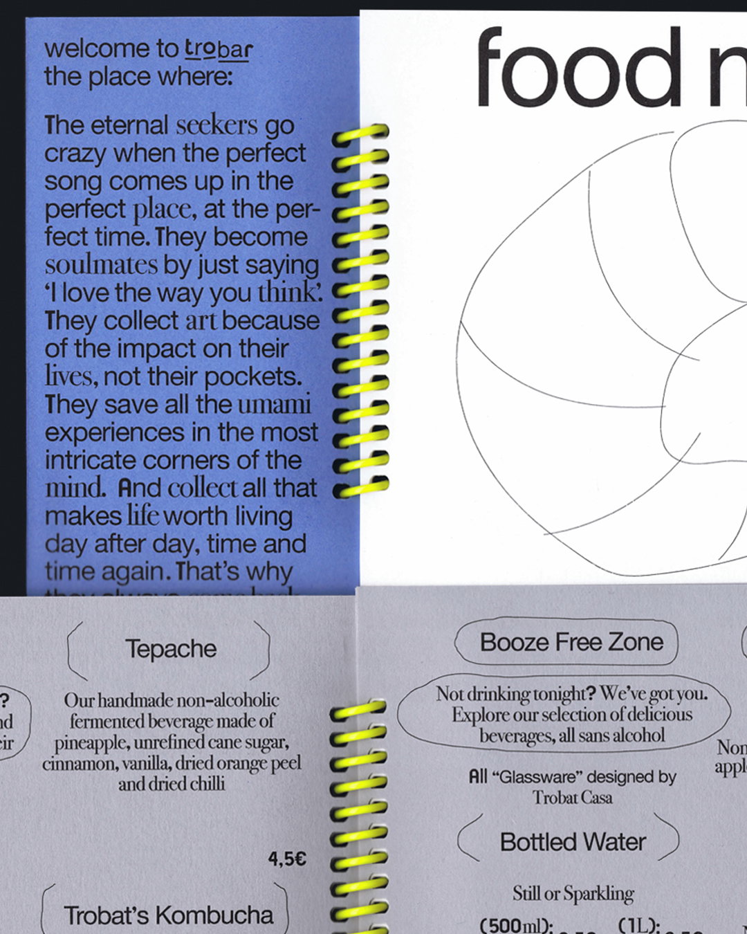
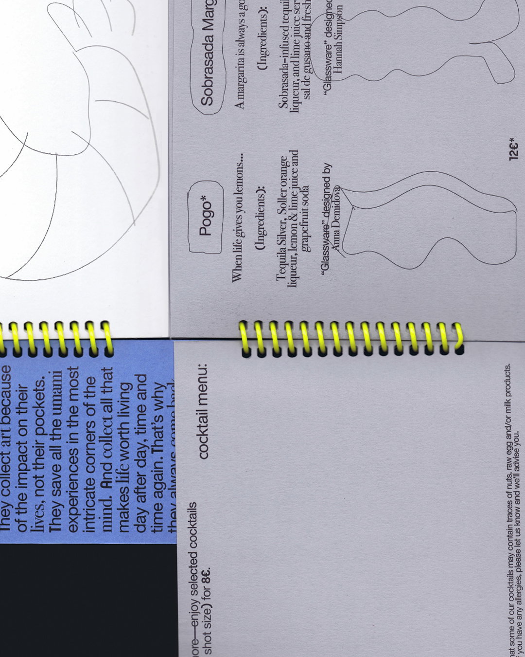
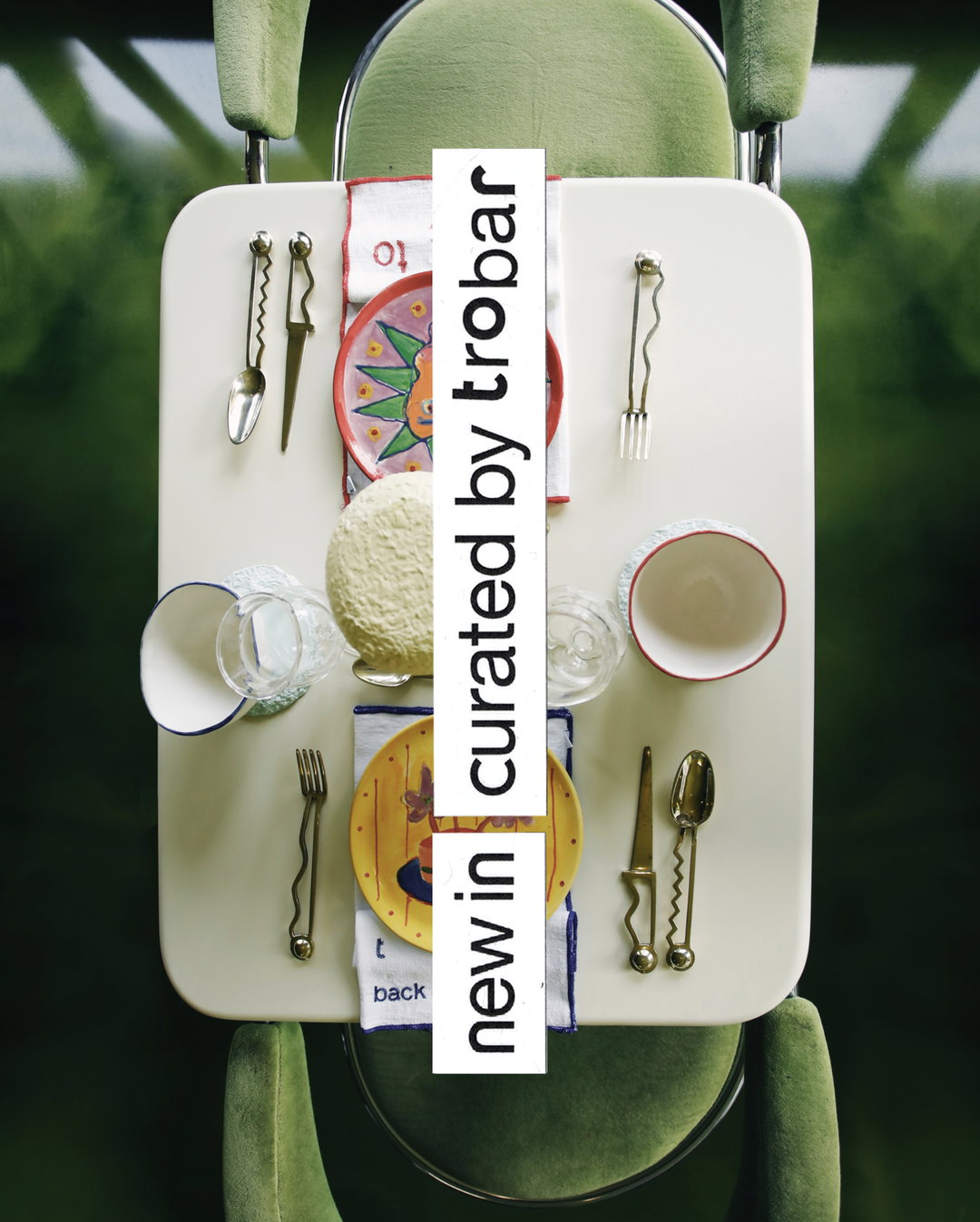
One such example is Trobar’s menu, which Paula describes as “a project of its own”. Rather than simply approaching it like your bog-standard double-sided card, Paula and the team proposed something much closer to a piece of editorial, or a book. It’s divided into several booklets, of grey blue and white paper, then all bound together with a neon yellow ring binder. On the design, Paula says: “It had to be a highly structured piece, easy to understand, very readable, and simultaneously a piece of art. Achieving that balance – something perceived as a unique, artistic object while still being intuitive enough for someone to instantly understand that taco prices are per ‘unit, or that certain cocktails are only available downstairs – was a complex task.” Not only was the menu an important object, it also became something of a testing ground for all of the many “ingredients” of the identity, a means to make sure they “communicated cohesively”.
With so much time spent in the ideation and planning stage, Paula is letting various ephemera and ideas lead her down new paths, if the Trobar identity has taught the designer anything its that “sometimes it’s important to recognise that the design phase – and jumping into the design programs – should come only at the very end.”
GalleryDesign Office Fun©: Trobar (Copyright © Design Office Fun©, 2025)
Hero Header
Design Office Fun©: Trobar (Copyright © Design Office Fun©, 2025)
Share Article
About the Author
—
Olivia (she/her) is associate editor of the website, overseeing the day-to-day editorial projects as well as Nicer Tuesdays events. She joined the It’s Nice That team in 2021. ofh@itsnicethat.com
To submit your work to be featured on the site, see our Submissions Guide.




