Launch Recite Me assistive technology
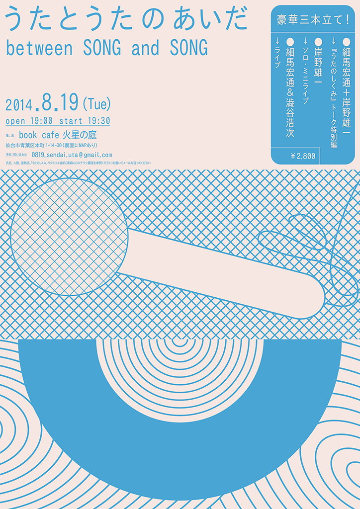
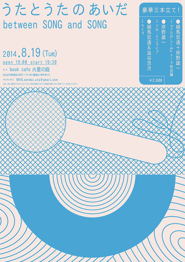
A blue and cream graphic poster for a musical event. The headline reads “うたとうたのあいだ” and “between SONG and SONG”, with the date “2014.8.19 (Tue)” and a price of “¥2,800”. Abstract shapes, including a large blue semi-circle and a cross-hatched pattern, fill the lower half of the page.

Yutaka Satoh's designs blur the boundaries between text and visuals

—
Date
27 March 2018

Yutaka Satoh’s posters are the perfect crossover between art and design. With their satisfying colour palettes and considered arrangements of unusual shapes, Yutaka’s creations could just as easily hang on the walls of a gallery as they could advertise upcoming events. The Tokyo-based artist commonly produces posters for exhibitions, concerts and shows alongside his long list of accomplished personal projects. Yet his distinct aesthetics never falter whether he is designing a commissioned piece of work or a stand-alone project; a testament to Yutaka’s loyalty to his craft.

Yutaka’s designs often merge information with intriguing, abstract visuals. This may not come as a surprise to those that know him. “When I was young, I was not good at drawing. But I liked writing words and letters on paper. For example, I used to ‘draw’ someone’s name with pencils on pieces of paper,” Yutaka tells It’s Nice That. The artist clearly still adopts this mindset; Yutaka allows little room for distinction between text and the surrounding visuals.

Many of Yutaka’s designs are the result of the artist following his instincts. Subtle pastels and bright colours are added to posters according to his intuitive judgements. “In most cases, inspiration lurks in my day-to-day life. But I am also influenced by past memories. It feels as though a chemical reaction occurs when ‘colour’ and ‘smell’ that are engraved in my memory are combined with the present,” Yutaka says. By visualising and incorporating nostalgic emotions into his posters, the designer creates series of consistently unique pieces of art. 

“I focus mainly on the balance between textual and visual communication. The popularisation of social media means that everyone easily obtains a huge amount information. But most of the data we consume lacks poetry. I believe poetic communication will make for deeper connections. It is for this reason I want to communicate ‘beyond language’. I use colour and form to create an alternative space through which information is transmitted,” Yutaka explains. The artist’s work marries words with visuals in new and unexpected ways. By weaving letters with geometric shapes and doodles, Yutaka prompts the viewer to reconsider how information can be received and processed.

When asked about his favourite artwork, Yutaka references his elegant Lee Lang poster. “Here I’ve laid out three different languages – English, Japanese, Korean – within one poster. Balancing each language and distributing them equally across the poster was important.” Yutaka’s incorporation of three distinct languages functions as a reminder that language is both a means to communicate as well as a series of visual symbols. The Latin alphabet is legible to an English speaker, for example, but may look like little more than visual signs to a Japanese reader.
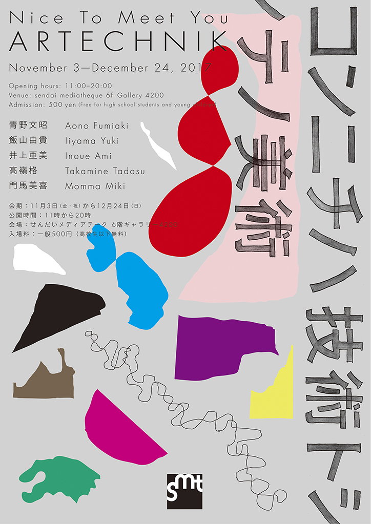
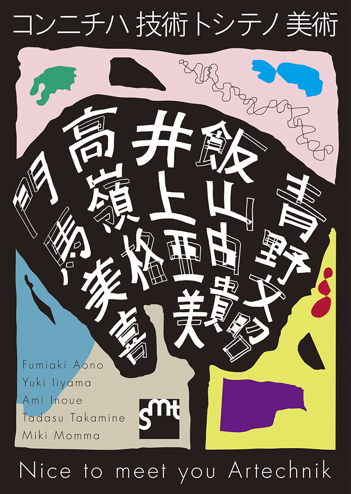
A graphic poster for an exhibition titled “Nice To Meet You ARTECHNIK”, running from 3 November to 24 December 2017. The layout features a list of artists and venue details alongside abstract, colourful shapes and large vertical Japanese calligraphy.
Above
Left

Yutaka Satoh

Right

Yutaka Satoh

A graphic poster featuring a large, dark organic shape filled with white Japanese calligraphy. A list of names including “Fumiaki Aono” and “Miki Momma” appears in the bottom left, beside a small “smt” logo. The poster is framed by a light pink background with colourful abstract shapes and the text “Nice to meet you Artechnik” at the bottom.
Above

Yutaka Satoh

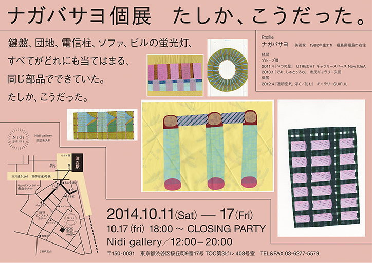
A promotional poster for a Nagaba Sayo exhibition featuring a collection of colourful, geometric textile works. The layout includes a map of the Nidi gallery and a schedule for the exhibition from 11 to 17 October 2014.
Above

Yutaka Satoh

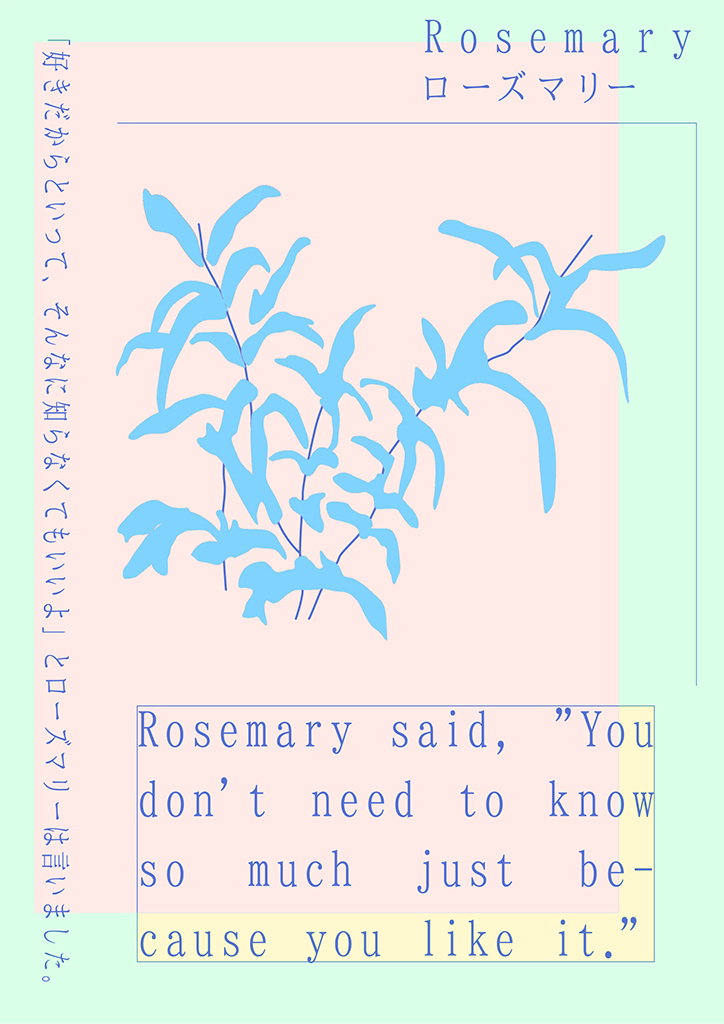
An illustration of a light blue rosemary sprig set against a pale pink background. Text at the top reads “Rosemary” and its Japanese translation, while a box at the bottom reads “Rosemary said, “You don’t need to know so much just because you like it.”"
Above
Left

Yutaka Satoh

Right

Yutaka Satoh

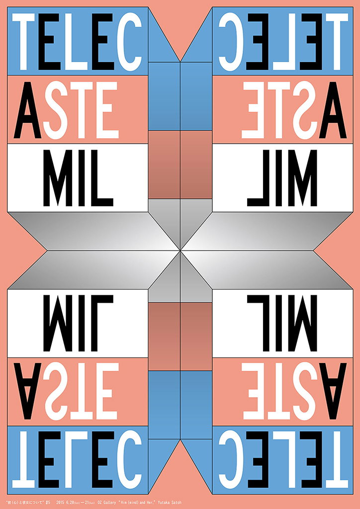
A symmetrical graphic poster featuring mirrored blocks of bold, sans-serif text in black and white. The words “TELECAST” and “MILLIMETER” are split and reflected across a central axis in shades of blue, red and grey. Small text at the bottom reads “Yutaka Satoh” and mentions a gallery exhibition from 2015.
Above

Yutaka Satoh

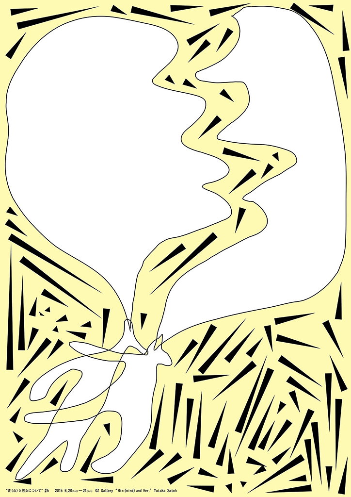
An illustration of two white, abstract figures facing each other on a pale yellow background. Their profiles merge into a single fluid shape, surrounded by a dense pattern of sharp black shards. Small text at the bottom reads “Hin (eind) and Her,” and “Yutaka Satoh”.
Above
Left

Yutaka Satoh

Right

Yutaka Satoh

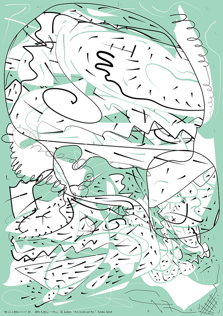
An abstract illustration featuring a dense tangle of black and mint green lines on a pale green background. The composition consists of overlapping organic shapes, scribbles and sharp geometric fragments. Small text at the bottom reads “His (mind) and Her,” and “Yutaka Satchi”.
Above

Yutaka Satoh

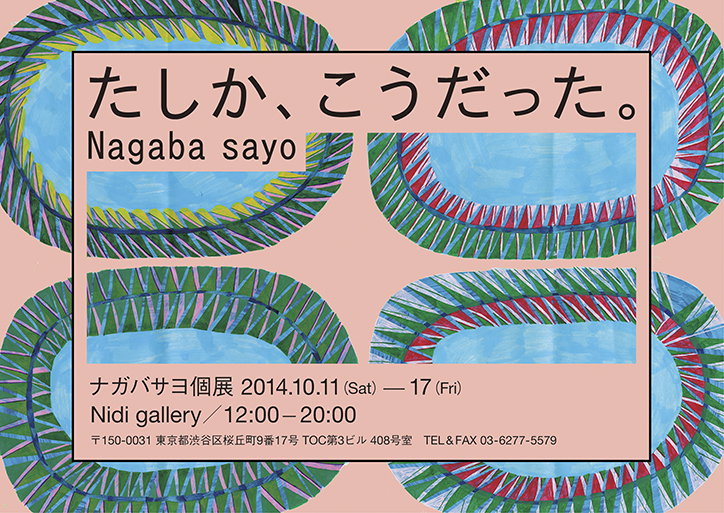
An illustration of a pink poster featuring four large, colourful oval shapes with textured, fringed edges. The top text reads “たしか、こうだった。” and “Nagaba sayo”. Below, a second block of text lists the exhibition dates as “2014.10.11 (Sat) — 17 (Fri)” at “Nidi gallery”.
Above

Yutaka Satoh

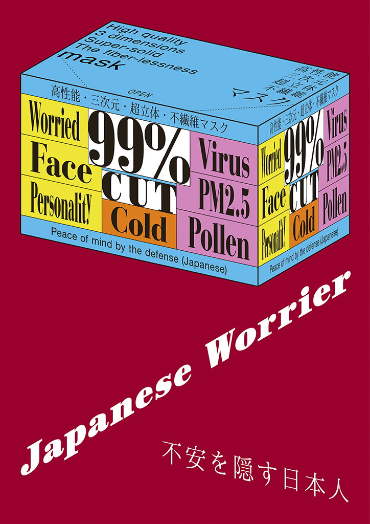
A 3D render of a blue and yellow face mask box against a deep red background. The packaging features bold text including “99% CUT”, “Virus”, and “Cold”. Below the box, the title “Japanese Worrier” is written in a white italic serif font.
Above
Left

Yutaka Satoh

Right

Yutaka Satoh

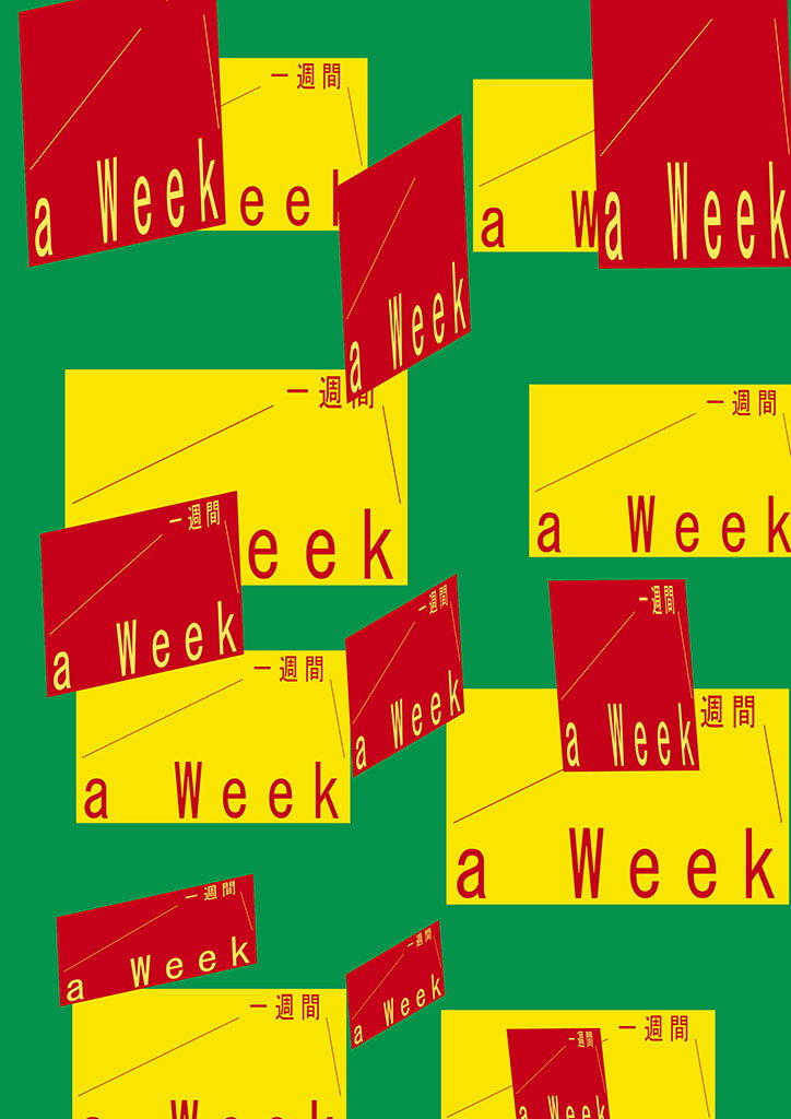
A collage of red and yellow rectangular blocks scattered across a green background. The blocks contain the phrase “a Week” in white and black typography, alongside the Japanese translation “一週間”.
Above

Yutaka Satoh

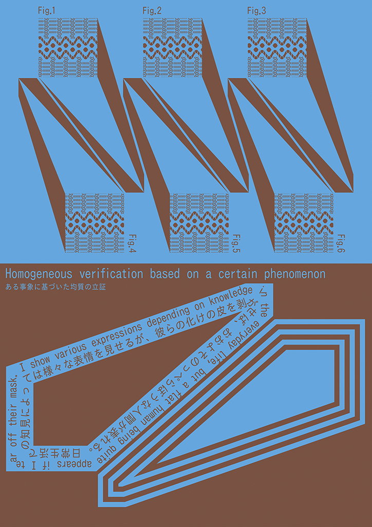
A graphic design piece on a blue background featuring six diagrams of folded patterned strips, labelled “Fig.1” to “Fig.6”. Below these, a headline reads “Homogeneous verification based on a certain phenomenon”. Red text is angled across the bottom, accompanied by Japanese characters and a series of concentric blue and brown outlines.
Above
Left

Yutaka Satoh

Right

Yutaka Satoh

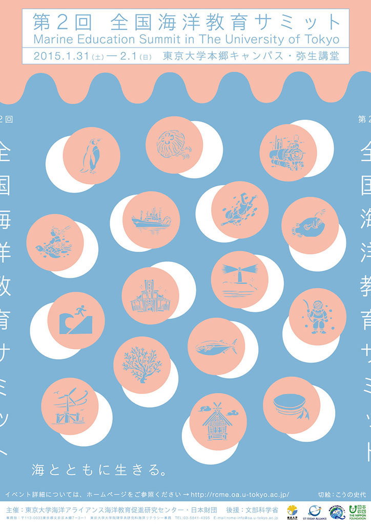
A poster for the “Marine Education Summit in The University of Tokyo”, dated 31 January to 1 February 2015. A blue background features a grid of white circles containing peach-coloured illustrations of sea life, ships and coastal scenes.
Above

Yutaka Satoh

Share Article

About the Author

Daphne Milner

—

Daphne has worked for us for a few years now as a freelance writer. She covers everything from photography and graphic design to the ways in which artists are using AI.

It's Nice That Newsletters

Fancy a bit of It's Nice That in your inbox? Sign up to our newsletters and we'll keep you in the loop with everything good going on in the creative world.