Tra Giang Nguyen (AKA Gydient) grabs attention through kinetic typography and energetic design
The Vietnam-born and Hamburg-based designer doesn’t have a specific style. Instead, she toys with kinetic design, textures and patterns.
Share
By referring to herself as a multidisciplinary designer, Tra Giang Nguyen – who goes by the artist pseudonym Gydient – this grants the liberty of exploring her medium with utmost freedom. From motion design, type, visual design and coding, Giang has a multifarious set of skills that are only increasing with experience. Born in Vietnam and currently based in Hamburg, the designer kicked off her journey in 2017 after attending an art class in Vietnam; she was “lucky” to meet a group of people who would later go on to form Fustic Studio together, a collective working on design, technology and motion graphics. “From there, we decided to create a virtual place, where we can learn, share and explore the world of design,” she tells It’s Nice That. Four years later and the studio is going from strength to strength, having worked on numerous projects with international clients like Billie Eilish, Facebook, Adobe, Adidas, Pull&Bear, Uniqlo and Adult Swim.
Flicking through her works, you’ll notice a consistent use of punchy colours, texture and shape. It’s lively, assertive and eye-catching; three qualities that have reigned supreme throughout the entirety of her, and the studio’s portfolio. It all stems from a pivotal moment back in 2019, when she’d just started studying at Design Department Hamburg for a BA. In the first semester, she took a typography class and fell “deeply in love” with lettering. “In the beginning,” she adds, “making letters and designing type was the only things I cared about, but after just working with still images, I wondered: ‘How could I make my design catch more attention’?” Kinetic typography was the answer, and a new-found adoration for moving image soon emerged.
In terms of where Giang sources inspiration, like “many other people belonging to this generation”, she turns largely to the internet, or what she refers to as the “giant black hole”. Japanese sci-fi, including anime and manga, are key drivers to her work and will usually appear greatly throughout her projects. Otherwise, she also collected various learnings from co-workers, teachers, friends, books, films and history, churning them out into visual references. “Luckily, a designer doesn’t have to look for inspiration only in design, but also from our rich texture of daily life.”
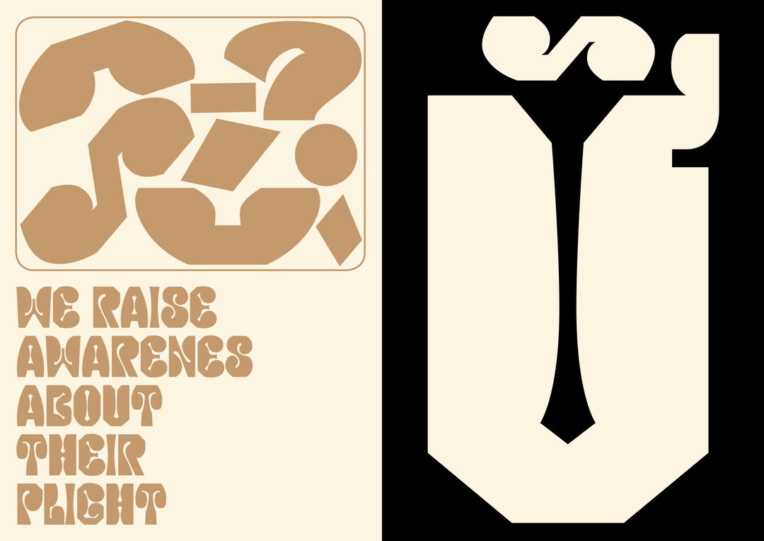
Gydient: Agent Orange (Copyright © Gydient & Nhi Bui, 2019). Project: Agent Orange. Art director: Gydient & Nhi Bui. Type design: Gydient. Copywriter: Toan & Adarsh. Year: 2019
But although her work gives off a sense of maturity and unity, Giang admits that she doesn’t feel quite like she’s landed on her own specific style just yet. This is partly due to her being in the early stages of her career, but equally because she’s someone who fluctuates creatively between ideas, experimental techniques and processes. “I don’t really have any signature visual language yet, because my taste changes over time and the urge to make something new is always my priority.” Whatever the outcome, however, rest assured that it will be filled with a certain energy – not least a mash up of patterns, textures and typography.
Move The Collection is a fine example of this, which is a collection of posters created in the course titled Move the System by Kinetic Poster Design by Martin Lorenz – and an animation course by Verena Kiesinger and Alica Pfister – held at the Department Design HAW Hamburg. There’s been a rise in kinetic design throughout the years, and this signals to a change in attitude throughout the wider industry, as well as in Giang’s own personal work. “They are indicators of a paradigm shift in communication design,” she says. “This project focuses more in exploring my design practice with kinetic development from static to flexible.”
Another project is Viaoda Antiqua, a personal project created in her first semester under the mentorship of professor and type designer Jovica Veljović. Created as a piece of printed media, the work is inspired by Vietnamese cultural symbolism; “Viaoda Antiqua is a mix of both the old and the new, appearing with traditional elegance and modern professionalism at the same time,” she explains. It’s much more pared back in comparison to her other projects, particularly in terms of a more simplified colour palette. Instead, the typography is the main focus and gives off a sense of both traditional and modern aesthetics. Comparatively, Agent Orange is far more graphic, bold and experimental, featuring a warping typeface and bold use of tones throughout. Giang directed and created the project with Nhi Bui for Monotype at ADC Young One New York in 2019, and was tasked to create a typeface that celebrates the community – the result being a font that responds to the Agent Orange’s victims in Vietnam that “gives the people belonging to this unheard community a voice of hope.”
Next in line is a whole host of inspiring projects, including a new visual system and custom typeface for Gatheround, which has a mission to help people connect virtually. There’s also a type design project in the pipeline called Hako, which explores the “new world of Hangul script”, plus a project delving into the world of NFT’s. “I’m eager to see how NFT’s can re-shape the creative industry in the future, whether it’s for the better to not is just a matter of perspective.”
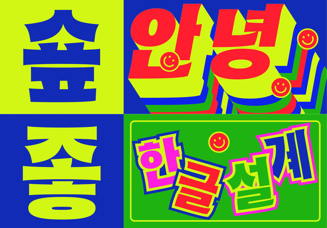
Gydient: Hako Hangul (Copyright © Gydient, 2020)
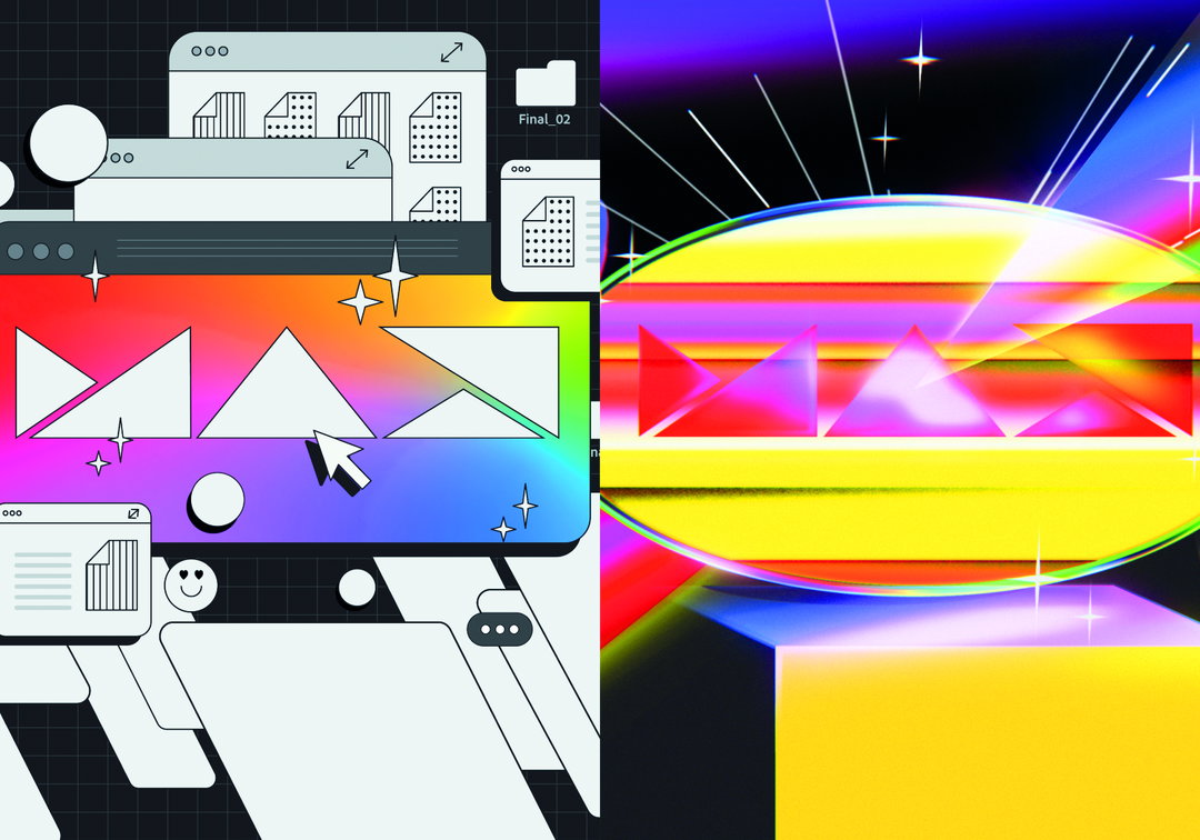
Gydient: Adobe Create (Copyright © Gydient, 2020)
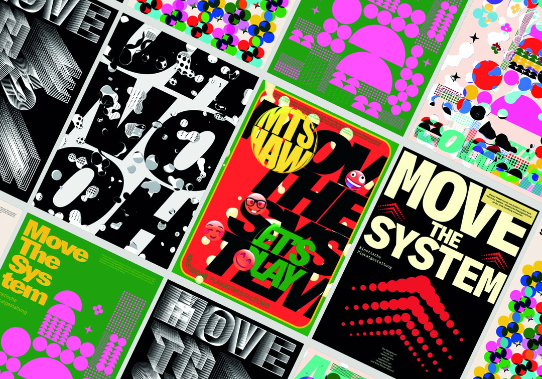
Gydient: Move The System (Copyright © Gydient, 2020). Motion & Graphic design: Gydient (Tra Giang Nguyen). Professor: Martin Lorenz. Coach: Verena Kiesinger and Alica Pfister. Course: Move the System - Kinetic poster design. Summer. Semester 2020 at Department Design HAW Hamburg. Year: 2020
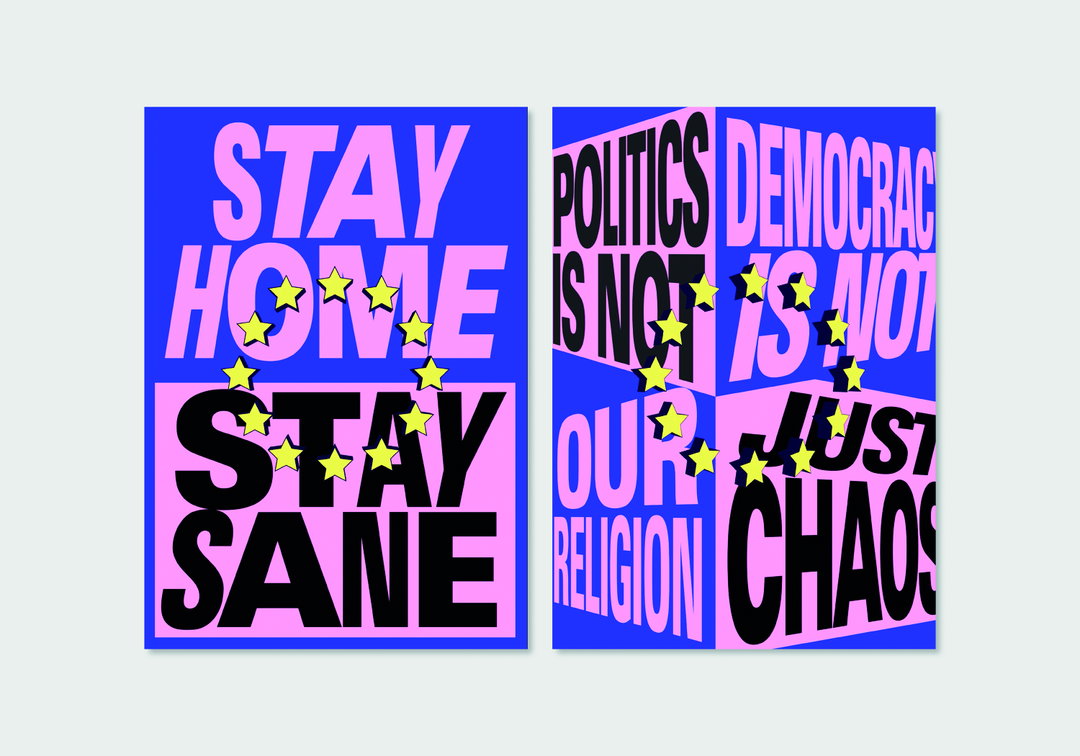
Gydient: Move The System (Copyright © Gydient, 2020). Motion & Graphic design: Gydient (Tra Giang Nguyen). Professor: Martin Lorenz. Coach: Verena Kiesinger and Alica Pfister. Course: Move the System - Kinetic poster design. Summer. Semester 2020 at Department Design HAW Hamburg. Year: 2020
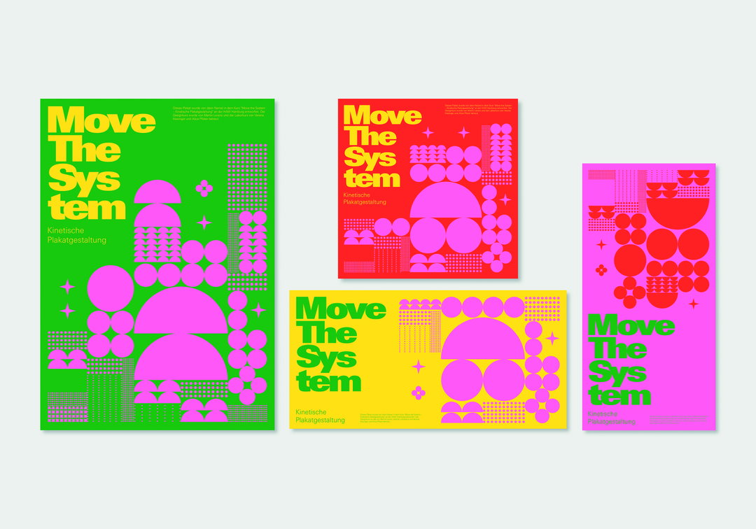
Gydient: Move The System (Copyright © Gydient, 2020). Motion & Graphic design: Gydient (Tra Giang Nguyen). Professor: Martin Lorenz. Coach: Verena Kiesinger and Alica Pfister. Course: Move the System - Kinetic poster design. Summer. Semester 2020 at Department Design HAW Hamburg. Year: 2020
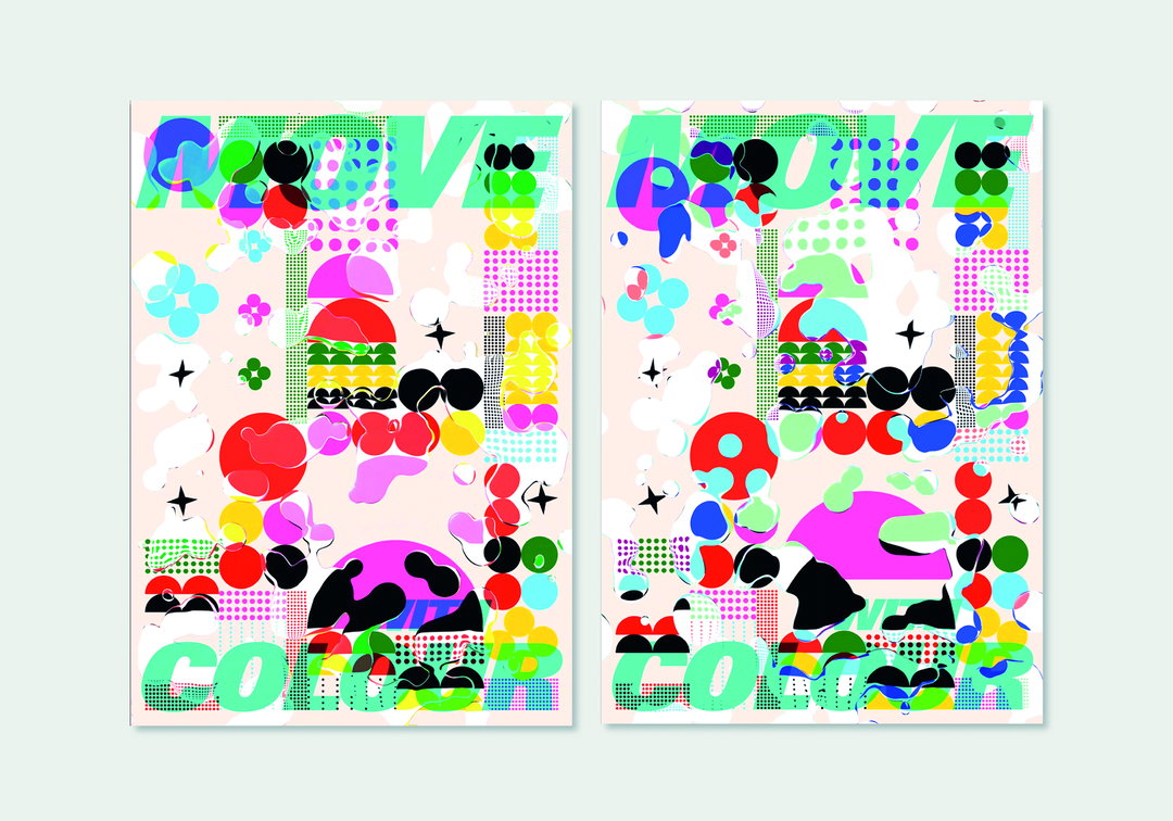
Gydient: Move The System (Copyright © Gydient, 2020). Motion & Graphic design: Gydient (Tra Giang Nguyen). Professor: Martin Lorenz. Coach: Verena Kiesinger and Alica Pfister. Course: Move the System - Kinetic poster design. Summer. Semester 2020 at Department Design HAW Hamburg. Year: 2020
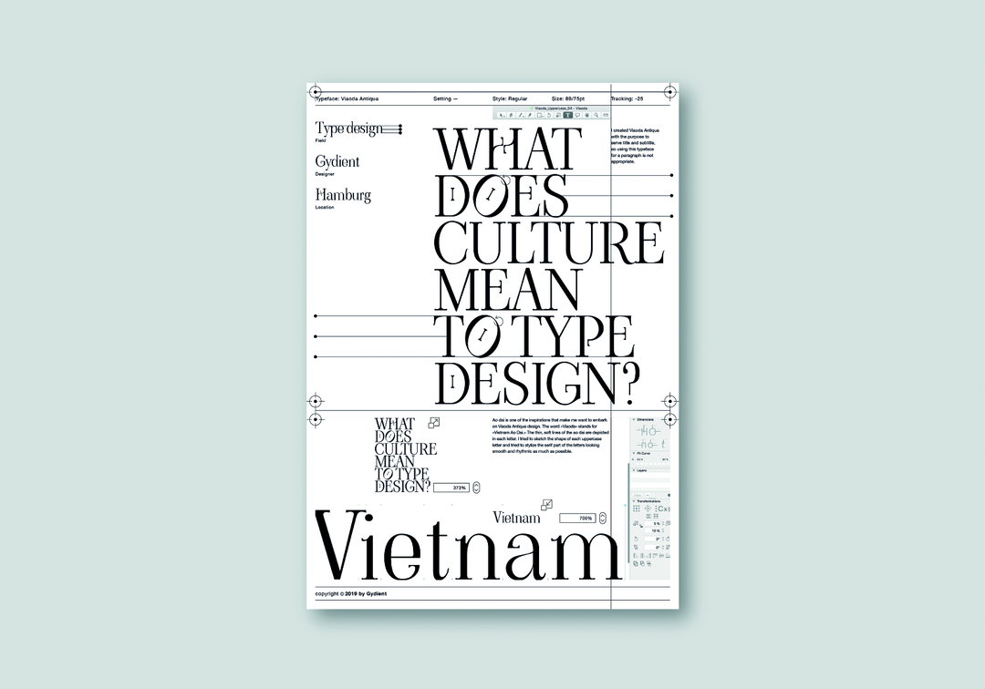
Gydient: Viaoda Antiqua (Copyright © Gydient, 2019). Typeface: Viaoda Antiqua. Type Design: Gydient (Tra Giang Nguyen). Type Engineer: Vietanh D. Nguyen. Year: 2019
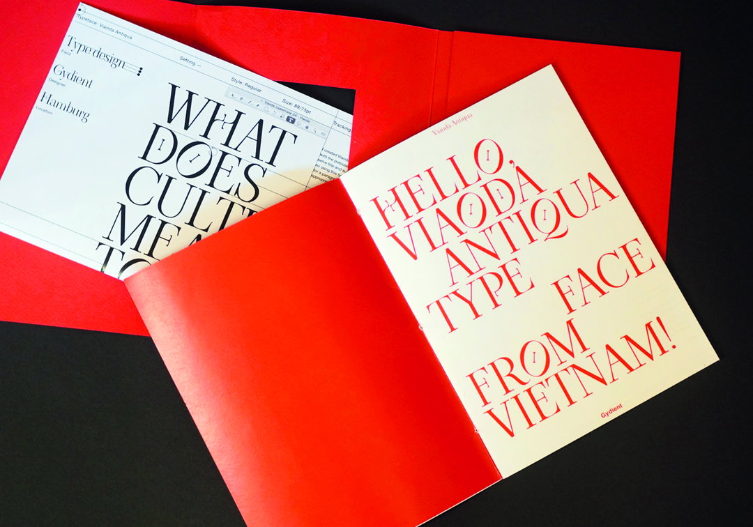
Gydient: Viaoda Antiqua (Copyright © Gydient, 2019). Typeface: Viaoda Antiqua. Type Design: Gydient (Tra Giang Nguyen). Type Engineer: Vietanh D. Nguyen. Year: 2019
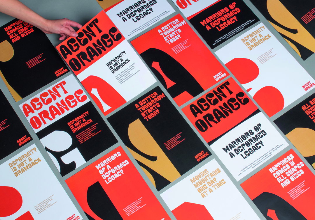
Gydient: Agent Orange (Copyright © Gydient & Nhi Bui, 2019). Project: Agent Orange. Art director: Gydient & Nhi Bui. Type design: Gydient. Copywriter: Toan & Adarsh. Year: 2019
Hero Header
Gydient: Move The System (Copyright © Gydient, 2020). Motion & Graphic design: Gydient (Tra Giang Nguyen). Professor: Martin Lorenz. Coach: Verena Kiesinger and Alica Pfister. Course: Move the System - Kinetic poster design. Summer. Semester 2020 at Department Design HAW Hamburg. Year: 2020
Share Article
About the Author
—
Ayla is a London-based freelance writer, editor and consultant specialising in art, photography, design and culture. After joining It’s Nice That in 2017 as editorial assistant, she was interim online editor in 2022/2023 and continues to work with us on a freelance basis. She has written for i-D, Dazed, AnOther, WePresent, Port, Elephant and more, and she is also the managing editor of design magazine Anima.