Studio Thonik’s typographic orchestra identity mimics the movement of a conductor’s baton
The Amsterdam-based studio used Grilli Type’s GT Planar to create a coherent identity for Phion Symphony Orchestra capable of adapting to each concert’s musical atmosphere.
An orchestra’s conductor is responsible of holding all the musicians together, guiding the performance with the gestures of their baton. So it only makes sense that Studio Thonik’s new identity for Phion Symphony Orchestra is built around a typeface that moves the same way – bending and slanting to mimic the feeling of the music.
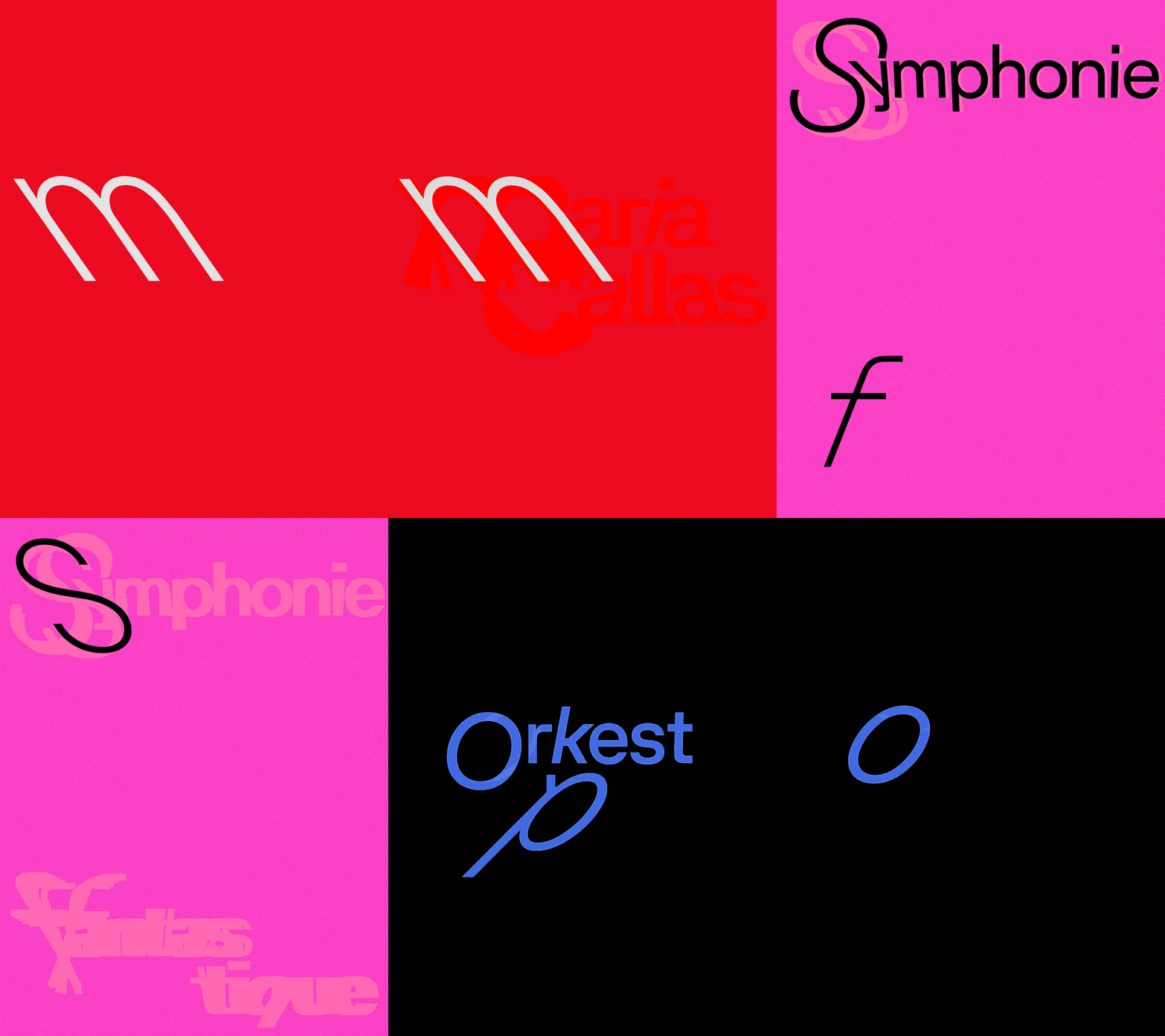
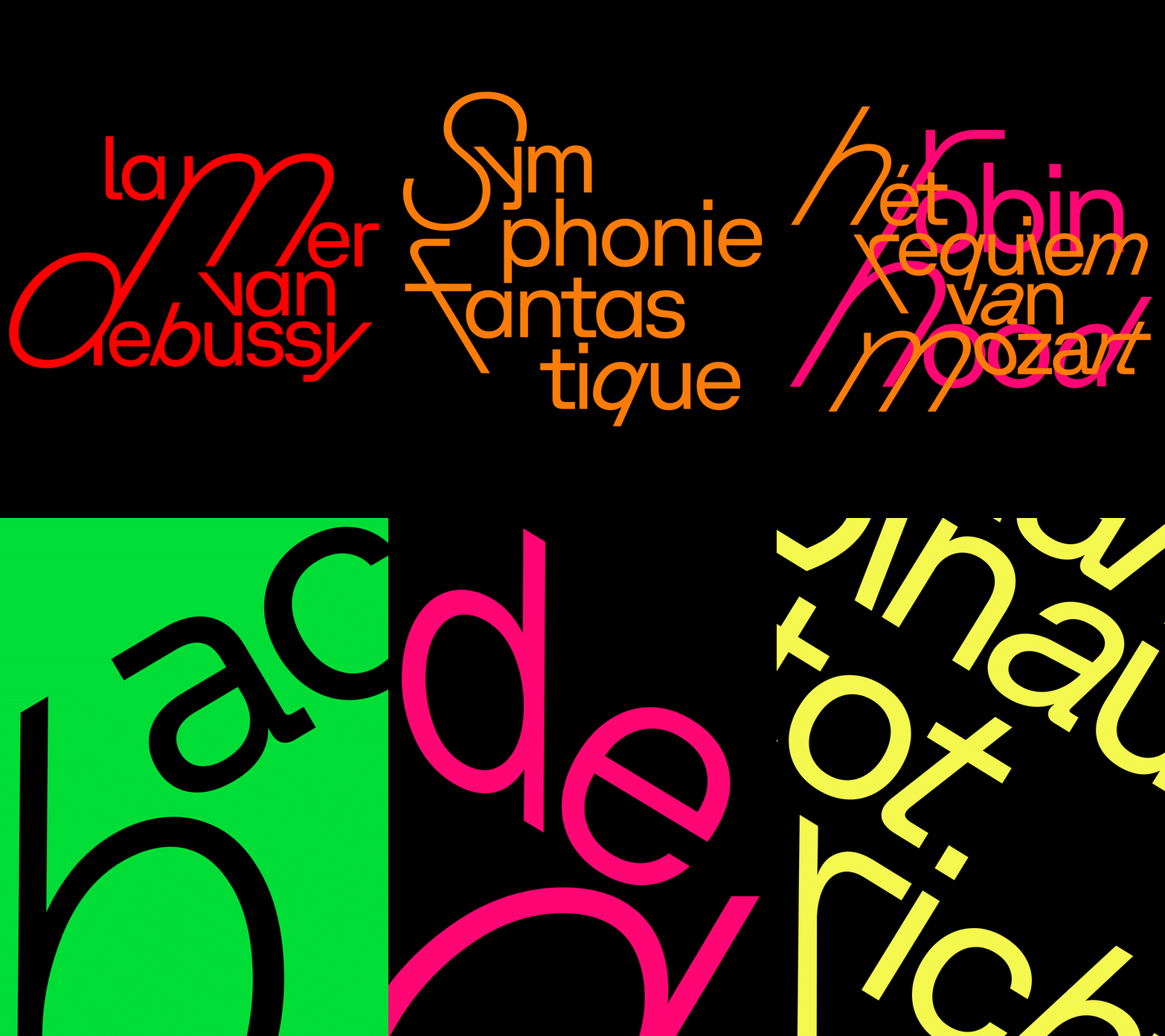
The designers chose GT Planar – a variable-angle sans-serif from Grilli Type with a continuous slant axis that spans a full 90 degrees. “GT Planar has details that only appear when you slant it,” explains Falco van Burg, design lead at Studio Thonik. “The moment the type tilts, extra forms come out that emphasise its character – you can feel that the typographer knows exactly how it should move.”
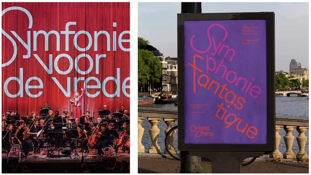
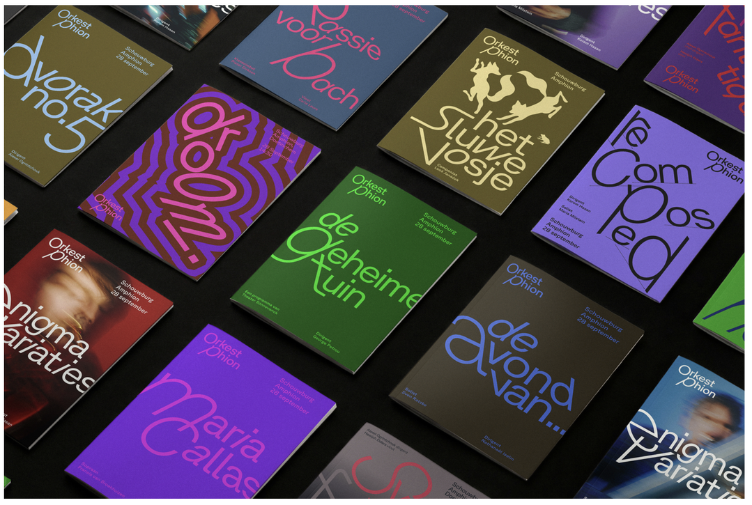
The decision to use typography came from the fact that while orchestras tend to have a permanent home, Phion Symphony Orchestra is a travelling ensemble. The group has no base or a recognisable building, so the design studio saw a need for something other than place or architecture to ground its identity. “We chose to make music the foundation,” explains Falco. “Phion needed a visual system they could expand with every concert, so they’d remain recognisable to their audiences while still giving each show a unique image.”
The appeal of GT Planar is that it can be played with for each concert, slanted in different directions to evoke the mood of the performances. “It always starts with the music, not the layout,” says Falco, referencing a series of animations that illustrates the system’s full potential. “Before we design anything, we ask what the piece feels like – calm or restless? Does it build slowly or hit you right away? A restless piece bends the letters hard and breaks the word apart; a calm piece stays open and quiet,” Falco explains.
In that sense, the identity truly does embody the conductor’s baton – expressive, precise, and capable of holding everything together in single strokes.
Hero Header
(Copyright © studio thonik, 2026)
Share Article
Further Info
About the Author
—
Marigold Warner is a British-Japanese writer and editor based in Tokyo. She covers art and culture, and is particularly interested in Japanese photography and design.