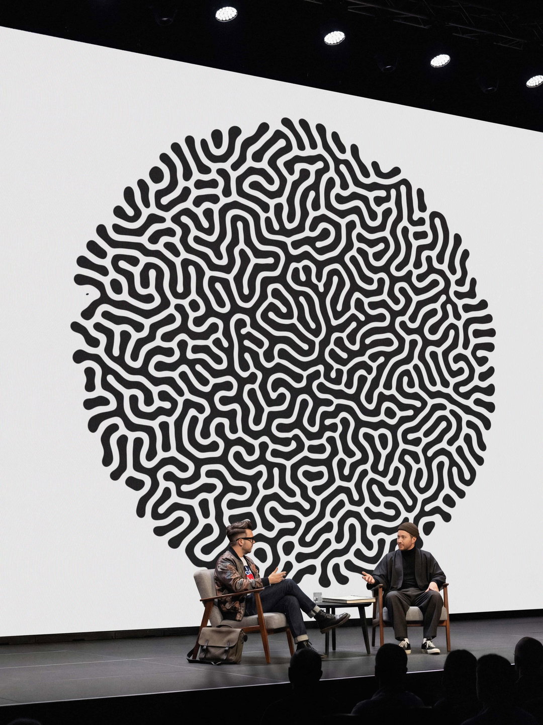
Mucho reaches beyond Silicon Valley with the branding for Biotic, the organisation behind breakthrough biology
Boundary-pushing science is often difficult to understand, that’s where clear and accessible brand design often comes in to help. With the promising results from SpudCells, branding agency Mucho has stepped in to introduce innovation to the public.
As parts of Silicon Valley are busy inventing technology to replace not just what humans do, but humans altogether, there are biologists elsewhere who are working on something far more important than a charismatic user interface or infinite image generation. These biologists are working on a brighter future through a little thing called SpudCells – manmade synthetic cells that are built using 36 genes as opposed to the thousands of genes inside natural cells. Why is this important? It’s vital to the accelerated development of medicines and materials that can help cure disease, break down pollutants, capture carbon, produce food and fuels, unbound by geography, climate or politics.
Stewarding SpudCell is Biotic, a nonprofit organisation that needs an identity that makes the complicated breakthrough simple and accessible – especially for the people of today who are largely under the impression that the end times are near. Independent design and branding agency Mucho (based in both San Francisco and Barcelona) were brought on board to take the complex and give it a clarity, and along with it, a personality rooted in cellular movement.
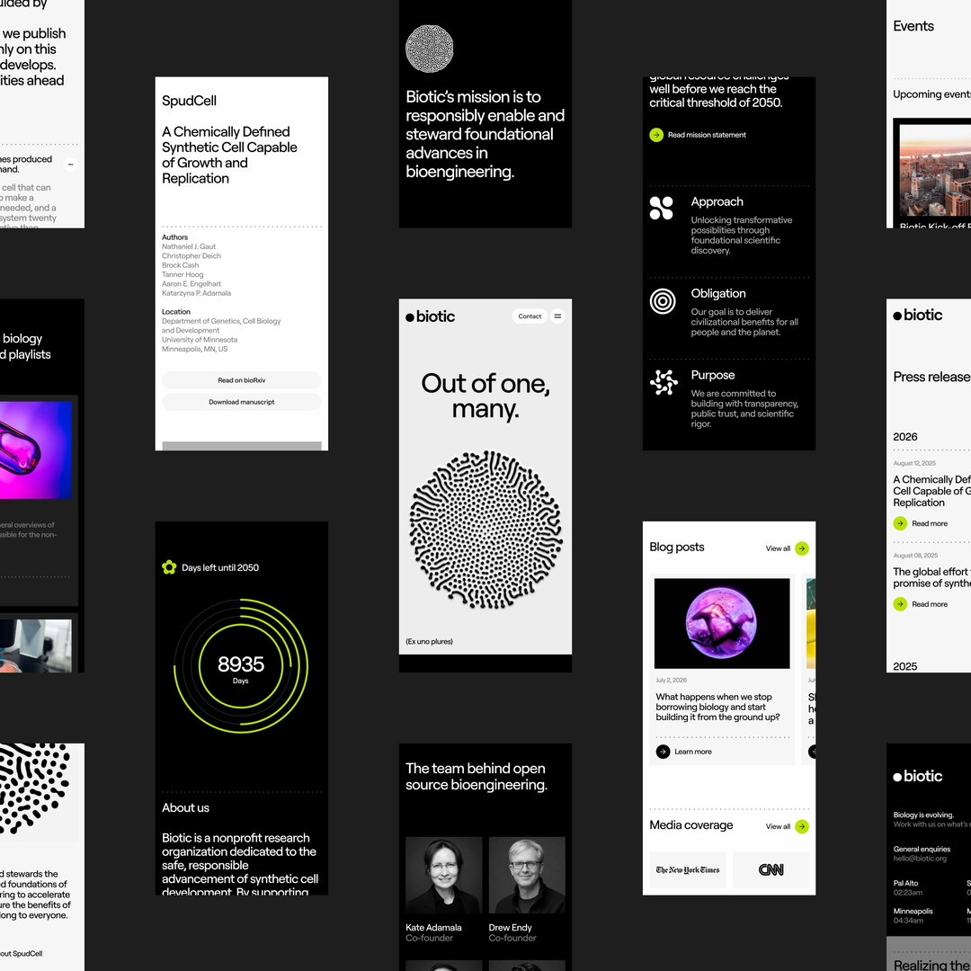
Before Mucho could craft Biotic’s branding, the designers had to understand SpudCells themselves, so they got fully immersed in the science, asked naive questions and challenged assumptions. Dr. Kate Adamala, leader of the team of scientists behind SpudCells, provided the scientific breakthrough, while Mucho designers Drew Endy, Chris Raggio and Jan Jedryszek worked on building a vision for making it accessible to everyone. This led Mucho to its tagline ‘Ex Uno Plures’ meaning ‘out of one, many’ – reversing the American motto ‘E Pluribus Unum’ meaning ‘out of many, one.’ What Biotic represents is an inverse of what we believed is possible, a new nation, a new science, a new way of living.
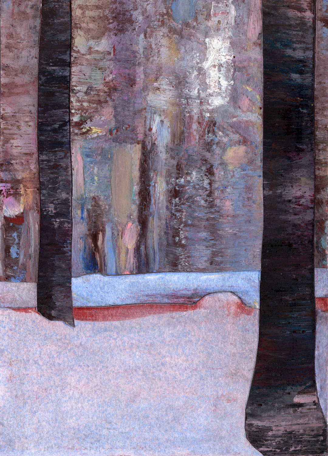
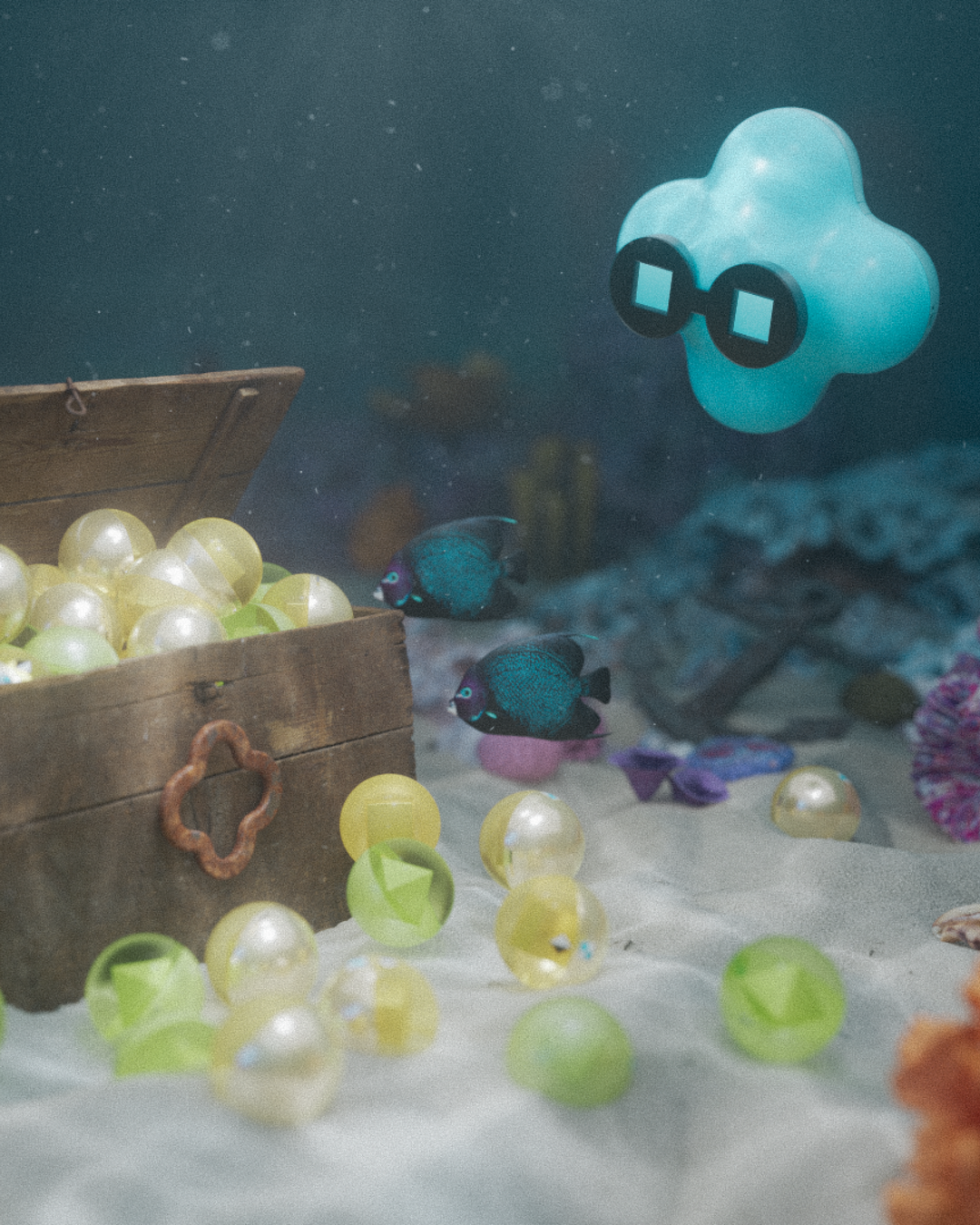
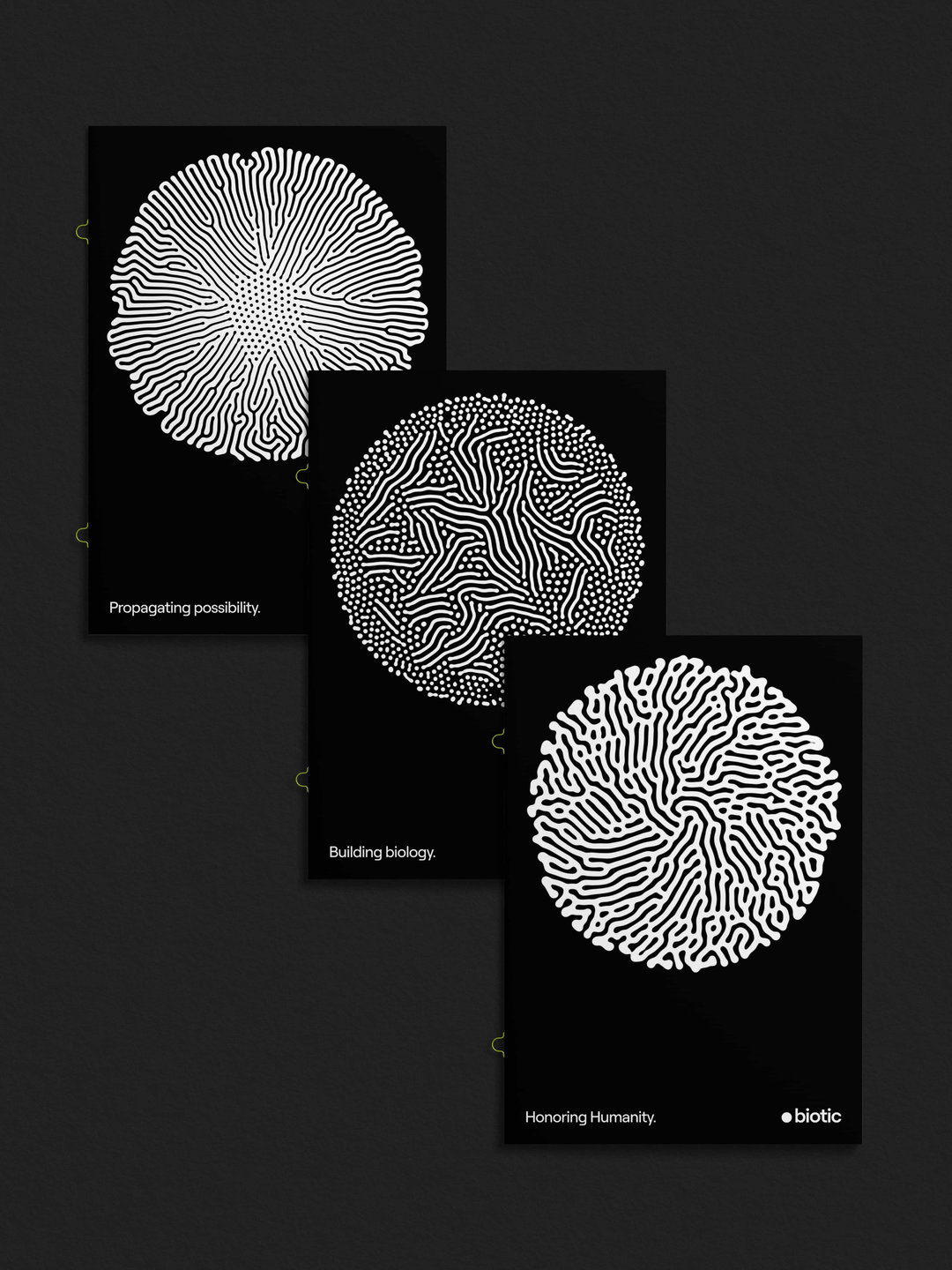
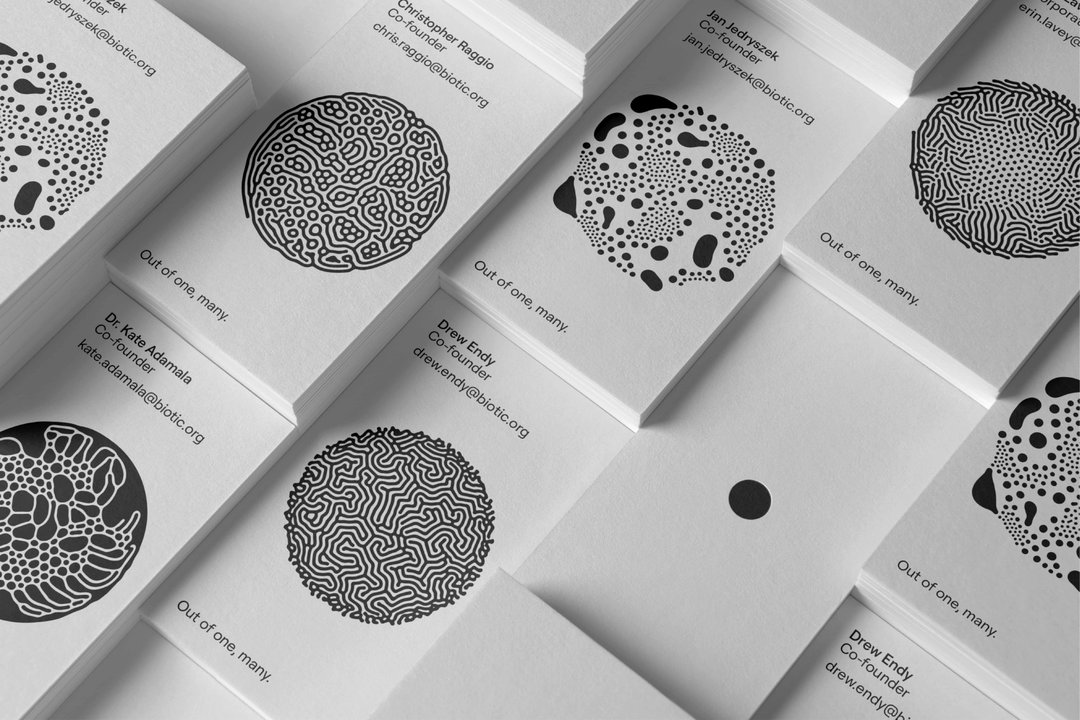
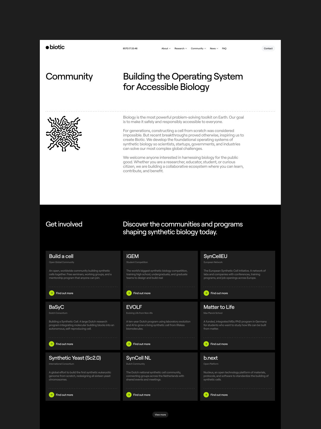
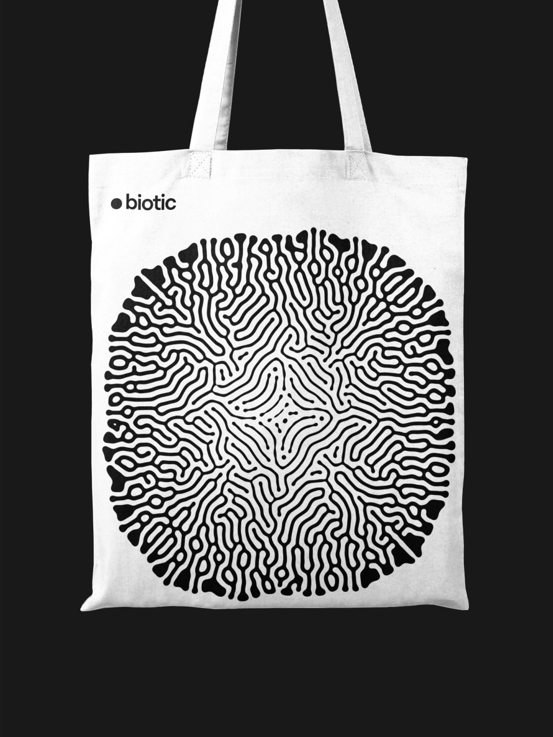
The logo is a simple dot, the purest representation of a single cell, understandable to all, but that’s not all. Working with reaction-diffusion software created by Karl Sims, Mucho developed a living visual language of animations which personify the multiplication of cells as a type of community building, and still illustrations using the diffused textures mimic a thumbprint, embedding humanity at the core of boundary-pushing science. As well as that, the variety of illustrative assets represents diversity within science, the innumerable branches of futurity that SpudCells promise.
“Our responsibility wasn’t to make synthetic biology look beautiful, but to make one of the most significant scientific stories of our generation understandable, approachable and inviting,” says Rob Duncan, Mucho partner and creative director. The colour palette is purposefully limited to black-and-white, reflecting the purity and simplicity of a single cell. Although this could appear as clinical or robbed of personality in any other setting, Mucho achieves with Biotic a time of calming resonance across the identity, offering potential and hope in the face of a media filled with scaremongering and doomsday prophets. SpudCells represent a brand new step for humankind and Biotic is here to communicate the importance of knowing its a good step forward, not another bad one.
GalleryMucho: Biotic (Copyright © Mucho, 2026)
Hero Header
Mucho: Biotic (Copyright © Mucho, 2026)
Share Article
Further Info
About the Author
—
Paul M (He/Him) is a Junior Writer at It’s Nice That since May 2025. He has a strong interest in graphic design, digital kitsch, multimedia painting, collage, nostalgia, analogue technology and all matters of strange stuff. pcm@itsnicethat.com
To submit your work to be featured on the site, see our Submissions Guide.