Swirls, beads and Art Nouveau roots: Emily Klaebe on type design as world building
Inspired by subway tiles, mosaics, snail shells and lollipops, this designer uses typography as a way of creating microcosms of larger ideas which expand how typography lives.
Whether it’s typefaces created out of bead-like modules, bubbly spirals or the playfulness of bending letter systems, Portland-based graphic and type designer Emily Klaebe thinks of type as “the ambassador of sentiments and culture”. She feels that people often look at a typeface and form an immediate association, each feature giving subtle or overt cues about tone and meaning. So when she designs a typeface, she makes sure every detail is drawn with intention, using the practice as an opportunity to world build.
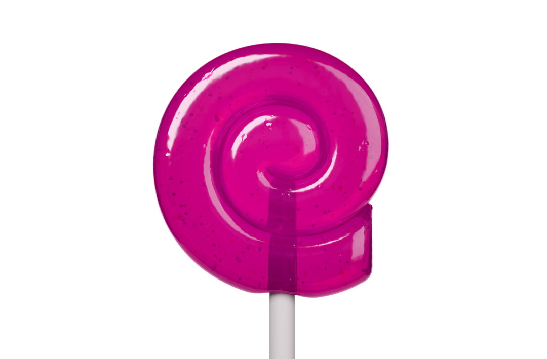
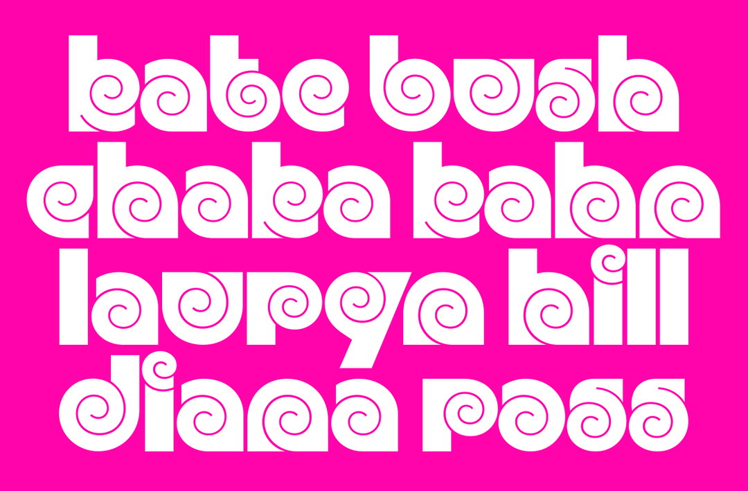
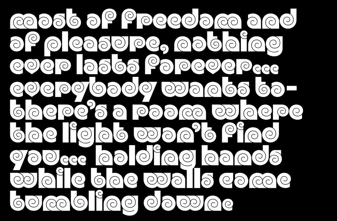
Over the years Emily has worked as a senior designer at Order, design lead at Order Type Foundry and a type design instructor at Portland State University Graphic Design. Spanning both sides of the medium creating custom typefaces for proprietary use as well as promoting typefaces for other designers, Emily understands the wide ranging uses of typography. In her Kickdrum typeface, Emily plays with geometric rigidity found in 70s letter systems by utilising organic swirls that appear like swirly lollipops, snail shells or the cochlear, of all things.
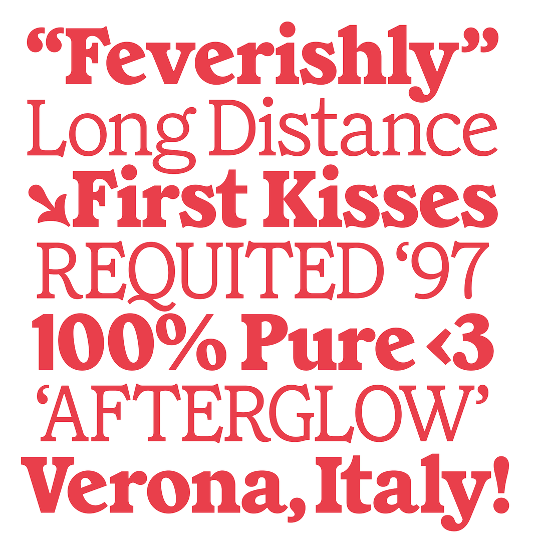
In other projects, Emily plays with type design that is made up of lots of tiny parts: “Missive Serif and Missive Bead are companion typefaces – Missive Serif is an ornate display family with dramatic flares, gooey ball terminals and Art Nouveau roots. Missive Bead distills those legible display serif forms into a grid-based system for embroidery, using a framework designed around the elongated proportions of bugle beads,” says Emily. “All of my typefaces are rooted in a distinct concept while remaining ubiquitous. Promoting a typeface means creating a microcosm – combining colours, materials and typesetting – that shows where the typography might live.”
GalleryEmily Klaebe: Kickdrum, 3D by Harrison Gerard (Copyright © Emily Klaebe, 2026)
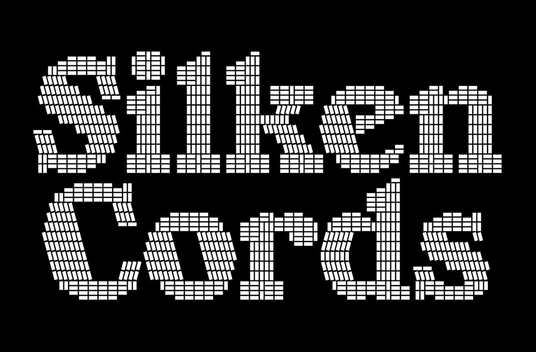
Emily Klaebe: Missive Bead (Copyright © Emily Klaebe, 2026)
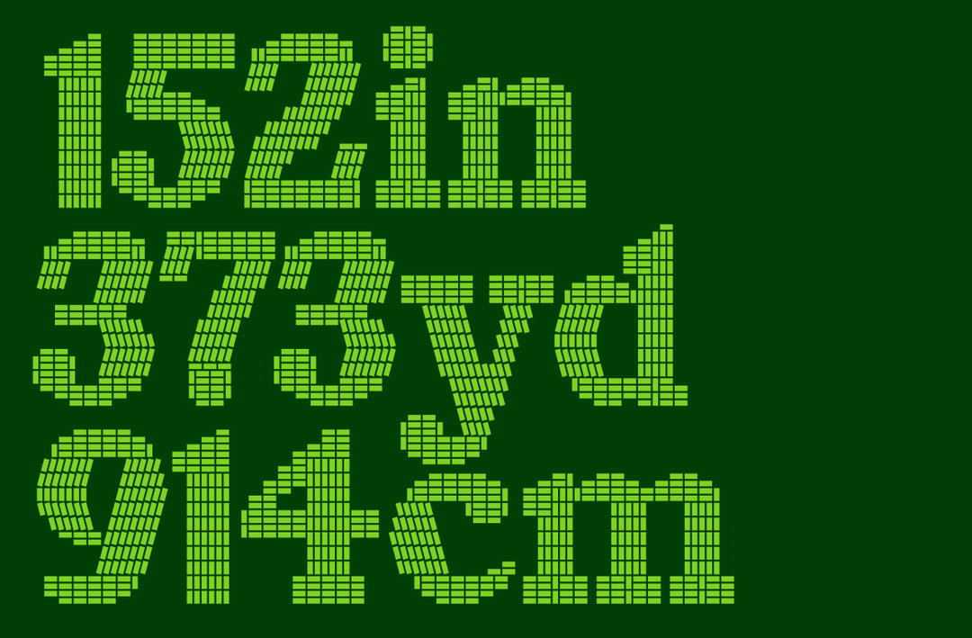
Emily Klaebe: Missive Bead (Copyright © Emily Klaebe, 2026)
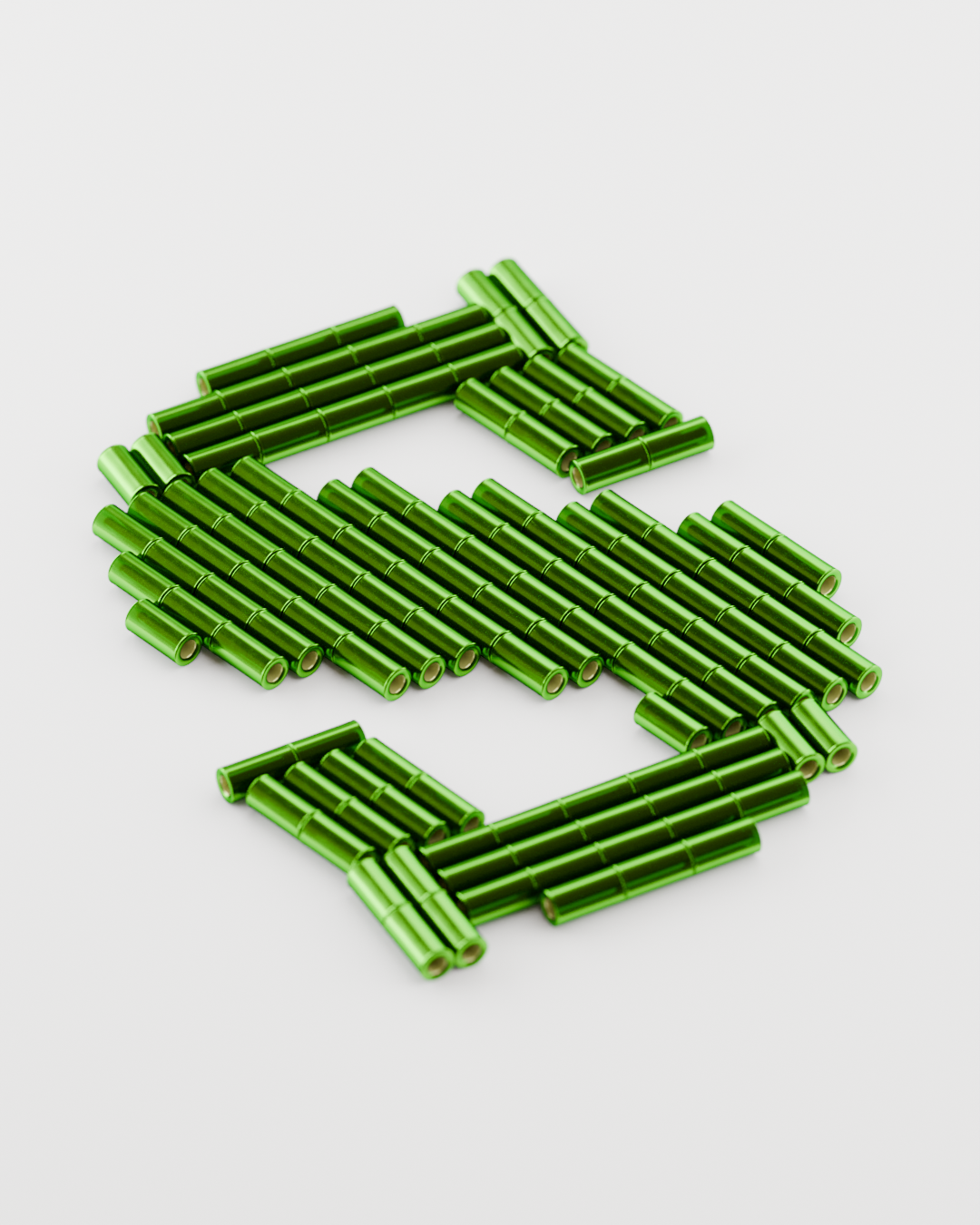
Emily Klaebe: Missive Bead, 3D by Harrison Gerard, (Copyright © Emily Klaebe, 2026)
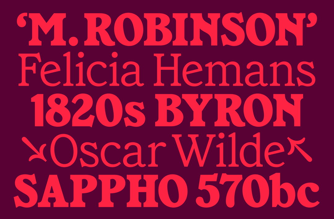
Emily Klaebe: Missive Serif (Copyright © Emily Klaebe, 2026)
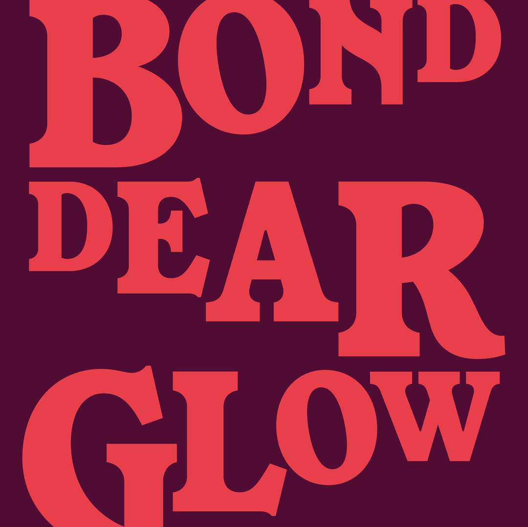
Emily Klaebe: Missive Serif (Copyright © Emily Klaebe, 2026)
Hero Header
Emily Klaebe: Missive Serif (Copyright © Emily Klaebe, 2026)
Share Article
Further Info
About the Author
—
Paul M (He/Him) is a Junior Writer at It’s Nice That since May 2025. He has a strong interest in graphic design, digital kitsch, multimedia painting, collage, nostalgia, analogue technology and all matters of strange stuff. pcm@itsnicethat.com
To submit your work to be featured on the site, see our Submissions Guide.