




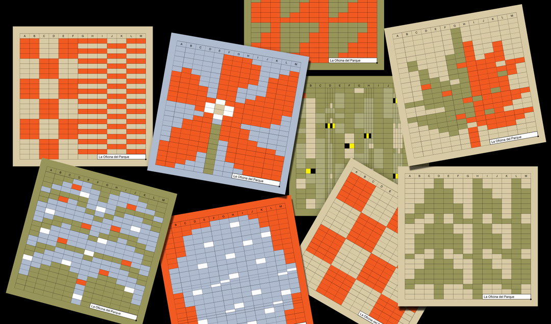
This identity for a digital nomad cafe uses the visual language of Excel as its foundation
Creating something simplistic and playful, Studio Ingrid Picanyol shows the visual potential of digitals tools.
Share
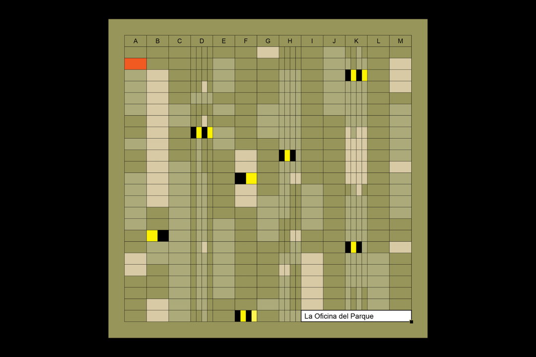
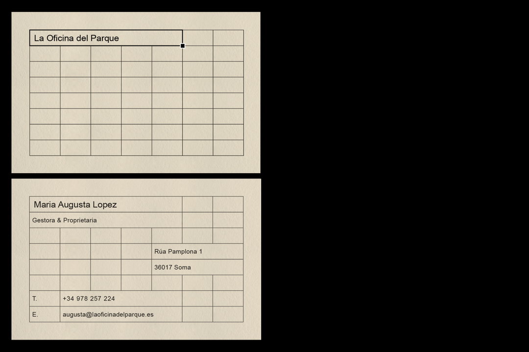
Since the pandemic, the digital nomad has become an evermore present figure of modern working life, with remote working allowing for more freedom in people’s schedules. To account for such vast changes, spaces are now attending to the needs of ‘rootless’ workers, like La Oficina de Parque, a bar-cum-cafe located in Barcelona. To tap into the establishment’s features, Ingrid Picanyol – founder and director of the studio – tried to think about what defined an ‘office’, leading her to your most organised colleague’s best friend, the Microsoft Excel Spreadsheet. Taking its core characteristics – grids, cells and numerics – Ingrid then utilised them to create natural imagery and iconography, paying homage to the cafe’s location in a leafy local park.
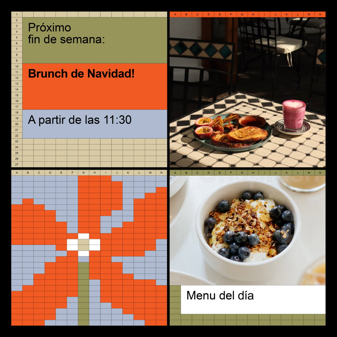
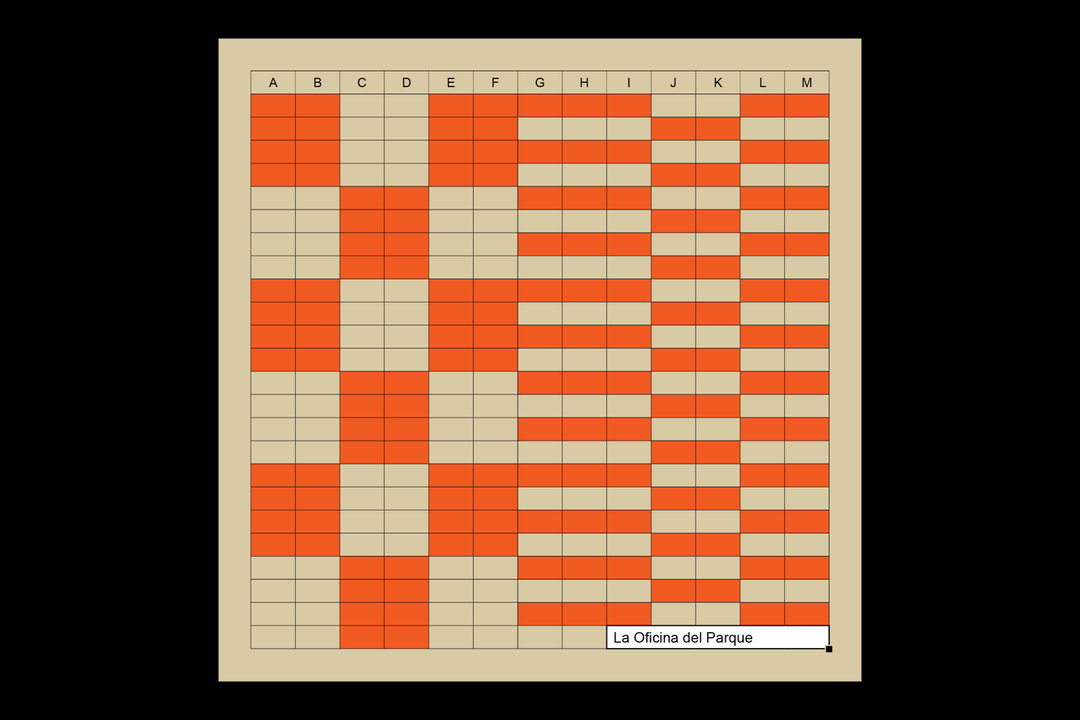
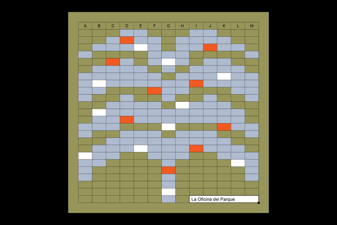
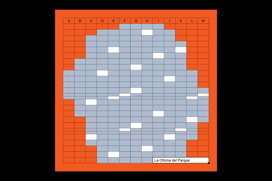
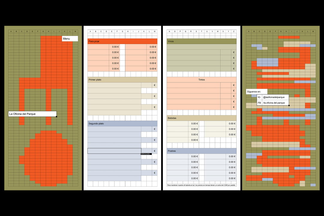
Somewhat surprisingly, the characteristics of excel made for a particularly dynamic tool. “Excel grid and typographic language offered a ready-made, versatile system that would adapt to any application, print or digital,” Ingrid explains. “It also allowed for particularly adaptive web and app design, with photographic elements introducing another layer to the visual language.” Ingrid continues, “Using the grid as a foundational structure, single cells provided the building blocks to create unique layouts.” Merging cells together “like Lego” or blocking out areas of the background allowed Ingrid to create clear shapes and outlines. With such an approach, she created modular illustrations, including leafs, flowers, trees and a particular favourite of ours here at It’s Nice That: a group of bees.
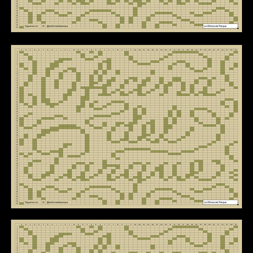
Studio Ingrid Picanyol: La Oficina del Parque (Copyright © Studio Ingrid Picanyol, 2023)
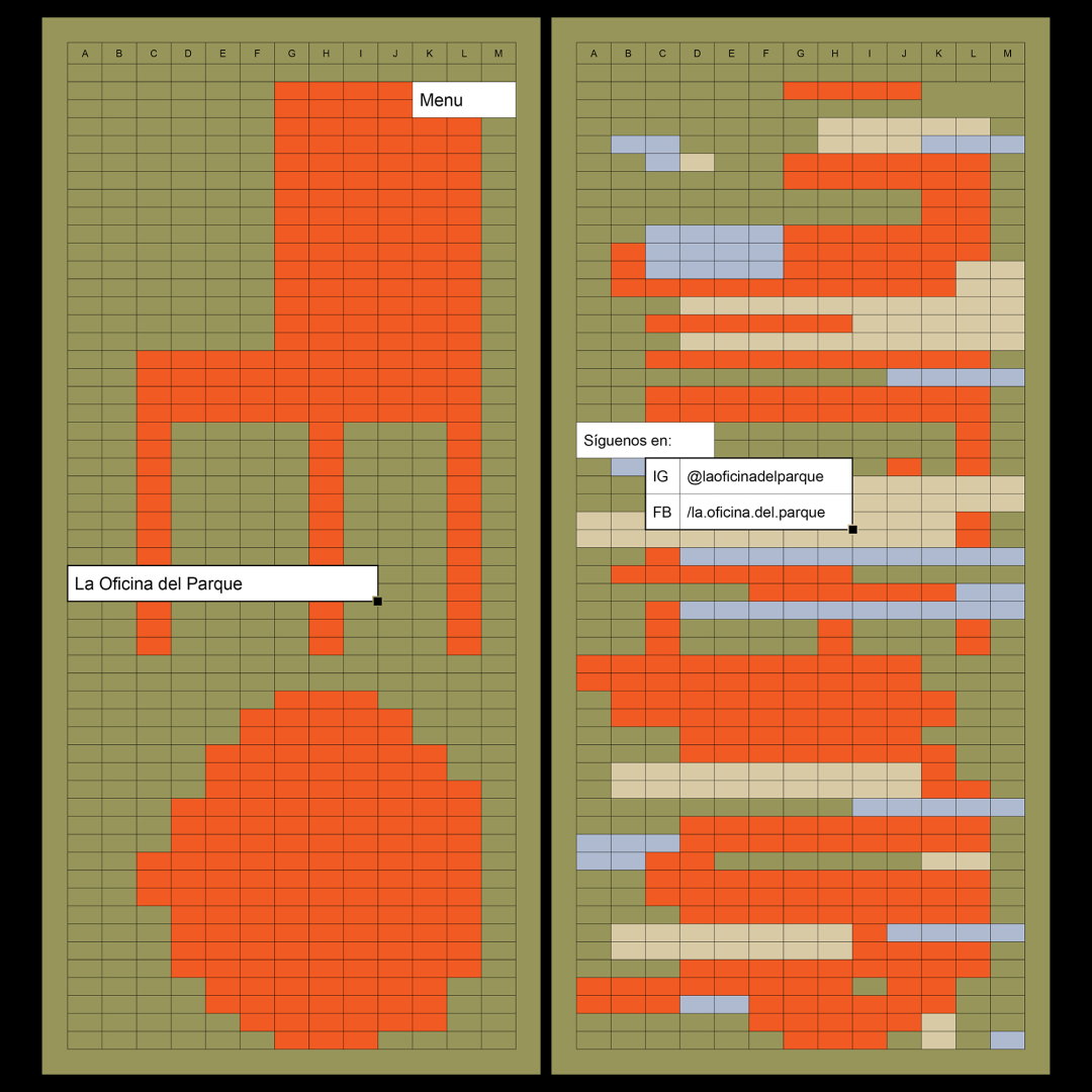
The identity's logotype sticks to tradition by using cells blocked out with white and finishing the name in Arial – Excel’s default font. The font also allows for numerical additions in order to “strengthen the digital origins of the brand identity”. Ingrid tells us that she explored more “decorative” text in the menu, recreating the bar’s name with blockout green cells, complete with elegant ligatures. The text has a calligraphic feel and gives off the sense of being created with tiles, as opposed to a digital organisation tool.
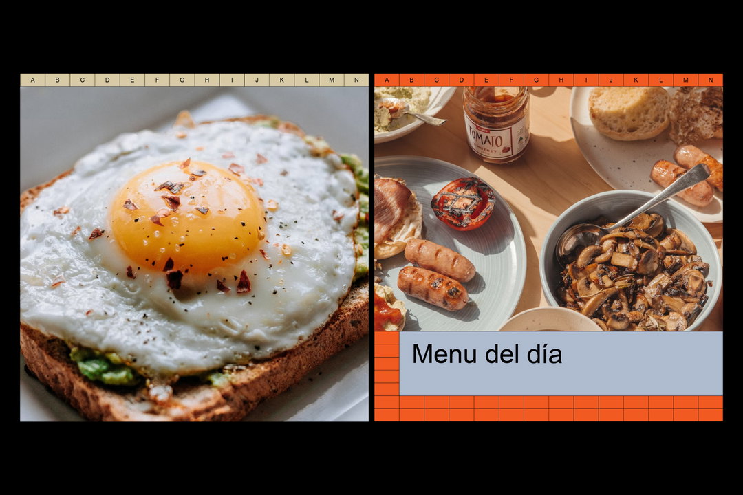
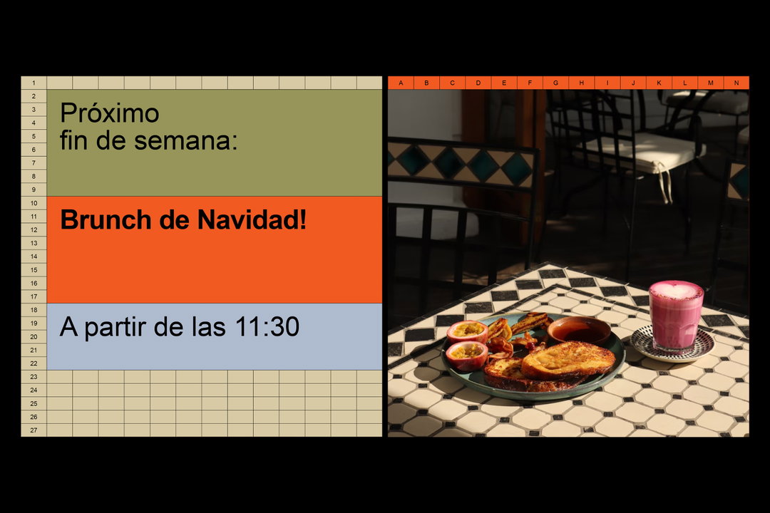
For the overall colour scheme, Ingrid opted for a “muted” palette – which reflects nature – with pops of bright orange added in for contrast. The cornflower blues, olive greens in varying shades and subtle beige all come together with the orange to create something both soothing and striking. The colours also pair particularly well with the photographic imagery of food, drinks and the cafe’s interior – all finished with warm lighting and tones.
Overall, Ingrid aimed to create a simplistic and playful set of designs. Using an unexpected digital tool and paying close attention to the characteristics of the brief at hand, Ingrid and her team created something truly unique – proving what can be achieved when you look at something ‘run-of-the-mill’ with a new perspective.
GalleryStudio Ingrid Picanyol: La Oficina del Parque (Copyright © Studio Ingrid Picanyol, 2023)
Hero Header
Studio Ingrid Picanyol: La Oficina del Parque (Copyright © Studio Ingrid Picanyol, 2023)
Share Article
About the Author
—
Olivia (she/her) is associate editor of the website, overseeing the day-to-day editorial projects as well as Nicer Tuesdays events. She joined the It’s Nice That team in 2021. ofh@itsnicethat.com
To submit your work to be featured on the site, see our Submissions Guide.





