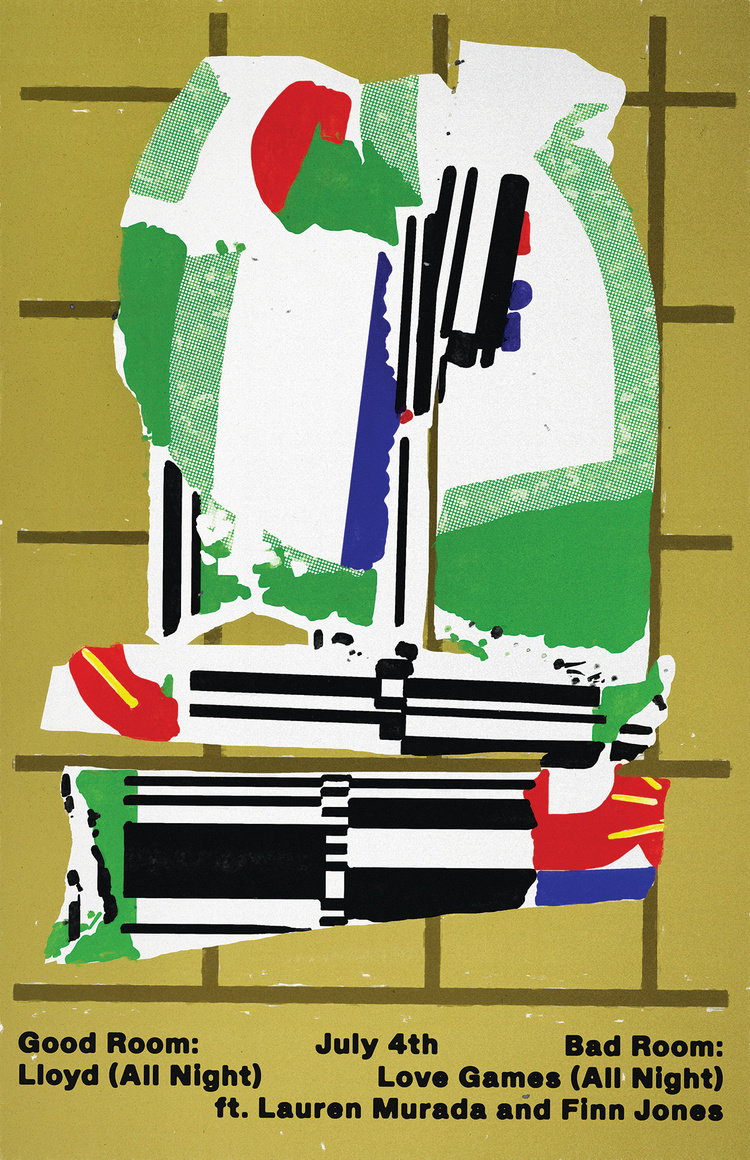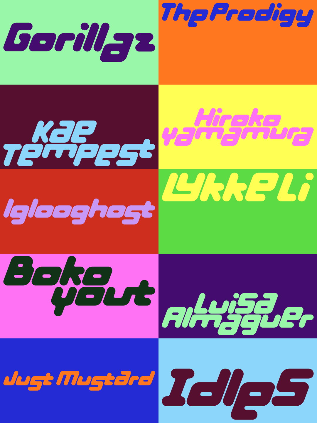
From rotten, gooey posters for imaginary drinks to organic type: slide into the posters of Robuche
The shared practice of Lou Buche and Javier Rodríguez Fernández is sumptuously chaotic, cross-disciplinary and funny to boot.
Right now in Amsterdam, a curious medley of two distinct creative perspectives is bubbling away. Under the moniker Robuche, Lou Buche and Javier Rodríguez Fernández have been making work together for the last few years – and what a result they have achieved in that time. Dipping into near-enough every discipline you could imagine, from sculpture to rug tufting and typography, the pair have amassed a seriously diverse portfolio. But across it all, we have been hooked by one thing in particular from Robuche: its brilliantly unique take on graphics and poster design. So much so that we had to catch up with the pair to get the skinny on some of their stand-out work in this category, covering both imaginative solo projects and their collaborative efforts.
Under Robuche, the commercial projects the creative duo tend to work on are “usually related to the cultural sector”; images “for the music industry, independent publishers or art foundations”, Javier tells It’s Nice That. This is exactly the kind of client Lou joined forces with for a fascinating recent work. Approached by MacGuffin Magazine, Lou designed a label for a totally imaginary drink for its tenth issue: “uncorking a miscellany of bottles that capture the zeitgeist”. Much to our delight, Lou went down the unexpected route of celebrating the “beautiful rotten fruits” generally used to make hooch, using digitally painted juicy contrasts and gooey smears of colour to represent berries. Lou explains: “I wanted to pay tribute to my grandfather and his homemade booze [...] I named the alcohol Carambolage. It is a bold and fortunate fruit collision. Neither holy nor blasphemous, yet very close.” As the hooch fruits slide across the label – complete with fictional vineyard date stamp – we’re reminded heavily of The Scream, if Munch was designing for a boozy winery.
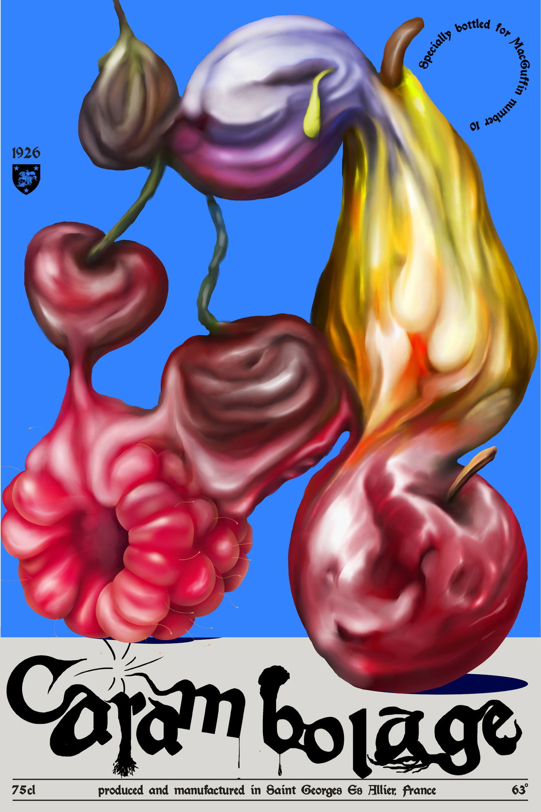
Lou Buche: Carambolage (Copyright © Lou Buche, 2021)
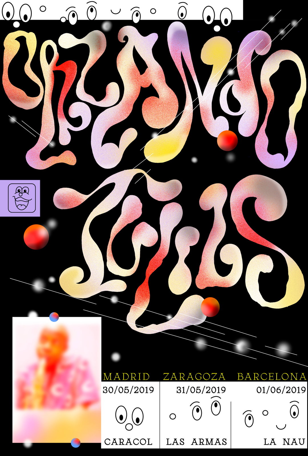
Javier’s solo practice often feels similarly organic, but in an entirely different manner. On a recent album cover for indie band Ciel, Javier – a typographically driven designer – drew typefaces by hand first, nailing a more organic form, like the kinds found in Lou’s work, before modifying it with software, “adding three-dimensional effects”, says Javier. This push and pull of fluidity and harsh-lined tech appears throughout Javier’s work. Fun, floaty, loose illustrations will often sit alongside structured grids, pixelation and static. The result is a joy to behold and is firmly rooted in Javier’s approach to “reconfigure, cut-up, and collage” references of sci-fi, punk, non-design, graffiti and outsider art – “alienated contexts where design comes from necessity instead of professionalism,” he tells us.
As for how all this works in tandem, one only needs to look at Constant 101 Foundation, a recent poster from Robuche for the 101st anniversary of the birth of Dutch artist Constant Nieuwenhuys, to see its multidisciplinary approach in action. Extracting ideas from Nieuwenhuys’ lectures and work, Robuche then did what they do best: remixed them. The final poster features symbols that “subtly refer” to the Nieuwenhuys universe mixed “with our own visual language”. Immersive, textural, and unexpected, it is a prime example of the stuff we’ve come to expect from Robuche – and have yet to be disappointed.
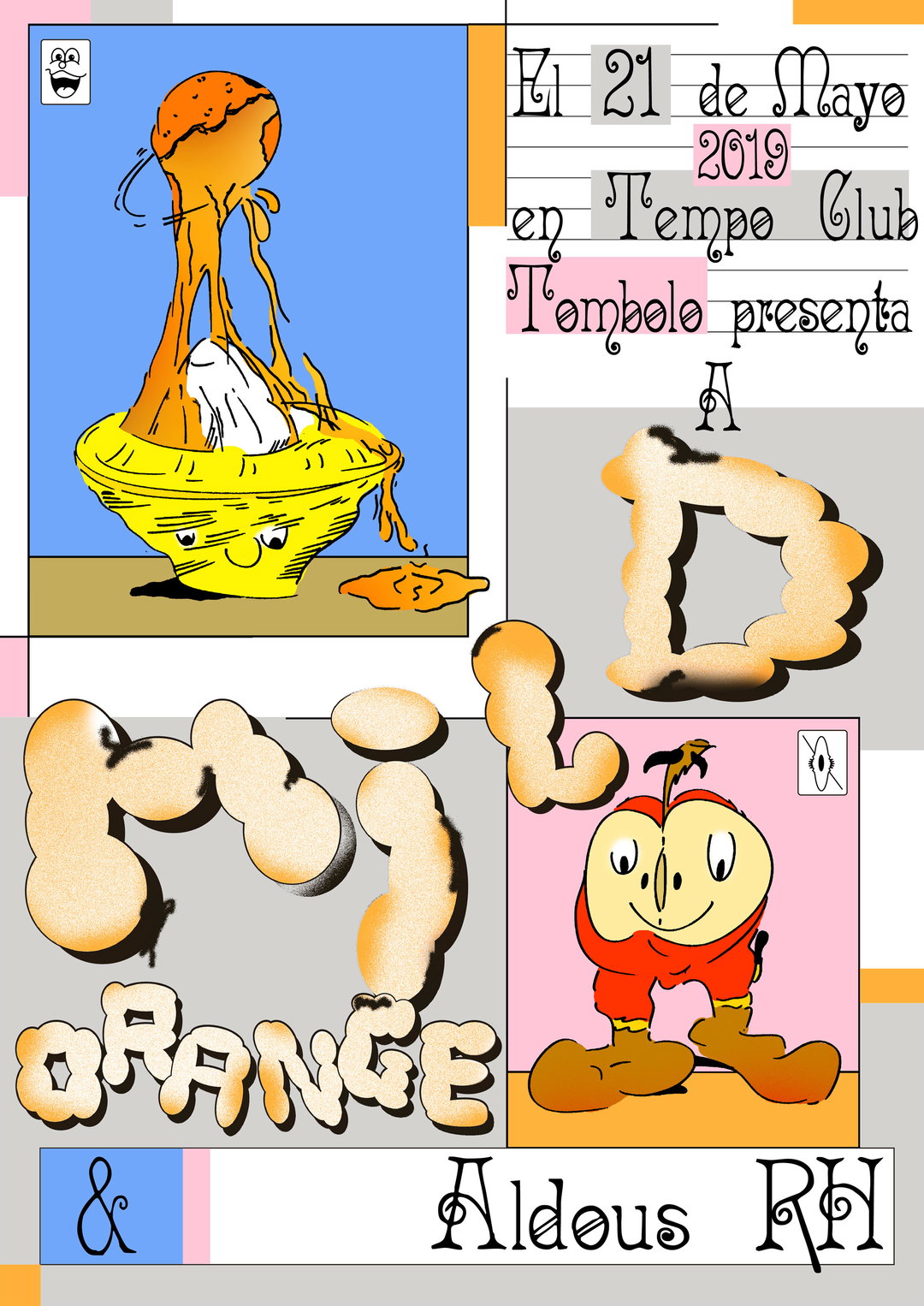
Javier Rodríguez Fernández: Mild Orange (Copyright © Javier Rodríguez Fernández, 2019)
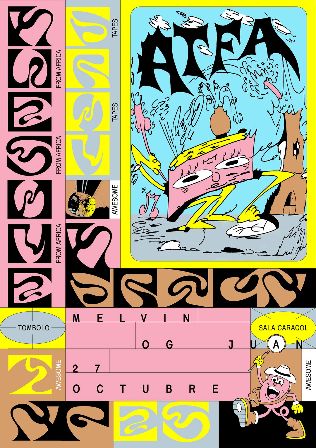
Javier Rodríguez Fernández: ATFA (Copyright © Javier Rodríguez Fernández, 2019)
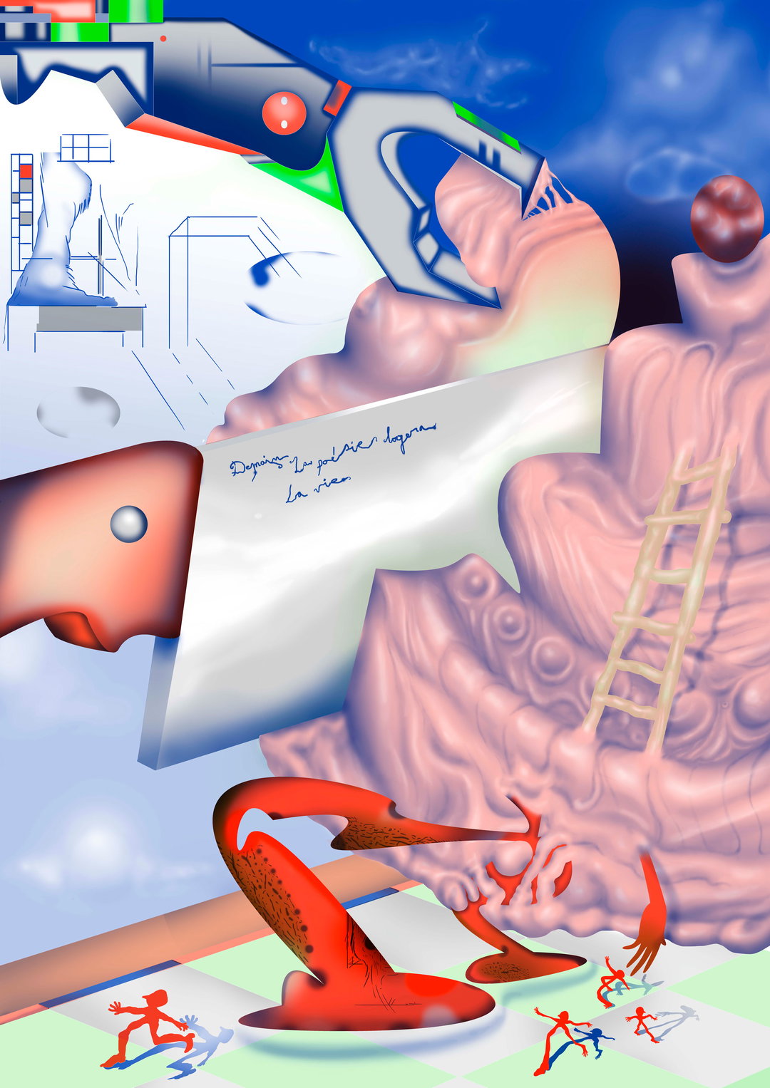
Robuche: Constant 101 Foundation (Copyright © Robuche, 2021)
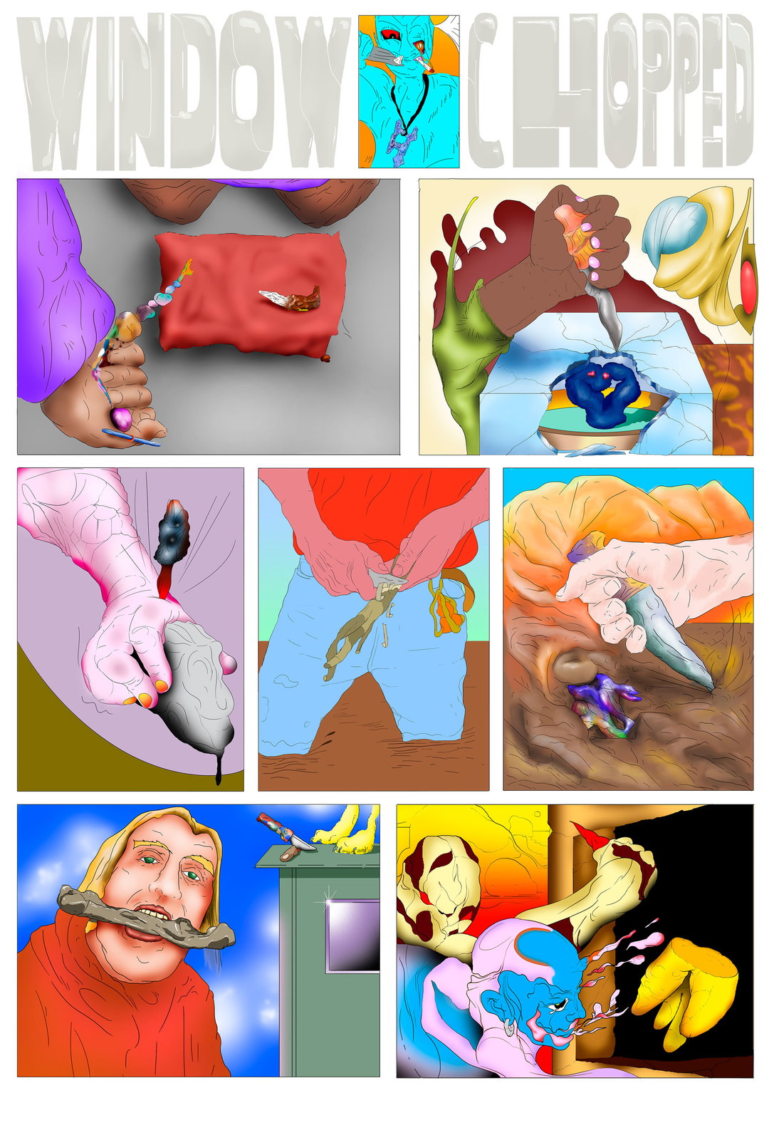
Robuche: Window Chopped (Copyright © Robuche)
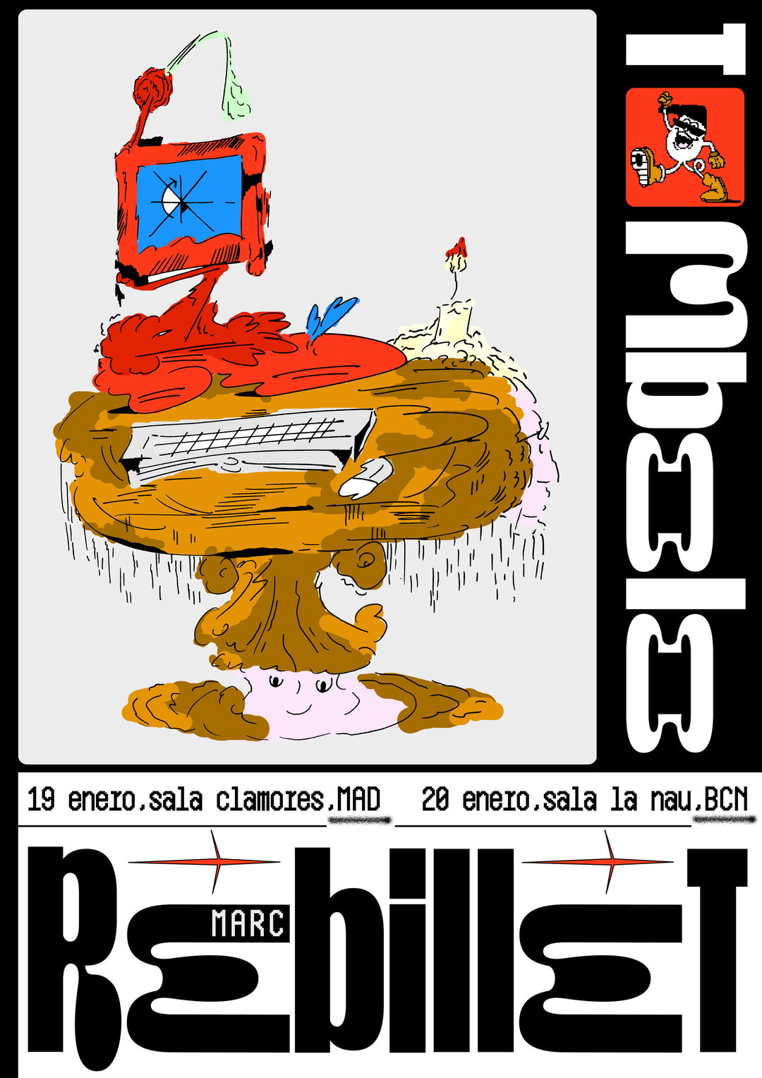
Javier Rodríguez Fernández: Rebillet (Copyright © Javier Rodríguez Fernández, 2018)
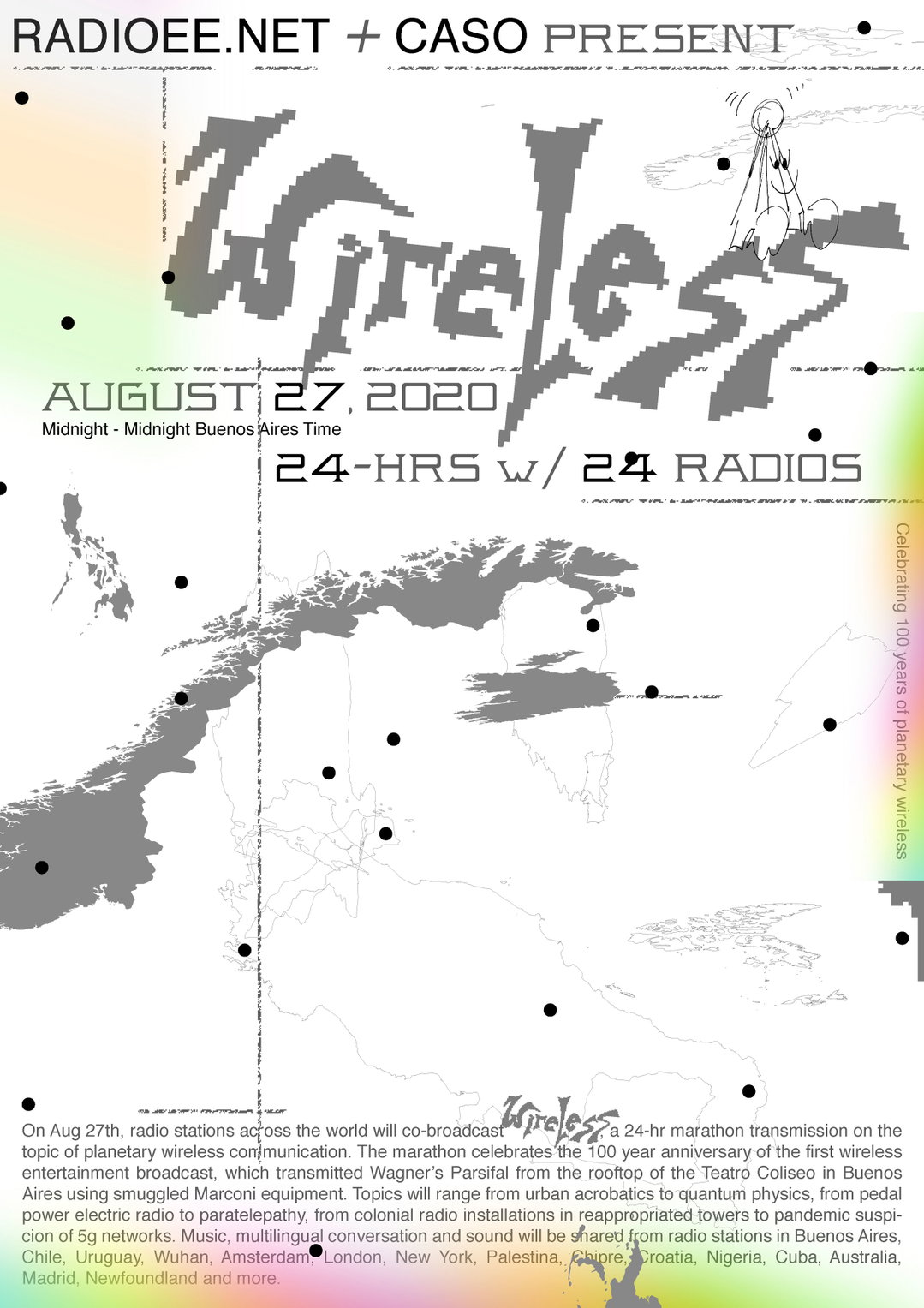
Javier Rodríguez Fernández: Wireless (Copyright © Javier Rodríguez Fernández, 2020)
Hero Header
Javier Rodríguez Fernández: Orlando Julius (Copyright © Javier Rodríguez Fernández, 2019)
Share Article
About the Author
—
Liz (she/they) is the senior editor at Insights, a research-driven department within It’s Nice That. They previously ran the news section of the website. Get in contact with them for potential Insights collaborations or to discuss Insights’ public-facing reports.