Niccolò Debole’s graphic design incorporates found objects and analogue processes
“My mom is an entertainment art director who met my dad while studying painting at the Accademia in Florence Italy, where he’s from, so I’m pretty convinced ‘creativity’ might actually be in my blood,” reflects graphic designer and artist Niccolò Debole. Having graduated from the Pratt Institute with a BFA in Communications Design, as well as “student loans and crippling anxiety about future success,” Niccolò now lives in Brooklyn with his dog, Giorgio, and is a senior designer with fashion and culture publication Document Journal.
In his work, Niccolò tries to maintain a playful approach to creating: “I’d like to think my artistic style is really not so different from my identity as a person. I’ve always been a bit fastidious, and I think that comes across in my process as I sometimes get caught up in the details. I’ve always been attracted to work that suggests the original creator had fun while making it, so I strive to find the fun in the process. While humour, simplicity, and a studied nonchalance are all aspects that define my visual identity, they also just happen to be my innate qualities, whether it’s how I dress, play soccer, write an email, or tie my shoes. I still ask for crayons at restaurants!”
Despite his tendency to spend hours on tiny details, Niccolò cultivates a DIY aesthetic that works against his impulse towards perfectionism. He tells us that he has been trying to curb his precisionist compulsions for years: “I used to hate it when my white shoes got scuffed, when different foods on my plate touched. I think at the end of the day it’s a control issue, so now I try to welcome the uncontrollable so that I can rewrite my personal definition of perfection."
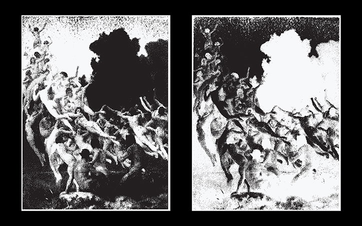
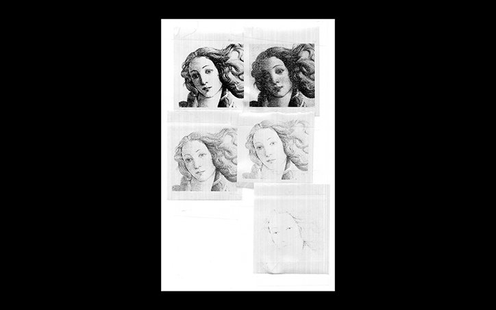
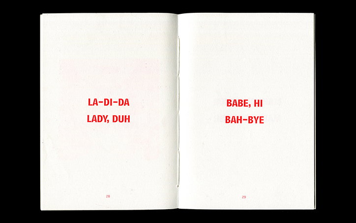
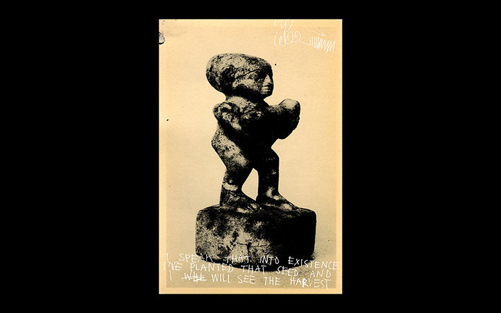
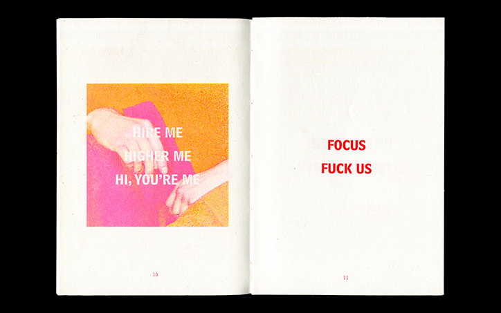
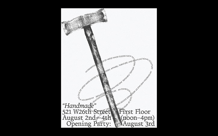
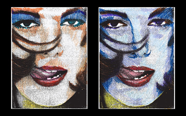
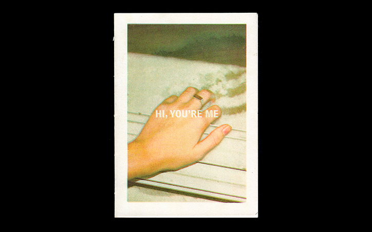
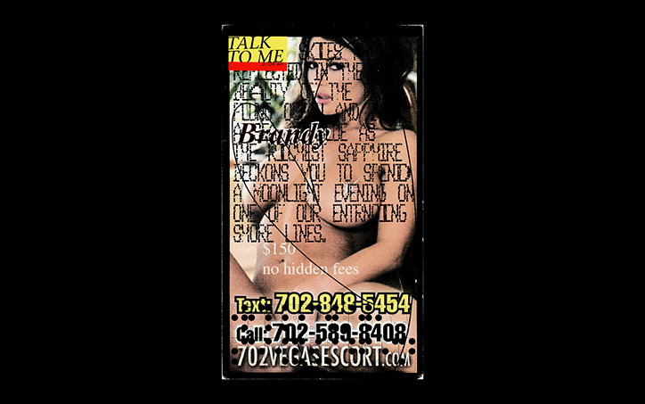
“I collect found photos, postcards, random scraps and tickets for fare evasion on the subway, I’ll scavenge through public domain collections, old works, sharpie notes from my mom – and I scan it all. Then I play with it digitally, throw it back into the physical world by printing, Xeroxing, tracing, pretty much anything, until it becomes something completely new. While a xerox usually results in a loss of detail, it also adds something that wasn’t there before. It’s been a good exercise for my mental health as a creative as well.”
Niccolò Debole: BAD NEWS
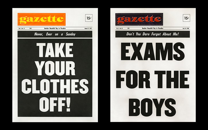
Niccolò’s obsession with collecting forms the basis of his personal project, Bad News. Over the course of a year, he accumulated an extensive stock of “random sentences, cryptic sayings, bits of overheard conversations, thrifted photographs, newspaper clippings, snippets that intrinsically meant nothing but that I saw meaningful potential in.” Crammed into a “huge notepad” on his phone, these pieces of information became isolated from their original context, purpose and meaning, thus tipping over into the realms of hearsay, fake news, conspiracy theories and half-heard, half-remembered rumours.
From this collection, Niccolò created newspaper tabloids propounding truths that were founded in a jumble of informational scraps. “It was,” he tells us, “somewhat based on a speculative design project from my senior year, during which I spent an entire semester ‘believing’ the rumour that Paul McCartney died in a car accident in 1966, and creating a series of historically accurate tabloids, newspapers, and various ephemera – PSA announcements and support groups – from that event, which I thought might have existed if the rumour had been true.”
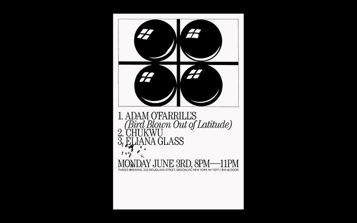
When it comes to his aspirations for his practice, Niccolò’s emphasis is on pursuing the intuitions and quirks that mark his graphic design work as wholly his own: “I’m really interested in pushing my work far as possible, so that it can tiptoe the line of fine art vs design as honestly as it can. I’d really like to cultivate a style my own that gets me hired, rather than just a skillset.”
Niccolò Debole
Niccolò Debole
Niccolò Debole
Niccolò Debole
Niccolò Debole
Niccolò Debole
Niccolò Debole
Niccolò Debole
Niccolò Debole
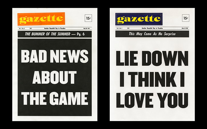
Niccolò Debole: BAD NEWS
Share Article
Further Info
About the Author
—
Rowe joined It’s Nice That in the summer of 2019 as an editorial assistant. She wrote many fantastic stories for us, mainly on hugely talented artists and photographers.