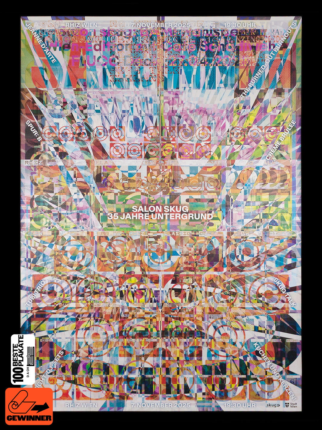
Nguyen Gobber’s poster series turns live music into noisy visuals
For the Austrian event series Salon skug, the Vienna-based studio creates posters that function as a design playground and a support system for emerging musical voices.
There’s been a lot to catch up on since we last spoke to Nguyen Gobber, the collaborative practice between Hoang Nguyen and David Gobber. Not only has their graphic design practice evolved into a fully fledged independent type foundry – with the 2026 release of Sticks, Funkhaus and their accessible, digital typographic playground Type Tinker – but they’ve also published their own writings on design. They’ve also been designing the posters for Salon skug, the live event series from Austrian subculture magazine skug, which has garnered acclaim alongside their inclusion in 2025’s INTL International Poster Competition.
“Friends of ours are involved in organising Salon skug, so our first visit was simply a welcome chance to spend time with people we like,” David says, “but we quickly realised how valuable this event series is.” It’s a welcoming space that hosts discussions on socially relevant issues alongside performances from musicians, many of which are undiscovered talent. “Skug is Austria’s oldest continuously published cultural magazine since 1990,” David adds, “so it’s no surprise that they are pretty good at finding and picking interesting live acts.”
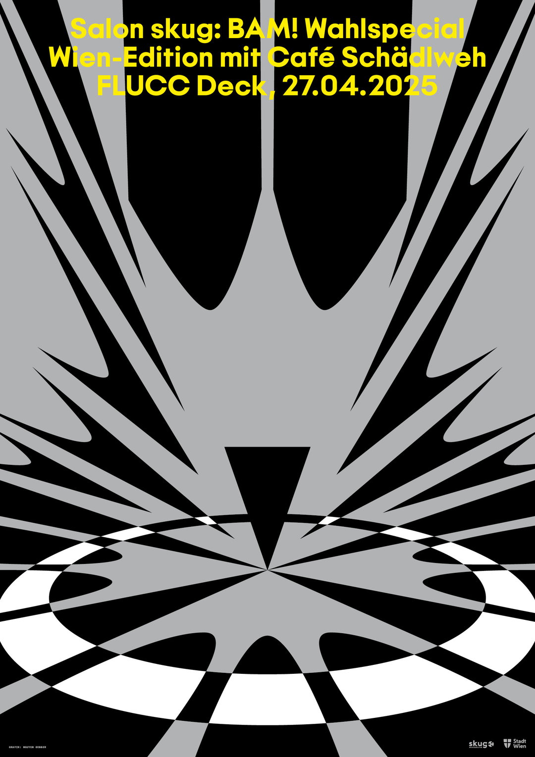
Nguyen Gobber: Salon skug, April 2025 (Copyright © Nguyen Gobber, 2024-2026)
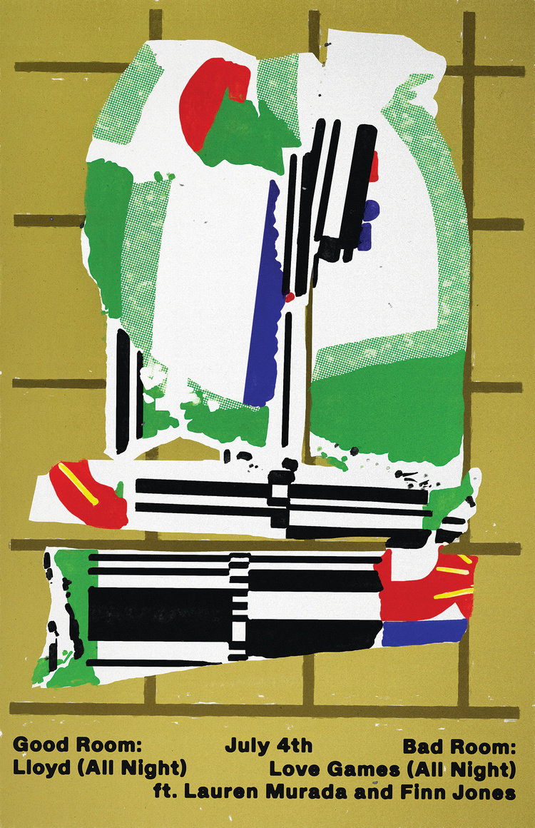
Each poster design by Nguyen Gobber is unique to that specific event and made in direct response to the evening’s performance, meaning they range drastically in colour, character, tone and type. The process usually starts with Hoang and David listening to the music and noting down any triggered associations, which become the foundation of the poster. “Through an iterative process, we explore different directions and try to weave in relevant references,” Hoang explains, using the Salon skug poster for December 2024 as an example. “It was very much inspired by the lyrics of a particular song of the artist Ines Wurst. We designed the typography to mimic the view down a staircase, which is the setting for the story.” The foundry’s own typeface, Farmacia, was used as the condensed display font. The whole series also serves as a creative excuse to experiment with new typographic forms and test entirely new typefaces. “Working with our own typefaces is something most Salon skug posters share,” Hoang adds. “Since we have complete freedom, each poster becomes a bit of an experimental playground.”
The distinctive tone of the poster series – one that evolves, dances, plays and reacts – is both the culmination of Nguyen Gobber’s innate reaction to the acts and an articulation of the founder’s approach to type, especially in what they consider expressive type to be. “We think of being ‘expressive’ not so much as in ‘standing out visually’, but in incorporating various visual, conceptual, technical, historical or other kinds of references,” says David. Through this definition, typefaces can express given ideas through the themes and context that underpin them. As David adds, “with Salon skug, we have events that are truly rich in various interesting themes and topics.”
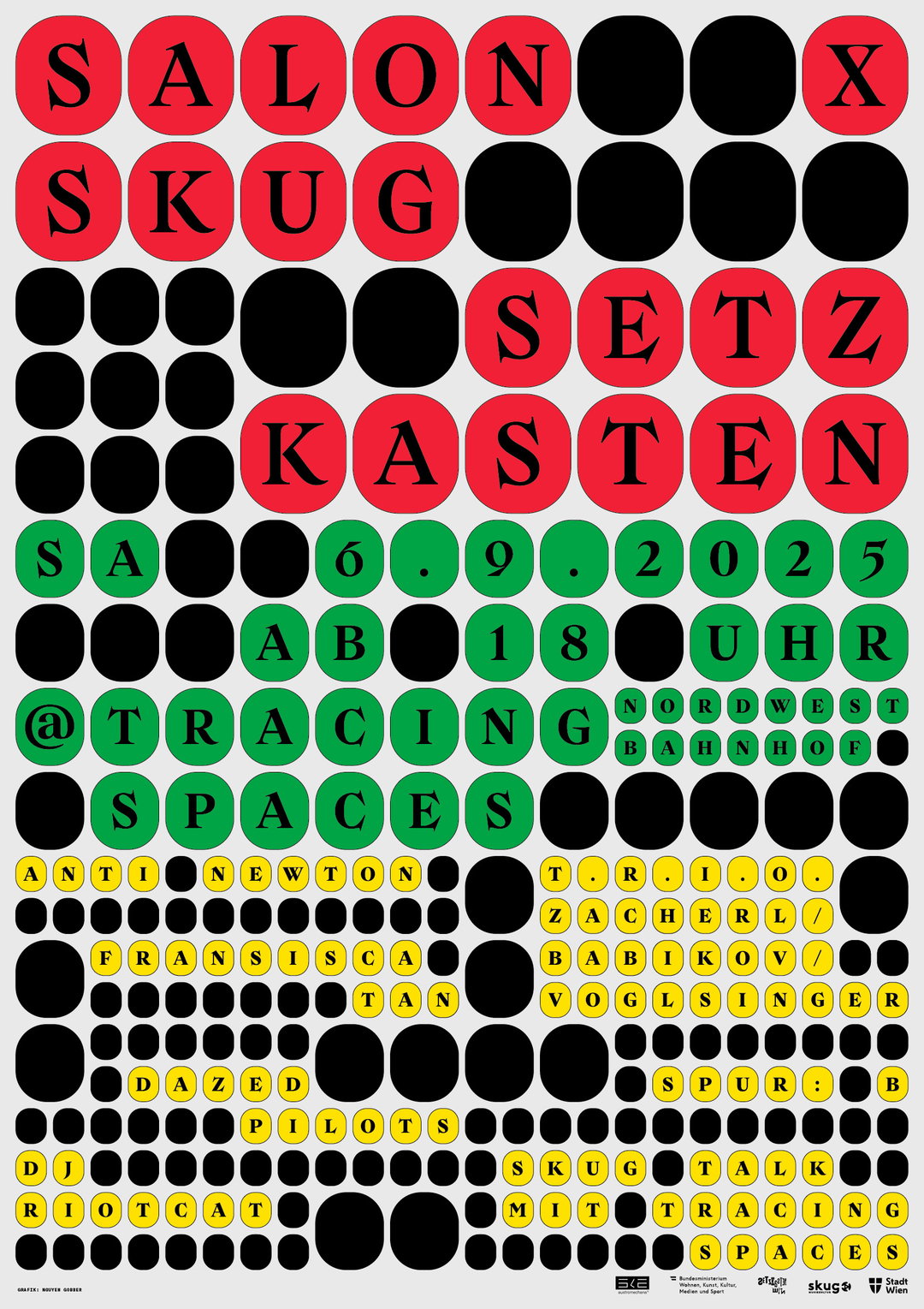
Nguyen Gobber: Salon skug, September 2025 (Copyright © Nguyen Gobber, 2024-2026)
Nguyen Gobber: Salon skug, March 2025 (Copyright © Nguyen Gobber, 2024-2026)
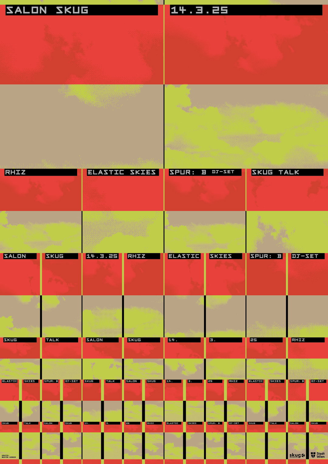
Nguyen Gobber: Salon skug, March 2025 (Copyright © Nguyen Gobber, 2024-2026)
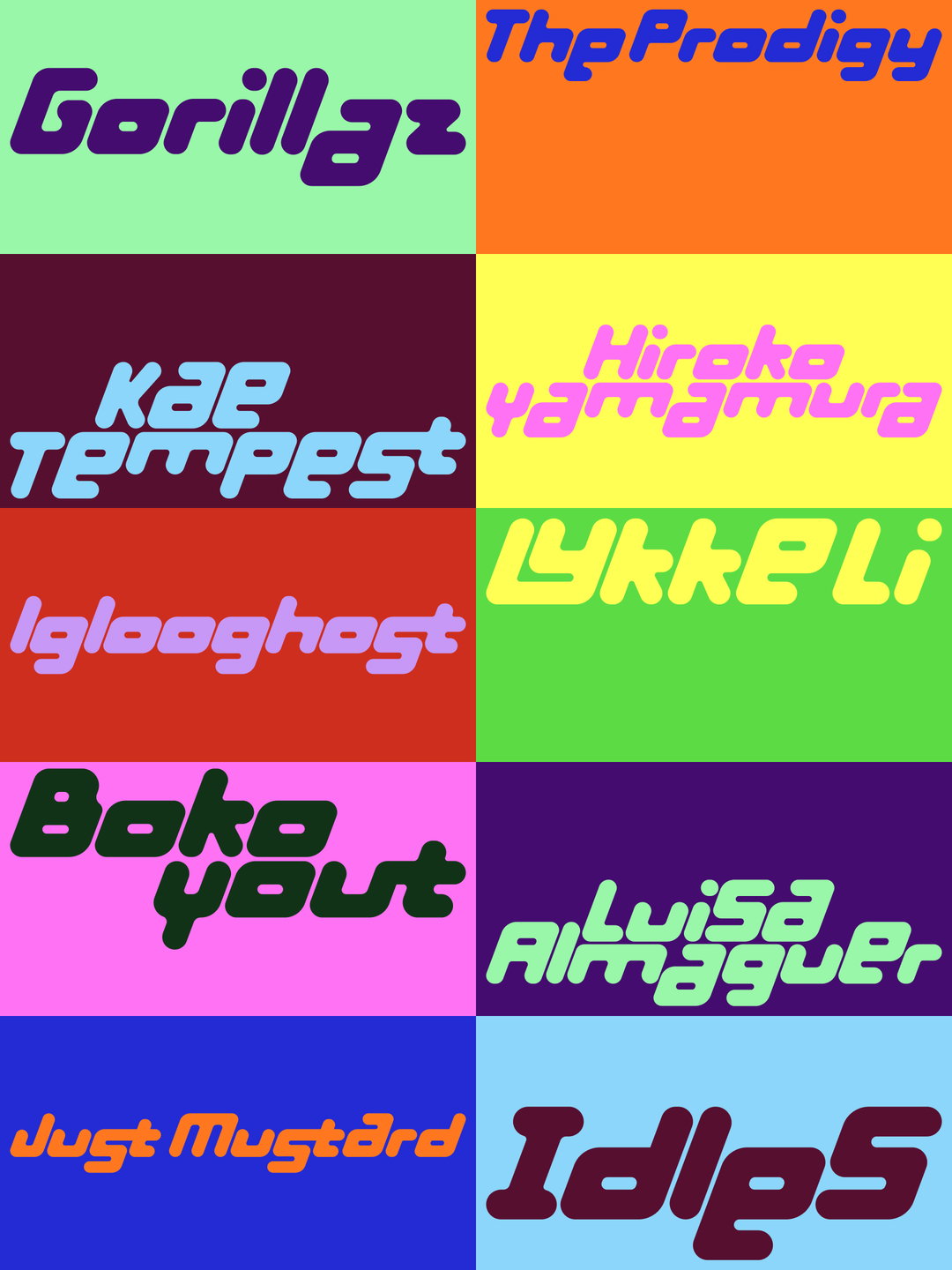
Nguyen Gobber’s poster creation and use of type seem to inform one another. “The posters sometimes motivate us to come up with a completely new type design. That was the case with a bold, monospaced and still unreleased Plattenbau Grotesk,” says Hoang. Or, indeed, the released soft version of Farmacia. Either way, the process appears fast, loose and intuitive. “Posters can be really helpful as a use case when designing type, as there is no need to create a complete character set straight away.” Instead, they only need to make what’s needed for the event. It can be tested and tightened up at a later date, if they want to, that is.
The poster series for Salon skug reflects the welcomed space it inhabits, becoming a microcosm of the events both in its design and process. “The people involved with Salon skug respect creative freedom,” David says. “Although the focus is on music rather than design, there is a natural shared understanding of the cultural value in creative expression.” As a result, both sides feel valued. “In this context, where the invited acts are not necessarily mainstream names but rather emerging talents, we experience our design work as extremely rewarding.” Ultimately, it serves as an act of support for other creatives. “As we all know, working in the cultural domain often means operating under precarious conditions,” Hoang ends. “In such settings, it is a particular pleasure for us to give recognition to that cultural work [...] and potentially reach a bigger audience than they otherwise would."
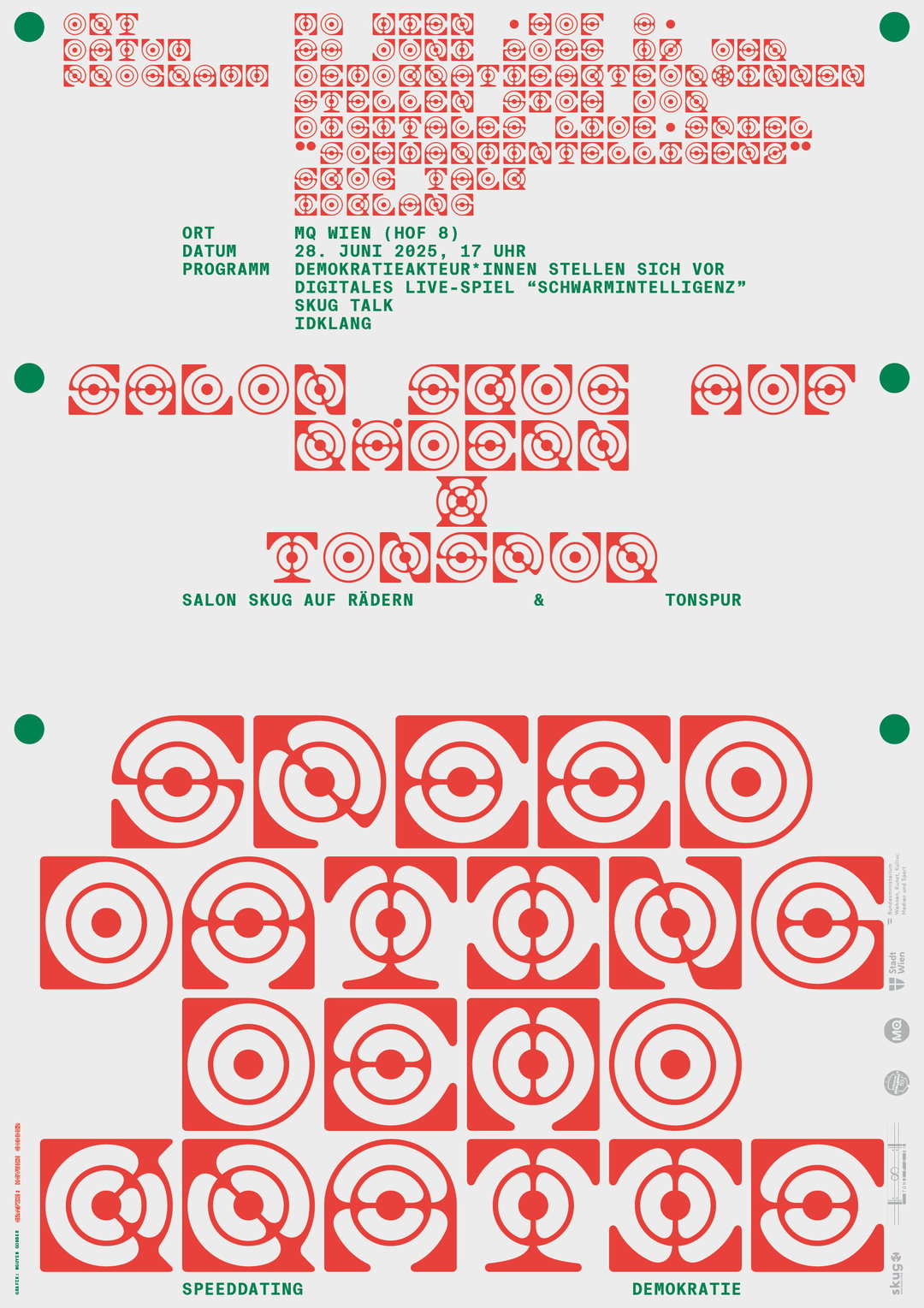
Nguyen Gobber: Salon skug, June 2025 (Copyright © Nguyen Gobber, 2024-2026)
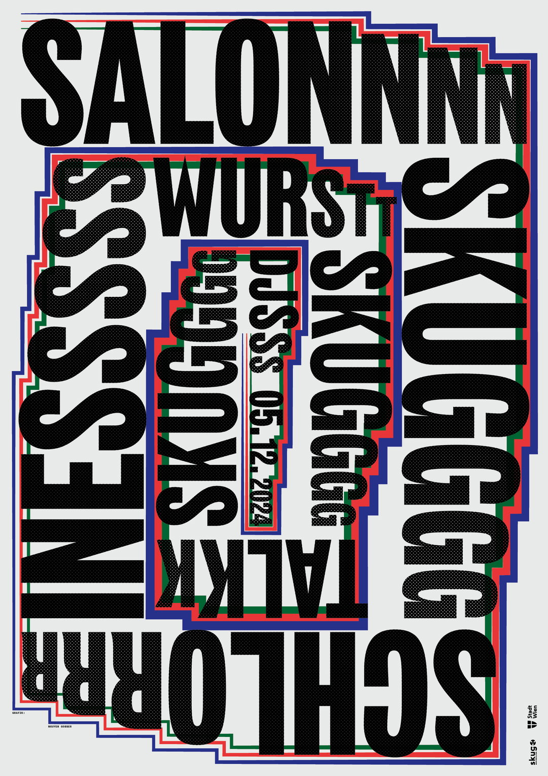
Nguyen Gobber: Salon skug, December 2024 (Copyright © Nguyen Gobber, 2024-2026)
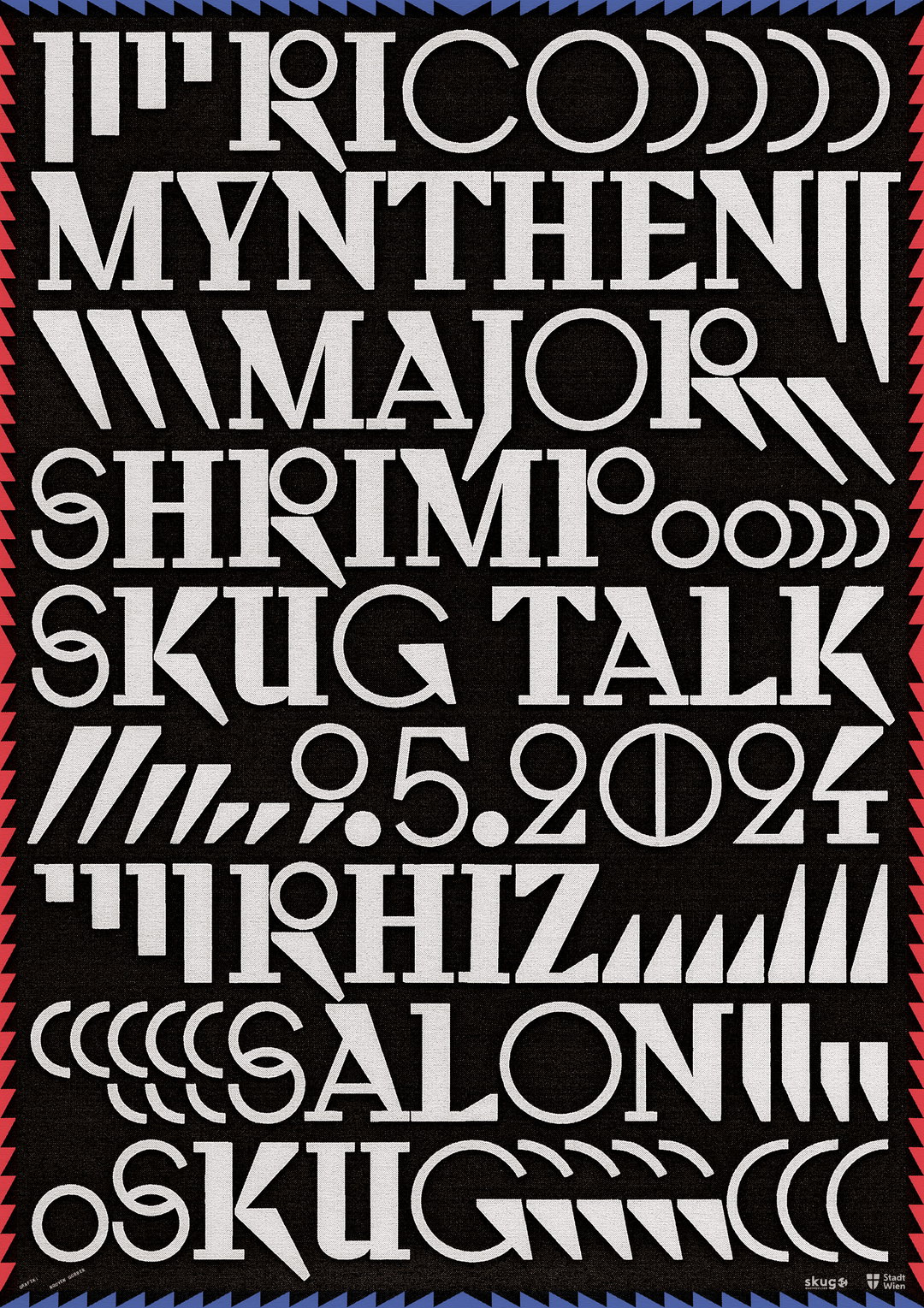
Nguyen Gobber: Salon skug, May 2024 (Copyright © Nguyen Gobber, 2024-2026)
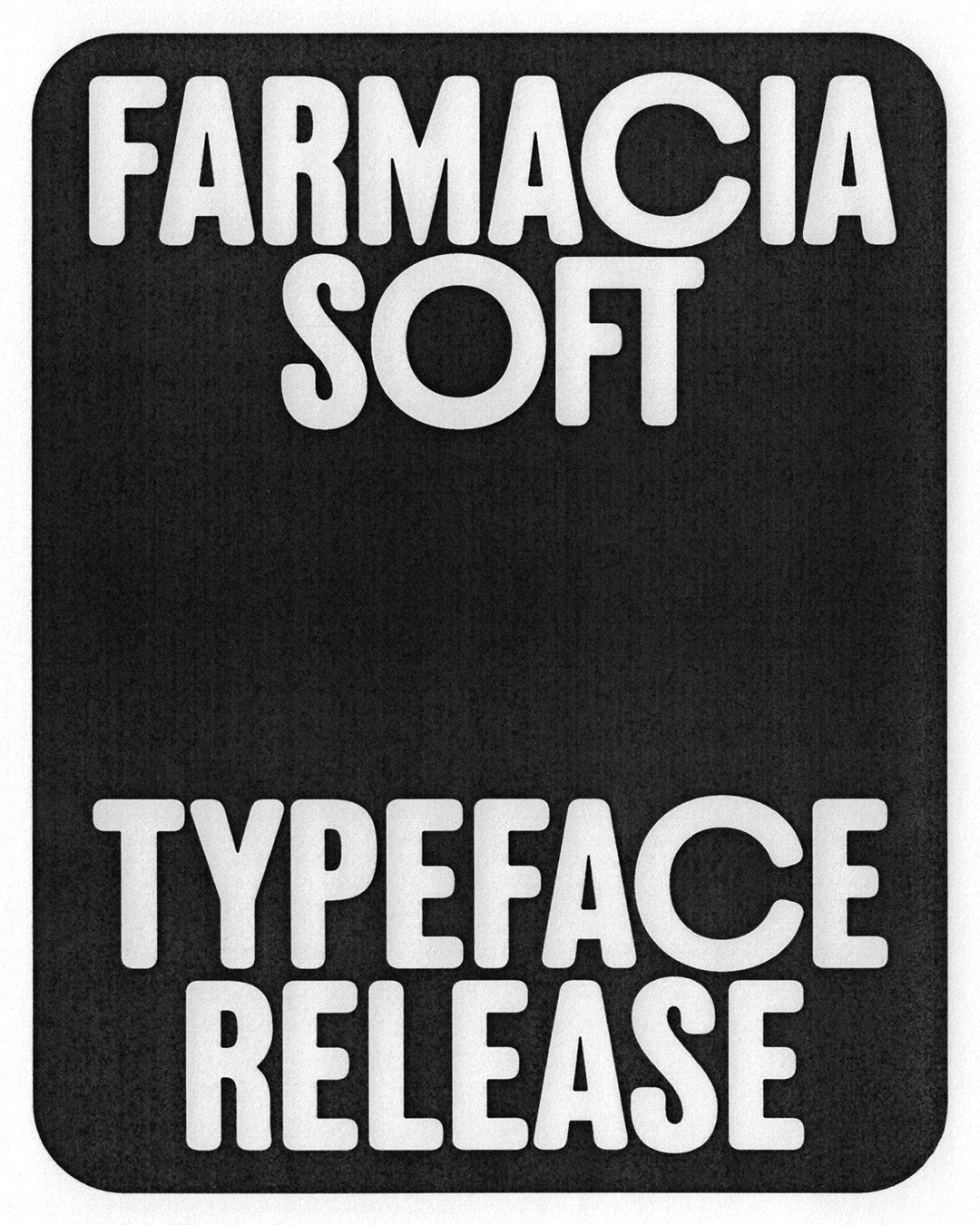
Nguyen Gobber: Farmacia Soft Typeface (Copyright © Nguyen Gobber, 2024-2026)
Nguyen Gobber: Farmacia Soft Typeface (Copyright © Nguyen Gobber, 2024-2026)
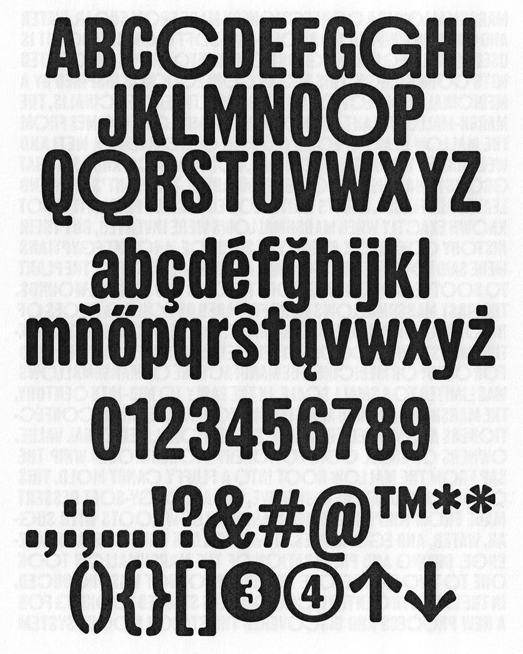
Nguyen Gobber: Farmacia Soft Typeface (Copyright © Nguyen Gobber, 2024-2026)
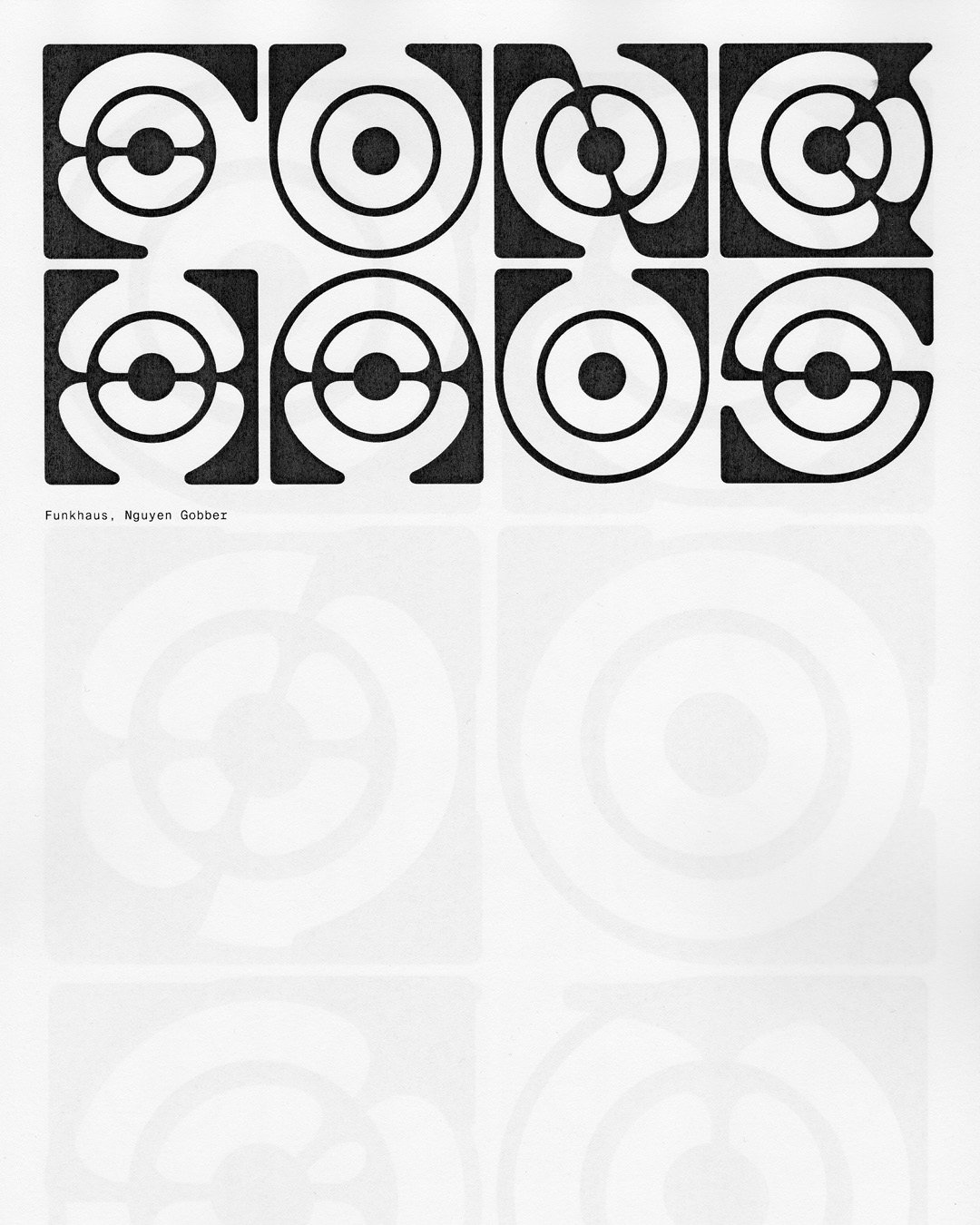
Nguyen Gobber: Funkhaus Typeface (Copyright © Nguyen Gobber, 2024-2026)
Hero Header
Nguyen Gobber: Salon skug, November 2025 (Copyright © Nguyen Gobber, 2024-2026)
Share Article
About the Author
—
Hailing from the West Midlands, and having originally joined It’s Nice That as an editorial assistant in March 2020, Harry is a freelance writer and designer – running his own independent practice, as well as being one-half of the Studio Ground Floor.