MMS provides a window into an inspiring period of pre-war female graphic design
Natural Enemies of Books is published by British publisher Occasional Papers.
Share
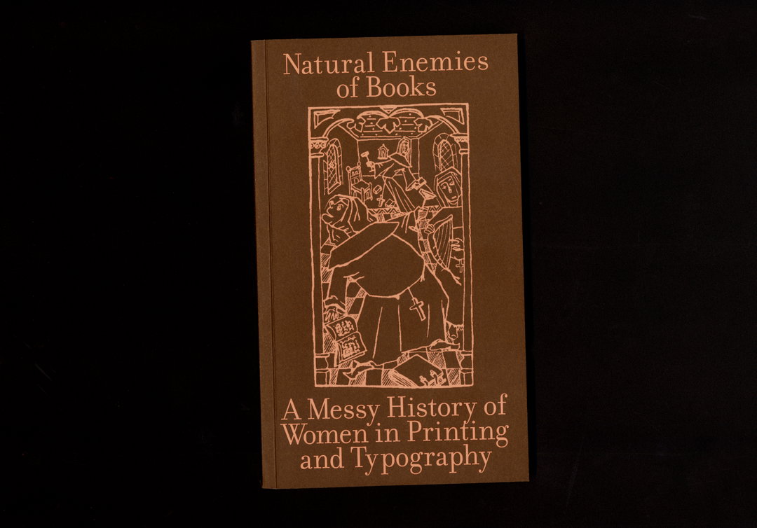
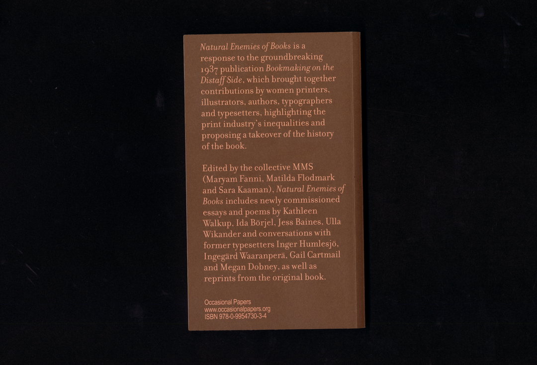
Natural Enemies of Books has been created with an extremely noble and important aim – to contribute new and expanded ways of looking at worker‘s and feminist graphic design history.
The recently released book is edited by MMS, a collective of feminist graphic designers Maryam Fanni, Matilda Flodmark and Sara Kaaman. The publication leads on from the seminal Bookmaking on the Distaff Side, which was a book published in San Francisco in 1937 by “a diverse group of women printers, illustrators, authors, typographers and typesetters.”
“I found the book via an online exhibition catalogue organised by Princeton university when looking for feminist forerunners within printing,” explains Matilda. “I applied for a grant to travel to the US to research the book, but since the grant only covered part of the journey, I figured I could just as well buy a copy that I found in the online rare book shop Oak Knoll. The price of the book equalled the plane ticket – 750 dollars!”
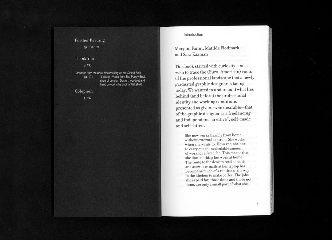
The book inspired the group, leading them to wonder what a contemporary version would look like. “We have tried to understand the material working conditions of the women in Bookmaking on the Distaff Side, as well as finding more stories about collective practices and organising in printing and typography,” says Maryam. “These encounters and stories make up the content of our book, along with reprinted facsimiles of the original book.”
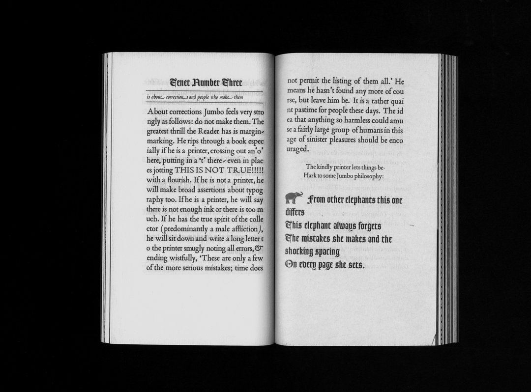
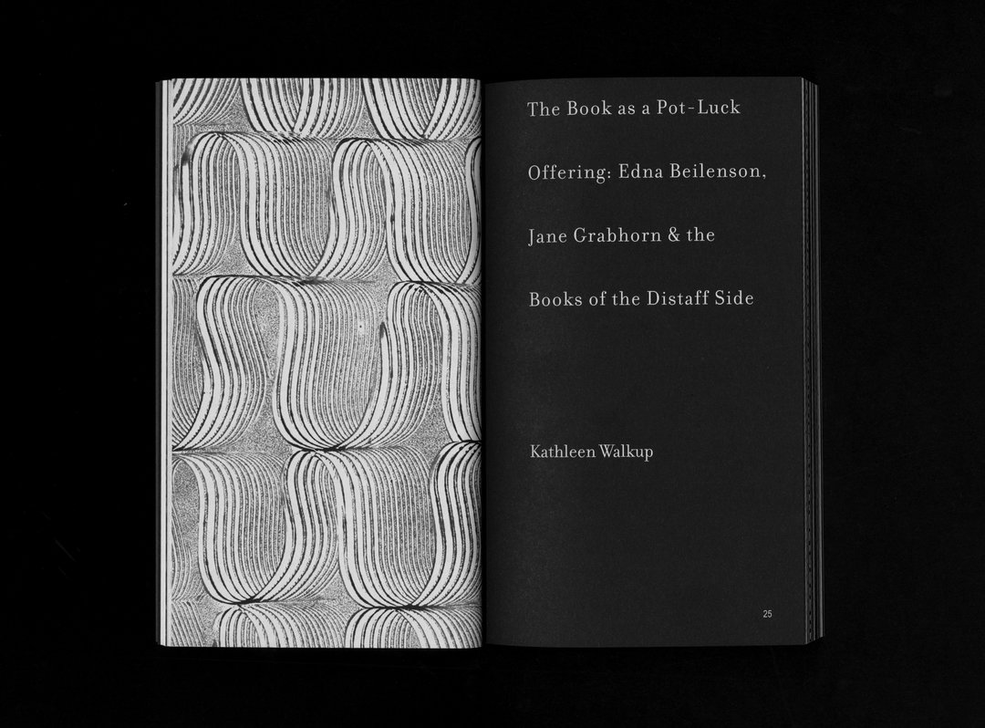
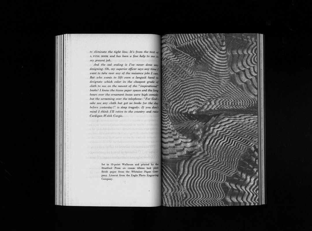
Despite being graphic designers themselves, they enlisted another design collective Eller Med to create the visual language for the project. “They, just like us, are a collective of three, interested in book design and history, and we believe their designs to be of high quality,” says Sara. “Inside the book you can see a variety of elements; facsimiles from the original book, as well as small drawings and graphic symbols borrowed from the Bookmaking-book, popping up here and there.”
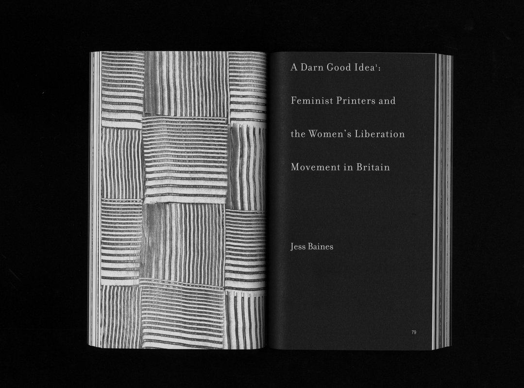
Natural Enemies of Books
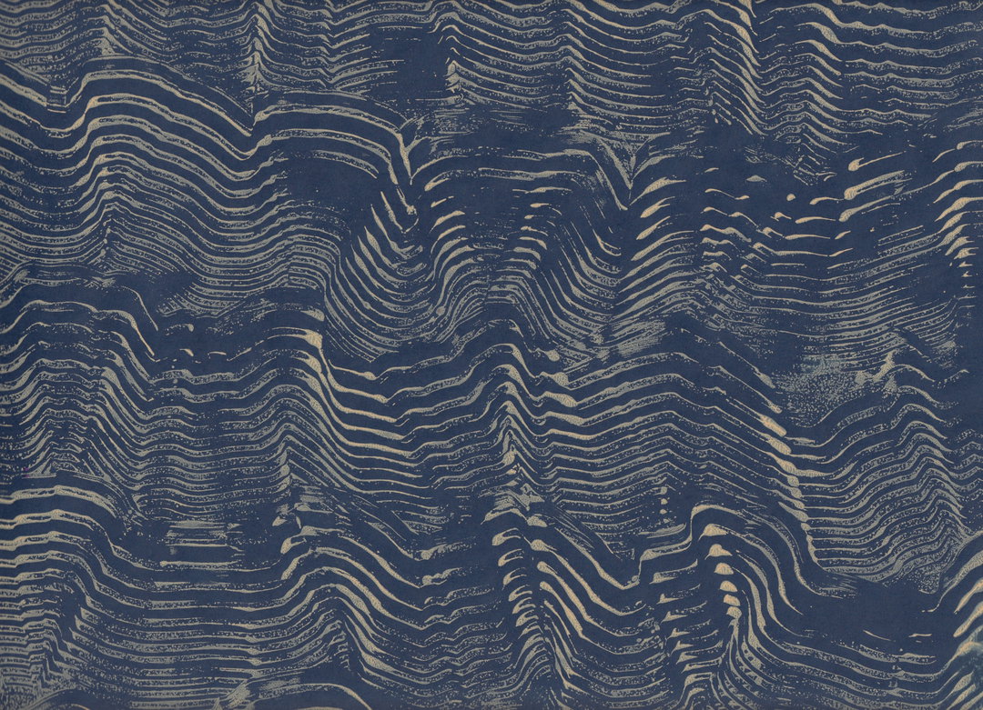
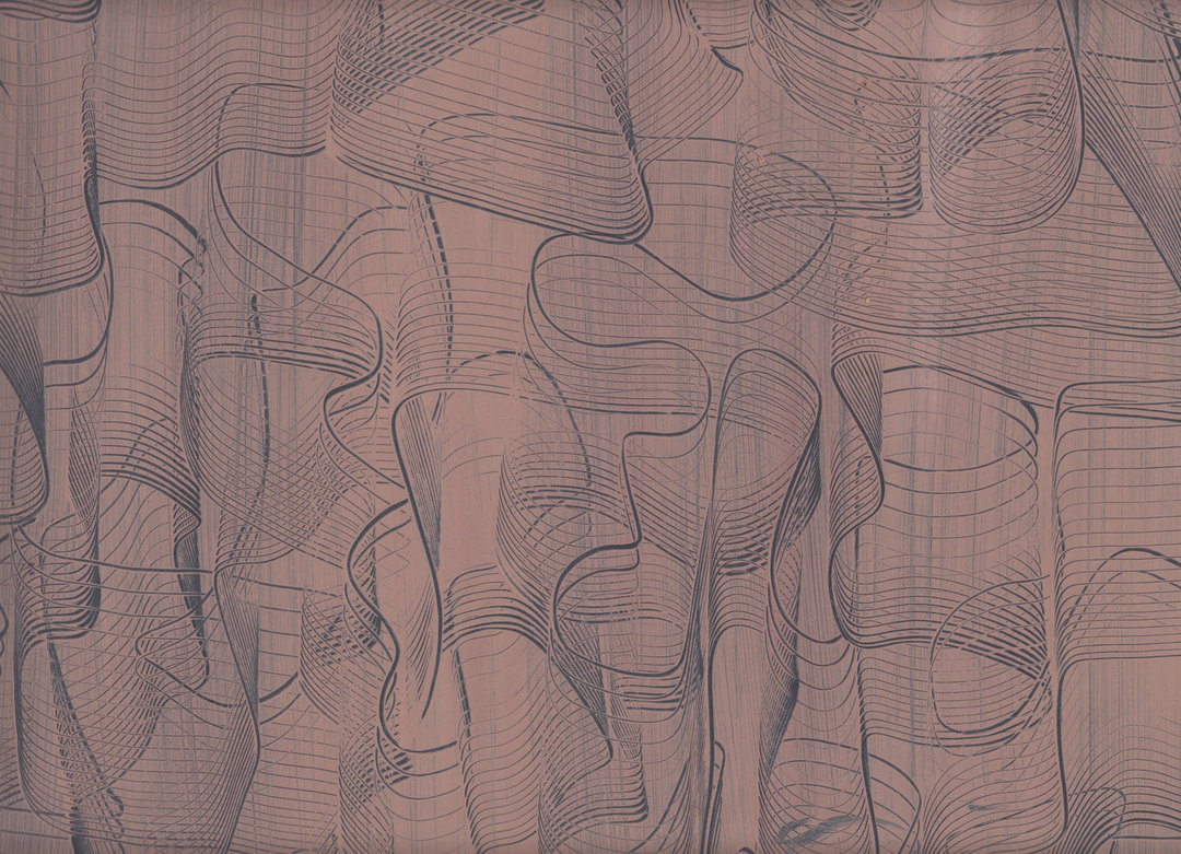
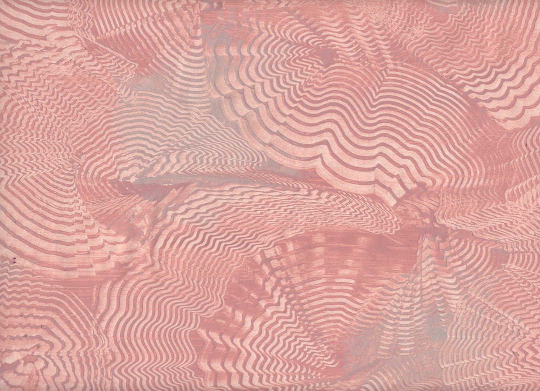
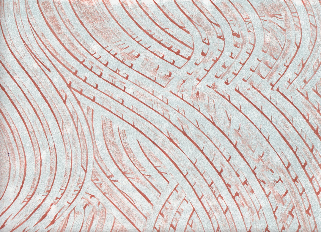
MMS did have some input into the design, incorporating some elements from projects it has previously worked on. “The chapter dividers are paste paper patterns that we have made together in a paper marbling workshop, inspired by, and as a tribute to Delight Rushmore,” says Matilda. “She made unique paste paper covers for each copy of the edition of 100 original Bookmaking-books. The book is a bit collage-like and ‘messy’, which is intentional in order to mirror the title.” As a result, there is no overarching uniform visual style present in the book, with typefaces, imagery and layouts differing markedly between pages.
In a publication that is so extensively researched, and that is underpinned by strong theoretical aspects, everything is seemingly deliberate and backed up by reasoning. This “messy” aesthetic is one of them: “‘Messy history’ is a term borrowed from design historian Martha Scotford, to describe a non-linear and always incomplete history-writing,” says Maryam. “For anyone interested in style variations in one volume, we recommend you to try finding a copy of Bookmaking on the Distaff Side from 1937, as each signature is printed on different paper, set in different typefaces and printed by different printers and presses. It’s a fascinating piece of book craft.”
The collective hope that by providing a contemporary update on this important section of graphic design history, that it will not only allow people to experience these schools of thought, but unearth more of the same too. “There are so many histories about people working in ‘graphic design’, especially before it was even called graphic design, waiting to be uncovered and brought into the discourse,” says Sara. “We hope that other people, who find other missing histories, will follow and make more books that continue to expand understandings of graphic design.”
GalleryNatural Enemies of Books
Hero Header
Natural Enemies of Books
Share Article
Further Info
About the Author
—
Charlie joined It’s Nice That as an editorial assistant in December 2019. He has previously worked at Monocle 24, and The Times following an MA in International Journalism at City University. If you have any ideas for stories and work to be featured then get in touch.