“A good designer can make a free font look expensive”: Callum Abbott on designing publications around type
The independent designer discusses going solo to make more work he can hold in his hands.
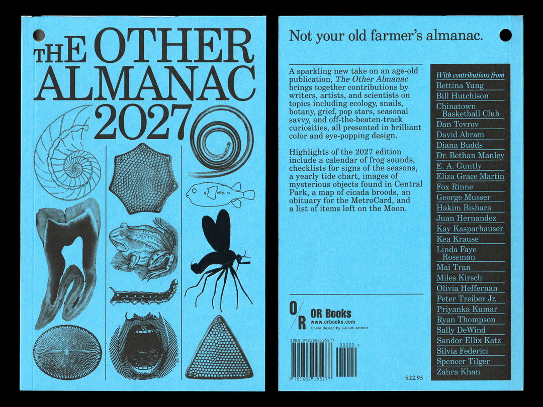
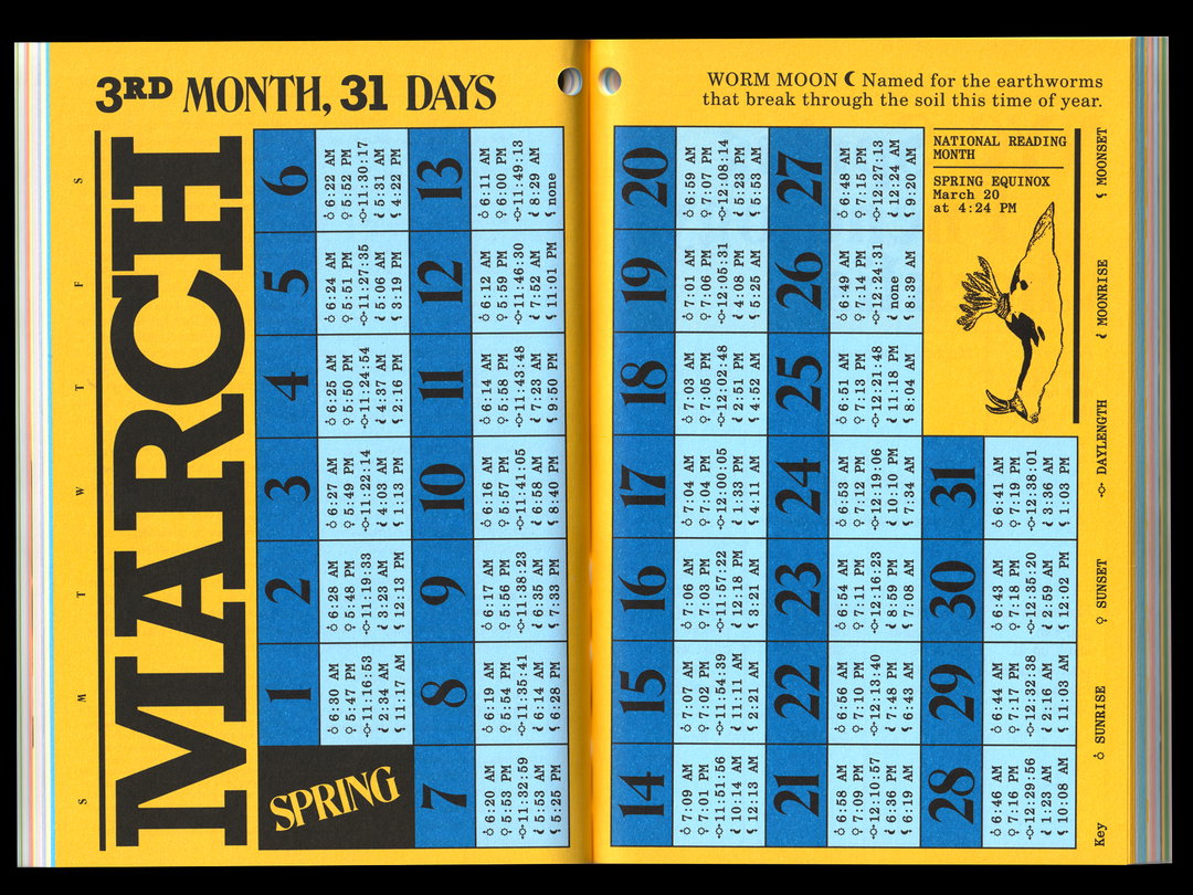
How do you design a compelling publication without any commissioning budget for illustration or photography? Callum Abbott’s recent work on The Other Almanac is a brilliant, beautiful guide.
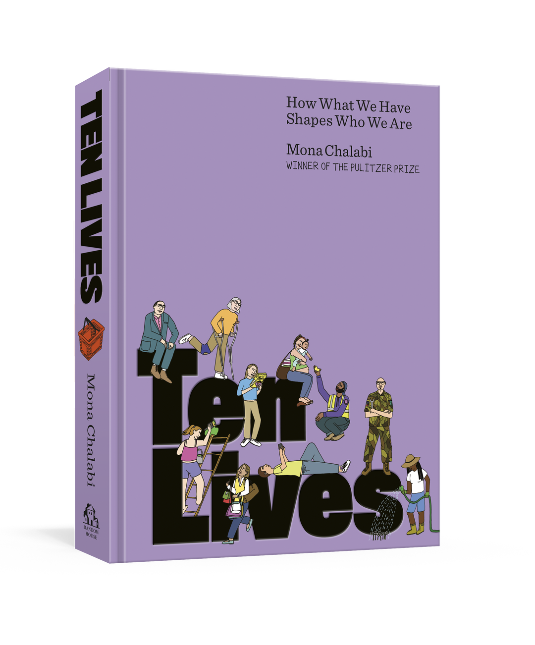
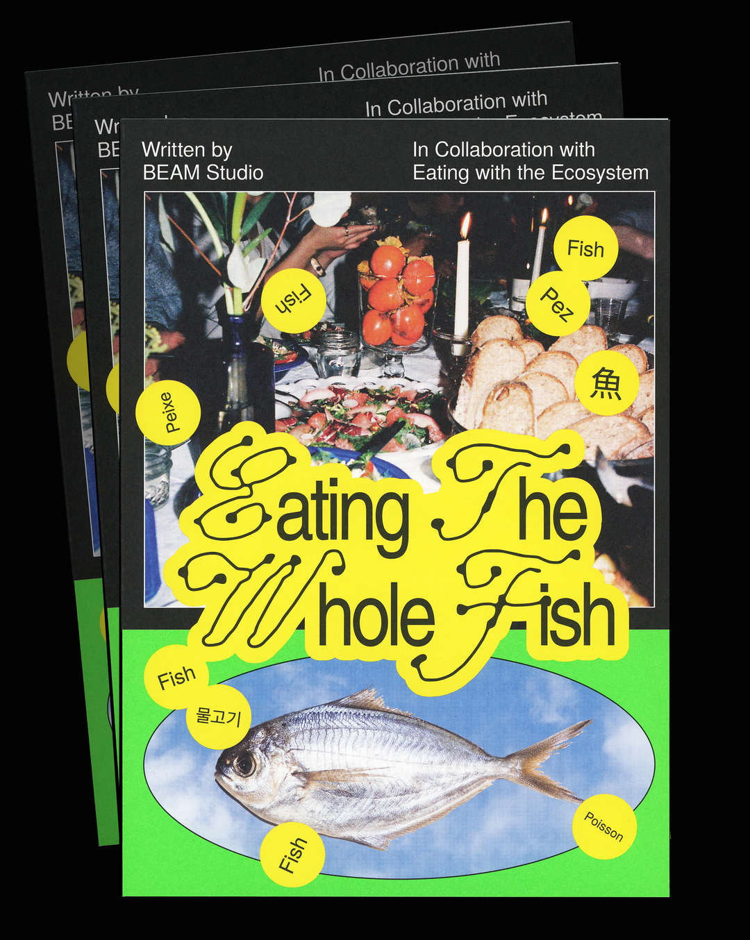
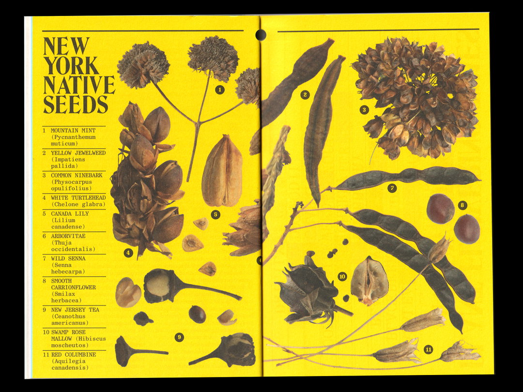
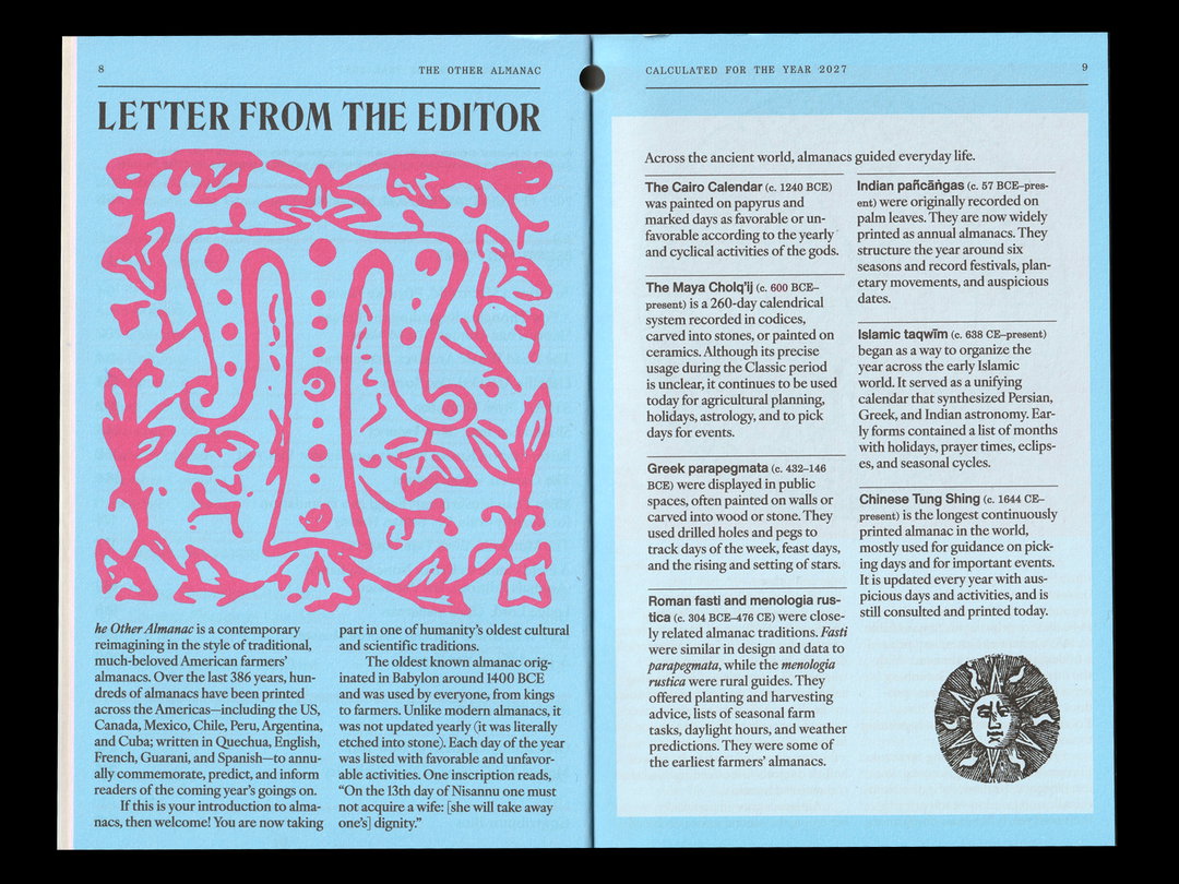
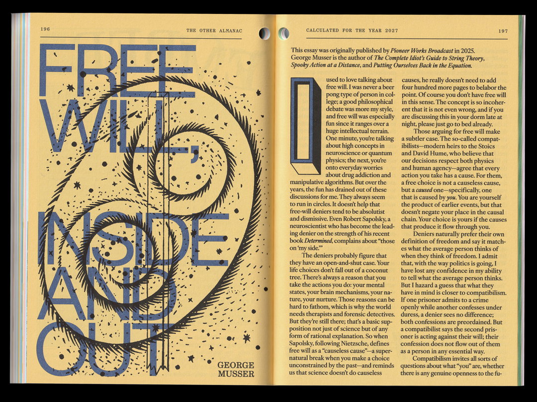
After four years the publication – a contemporary take on the traditional American farmers almanac that digs into ecological themes – was due a redesign. Together, with editor Ana Ratner, Callum devised a new vision, one that worked around some fairly strict parameters: the book could have no new images or illustrations and would need to be over 200 pages long. Callum turned to historic, open-source imagery and what he calls an “inventive and over the top” approach to colour, pattern and scale. Key references were the cut-and-paste layouts of Whole Earth catalogues, and Hallmark calendars from the 1970s, cluster-bombs of colour and information. But primarily, Callum rested on one key visual tool – typefaces. 40 of them, to be exact, and many of them free, found on sites like DaFont and 1001 Fonts. “To me, it felt like the best challenge was restriction,” says Callum. “A good designer can make a free font look expensive.”
After leaving university seven years ago, Callum worked in-house at various arts and publishing institutions, Dazed, Pitchfork and Pioneer Works, before getting the itch to go solo. “It was a sort of unexpected but sudden pull,” says Callum. “I finally felt like the work I was producing felt cohesive and I was forming my own design point of view thanks to years of mentorship,” he says, “and I knew going solo would only help me to hone that more.” There was one other reason; Callum’s gravitation toward print design. “For better or worse, print is very satisfying,” he says. “Holding something you’ve worked on in your hands is very exciting, in a way that’s hard to replicate digitally. So the more I did it, the more I was drawn to continue.” Taking on small projects, like a poster, alongside a full-time job are feasible, notes Callum, while bigger undertakings, like publications – with unpredictable asks, like press checks at the printers – cause far too much friction.
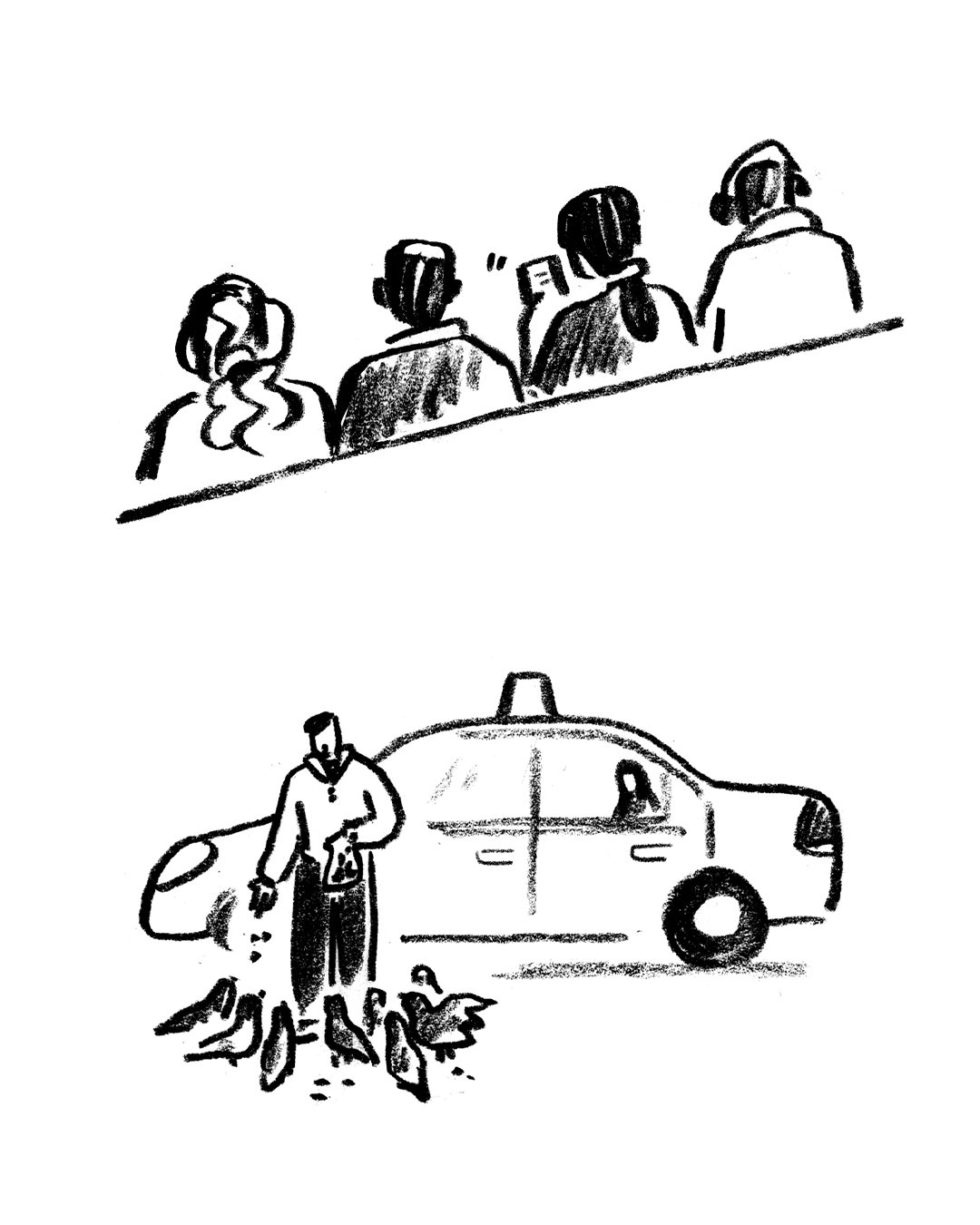
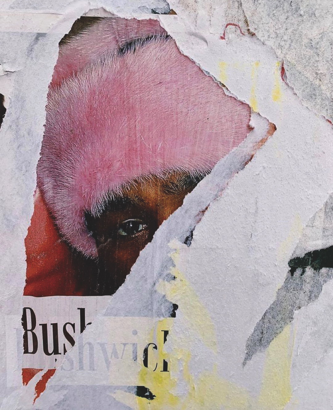
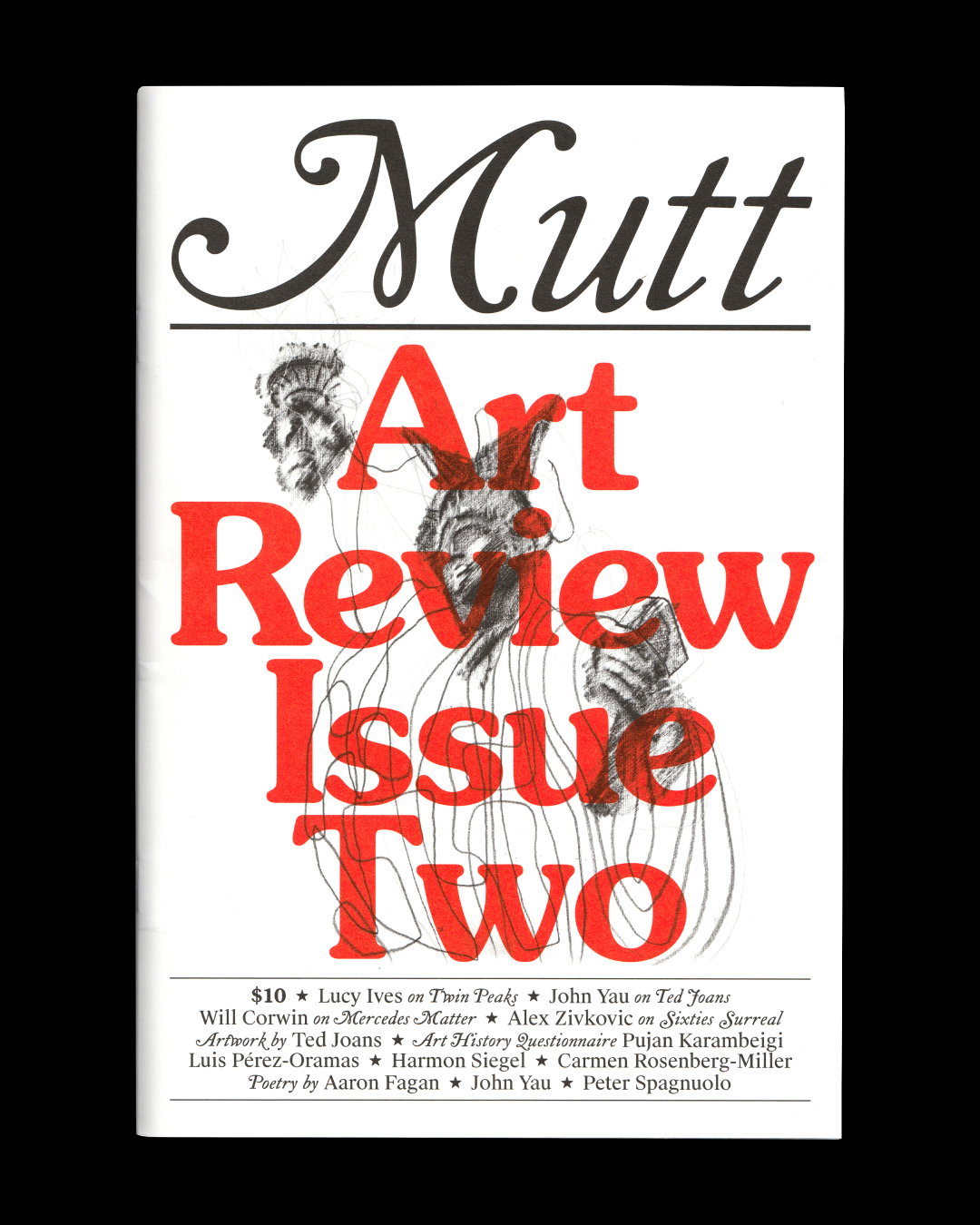
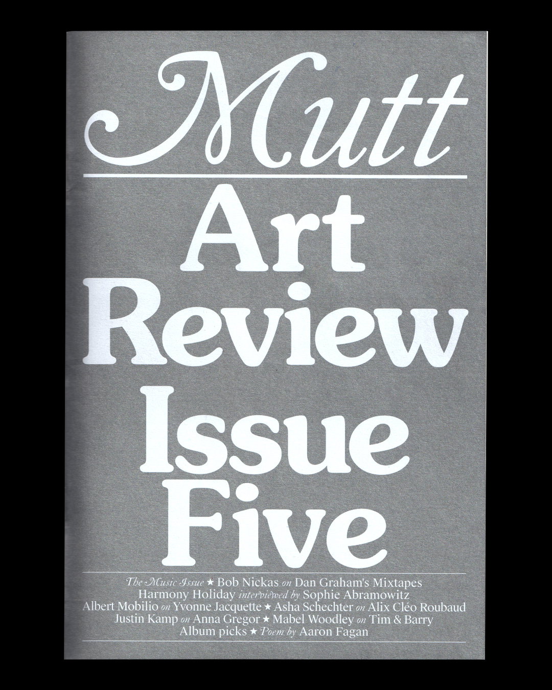
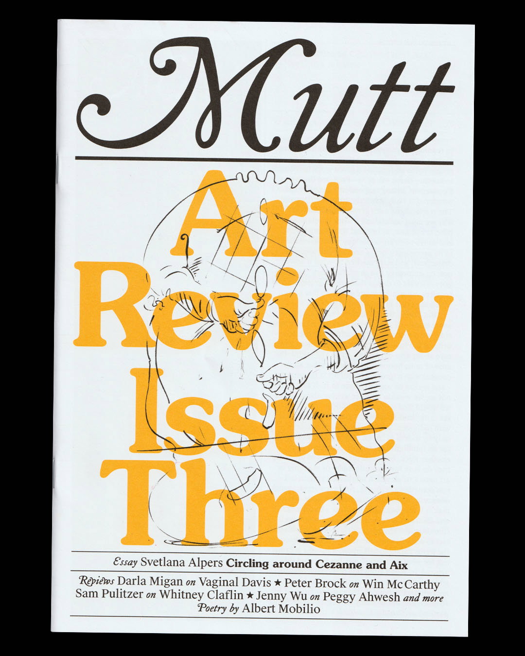
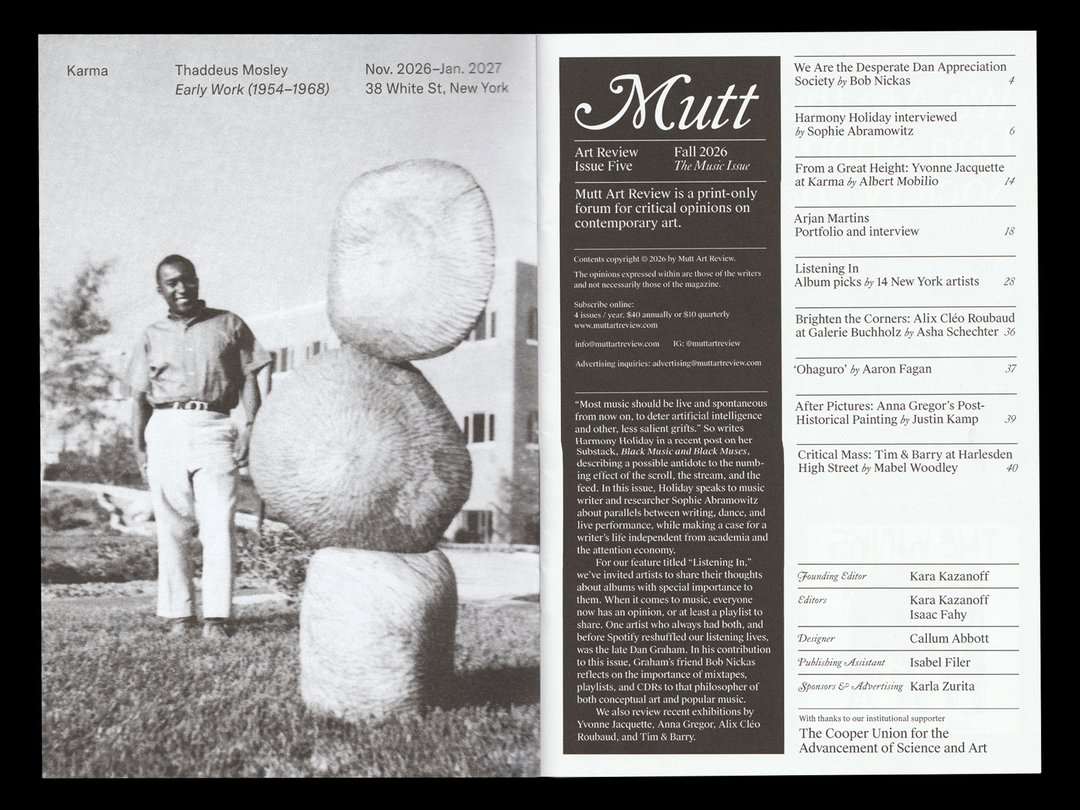
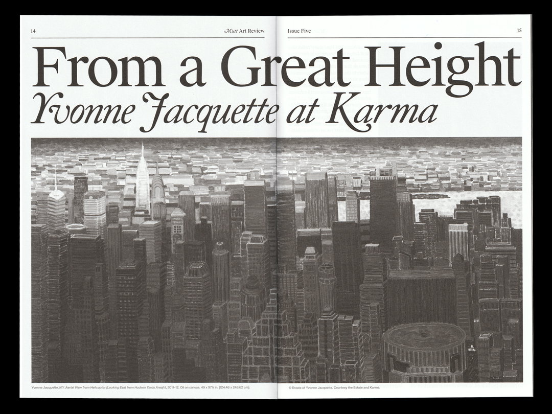
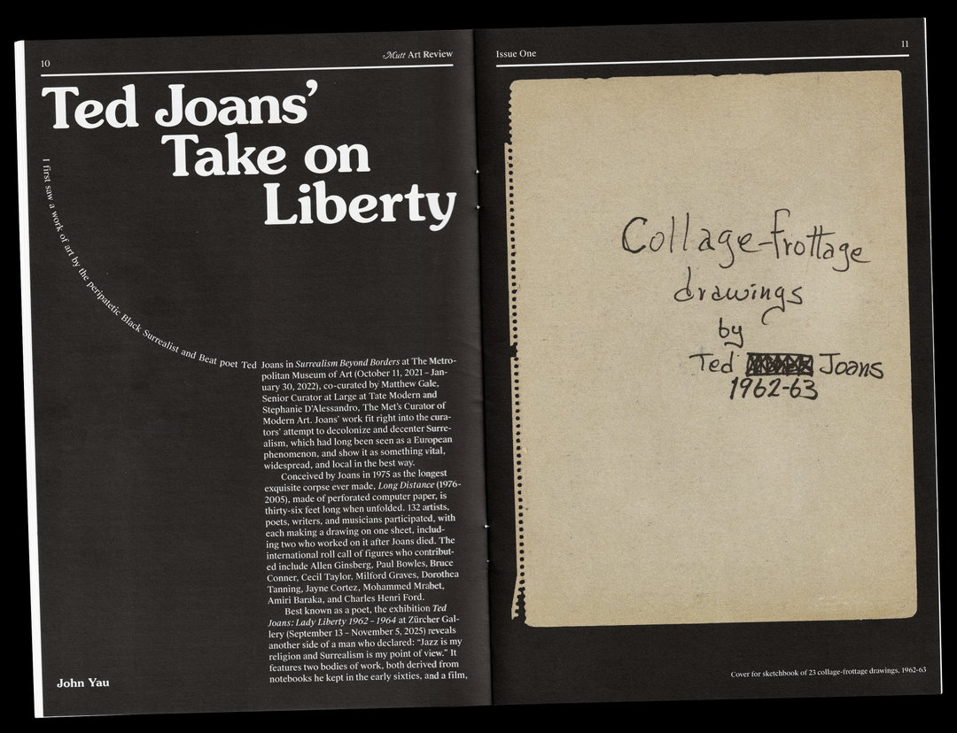
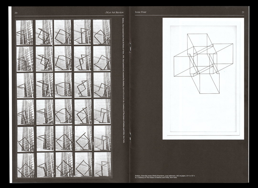
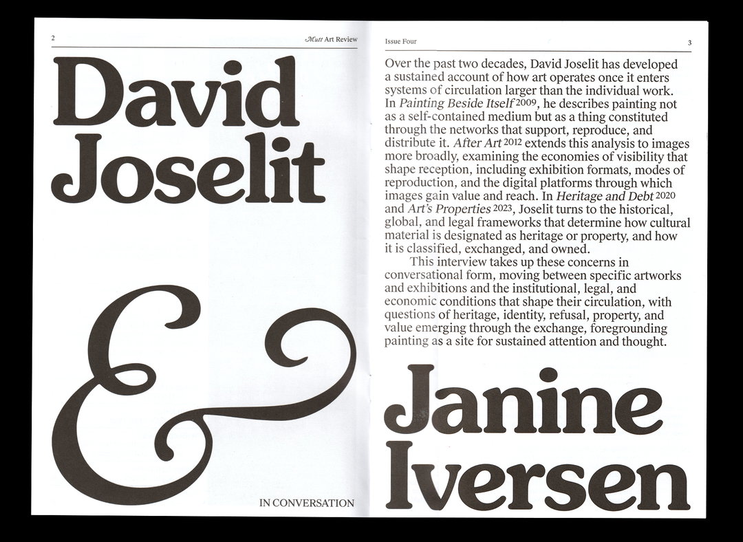
Callum has noticed a certain pattern to the print projects he’s asked to work on – ones that involve wringing the most out of lettering. “My job is to flex the ‘graphic design’ in a ‘big’ way and try to make something compelling that doesn’t rely on really strong imagery,” says Callum. As with the Other Almanac project, his work with Mutt Art Review shows this approach at its finest. Alongside founder Kara Kazanoff, the pair aligned on a 1970s “typographic sensibility”, mainly, more recognisable, cheaper-to-licence ITC fonts, but ones Callum endeavoured to use in unexpected ways; transparent and in colour on the primarily black-and-white covers, for example, letting the minimal cover images infuse the letters. Throughout each issue of Mutt, the collection of typefaces remain the same, while the template is ever-changing. “That is sort of selfish because I enjoy mixing it up every time, but also allows every piece to be treated uniquely, and feel fresh for our readers,” says Callum.
In reaction to a certain something dominating the creative industry right now (we don’t need to say those two letters, you know what we’re talking about), there’s a renewed thirst for physical design. But, in tandem, it likely feels harder than ever to pursue publishing, the cost, and the preference for digital skills in the workplace – though Callum is a brilliant example of the potential to craft a career around pages. His advice for a student, young person or anyone looking to carve their own publishing path? “Be patient, learning takes a long time. Acquire books. Practically speaking: test print body copy sizes, and learn the difference between rich and process black. But importantly, don’t be too precious,” he says. “You will make mistakes (I most certainly do all the time) but don’t let that stop you from trying.”
GalleryCallum Abbott: Mutt Art Review (Copyright © Mutt Art Review, 2026)
GalleryCallum Abbott: The Other Almanac 2027 (Copyright © The Other Almanac, 2026)
Hero Header
Callum Abbott: Mutt Art Review (Copyright © Mutt Art Review, 2026)
Share Article
Further Info
About the Author
—
Olivia (she/her) is associate editor of the website, overseeing the day-to-day editorial projects as well as Nicer Tuesdays events. She joined the It’s Nice That team in 2021. ofh@itsnicethat.com
To submit your work to be featured on the site, see our Submissions Guide.