




Mirna Pierre’s curvy and bold typeface is a celebration of Black graphic designers in history
The Florida-based graphic designer talks us through her recent display typeface View, designed to educate and “inspire future designers”.
Share
Sometimes it takes a turn elsewhere to figure out what it is you really enjoy. Mirna Pierre, who’s originally from Boston and has spent most of her life in Florida, experienced just that as she pursued a degree in business. She’s long had an interest in the arts, though, and creativity is something that she always nurtured on the side. “After realising that [business] wasn’t what I wanted to do, I decided to take some time off to reflect on what my next steps would be,” she tells It’s Nice That. “Not too long after, I started the graphic design programme at Valencia College. With that transition, I met a lot of amazing like-minded people that supported me along the way.”
One thing led to another and Mirna ended up interning at a local design studio named Maven Creative, which she marks as the pinnacle moment for her progression. Shortly after completing the programme, the budding designer took on a role as junior designer at Bustle – which is where she is as we speak. “To be honest, as much as I desired a creative career, it never felt attainable for me,” she adds, “especially if I went down the path of a traditional artist.” Rather than going down this route, however, Mirna took the time to research and figure out the path that she should most likely end up taking. Of course, that ended up being graphic design, an apt merging of her skillset and the fact that it could also pay her bills.
Mirna’s design ethos is rooted deeper than most, for she sees her work and philosophy of life as running in two cadences – both complement the other and follow a similar rule of thumb. “I believe everything you do should be done wholeheartedly and with integrity,” she adds. “Most of the projects that I take on immediately catch my attention. Whether it’s the idea behind the project or the client and their purpose, I try not to take on work just for the sake of it, but rather projects that I feel connected to in some way.”
While studying, Mirna avoided social media, meaning she was able to avert her eyes from the temptations of inspiration and build her own specific visual language. These days, everything is posted, shared, saved and copied – more or less – and it’s easy to fall into the trap of accidentally mimicking something you’ve seen online. Or worse, feeling like your work is incomparable. “It allowed me to not be influenced as much by what other people were doing,” she notes. This has undeniably worked in her favour, considering that during her education, her research steered to the past and she started to draw from aesthetics of the 70s: “the colours, shapes, patterns and textures of that time really influence my work today.”
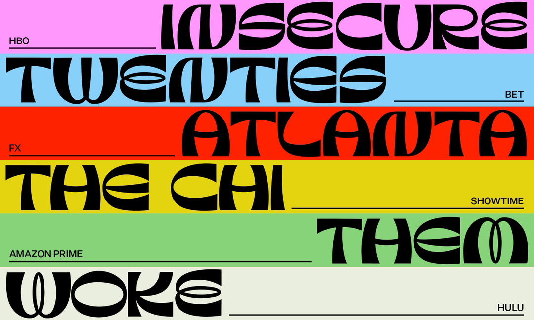
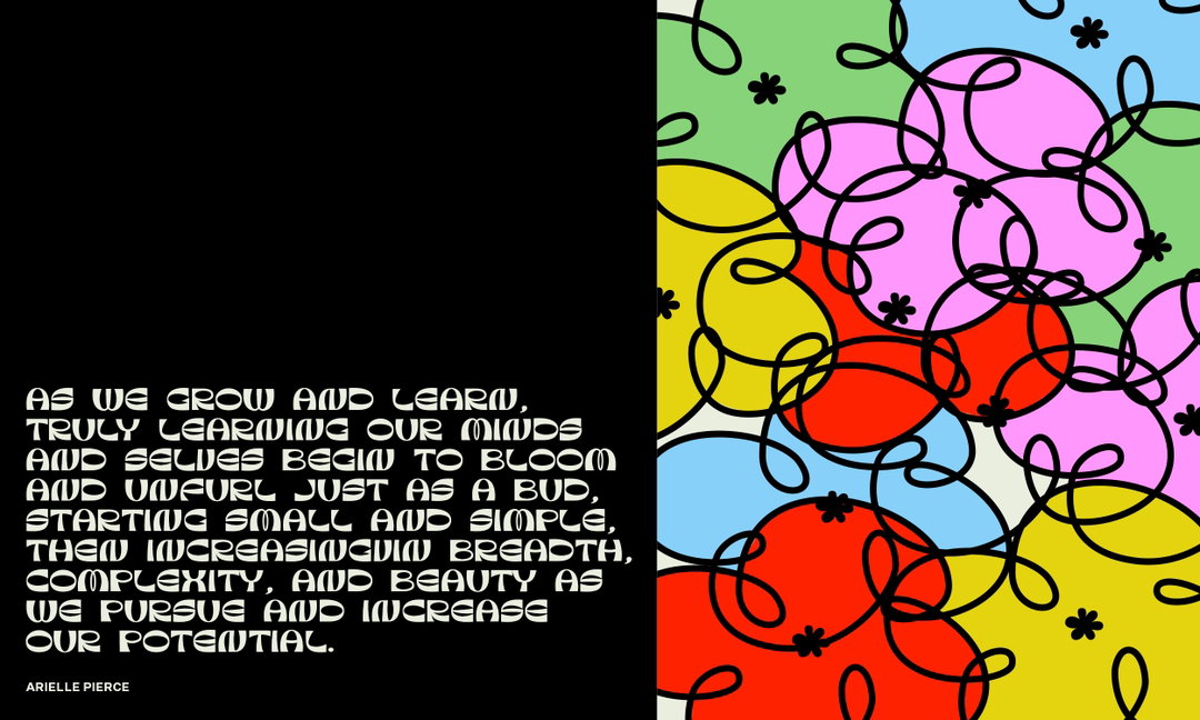
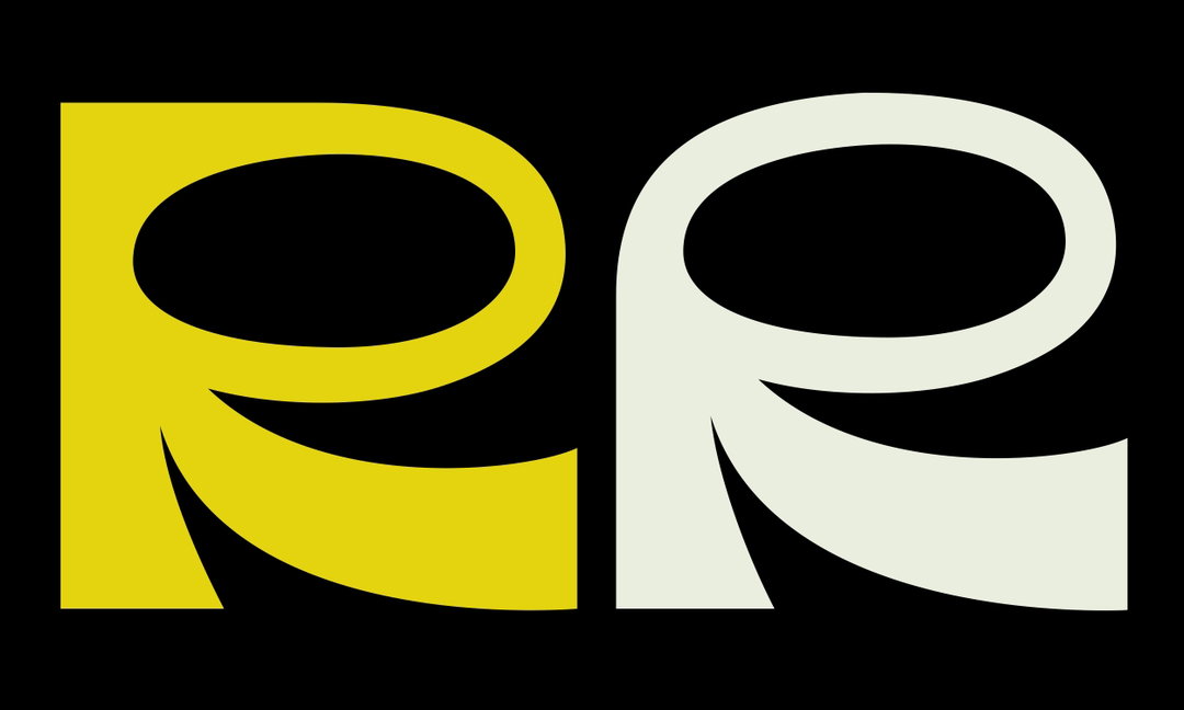
Mirna Pierre: View (Copyright © Mirna Pierre, 2021)
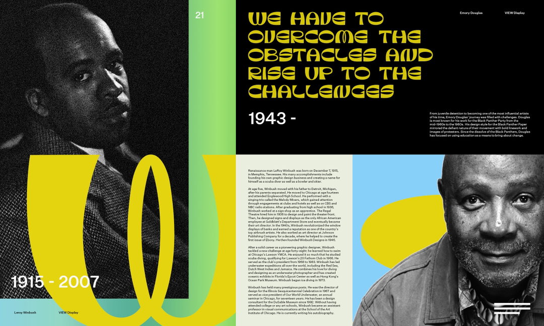
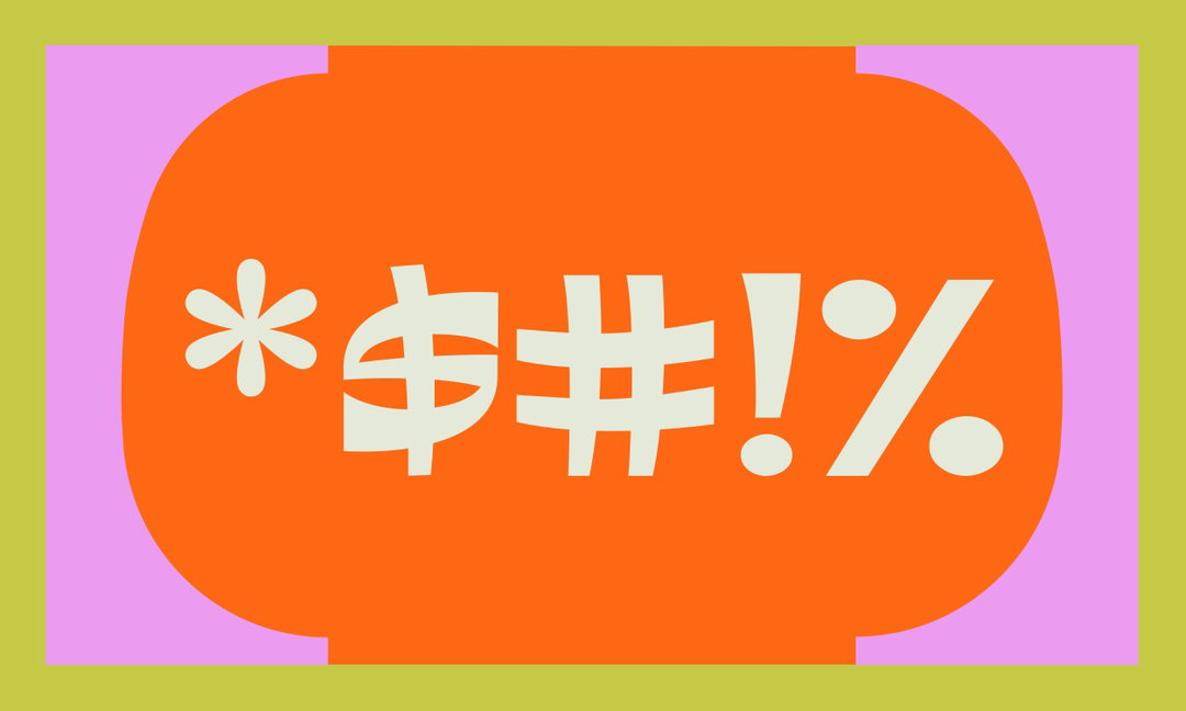
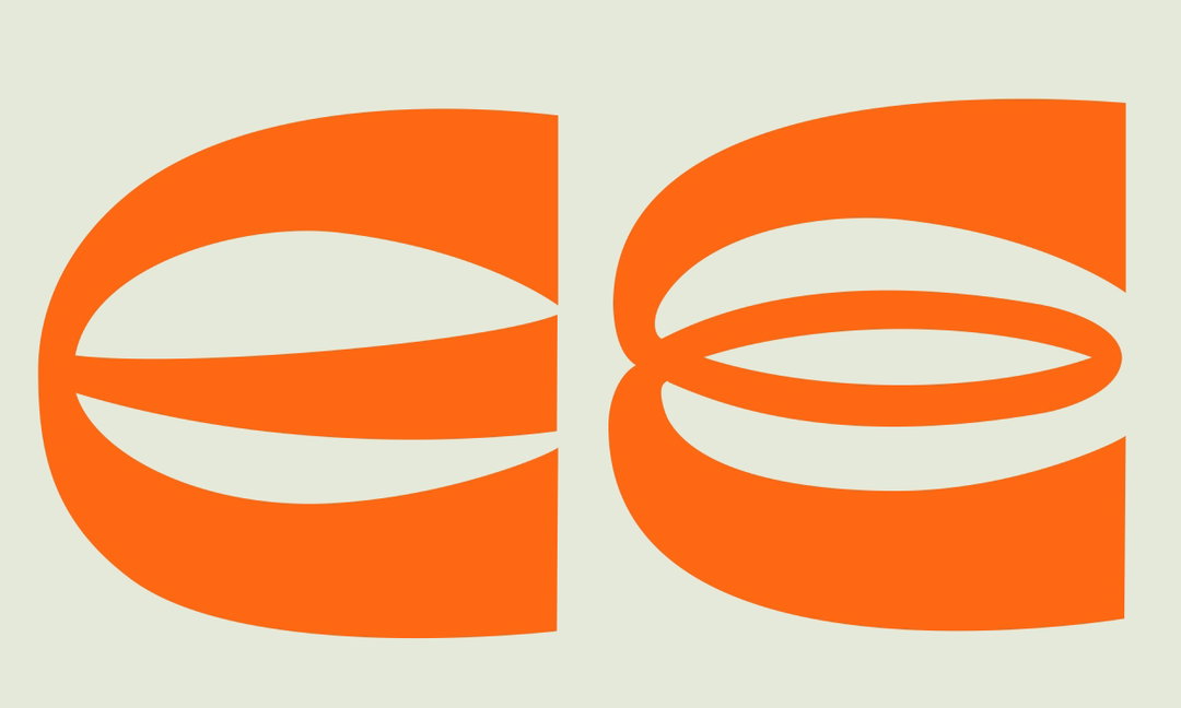
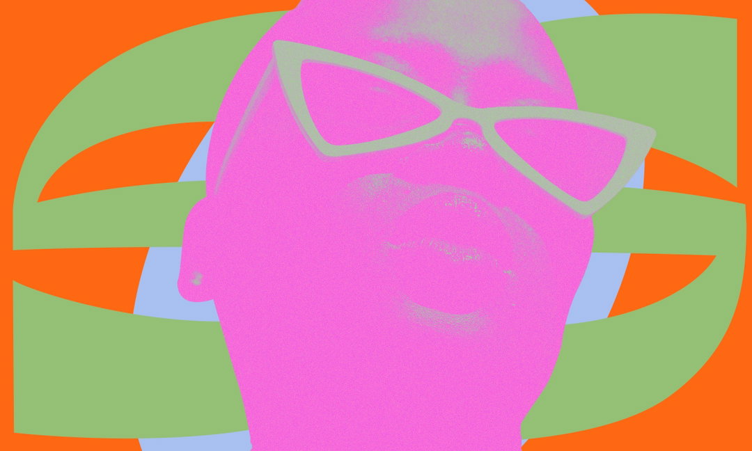
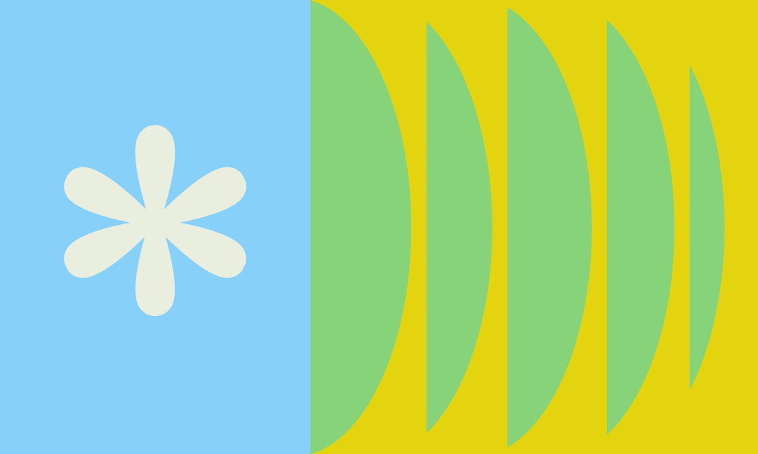
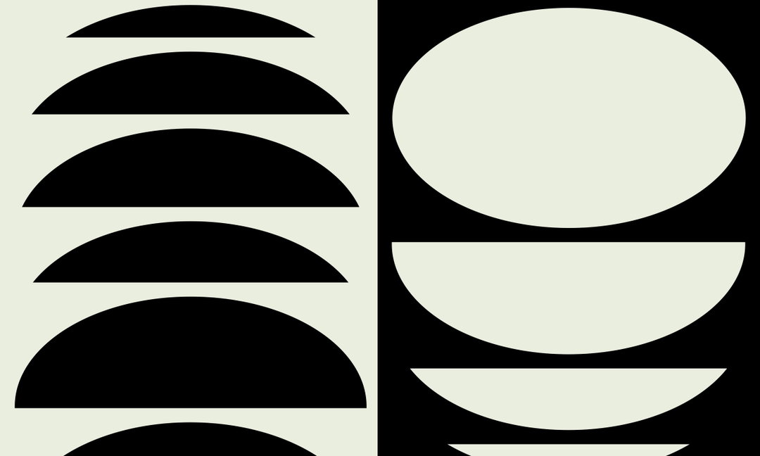
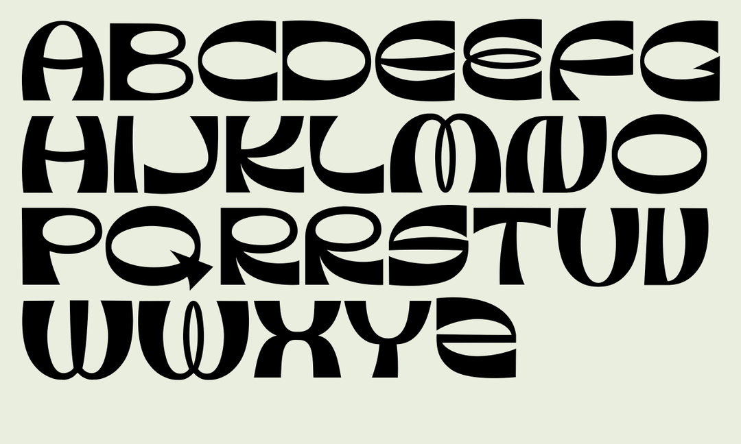
Her most recent endeavour is a bold and curvy display typeface named View – a project that follows a similar trajectory to her research beforehand, i.e. pulling references from the past. Designed for the AIGA SPORT Mentorship programme, the idea was to base the typeface on the celebration of Black graphic designers in history, “past, present and to inspire future designers,” she says, citing how she wanted to use this project as a platform to further both her passion for design while also shining a light on Black graphic designers. “Oftentimes their work and the impact they’ve made on the design community is overlooked, but I wanted to make sure they were in full view.” Through deep research into this field, Mirna was able to speak to designers and share their stories throughout the process – allowing an insightful display of narrative, powerful quotes and colourful design to blend and shine into the fore. There’s something to learn and observe here in the work of View, and its artful matching of vibrancy, capital letters, dramatic and bouncy curves, and contrasting shapes only makes it that much more powerful.
Mirna is still in the earlier days of figuring out her processes, and currently she’s at the point of experimentation, working out how best to approach a project through the trusty method of trial and error. But clearly, this is adding a welcomed hint of rawness to her portfolio. “I just want people to appreciate my work for what it is. More specifically with a project like View, which was created with designers in mind, if they’re able to learn something new and go on a journey of their own to find out more about Black designers and their untold history, then that’s a win.”
“In the digital age that we live in, we have to be intentional about finding inspiration beyond what the algorithm puts in front of us. If not, we all end up liking the same things and creating the same things, which after a while gets boring.”
GalleryMirna Pierre: View (Copyright © Mirna Pierre, 2021)
Hero Header
Mirna Pierre: View (Copyright © Mirna Pierre, 2021)
Share Article
Further Info
About the Author
—
Ayla is a London-based freelance writer, editor and consultant specialising in art, photography, design and culture. After joining It’s Nice That in 2017 as editorial assistant, she was interim online editor in 2022/2023 and continues to work with us on a freelance basis. She has written for i-D, Dazed, AnOther, WePresent, Port, Elephant and more, and she is also the managing editor of design magazine Anima.


