




Koto revives an 80-year-old wordmark to rebrand Norton Museum of Art
The new branding system pays homage to the institution’s history while bringing it firmly into the future, with colours inspired by Florida’s landscape and a redrawn seal.
Share
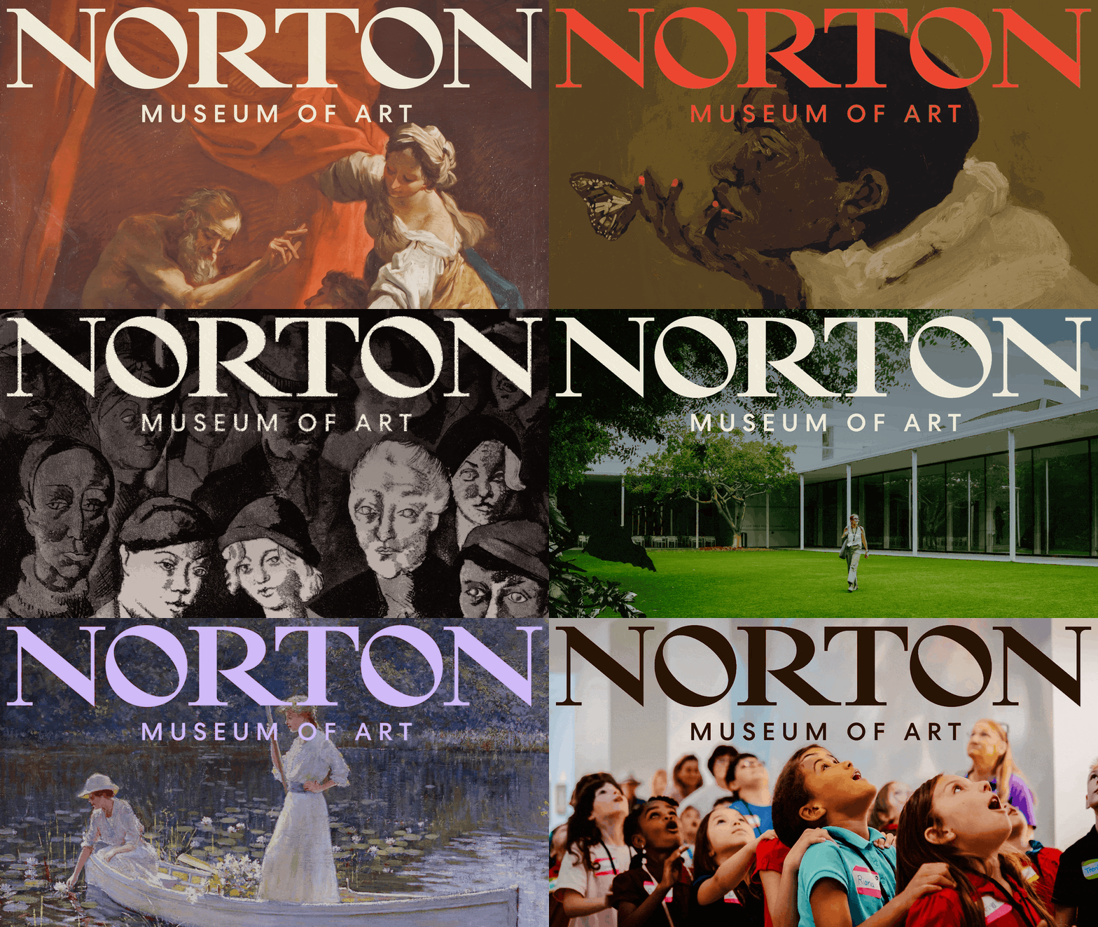
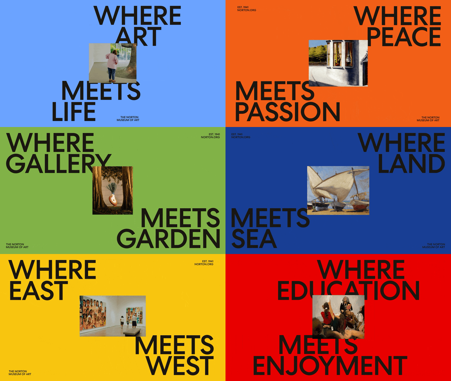
Koto has rebranded the Norton Museum of Art, a gallery that sits on Florida’s sunny coastline and hosts an impressive permanent collection, from the works of painter John Singer Sargent to photographs by Nan Goldin. The space is divided into an original 1941 building and a newer 2019 expansion, as well as incorporating a lush garden and restaurant, making it more than just a museum, but a place to relax and indulge. This multiplicity is captured in Koto’s brand strategy – ‘Where art meets life’ – and the studio aimed to build something around “unexpected connections and inherent dualities”, a press release states. Visually, this comes to life in the rebrand’s revival of an 80-year-old wordmark and seal, which bring together yet another duality: the old and the new.
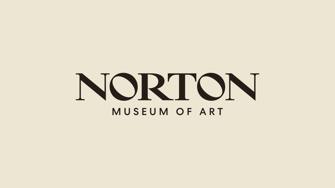
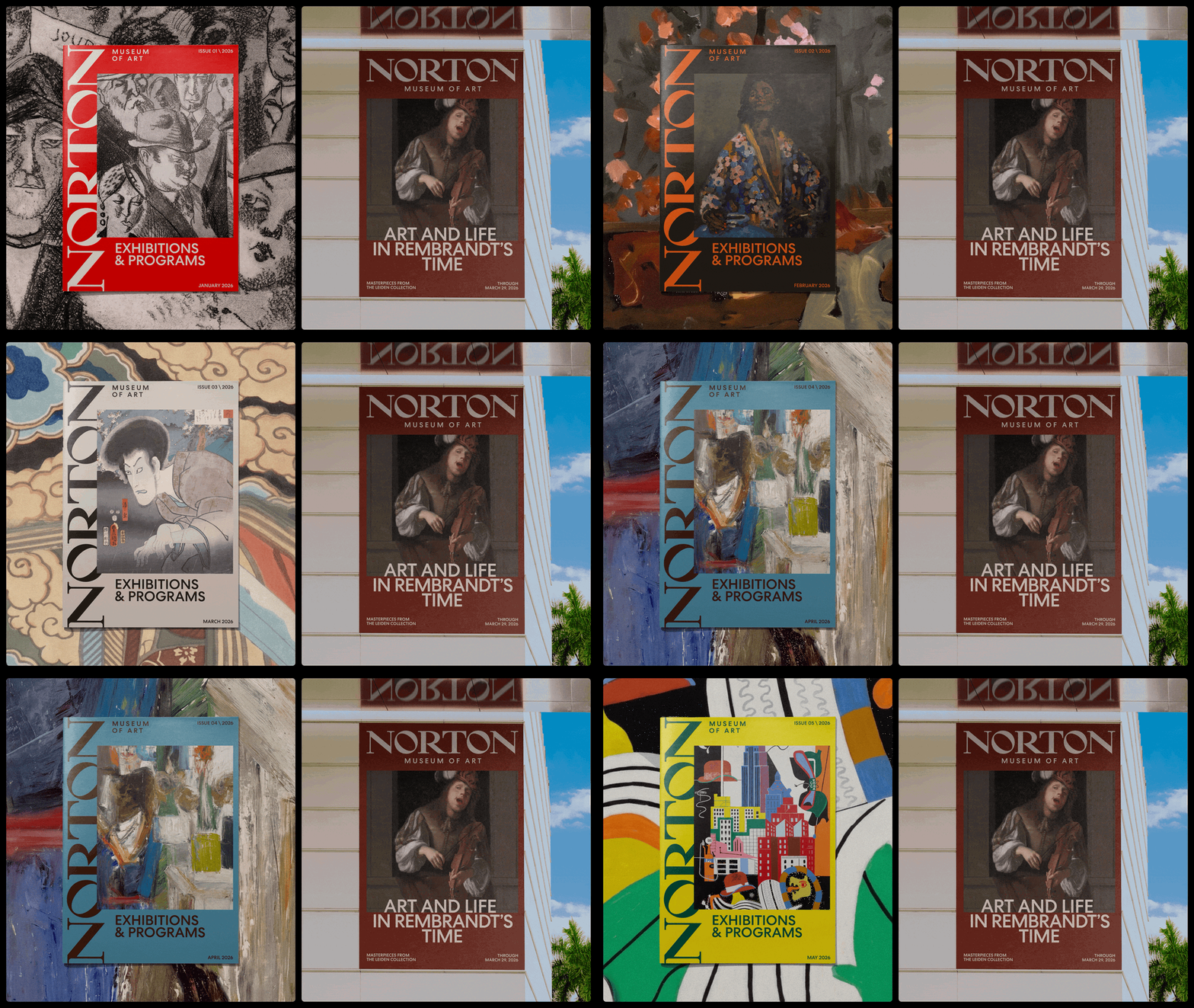
The studio dug deep into the museum’s archive, uncovering old communications, records, and artefacts to see what could be brought back to the fore; one was an old ‘Norton’ wordmark, found on the masthead of recovered documents. But it couldn’t exist as a simple ‘revival’, and the team experimented with its glyphs to give it a bit of spirit. “We used the 40-degree angle of the N and incorporated it throughout the wordmark – the tilt of the O and the leg of the R – to capture the brand’s somewhat against-the-grain nature,” design director David Shatan-Pardo tells It’s Nice That. “This diagonal device then shaped the rest of the identity, becoming holding shapes and text paths, a symbol of different perspectives coming together.”
Koto: Norton Museum of Art (Copyright © Koto, 2026)
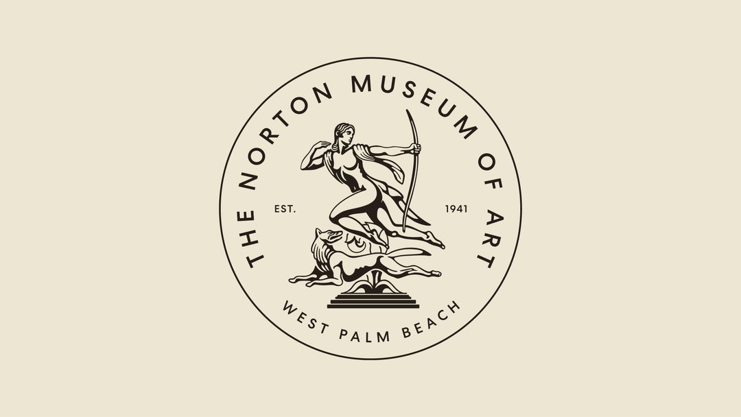
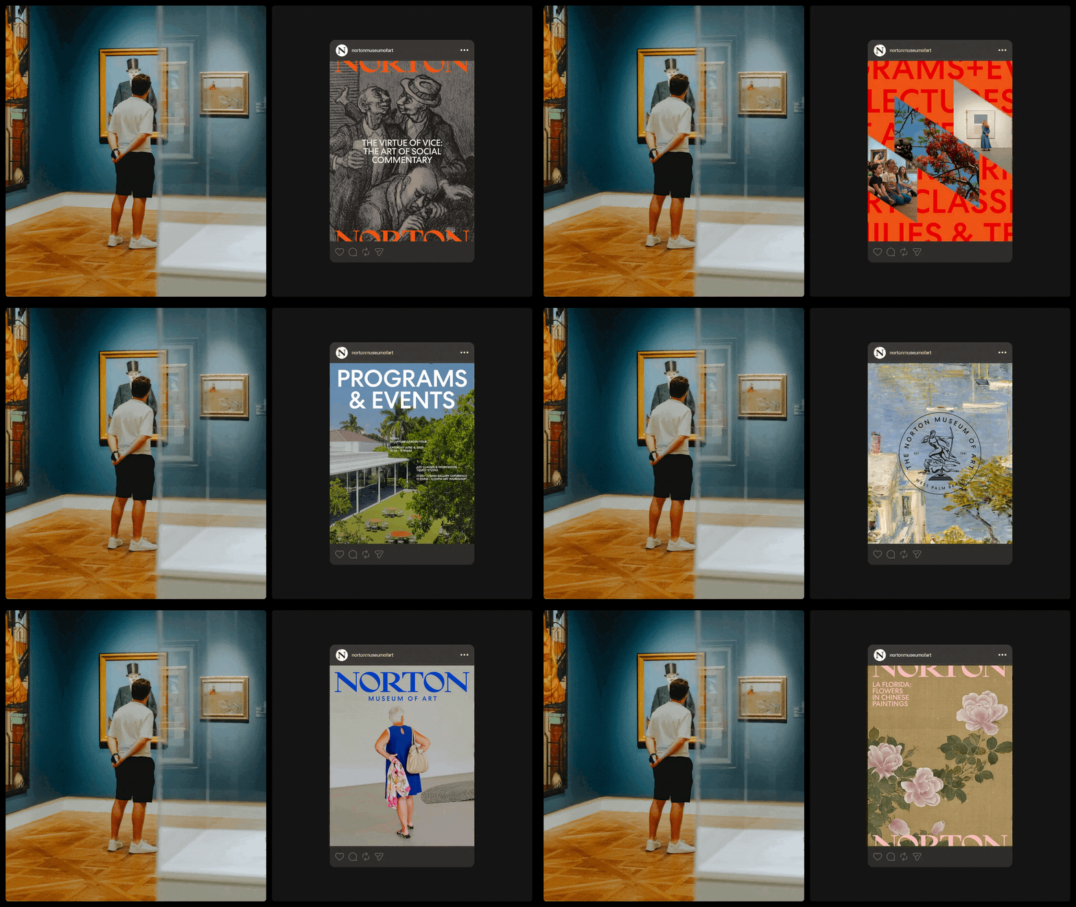
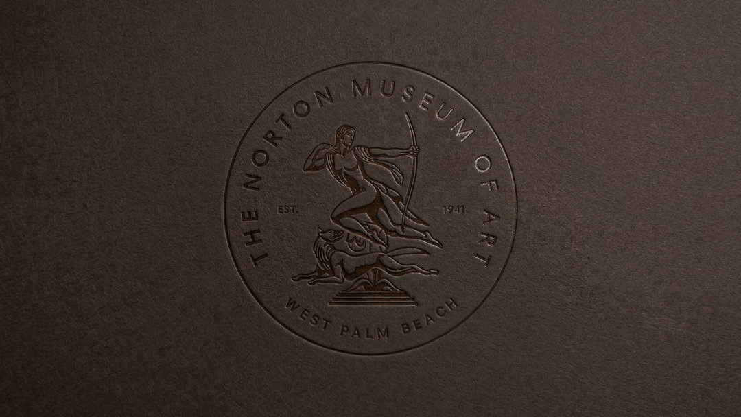
The second revival, The Diana Seal, is an illustrative rendition of the museum’s 50th anniversary mark, which depicts Paul Manship’s Diana statue – commissioned by one of the museum’s co-founders, Ralph Norton, in 1941 and which lies in the museum’s garden. The Koto team have redrawn the seal for clarity and so it can be downsized for more varied application, on small screens, for example. However, its use remains intentional – used throughout the rebrand in celebratory moments, for historical reference or subtle brand details. The wordmark and seal are then paired with Sharp Type’s Centra No. 2, the clean geometry and circular forms of which reference the Foster + Partners 2019 architectural expansion.
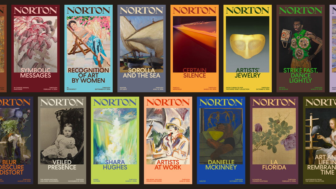
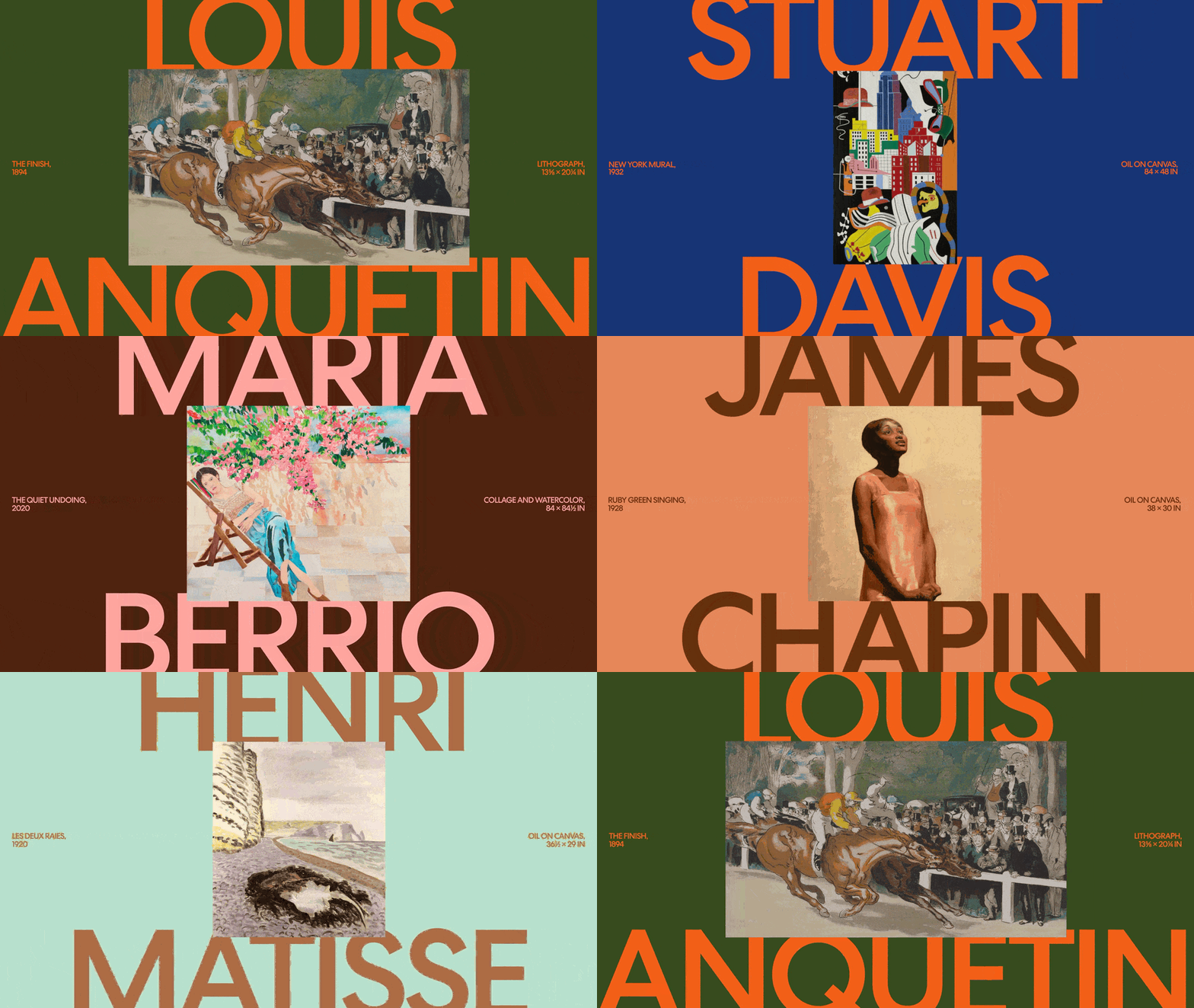
The colour palette exists in two pools: the core palette draws from the surrounding Florida landscape – yellows, sky blues, and oranges – with Klein blue, olive green, and warm black to add contrast. While the secondary extended palette is more flexible, allowing colours to be brought in from the Norton collection and temporary exhibitions – a move that “enabl[es] the identity to shift dynamically over time and let the art shape the visual experience”, the studio states.
All of these disparate elements come together to create an identity that conjures the feeling of being within the Norton Museum, rather than just referencing its characteristics. As well as digging into its archive, the Koto team spent hours immersing themselves within it, meeting staff and attending its events. “There’s a version of this project where you lean into the gravitas, the architecture, the collection and the history,” says Katie Hughes, strategy director at Koto. “The Norton has all of that in spades. But when you spend time there, something else becomes impossible to ignore: the tour guides talking about art as personal experience rather than art history, the community showing up for Art After Dark, for lunch, for the garden. The brand idea had to hold both – the institution and the life happening around it. ‘Where art meets life’ sounds simple because the truth it’s based on is undeniable.”
GalleryKoto: Norton Museum of Art brand identity (Copyright © Koto, 2026)

Hero Header
Koto: Norton Museum of Art (Copyright © Koto, 2026)
Share Article
Further Info
About the Author
—
Olivia (she/her) is associate editor of the website, overseeing the day-to-day editorial projects as well as Nicer Tuesdays events. She joined the It’s Nice That team in 2021. ofh@itsnicethat.com
To submit your work to be featured on the site, see our Submissions Guide.





