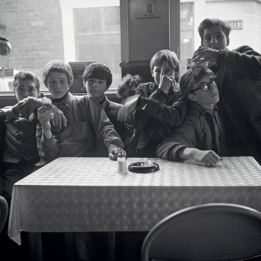
“I love books!”: How Japanese graphic designer Ikuya Shigezane keeps traditional techniques alive
A true devotee to craftsmanship, the Tokyo-based graphic designer is drawn to both digital and analogue techniques – whether it's an event poster, exhibition identity or book design.
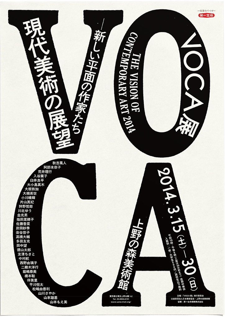
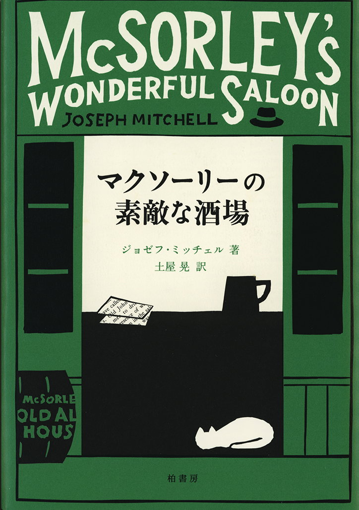
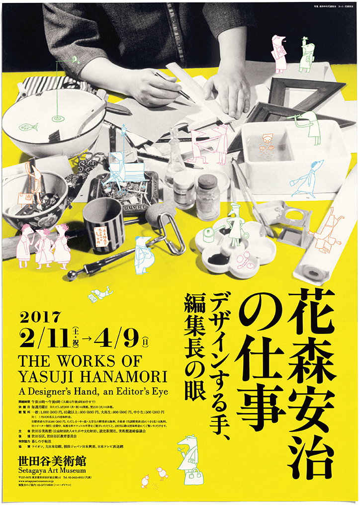
A true devotee to craftsmanship, Tokyo-based graphic designer Ikuya Shigezane is drawn to both digital and traditional analogue techniques. His projects take on a variety of forms, whether it’s a poster for Tokyo’s Setagaya Art Museum, an exhibition identity, book design, event or piece of editorial, but most of all, it’s his profound obsession with old printed matter that drives his practice forward.
Ikuya began his journey into the subject while studying graphic design and picture books at the School of Art and Design at the University of Tsukuba. Based in Ibaraki, it’s hailed as one of the oldest and most prestigious in Japan. After graduating, he worked for a year as an assistant at a book design office, before venturing off to work with friends in a three-year stint setting up an editing and design company. Taking things under his wings fully, he later decided to leave the company in the quest of becoming a picture book writer or a manga artist, but things changed – “now I am working as a graphic designer in Tokyo,” Ikuya tells It’s Nice That.
Ikuya Shigezane
Ikuya’s undeniable interest in the medium is evident throughout his creations, despite the fact that he steered away from his previous plans of entering the professional realms of Japanese comics or picture books. Now working in broader terms across graphic design, he commences his day at seven in the morning sharp, with a regular, timed and structured routine. Then, Iyuka will take an early lunch before checking in on the local bookstores – something he always makes sure to diarise throughout his working day. Next up, there’s more work on projects and commissions, followed by meetings and a train ride home that allows him some time to read various materials and manuscripts.
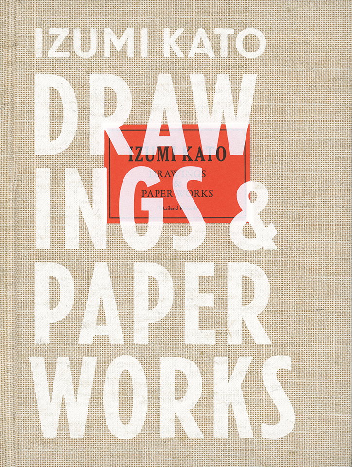
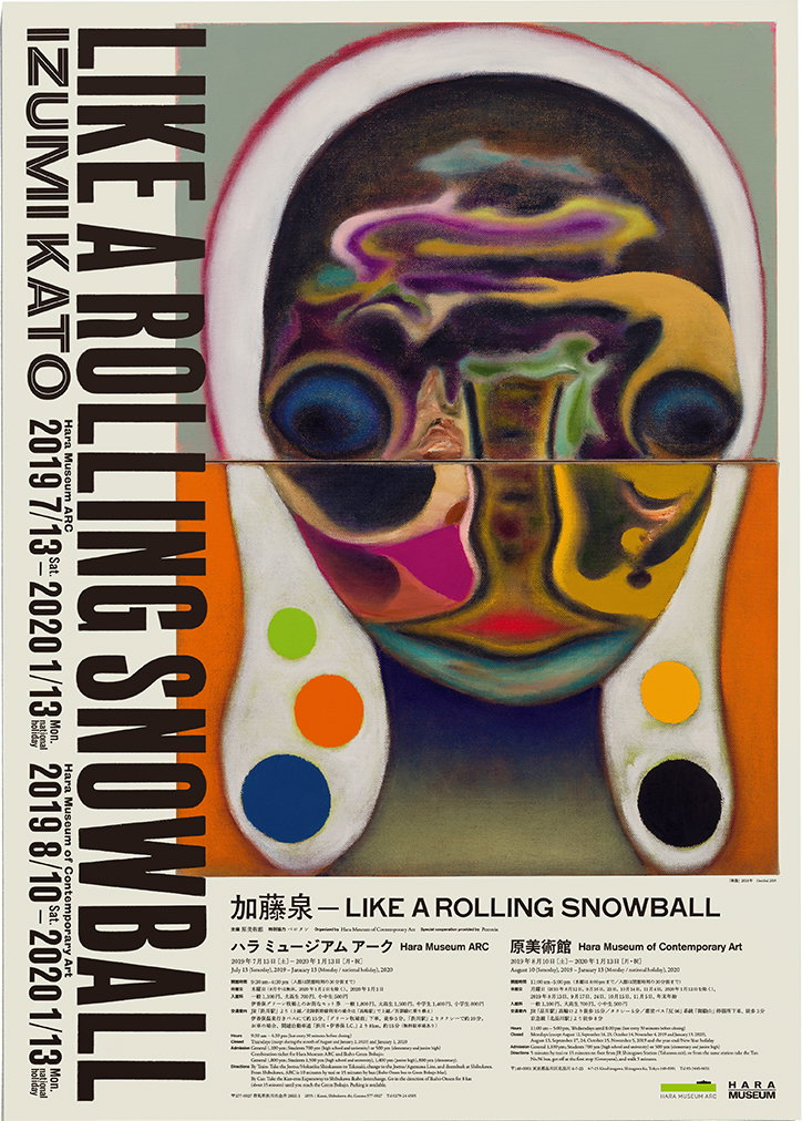
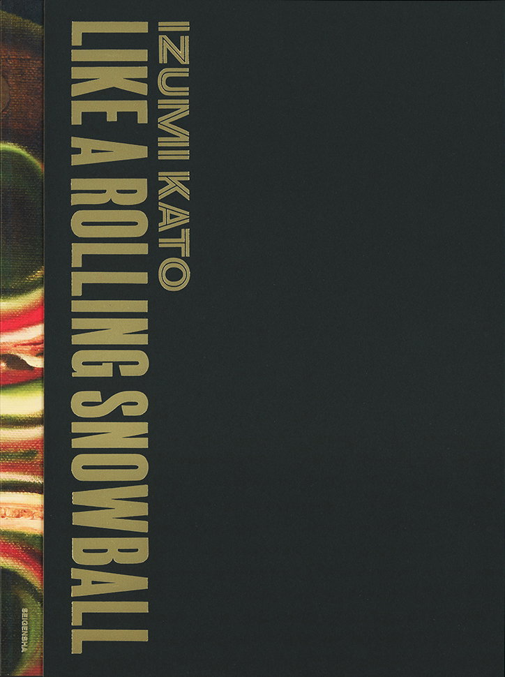
The designer has a prominent interest in the more anarchic of sources, which includes old books, printed matter and old type specimen publications. “There are many used bookstores in Jimbocho where my studio is located,” he continues, “so I can always be inspired. I am also stimulated by craftsmanship that involves printing and bookbinding – without them, my design will not be fulfilled.” An example of this can be seen in his recent work, Izumi Kato – Drawings and Paperworks, [pictured below] where the designer places an orange title sticker on a cloth cover and then silk-screens it from above. “It seems to be a simple task, but since the part with the title sticker is embossed, it cannot be printed at once,” says Ikuyu. “For this reason, it’s printed twice, with the first version placed only on the the title sticker and the other part.” Additionally, he explains how cloth and paper use different inks, hence the usage of two different kinds of white inks used on the cover.
As digitalisation continues to rapidly increase through most industries today, it’s refreshing to see that there is still an appreciation for traditional methods utilised throughout the creative industry. “I need both digital and analogue tools,” says Ikuyu. “Pencils, brushes, scissors, pens, chisels and my iMac are my necessities; rarely do I design on my iMac alone.” Instead, he digitalises his hand-drawn logos and illustrations, or draws by hand from the rough sketches created on his computer. Continuing to transfer these techniques in his future practice, not only does he hope to lend his hands to a picture book for children, in fact, Ikuya sees a whole bunch book design lined up for him on the horizon – “I love books (not e-books)!”
GalleryIkuya Shigezane
Hero Header
Ikuya Shigezane
Share Article
Further Info
About the Author
—
Ayla is a London-based freelance writer, editor and consultant specialising in art, photography, design and culture. After joining It’s Nice That in 2017 as editorial assistant, she was interim online editor in 2022/2023 and continues to work with us on a freelance basis. She has written for i-D, Dazed, AnOther, WePresent, Port, Elephant and more, and she is also the managing editor of design magazine Anima.