




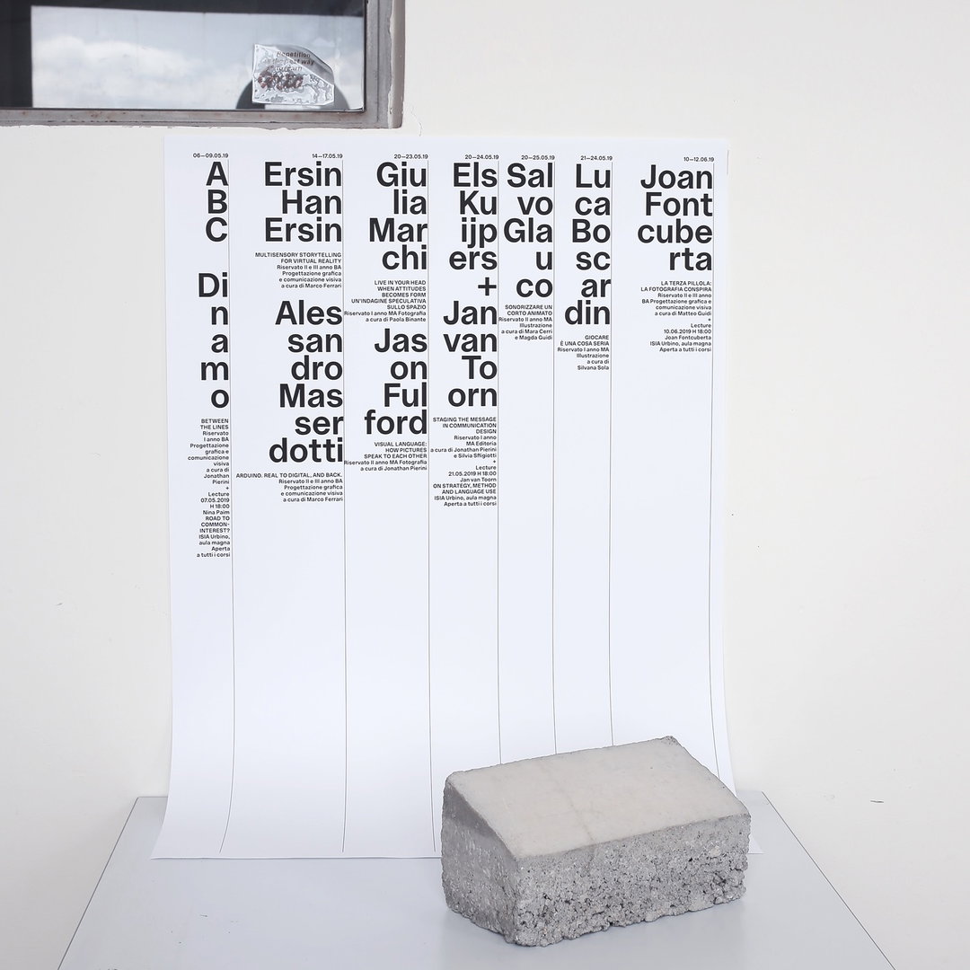
“I like building worlds with words”: Meet Italian graphic designer Francesco Delrosso
The Urbino-raised designer discusses his experimental practice – one that’s seen him work across editorial, typography, web design and cultural research projects.
While his sister’s husband flipped through an informative brochure, looking at graphic design schools located in his hometown of Urbino, Italy, Francesco Delrosso began to form an idea of what he wanted to study in school. “I started my career as a graphic designer due to fortuitous circumstances,” he tells It’s Nice That. “I had no idea what it was; I thought it was similar to an artistic high school for people who wanted to improve their skills in drawing, or learn how to use graphics softwares.”
This sense of the unknown, however, spurred on Francesco’s curiosity for the field. So much so that a year later he registered for school when he was just 13 years old. During his time there, he developed strong interests in the arts – photography, video, 3D graphics and animation – which inspired him to continue his studies at the Academy of Fine Arts in Urbino. However, the first moment that he “really” encountered graphic design was when he won the research scholarship at Fabrica, an experimental communication centre of Benetton.
“I spent a lot of time in the library, where I discovered the work of a certain number of important graphic designers,” he recalls. This included Massimo Vignelli, Wim Crouwel, Otl Aicher, Bruno Monguzzi and also Tibor Kalman’s work for Colors magazine. “That was the world that I felt was mine and that I was really interested in,” he continues. After receiving the scholarship, Francesco travelled back to Urbino and pursued Graphic Design and Communication for Publishing at ISIA to deepen his studies. “My experiences made me more and more aware of my profession – so here I am!”
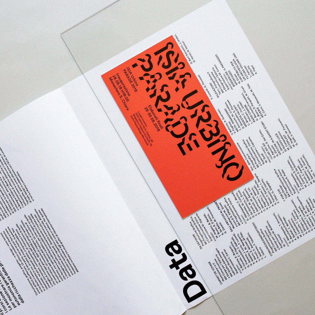
Francesco Delrosso: Parade identity; project in collaboration with ISIA U and visual communication team
Alongside co-founding M1M with Saver Rociola, Antonio D’Elisiis, Michele Margqiotta in order to present research and experimentation on the topic of graphic design, typography and web design, Francesco has now been a tutor and personal assistant to the director of ISIA Urbino for a total of three years. During which Filippo Emiliani and himself, in collaboration with their communication team, worked on various projects including the visual identity of Parade – the final exhibition of the student’s best works from the year. “When I work on identity projects, I prefer creating the typographic system; so many times I’ve started designing typefaces which, in the end, become the main part of the visual identity,” says Francesco. “I like the idea that letters have the power to become identities in themselves.”
Additionally, Francesco worked with Saverio Rociola on a project called Rongorongo. “We still don’t know what Rongorongo is,” he says, “the name comes from a real language, discovered on Easter Island and it’s not even decrypted.” Francesco adds: “I like building worlds with words,” especially when he gets to transfer language into objects. As for Rongorongo, they were both keen that the writing system could “become a cap, a bag or tape to design the space”.
One of the projects that Francesco “cares about the most” is the visual identity that he created for vieè (Valle d’Itria photo experience) alongside Saver Rociola. As organisers of photographic tours in Valle d’atria – “a beautiful place in the south of Italy” – they commissioned a brief to represent this “complex territory” where imagery is usually stereotyped. “We didn’t want to use figurative and didactic language,” he adds, instead opting for a more conceptual approach that steers away from narrative clichés. Thus the duo built a visual language that was able to “grow and expand” by itself, beginning with an investigation into dry stone walls and ending in a typeface with two typographic styles: ink trap (“which refers to interlocking”) and pixel (“which refers to digital photography”). An intriguing and highly complex project, Francesco explains how they are both still working on it: “For me, no project is ever finished, at least until I save the final version of the file on my hard disk.”
With a vast amount of experience and an impressive portfolio to boast, Francesco’s future plans will see the designer work on a new book with Jonathan Pierini, director of ISIA. The book’s focus is on the work of Massimo Dolcini, an Italian designer from Pesaro, and its relation to Albe Steiner and Michele Provinciali. In other news, he will continue working on cultural research projects and hopes to launch a couple of display typefaces. “I still have no certain plans for next year,” he concludes, “but I’d like to continue in both the educational and graphic design fields. But, at the same time, I can’t rule out moving to somewhere in central Europe for the possibility of challenging myself by learning and experiencing something new.”
GalleryFrancesco Delrosso
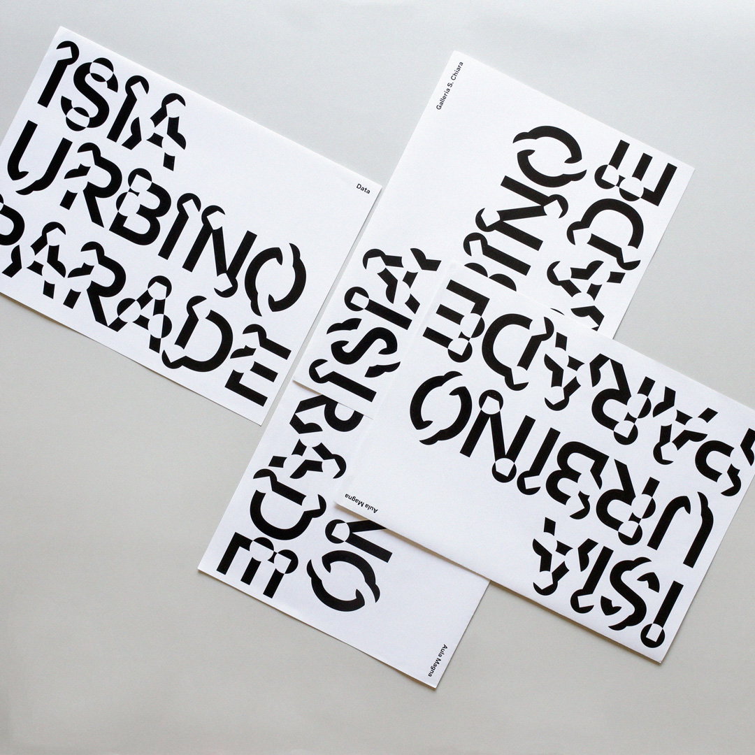
Parade identity; project in collaboration with ISIA U and visual communication team
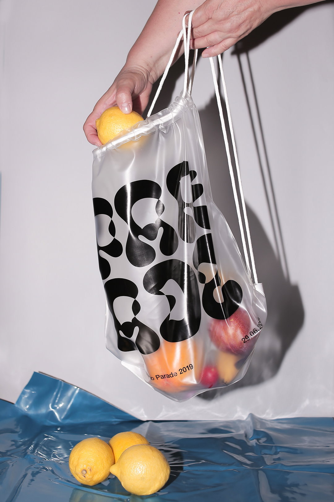
Parade identity; project in collaboration with ISIA U and visual communication team
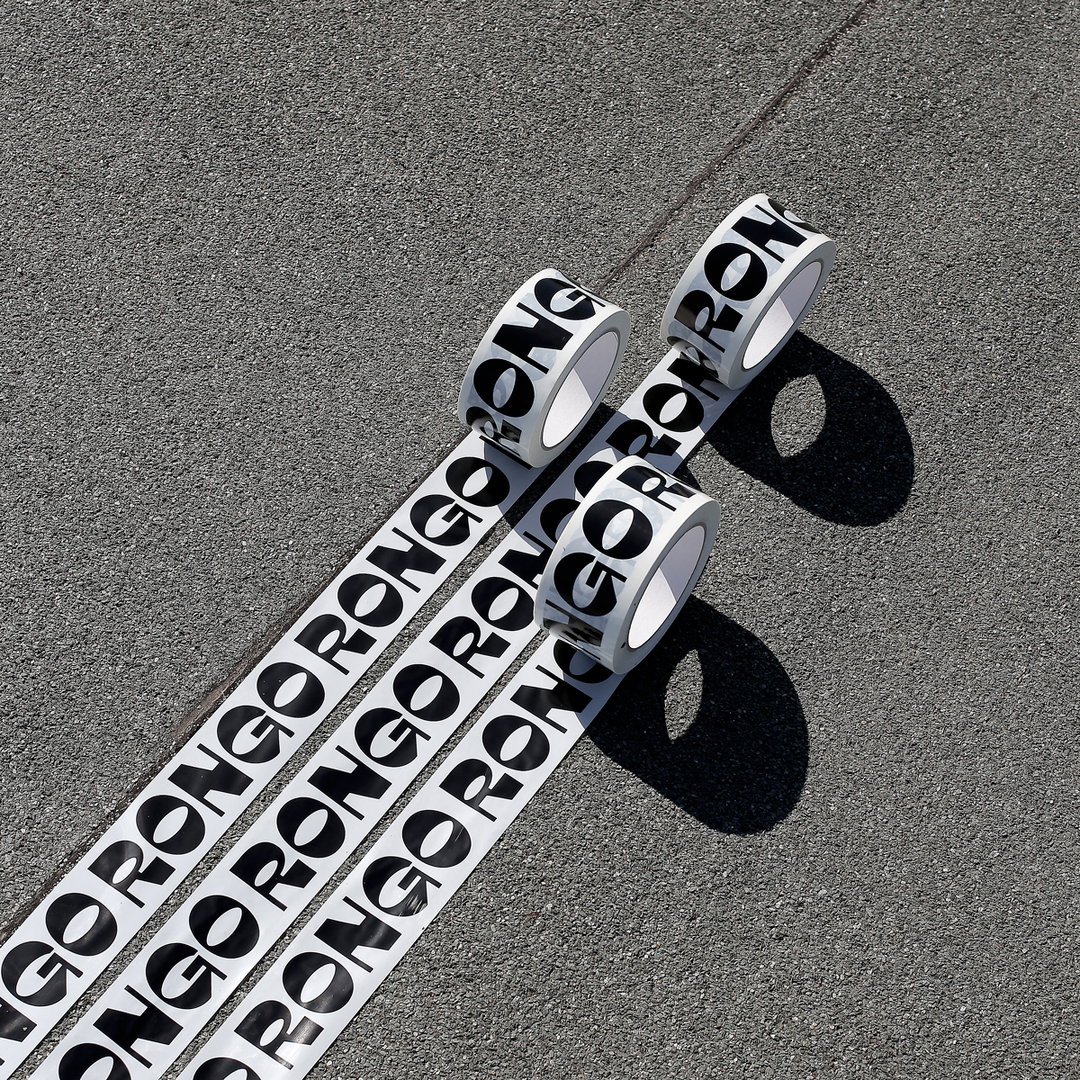
Rongorongo typeface; project in collaboration with Saverio Rociola
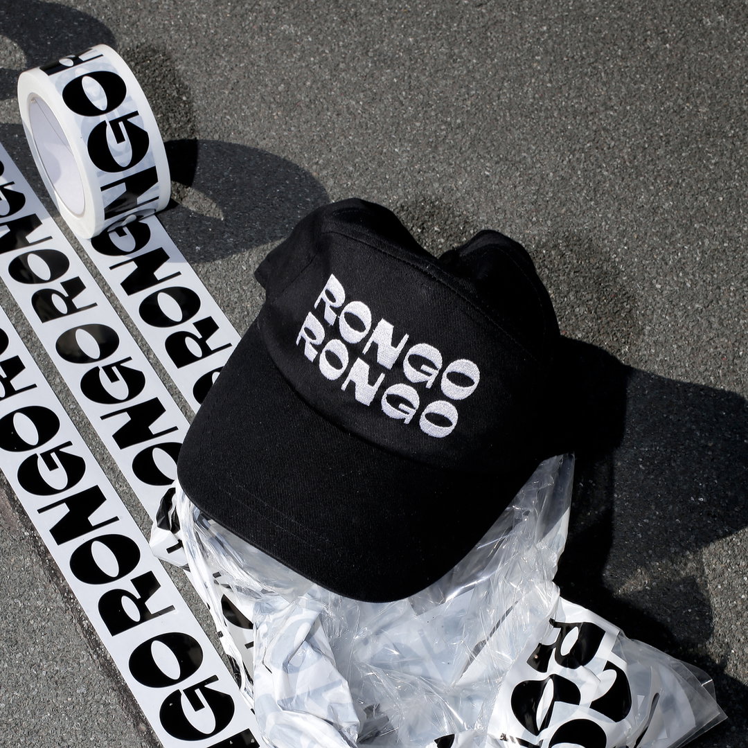
Rongorongo typeface; project in collaboration with Saverio Rociola
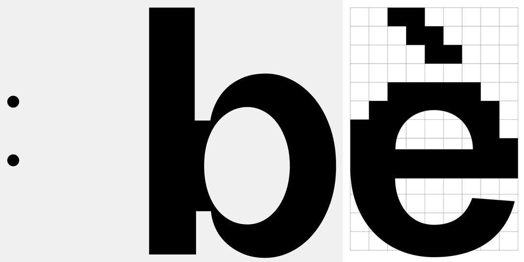
Vieè Valle d’Itria Photo Experience identity; project in collaboration with Saverio Rociola, type design with Gianluca Ciancaglini
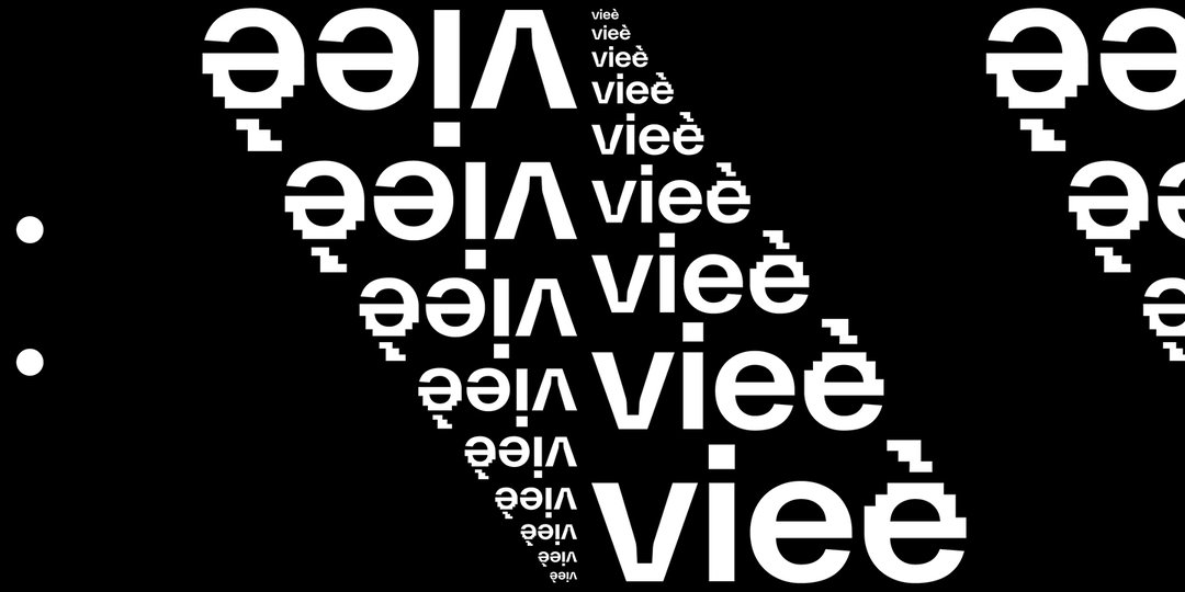
Vieè Valle d’Itria Photo Experience identity; project in collaboration with Saverio Rociola, type design with Gianluca Ciancaglini
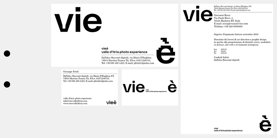
Vieè Valle d’Itria Photo Experience identity; project in collaboration with Saverio Rociola, type design with Gianluca Ciancaglini
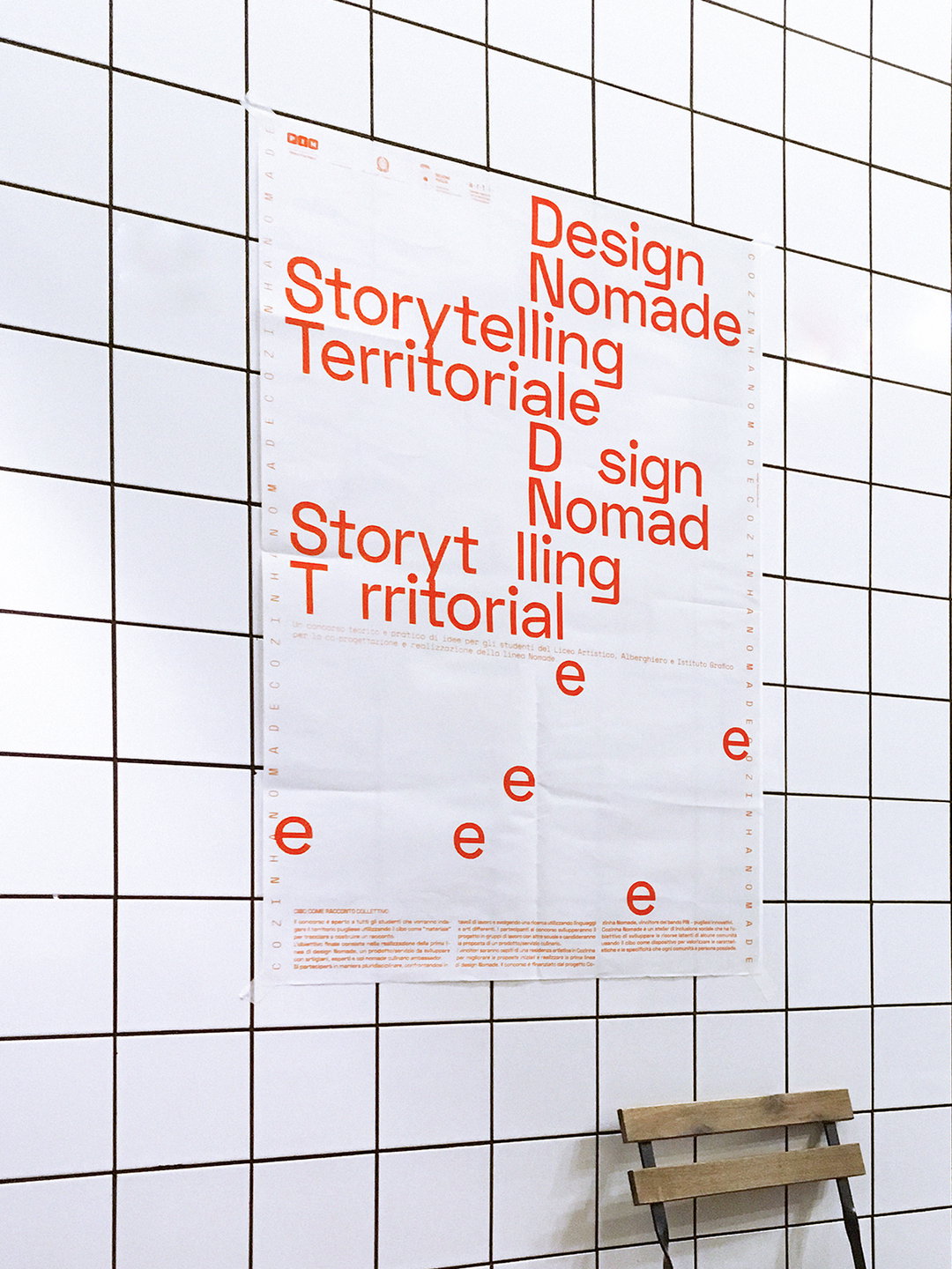
Cozinha Nomade identity; project in collaboration with Saverio Rociola
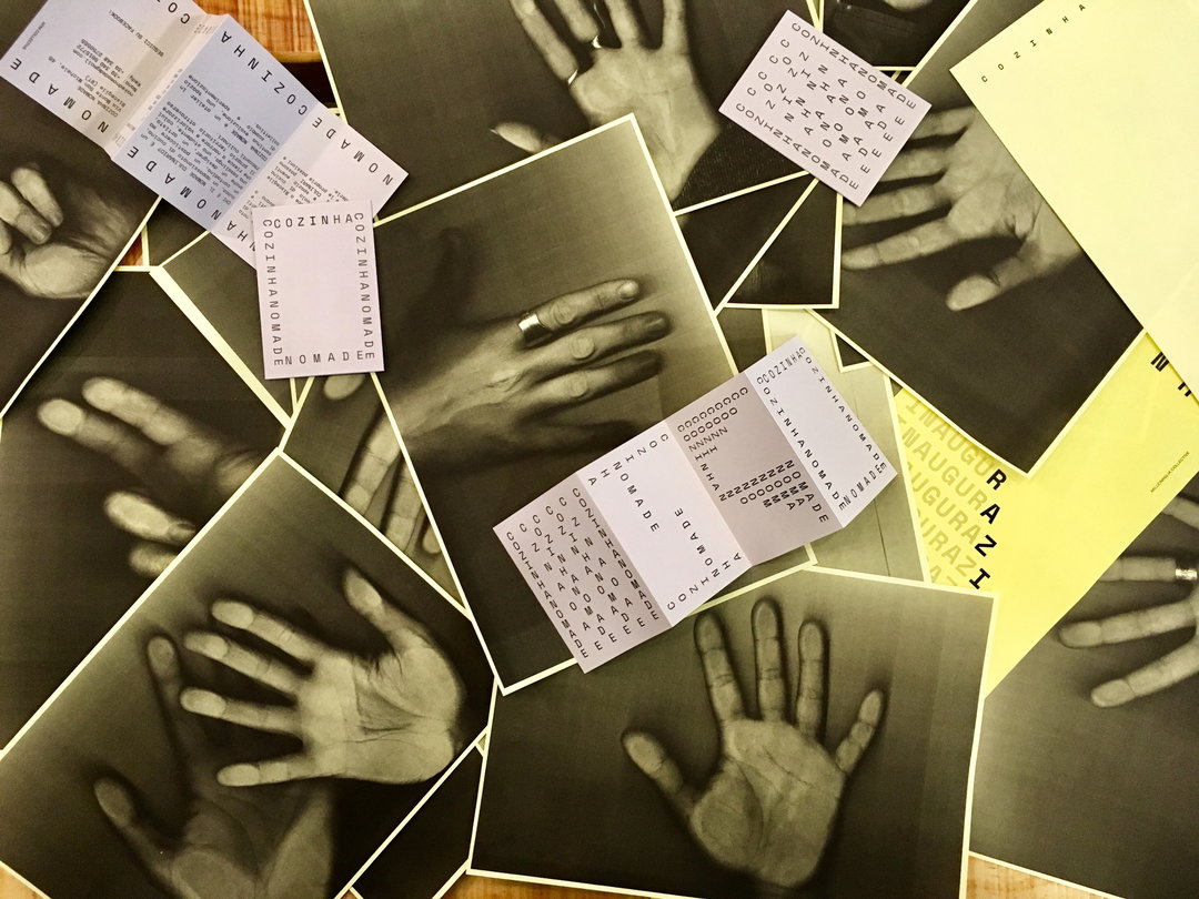
Cozinha Nomade identity; project in collaboration with Saverio Rociola
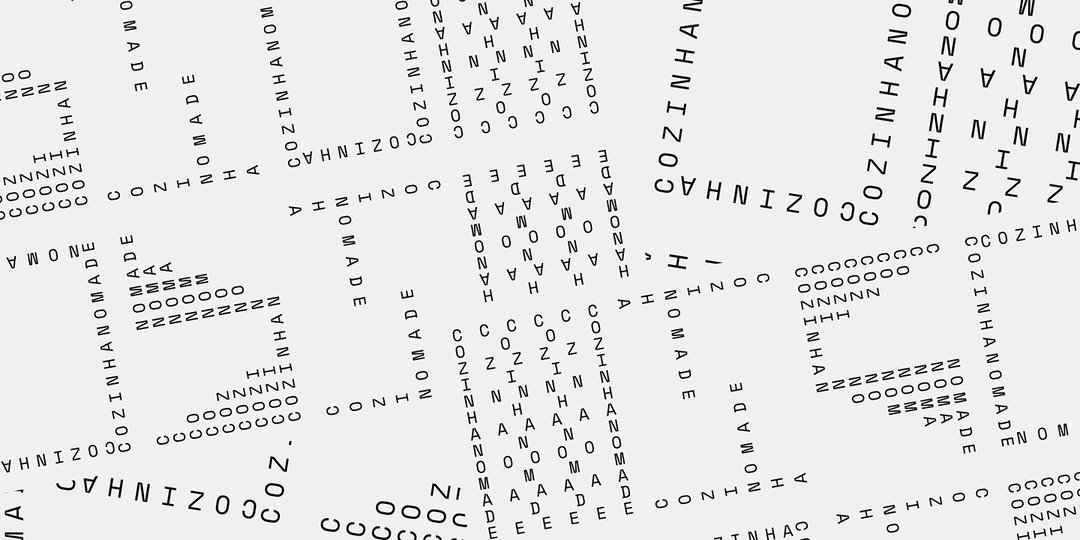
Cozinha Nomade identity; project in collaboration with Saverio Rociola
Hero Header
Share Article
Further Info
Francesco Delrosso: poster designed in collaboration with ISIA U and visual communication team
About the Author
—
Ayla is a London-based freelance writer, editor and consultant specialising in art, photography, design and culture. After joining It’s Nice That in 2017 as editorial assistant, she was interim online editor in 2022/2023 and continues to work with us on a freelance basis. She has written for i-D, Dazed, AnOther, WePresent, Port, Elephant and more, and she is also the managing editor of design magazine Anima.


