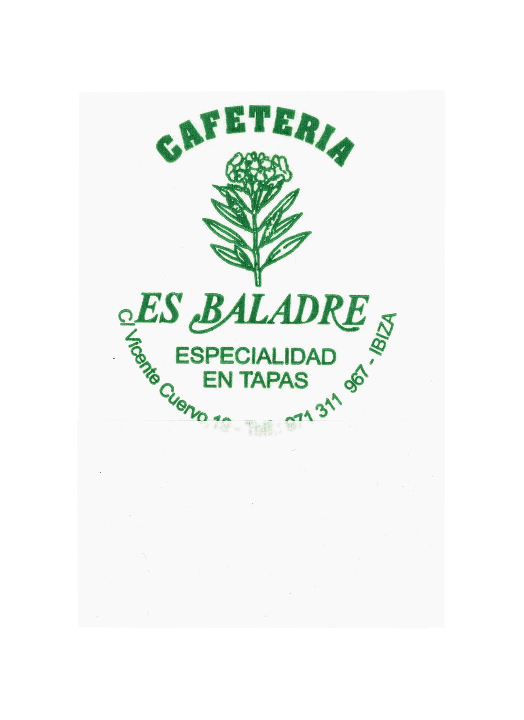
This little book is a design archive of the most delicate memento – the Spanish napkin
For the past ten years Felipe Hernández Duràn has been collecting napkins from bars and tables across Spain. His new book shows how meals are memorialised in these small graphic moments.
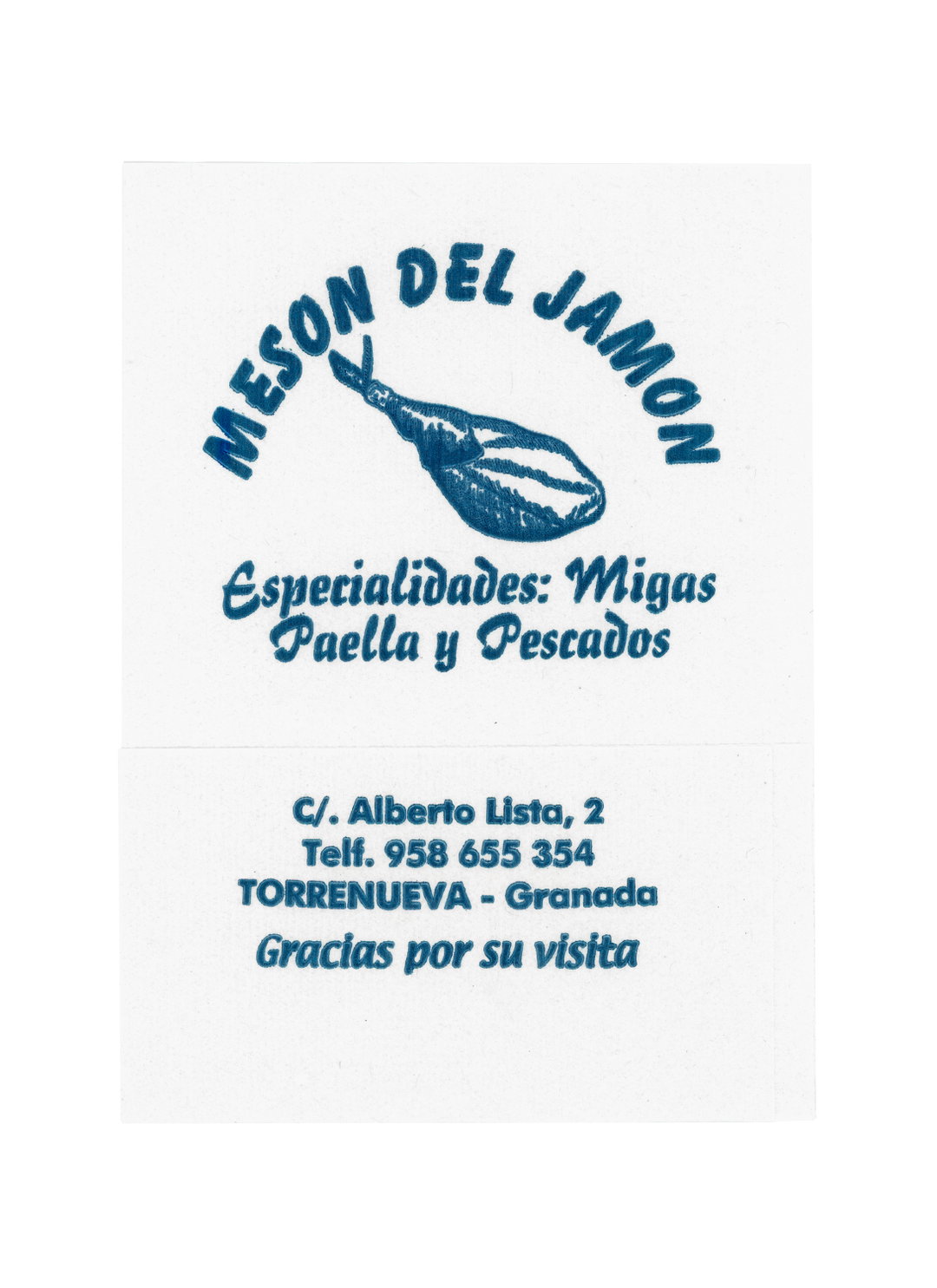
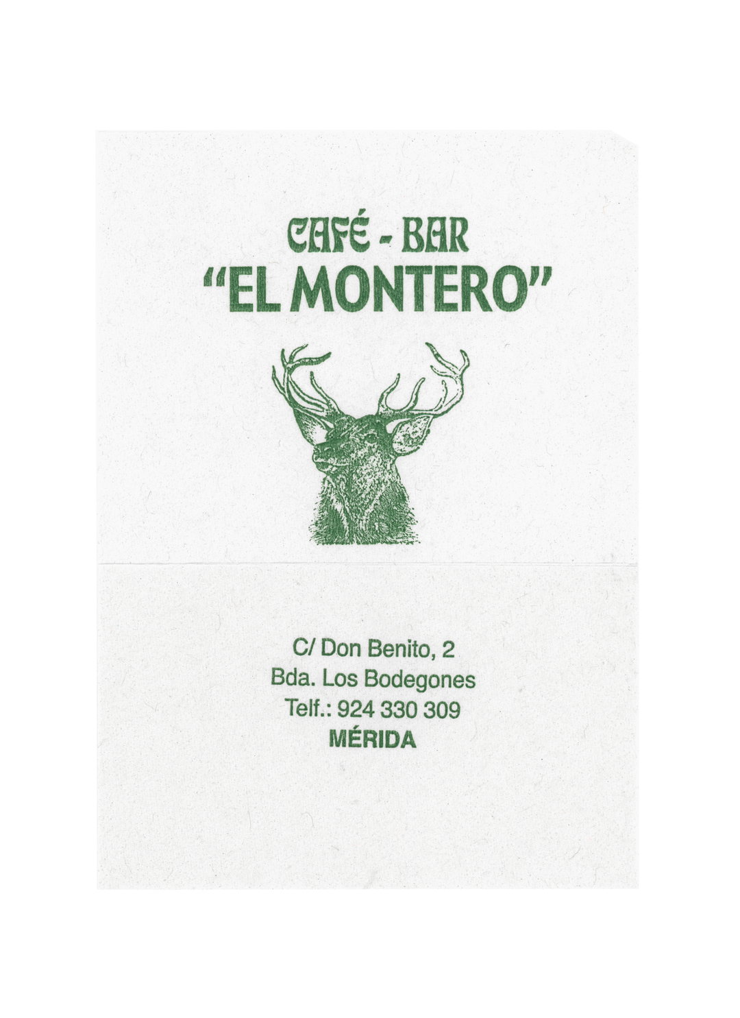
We’ve had matchbooks, paper bags, beer mats and crisp packets, but we might’ve now encountered the winner for the most delicate archive of everyday objects – the napkin. Under the ward of photographer Felipe Hernández Duràn, 600 of these flimsy white rectangles have been taken from tables across his native country of Spain and published in a new book, Servilletas: Spanish Napkins. It makes sense that such a book should come from the Iberian nation known for tapas, small plates of food intended to be shared (or, such delicacies us Brits have been known to crudely simplify to ‘finger food’). Here, napkins aren’t just a nicety or decoration, but an essential facet to a meal.
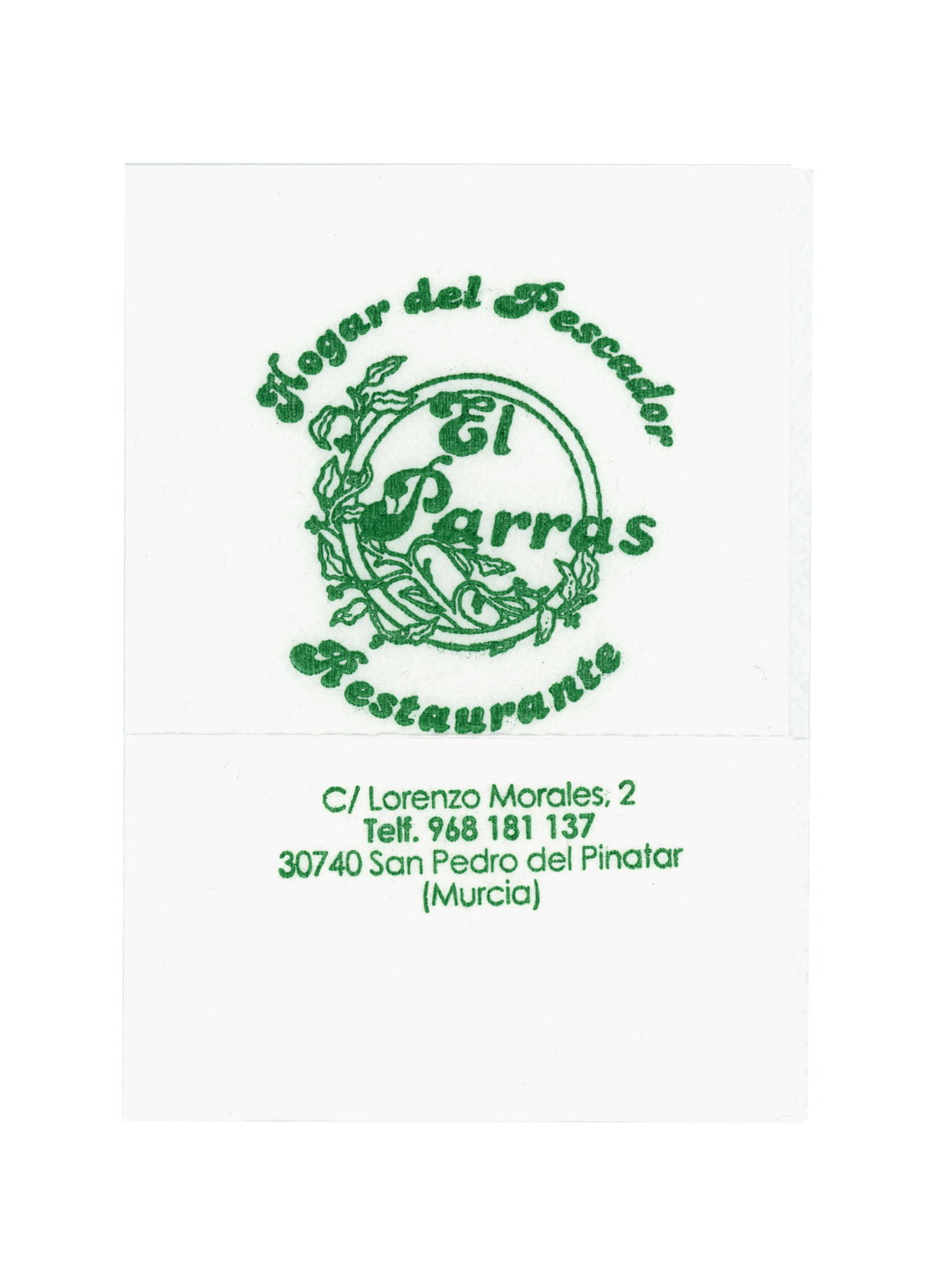
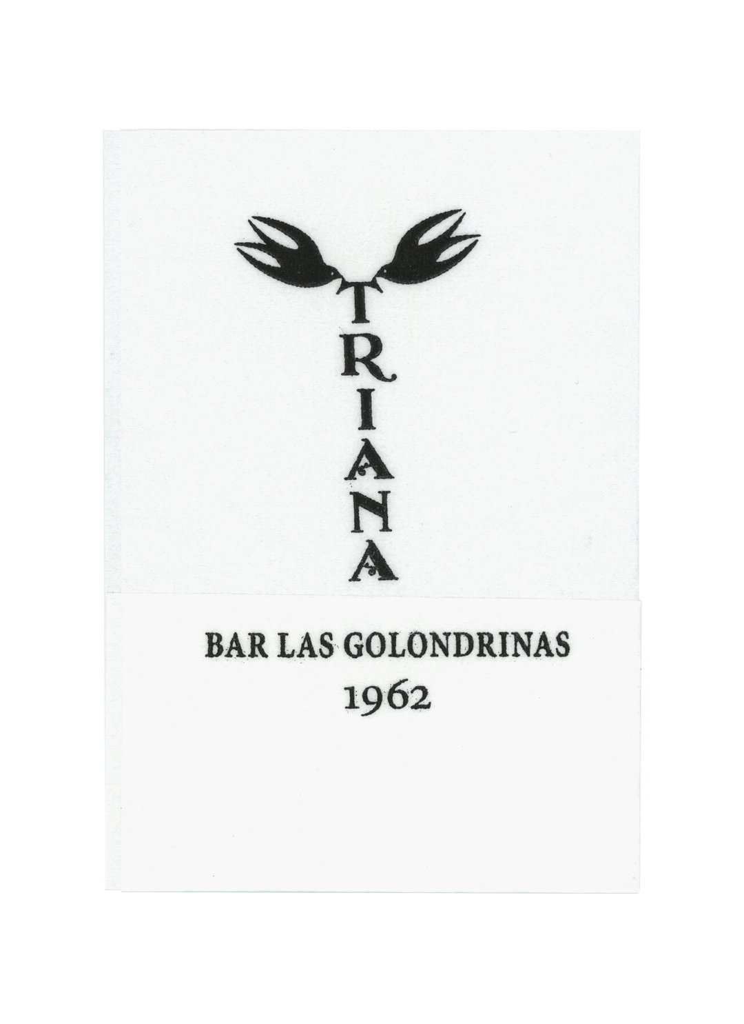
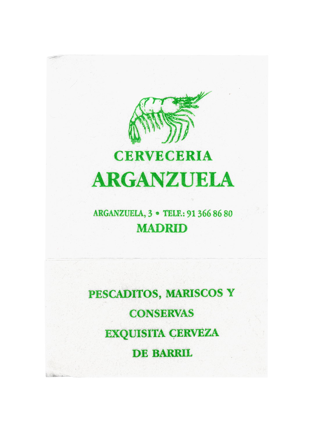
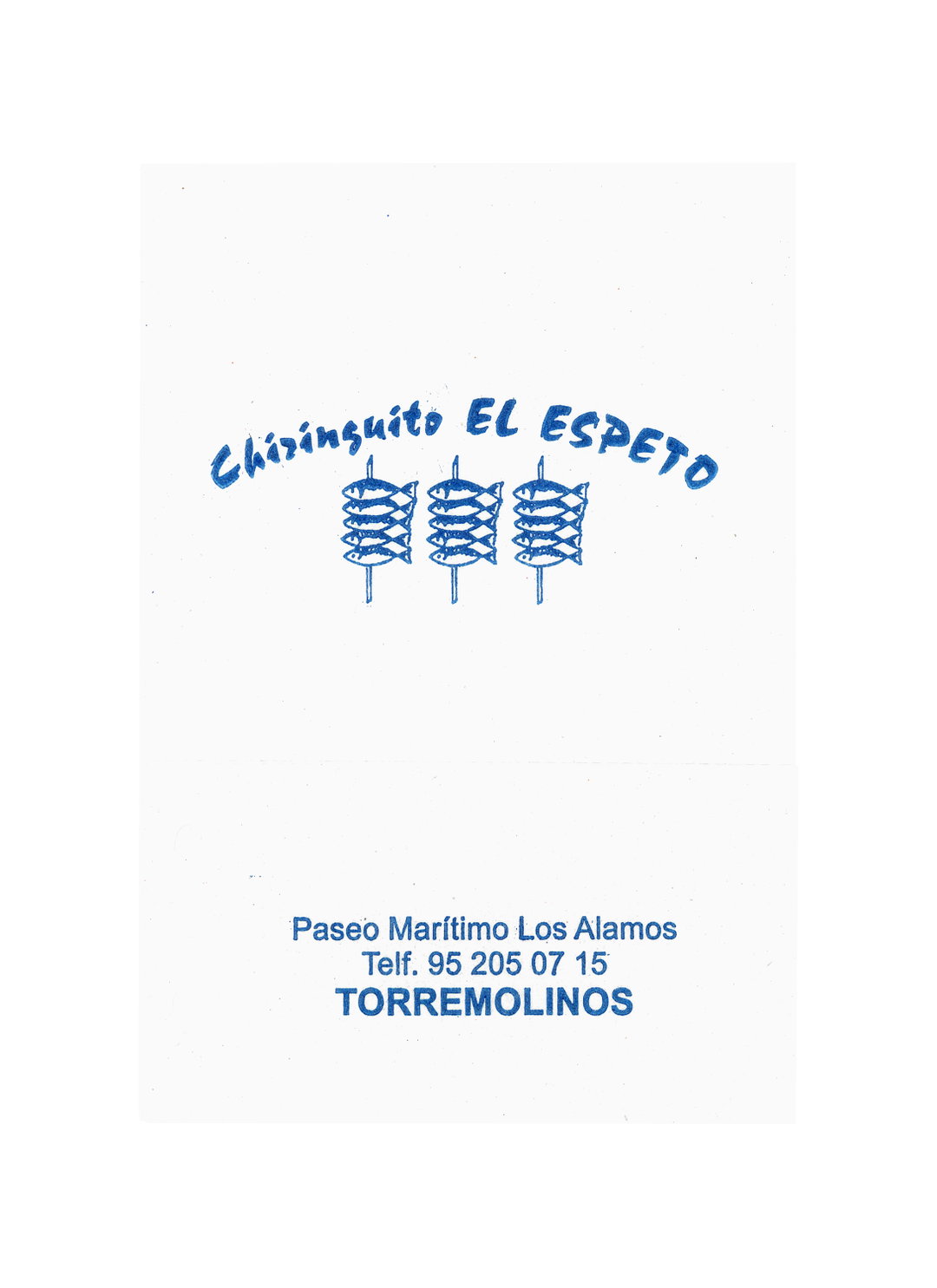
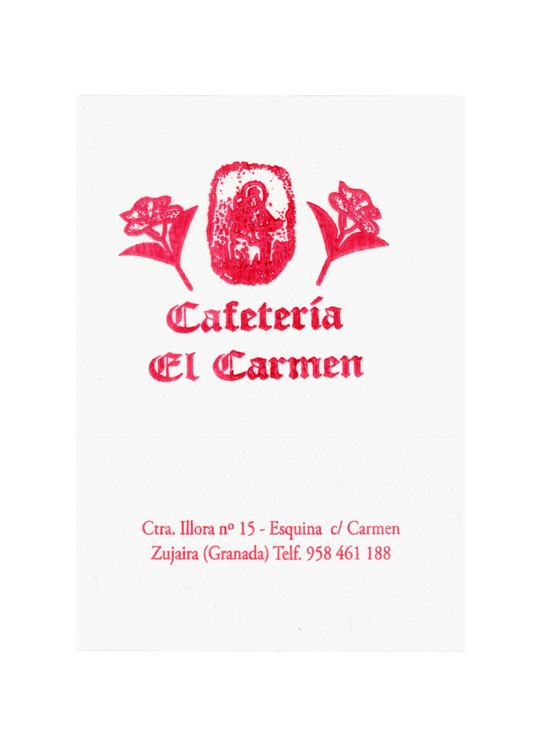
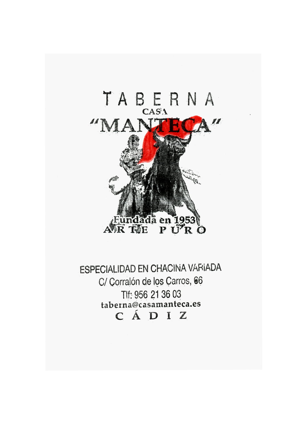
Felipe is a Madrid-based photographer who works across film stills, and commissions for magazines and commercials. Ever since he can remember he’s always been drawn to collecting things specifically for their graphic forms, and napkins are one particularly unique example. Some in the collection feature the logo or wordmark of the restaurant, in sweeping serifs, medieval jaunts or ones that look like they’ve been roughly drawn with a marker pen. Many also have an accompanying and typically very detailed, illustration, often a nod to their speciality: a cute row of fishes on a skewer, a juicy leg of ham or a many-legged shrimp. It’s a wonder to think how much attention has gone into so many of these designs, all existing on canvases which are by their very nature, intended to be disposable.
GalleryFelipe Hernandez / Ojos de Buey: Servilletas (Copyright © Felipe Hernandez / Ojos de Buey, 2026)
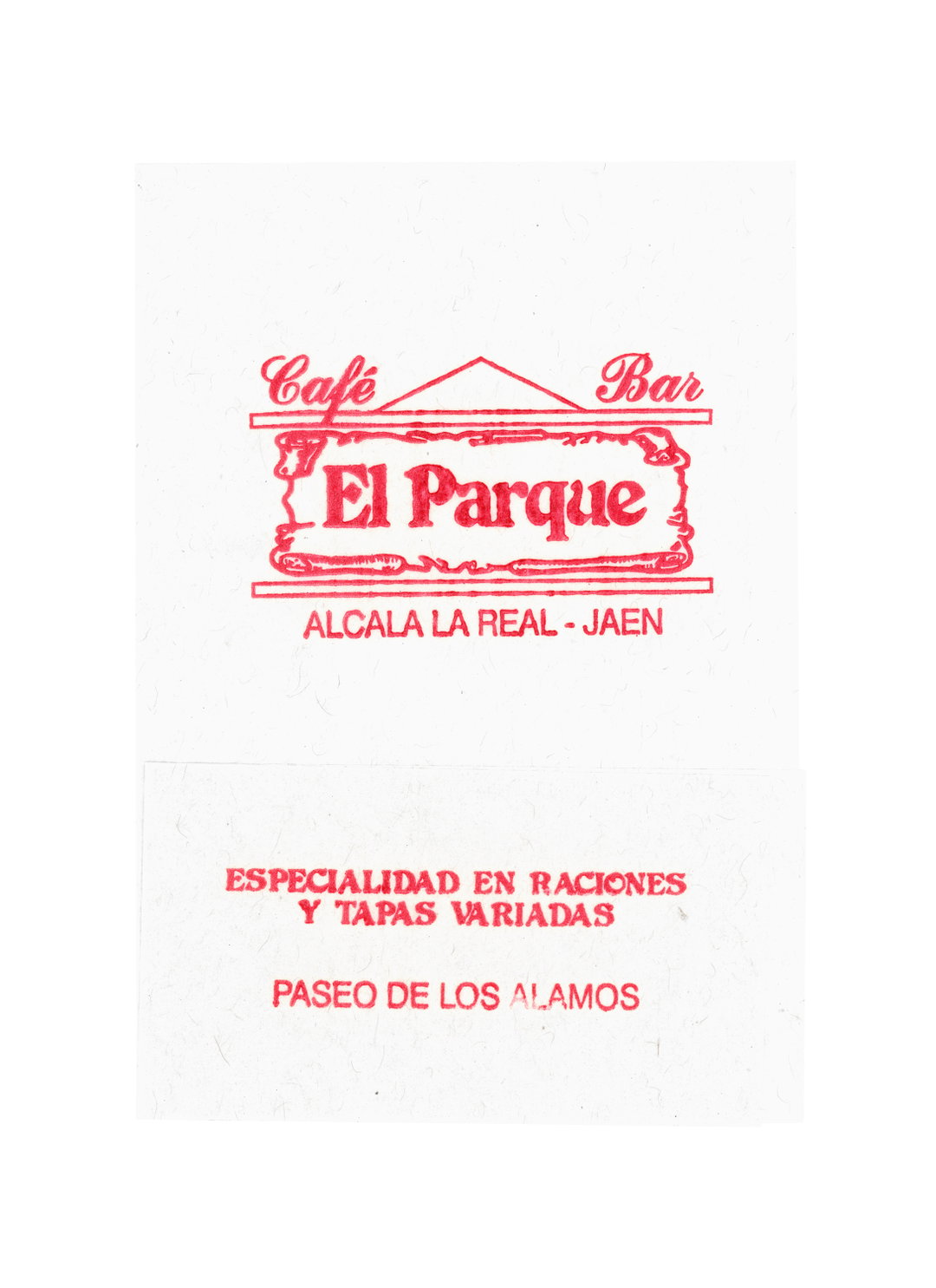
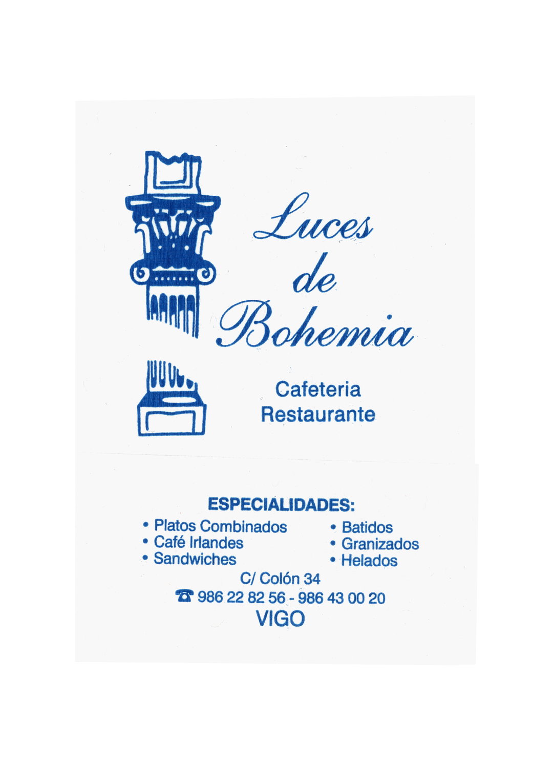
While the flimsiness and crisp white nature of the napkins might seem like a cause for trouble when storing, Felipe says it’s actually a pretty easy task – they’re small and thin so don’t take up much space. He stores each one in a number of shoeboxes, divided up and ordered by region. This division by place is important, as each box now provides a localised window into the vastness of the country’s foodie landscape and the independent businesses keeping it alive. “I think the napkins we have here say a lot about our cuisine and therefore about our culture,” says Felipe. “In the end, they reflect how diverse our country is.”
But for Felipe, these napkins go beyond culinary associations – they’re mementoes, memories immortalised in tissue. “Something that I think resonates with people is that each napkin holds hundreds of people’s stories,” he says, “the ice cream shop of someone’s childhood, the bar they went to with friends, the restaurant where they ate with their family.”
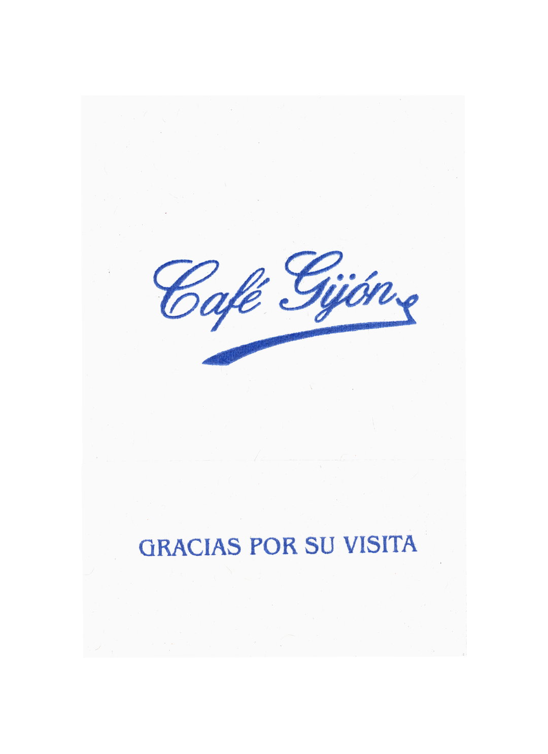
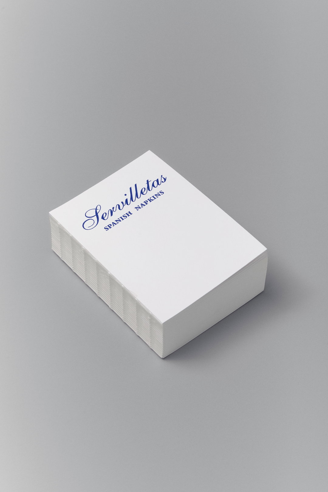
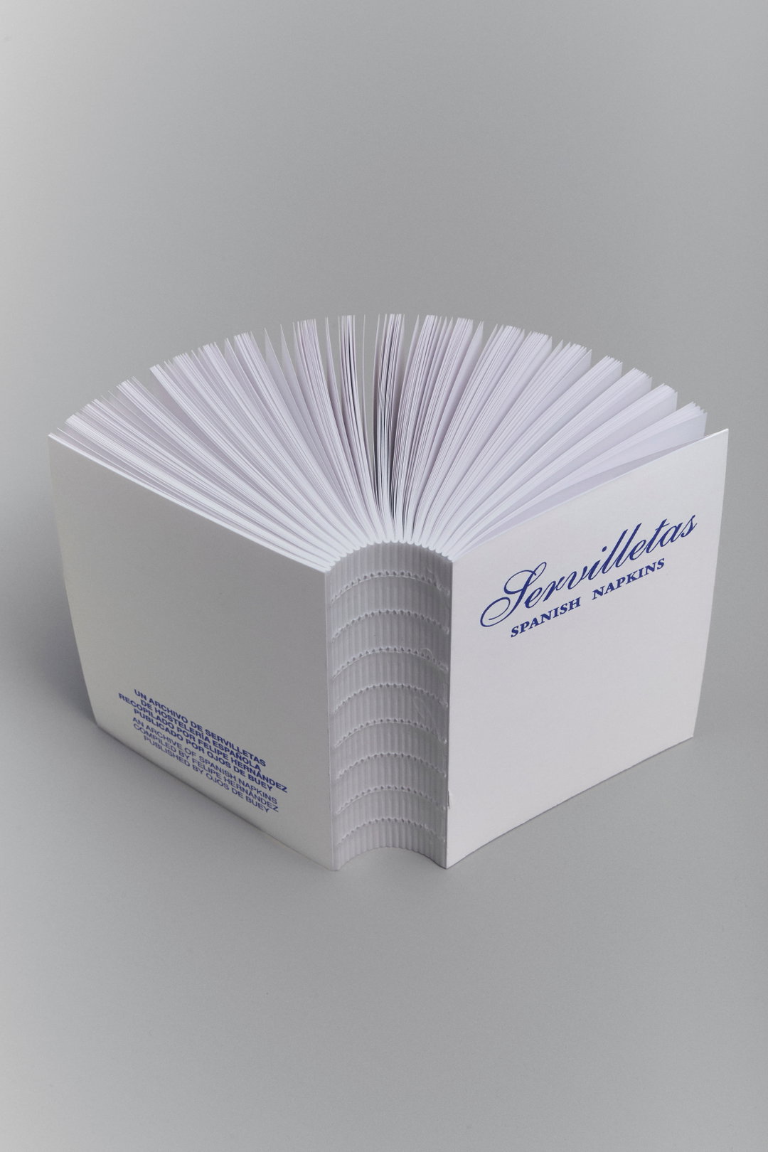
The moment Felipe started accumulating the napkins ten years ago, he knew the perfect format to show them in all their glory was a book, and, of course, “the book is the best format for the collection to endure over time”, says Felipe. Published by Ojos de Buey, the pocket-sized publication mimics its subject matter in more ways than one; it’s printed to around the size of a napkin, and its royal cursive title (not too dissimilar from the typeface you’ll find on Madri’s Café Gijón napkin) sits atop a plain white background. Though it’s safe to say you won’t be using this beautiful little book to mop up spillages or get grease off your fingers.
GalleryFelipe Hernandez / Ojos de Buey: Servilletas (Copyright © Felipe Hernandez / Ojos de Buey, 2026)
Hero Header
Felipe Hernandez / Ojos de Buey: Servilletas (Copyright © Felipe Hernandez / Ojos de Buey, 2026)
Share Article
About the Author
—
Olivia (she/her) is associate editor of the website, overseeing the day-to-day editorial projects as well as Nicer Tuesdays events. She joined the It’s Nice That team in 2021. ofh@itsnicethat.com
To submit your work to be featured on the site, see our Submissions Guide.