Launch Recite Me assistive technology
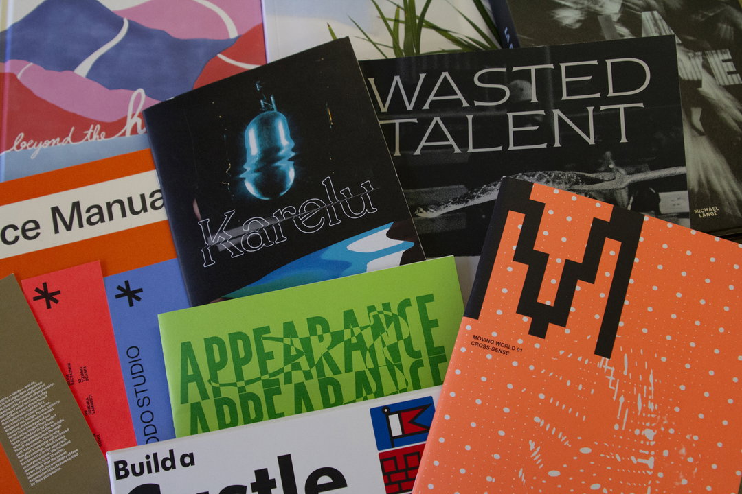
A collection of books and magazines are scattered across a surface. Visible titles include “Wasted Talent”, “Karelu”, “Appearance” and “Build a Castle”.

Build your own castle, augmented reality calendars and living letters: Here’s February’s Things

As Winter draws to a close (or so we are told) we delve into the wonderful items we've been sent over the last month.

—
Date
11 February 2020

Share

January is over, and Christmas definitely feels like an age ago. Now it’s back to work (properly), but luckily for us, there’s no shortage of reading material to help us through our commutes. From the future of augmented reality to travel pieces that have us dreaming of warmer times as our umbrella is blown inside out by Storm Ciara, these are some of our picks from the post.

If you would like to contribute to next month’s Things, please send your designs to this address.
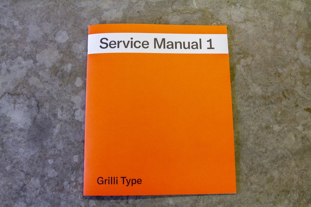
An orange booklet lies flat on a grey concrete surface. A white band across the top reads “Service Manual 1” and the words “Grilli Type” appear in the bottom left corner.
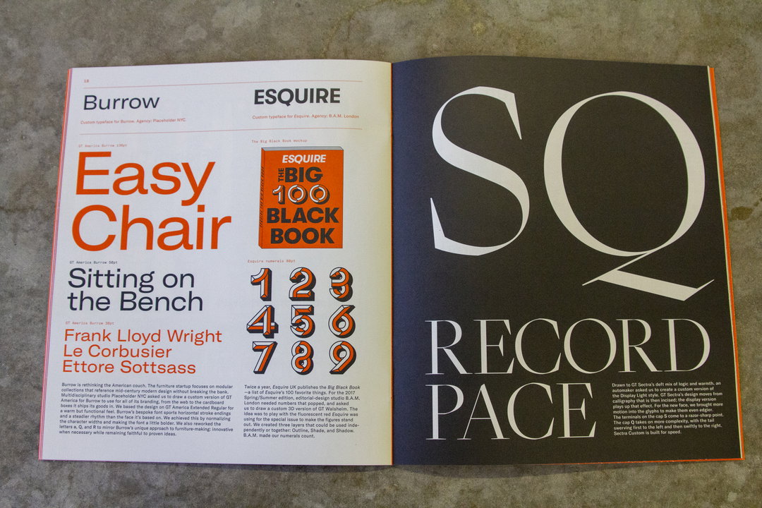
An open magazine spread featuring typography and layout design. The left page displays bold headings for “Burrow” and “Esquire”, while the right page shows the large, white letters “SQ” above the word “RECORD FACE” on a dark background.
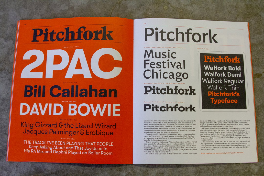
An open magazine spread showcasing the Pitchfork brand identity. The left page is bright orange with the names “2PAC”, “Bill Callahan” and “David Bowie” in bold, white and black typography. The right page is white, featuring the “Pitchfork” wordmark and a black box listing the Walfork typeface family.

Grilli Type: Service Manual 1

This publication is a bit of a highlight reel of Swiss type foundry Grilli Type’s work in recent years. This includes its custom type created for Pitchfork, as well as work with brands such as Esquire and Samsonite. It also details its work to embrace new alphabets such as Cyrillic, Japanese, Korean and Chinese.
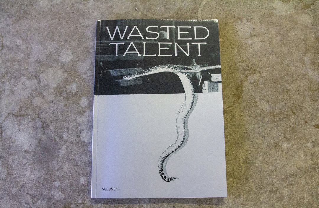
The cover of a book titled “Wasted Talent” in bold, white serif type. Below the text, a black and white image shows a snake curving across a white background. Small text at the bottom left reads “Volume VI”.
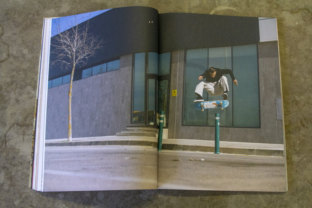
An open magazine shows a person mid-air on a skateboard, performing a trick over a green bollard. They are positioned against the dark glass facade of a modern building.
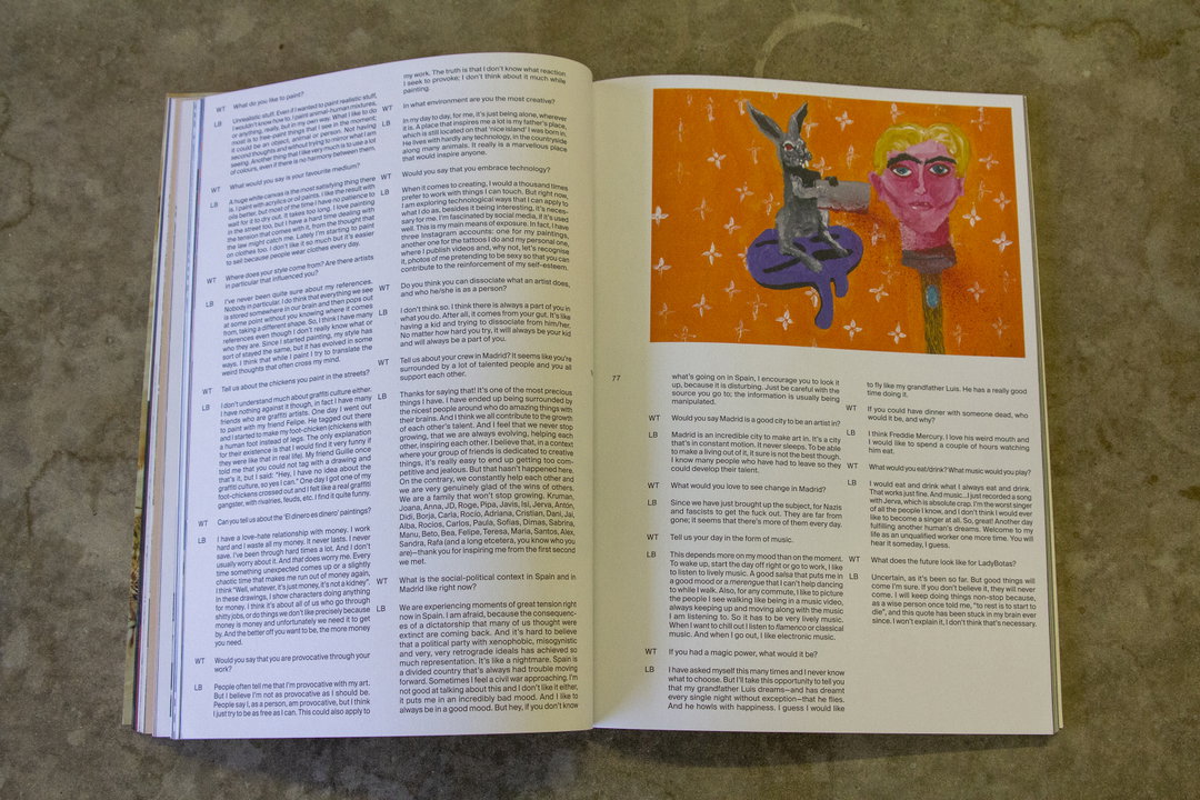
A double-page spread from a magazine featuring an interview and a painting. The left page contains a Q&A text layout, while the right page shows a colourful painting of a figure with a large, orange head and a small body.

Wasted Talent Volume VI

The magazine that focuses on youth subcultures across skating, surfing, art and music has had its largest visual redesign yet. The aim was to give a more premium look and feel, and it’s definitely worked. Taking you on a worldwide tour via Tel Aviv, Barcelona, New York and Madrid, the magazine is packed with photographic and written accounts of places and the subcultures that make them tick.
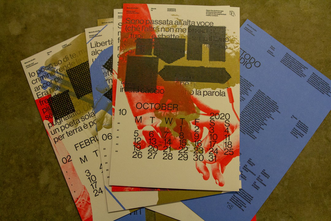
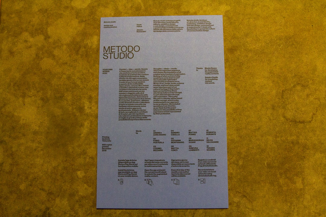
A collection of printed calendars and posters with bold typography and red and blue colour blocking. The central page shows an October 2020 calendar overlaid with a red hand and the Italian phrase “Sono passata all’alta voce”.
A yellow printed page for “Metodo Studio” featuring a grid of text and names. The layout includes a manifesto in Italian and English, alongside a numbered list of contributors.
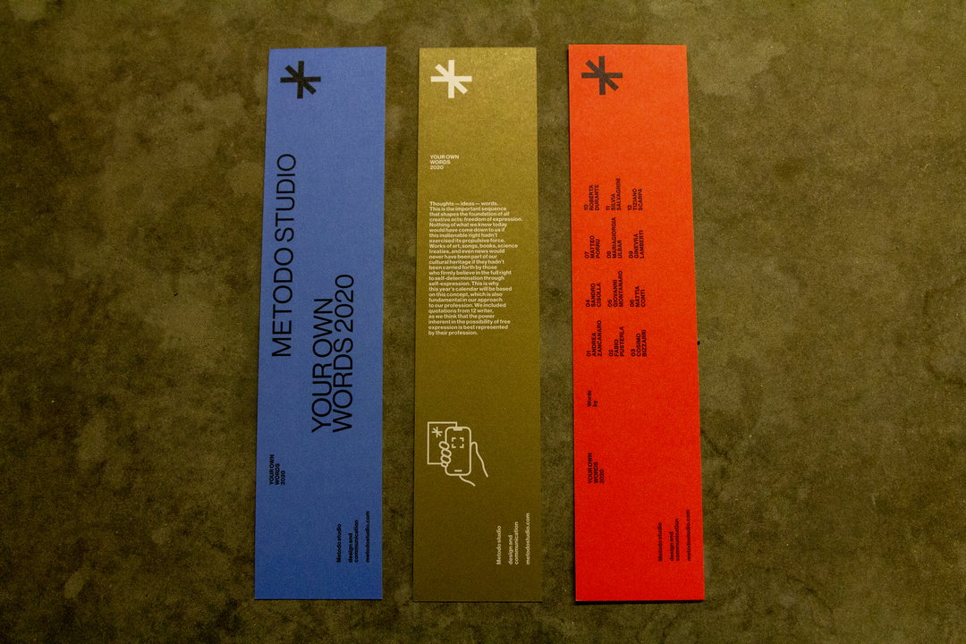
Three tall, narrow cards in blue, olive green and red are laid side by side. Each features a star icon at the top and the text “Your own words 2020”.

Metodo Studio

The Italian design and communication agency has created a calendar with quotes from a different writer for each month. To access these quotes requires some work from you though. Open the Artivive app and point it at each sheet to unlock the quotes, as well as other augmented reality content.
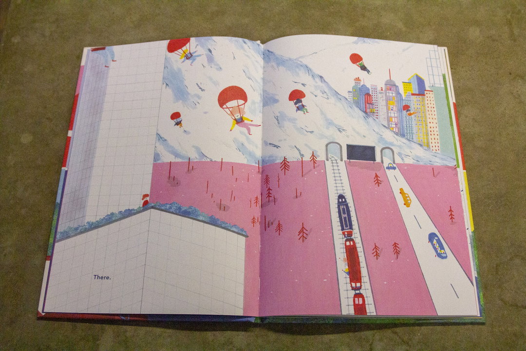
An illustration in an open book shows a pink landscape with a snowy mountain and a distant city. Several figures with red parachutes drift through the sky above a red train and cars on a road. The word “There.” is printed in the bottom left corner.
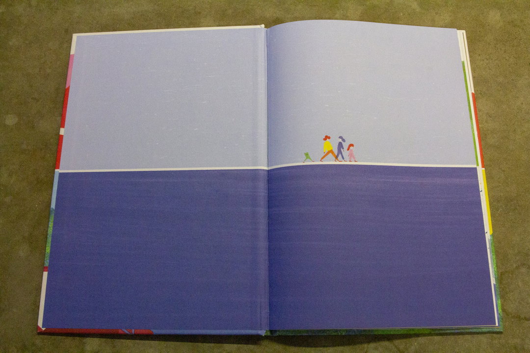
An open book shows a minimalist illustration of a landscape split horizontally into light purple and deep blue. Three small, colourful figures walk across the horizon line.
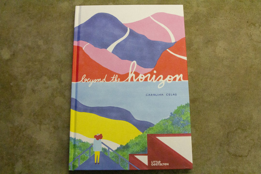
The cover of a book titled “beyond the horizon” by Carolina Celas. An illustration shows a small figure standing on a bridge, looking out over a landscape of colourful, rolling hills.

Carolina Cela: Beyond the horizon

The focus of this children’s book is the horizon, how it’s constantly there but always out of reach. The few words that there are have been translated from Portuguese into English, yet it’s the illustrations that steal the show. These calming scenic landscapes and beautiful everyday scenes are extremely relaxing.
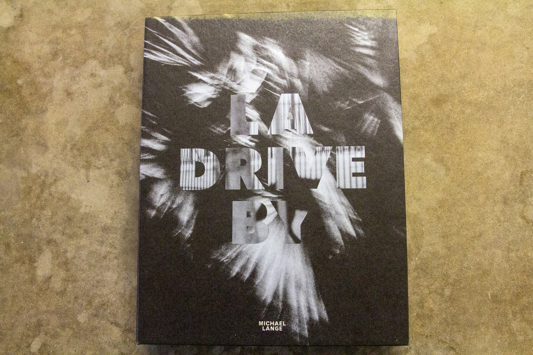
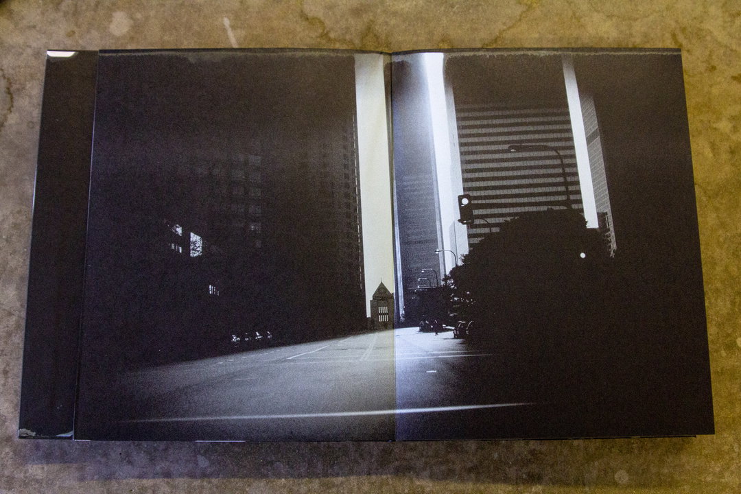
The cover of a book features a blurred, high-contrast black and white image of a figure in motion. Bold, distorted text across the centre reads “A DRIVE BY”, with the name “MICHAEL LANGE” at the bottom.
An open book displays a black and white photograph of a city street at night. Tall buildings flank a road, with a bright light illuminating a set of stairs and a dark silhouette of a tree.
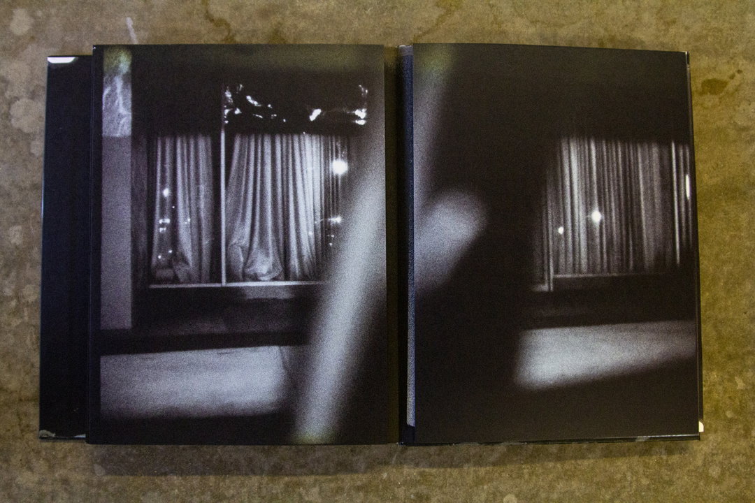
A black and white photograph across a two-page spread shows a view of a window with closed curtains. A blurred, light-coloured shape cuts vertically across the centre of the composition.

LA Drive By

This book by German photographer Michael Lange documents isolation and desertedness in Los Angeles. The project was shot from 1996-2001 entirely from a car using Polapan35, which explains the varying levels of clarity in the images. Rather than a cliche-heavy trip along sunset boulevard, this series draws you into the darker and less seen corners of the city of angels.
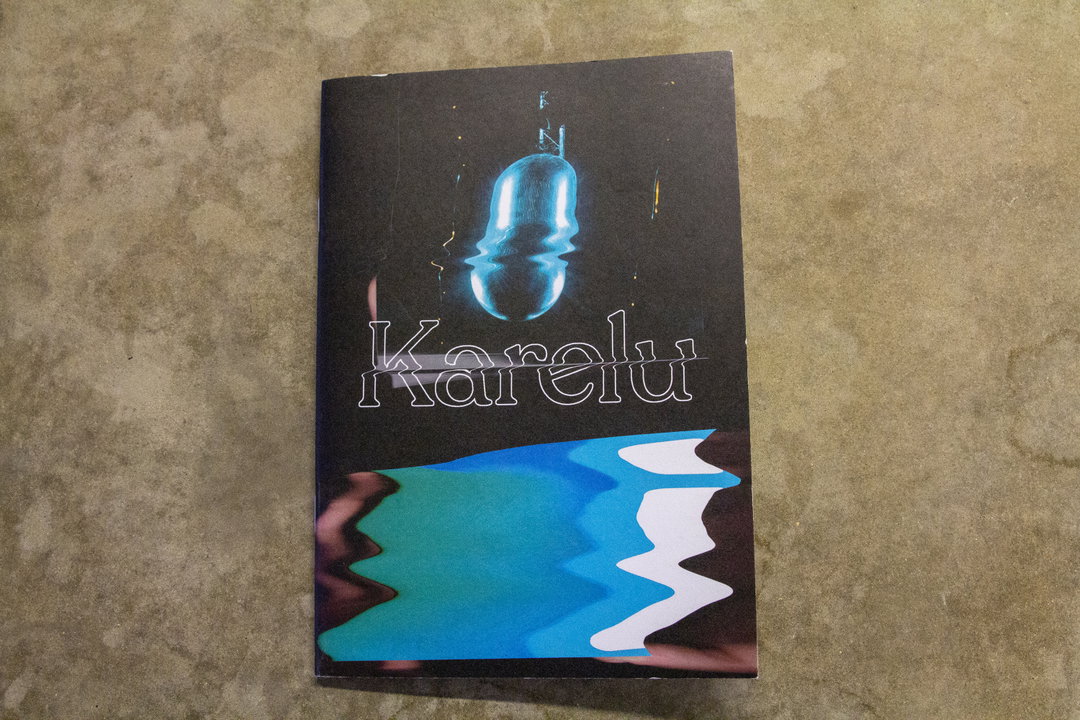
A book cover featuring a glowing blue pill floating against a dark background. The word “Karelu” is written across the centre in a white, outlined font.
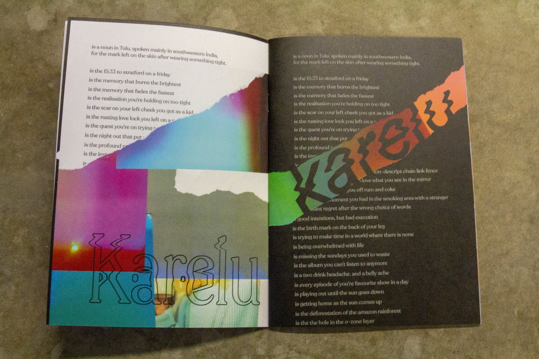
An open book showing a poem across two pages. The left page features a colourful, blurred gradient image with the word “Karelu” printed in a light blue serif font.
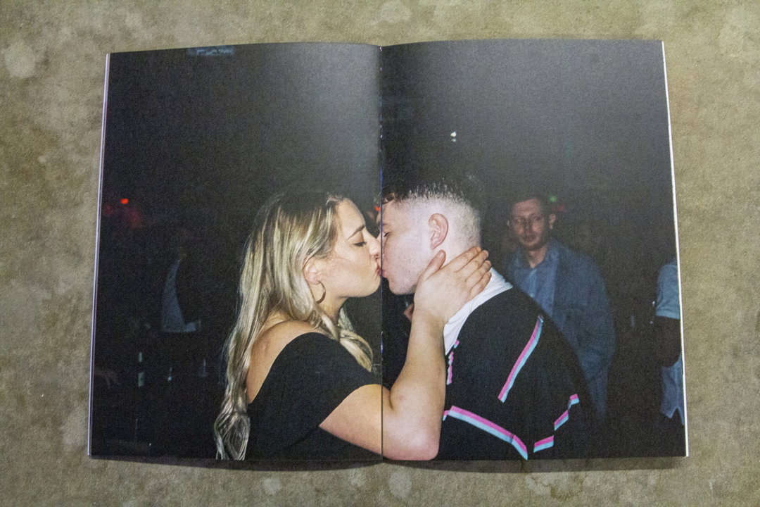
Two people kiss in a dimly lit room. One person wears a black off-the-shoulder top, while the other wears a black jacket with pink and blue stripes.

Karelu

In Tulu, a language spoken in southern India, “Karelu” means the mark left on the skin by wearing something too tight. This zine has been produced to coincide with the release of CJ Pandit’s debut single that shares the name, and looks to explore the marks that we leave on each other in a scrapbook-style collage of photographs and memories.
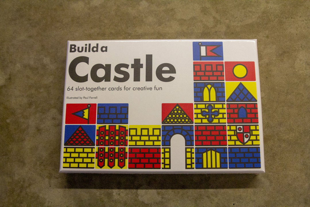
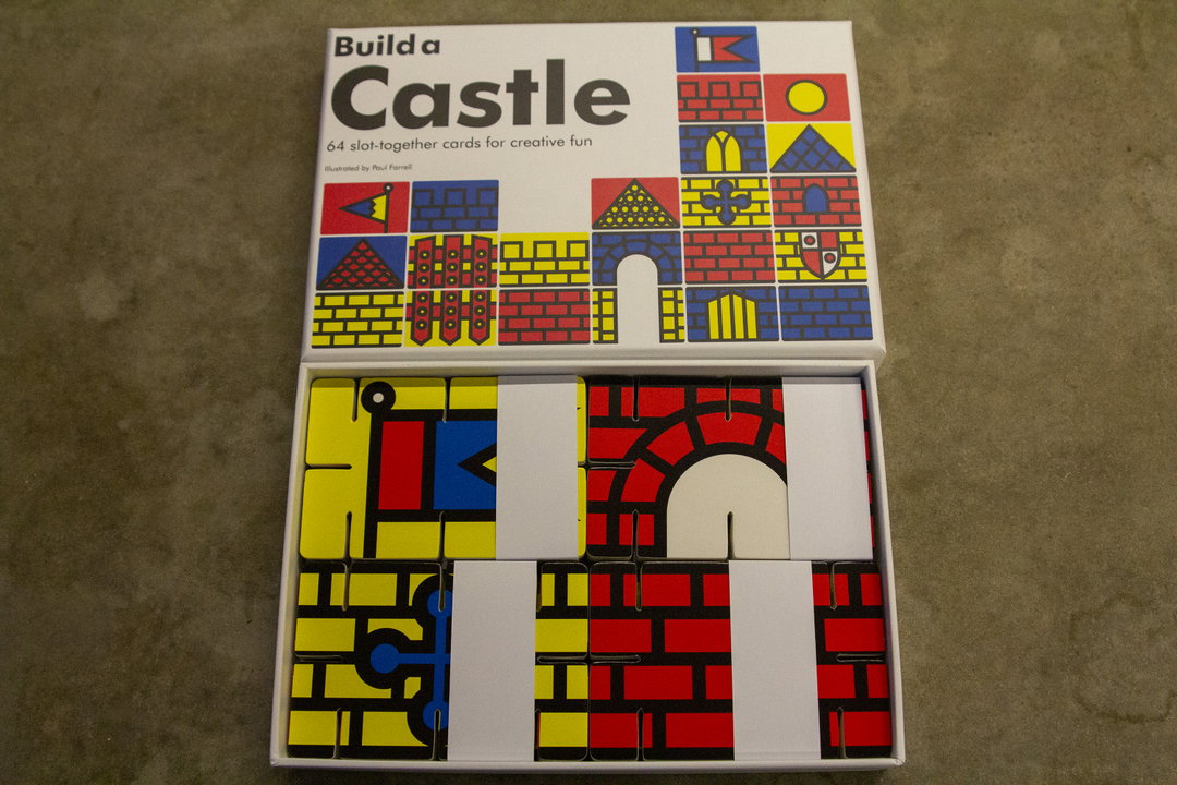
A white box for a card game reads “Build a Castle”. Below the title, text reads “64 slot-together cards for creative fun” and “Illustrated by Paul Farrell”. The bottom half of the box features a colourful grid of primary-coloured illustrations depicting castle walls, gates and towers.
An open box of a card game titled “Build a Castle”. The cover and the slot-together cards inside feature bold, primary-coloured geometric illustrations of castle walls, towers and flags.
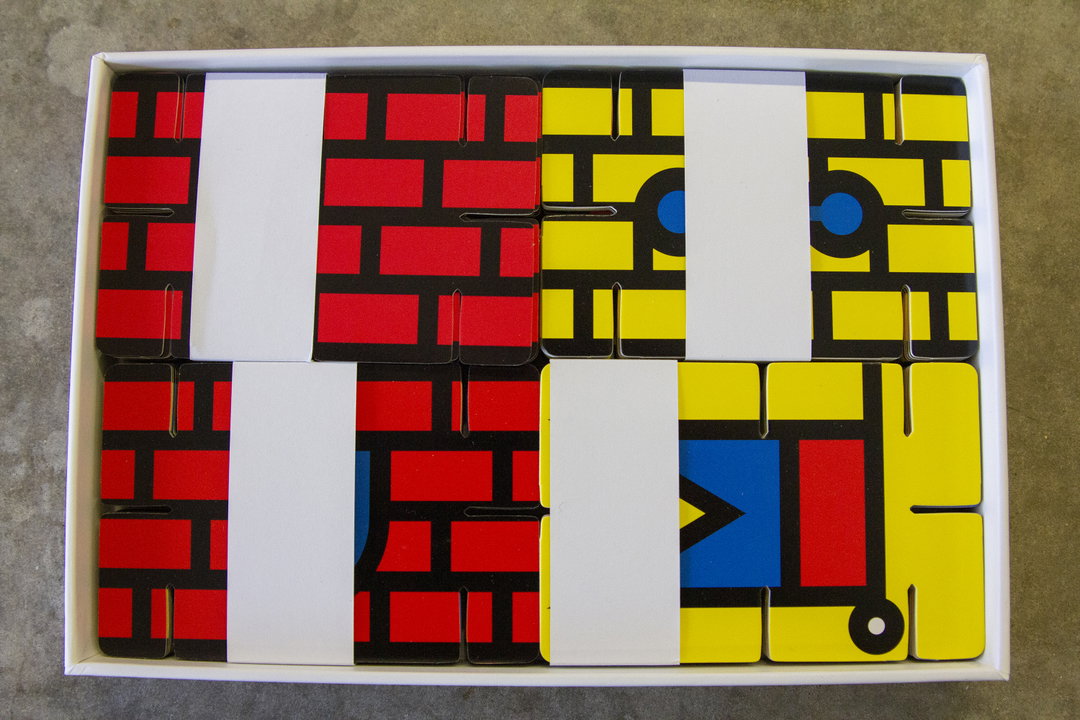
A set of rectangular cards arranged in a white box to form a grid. The cards feature bold red and yellow blocks with black outlines, creating a geometric, abstract pattern.

Build a Castle

This does what it says on the tin!

Building things is always fun (whether aged five or 55) and this simple set of 64 attachable cards gives you a multitude of options when it comes to designing your humble abode.
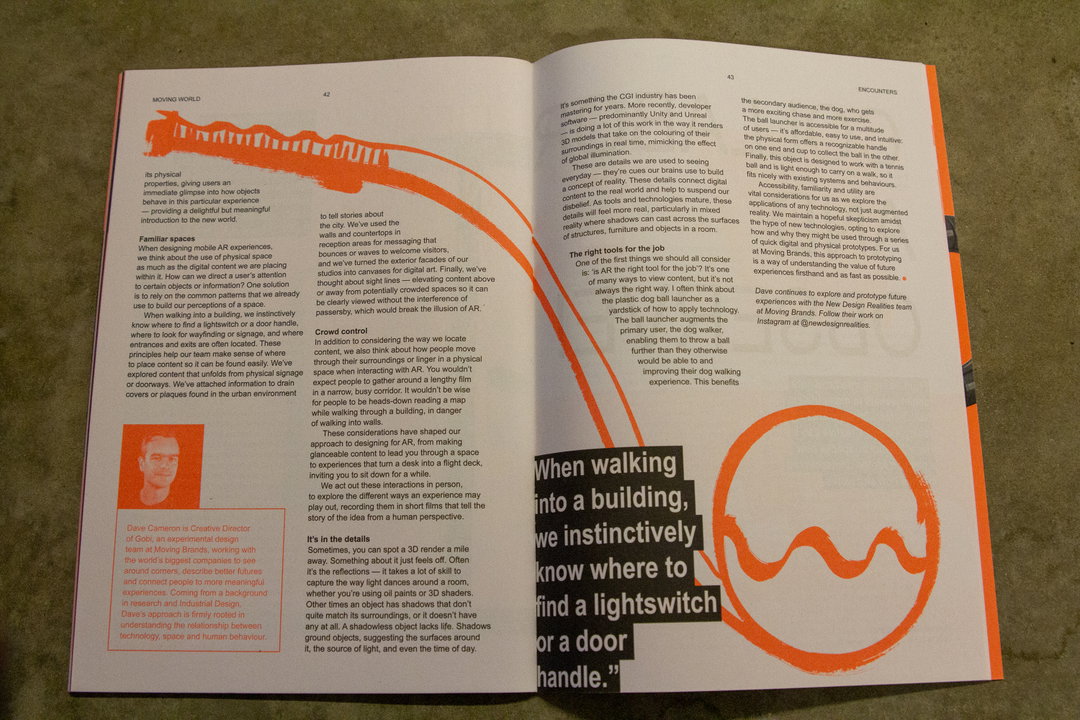
Two open pages of a magazine featuring a layout of text and a large photograph. The image shows a person standing in a bright, orange-walled room, looking at a digital screen. A large pull-quote on the right page reads, “When walking into a building, we instinctively know where to find a lightswitch or a door handle.”
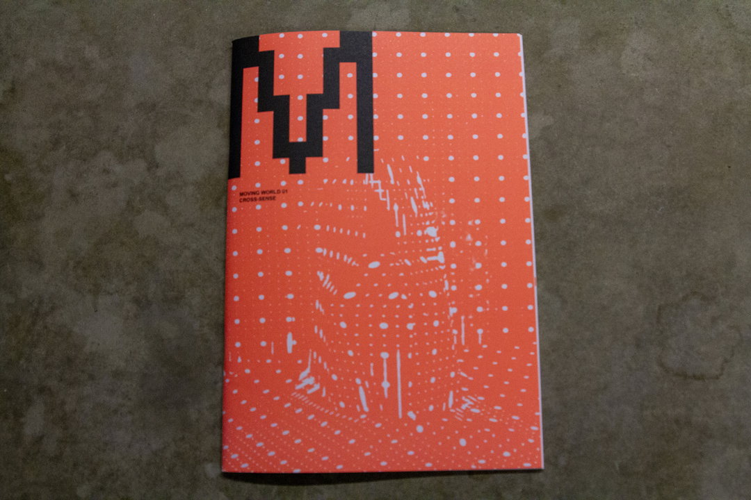
A bright orange book cover features a white dotted pattern and a large, black geometric shape in the top left. Small text below the shape reads “MOVING WORLD 01 CROSS-SENSE”.
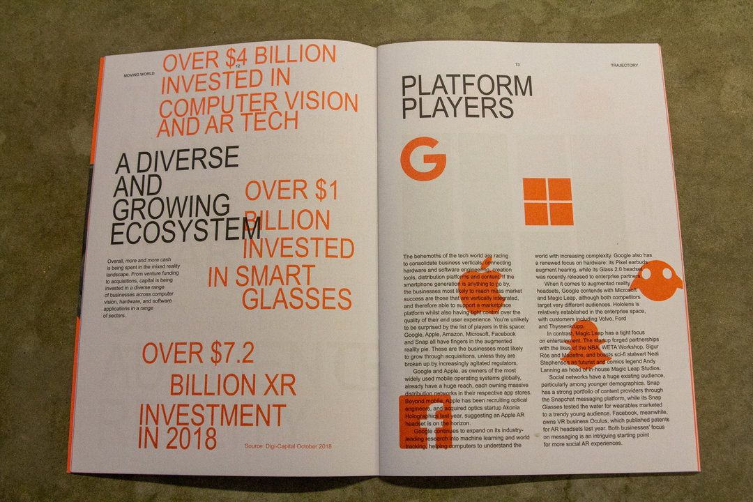
A page from a report featuring bold orange and white typography. Large headlines read “Over $4 billion invested in computer vision and AR tech” and “Over $7.2 billion XR investment in 2018”.

Moving World 01

This also focuses on augmented reality (AR) and the possibilities that it currently holds. The zine predicts that AR will one day fit seamlessly into day-to-day life, and features interviews with game designers, creative directors and artists that are at the forefront of this exciting medium. It also lists the most important technology in the field being made at the moment by businesses both big and small.
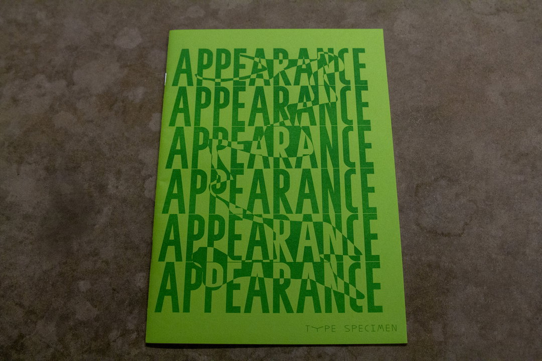
A lime green booklet features the word “APPEARANCE” repeated six times in a bold, sans-serif typeface. The letters are distorted with a checkered, mirrored effect. Small text at the bottom right reads “TYPE SPECIMEN”.
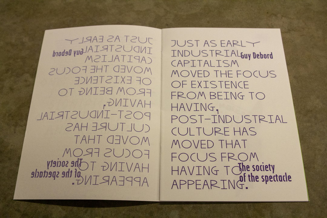
An open booklet shows a block of text on the right page and its mirrored reflection on the left. The text reads “Just as early industrial capitalism moved the focus of existence from being to having, post-industrial culture has moved that focus from having to appearing.” Small text tucked into the right margin reads “Guy Debord” and “The society of the spectacle”.
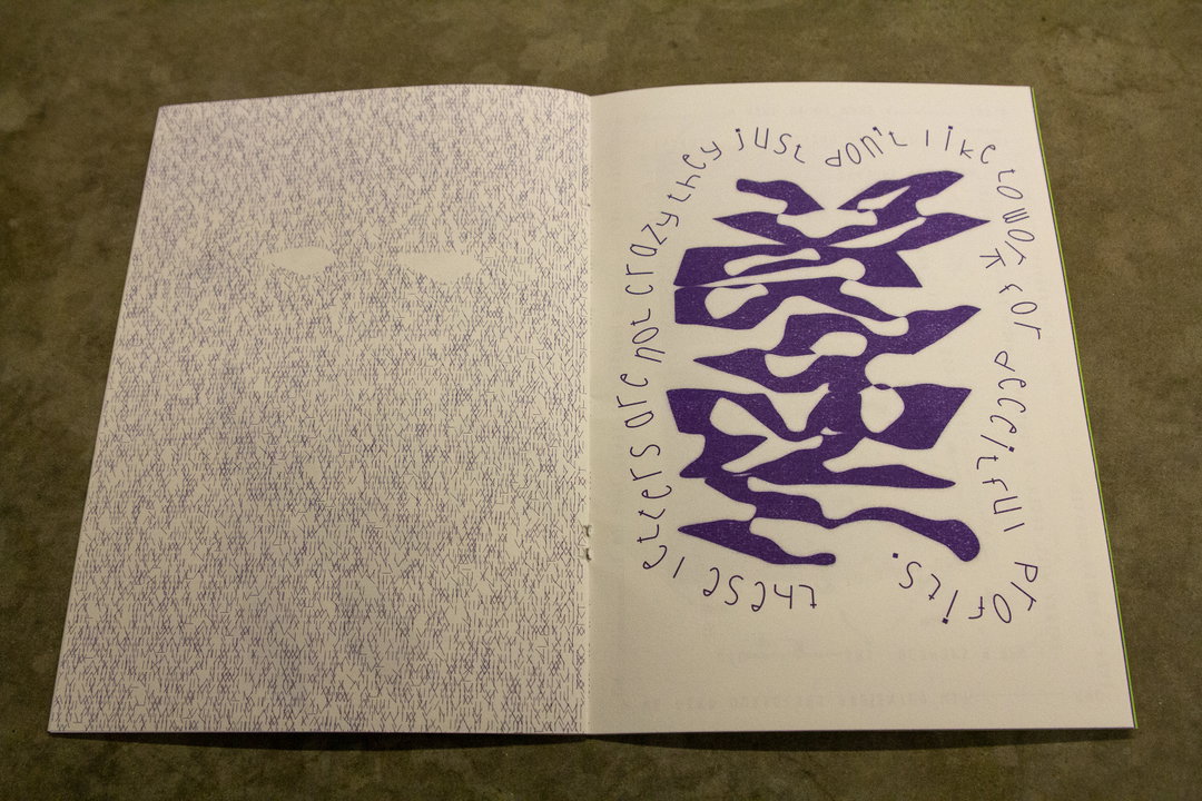
An open book shows a purple abstract shape surrounded by a circle of handwritten text on the right page. The text reads “these letters are not crazy they just don’t like to show the profile of its deceitful”. The left page is filled with a dense, grey textured pattern.

Appearance

This is a speculative set of typographic experiments by Dutch graphic designer Maartin Van Maanen. The main approach for this work was to look at it from the letter’s point of view, considering them each a separate entity with their own character. Merging the type with text and other elements such as sign language and illustration, he treats each letter as a living being and works off of the interactions that result.
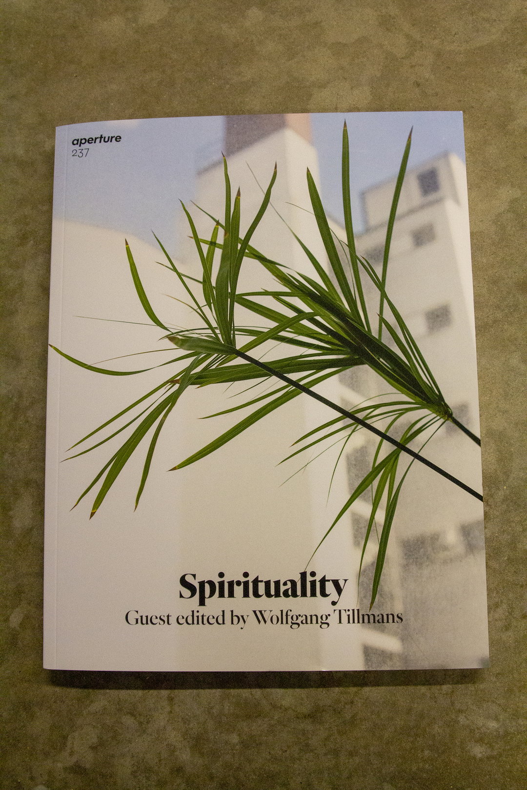
The cover of an Aperture magazine issue 237 features a close-up of green palm leaves against a pale building. Text at the bottom reads “Spirituality” and “Guest edited by Wolfgang Tillmans”.
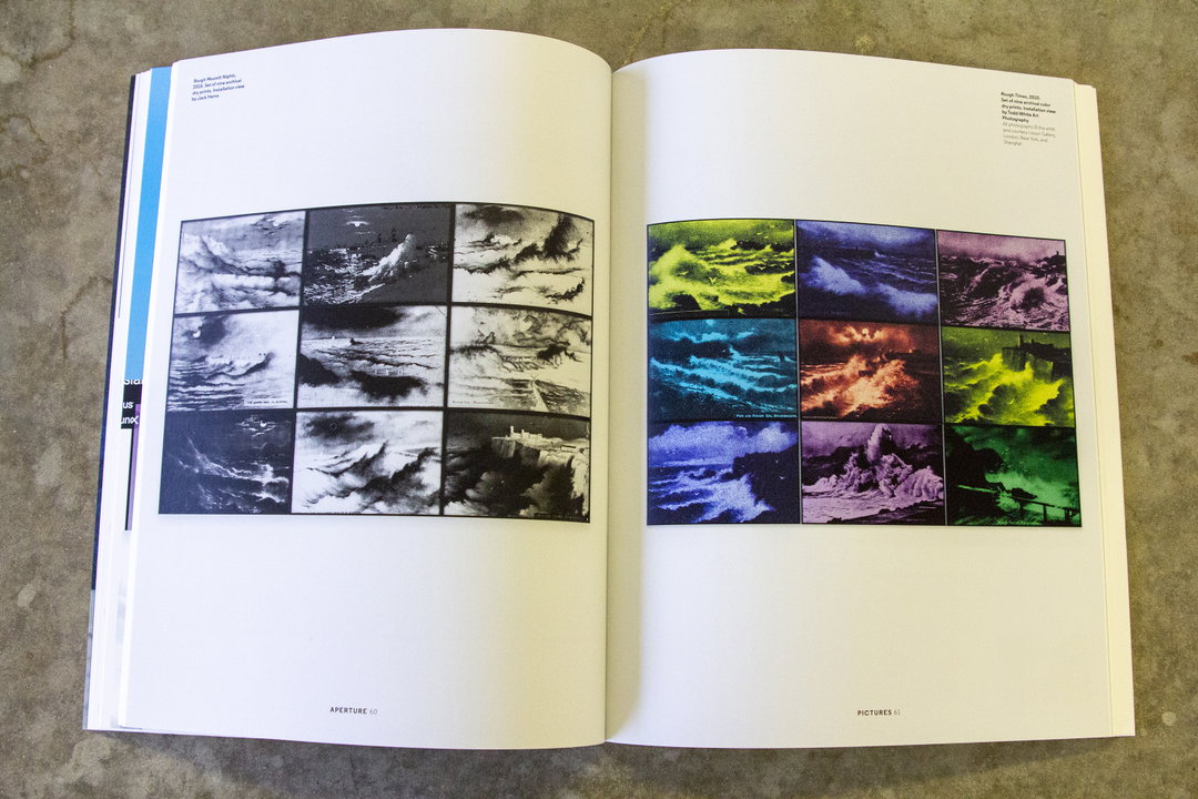
An open book displays two grids of nine small photographs. The left page shows black and white images of stormy seas and clouds, while the right page features similar scenes in vivid, saturated colours.
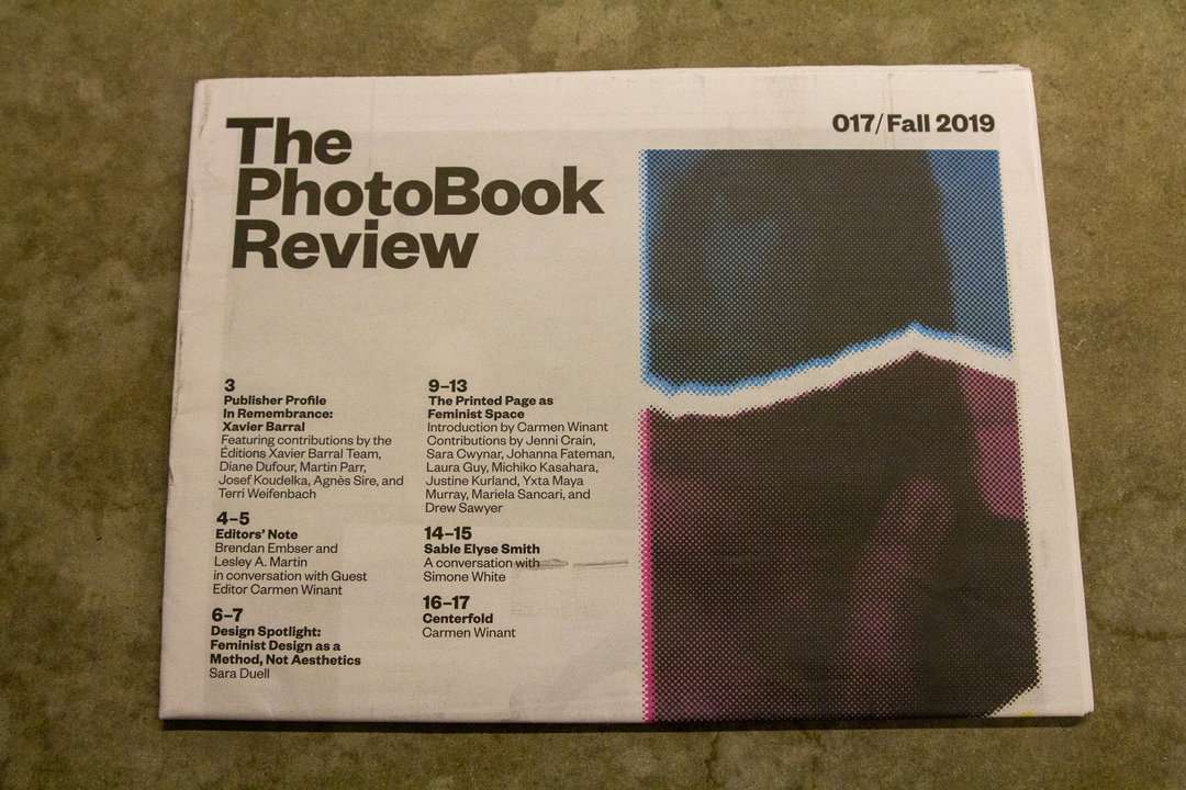
The front cover of a publication titled “The PhotoBook Review”, issue “017/Fall 2019”. A table of contents lists features on feminist design and a centerfold by Carmen Winant.

Aperture 237

This issue of Aperture is on the subject of Spirituality, and is guest-edited by Turner Prize winner, Wolfgang Tillmans. In the magazine, artists, photographers and writers explore how the captured image has represented the human quest for a spiritual connection. This encompasses a wide range of topics, from the second summer of love to rituals to space exploration.

Share Article

Further Info

About the Author

Charlie Filmer-Court

—

Charlie joined It’s Nice That as an editorial assistant in December 2019. He has previously worked at Monocle 24, and The Times following an MA in International Journalism at City University. If you have any ideas for stories and work to be featured then get in touch.

cfc@itsnicethat.com

It's Nice That Newsletters

Fancy a bit of It's Nice That in your inbox? Sign up to our newsletters and we'll keep you in the loop with everything good going on in the creative world.