Channelling personality into branding: Commission Studio on Fenty’s new visual identity
Style icon, actress, chart topper and now artistic director of her eponymous fashion house Fenty, Rihanna is a multi-faceted goddess of creativity. As artistic director of her latest venture, the pop sensation has overseen the new visual identity for her first fashion house and the task at hand presented no easy feat to the entrusted designers lucky enough to work on the job. But, highly praised for its previous work with the LVMH group, London’s Commission Studio landed the job. Founded by David McFarline and Christopher Moorby, the studio endeavoured to capture the essence of the internationally acclaimed artist through the Fenty brand which inspires to “clash, empower and include.”
Below, Commission’s creative director Christopher talks us through the new visual identity. Touching on what it was like to work with Rihanna herself, and how to contextualise a person of her celebrity into an identity, the founding designer discusses the creative process in delivering designs that combine contemporary graphics with a traditionally luxurious application.
Commission Studio: Fenty, photography by Luke Evans
It’s Nice That: How did you come to work on the Fenty visual identity with LVMH group? No doubt this is an extremely competitive job!
Christopher Moorby: We were put forward for the job by the LVMH strategy team based on the success of our ongoing brand identity work with Rimowa. Our previous work with LVMH also includes the rebrand of DKNY and the launch of their own maisons: Clos19 and Thélios (the group’s in-house eyewear manufacturing plant). We were selected by Rihanna from a shortlist of two agencies.
INT: Do you approach a project of this stature like any other, or is there more pressure on a monumental job like this?
CM: The creative pressure is much higher with a job like this because we’re working with an artist operating at the highest echelon of creativity in popular culture. Most of the time people are coming to us for our specific taste and vision – often helping them figure out their own vision for their brands. Rihanna literally defines taste and dictates trends across the globe. She is a very creative artist with very specific tastes and she has access to advice from some of the most influential creative minds in the world. You don’t go into a job like this telling her what her brand needs to be. Our job, in this instance, is to listen to her and then realise her vision through a visual identity.
INT: How did you approach the visual identity for Fenty? How did you interpret Rihanna’s existing brands for today’s market and the future?
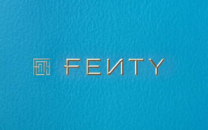
CM: This is a completely new brand – a fashion house – but it possesses a legacy in its name due to Rihanna’s existing businesses; Fenty Beauty (her cosmetic line) and Savage X Fenty (her lingerie line). As Fenty Beauty was also created within the LVMH group, it made sense to carry over the defining feature from that logo – the reversed “N” – to create some continuity.
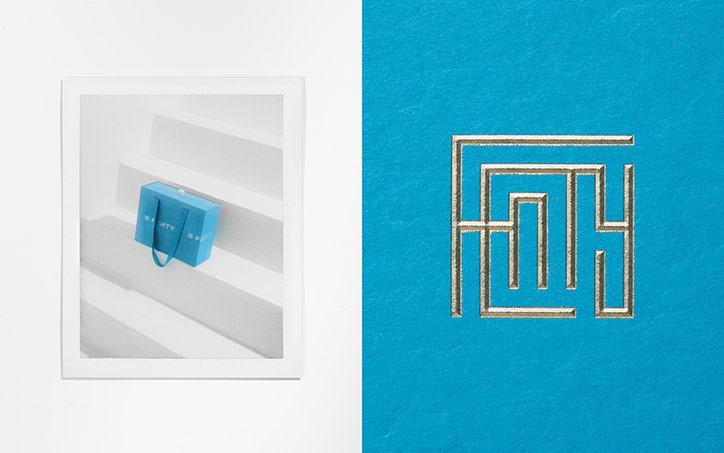
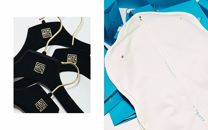
Other than the N, the branding was a clean slate. We wanted to create something distinctive, but timeless. The logo – known as The Maze – was inspired by the traditional monograms of luxury houses, combining all the letters of the name. The result of working with such geometric letters created a monogram that felt something like a maze of circuitry. I think it complements the complexity of her character.
Commission Studio: Fenty, photography by Luke Evans
INT: What kinds of things did you look at for research? Did you listen to any of Rihanna’s music to translate the feeling of the artist into the product?
CM: First off, we met her and listened to her talk about her vision for the brand. She explained what she likes about other brand experiences, and also what she doesn’t want. This was not an exercise in creating a fashion brand for Rihanna the music artist. This is a brand from Robyn Rihanna Fenty, the style icon turned creative director.
So there was little we could take from her music, but we could channel her personality into the branding. For example, the shopping bags feature the classic polished logo application – a gold diamond bevel emboss – but repeated randomly like a news ticker around the bag; nonchalantly offset and uncentered. Also, it’s on this unexpected cyan blue. The identity catches that clash and tension in her own style; sweats with pearls, denim and stilettos. It’s taking the classic codes of luxury and twisting and bending them into something new and unexpected – much like how she wears her clothing.
INT: What was Rihanna like to work with on the several occasions you met with her? Does she have a keen eye for design and typography?
CM: She’s an incredible creative to work with. She knows exactly what she wants, but trusts fellow creatives to do their job and listens to their advice. She’s focused and engaged at all times. She doesn’t say no to anything, because it disrupts the creative momentum, but instead locks in on stuff she loves that could be pushed further. The meetings were informal and fun.
She has a keen eye. I remember her picking out an ad mockup from our first meeting. It featured a close up face shot of a non-binary punk artist with the logo ticker running across the image. Rihanna singled it out from a lot of stuff and said “Yes! This is HARD AF! This is what this needs to feel like.” It was by far the most progressive thing in the deck, and she honed right in on it.
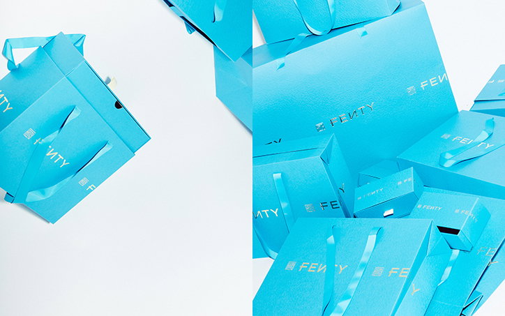
Commission Studio: Fenty, photography by Luke Evans
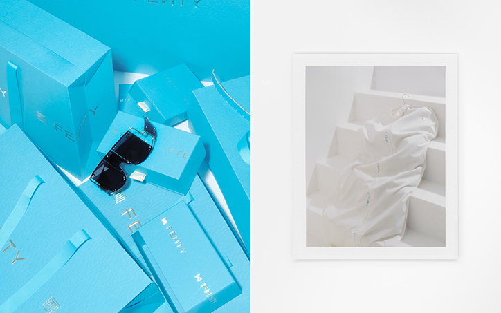
Commission Studio: Fenty, photography by Luke Evans
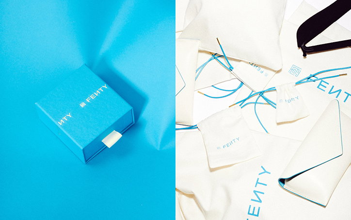
Commission Studio: Fenty, photography by Luke Evans
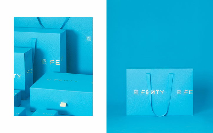
Commission Studio: Fenty, photography by Luke Evans
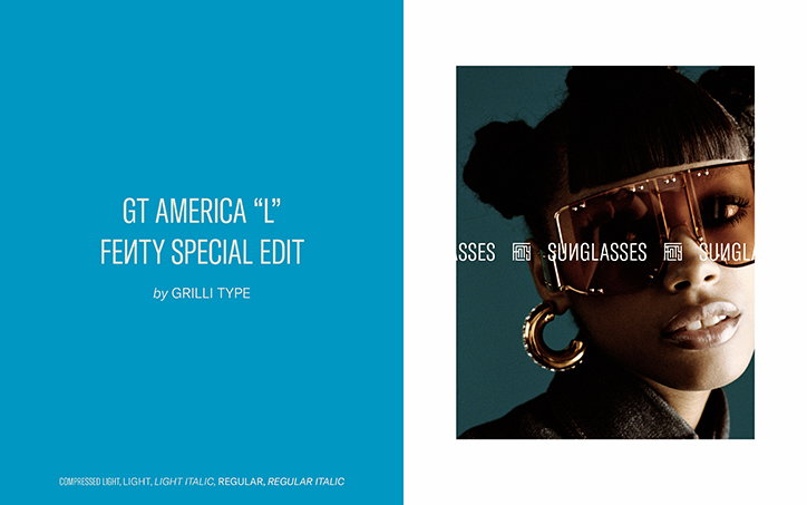
Commission Studio: Fenty, photography by Jack Davison
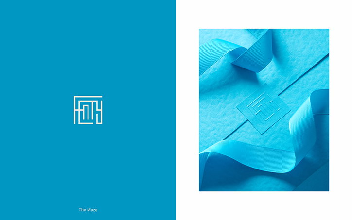
Commission Studio: Fenty, photography by Luke Evans
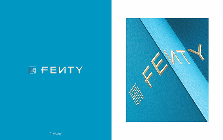
Commission Studio: Fenty, photography by Luke Evans
Share Article
Further Info
About the Author
—
Jynann joined It’s Nice That as an editorial assistant in August 2018 after graduating from The Glasgow School of Art’s Communication Design degree. In March 2019 she became a staff writer and in June 2021, she was made associate editor. She went freelance in 2022.