Christian Jánský on how he learned type design by “tinkering with technology”
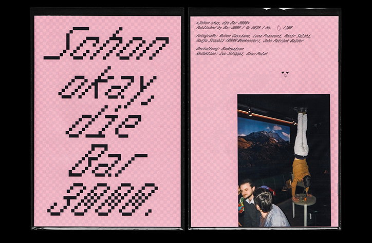
“Be it a typeface, a poster or a website, I especially relish the trial and error phase in every project,” says Brno-based designer Christian Jánský. “Actually,” he continues, “some of the most entertaining concepts I’ve made came out rather unintentionally whilst trying to make something else work.” Having studied computer engineering at high school before gaining a bachelor’s and master’s in digital design – as well as spending many an hour playing video games – Christian came to graphic design in a somewhat convoluted manner but now runs Kometa, a design studio combining “tongue-in-cheek conceptualism with a contemporary finish” to produce typefaces and websites.
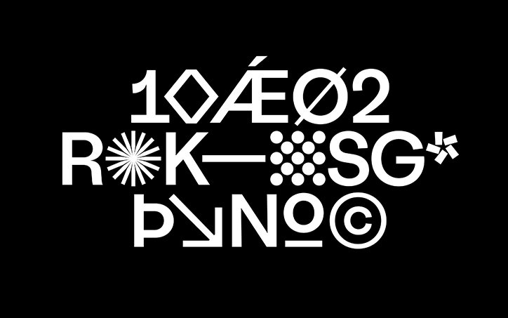
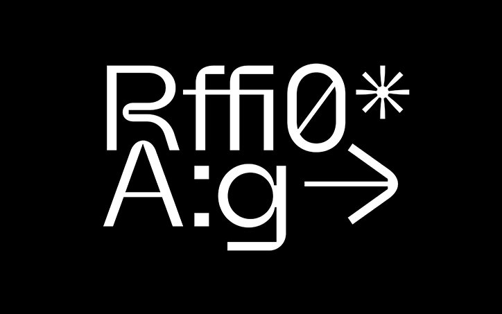
Christian’s technical background is clear throughout his portfolio. Typefaces are precise and well-built but always feature a certain sense of personality; a quirk in the form of an unusual counter or a distinctive use of thicks and thins in one letter. This, he describes, is thanks to his lack of conventional type design education: “I owe it to fiddling with software that gradually evolved into what’s now Kometa.” As with many self-taught creatives, producing work for Christian is therefore synonymous with some form of exploration. “Rather than a style I try to adopt a carefree attitude towards tinkering with technology,” he explains. “To use Louis Kahn’s words: I am drawing to find out, seeing where the medium can take me this time around.”
Kometa
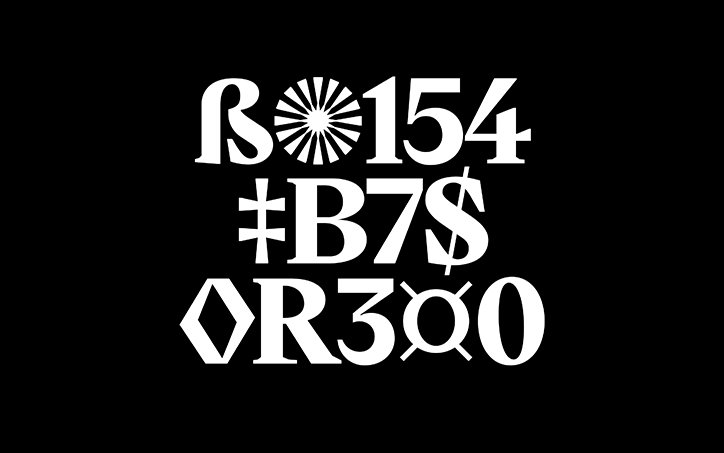
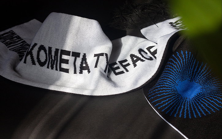
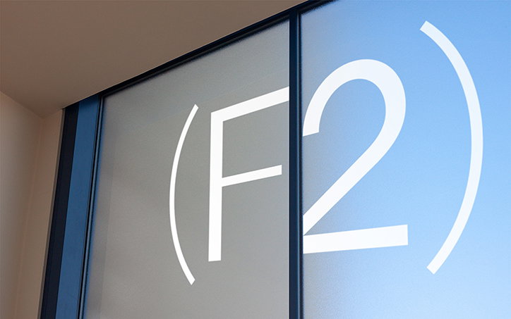
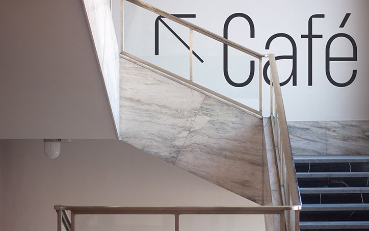
While he works on individual projects, Kometa itself, he tells us is an ongoing project “on shaping the perception of how a traditional typeface studio can present itself.” The studio is “an amalgamation of Brno’s mid-century functionalist ideals and progressive thinking named after a local hockey club.” The former is something Christian is “deeply passionate” about, whereas the latter is somewhat of an ironic joke considering the designer’s indifference to the sport despite its popularity in the city. This fusing of concepts is typical across Christian’s portfolio where he toes the line between referencing historic work and building something original on top of it.
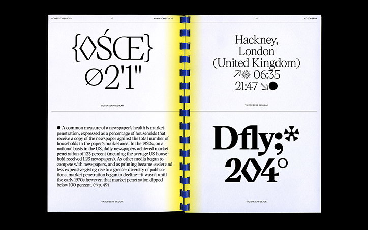
Take his recent release, Victor Serif, for example. The foundry’s first commercially available serif, it “pays homage to the now ubiquitous icon of newspaper type that came to be an inseparable backbone of modern desktop publishing” ie Times New Roman. Inspired by the classic font, Christian took “artistic license” when working with the letters, tweaking them to see what they would look with without balls AKA circular terminals.
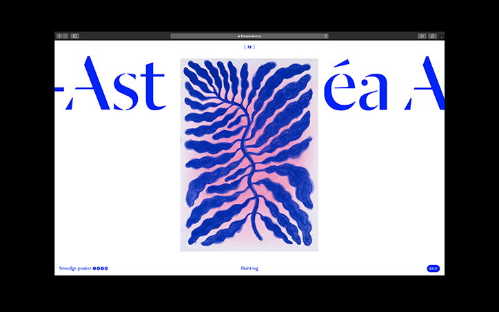
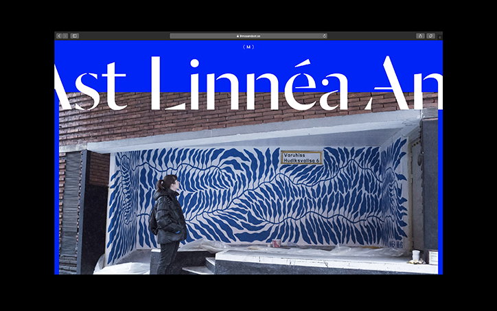
In terms of his non-type-related work, Christian references a recent project creating the portfolio site for Gothenburg-based illustrator Linnéa And-Ast as one he particularly enjoyed. “I’ve had a lot of fun crafting [her] portfolio… trying to compliment her sense of refined, yet lively shapes and signature use of colour.” The result is a dynamic site featuring moving type and a larger cursor which morphs through shapes to invite interaction. Despite somewhat gregarious graphic elements, the site still manages to pull focus to Linnéa’s work, complementing its style through the look and feel of image slideshows and animated transitions.
Kometa
Kometa
Kometa
Kometa
Kometa
Kometa
Kometa
Kometa
Kometa
Kometa
Kometa
Share Article
Further Info
About the Author
—
Ruby is Senior Creative at It's Nice That, overseeing our visual output across platforms and projects. Before that, she was associate editor on the editorial team, after joining in September 2017 following graduation from Central Saint Martins.