A history of colour is a history of us: Inside the new Taschen book on four centuries of colour theory
From its rooting in scientific advancements to the first illustrated book on colour being made by a woman, art historian Alexandra Loske presents a four centuries survey in The Book of Colour Concepts.
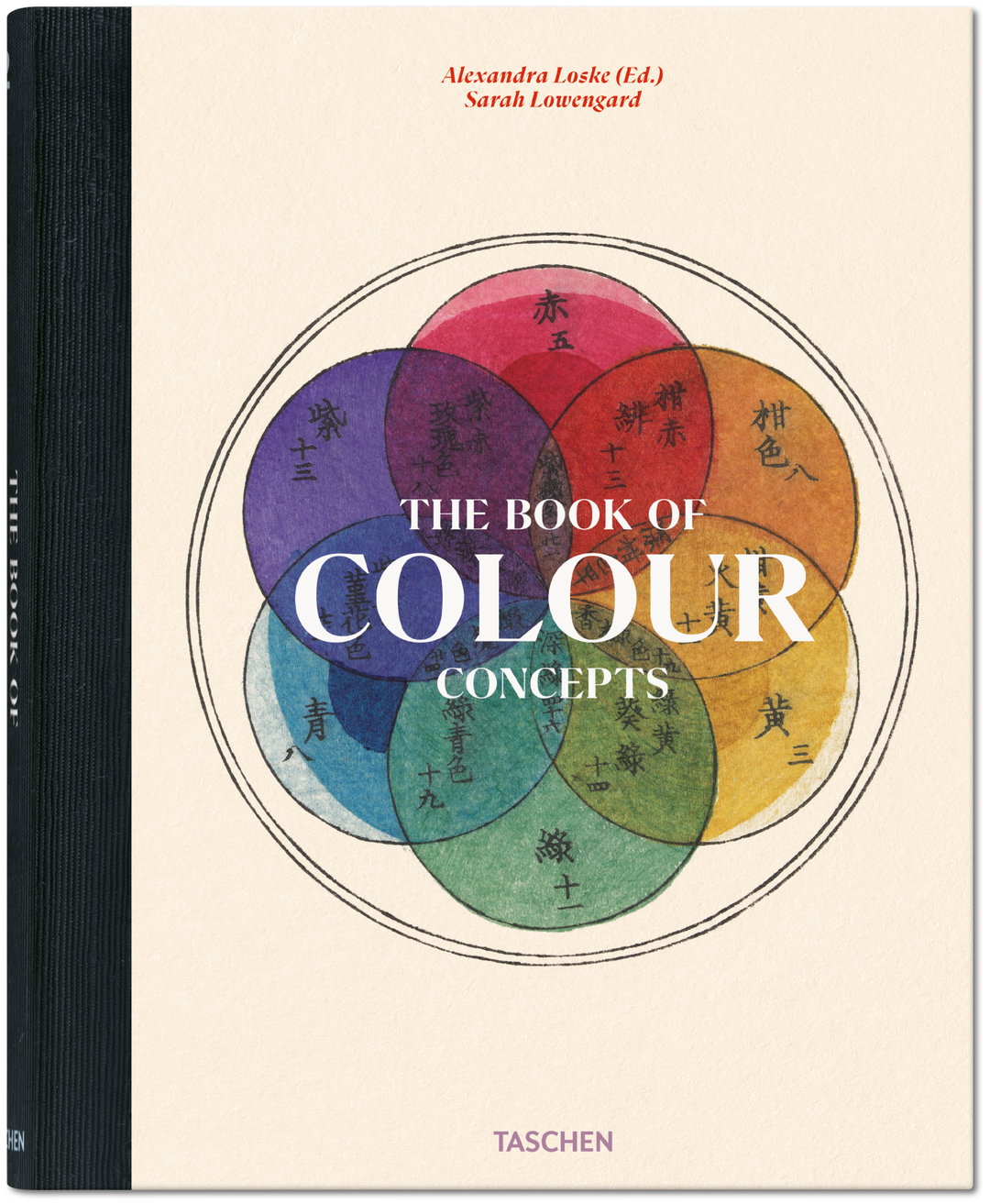
Colour classification is one of the many manifestations of our desire to order things. It’s not enough for something to be pink – because we love specificity – we must be clear about whether what we’re seeing is fuschia, watermelon or the oldest colour of them all, bright AKA the often dubbed, Barbie pink. Classifying these varying shades isn’t just a result of a nitpicky urge though, it’s evidence of our love for nature, art and history; terracotta gets its name from a long history of earthenware, and sage green is named after the leaves of the healing plant. In a new Taschen book, The Book of Colour Concepts, Alexandra Loske lays context to our long dance with visual stimuli and why we find the colours beneath so enticing.
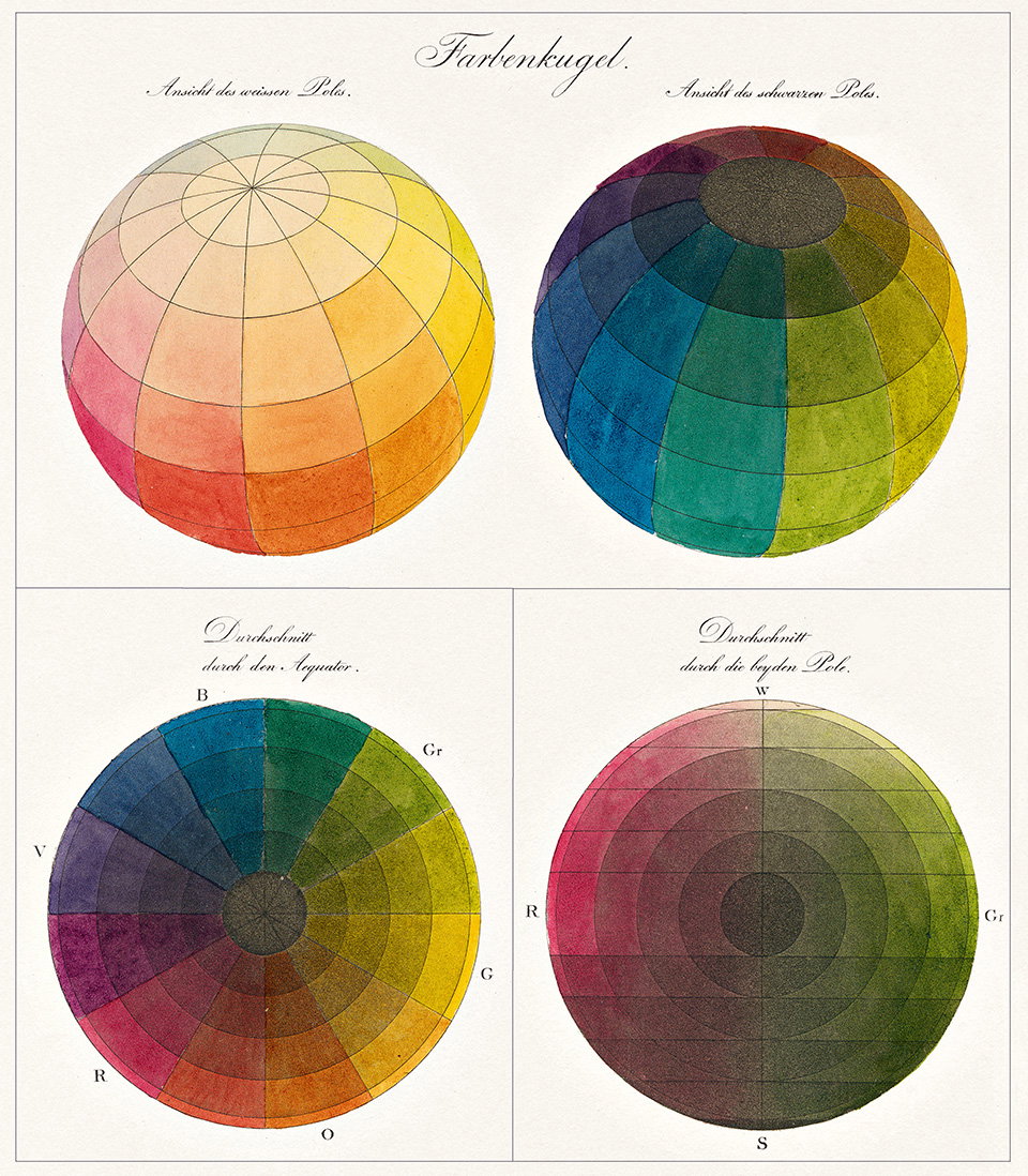
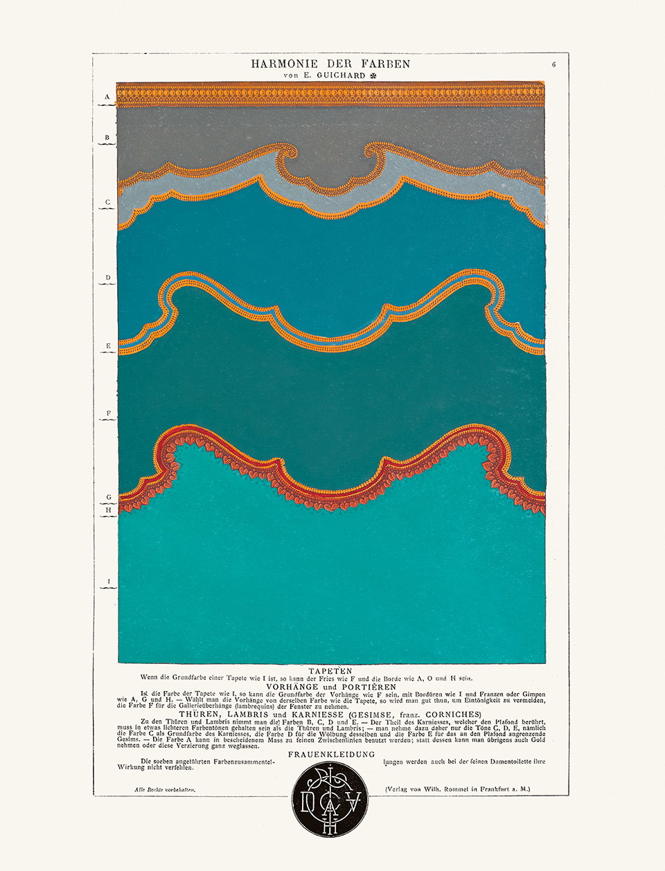
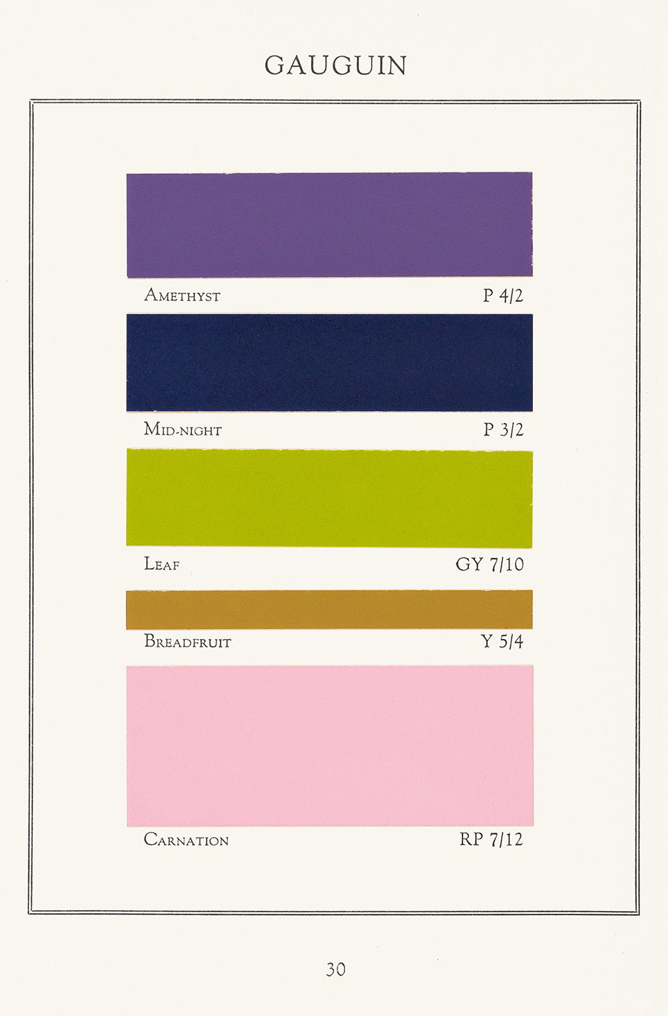
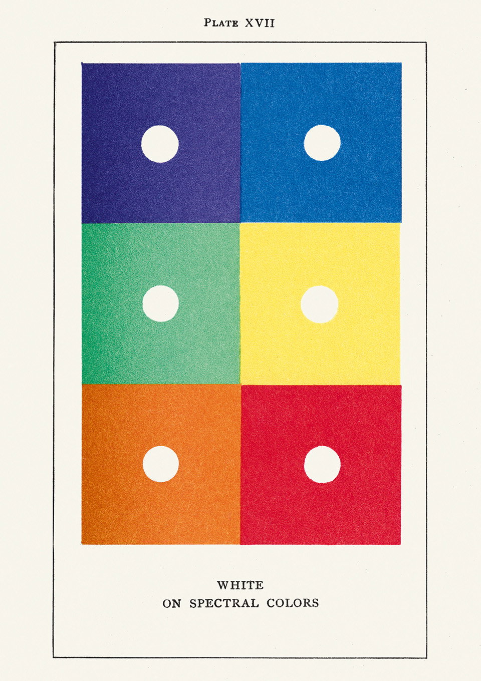
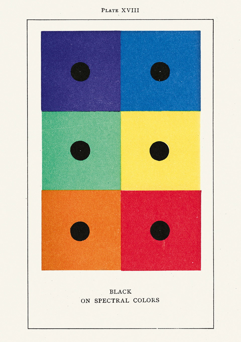
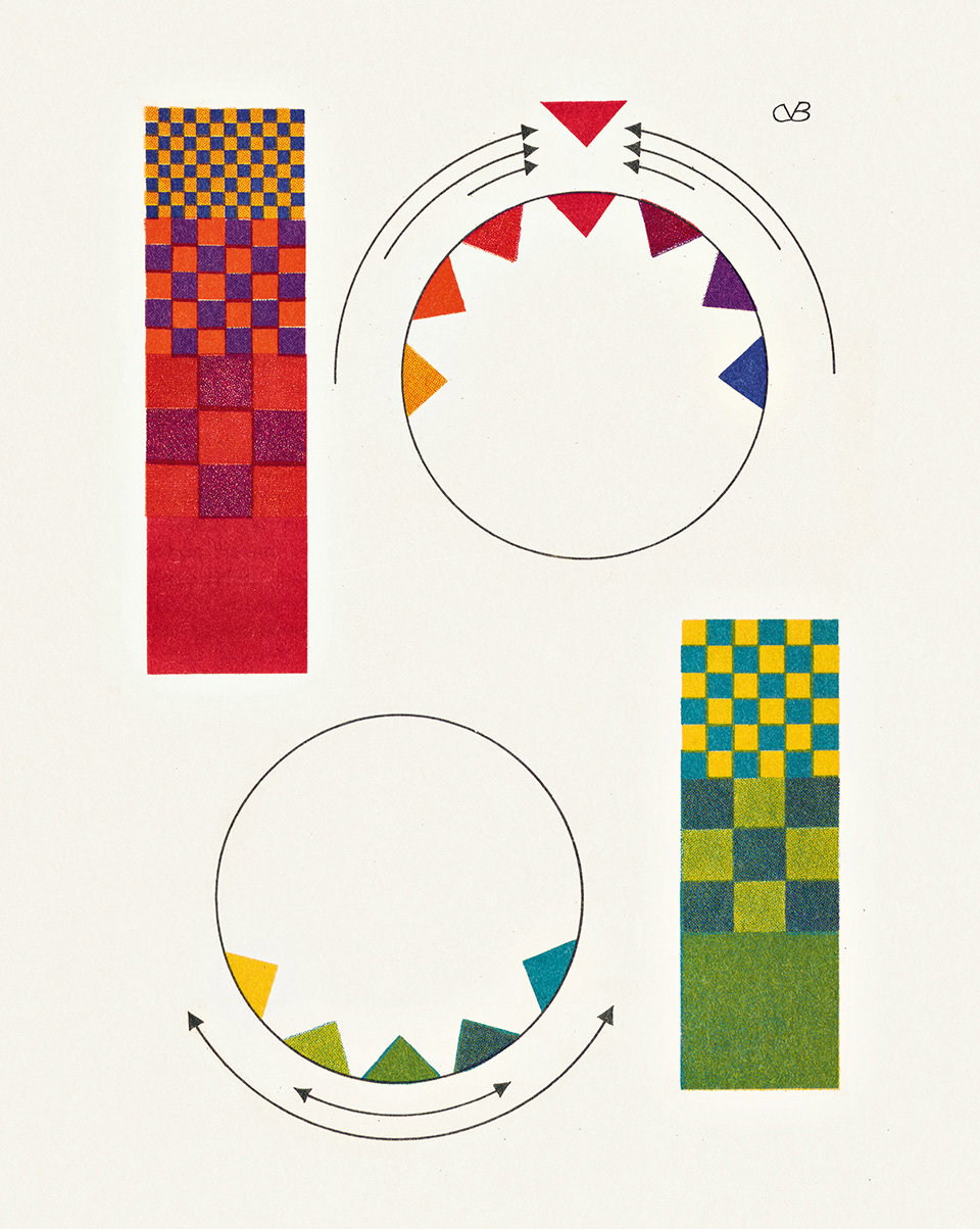
When thinking about colour’s expansive history, Alexandra describes it as “an essential part of our intelligence” and “probably also our desire to control and understand the world around us”. But despite the yearly expansion of colour classification it is still a somewhat “intangible phenomenon”, she tells us. Throughout the book, the author presents a myriad of artworks and colour diagrams that themselves look like artworks. The colour diagrams were inspired by her early interest in the relative tool and why she began collecting charts, wheels and old paint boxes. “I think much of the appeal lies in the abstract quality of them, although some reveal their age through how they are made, labelled or decorated,” she adds. The art historian found the diagrams to have an underlying focus on colour filing squares, circles or segments of geometrical design, making the complex systems appear contemporary and “even timeless”.
For Alexandra, some particularly timeless colour systems include Patrick Syme’s colour charts and Moses Harris’ 18th century colour wheel that we’ve all become familiar with. “Syme’s Werner Nomenclature from 1814 because it’s simple and elegant, we can almost imagine creating something similar ourselves; the vividity of colour diagrams plays a part here, and is particularly effective in design, print culture and on screens,” she tells us. “And Harris’ wheels look great on social media or as a poster. Colour diagrams are well suited to the digital age,” she adds.
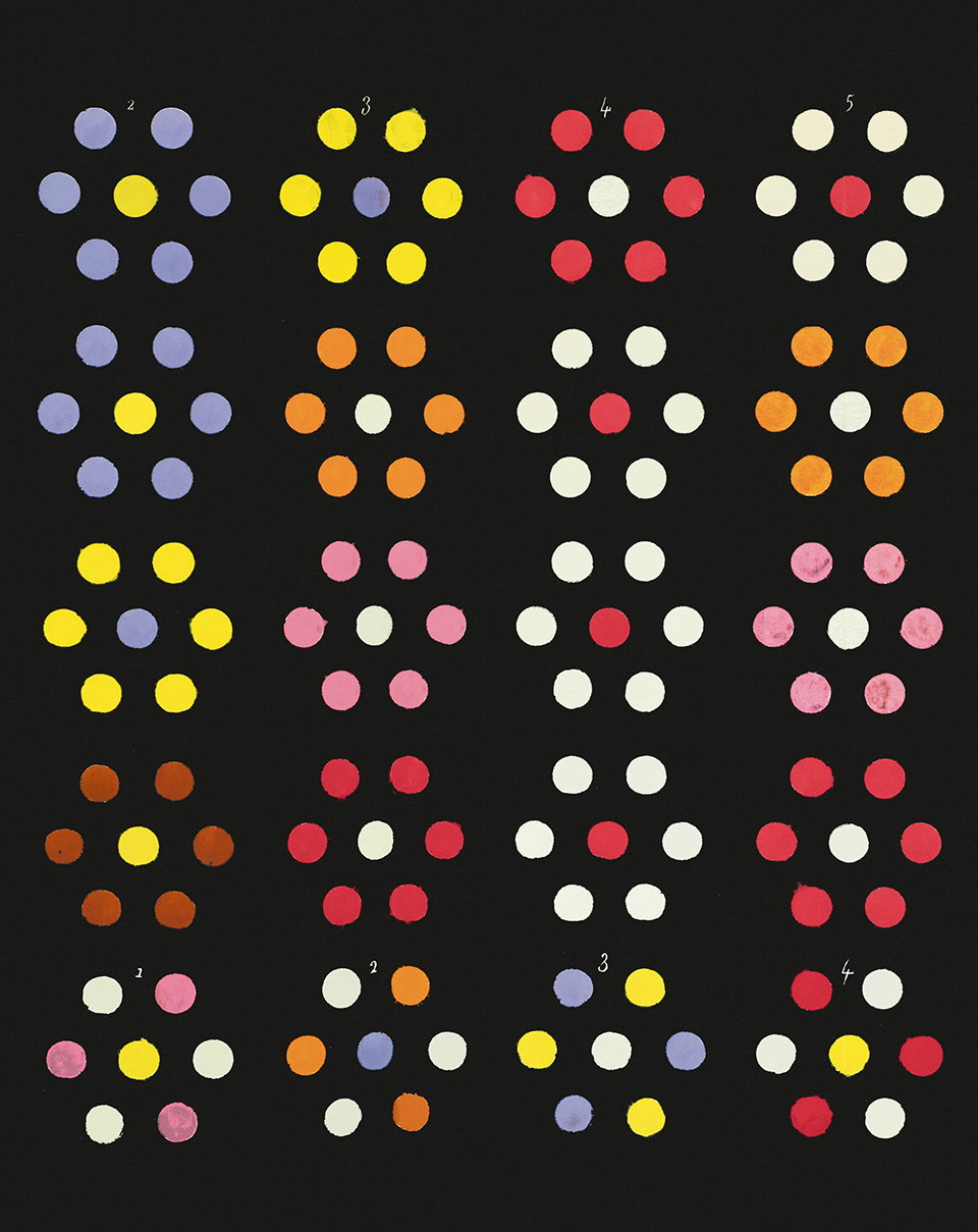
Alexandra Loske / Taschen: The Book of Colour Concepts (Copyright © Taschen, 2024)
So how does one collate such a huge topic? By focusing on how colour theory has developed with us. Throughout the book, Alexandra presents these changes as being gradual, changing and growing with print culture, developments in science, and changes in taste. “You could call the latter aesthetics, but it is about more than fashion,” she tells us. She instead renders colour’s use as more or less symbolic, “meaning that significance has been attached to particular colours, but if you dig deeper, you realise that often these associations are linked to materiality and which colours were available, or to what extent the properties of light were understood.”
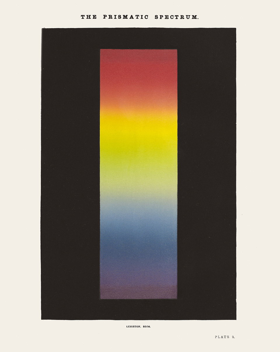
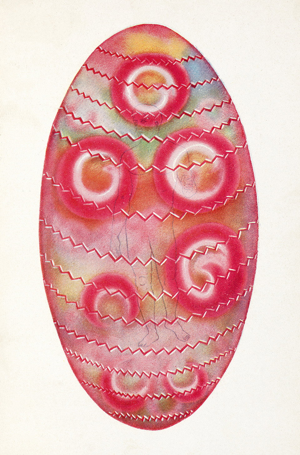
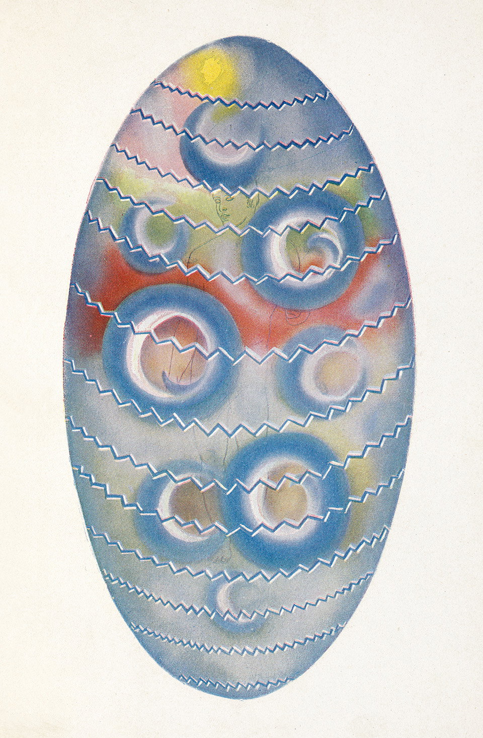
This concept is then articulated through a series of historical milestones, that we have all engaged with and that I hadn’t particularly thought about as a study of colour before, perhaps because we usually assign them solely to the scientific advances they sit under. Examples include Isaac Newton’s unveiling of the rainbow which offered us an understanding of how light creates colour and the theosophists and spiritualists of the early 20th century’s use of individual colour systems in their published works. “By then [the early 20th century] colour had become easily available and creating colour image in books and magazines had become considerably cheaper than before,” Alexandra shares. “I love how this led to writers and artists becoming much more experimental and daring in their discussions and use of it,” she adds.
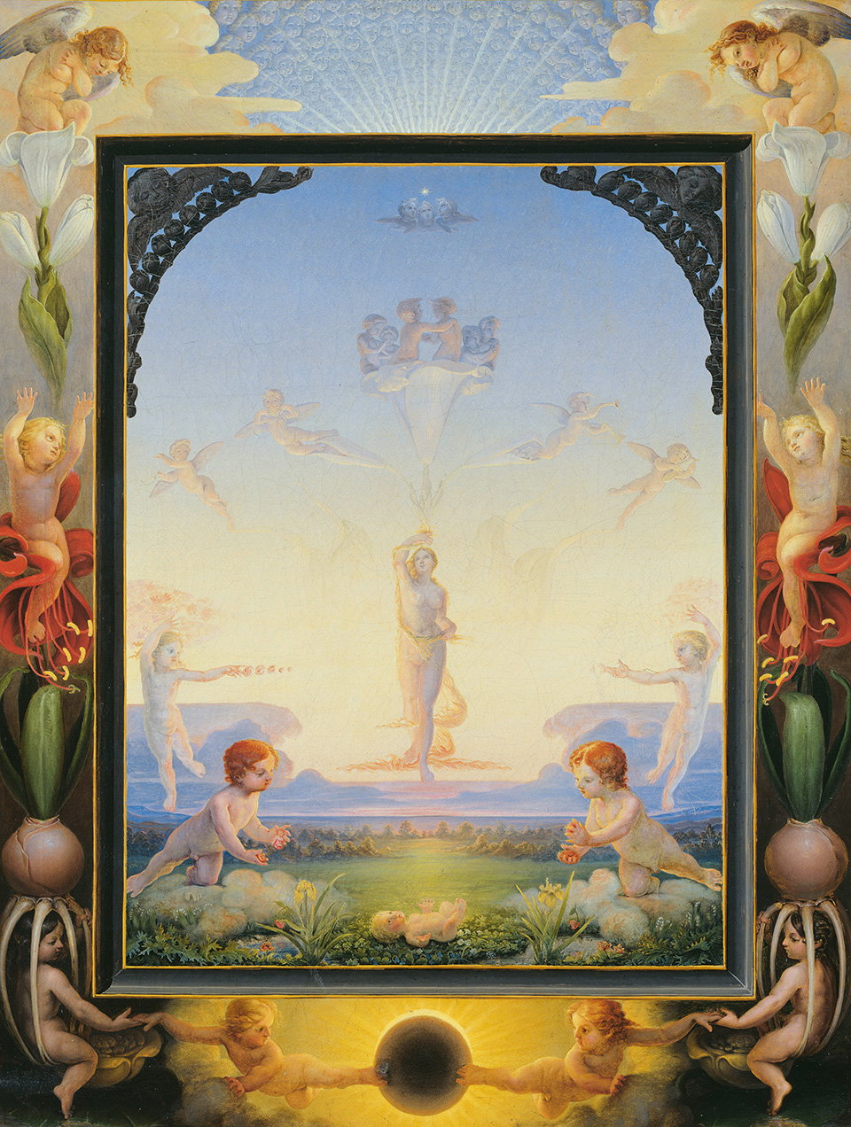
Alexandra Loske / Taschen: The Book of Colour Concepts (Copyright © Taschen, 2024)
The historical survey includes an avid exploration of contributions made by women, one of which makes up Alexandra’s favourite in the book. “Mary Gartside,” she shares, “not just because she is probably the first woman who published an illustrated book on colour in 1805, but because she surprises us with something unique and radical: her illustrations include a set of abstract, freely painted colour blots that look like bunches of flowers seen through a gauzy veil, or with myopic eyes. They are stunning in their novelty and beauty, and surrounded by some mystery. Who was Gartside? Why could she publish? Who painted all these blots? Why did she not choose a diagram, but opt for freely painted shapes?”
The Book of Colour Concepts makes something that could be easily mistaken as niche and minimal, an expansive topic with maximum effect. Colour is everywhere, in every work of art, film, print and design. While it was once hard to access, its use has now become such a part of daily creation that we can now render it second nature. Alexandra does the work of making its history that bit more accessible too – growing as we do.
The Book of Colour Concepts by Alexandra Loske is out now, published by Taschen.
GalleryAlexandra Loske / Taschen: The Book of Colour Concepts (Copyright © Taschen, 2024)
Hero Header
Alexandra Loske / Taschen: The Book of Colour Concepts (Copyright © Taschen, 2024)
Share Article
About the Author
—
Yaya (they/them) was previously a staff writer at It’s Nice That. With a particular interest in Black visual culture, they have previously written for publications such as WePresent, alongside work as a researcher and facilitator for Barbican and Dulwich Picture Gallery.