




Aiqi Zhang on the benefits of working in multiple dimensions
“In my understanding, there’s no limitation for graphic design”: The recent grad tells us why she pursues such a multidisciplinary approach.
Share
Originally from Beijing, Aiqi Zhang is a multidisciplinary designer obsessed with extremes. Be it through scale, multiple dimensions or complex concepts, she constantly looks for ways to push her work beyond the screen or printed page. A recent graduate from ArtCenter College of Design, Aiqi tells us her approach is “about extensive research, interpreting information into inspiration, and making thoughtful design decisions.
Aiqi’s love of the multidisciplinary stems from her naturally curious and creative personality. “When we mention graphic design, it’s always about creating visual content to communicate messages in a two-dimensional form,” she remarks. “However, in my understanding, there’s no limitation for graphic design.” As a result, her portfolio is full of projects that involve spatial concepts or that “navigate four-dimensional space” in some way. In order to produce such varied outcomes, she utilises research and explorations as a key step of her process, a time that allows her to figure out how she can “transfer invisible concepts into visuals.” In turn, Aiqi’s projects feature design choices where the aesthetics always serve a purpose.
Despite her love of spatial design, Aiqi’s portfolio has a strong grounding in different aspects of graphic design such as brand identity systems, editorial printing, motion graphics, and interaction. She also harbours a love of “using cross-media technologies and graphical languages simultaneously,” and finds “emerging relationships between media, architecture, and design in an interdisciplinary way.” One element that’s of particular importance to Aiqi’s projects is scale, which she uses as a compositional tool, “blowing up the hierarchy” of her designs.
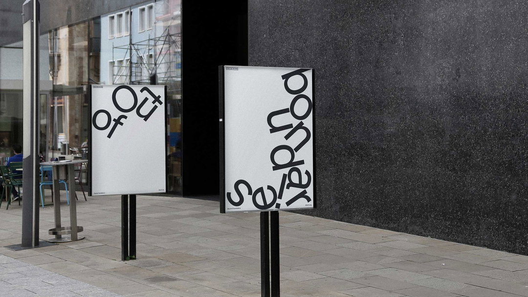
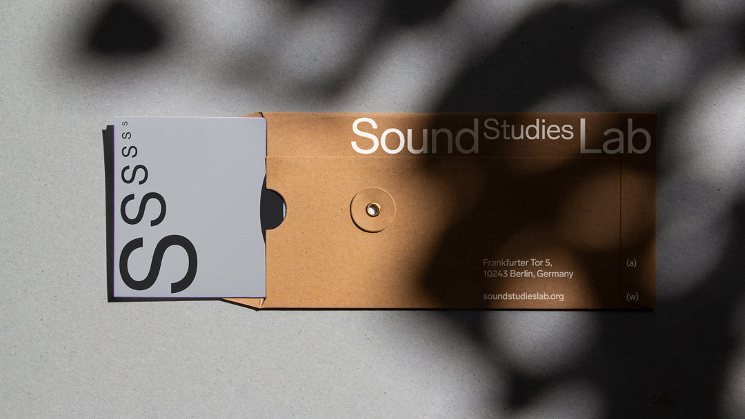
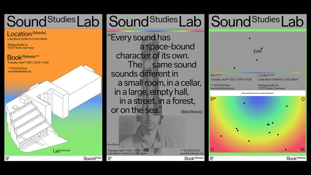
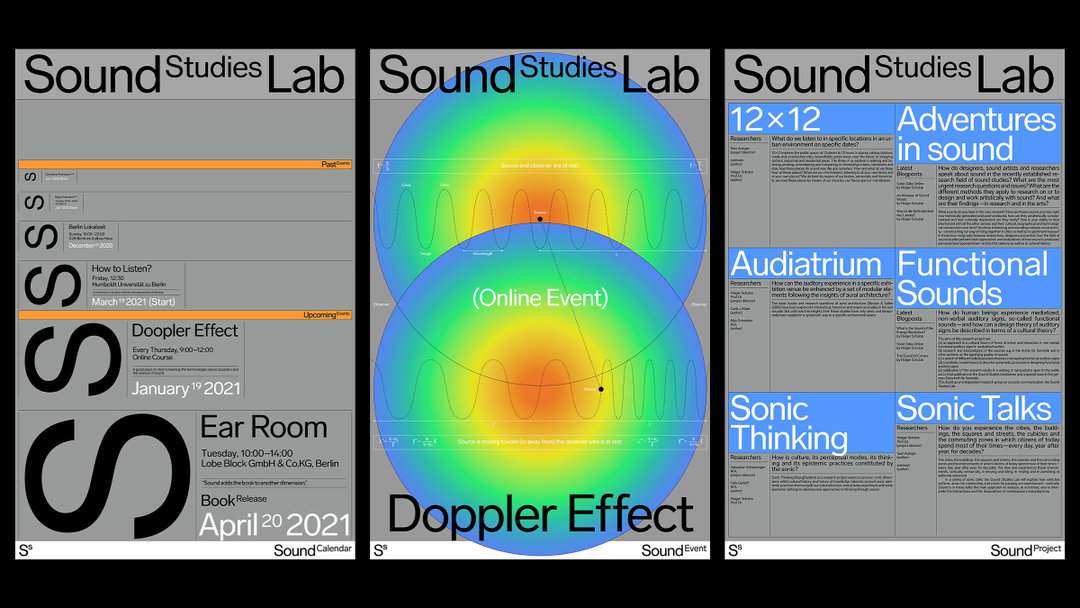
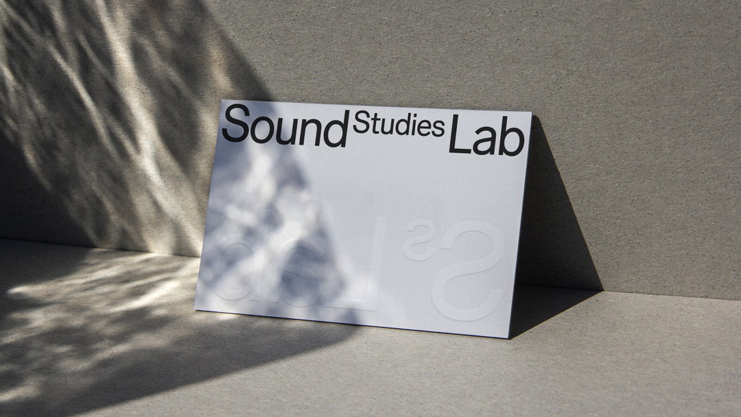
As someone who’s constantly pushing herself to try out new media or applications, it’s no surprise to hear that Aiqi sees taking risks as an “indispensable part of the design path.” She looks for ways to step out of her comfort zone, which was certainly the case when she worked on the identity for Sound Studies Lab. Sound Studies Lab invites young and experienced scholars and artists to work on the sonic sensory aspects of individual lives and in heterogeneous societies, cultures and historical eras. The projects at the lab operate in mobile, experiential and field-based research environments. The basic research strategies of the lab are therefore field research, critical analysis and the production of sonic artefacts.
Aiqi Zhang (Copyright © Aiqi Zhang, 2021)
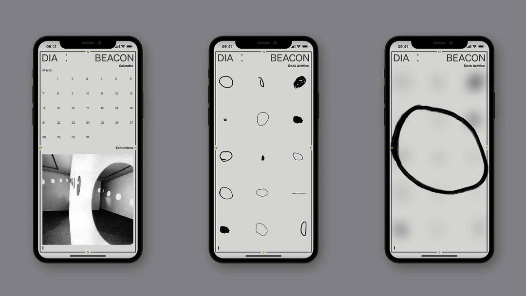
The problem for Aiqi when she took on the project, was that it was a topic she knew nothing about. But taking it in her strive, she delved into the subject in as much depth as she could, with the aim of combining mathematics and design in an exciting way. “Through this process, I learned how to merge the mathematical terminologies of sound with visible intriguing visuals,” she says of the identity in which the superscript “S” in the logomark echoes the shift of sound as seen in the Doppler Effect. Additionally, it indicates the scientific and mathematical side of the lab.
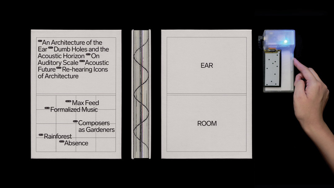
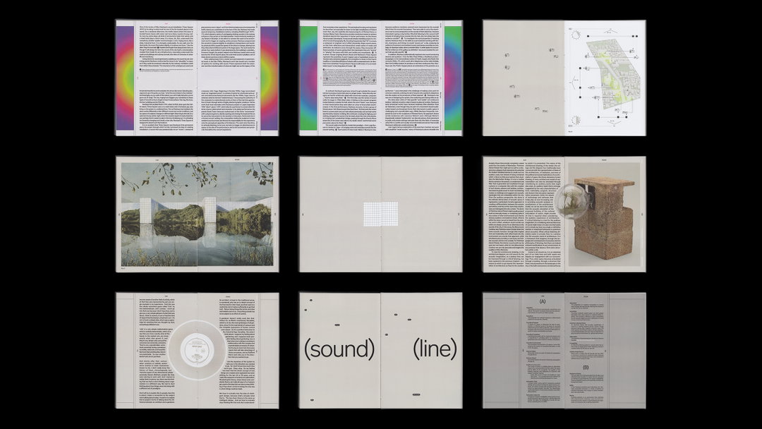
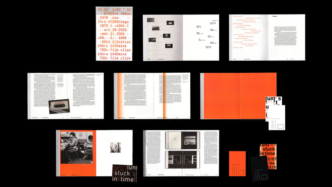
In another project titled Ear Room, Aiqi explores the interactions between sound and hearing, space and architecture. “The structure of the book explores an order of magnitude from the intimate scale of the ear to the architectural scale of the environments. At the same time, it provides the reader with a framework of understanding how sound in space is deeply intertwined,” she writes on her website.
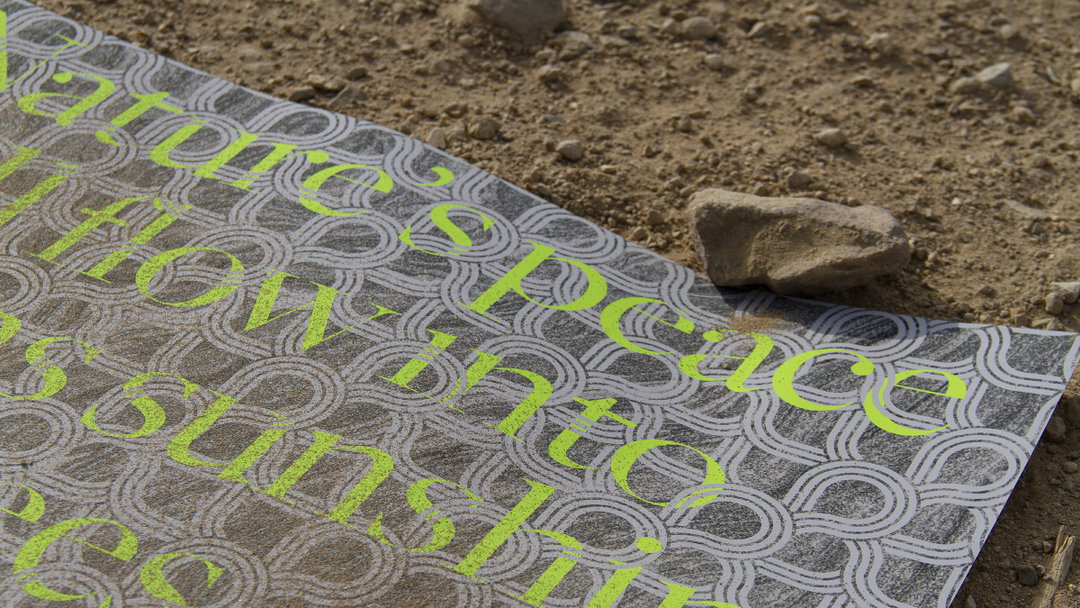
Aiqi finally tells us about a project for California State Parks which demonstrates her love of creating work for the public realm. “The mission of California State Parks is to encourage the public’s engagement with California’s stunning biological and environmental diversity,” she outlines. “The concept asserts that we should be respectful of nature while we are visitors in the parks, especially for those engaged in backcountry sports. At the same time of shifting the target audience to the new generation, I was thinking using typography and composition to maintain the sense of nature and using colour to attract the younger generations.”
On the horizon, Aiqi is excited about a recent role she’s undertaken at TBWA\Media Arts Lab, telling us “it is a fast-paced working environment, and I enjoy learning more soft skills and experiencing more collaborations.’ Besides that, she’s looking to get the balance with life and work right so that she has time to pursue other interests, especially on the weekends.
GalleryAiqi Zhang (Copyright © Aiqi Zhang, 2021)
Hero Header
Aiqi Zhang (Copyright © Aiqi Zhang, 2021)
Share Article
Further Info
About the Author
—
Ruby is Senior Creative at It's Nice That, overseeing our visual output across platforms and projects. Before that, she was associate editor on the editorial team, after joining in September 2017 following graduation from Central Saint Martins.


