




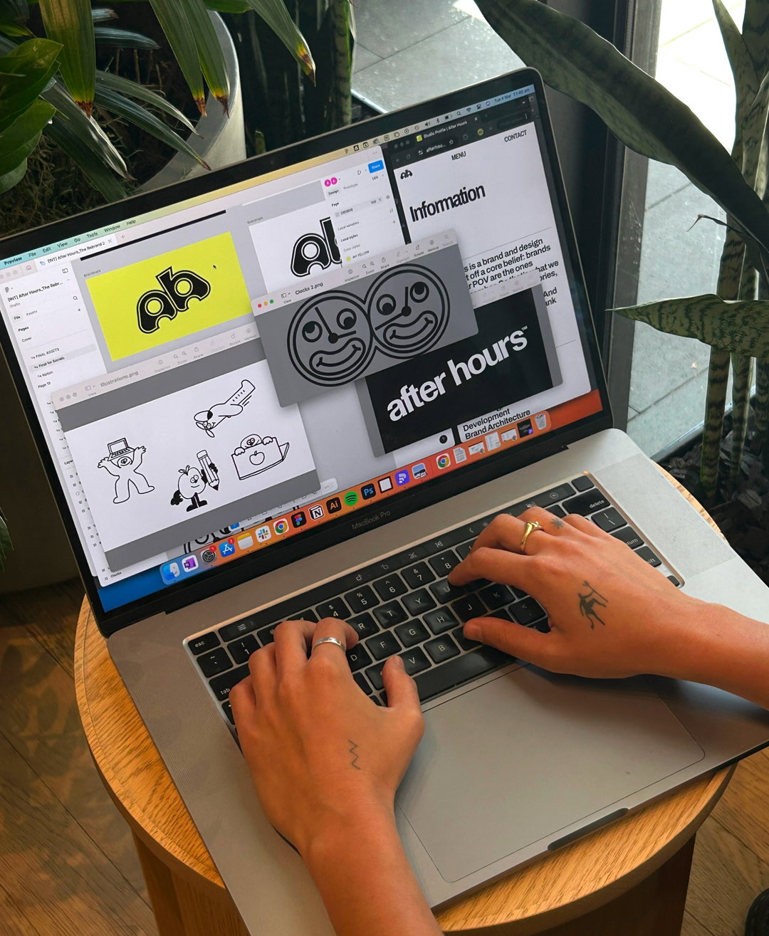
After Hours’ new identity is expressive, layered, and always on the move
The duo behind the creative studio talks through its recent refresh, and why they choose to operate fully remote.
“Not here to fuck spiders.” These five words – typically Australian slang – are what the duo behind After Hours uses to describe its new identity. “The old brand looked fine. That was the problem,” says co-founder Shy Trutwein. “It said nothing. A patchwork of trends, borrowed fonts, and ‘this’ll do for now’ decisions that slowly became permanent.” While the old brand was functional, “emotionally, it didn’t land”, Shy continues. Shy and fellow co-founder Jasmine Gallagher wanted an identity that reflected their energy and approach – expressive, layered, and extroverted. So at the beginning of 2025, five years after they first launched, they finally took the plunge.
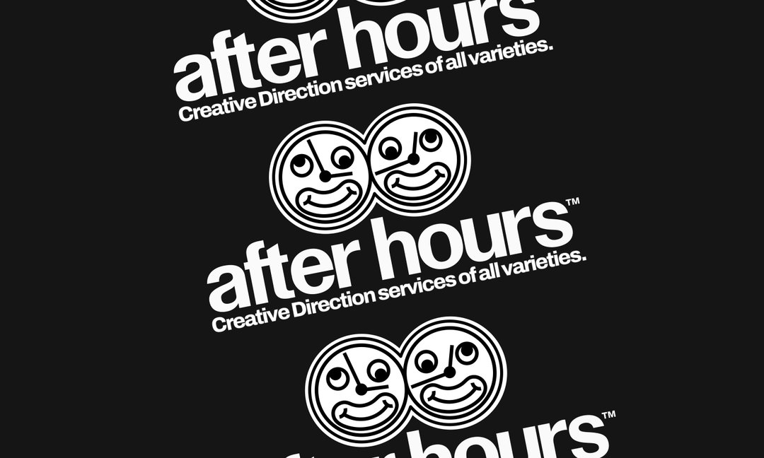
The “not-quite-right yellow” stayed, as did the name, but everything else changed. “We treated it as a reposition, not just a rebrand,” Jasmine says. “Something that can flex – buttoned-up or all buttons undone – but still feels like After Hours.” They worked with web developer Sam Morgan, introducing a new wordmark, brandmark, type, and a clock illustration. “Time has always been a running theme for the studio: After Hours, deadlines, time zones, missed time zone; the clock felt right. Slightly odd, slightly unhinged – very us,” says Shy.
Gallery(Copyright © After Hours, 2025)
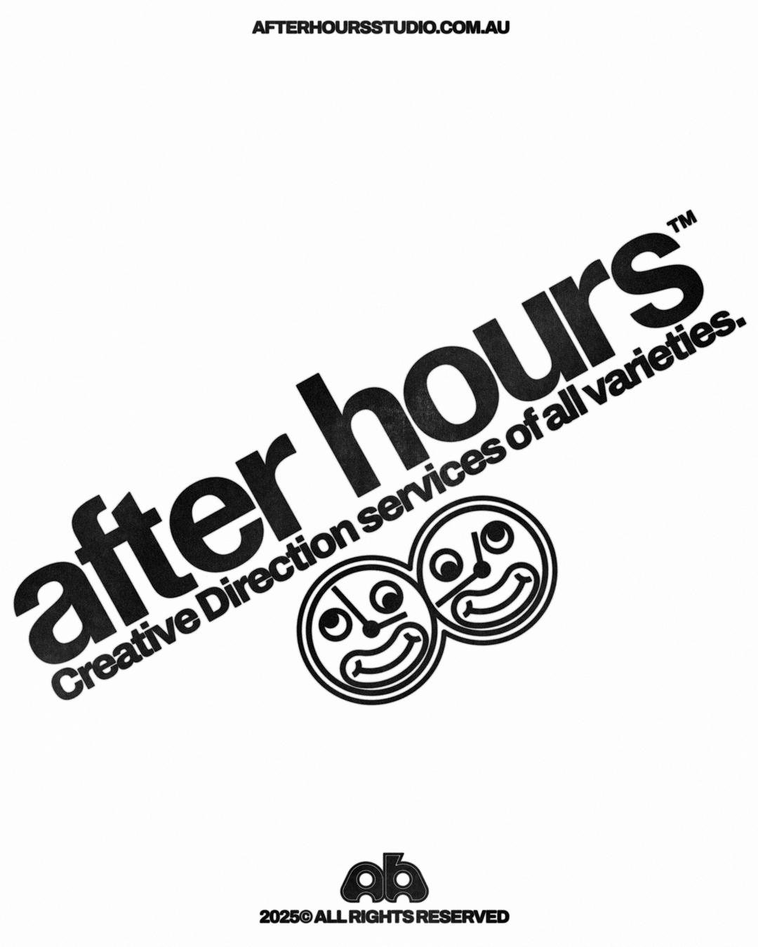
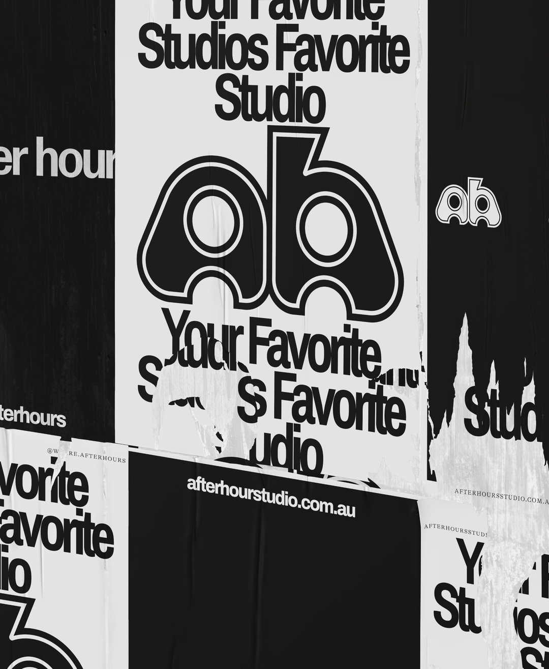
Dynamic, witty, and energetic, this new identity is certainly fitting for After Hours – a fully remote studio with a huge range of clients from cannabis products, to retail, music, and hospitality. It initially launched in February 2020, specialising in hospitality business. ”Objectively, that was the worst possible timing,” says Jasmine. “Three weeks in, Covid-19 hit and wiped every client off the calendar. We thought we were about to take over the world – we were not.”
Clientless and spiralling, the duo decided to operate as a “design hotline”, offering their services for free – or for boxes of free wine – to help out the hospitality community. “We made hundreds of posts. It was completely unsustainable, but it felt useful… Not that we intended for it to be a marketing ploy, but it really helped to get our name out there,” says Shy. “The work got shared, people started DM-ing us, and somehow we got real clients and the studio started to actually form.”
The duo went on to work with larger agencies, across New York, London, Los Angeles and Sydney. They realised that some of the best studios were fully remote – “and doing it really, really well”. say Jasmine. So now, After Hours bounces between Sydney or Melbourne for the Australian summer, and then over to the Northern Hemisphere for a second wind of sun.
“Pretty sure we’ve dodged winter for three years straight now,” Shy says. “Our studio philosophy is that if you’re designing for the world, you should probably spend some time in it. Try things. See things. Change your perspective. Be slightly disoriented – it helps.” Just like their new identity – a flexible framework that grows and adapts wherever they land. “We’re asking clients to rethink how they show up, so it makes sense we do the same,” ends Jasmine.
Gallery(Copyright © After Hours, 2025)
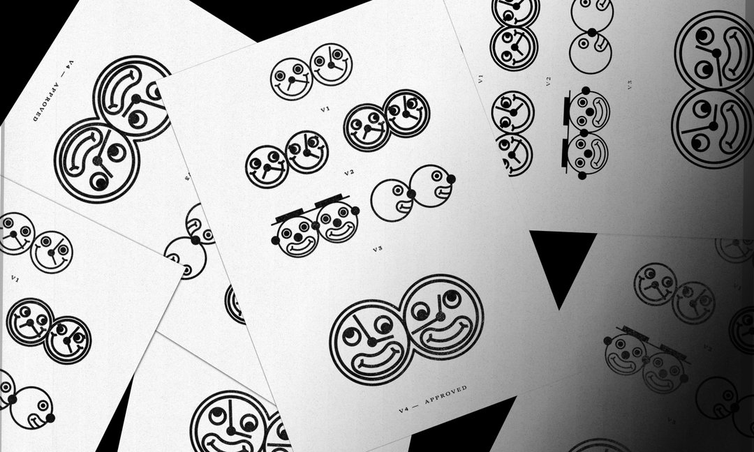

After Hours: Dumps
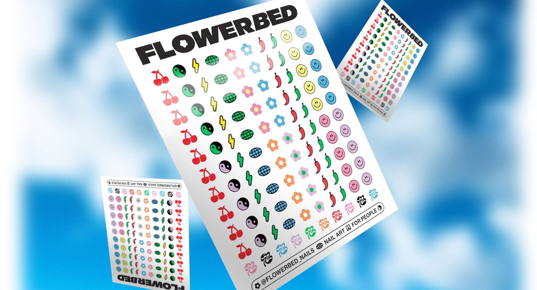
After Hours: Flowerbed
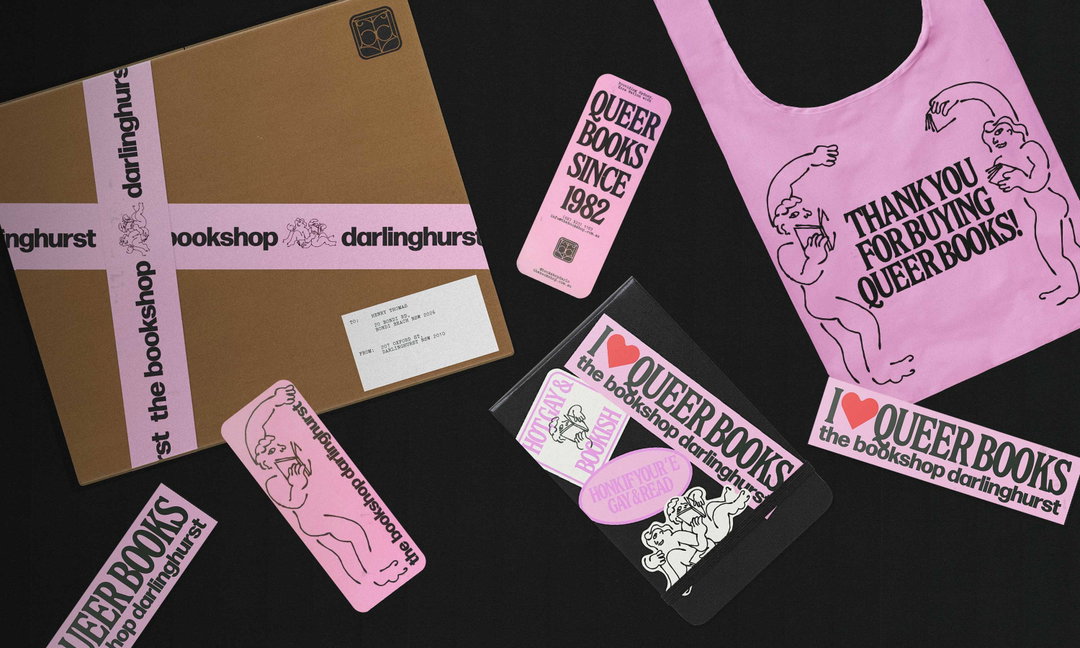
After Hours: The Bookshop Darlinghurst
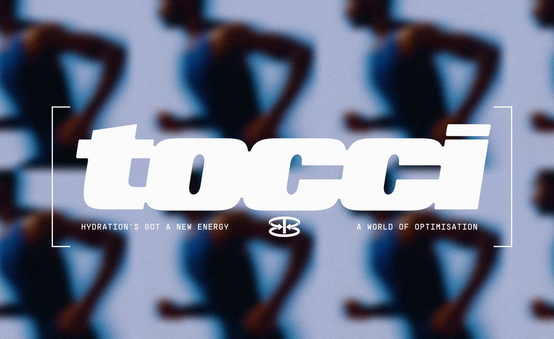
After Hours: Tocci
Hero Header
(Copyright © After Hours, 2025)
Share Article
Further Info
About the Author
—
Marigold Warner is a British-Japanese writer and editor based in Tokyo. She covers art and culture, and is particularly interested in Japanese photography and design.





