Time Out’s art director on orchestrating an illustrated love letter to London for its last print issue
“My God, the amount of emailing”: art director Bryan Mayes talks us through the highs, lows, and “sheer amount of commissioning” that went into the four-cover issue.
After 54 years of printed publication, Time Out has published its last ever physical edition. Hitting streets yesterday (23 June), London Rising focuses on the people who are shaping the future of the city. Importantly, the illustrations and design also stays as far away as possible from delivering a “gloomy ‘This Is the End’-style cover,” art director Bryan Mayes tells us. “Also, nothing cheesy: ‘Thank you, London and goodbye!’ – no, thank you.” Instead, ambitious and anything-from-cringe, the issue comes together with four covers illustrated by some of London’s most exciting creatives.
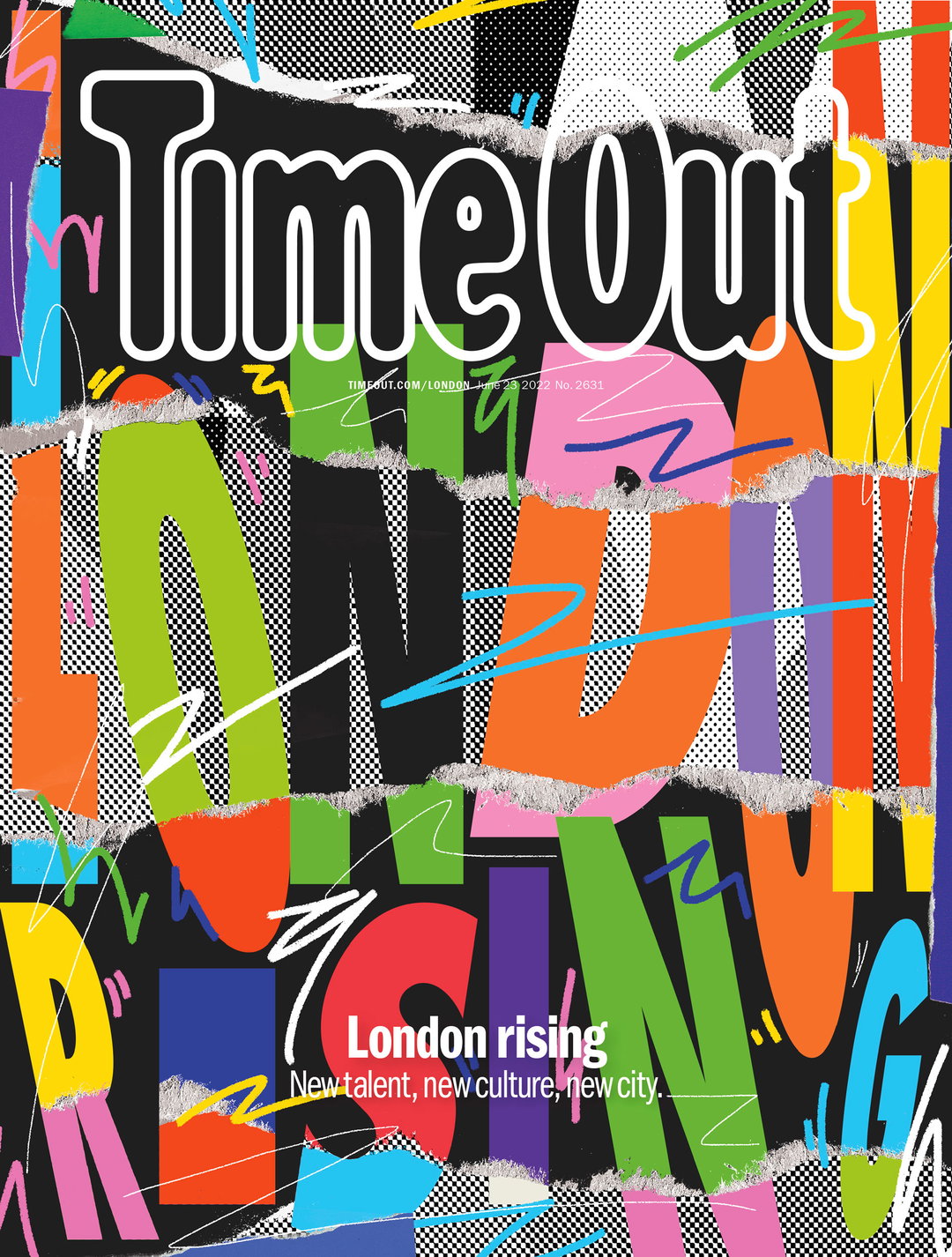
As for those four crucial commissions, Bryan was after graphic artists with a “really strong, vibrant visual style”, he explains. “Fine artists are of course brilliant and important and wonderful but they’re not always the best at designing magazine covers.” With this in mind, helming a cover each is: Hassan Hajjaj, Bryan surmises: “big, bold, clashing colours. Lairy as fuck!”; Kris Andrew Small, “I’ve wanted to work with [him] for ages now”; Lakwena Maciver, “big bold colours and typography are at the heart of her work”; and Real Hackney Dave, “ex ad guy turned good who now plies his trade as a traditional printmaker with witty typography and a mutual adoration of pink.” “Aside from that, we wanted to make sure we represented the diversity of London with our choice of cover artists,” Bryan adds.
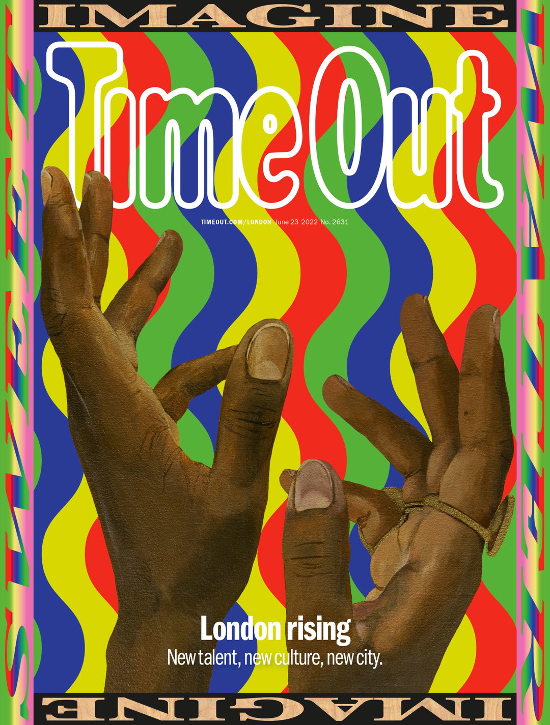
Lakwena: Time Out, London Rising (Copyright © Time Out, 2022)
Throughout the cover commissioning process, Bryan was faced with perhaps an even more overwhelming prospect: how do you orchestrate a finale for 54 years of printed publishing? While London Rising does mark the close of a chapter for Time Out, Bryan stresses that half the battle comes from keeping one eye on the next one. “Although Time Out is ending its regular print magazine, the brand and its mission aren’t going anywhere. All the funny, informative and visually compelling content the printed magazine was always known for will now carry on digitally. So we wanted these last covers, and the whole issue, to be really positive and looking to the future”, showing “that it was – to some extent – business as usual.” While pulling together the issue, Bryan was also designing a brand new daily email – launched just two days after London Rising went to print – then polishing off the first-ever digital Time Out cover shoot that afternoon in Stoke Newington.
London Rising also meant Bryan got to do what most art directors can only dream of in this lifetime: “hav[ing] a pocket full of blank cheques to commission whoever the hell I wanted (within reason!).” As expected, this culminated in a mammoth amount of commissioning; aside from the four cover artists, Time Out worked with Jimmy Turrell, Eynon Jones, Toby Triumph and Kezia Gabriella for features within the issue.
If you haven’t yet spotted a copy of London Rising out in the wild (find out where to nab yourself a copy here), in this issue, you can expect love letters to London from writers and comics, plus a summer guide and a look into how our city is rewilding itself. On the cover front, Lakwena imagines London as a paradise, Hassan Hajjaj illustrates London through friend and local, Blaize, Hackney Dave sees London as an ever-evolving organic entity, while Kris Andrew Small sums up the city’s energy, colour, mess, and beauty.
As for us, we’re just hopeful Bryan’s inbox gets some respite soon: “My God, the amount of emailing I had to do. The back and the forth,” the art director recounts. “I basically can’t type anymore. That’s why I’m dictating this to the editor while lying on a chaise longue.”
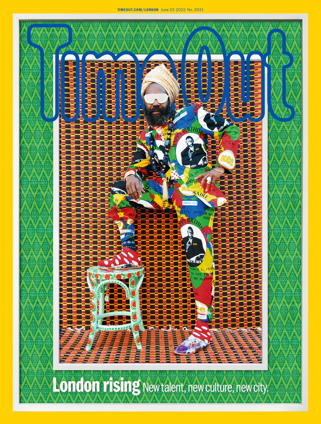
Hassan Hajjaj: Time Out, London Rising (Copyright © Time Out, 2022)
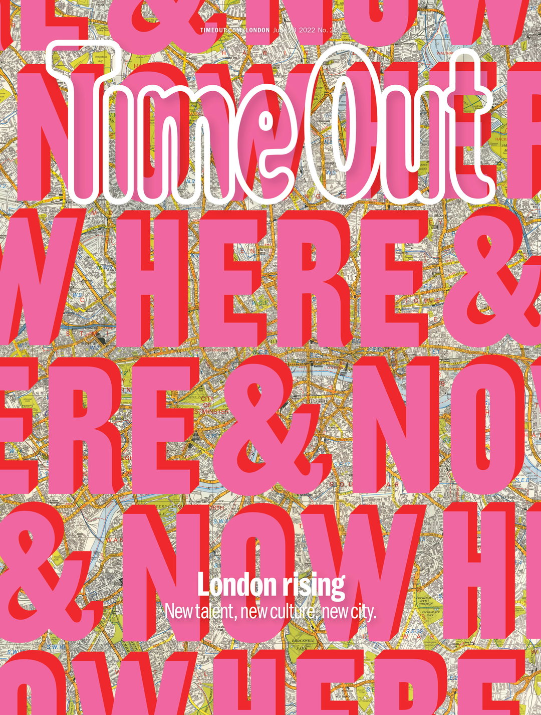
Hackney Dave: Time Out, London Rising (Copyright © Time Out, 2022)
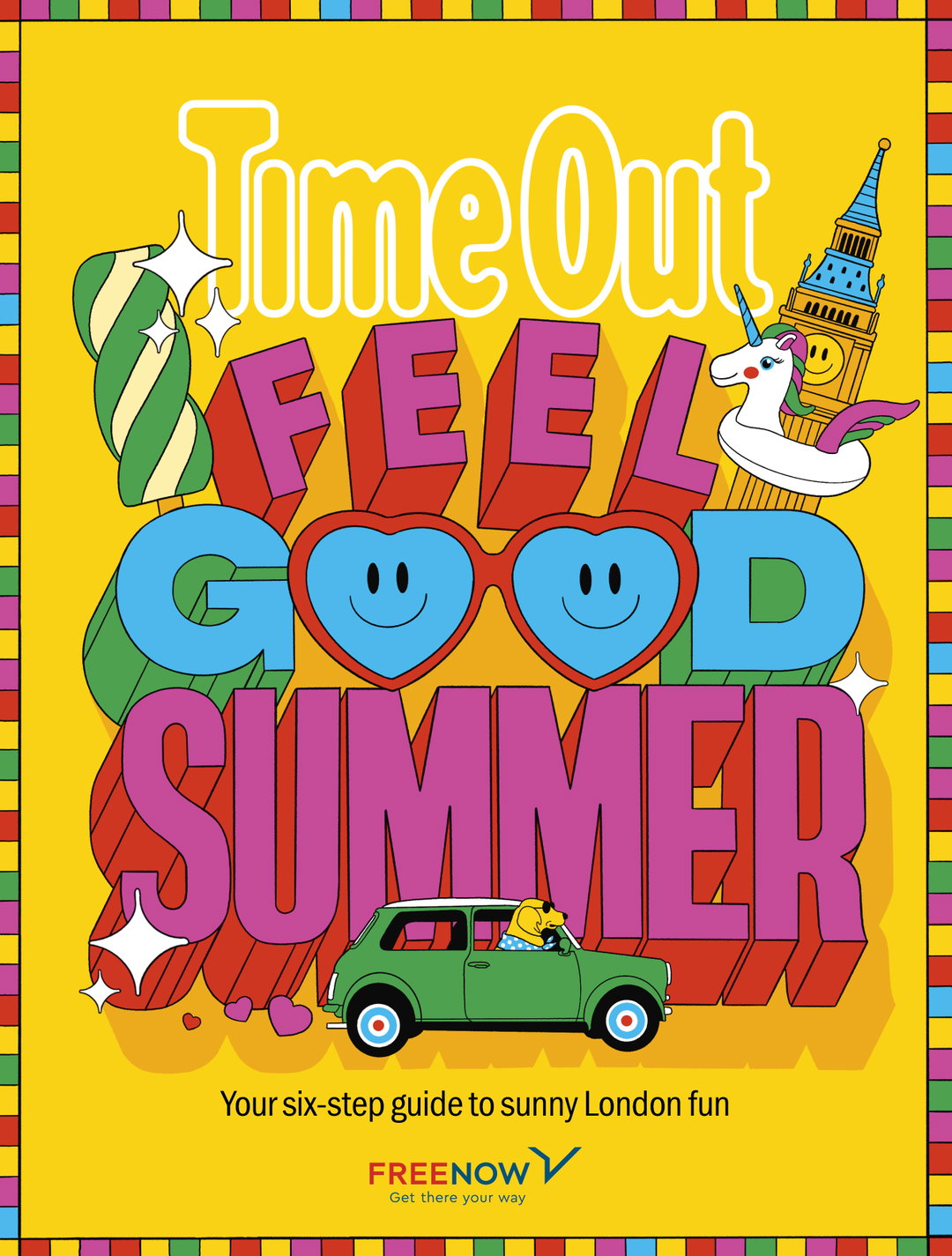
Time Out: London Rising (Copyright © Time Out, 2022)
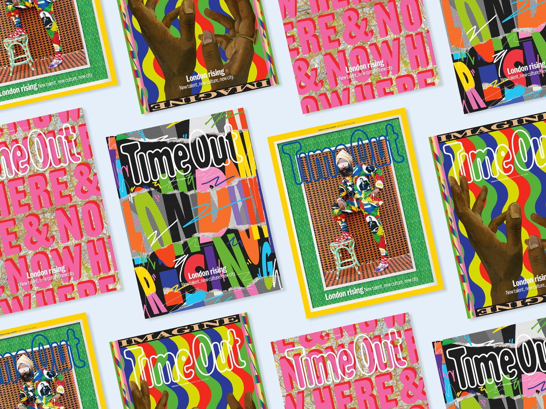
Time Out: London Rising (Copyright © Time Out, 2022)
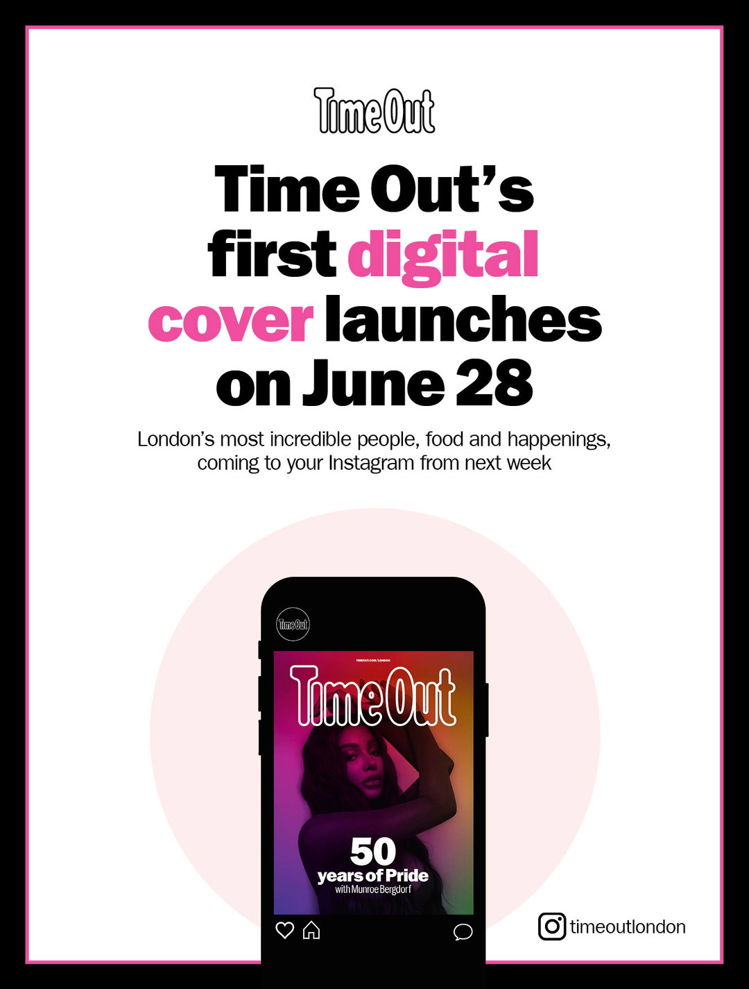
Time Out: Out Here (Copyright © Time Out, 2022)
Time Out: Out Here (Copyright © Time Out, 2022)
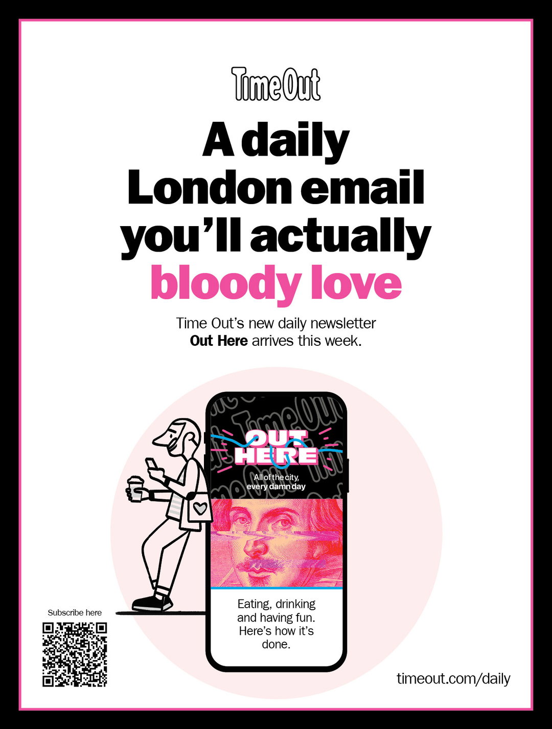
Time Out: Out Here (Copyright © Time Out, 2022)
Hero Header
Kris Andrew Small: Time Out, London Rising (Copyright © Time Out, 2022)
Share Article
About the Author
—
Liz (she/they) is the senior editor at Insights, a research-driven department within It’s Nice That. They previously ran the news section of the website. Get in contact with them for potential Insights collaborations or to discuss Insights’ public-facing reports.