




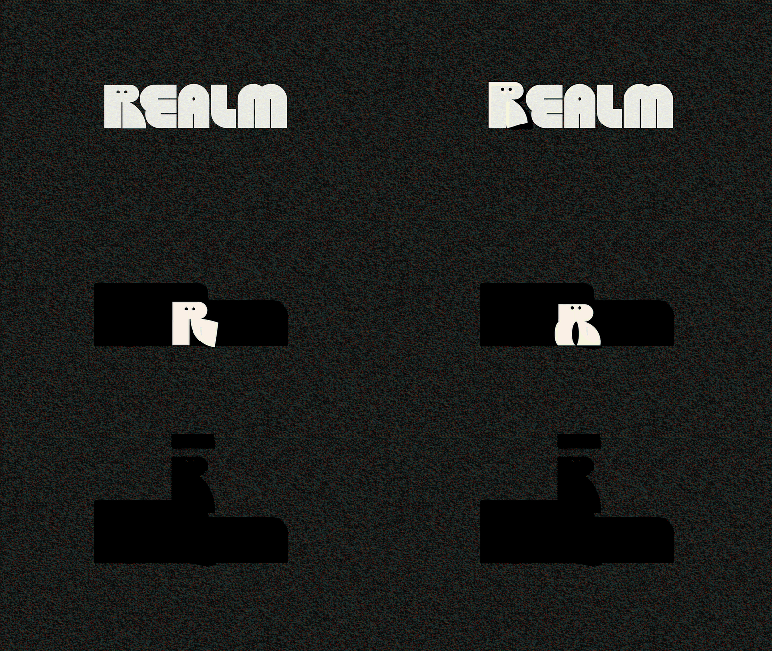
Mother Design rebrands fiction podcast brand Realm, inspired by sci-fi and magic
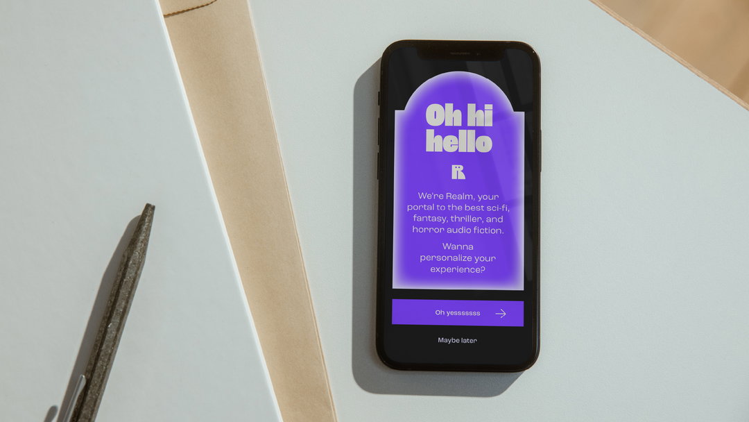
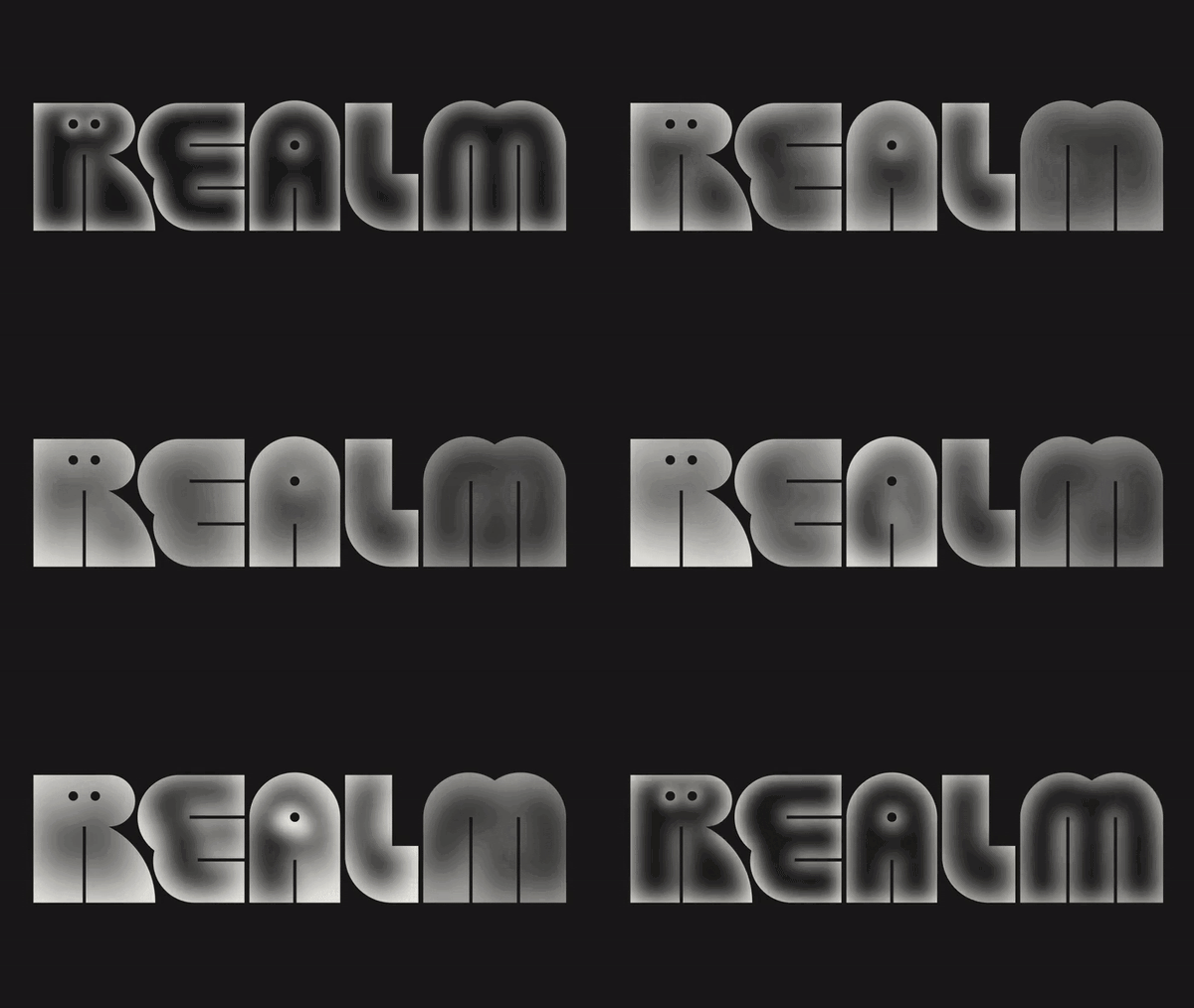
With a wonderfully characterful logo / mascot, the visual identity features glowing graphics akin to otherworldly portals, and a “slightly strange but overall friendly” typeface.
Share
Realm is currently the number one fiction podcast in the US on Apple Podcasts, with its listeners no doubt relishing in the escapism it offers. The audio entertainment company, formerly known as Serial Box, has been creating and producing episodic fiction podcasts specifically within the sci-fi and fantasy genre for a number of years. Recently, in tandem with a revamp of how the company releases its audio series, it enlisted Mother Design to also rebrand its entire visual identity. The studio came up with the new name and a wonderfully characterful, sci-fi-inspired identity that tells a story of its own.
First off, the name Realm not only increases ease of being searchable – something its previous name lacked – but also represents “the journey listeners take in the act of escapist, psychological world-building,” Mother Design’s creative team tells It’s Nice That. The design choices take their cues from this idea, but also the fact that Realm is a “magical refuge” for its listeners, known for its inclusive approach, featuring culturally underrepresented voices, writers, and characters. “We wanted to reflect that progressive intention in Realm’s new aesthetic,” the team adds.
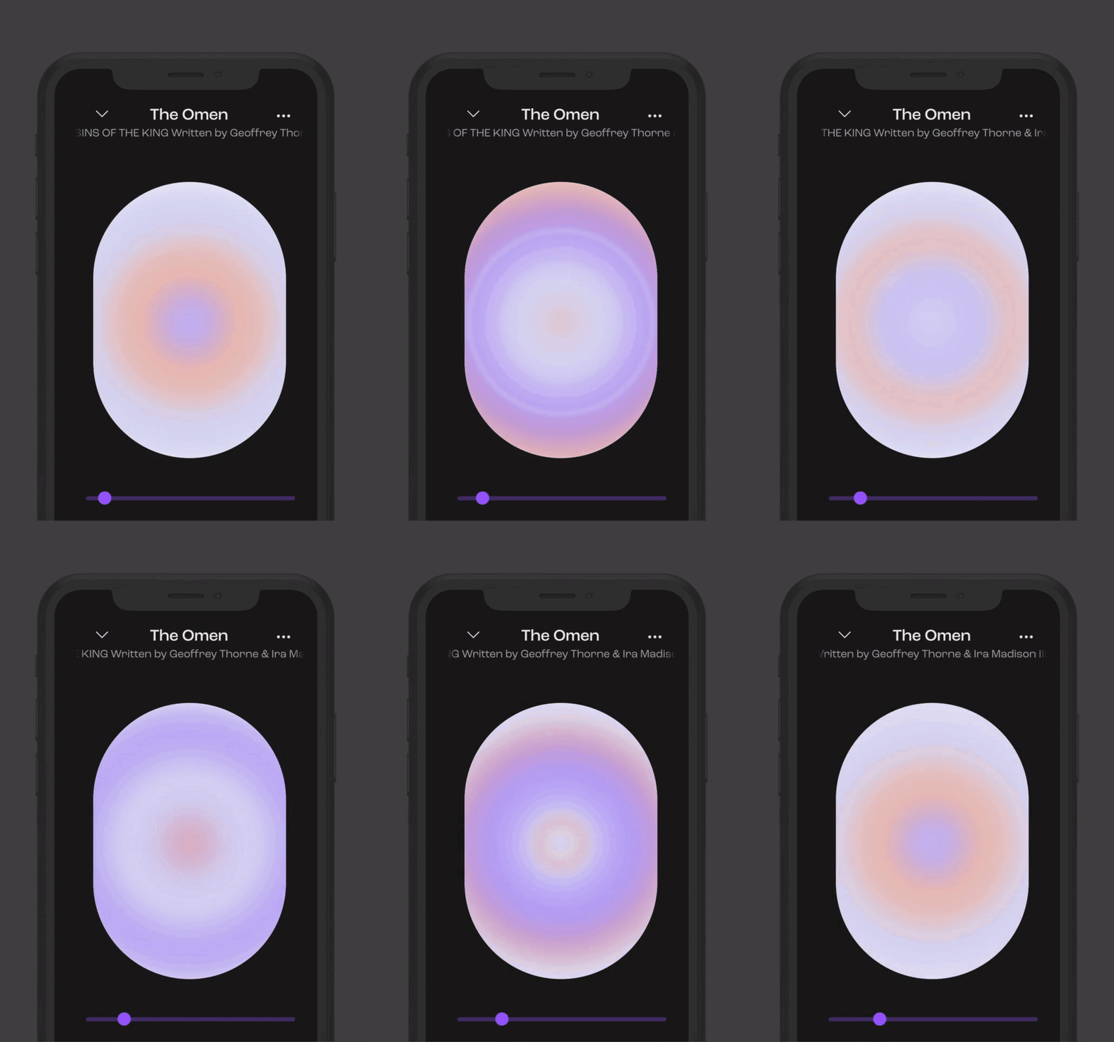
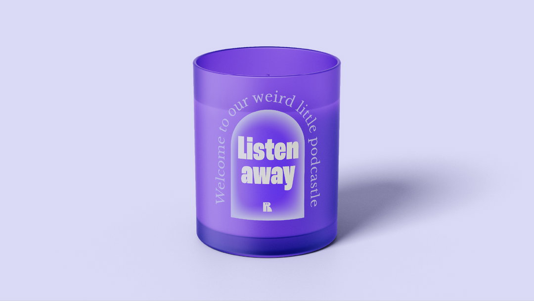
As such, the identity features a set of portal-like graphics, symbolising entrances to metaphysical realms. These are gradient-heavy, and glow and pulsate as the story is being read to bring a “mysterious, otherworldly vibe,” say the creatives, as well as adding “magic and energy a la James Turrell”. The colour palette is predominantly purple, “representing inclusivity, magic, spirituality, vitality and creativity,” says Mother. This also creates a futuristic feel when paired with the near-black backdrop, alongside complementary colours of orange and off-white. Interestingly, the branding is also designed around the app being mostly used after-hours.
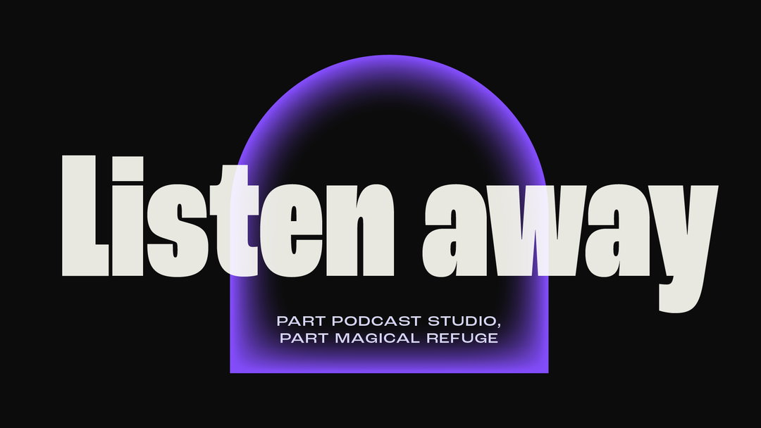
Mother Design: Realm visual identity (Copyright © Realm, 2021)
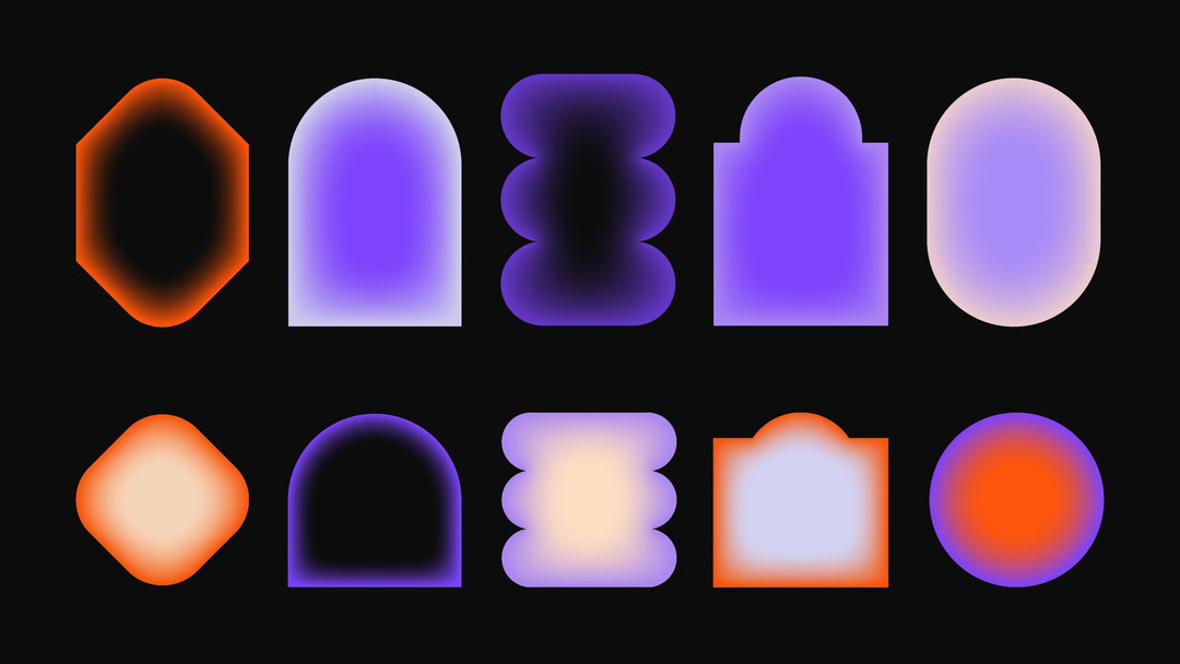
Mother Design: Realm visual identity (Copyright © Realm, 2021)
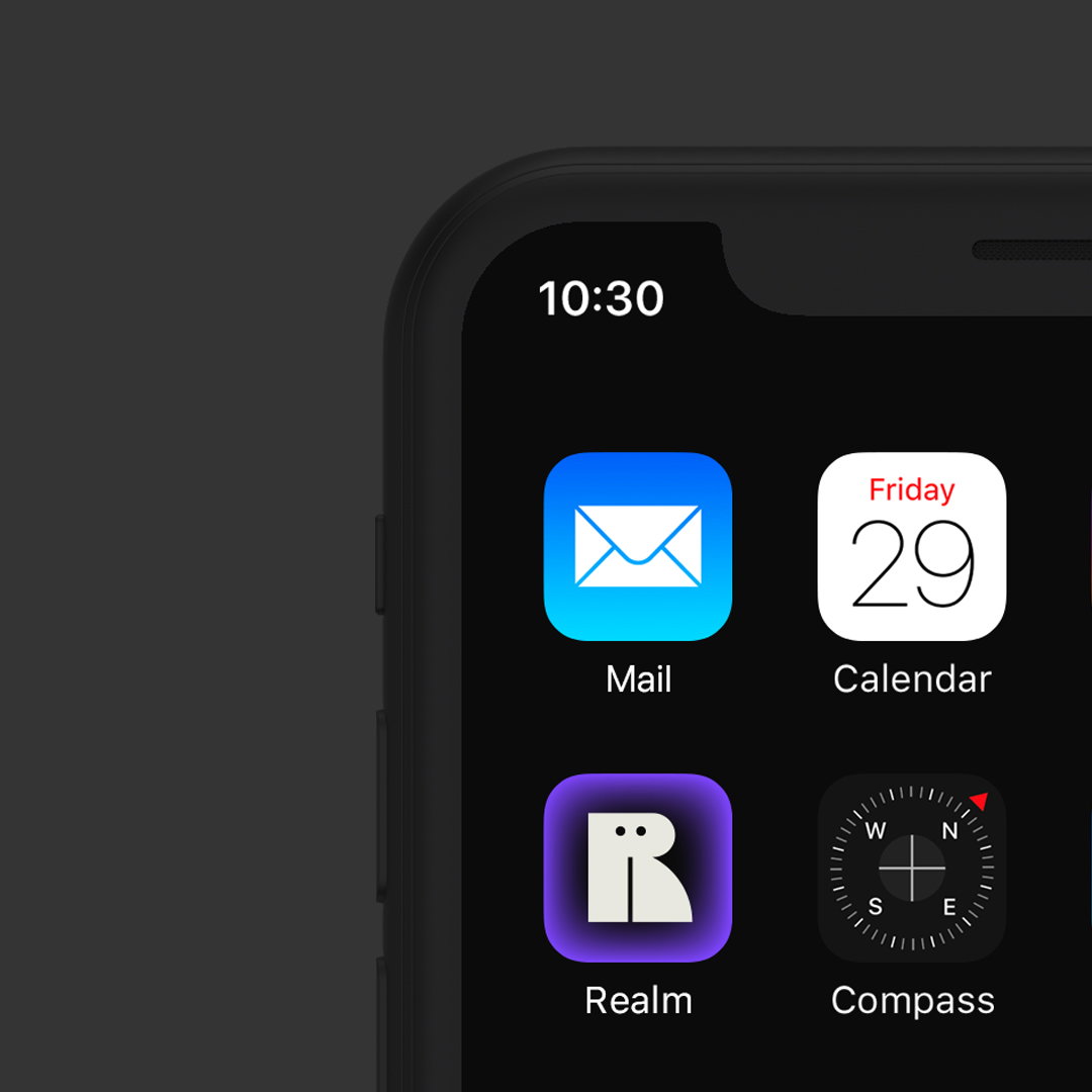
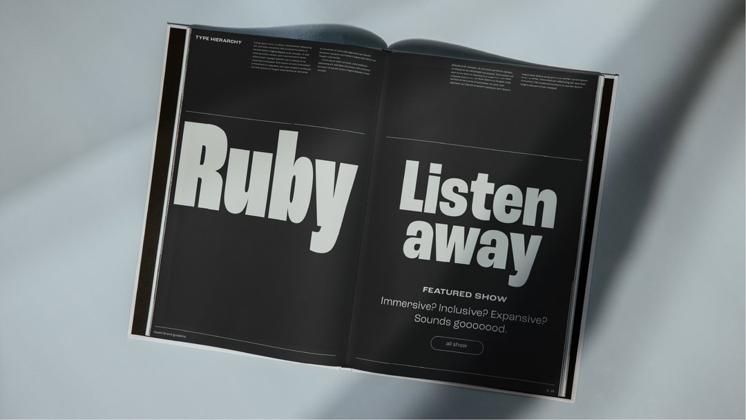
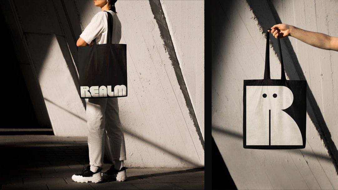
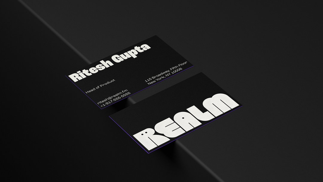
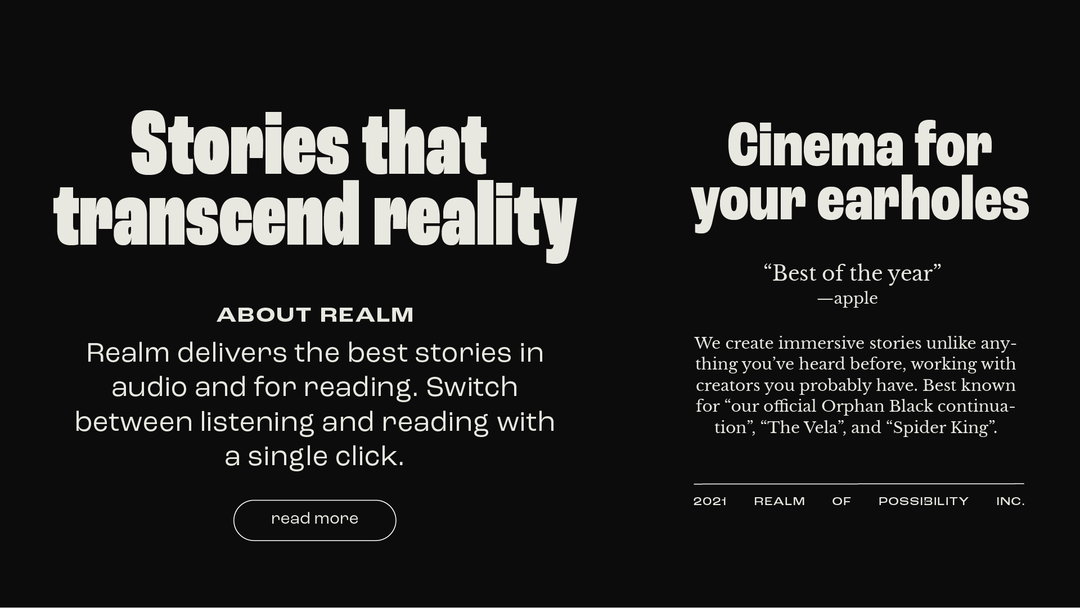
The wordmark is inspired by sci-fi art, and aims to convey an inviting, friendly feel – delivered by the bucketload through its mascot Ruby, a cute and curious letter ‘R’ that sits upfront and accompanies listeners on their audio journey. This is complemented by the bold, condensed Roc Grotesk typeface which the Mother team says shares its “unique, slightly strange, but overall friendly characteristics”; and Baskerville, mainly because it is commonly used in book design and therefore visually alludes to storytelling. The design team opted for Libre Baskerville as it works particularly well for on-screen reading.
To make the user experience fully immersive, Mother worked with studio Felt Not Heard to create a sonic logo that sounds as if “the listener is cinematically entering a portal”.
Overall, the creative team say they wanted the visual language to reflect the “warmth, weirdness and wit of the brand,” and hopes it invites “anyone and everyone to jump down the rabbit hole and lose themselves in the magic of audible storytelling”.
GalleryMother Design: Realm visual identity (Copyright © Realm, 2021)
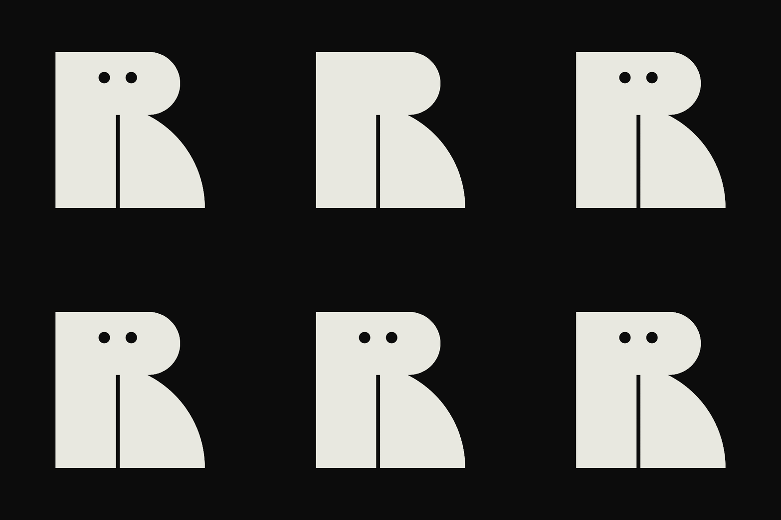

Hero Header
Mother Design: Realm visual identity (Copyright © Realm, 2021)
Share Article
Further Info
About the Author
—
Jenny oversees editorial output across It’s Nice That. Get in touch with writing pitches for features or opinion pieces, big creative story tips, or questions about all things editorial. jb@itsnicethat.com
To submit your work to be featured on the site, please see our Submissions Guide.


