Lad Bible rebrand by UFO's design director Ben Walker sees lad culture as a “positive force”
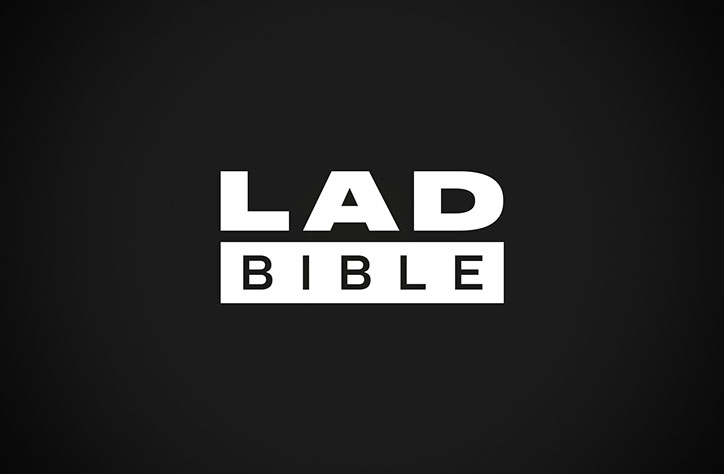
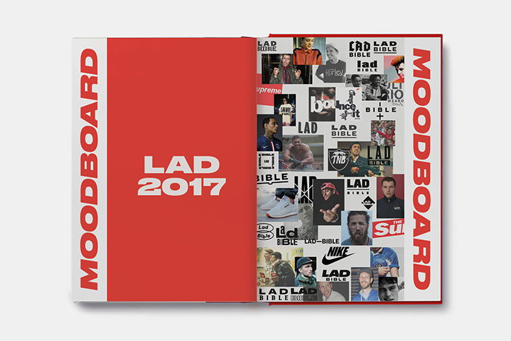
Design director of London design agency UFO Ben Walker has worked with the in-house design team at Lad Bible, one of the largest media outlets in the UK, on its comprehensive rebrand. The strategy behind the complete visual identity redesign is based on “typical audience types and their aspirations,” says the team, and is rooted in “lad culture being a positive force”.
“We wanted to create something that was post-hipster,” says Ben, “a celebration of design outside of niche.” He collaborated with Lad Bible’s head of design Stephen Mai and his team on the new branding.
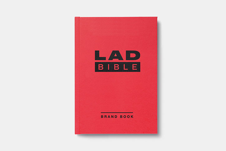
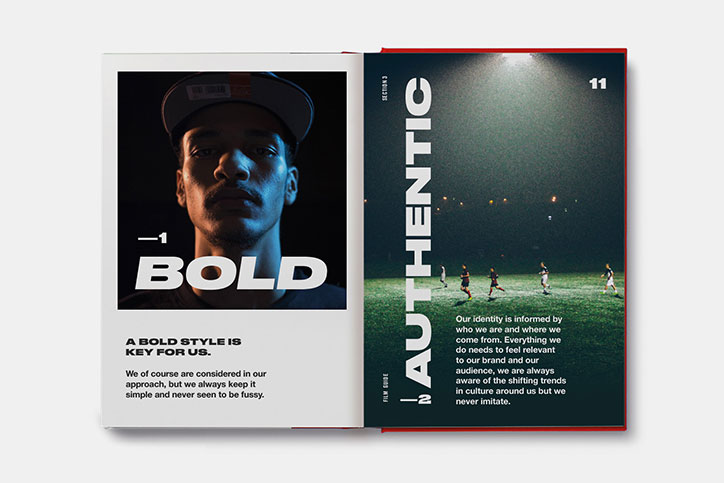
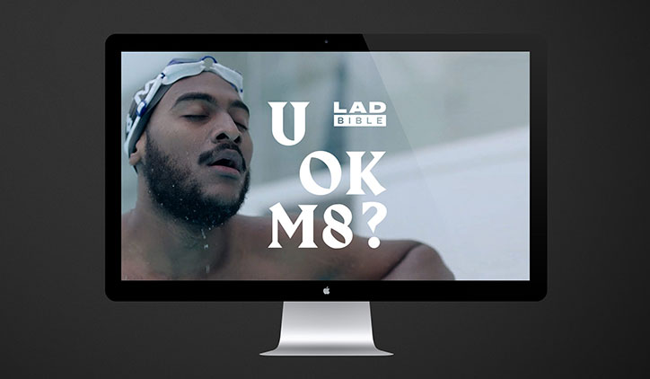
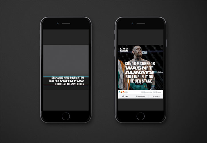
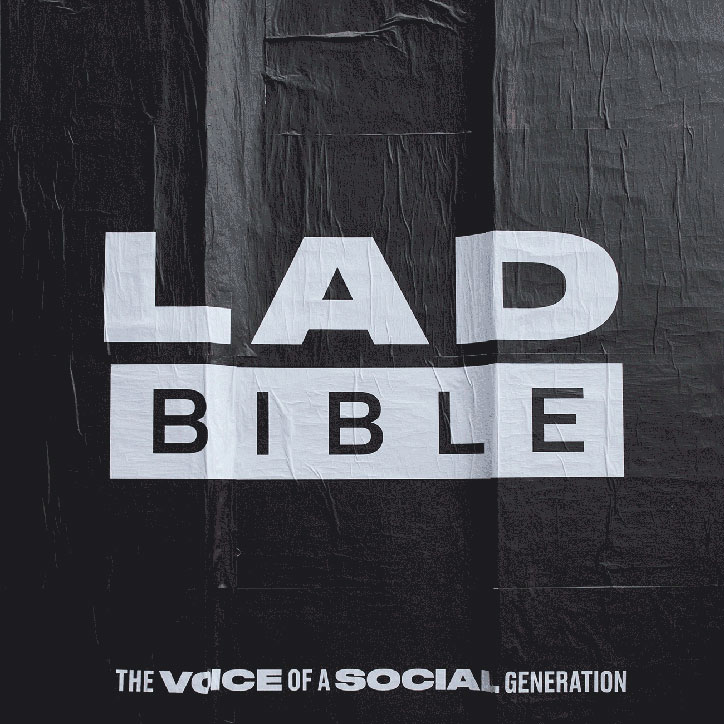
The brand guidelines show a bold style, with simple combination of big, capitalised type against photographic imagery that conveys its “fun, youthful and irreverent” tone of voice.
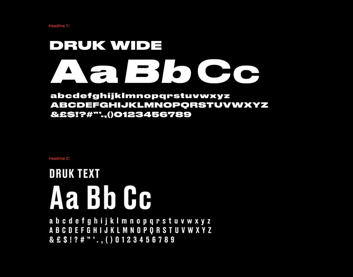
In keeping with the brand’s personality, the logo is “designed for purpose and with icon functionality at its core”. Druk is the core typeface, used for its wide range of expression Ben says, which allows the content to “communicate sensitively or shout loudly when needed”.
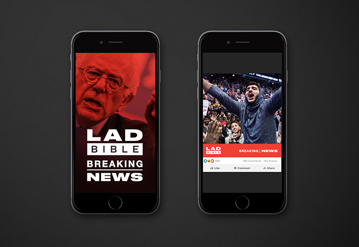
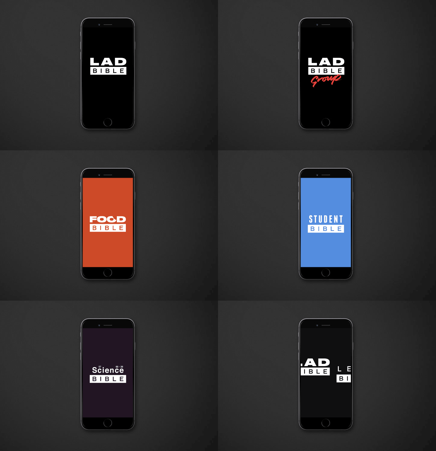
Wordmarks in the logo are equal in height, to give prominence to both words, with the first, ‘Lad’, emblazoned in thickset capitals above an inverted-colour box for the word ‘Bible’. UFO also created animated versions of the logo for used in video content and other editorial devices.
Black and white is the primary colour palette, described by Lad Bible as “straight up and truthful” with red as a highlight colour to “strengthen brand recognition in a competitive space”. These are used with supporting colours of navy and grey.
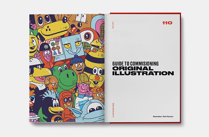
The team also created an illustration guide for the brand, to dictate a style that resonates and works best for the audience. This includes statements such as “Expressive! Not perfect” and “stark lines and basic styles work, it’s not clever but it’s funny. The palette is vibrant and pop.” It also says illustrators “are commissioned more on their ideas and cultural references that on their technical skills as ‘artists’”.
Ben also recently created the visual identity for U OK M8? a Lad Bible campaign focused on mental health issues in young men. Lad Bible commissioned illustrations by Dan Wilson for the identity and supporting articles, and a style guide for typography on editorial videos by Mollie Mills. The studio says this will form part of a bigger project due to launch later in 2017.
Lad Bible rebrand
Lad Bible rebrand
Lad Bible rebrand
Lad Bible rebrand
Lad Bible rebrand
Lad Bible rebrand
Lad Bible rebrand
Lad Bible rebrand
Lad Bible rebrand
Lad Bible rebrand
Lad Bible rebrand
Logos: Ashley Kitchen
Share Article
Further Info
About the Author
—
Jenny oversees editorial output across It’s Nice That. Get in touch with writing pitches for features or opinion pieces, big creative story tips, or questions about all things editorial. jb@itsnicethat.com
To submit your work to be featured on the site, please see our Submissions Guide.