




Jessica Walsh is launching her own creative agency, &Walsh
&Walsh
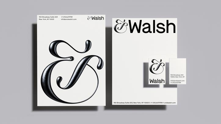
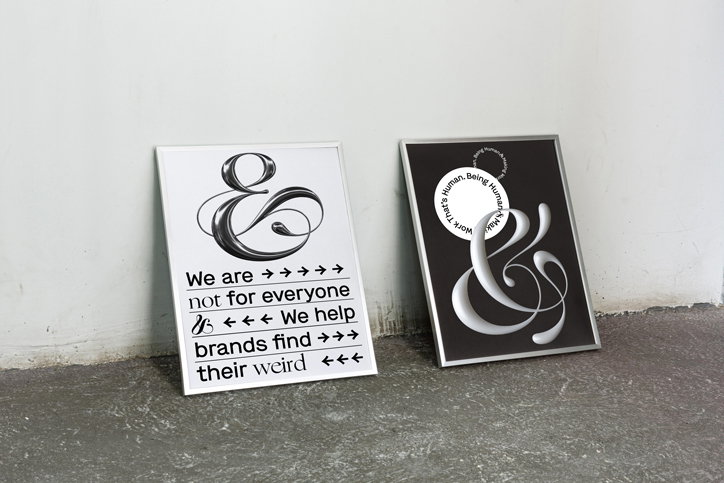
Sagmeister & Walsh, as we know it, is no more, as founder and partner Jessica Walsh is setting up her own agency. The solo venture &Walsh has a new identity and vision – to help brands “find their weird” – yet keeps the same 25-strong creative team and headquarters on Broadway, as well as many of the same clients, including Apple, Snapchat, Kenzo and Adobe. This is the culmination of ten years of collaboration with Sagmeister and seven years as a joint studio.
Sagmeister will be stepping away from commercial work “for the foreseeable future” but will be undertaking non-commercial work under his own studio, Sagmeister Inc, and the duo will continue to work together on art and exhibition work.
&Walsh joins the 1 per cent of women-owned creative agencies, a statistic Walsh has said she wants to do something to change. A key focus for the agency will be its social and non-profit initiatives, including Ladies, Wine & Design, which aims to empower women and non-binary people through mentorship, portfolio reviews, talks and meet-ups. The project now has over 250 chapters worldwide.
In a blog post about the agency’s launch, Walsh professes (in typically honest style) that she had wanted to open her own agency before she met Stefan, and while her time with the man she refers to as “a design legend” was “a great decade”, her desire to go it alone hadn’t faded. “Have you ever felt a deep voice inside telling you that it was time for a change, but you didn’t know why?” she asks. “Why did I want to ruin something that was going well when nothing was wrong? What if I had to start from scratch? ‘Don’t break what isn’t broken,’ they say. It’s much easier to make a life-altering decision when there is something very wrong. Things were going just fine.” In the end, she explains, “I woke up one morning and realised if I didn’t take the leap, I’d always be wondering ‘what if?’”
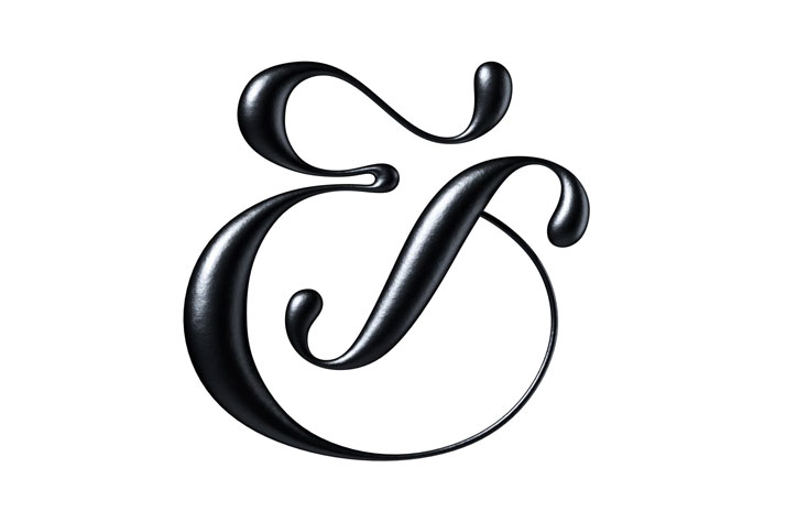
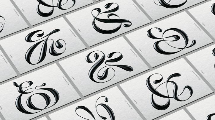
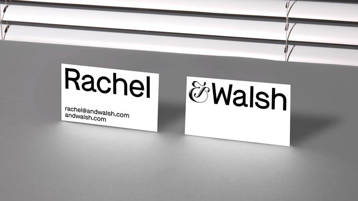
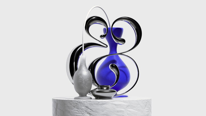
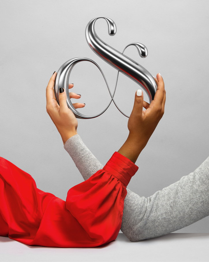
Explaining the name &Walsh, its founder states it isn’t purely a reminder of its origins in the renowned duo; it is to highlight the collaborative nature of its approach. “Our clients are true partners and collaborators and that synergy is so vital to everything we do. Every part of our process will reinforce the agency-client bond and convey that our clients always come first.” Hence why the ampersand is at the centre of its brand identity, and will be customised to each new client or creative partner.
Another part of the agency’s offering to clients will be a so-called “brand therapy” stage, which Walsh says helps clients to “uncover their brand’s true personality and voice”.
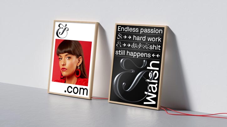
True to Walsh’s roots in unusual online projects, such as 40 Days of Dating, &Walsh’s website is full of Easter eggs for visitors to find, such as “unconventional client tools”, animations and games.

&Walsh
&Walsh
&Walsh
&Walsh
&Walsh
&Walsh
&Walsh
&Walsh
Share Article
Further Info
About the Author
—
Jenny oversees editorial output across It’s Nice That. Get in touch with writing pitches for features or opinion pieces, big creative story tips, or questions about all things editorial. jb@itsnicethat.com
To submit your work to be featured on the site, please see our Submissions Guide.


