Google and Monotype launch Noto, an open-source typeface family for all the world’s languages
Monotype: Google Noto
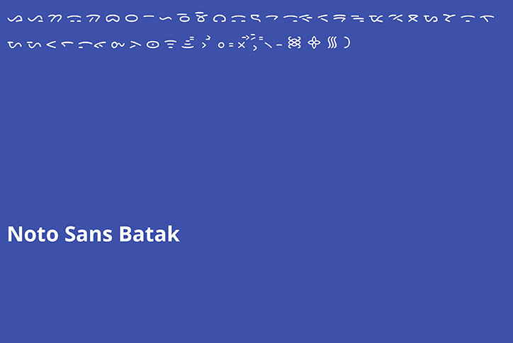
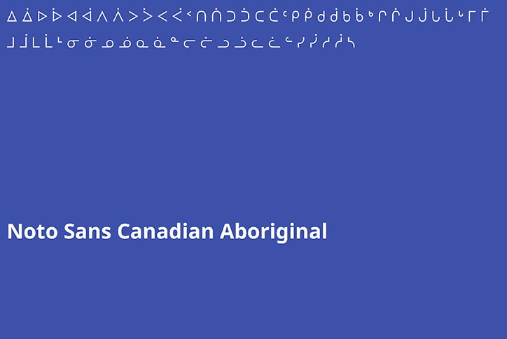
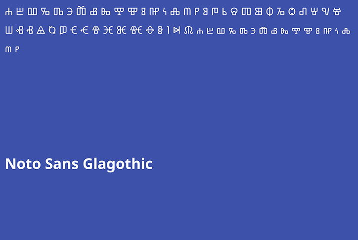
Google and Monotype have launched Noto, an open-source typeface family that encompasses every written language in the world, living and dead. It is one of the largest typographic projects ever undertaken and the result of five years collaborative work.
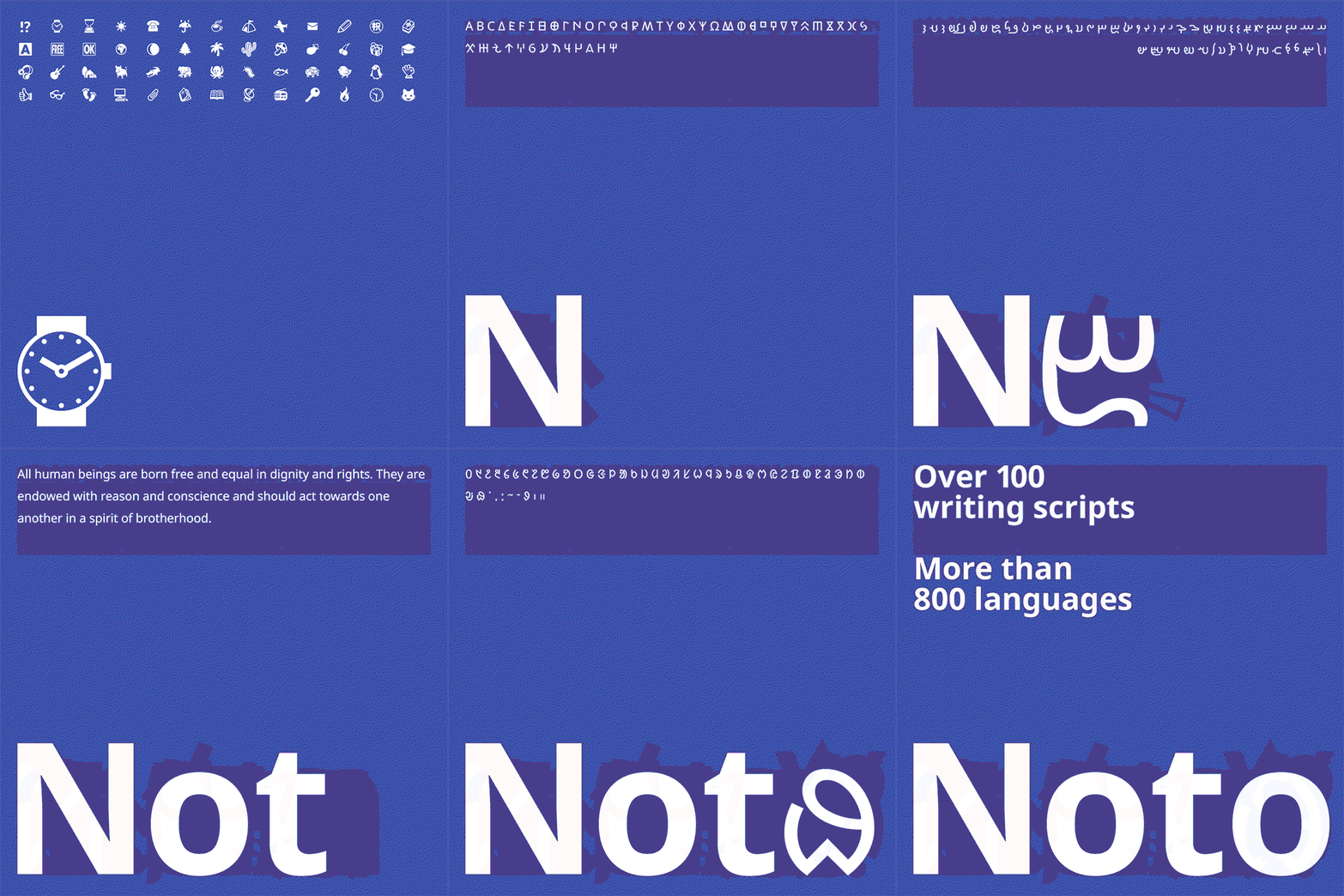
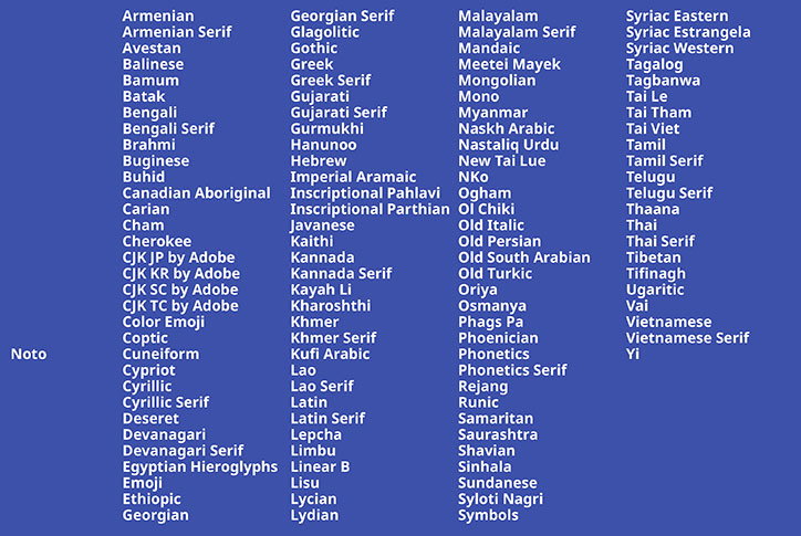
Noto is a unified set of typesets and writing systems with a harmonious look and feel, that includes over 800 languages and 100 written scripts from Latin, Cyrillic and Hebrew to Egyptian Hieroglyphs, Cherokee and Emoji.
One of the aims of the Noto project is to digitally preserve little-spoken or dead languages to help enable global communication “across borders, languages, cultures and time periods”. It also includes letters in multiple serif and sans serif styles in up to eight weights, as well as numbers, symbols and musical notations.
By creating a digital representation of all the scripts in the Unicode standard, “in many cases we’ve produced the first font ever to serve a particular language community,” says Kamal Mansour, linguistic typographer at Monotype. “So to me, the aim is to serve that human community that would otherwise be deprived of the ability to have a digital heritage.”
Monotype: Google Noto
Monotype: Google Noto
Monotype: Google Noto
Monotype: Google Noto
Monotype: Google Noto
Monotype: Google Noto
Monotype: Google Noto
Monotype: Google Noto
Monotype: Google Noto
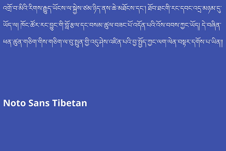
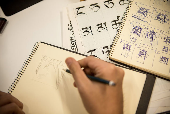
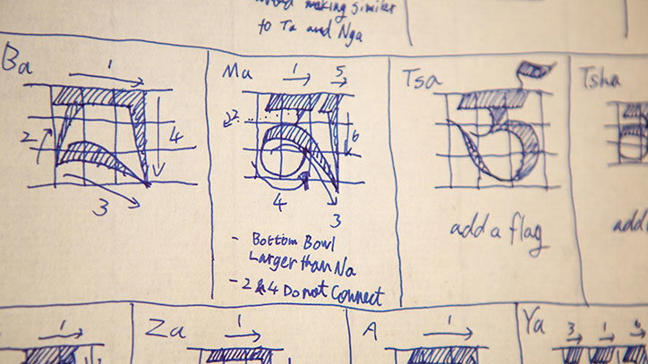
Many of the scripts required significant research for Monotype, in order to apply the rules and traditions of the individual languages to the designs of their fonts. For example for the Tibetan face, Monotype did in-depth research into a vast library of writings and then enlisted the help of Buddhist monks to critique the font and make adjustments to the design.
Hundreds of researchers, designers, linguists, cultural experts and project managers around the world have been involved in the Google Noto project, and the sans serif family is “pretty much done”, while the serif is still being developed.
“There are some characters you can only see on stones,” says Xiangye Xiao, product manager at Google. “If you don’t move them to the web, over time those stones will become sand and we’ll never be able to recover those drawings or that writing.”
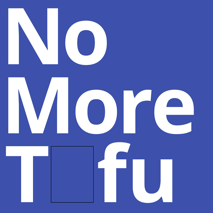
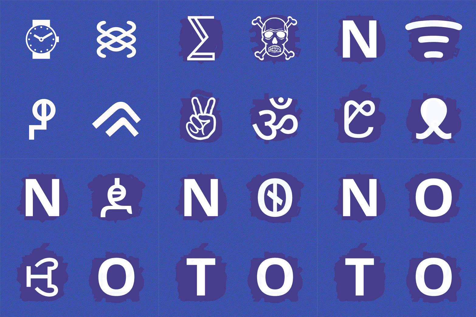
The name “Noto” comes from the little squares that show when a font is not supported by a computer. This are often referred to as “tofu”, because of their shape, therefore the font is short for No Tofu.
Monotype: Google Noto
Monotype: Google Noto
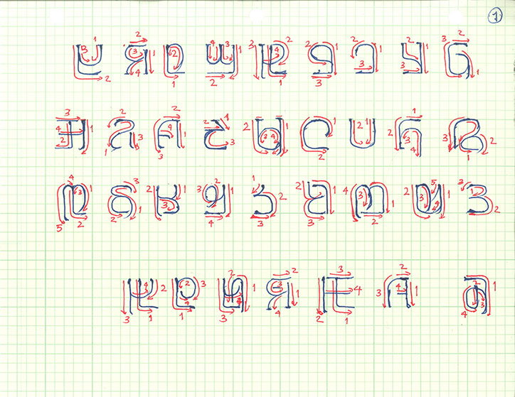
Monotype: Google Noto
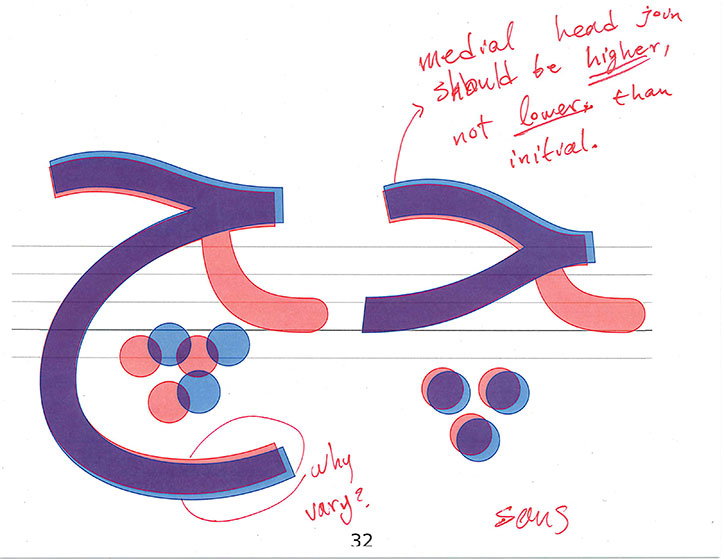
Monotype: Google Noto
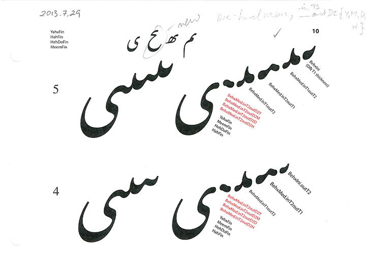
Monotype: Google Noto
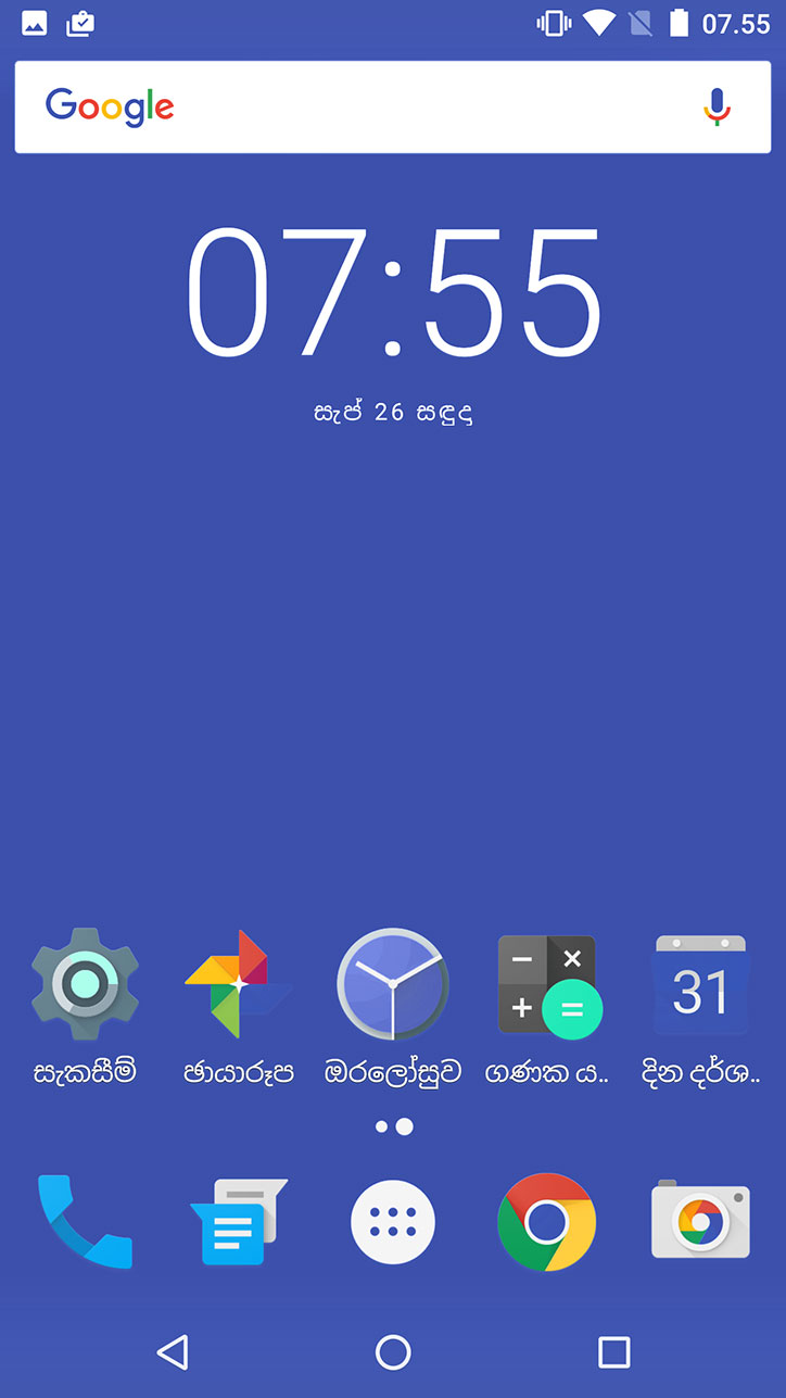
Monotype: Google Noto
Monotype: Google Noto
Monotype: Google Noto
Share Article
Further Info
About the Author
—
Jenny oversees editorial output across It’s Nice That. Get in touch with writing pitches for features or opinion pieces, big creative story tips, or questions about all things editorial. jb@itsnicethat.com
To submit your work to be featured on the site, please see our Submissions Guide.