Launch Recite Me assistive technology

FutureBrand redesigns NatWest’s identity and logo, returning to “the cubes” from 1968
—
Date
4 October 2016
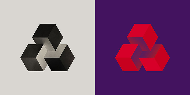
Two versions of a geometric logo featuring three interlocking cubes arranged in a triangle. The left version is black and grey on a light grey background, while the right is red on a purple background.
Above

NatWest’s 1968 logo and new logo by FutureBrand

FutureBrand has redesigned the visual identity and logo for NatWest, basing the revamp on the bank’s original 3D logo from 1968.

The logo was originally designed as three interlocking cubes to represent the coming together of three banks, the design agency explains, though the existing logo was a simplified and flattened version of that form.

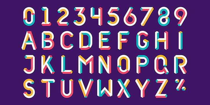
FutureBrand has brought the icon back into 3D by adding shadows to the shapes, and has rolled out the cube concept across the rest of the branding. An illustrative cuboid typeface has been created to be used across the identity, using colourful, multifaceted forms to directly connect with the updated icon. The rest of the branding uses the colour scheme and blocky forms, linking to the design in a more subtle way.

“We wanted to create an identity system that was unique to NatWest and to do that we needed a brand asset that was already their own, however hidden or historical,” explains Dan Witchell, FutureBrand executive creative director and creative lead on the project. “We found the reference to the cubes in the RBS archive from 1968 and it gave us the sort of device we were looking for. It means that even if you don’t see the logo, you see cubes and that tells you instantly that it’s NatWest, a subconscious yet direct link back to the logo.”
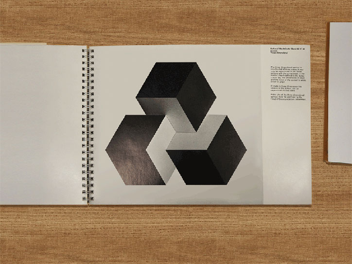
An open spiral-bound sketchbook shows a page with a black and white 3D render of three interlocking cubes. To the right, a column of small text provides a description of the work.
Above

NatWest logo from the archive

Four versions of the Prudential logo are shown in a row against a light grey background. Each version is a geometric, hexagonal shape, evolving from a black symbol in “1969” to red variations in “2003”, “2014” and “2016”.
Above

NatWest’s logo history

A 3D typographic set of the alphabet and numbers 0–9 against a deep purple background. The characters feature a bold, isometric style with white faces and colourful edges in pink, yellow and teal.
Above

FutureBrand: NatWest illustrated alphabet
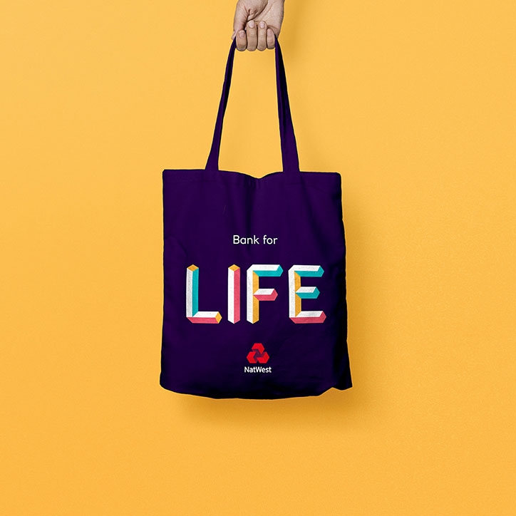
A person holds a purple tote bag against a bright yellow background. The bag features the NatWest logo and the text “Bank for LIFE” in bold, colourful 3D lettering.
Above

FutureBrand: NatWest illustrated alphabet

An isometric illustration featuring a grid of colourful panels, each depicting a different digital or logistics concept. Elements include a delivery truck, a laptop, a smartphone and various floating 3D cubes.
Above

FutureBrand: NatWest illustrations

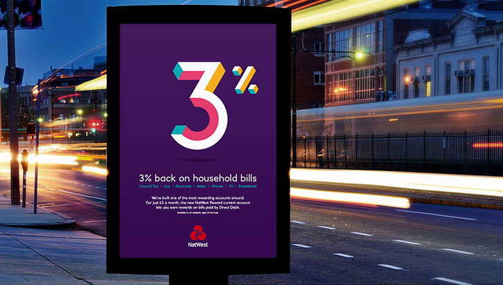
A digital billboard on a city street at night displays a purple advertisement for NatWest. A large, 3D rendered “3%” sits above the text “3% back on household bills”.
Above

FutureBrand: NatWest posters

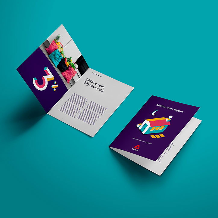
Two open brochures are displayed against a teal background. One features a large number “3” and the text “Little steps. Big rewards.”, while the other shows a stylised illustration of a building under a crescent moon with the headline “Making ideas happen”.
Above

FutureBrand: NatWest brochures

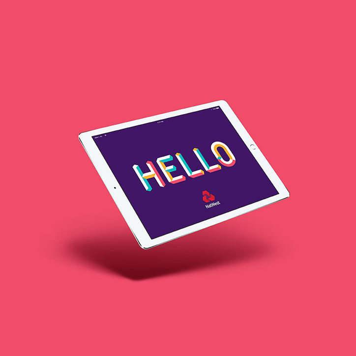
A tablet floats against a bright pink background. The screen shows a purple backdrop with the word “HELLO” in colourful, 3D lettering and the NatWest logo below.
Above

FutureBrand: NatWest digital design

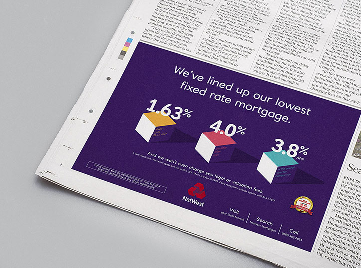
A purple NatWest advertisement reads “We’ve lined up our lowest fixed rate mortgage.” Three 3D blocks in white, red and teal display the rates “1.63%”, “4.0%” and “3.8% APR”.
Above

FutureBrand: NatWest advert

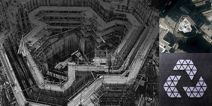
A triptych of images showing the construction and design of a building. A black and white photo shows the complex, angular concrete foundations of a site under construction. Beside it, an aerial view shows the completed building from above, and a graphic shows a white geometric logo made of triangles.
Above

NatWest: history of the NatWest tower and logo

As part of the project FutureBrand has also redesigned the visual identity for the Royal Bank of Scotland, using patterns inspired by Scottish tweeds and tartans. Aiming to create a contemporary interpretation of the traditional fabric patterns, FutureBrand has generated its own RBS pattern, “the Royal Bank tweel… a subtle nod to its Scottish heritage that runs through all brand communications”.
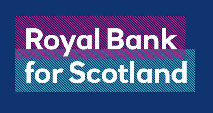
A graphic on a dark blue background features the text “Royal Bank for Scotland” in white. The words are set against two overlapping rectangular blocks of diagonal stripes in purple and teal.
Above

FutureBrand: RBS rebrand

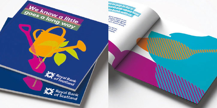
Two brochures for Royal Bank of Scotland. The cover features a yellow watering can and a pink spade against a blue background, with the headline “We know a little goes a long way”.
Above

FutureBrand: RBS rebrand

Share Article

About the Author

Jenny Brewer

—

Jenny oversees editorial output across It’s Nice That. Get in touch with writing pitches for features or opinion pieces, big creative story tips, or questions about all things editorial. jb@itsnicethat.com

To submit your work to be featured on the site, please see our Submissions Guide.
It's Nice That Newsletters

Fancy a bit of It's Nice That in your inbox? Sign up to our newsletters and we'll keep you in the loop with everything good going on in the creative world.