



Launch Recite Me assistive technology

The Dropbox rebrand features a logo update, new typography and vibrant illustration collaborations
—
Date
4 October 2017
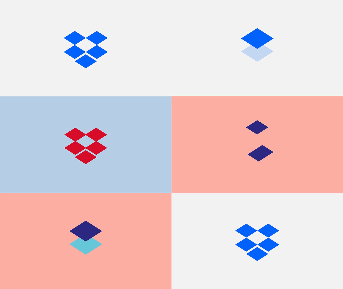
An animation in which a blue diamond shape morphs and multiplies against a changing background. The shapes shift in colour and arrangement before forming the Dropbox logo on a light grey field.
Above

Dropbox and Collins: Dropbox rebrand (Copyright © Dropbox, 2017)

Dropbox has unveiled a complete rebrand by its in-house team in conjunction with design studio Collins, the biggest change to the company’s visual identity in its 10-year history. Featuring a “cleaner and simpler” logo, a typography shift to Sharp Grotesk, and a wealth of vivid illustration collaborations, the rebrand injects energy to the brand’s image. Collins also worked alongside studios Instrument, XXIX, Sharp Type and Animade on the project.

The illustration commissions represent a change in style for the brand, displaying a shift in focus towards being a “living workspace”, or moving its users “from ‘knowledge workers’ to ‘creative workers’,” explains Dropbox’s creative director Aaron Robbs and vice president of design Nicholas Jitkoff. According to a blog post by the designers, the brand has been repositioned as a place “where in-progress work happens as opposed to old finished project storage”. In the illustrations, this manifests as a “sketchy”, pencil-drawn style of illustration to maintain a raw feel, that also contrasts the block colours and shapes of the wider branding.

Along the same vein, one aspect of the launch campaign sees Dropbox invite pairs of artists of differing styles and disciplines to collaborate on “co-creation imagery”, as a “visual metaphor” for the importance of collaboration in the creative process. These split screen images have been made by illustrator David McLeod with photographer Davy Evans; and illustrator Lynnie Z with photographer Alexandra Gavillet.

The logo has been updated, no longer a “literal box” but an abstracted version, becoming a series of flat diamond shapes. Collins chose to revamp the entire brand’s typography, including its core wordmark, using Sharp Grotesk for its “versatility” and sheer range of 259 fonts. Together with a braver colour palette that “juxtaposes in unexpected ways”, this allows the brand to “speak in a variety of tones”. According to the team, the homepage redesign aims to tell its “new story in a bold, evocative way”.

“Our new system lets us pick the right amount of expressiveness for the situation,” the designers explain. “Colour can go from a standard Dropbox blue to ‘whoa’. Same for type, photography, and illustration. In a marketing campaign, we can dial things up to provoke and inspire creative energy. But in our product, where people need to concentrate on their work, we can dial it down.” The brand has also released an ad on YouTube to launch the rebrand.
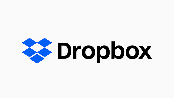
The Dropbox logo, featuring a blue open-box icon next to the word “Dropbox” in black.
Above

Dropbox and Collins: Dropbox rebrand (Copyright © Dropbox, 2017)
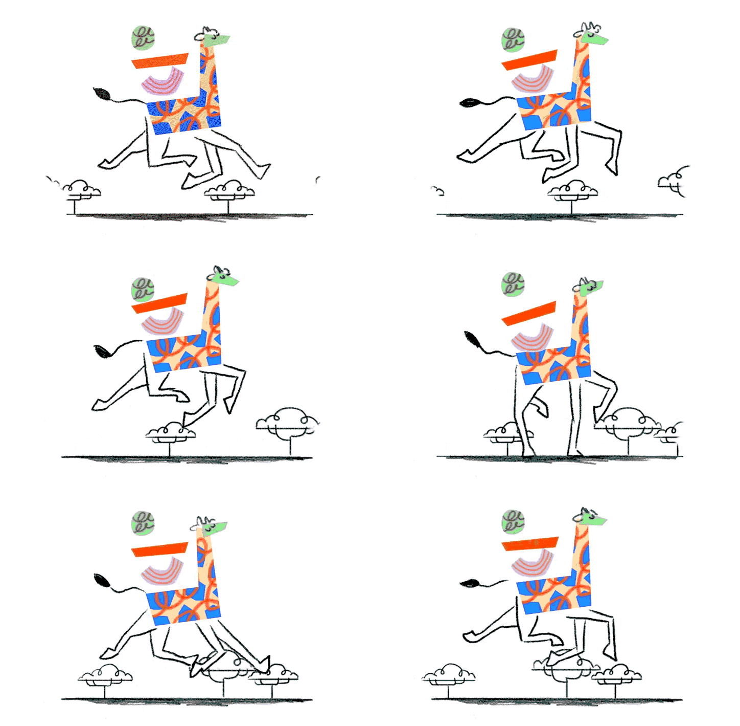
An animation of a stylised giraffe with a blue and orange patterned body. The figure trots across a white background, stepping on small, cloud-like shapes.
Above

Dropbox and Collins: Dropbox rebrand (Copyright © Dropbox, 2017)
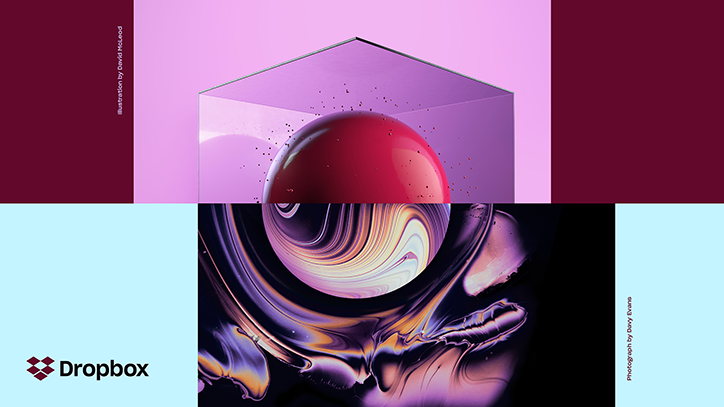
A 3D render of a glossy red sphere inside a translucent purple cube against a pink background. Below, a distorted, swirling liquid version of the same sphere appears in shades of purple and gold. The Dropbox logo is positioned to the left.
Above

Dropbox and Collins: Dropbox rebrand (Copyright © Dropbox, 2017)
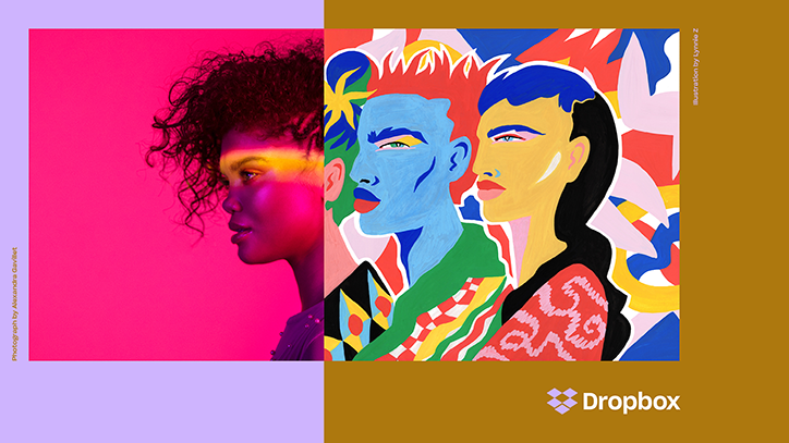
A split image showing a photograph of a person in profile on the left and a colourful illustration of two people on the right. The Dropbox logo appears in the bottom right corner.
Above

Dropbox and Collins: Dropbox rebrand (Copyright © Dropbox, 2017)
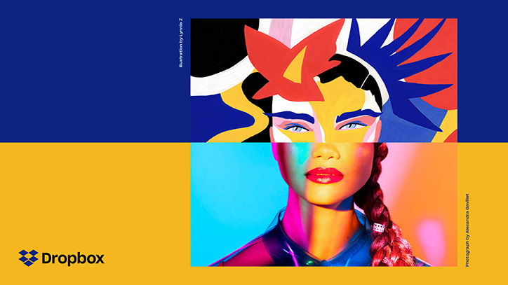
A split-screen composition featuring a person’s face. The top half is a colourful illustration with abstract shapes, while the bottom half is a photograph with vibrant, neon lighting. The Dropbox logo appears in the bottom left corner.
Above

Dropbox and Collins: Dropbox rebrand (Copyright © Dropbox, 2017)
The white Dropbox logo is centred on a bright blue background.
Above

Dropbox and Collins: Dropbox rebrand (Copyright © Dropbox, 2017)
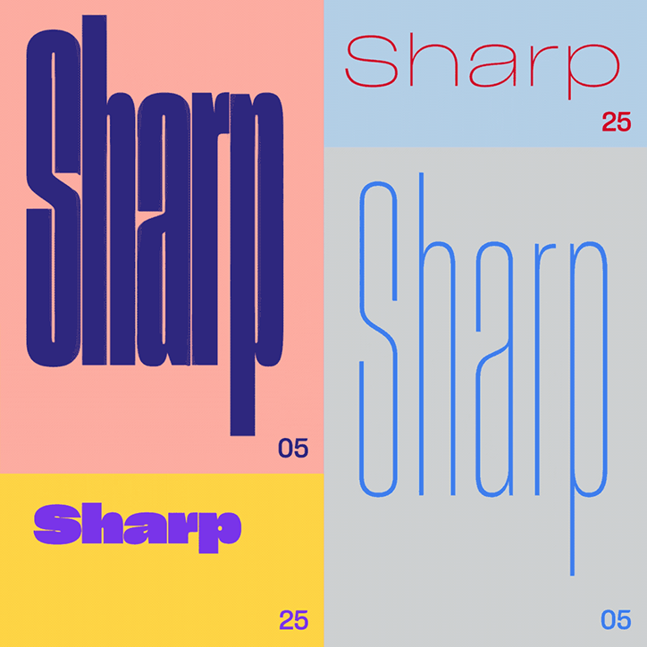
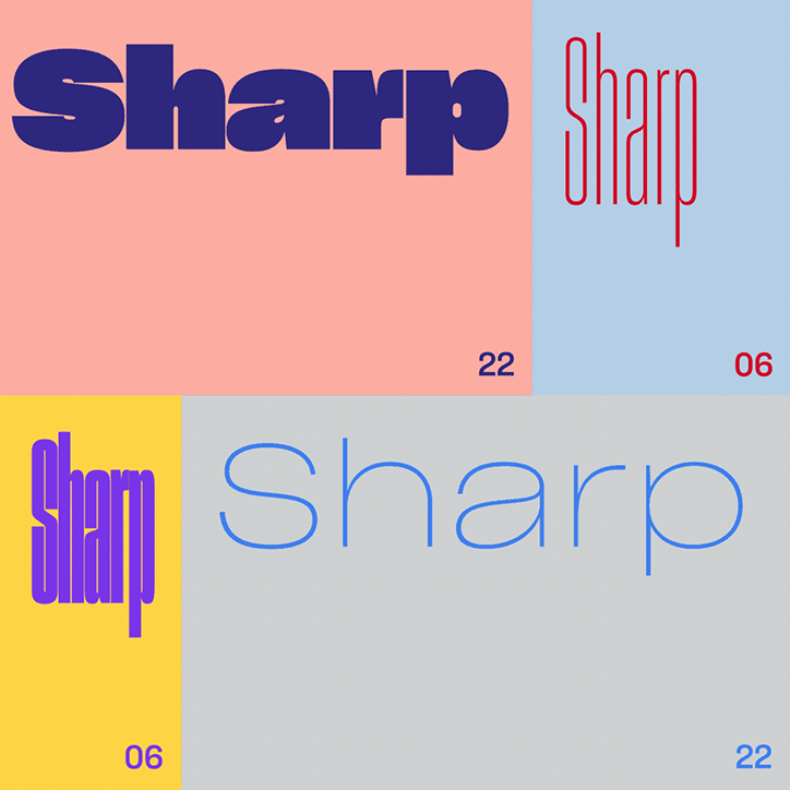
A graphic design study showing the word “Sharp” in four different typographic styles. The layouts use a grid of pink, blue, yellow and grey backgrounds with the numbers “05” and “25” in the corners.
Above
Left

Dropbox and Collins: Dropbox rebrand (Copyright © Dropbox, 2017)
Right

Dropbox and Collins: Dropbox rebrand (Copyright © Dropbox, 2017)
A graphic divided into four coloured quadrants, each featuring the word “Sharp” in a different typeface. The styles range from a bold, heavy sans-serif to a thin, elongated serif and a light, rounded font.
Above

Dropbox and Collins: Dropbox rebrand (Copyright © Dropbox, 2017)
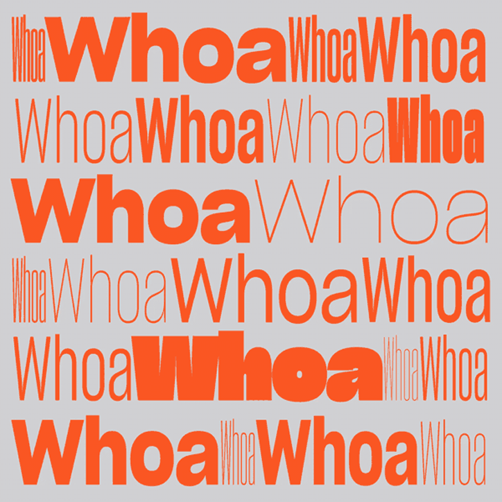
A graphic composition featuring the word “Whoa” repeated in various sizes and weights. The orange text is set against a plain grey background.
Above

Dropbox and Collins: Dropbox rebrand (Copyright © Dropbox, 2017)
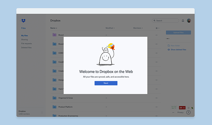
A screenshot of the Dropbox web interface. A central pop-up window features a simple line drawing of a smiling figure and reads “Welcome to Dropbox on the Web”.
Above

Dropbox and Collins: Dropbox rebrand (Copyright © Dropbox, 2017)
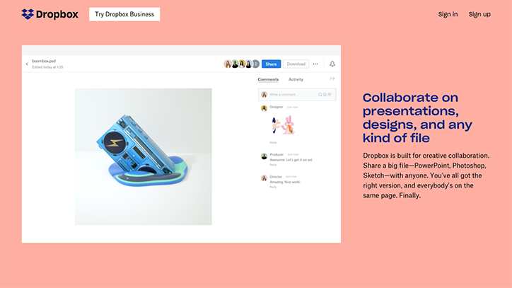
A screenshot of the Dropbox website on a pink background. A project window shows a 3D render of a blue electronic device, alongside a comments section and the headline “Collaborate on presentations, designs, and any kind of file”.
Above

Dropbox and Collins: Dropbox rebrand (Copyright © Dropbox, 2017)
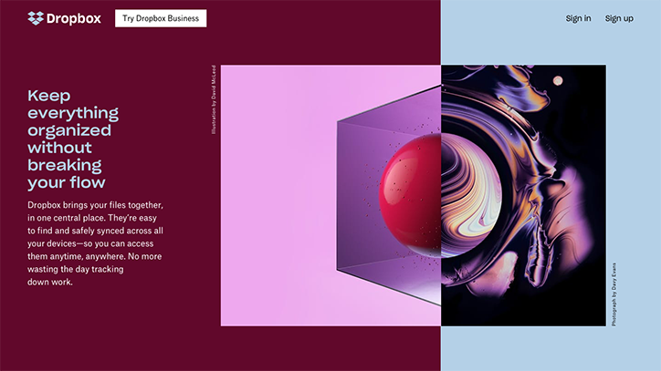
A Dropbox landing page split between a deep burgundy and light blue background. The burgundy side features the headline “Keep everything organized without breaking your flow” alongside a short paragraph of body copy. Between the two colours, a central image shows a red sphere inside a purple cube, partially merged with a swirling, iridescent abstract form.
Above

Dropbox and Collins: Dropbox rebrand (Copyright © Dropbox, 2017)
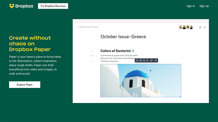
A promotional image for Dropbox Paper set against a dark green background. A digital interface shows a collaborative document titled “October Issue–Greece” featuring a photo of a blue-domed building in Santorini.
Above

Dropbox and Collins: Dropbox rebrand (Copyright © Dropbox, 2017)
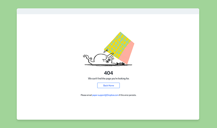
An illustration of a small, white creature pinned to the ground by a large, colourful block. Below the figure, bold text reads “404” followed by “We can’t find the page you’re looking for.”
Above

Dropbox and Collins: Dropbox rebrand (Copyright © Dropbox, 2017)
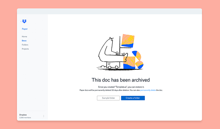
An illustration of a figure pushing a trolley of colourful abstract shapes. Below the image, a message reads “This doc has been archived” with a button to “Create a folder”.
Above

Dropbox and Collins: Dropbox rebrand (Copyright © Dropbox, 2017)
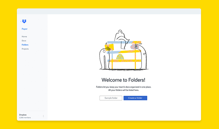
A screenshot of the Dropbox Paper interface on a bright yellow background. An illustration of figures arranging large blocks sits above the text “Welcome to Folders!” and a blue “Create a folder” button.
Above

Dropbox and Collins: Dropbox rebrand (Copyright © Dropbox, 2017)
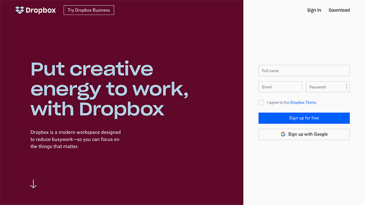
A screenshot of the Dropbox homepage. A deep red section on the left features the headline “Put creative energy to work, with Dropbox” and a short introductory paragraph. On the right, a white sign-up form includes fields for name, email and password, alongside a blue “Sign up for free” button.
Above

Dropbox and Collins: Dropbox rebrand (Copyright © Dropbox, 2017)
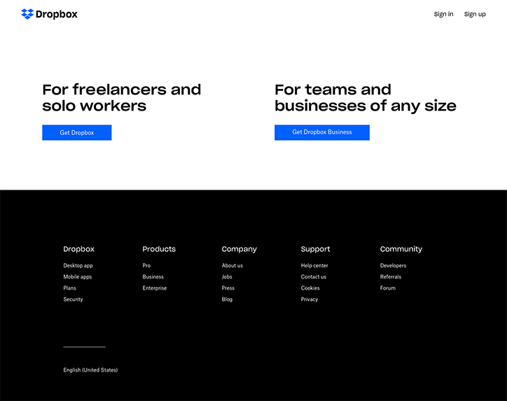
A screenshot of the Dropbox homepage. Two sections offer options “For freelancers and solo workers” and “For teams and businesses of any size”, each with a blue call-to-action button. A black footer below contains links organised under the headings “Dropbox”, “Products”, “Company”, “Support” and “Community”.
Above

Dropbox and Collins: Dropbox rebrand (Copyright © Dropbox, 2017)
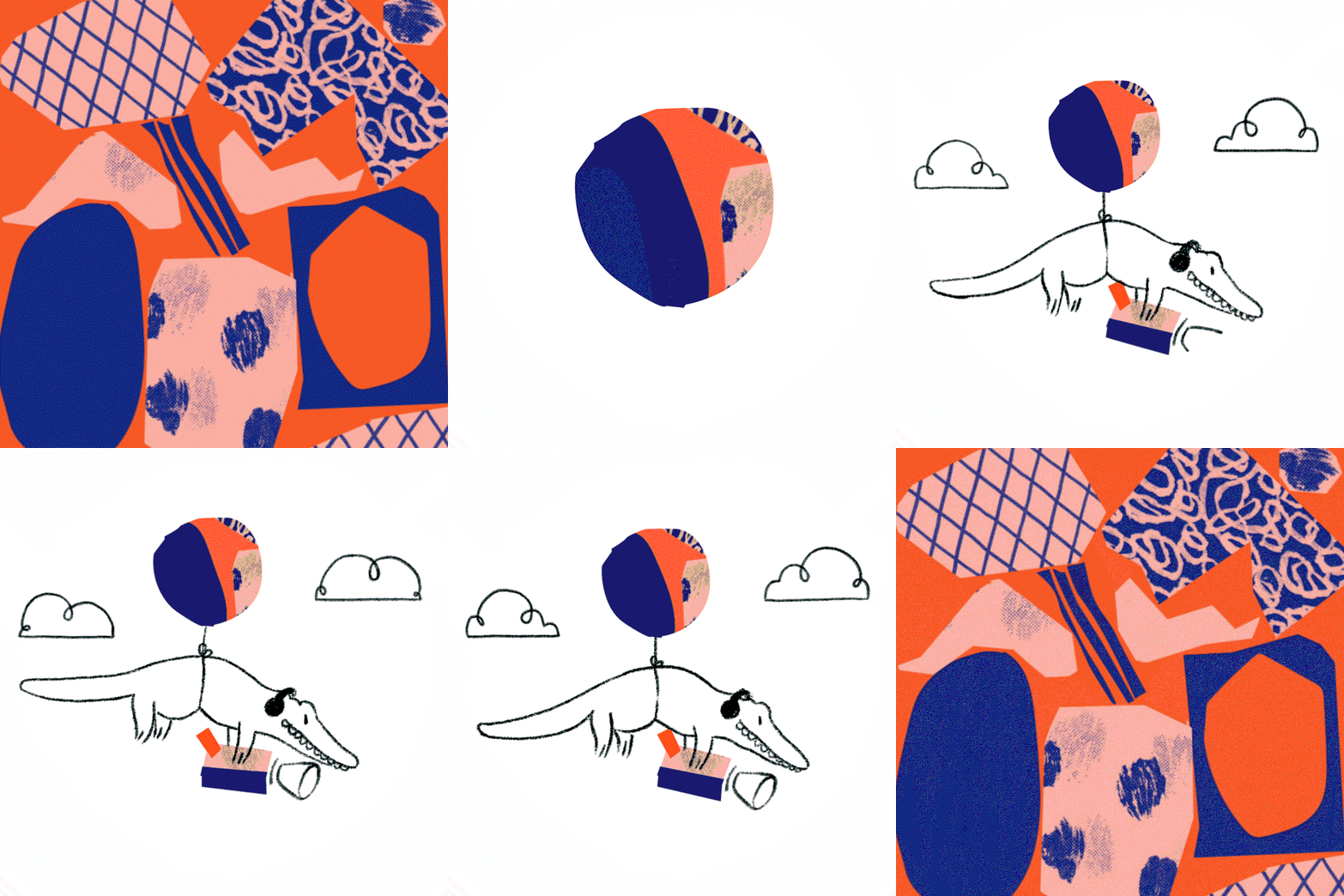
An animation in which a collage of blue, pink and orange abstract shapes shifts to reveal a line drawing of a crocodile. The crocodile has a colourful balloon tied to its back and stands against a white background with simple clouds.
Above

Dropbox and Collins: Dropbox rebrand (Copyright © Dropbox, 2017)

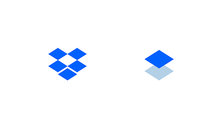
Two versions of the Dropbox logo on a white background. The first is the full blue icon made of open boxes, and the second is a simplified version showing a single blue diamond floating above a pale blue shadow.
Above

Dropbox and Collins: Dropbox rebrand (Copyright © Dropbox, 2017)

Share Article

About the Author

Jenny Brewer

—

Jenny oversees editorial output across It’s Nice That. Get in touch with writing pitches for features or opinion pieces, big creative story tips, or questions about all things editorial. jb@itsnicethat.com

To submit your work to be featured on the site, please see our Submissions Guide.
It's Nice That Newsletters

Fancy a bit of It's Nice That in your inbox? Sign up to our newsletters and we'll keep you in the loop with everything good going on in the creative world.