Launch Recite Me assistive technology
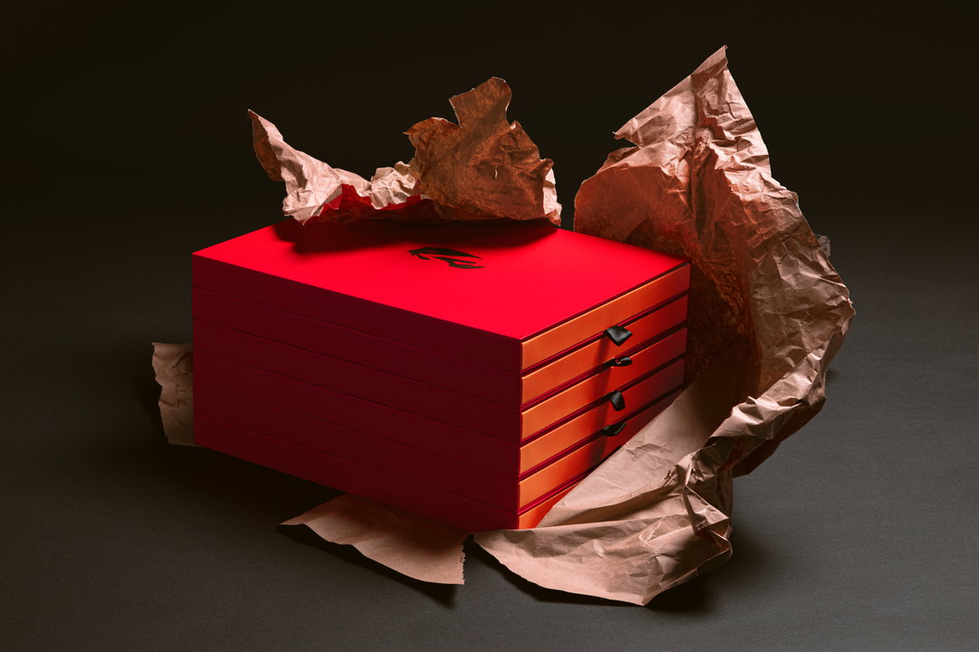
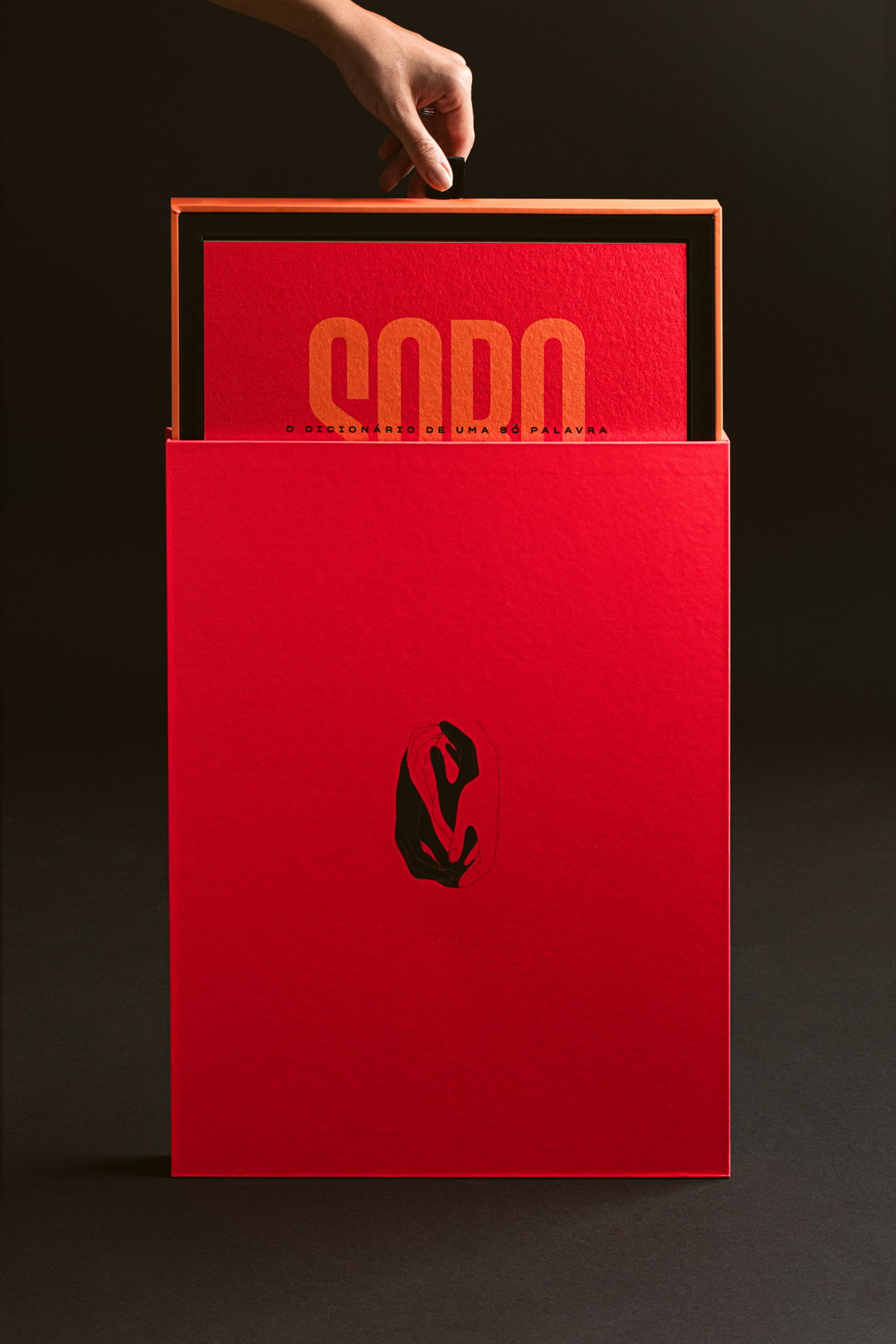
A hand lifts the lid of a tall red box to reveal a red book inside. The book cover features the word “Sodo” in bold orange type, with the phrase “O DICIONÁRIO DE UMA SÓ PALAVRA” below.

This hand-bound One-Word Dictionary for Hershey’s champions female talent and sisterhood in Brazil

Embracing a slower, more physical form of campaign, BETC Havas hopes to rectify the omission of “sororidade” (sisterhood) from Brazilian dictionaries.

—
Date
18 May 2022

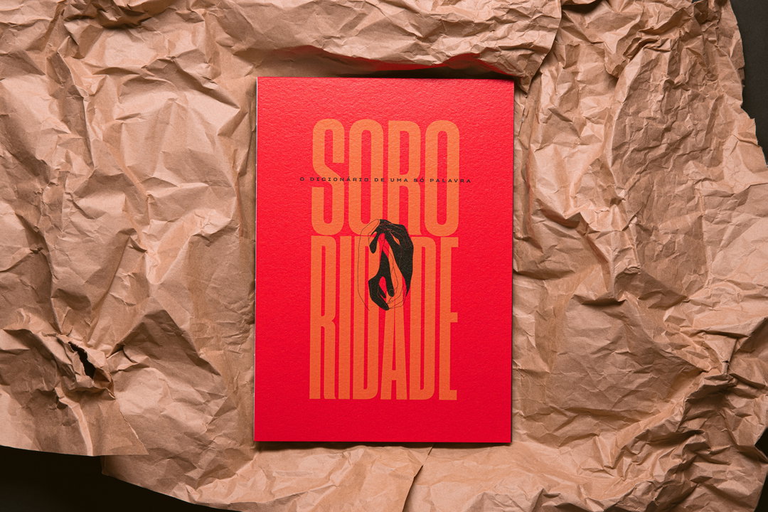
Where campaigns for colossal brands are concerned, it’s easy to see why agencies might favour a digital approach, offering ease when it comes to production and audience reach. So it’s a welcome change of pace to see something more tangible and reflective in the sphere, which is exactly what BETC Havas has just delivered for Hershey’s. Utilising traditional hand-sewn binding and an A3 art book format, the agency has crafted the One-Word Dictionary as part of the brand’s Her for She campaign – an initiative championing female talent. The idea for the One-Word Dictionary came from BETC Havas when it discovered that the word “sororidade” (sisterhood) did not exist in Brazilian dictionaries. Aiming to rectify the omission, the agency decided the word needed more than a mere definition; “it deserves its own book,” says Marcelo Ribeiro, creative director of BETC Havas São Paulo.

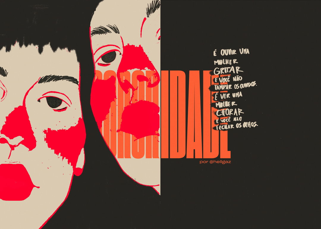
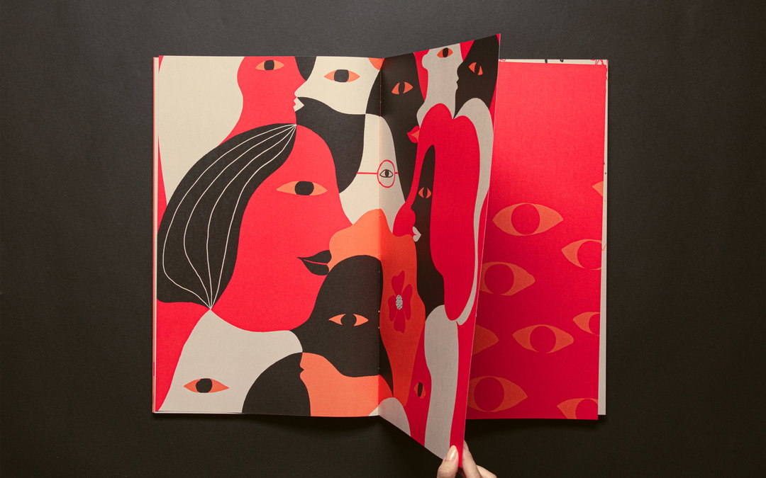
Rather than pushing a singular rigid definition, BETC Havas has widened the scope of the word, inviting seven female talents in Brazil to discuss what sisterhood means to them. Each definition has been brought to life with custom illustrations from BETC Havas and São Paulo-based studio Olho Bala, using the term as a starting point and loose conceptual thread between the pages. Another unifying force throughout is colour: “The One-Word Dictionary uses an intense colour palette that shows the strength of women without losing the subtleties of female talents,” Marcelo tells us.
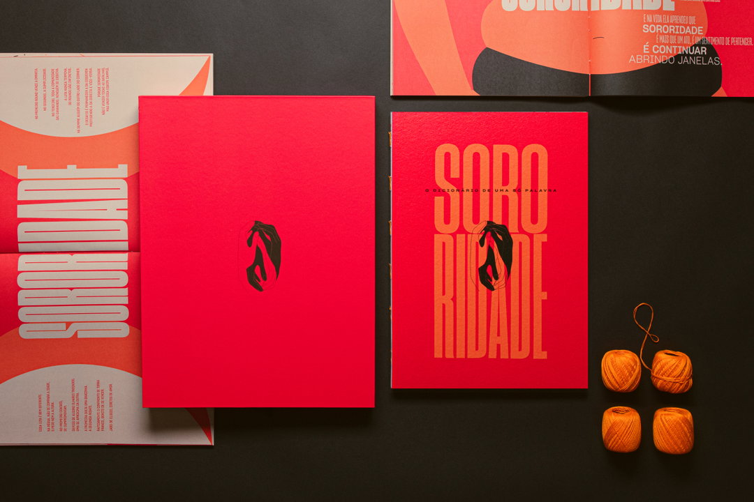
A red book and its open pages are laid out on a black surface. The cover features a black abstract shape and the word “Sororidade” in bold, orange typography. Four balls of orange yarn sit to the right.
Above

BETC Havas: One-Word Dictionary, Hershey’s (Copyright © BETC Havas, 2022)

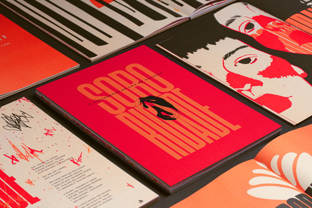
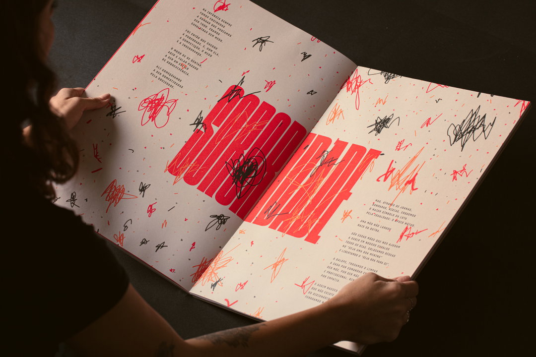
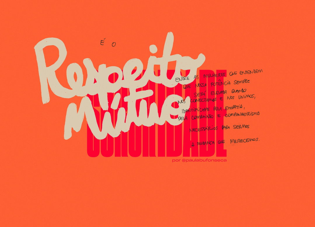
While the starkness of the palette and the grandeur of the A3 format provides the book with the same weight you might expect from an old trusty dictionary, hand-scribbled scrapbook accents bring the voices behind the dictionary to the fore. In fact, Marcelo likens the text to a “blank moleskine”, allowing its seven contributors to take over the pages with their definitions. From rappers and scientists to activists and film directors, BETC Havas has pooled the likes of writer Ryane Leão and artist Katu Mirim for a broad range of responses to the word. Then, to outline the uniqueness of each contributor’s definition, BETC Havas mixed Sharp Grotesk – Hershey’s brand typeface – with cursive calligraphy. Aiming to “translate a unique word” with a “unique design”, BETC Havas steered clear of similarities with traditional dictionaries, instead finding inspiration in art books.

In all, 100 dictionaries were produced and sent to a collection of influencers. Meanwhile, the creation process has been turned into a video – a clever way of turning a uniquely physical campaign into a digital format. BETC Havas hopes both the One-Word Dictionary and accompanying video will prompt publishers to add the word to their own dictionaries, in line with Hershey’s continuing initiative to bolster visibility around female talent.

GalleryBETC Havas: One-Word Dictionary, Hershey’s (Copyright © BETC Havas, 2022)
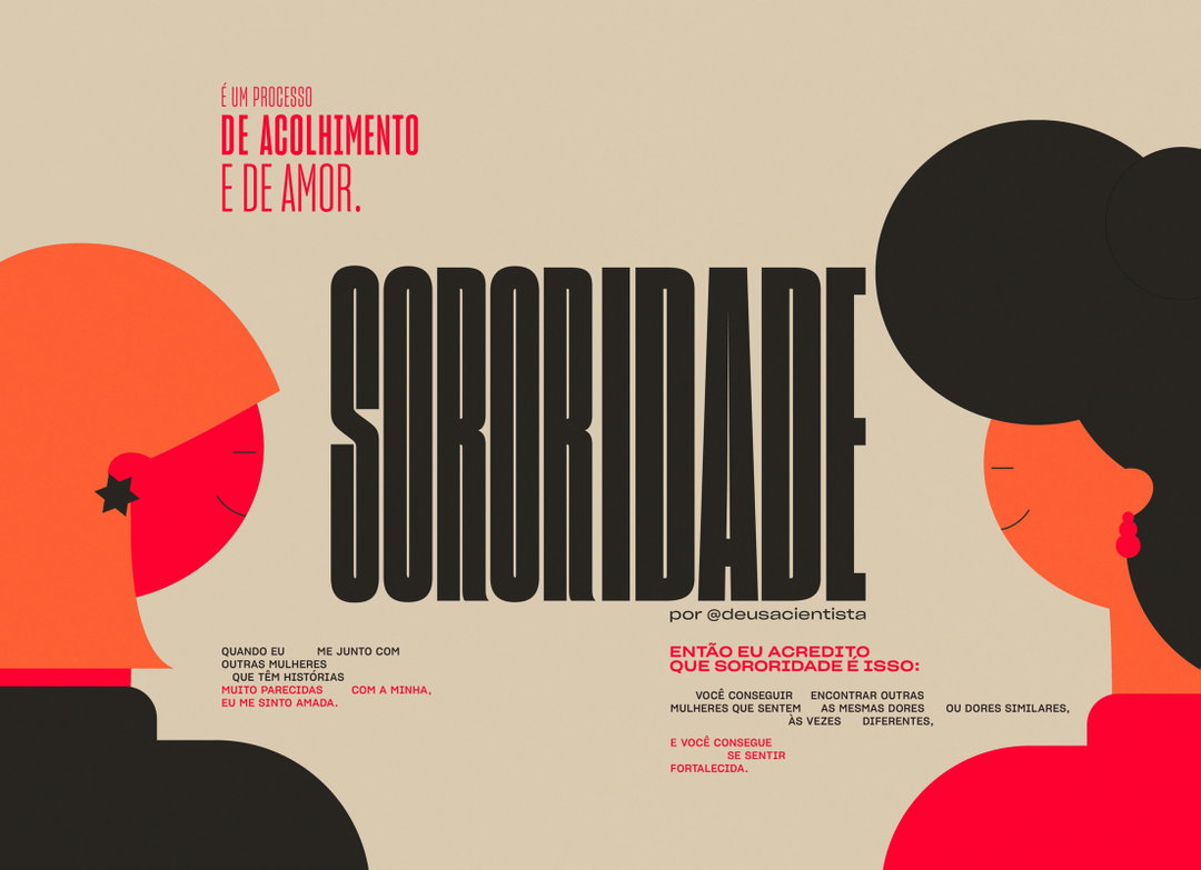
An illustration of two people facing each other, separated by the large black word “SORORIDADE”. The figure on the left has orange hair and a star earring, while the figure on the right has a black bun and a red earring. Portuguese text in red and black surrounds them, including the phrase “É UM PROCESSO DE ACOLHIMENTO E DE AMOR.”
A hand lifts the lid of a tall red box to reveal a red book inside. The book cover features the word “Sodo” in bold orange type, with the phrase “O DICIONÁRIO DE UMA SÓ PALAVRA” below.
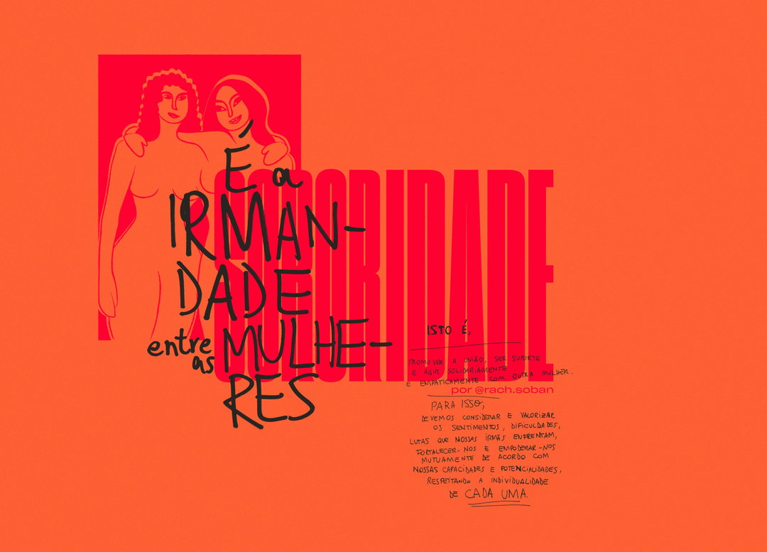
An illustration in shades of red and orange featuring two figures with their arms around each other. Bold, stylised text reads “E a IRMANDADE entre as MULHERES”, with the word “solidariedade” layered behind it. Smaller Portuguese text below explains the concept of sisterhood and provides a social media handle, “por @rach.soban”.
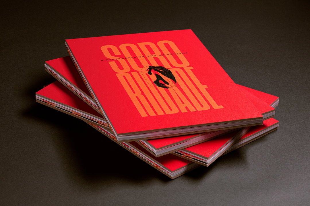
A stack of red books on a dark grey surface. The top cover features bold orange typography that reads “Soro Ridade” and smaller text that reads “O dicionário de uma palavra”.
An illustration of two faces in profile, rendered in cream and bold red. The word “COVARDIA” is written in large, red block letters across the centre. To the right, handwritten Portuguese text describes the act of hearing a woman scream or seeing her cry without closing one's eyes or ears.
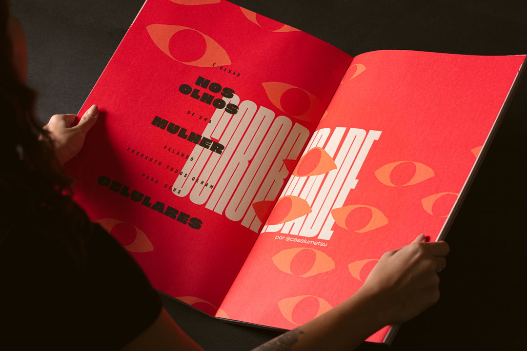
An illustration across an open book featuring stylised, overlapping faces in red, black and cream. The right page is a solid red field patterned with several large, open eyes.
A red storage box with four shallow drawers sits partially wrapped in crumpled brown paper. The box is set against a dark, neutral background.
A bright red book cover features bold, stylised typography that reads “Soro”. A small illustration of a face is integrated into the lettering. The book is surrounded by other printed materials, including a red page and a graphic illustration of a person in red and white.
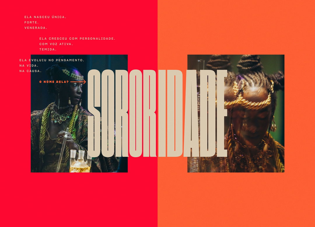
A graphic design piece split vertically between red and orange backgrounds. Two photos of a person wearing ornate gold jewellery and headwear are overlaid by the large, bold word “SORORIDADE”. Portuguese text in the top left describes a figure who was born unique, strong and venerated.
A person holds open a red magazine featuring a bold typographic layout. The Portuguese text reads “Nos olhos de uma mulher” and “celulares”, with a large, distorted word stretching across the center fold.
An illustration across an open book featuring stylised, overlapping faces in red, black and cream. The right page is a solid red field patterned with several large, open eyes.
A person holds open a book featuring a bold red and cream layout. Large, distorted red typography is overlaid with black scribbles and handwritten Portuguese text.
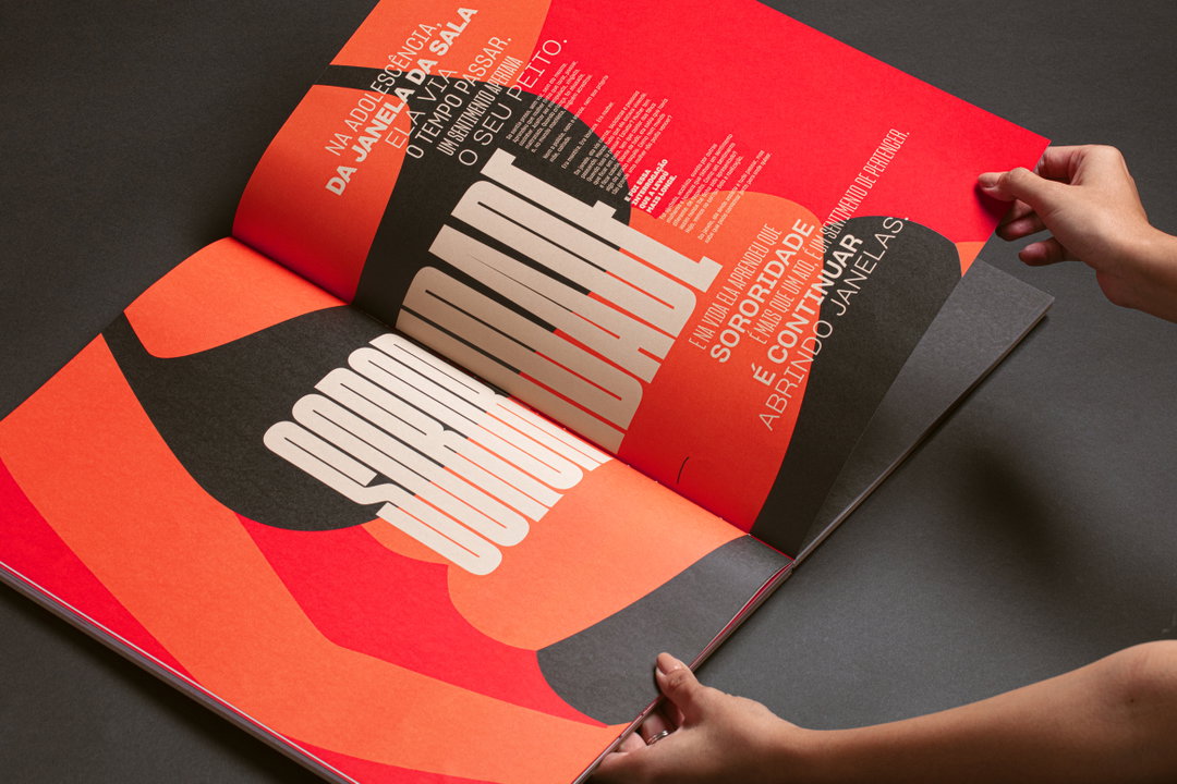
A person holds open a magazine featuring a bold, red and black layout. Large, stylised typography in Portuguese reads “Sororidade” across the spread.
A graphic design in bright orange featuring bold, layered typography. Large, cream-coloured script reads “Respeito Mútuo”, laid over a block of thick, red sans-serif text that reads “SOLIDARIEDADE”. Smaller Portuguese text to the right discusses empathy and sisterhood, with a credit at the bottom for “@paulabufonseca”.
A red book cover with bold orange typography reads “SORO” and “RIDADE”. A small line of text between the words reads “O DICIONÁRIO DE UMA SÓ PALAVRA”. The book is centred on a backdrop of crumpled brown packing paper.

BETC Havas: One-Word Dictionary, Hershey’s (Copyright © BETC Havas, 2022)
Hero Header

BETC Havas: One-Word Dictionary, Hershey’s (Copyright © BETC Havas, 2022)
Share Article

Further Info

About the Author

Liz Gorny

—

Liz (she/they) is the senior editor at Insights, a research-driven department within It’s Nice That. They previously ran the news section of the website. Get in contact with them for potential Insights collaborations or to discuss Insights’ public-facing reports.
It's Nice That Newsletters

Fancy a bit of It's Nice That in your inbox? Sign up to our newsletters and we'll keep you in the loop with everything good going on in the creative world.