




- Words
- Lucy Bourton
- —
- Date
- 15 August 2022
- Tags
“Their work was a feeling, not an instruction”: A visual history of tomato, the era-defining collective of the 1990s
During the early ‘90s a group of artists, designers and musicians formed a collective studio, known only as tomato. In the years that followed, their experimental design approach led to era-defining work – always placing the process first.
Share
Share
This article is published as part of Us vs Them, a guest edit of It’s Nice That commissioned and curated by creative director Richard Turley. To read further articles from Richard’s takeover head here.
I remember the design agencies we visited while at university as being quite cold, sterile places. There were benches of Apple Macs, trip-hop was playing and everyone dressed identically, wearing wireframe glasses. The work being produced in that environment often felt the same. Slick, but sterile.
I feel the same now. When I visit studios there’s usually fancy seating, long benches, pot plants, neatly arranged libraries of collectable books. Like there’s a manual and we all just nod along and follow it. Tomato, on the other hand, looked like a mess. Work made by this collective of artists, designers and musicians was out of focus, itchy, unsure of itself, pile ups of text and texture. Their work was a feeling, not an instruction.
This article is the one probably closest to my heart. I’m not a great student of graphic design, couldn’t tell you anything about Wolfgard Reinwhateverhisnameis or much at all about the Bauhaus, or even Paul Rand or whoever. I loved Vaughan Oliver’s covers (if there was a reason I went into design, it’s probably him), but when Dubnobasswithmyheadman came along, that was my epiphany.
I miss that. I look back at tomato’s work now and, to me, it feels like what it felt to be alive at that time. A mess of energy, excitement, confusion and hangovers, being out all night, warm bodies and days where your brain was wandering about, trying to connect it all. – Richard Turley

At the beginning of the 1990s in London’s Soho, a group of artists from all mediums formed a creative collective which defined the graphic aesthetic of the era. Unlike the traditional agency structures we see today, the collective operated with a flat hierarchy. There was no overarching creative visionary, but instead a group of singular practices operating as a network. Across identities, campaigns, exhibitions and various visual projects, the collective worked with everyone from Chanel to Channel 4, Microsoft to Mute Records, Sony, Samsung, Nokia, Nike, Renault and Royal Mail – while dually maintaining their own practices. All of this work only featured one authored name however, their collective identity: tomato.
Behind the scenes, the individuals who made tomato were acquaintances to old friends, joining forces to create original work against the backdrop of a stale design scene at the time. Including artists and designers Simon Taylor, Dirk van Dooren, Graham Wood, Michael Horsham, Dylan Kendle, Jason Kedgley, John Warwicker, alongside managing director Steve Baker, and Karl Hyde and Rick Smith of Underworld, the group amalgamated references, movements and their individual experiences, to create an entirely new approach. As Michael Horsham from the collective describes: “Tomato was a breath of fresh air: not just interesting and original work, but also people who not only thought about the history of their discipline, but had ideas behind what they wanted to do, where they wanted to take things, how to act and work differently. Process. Making. Thinking and doing. Call it what you like. Predominantly though, the atmosphere was fun.”
During their time together, the collective’s members formed an approach to design at odds with any process you’re likely to hear across studios and agencies today; avoidance of ego, working with clients on their terms, adopting the advances of technology when it was creatively useful rather than necessary. And so, as part of Richard Turley’s guest edit of It’s Nice That, we’ve pulled together a variety of its many members to create an in-depth visual history of tomato. We hope that reflecting on the work of a studio who paved their own way demonstrates what is possible “when experimentation, play and process are presented with as much importance as the work,” as Richard describes. “That actually, the work isn’t about the ending, it’s about the path travelled to get there.”
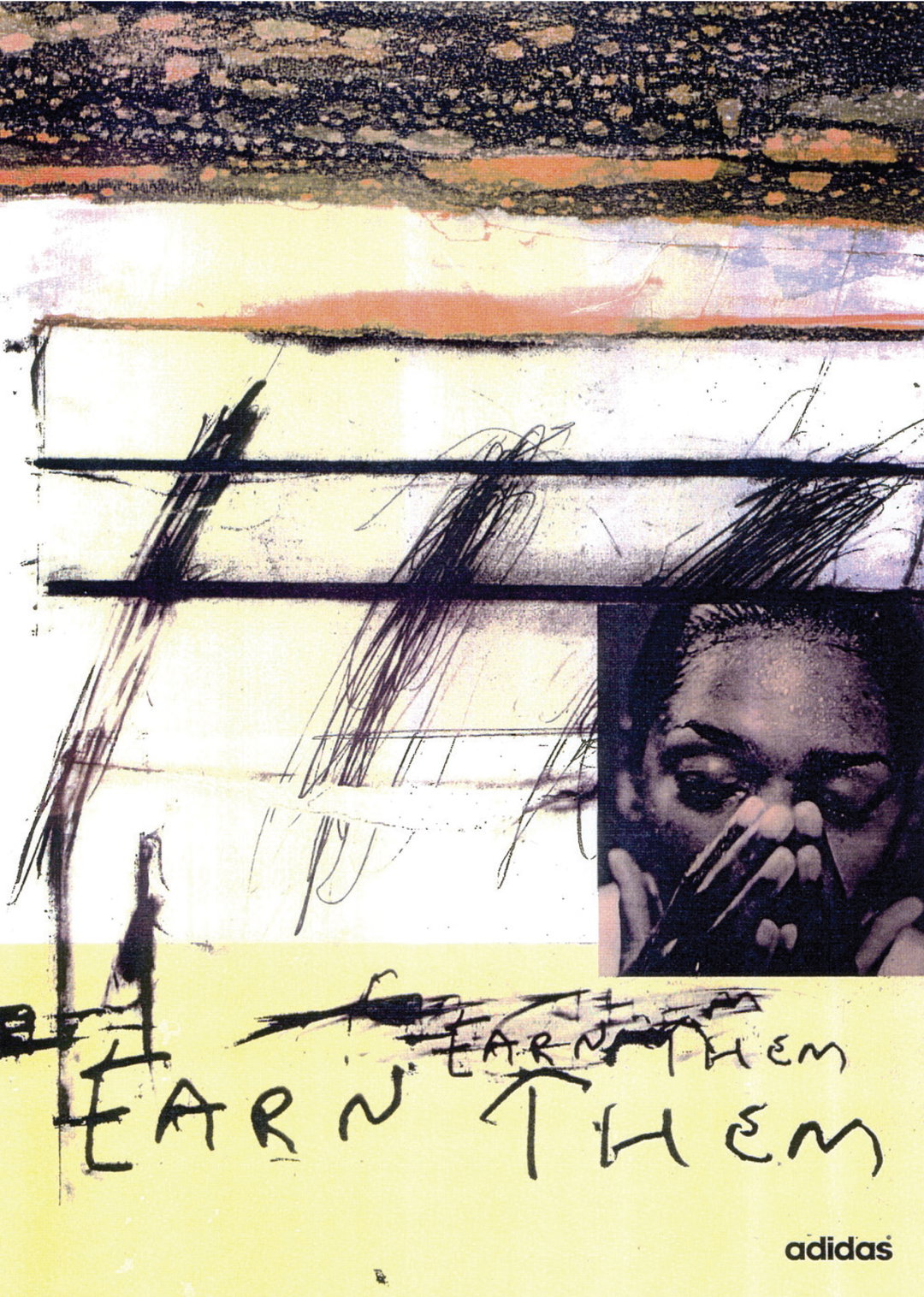
Tomato: Adidas (Copyright © Tomato, 2022)
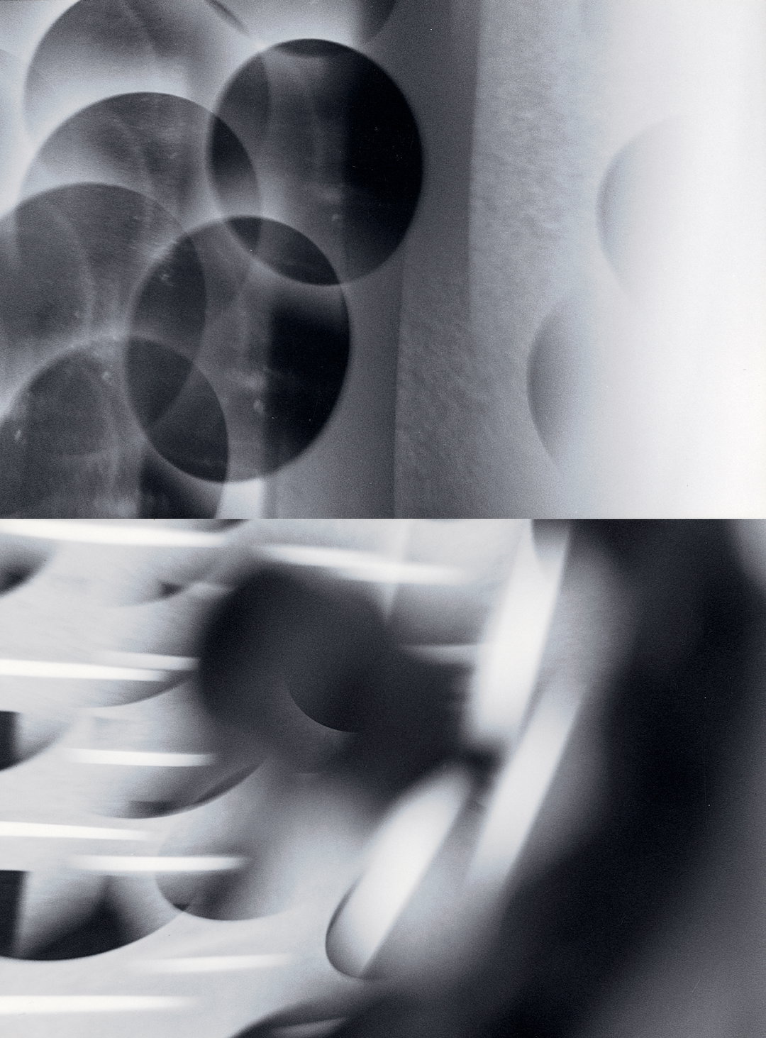
Tomato: Light Composition (Copyright © Tomato, 2022)
Tomato: Light Composition (Copyright © Tomato, 2022)
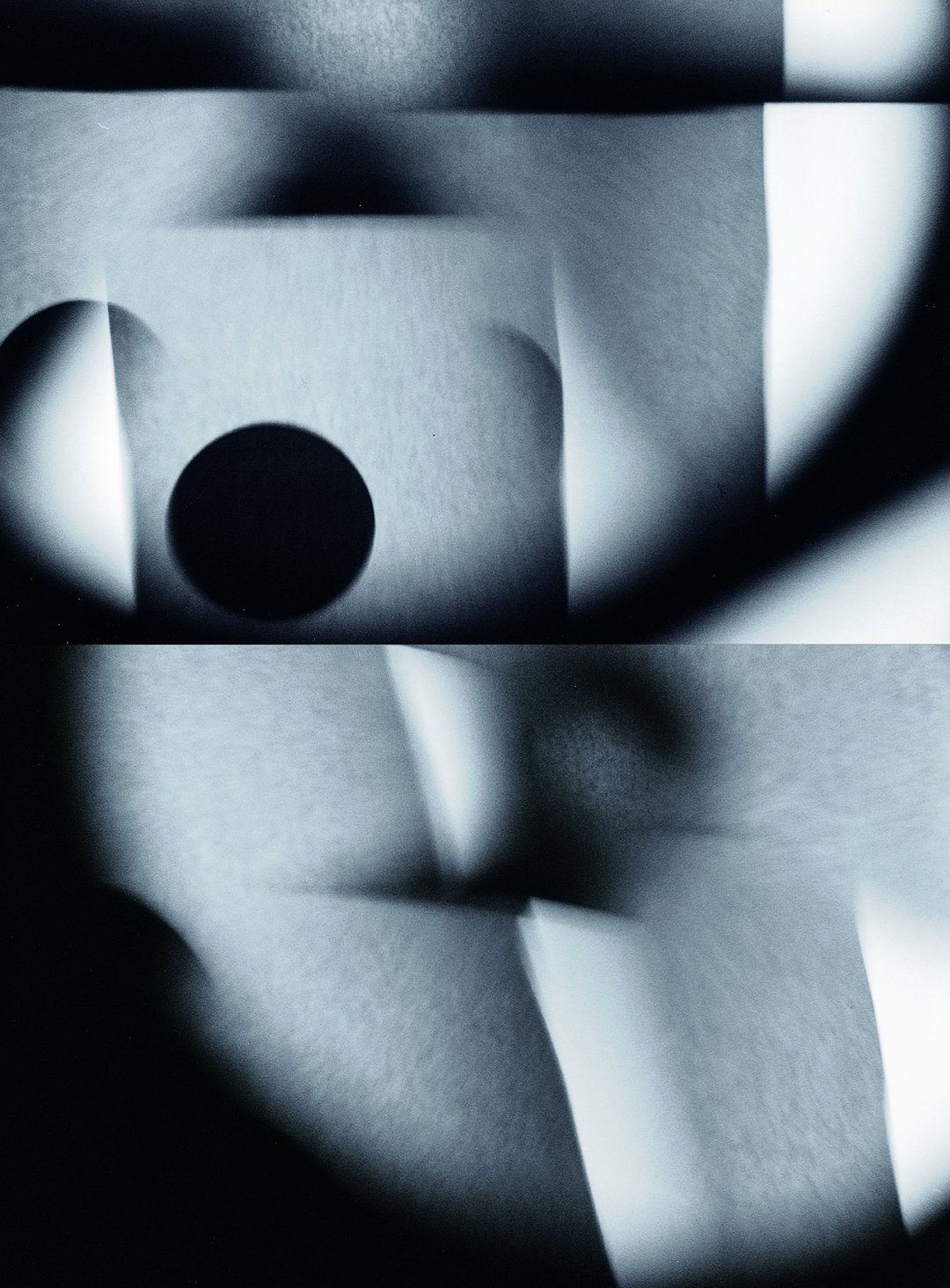
Tomato: Light Composition (Copyright © Tomato, 2022)

D’Arblay Street: The Studio
Simon Taylor:
There was a party in an empty part of the building, I got talking to people there and suddenly we were tenants. That was in the summer of 1991, about three months after we initially set up as a studio. D’Arblay Street itself is in the heart of Soho. It attracted a lot of characters.
Steve Baker:
Fortunately, there was a recession going on so “To Let” signs were like confetti in Soho. Unfortunately, there was a recession going on. The advertising business was frozen and record companies were slashing budgets so we couldn’t afford what we needed. D’Arblay Street was handily located and more than we could afford, so we sublet a couple of rooms and moved in.
Simon Taylor:
Our space was at number 26. Three rooms on the top floor, one turned into a sound studio. It was charming and scruffy. On opening the door, you walked right into the middle of the work space – no reception or anything like that.
Graham Wood:
It was the top floor of a 1930s workshop type building, pretty much unchanged except for paint I think. It was fairly rough, but not uncomfortable. By the entry was a small sink, one smaller room off the other, a bigger studio space which we used for admin, and a very small room of the studio was a kind of quiet space (which was rare). Next door, a smaller self-contained room became a music studio. The windows were the full width of the studio, where you could look out onto D’Arblay Street.
Michael Horsham:
It had been a workshop of some sort. Crittal windows. It was decidedly shabby. But there were computers and a fax machine. Decks? Can’t be sure. But there was music. And a little music studio in the room next door. The tables looked like Foster Nomos with black tops. A mixture of chairs. Nothing too studied, some books and plan chests… It was a working space, but also a great place to hang. You never knew who would show up.
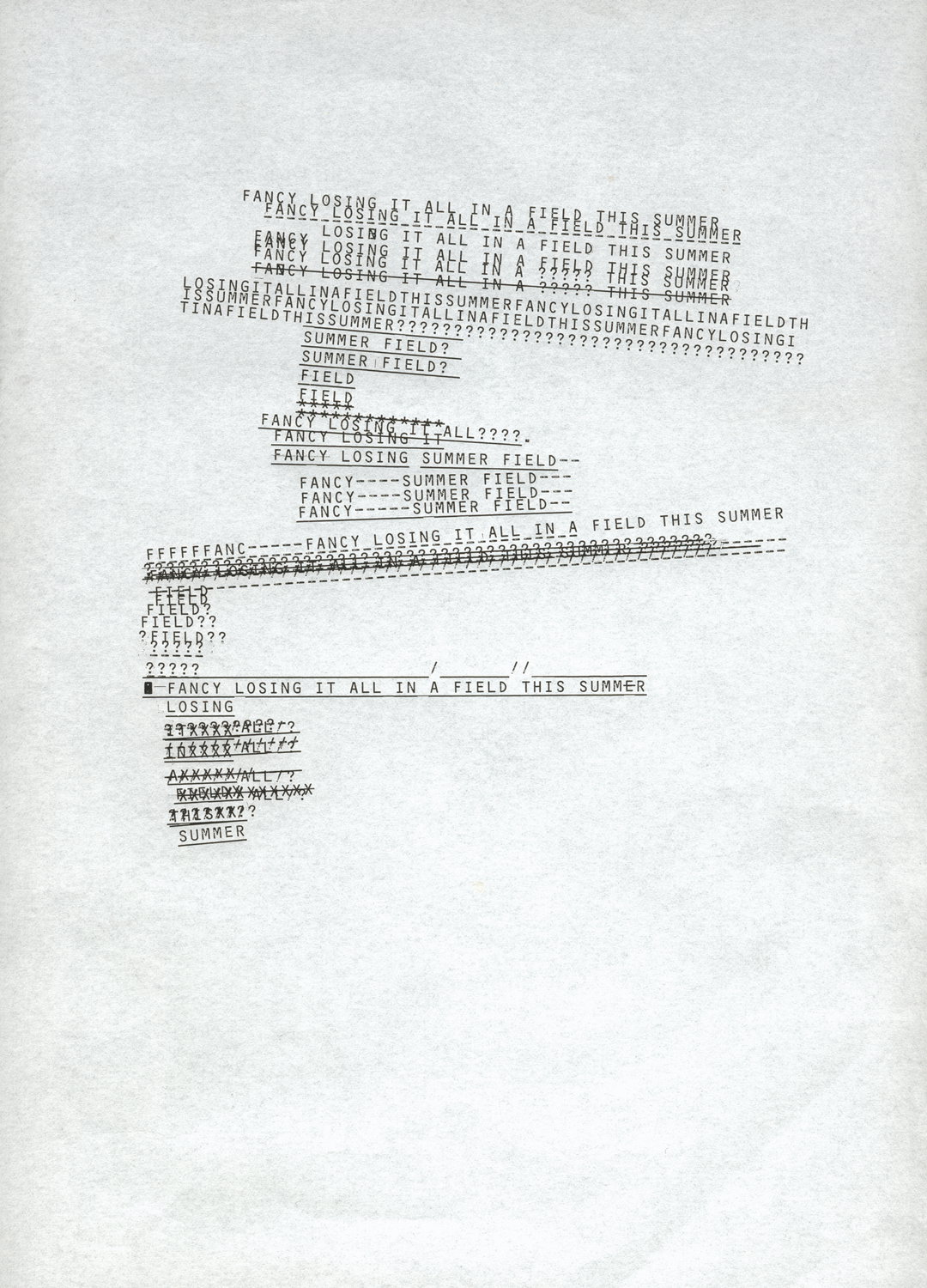
Tomato: Summer Field, 1996, Typewriter Composition (Copyright © Tomato, 2022)





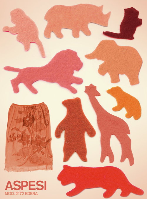

1 of 8
Tomato: Aspesi, Spring/Summer 2003 (Copyright © Dirk van Dooren, 2022)
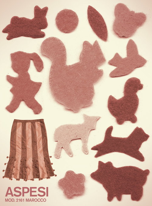
1 of 8
Tomato: Aspesi, Spring/Summer 2003 (Copyright © Dirk van Dooren, 2022)
Dylan Kendle:
A beaten up Chesterfield served as both a meeting room to the great and good, and a late shift crash pad. On top of plan chests, a thermal fax machine constantly buzzed with agency briefs, or in copy function generating oversized artwork to be loosely reassembled and sent out to Orange or UDO for dyeline runouts. Crittal windows, cracked by wayward BB pellets framed each end, and the south side overlooked a sunny, quiet, cobbled courtyard, just north of the 24-hour hustle of W1.
Simon Taylor:
There was usually someone there day and night, making something. A lot of optimism and possibility around there.
John Warwicker:
Yes, it was crammed when we were all in there, but that was more than made up for by the location. At the time the streets were full and active with a feeling that “something was in the air”. There was a lot of energy around, full of characters.
Dirk van Dooren:
There was a green Chesterfield sofa and three or four plan chests, as a lot of the things we made were not entirely digital. Many rolls of blueprints, stuck together fax printouts. Storage was always an issue.
Dylan Kendle:
Across the road The George – one of the smaller pubs in town – was where all the creatives and clubbers met, affectionately known as “meeting room three”. In a pre-mobile world its public phone in the bar would ring to round up errant designers as the US woke up and demanded London’s service.
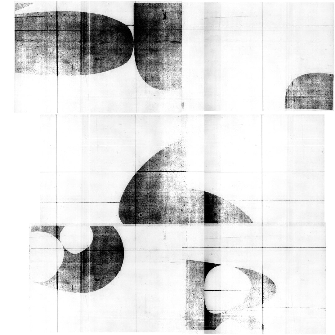
Tomato: Stones, 1994, Laser Print, Fax, College (Copyright © Tomato, 2022)
Graham Wood:
At that time, D’Arblay Street seemed to be a little bit of a meeting place, both in terms of people who worked on the street and others popping over to say hello. Below us was a film production and editing company, and on the ground floor the first (after Ladbroke Grove) Soho Duffer St George. Next door was Black Market Records, an amazing dance music place, and on the other side, Mark Powell (tailor to the stars!) had his studio. Down the street, there was Fish hairdressers which was the spot to get a haircut, and on the corner of D’Arblay and Wardour Street was (and still is) The George pub, which holds many, many arcane stories and unrepeatable secrets. I loved D’Arblay Street.
John Warwicker:
We instantly felt at home rather than just occupying a neutral space. This was partly due to having Black Market Records below, at the street level of our building. We noticed that every Friday a van would pull up and a vast amount of boxes were taken into the store. Curiosity piqued, and we found a store full of 12” singles from the evolving club scene, energised by not only the music but the quick turn over (by Saturday afternoon the shelves were bare). Something was happening, that was “underground”, and it was full of energy. At the same time, Rick and Karl were also exploring this “new scene” and the first Underworld single – a 12 inch, Mother Earth – was released on our own label, Tomato, and found its way to the shelves below.
Dirk van Dooren:
Record decks, speakers, music of every conceivable type was playing most of the day… A door buzzer which rang every four minutes, which I sat closest to…
Graham Wood:
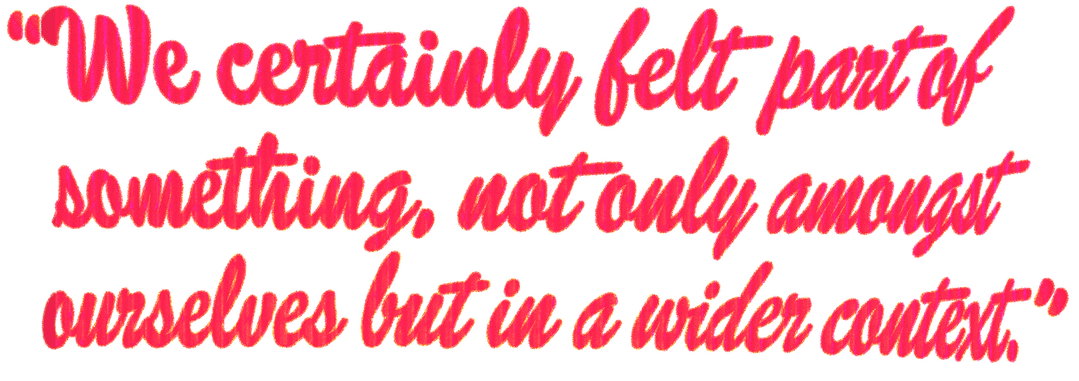
We were in that space for about five years. This first studio was a great spot… We certainly felt part of something, not only amongst ourselves but in a wider context. Stepping out onto the street was a vibrant, engaging experience. There were lots of people making things, sharing, thinking and talking. The George was a bit of a hub for that; photographers, musicians, filmmakers, fashion designers, artists, all overlapping, all at that point of optimistic energy and filled with possibility. You couldn’t help but be inspired by that.
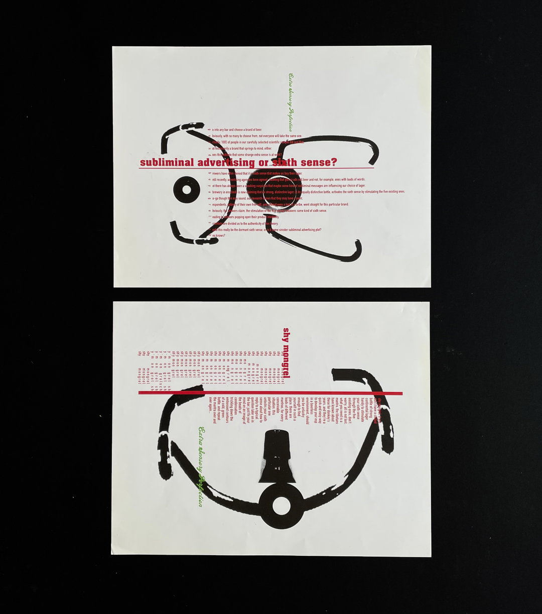
Tomato: Grolsch OOH advertising, 1997, PMT Machine, collage (Copyright © Tomato, 2022)
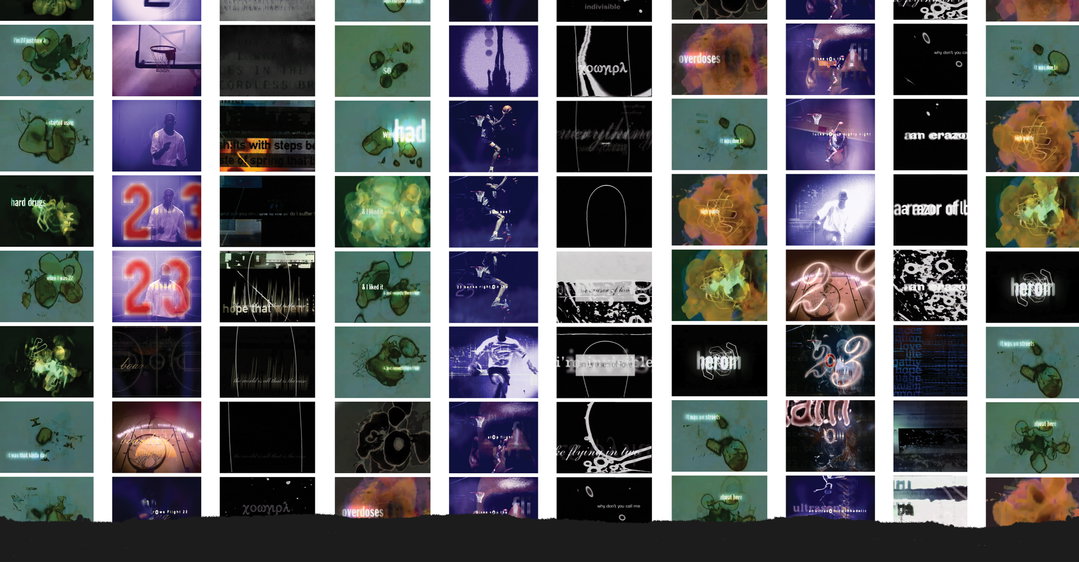
Tomato: Nae Hope, Jordan, Cowgirl (Copyright © Tomato, 2022)
The principles of tomato
Graham Wood:
There was a sense of change, especially at college; people wanted to start their own things rather than work for a company, and the kind of work people wanted to make was very different from the corporate world. That kind of work didn’t mean anything to us. We were inspired by Vaughan Oliver, April Greiman, Peter Saville, Reid Miles, protest and underground work, and by film, music, books and politics – culture which was iconoclastic and visceral. I definitely shared that with both my contemporaries at college and the tomato members. It was common ground among a lot of people. There was that feeling of exploding things in a beautiful way.
Simon Taylor:
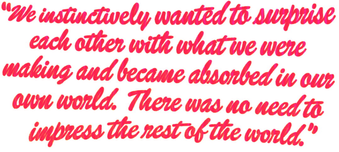
We set up tomato as a way of reshaping the typical studio environments we’d experienced. We decided not to use individuals’ names or credits on the work, everything was just “tomato”. We all belonged to the group collectively, no creative director or hierarchy, no individual ownership. We instinctively wanted to surprise each other with what we were making and became absorbed in our own world. There was no need to impress the rest of the world.
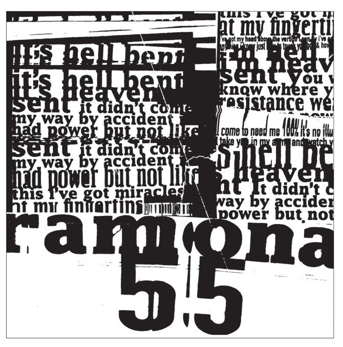
(Copyright © Tomato, 2022)
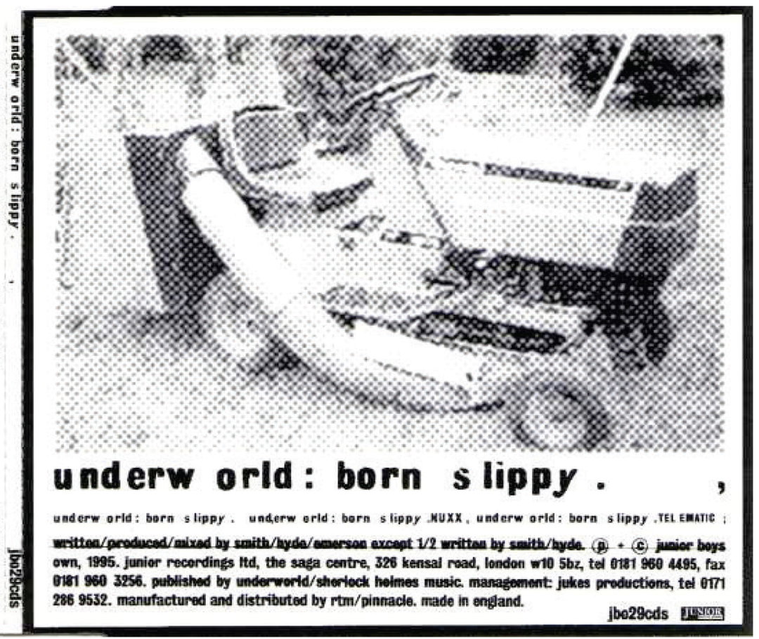
Tomato: Underworld (Copyright © Tomato, 2022)
Tomato: Underworld Live (Copyright © Tomato, 2022)
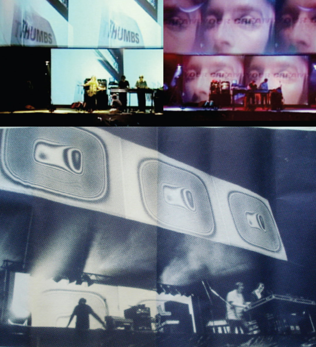
Tomato: Underworld Live (Copyright © Tomato, 2022)
Steve Baker:
Right at the start, the principles were simple. Our goal was to make the work we wanted to make and get adequately paid for it. After four years, the company structure was changed to make all of the eight founding members equal shareholders and we had a written “constitution” that described the company’s purpose, principles and role.
Jason Kedgley:
How everyone at tomato approached their lives was their methodology. It soon became clear to me that tomato was not a job. This was who and how they were.
Simon Taylor:
The premise was very simple – we were going to have a conversation, ongoing. When I think about it now it reads like an anti-manifesto, completely open-ended.
John Warwicker:
“tomato” would be a space to make, show and tell, and then to move on, with personal experimentation at its core (without regard for what had gone before, or what was currently happening).
Dirk van Dooren:
I think, to some degree, we just began working together and treating each other as we would like to be treated. There was a gentleness to everything which was refreshing. Not at all blokey, even though we were all blokes.
Graham Wood:
There was a sense of support, of not getting in each other’s way, of pursuing things that would be fruitful artistically, but beyond that, there weren’t principles really, in terms of what we were looking for with the work we made. There were principles in terms of being a collective, very practically, which was really important for our working relationship; that basic foundation of how finance, etc. was handled was very important, and more essential than necessarily having a creative ethos of any kind.
Simon Taylor:
The sharing part was fundamental to how it worked. Suddenly the pressure to continuously find paid work was released, we were all finding it for each other. I’m talking about this and thinking, “Hold on a minute, was that all possible?” but that is how we set things up. You had to contribute if you wanted to take part, and there was a lot of taking part.
Graham Wood:
In the studio, we’d paint, draw, take pictures, make sculptures, prints, write. But above all, we’d share those things, all of them, with each other. We communicated above all (sounds obvious but believe me, it’s rare).
Steve Baker:
Someone said that we wanted to create work that “transcends the expected”. I liked that.
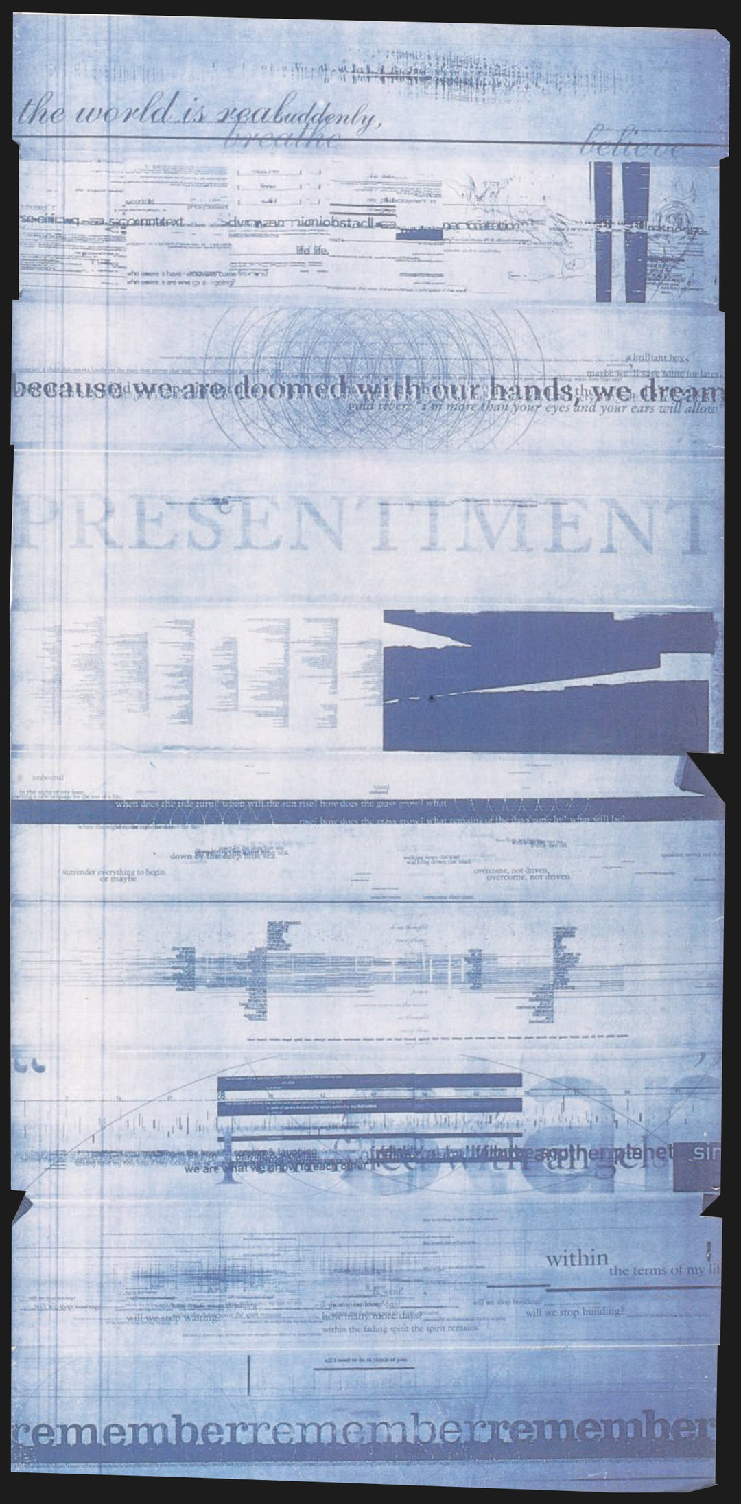
Tomato: Blueprints (Copyright © Tomato, 2022)

The influence of the 1990s cultural scene on tomato’s design practice
Simon Taylor:
We were engaged in after-hours culture. Music and nightlife was a huge part of that. A lot of our friends lived and worked in the club scene and wanted our help. It became a place to show up and show things. I remember tomato’s Graham Wood one night in Gossips nightclub, dressed in a baby blue nightie playing a huge marching drum on stage. Another memory is of helping Rick unload boxes of Underworld’s latest 12” out of the back of his car and into Black Market records, straight from the pressing plant. These are little things, but connected us to the ebb and flow of the time.
John Warwicker:
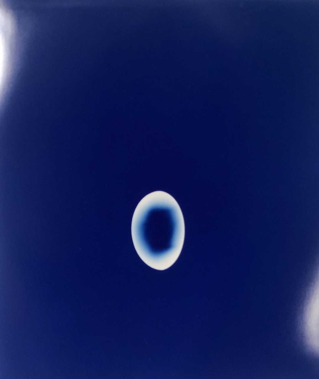
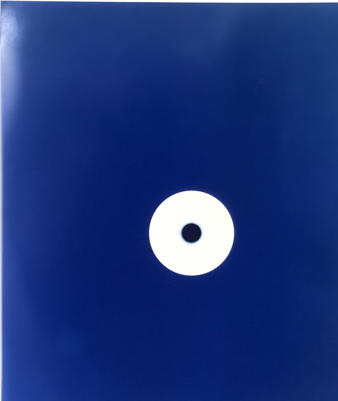
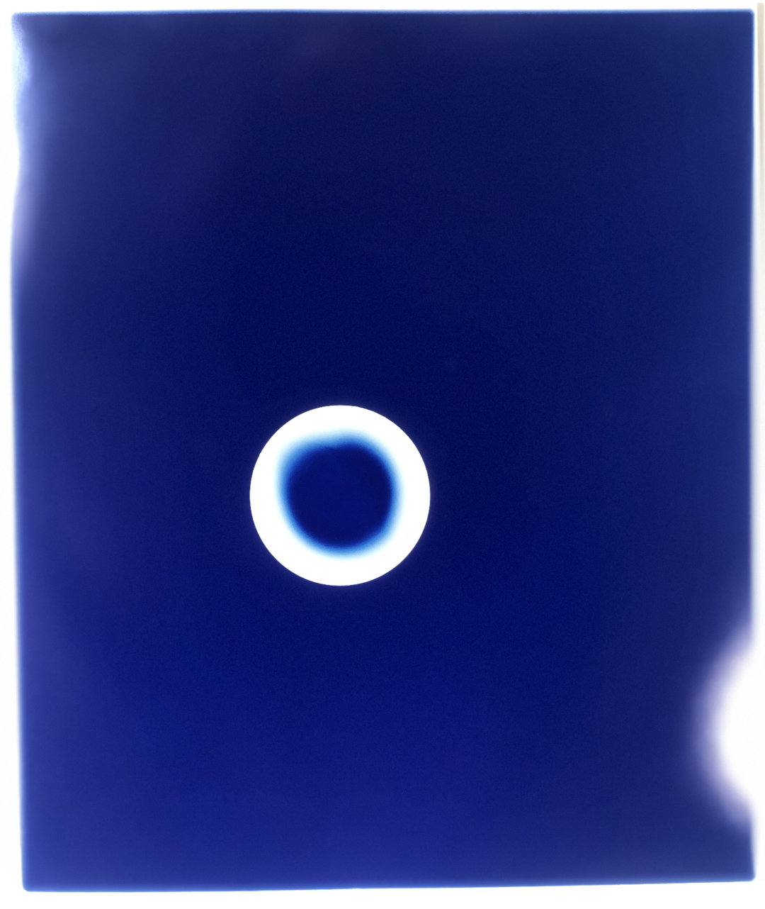
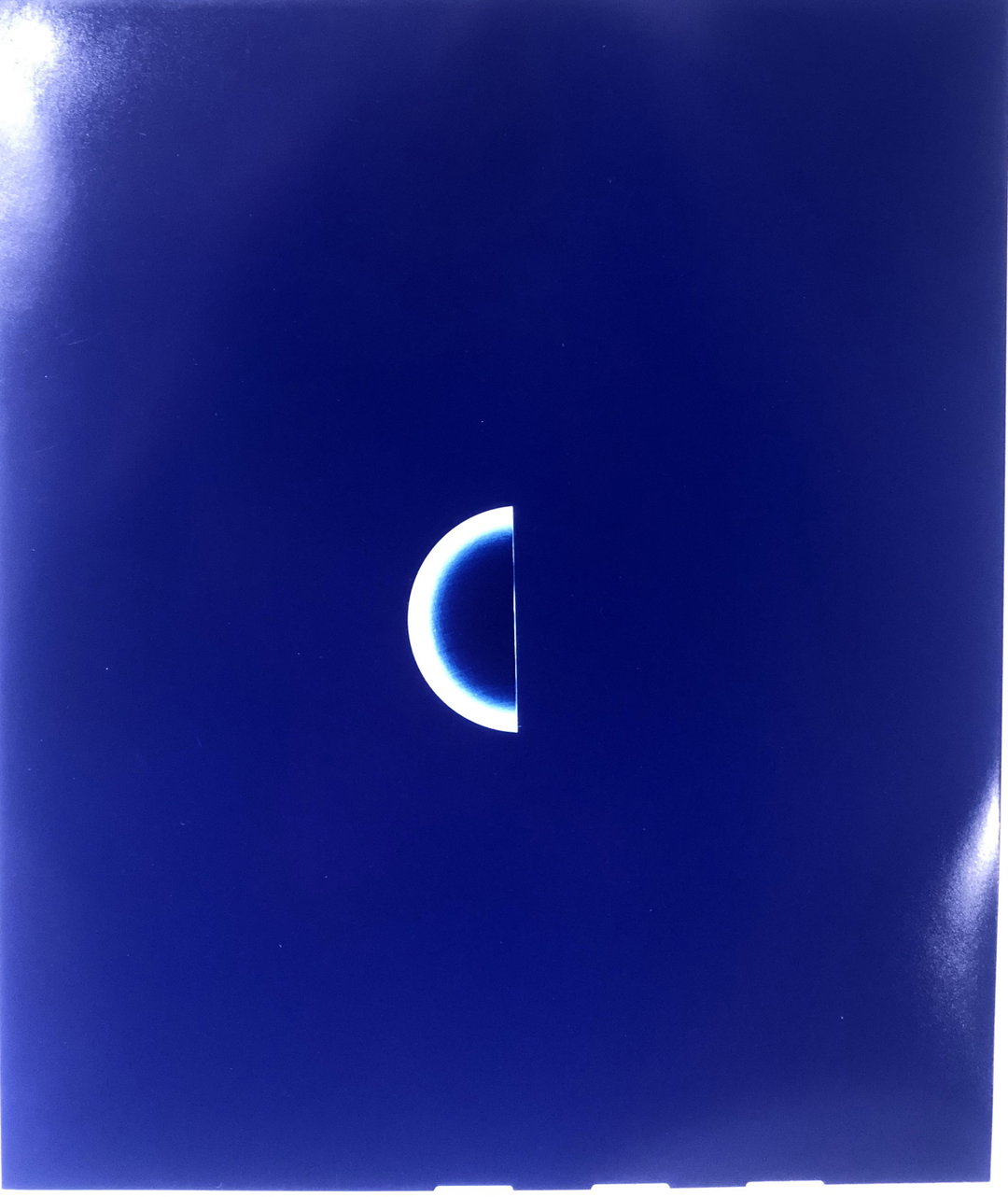
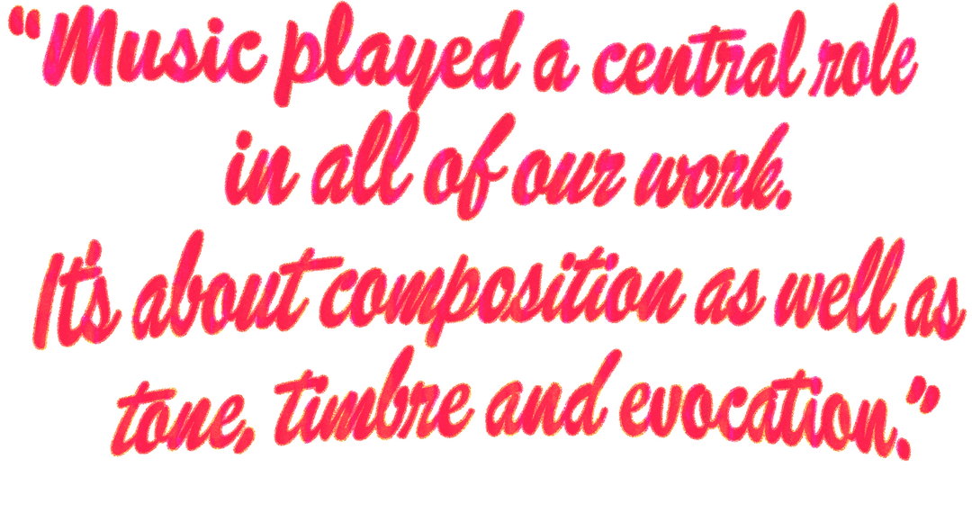
Music played a central role in all of our work. It’s about composition as well as tone, timbre and evocation. Everything is “time-based” media, it’s all experiential.
Dirk van Dooren:
Music has always been a big part of my life. It seemed to make everything better. Early on, it saved me from the very restrictive and largely dull family life. It allowed me to travel in my head whilst not being able to physically move.
At tomato, every single day one could listen to the musical tastes of seven different people. Sometimes this was overwhelming, sometimes wonderful.
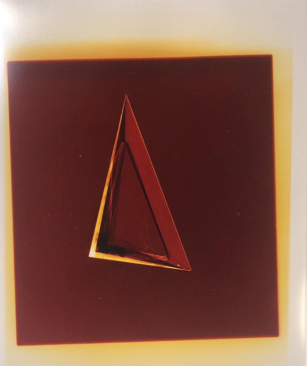
Tomato (Copyright © Tomato, 2022)
1 of 4
Tomato (Copyright © Tomato, 2022)
1 of 4
Tomato (Copyright © Tomato, 2022)
Dylan Kendle:
Not only did the collective count several musicians as members, and therefore music as an output, it also served the music industry as creatives, designers and video directors. Practically, I think it borrowed from the sample culture that defined much of the music of the era; in that it used the computer as a sampler and filter to create something new and “other”. Its point of difference perhaps was that the inputs or sources were more often its own, rather than archive, stock or commissioned, and consequently the visual output was more unique.
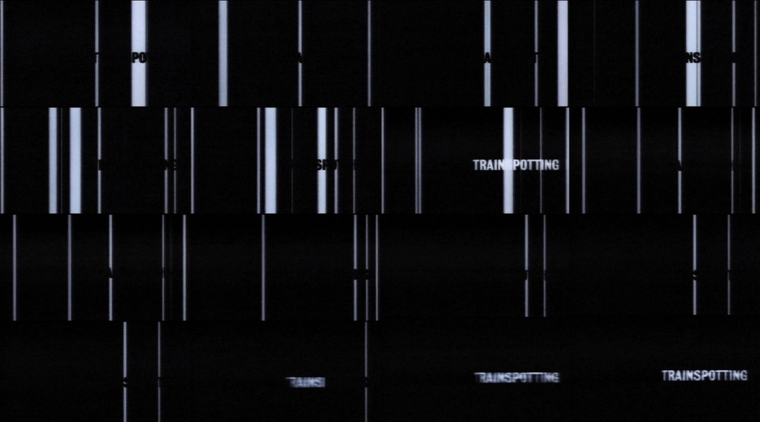
Tomato: Trainspotting Intro Titles (Copyright © Tomato, 2022)
Steve Baker:
Music played a major role. It was through music that John, Colin and I met. We relied on music industry contacts for a lot of the work that kept us afloat for at least the first 12 months. Rick and Karl’s music contributions inspired, and helped finance, a large amount of video making and sleeve designs, and eventually, tomato would be involved in their live performances and publications. The success of Underworld had a direct effect on tomato’s profile too – especially in Japan.
Graham Wood:
When Rick and/or Karl would arrive with a new cassette of work it would be a brilliant moment. Always energising, propelling work to happen, and causing us to think about how emotion could be embodied through image. I think that making emotional images from music can sometimes be quite hard; if I try to equate it, it is as if only ten per cent of the full emotion one invests in that kind of imagery ever really becomes manifested, whereas it seems to me to be the opposite with making music. What I’m trying to say is that it was intense, hard work. And lots of it. Never stopping producing, never stopping learning.
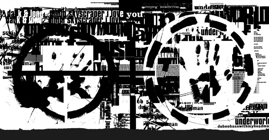
Tomato: Underworld, Dubnobasswithmyheadman (Copyright © Tomato, 2022)
How technology altered the studio’s output
Steve Baker:
I’d say it had a profound effect, but at the same time didn’t change the foundations of the work because that was based on talent, not technology. Later, when we wound up doing lectures and seminars, we’d often get asked what applications we used, as if having the same programmes and machines would allow others to be as talented. This was missing the point. Graham would delight in telling people that a knackered fax machine was essential to our work. There was a glimmer of truth in that.
John Warwicker:
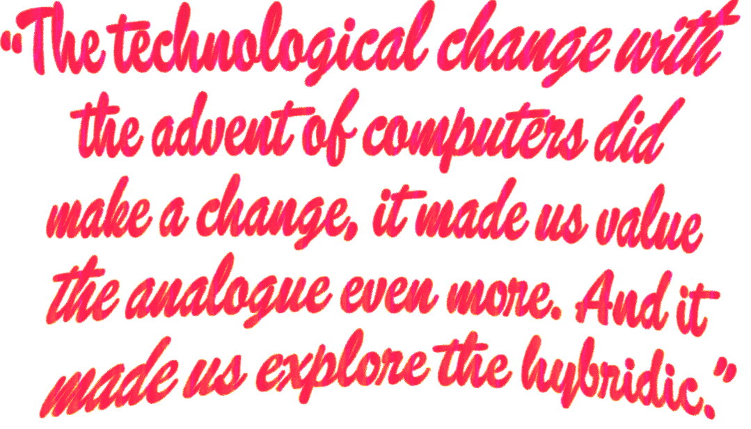
The technological change with the advent of computers did make a change, it made us value the analogue even more. And it made us explore the hybridic. It was exciting to be in that period of transition and interesting to explore what computers weren’t meant to do.
Simon Taylor:
Another important aspect was the idea of tools and how they’re used to achieve an end. Analogue tools are quite specific and have direct outcomes. It immediately became obvious that digital tools were more than simply a mechanical means. The realm we inhabited was changing each day, each month. That’s still the case today, but at the start of the shift towards digital we didn’t fully comprehend how big the impact would be. We found out as we went along.
Dirk van Dooren:
I carried on working pretty much the way I always had, using what ever methods were at hand.
Computers were very slow to render, and I mean very slow. The quality you got was hard both in terms of colour and line. Sometimes that is good, sometimes that is bad. Saying that, I was most definitely the least computery of everyone.
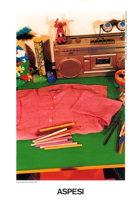
Tomato: Aspesi, Spring/Summer 1998 (Copyright © Dirk van Dooren, 2022)
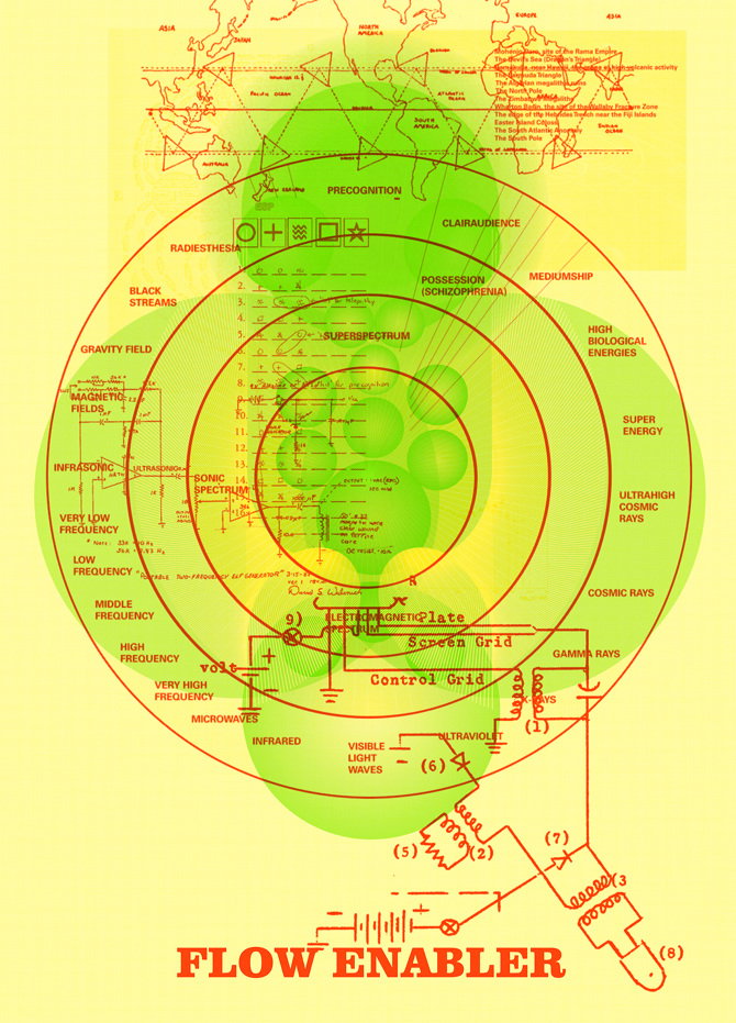
Tomato: Flow Enabler (Copyright © Tomato, 2022)
Tomato: The Telematic Embracer (Copyright © Tomato, 2022)
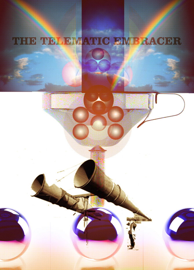
Tomato: The Telematic Embracer (Copyright © Tomato, 2022)
John Warwicker:
What mattered was not how the work was made but how it transformed the idea, the thought into form. At this time it was an expansion of the palette, after this period the work-by-computer became more prevalent, even though its limitations were obvious to all. It was the attempted expression of something that was thwarted by technology that gave these works their energy or frisson.
Steve Baker:
We bought an Apple Mac IIfx with an extraordinarily expensive 19 inch monitor. I got a Macintosh Classic for business stuff and Simon brought in his IIci machine. We created a network using phone cables, adding a huge, one GB external drive which we called “Mother” (thinking that it would never be filled – something John achieved on his own inside a month).
Michael Horsham:
It was revelatory for me. I had worked at a record label in my youth and I was used to working on album sleeves that were pasted up and then PMT’d. What was great in the studio was the way that analogue was made to rub up against the digital, creating the friction that made and maintained the human warmth in the work. This was true for the visual output and the sonic stuff that was always in and around the practice.
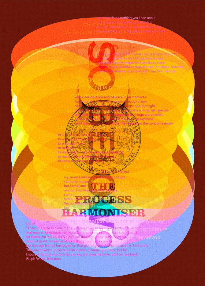
Tomato: Process Harmoniser (Copyright © Tomato, 2022)
Balancing creative experimentation with client work
Michael Horsham:
The phone would ring or the fax would judder into action. Anyone would answer. If it sounded interesting the conversation would develop. In retrospect, there was a conscious and unconscious desire to make a space that didn’t work like others, that allowed for a certain freedom. We had no one telling us what to do – if we didn’t want to work on something it was fine. No boss. A flat hierarchy that was always changing.
Steve Baker:
It was often self-selecting. Because of the structure of the company, none of the creatives were employed and could be “given” jobs. They always selected their own work, based on their own criteria. Clients would be told that right from the start. We’d receive a brief and see who was interested, then take it from there. If a client didn’t understand this, and wanted us to provide company brochures, then we’d just say we didn’t have one.
Jason Kedgley:
In the early days, everyone had people approach them individually and more often than not they would open it up to evolve into something more. I’m not sure the clients had a clue what was going on, but they enjoyed the energy and positivity the studio gave out.
Graham Wood:
We were fortunate in that we did have a lot of projects that were, for varying reasons, open and fairly freeform. That meant we could get a good representation of what we could really do out into the world, in what felt like a pretty unmediated way. On the other end of the scale, was work that was about that “can we have some of that tomato stuff please?” You’d always try and do something different in those circumstances, but it might not go as well as it could. To say the least.
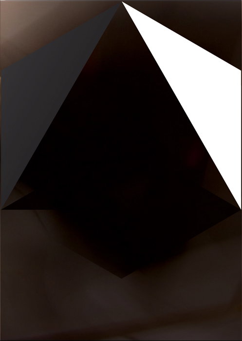
Tomato: Cube (Copyright © Tomato, 2022)
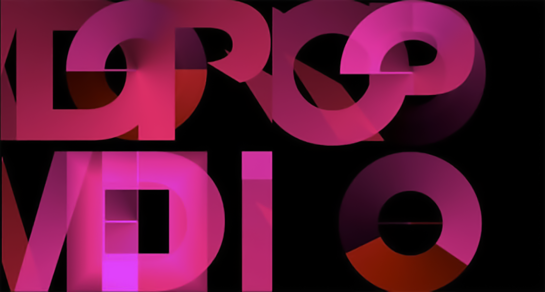
Tomato (Copyright © Tomato, 2022)
Dirk van Dooren:
Eventually, when things began to take off, we created a loose business structure. It was based party on the principles of John Lewis (the department store) and partly on the least hierarchical structures we could think of that could legally exist. Our business manager, Steve Baker, helped create a loose enough structure. He’d managed bands and solo artists in the music industry, so he applied similar principles.
John Warwicker:
I think many clients couldn’t qualify, in conventional terms, why they approached us, beyond a sense, rightly or wrongly, that we represented the zeitgeist of that time. Others, I think, were interested in seeing what would happen. And yes, some “got it”.
Steve Baker:
There was one moment at the end of the first year when John and I flew back from Eindhoven after a meeting with the head of worldwide marketing for Phillips. By the time we landed, we’d come up with an idea for a marketing campaign that, if it had been adopted, would have preceded Apple’s iPod campaign by about ten years, and allowed Phillips to claim a leading role in digital consumer products. The board didn’t get it, although the head of marketing loved it. They awarded us a point of sale campaign in compensation and the fee from that kept us going for the next quarter.
Michael Horsham:
Quite often it seemed potential clients would claim they wanted what tomato did, expecting something to come out that looked or felt like something that had been made for someone else. If the response was new, which it always was, some clients would not like that result. They wanted a tomato style and of course, from our perspective, there was never really a style (though individuals had their own approaches), just ways of working together and against each other. Different results emerged.
Dylan Kendle:
In some ways I think the opacity of the process made it more exciting at a time when even advertising could be experimental. Externally, everything was collective rather than individually labelled, so new clients often didn’t know who, or what they were getting. I guess the results and the portfolio were proof enough, the enigma and the buzz surrounding the studio afforded us freedom and space to play in traditionally quite staid and structured establishments.
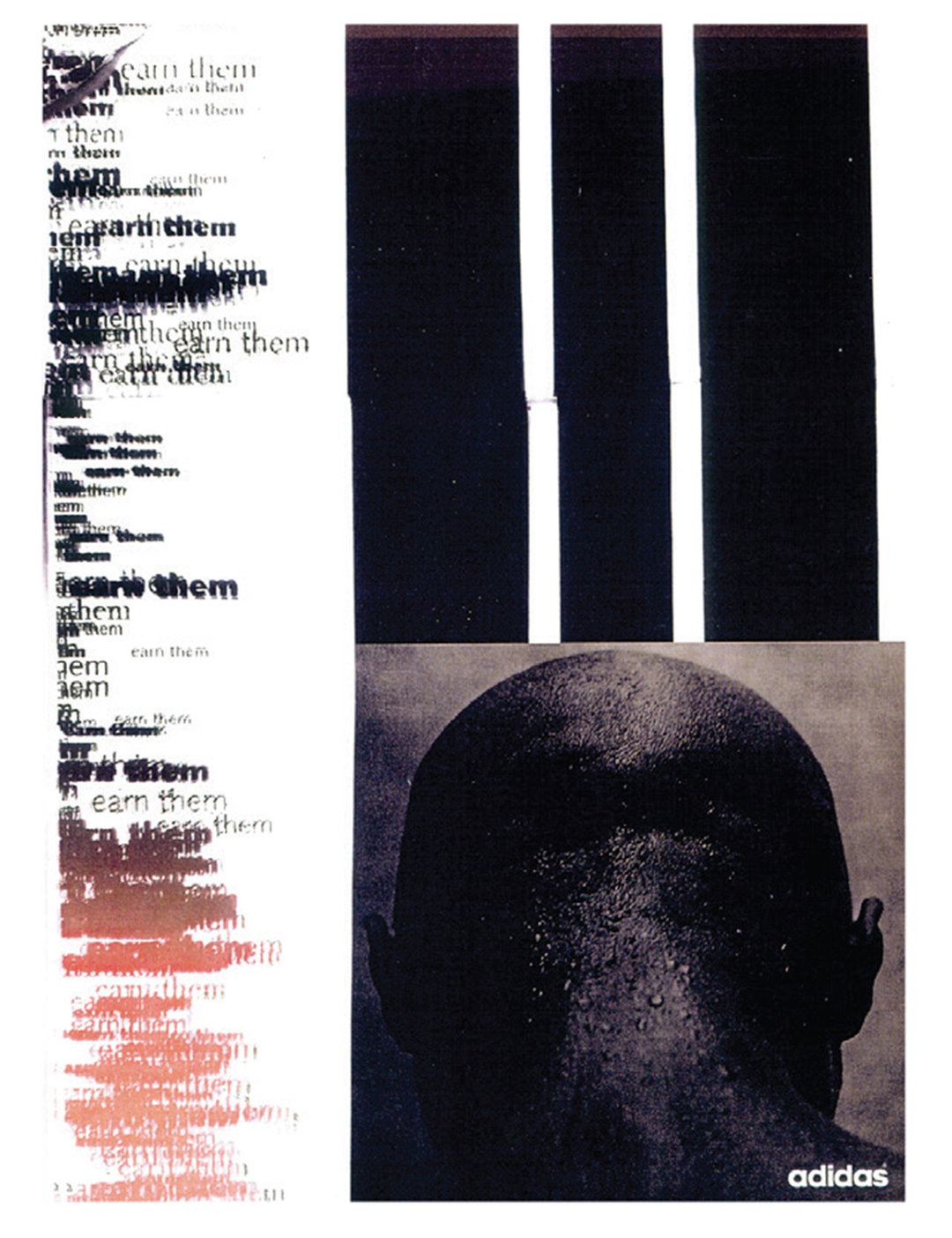
Tomato: Adidas (Copyright © Tomato, 2022)
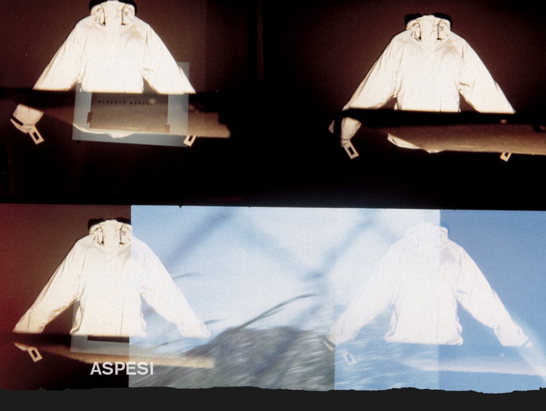
Tomato: Aspesi, Autumn/Winter 1994 (Copyright © Dirk van Dooren, 2022)
Working amongst friends as a collective
Graham Wood:
In a sense, early on, tomato was a marriage of convenience. We became friends, but we weren’t a group of friends getting together initially. I needed somewhere to work and enjoyed the company of the others, but there was also a degree to which we became associated by chance rather than by choice. Our personal interests were (still are) pretty diverse and sometimes perhaps contradictory, but because of our shared tolerance we found that in colliding these things we’d end up with results that were surprising, inspiring. It was definitely a massively supportive relationship, an inspiring one. In seeing everyone else’s work, and the things that inspired them all, we were all gaining from each other all of the time through a kind of osmosis – being in the same space, whilst also striking out on our own.
Jason Kedgley:
It’s always interesting to work with people from outside your comfort zone or understanding and see where it takes you.
Dylan Kendle:
Like all relationships, trust and respect are all (when you have them, it’s a positive; when you haven’t, it’s a difficulty). Creatively you can halve the risk and double the reward, of course the opposite is also true, but joint enterprise is great to incentivise. There’s a childlike tendency to protect our work, to wrap our arms around our answers and hide our working out, but an open-source, flat-hierarchy creativity can really break things apart.

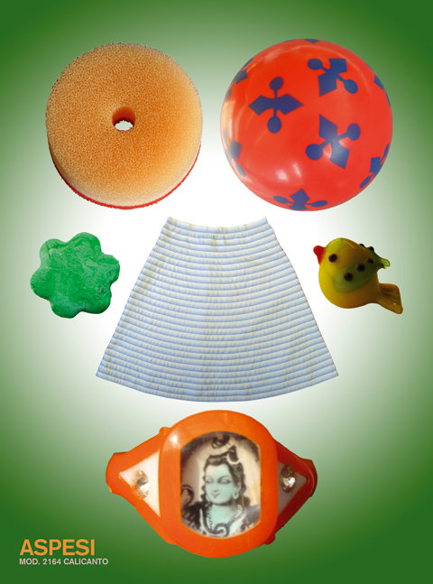
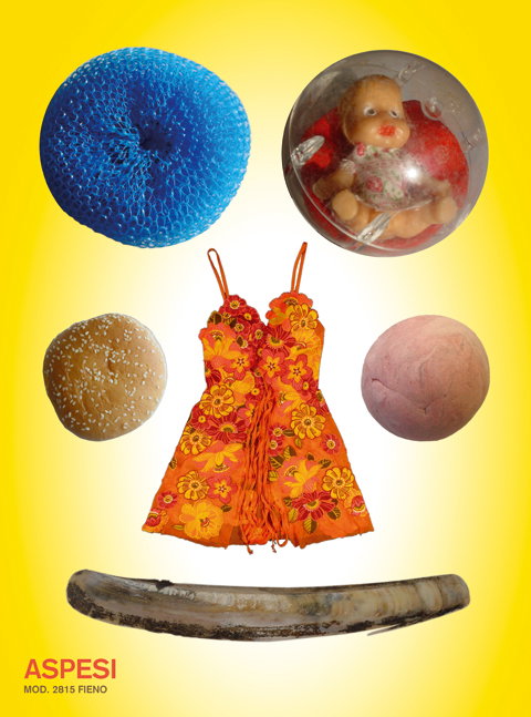
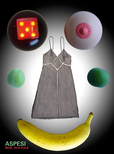
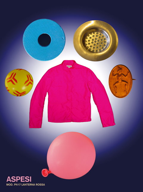
Tomato: Aspesi, Spring/Summer 2004 (Copyright © Dirk van Dooren, 2022)
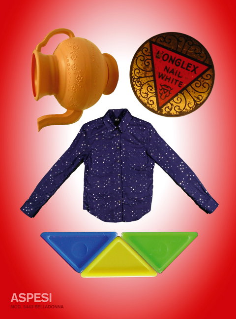
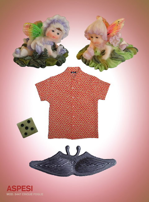

1 of 7
Tomato: Aspesi, Spring/Summer 2004 (Copyright © Dirk van Dooren, 2022)
1 of 7
Tomato: Aspesi, Spring/Summer 2004 (Copyright © Dirk van Dooren, 2022)
Steve Baker:
I don’t think tomato was primarily based on friendship, I think it was based on everyone having a high regard and mutual respect for each other’s talents. Some friendships existed before the company was formed, but most were formed as a result of working together. I don’t recall any difficulties because of those friendships. The positives were that our constitution, which was a pseudo-shareholder agreement, had the word “love” in it. Regarding methodology and ways of thinking, I would assume that in any physically close environment where ideas are being developed and work is being made, there is a natural creative cross-fertilisation. Surely, that’s one of the reasons for working together in the first place.
Simon Taylor:
I think the difficulties and the positives are sides of the same coin. Ego is the thing that helps drive you forward. You make your work, your identity, develop how you like to see yourself. But the impression you have of yourself is also the thing that gets in the way, it restricts how you interact. We all do it. But fortunately we could see it, so time went by quite well. The other difficulty is how you grow as a person as you get more experience, what becomes important to you and the impact of that on everyone else. Have kids, buy a place to live, spend time away and so on. These are important realities that have to be reconciled. That’s also part of the conversation we were having.
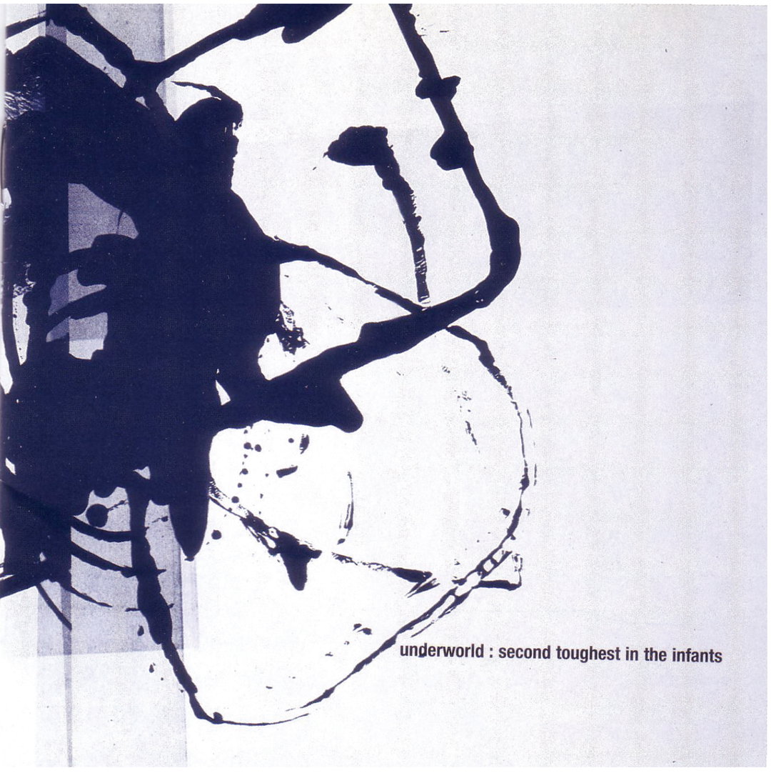
Tomato: Underworld, Second Toughest In The Infants (Copyright © Tomato, 2022)
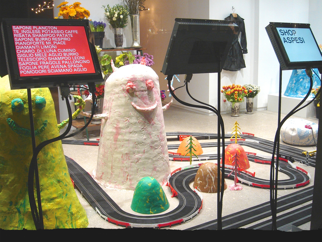
Tomato: Aspesi Milan (Copyright © Dirk van Dooren, 2022)
John Warwicker:
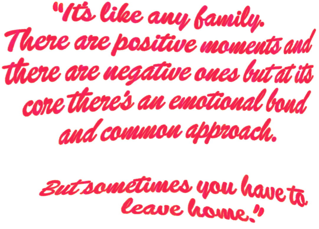
It’s like any family. There are positive moments and there are negative ones but at its core there’s an emotional bond and common approach. But sometimes you have to leave home, for any number of reasons. Personal situations change and one’s centre of gravity is moved elsewhere.
Michael Horsham:
Friendship enables honesty and support. Sometimes honesty can be painful and that engenders more support. Friendship love tends to grow out of respect and I had, and still have, huge respect and love for the quality of the work, the quality of the ideas, and of course the people.
Dirk van Dooren:
I think that when you are with a group of people you tend to gravitate towards the ones you connect with on a deeper level. In my case, it was Graham Wood. We shared a desk and also a sense of childlike wonder, openness and experimentation.
It’s also tough because there are bound to be fallings out and misunderstandings, some individuals being successful etc. All very human things.
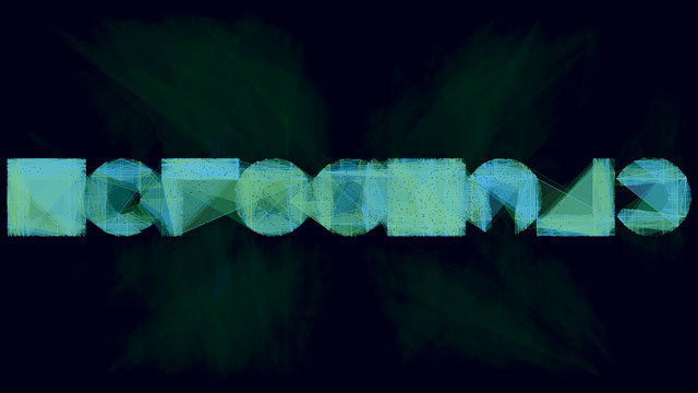
Tomato: Rophalic (Copyright © Tomato, 2022)
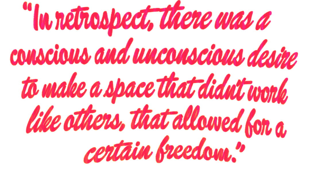
How to build a collective future creative industry
Steve Baker:
Keep your overheads as low as possible and keep the percentage of fees that the creatives get as high as possible. This gives the creatives the freedom to choose jobs where they can do their best work, which will enhance your portfolio and showreel, and that attracts better opportunities. Also, give the creatives who contribute to the company a percentage of it. This has two main benefits: when they work for very little (or nothing in the case of work on spec), but make great work, that contributes to their own company. Also, if they own a part of the growing reputation they hold some ownership of the original work, rather than just being paid to supply work that they have no residual ownership of – because that way drains the soul.
Michael Horsham:
What is lacking is the culture of ideas and the idea that you should break the mould, use the analogue, do what you do with love, hone your craft. Some students still survive art school and they tend to be the ones who go on to do interesting things. But, rising student numbers don’t help, and neither does the idea that you don’t have your own studio space to leave stuff up, explore and make a mess! Potential employers I spoke to wanted engaged, surprising work and people, not 60 people a year who’ve all been taught the same methods, vocabulary and ideas.
Part of the problem we have at the root is the idea of employability. Some universities attract their students with the idea of employability – then you get a bit of a cookie-cutter mentality, bolstered by the (depending on the context) bogus ideas of attainment and grading. Students paying through the nose really don’t want C and D grades, as they feel they are failing rather than being shown the headroom they have to improve. On the other hand, the technicalities of design through computers (computers are tools) needs to be taught.

Tomato: Roadkill (Copyright © Tomato, 2022)
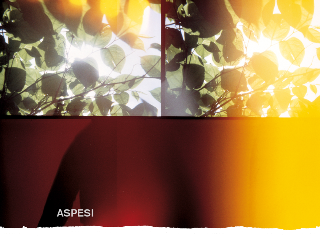
Tomato: Aspesi, Autumn/Winter 1994 (Copyright © Dirk van Dooren, 2022)
John Warwicker:
I tell my students (I’m a professor at the Victorian College of Arts at the University of Melbourne) these two things: Be interested. Because if you are interested you will become interesting. If you then become interesting, then someone, somewhere in the world (who you might never meet), will be interested in you.
Secondly, the only thing you are designing is yourself. The rest is pure commodification. You are the medium, you are the agent. Work fast, to the point of the work making itself and you are trying to catch it. Walk slow, it’s your life’s commitment to yourself (circling back to being interested).
Simon Taylor:
If you’re making a group, trust the group and each other. Make good work!
Michael Horsham:
Give it a go. It probably won’t work.
Dirk van Dooren:
I hope people gain some strength and encouragement to do their own thing, and not fall to the whims of the fools in charge.
Jason Kedgley:
Perhaps the hope is that conversation and an open approach can take you to places you would have never thought of going.
Graham Wood:
Try and find out what a true collective is and what that means; give trust and support; don’t let the petty things eat away at relationships; don’t let the perfect be the enemy of the good; agree money stuff as a first principal, but be flexible as time goes on; see the world as interrelated, not competing; but also, know the enemy.
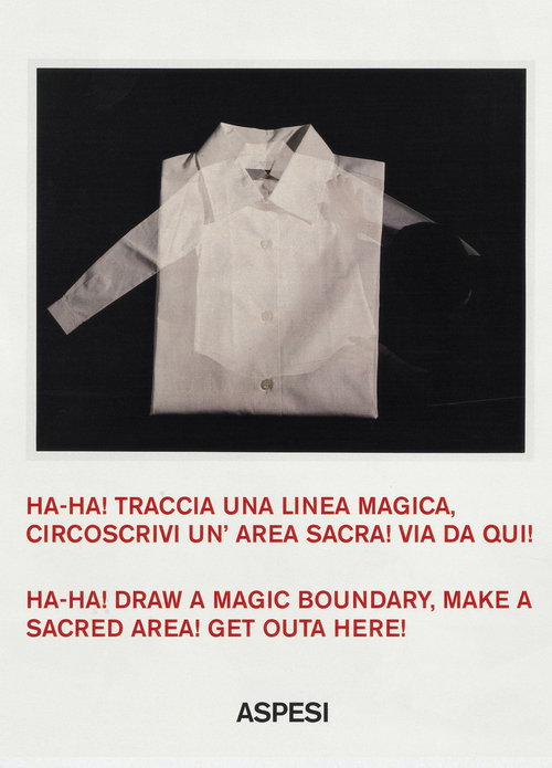
Tomato: Aspesi, Spring/Summer 1999 (Copyright © Dirk van Dooren, 2022)
Us vs Them with Richard Turley
This story along with many others are part of a guest edit of It’s Nice That by Richard Turley. To read further pieces from Richard’s curation click on the link below.
Become an Extra Nice Supporter
This story, and the entire of Richard Turley’s guest edit series were made possible by Extra Nice and our supporters. To become a member and unlock an inspiring new way to explore It’s Nice That, and get your hands on some exclusive perks, head below.
Hero Header
Tomato: Underworld, Dubnobasswithmyheadman (Copyright © Tomato, 2022)
Share Article
Further Info
About the Author
—
Lucy (she/her) was part of the It’s Nice That team from 2016–2025, first joining as a staff writer after graduating from Chelsea College of Art with a degree in Graphic Design Communication, eventually becoming a senior editor on our editorial team, and most recently at Insights, a research-driven department with It’s Nice That.