How do you summarise a studio of over 250 people in one brand identity?
February’s Nicer Tuesdays was an evening of variety in terms of discipline, but each talk delivered articulate insight into a project – whether a porno, a 20-year-long photography project or rebrand.
Share
Share
It never ceases to amaze us how inviting four people to a venue to deliver a ten-minute talk on a recent project can leave us feeling so inspired. But the speakers who take to the Nicer Tuesdays stage every month continue to do so and this month was no exception.
While it was an evening of variety in terms of creative disciplines, what really stood out to us was the confidence and eloquence with which each speaker communicated their work. Starting in the world of filmmaking, Ali Kurr was first to the stage before Rinchen Ato spoke on her photographic works. After the break, graphic designers Studio Lowrie took their turn, before Benjamin Langsfeld, Buck’s group creative director rounded off the show.
Catch up with what happened on Tuesday night below and, as always, keep an eye out for each speaker’s talk which we’ll be posting in full over the next few weeks.
If in doubt, wing it
Ali Kurr had the brave job of kicking off February’s Nicer Tuesdays but she took on the challenge with ease, delivering a talk which had everyone in the audience laughing. A filmmaker who’s worked in advertising and music videos for years now, Ali knows a thing or two about directing – but that wasn’t always the case.
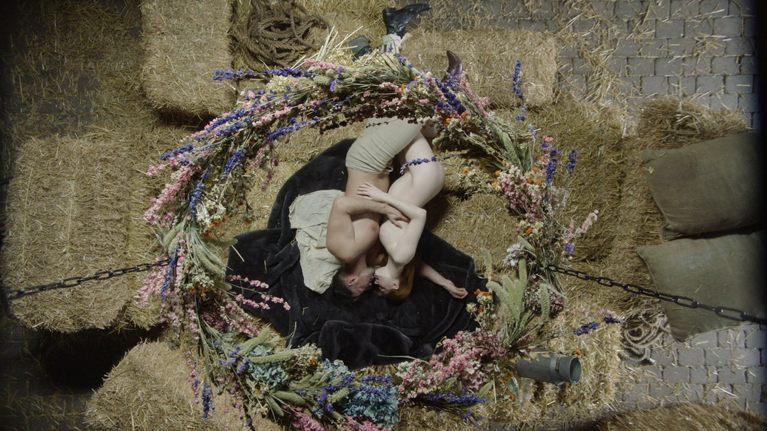
Growing up, she began by telling us, Ali wasn’t allowed to watch TV and she “couldn’t read very well,” so instead she would create plays. Her official start in filmmaking didn’t happen until she was studying at The Courtauld Institute of Art, however, when she began creating video clips to accompany her projects, uploading these to YouTube. When she started getting contacted to create music videos, she ran with it, she joked. “I realised that with directing, no one really knows what they’re doing, everyone’s kind of winging it,” she added before outlining four key things anyone interested in directing should get right, so you don’t have to be the same: the pitch, art direction, storyboarding and casting. When outlining each of these points, Ali relayed it back to a work of her own, giving insight into recreating Olafur Eliasson’s The Weather Project using a ten quid reflector, and attempting to storyboard two people having sex by drawing stick figures with squiggly legs among many other hilarious stories.
Ali Kurr
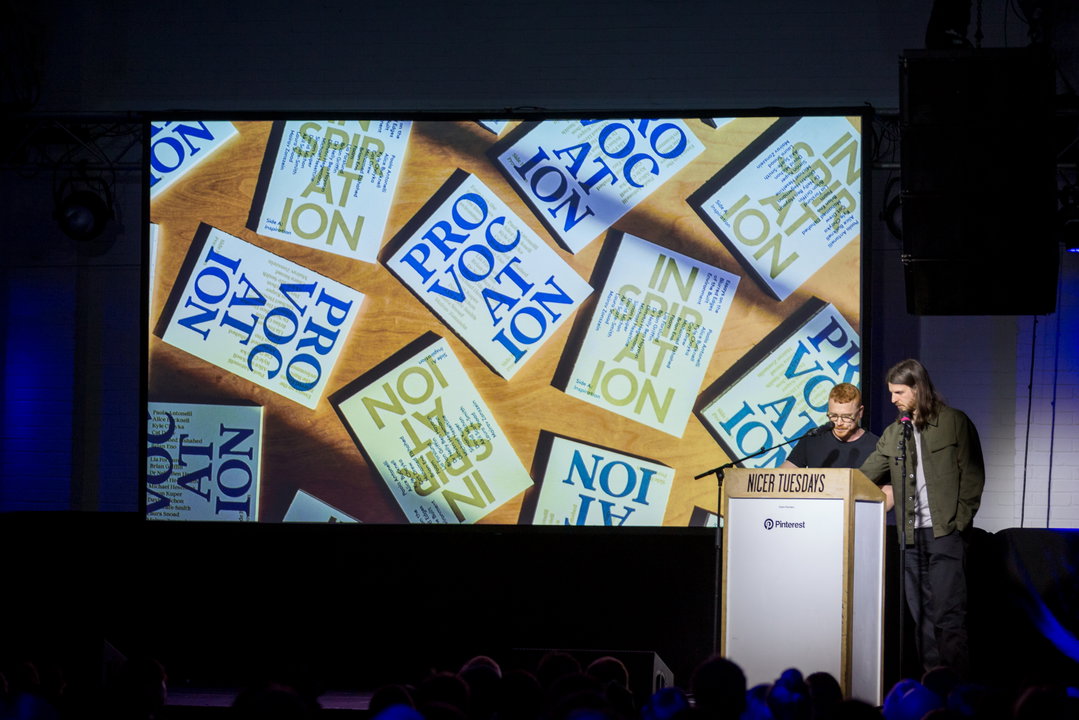
Ali Kurr at Nicer Tuesdays
A good portrait requires the trust of your subject
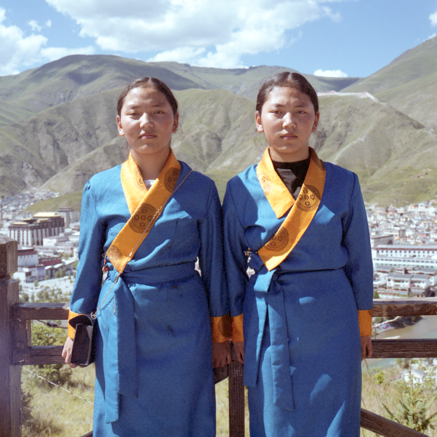
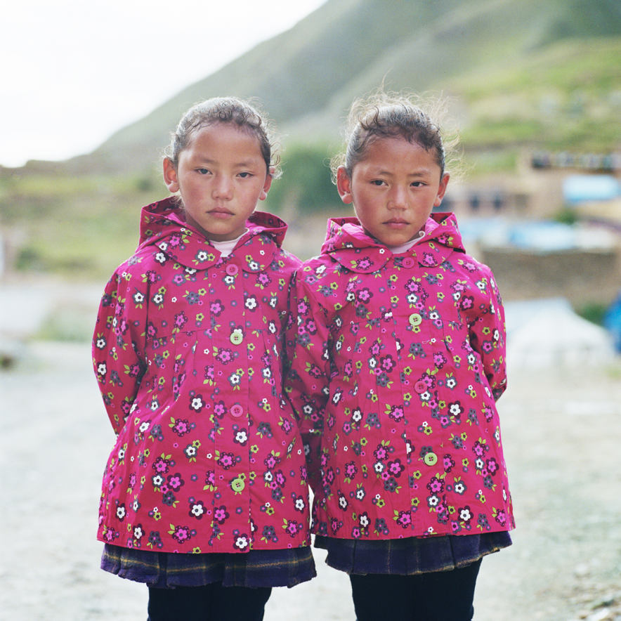
From anecdotes about making a porno, to Tibetan monks, joked Rinchen Ato as she took to the stage. While Ali’s talk was full of the hilarities of figuring things out on the job, Rinchen’s talk made us think (and some of us cry). During her ten minutes, Rinchen talked through the project she’s been working on for the best part of two decades, documenting her father’s homeland, Tibet.
The full story of why Rinchen has been photographing this area so avidly since the age of 17 can be found in our recent interview with her. It’s a complex story and one she told articulately at Tuesday’s event but something Rinchen expanded upon which we particularly enjoyed were the more technical aspects of her photographic practice and how that directly impacts the resonance of her images. For example, Rinchen shoots on a Hasselblad medium format camera, not only because she has done it for so long, but also because it’s a camera which allows you to look up and engage with your subject after focussing. “Photography is a really intrusive act, no one wants a camera in their face, in meeting their eyes you create a feeling of trust,” she explained. She’ll then spend time shooting her subject from various angles, and the slight tilt of a head, or movement of a shoulder can make all the difference.
Ultimately, Rinchen concluded by encouraging others to take on personal projects such as these and not to worry about putting them out into the world. “This project has been a really slow burner, but it has worked,” she said. “Those labours of love become something really special for you, if not anything else.”
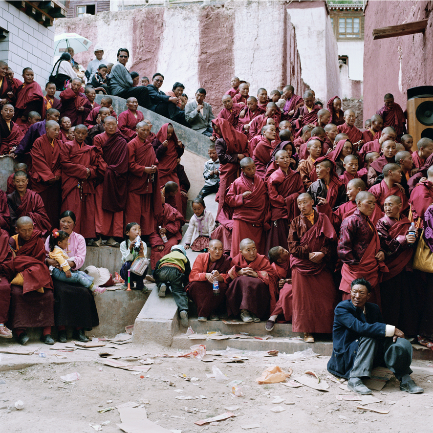
Rinchen Ato
Rinchen Ato at Nicer Tuesdays
GalleryRinchen Ato
Sometimes that dodgy looking email isn’t actually spam!
After the break, Michael White and Callin Mackintosh of Studio Lowrie delivered ten minutes on their recent identity of Sundance Film Festival 2020. It was a talk that expressed the true excitement of seeing your work out in the real world, enjoyed by others, and the pair’s enthusiasm for the project was palpable. After thanking us all for missing Pancake Day for them, the pair explained how when they first received the email asking them to pitch on the identity, they were convinced it was spam, or a hoax. After verifying that it was in fact a legitimate request, the main challenge was to create an identity which could compete with the mountains, architecture and the 50,000 people which descend on Park City, Utah every year for the festival.
Michael and Callin were given the brief of creating something modernist and minimal, that would draw in a younger audience, which expressed themes of celebration and connectivity and which expressed what a vital and inclusive part of the film industry Sundance is. Their response is a beautifully simple interpretation of the beam of light from a film projector, forming the central icon and logo; one that has several iterations, also mimicking how the pupil responds while watching a film. This was combined with a set of bold colours and the interchangeability of the logo and colour palette made for an identity which remains fresh but which is instantly recognisable around the town and its hodgepodge of buildings. “The block colours worked really well for navigation, it worked so simply,” Michael explained, adding that “everywhere you looked you could see the branding, it was quite a surreal experience.”
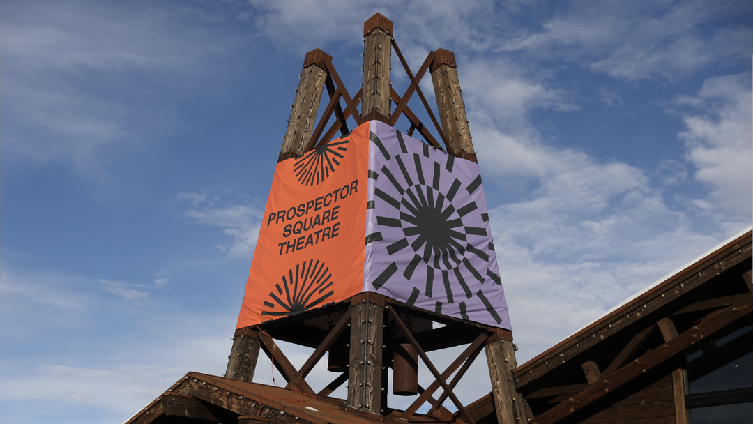
Studio Lowrie: Sundance Film Festival 2020
Studio Lowrie at Nicer Tuesdays
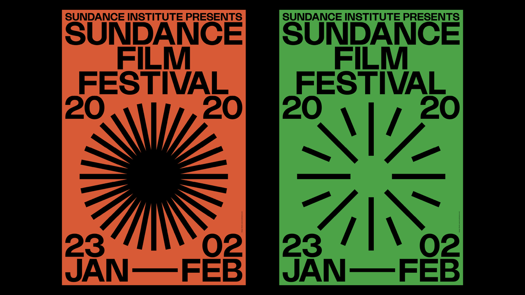
Studio Lowrie: Sundance Film Festival 2020
If you focus on the process, the project will come naturally
Finally, Benjamin Langsfeld, Buck’s group creative director delivered a slick talk – the kind you’d expect from someone with years of experience at one of the industry’s leading agencies. The focus of his ten minutes was on the studio’s recent rebrand, and the challenge of creating an identity which wholeheartedly embodies the studio’s 250 plus employees. Luckily, however, Benjamin has been with Buck since the start – when the studio was a small team in Korea Town – and so he was the right man for the job.
“What was interesting about the rebrand wasn’t necessarily the final product but the process,” he began by saying. “It was about creating a brand that all of our studio could connect with.” He proceeded to talk through some of the iterations the rebrand took, how it involved the experimentation of so many different team members and how, ultimately, that is exactly what makes it successful. The final result sees the recognisable Buck logo and brand updated to work in myriad contexts. It can, for example, take a backseat and work alongside the colour palette of another brand when used in a pitch deck. Or, if needs be, it can take centre stage by incorporating movement or 3D visuals. A key factor of the identity is the new suite of templates and guidelines the team has for sharing their work, in particular their process – a full 360 reference to what makes the work of Buck so good in the first place. It’s not about outcomes (although those too are great), it’s about the journey to create the, and the people who were involved in their making. “It felt like a brand for us, by us,” he concluded.

Buck rebrand
Benjamin Langsfeld at Nicer Tuesdays
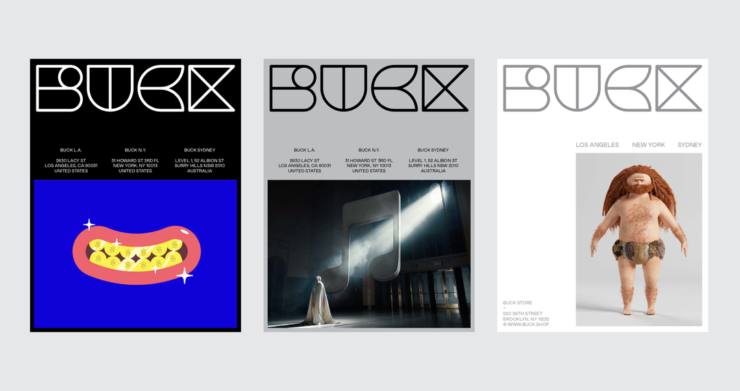
Buck rebrand
GalleryNicer Tuesdays February
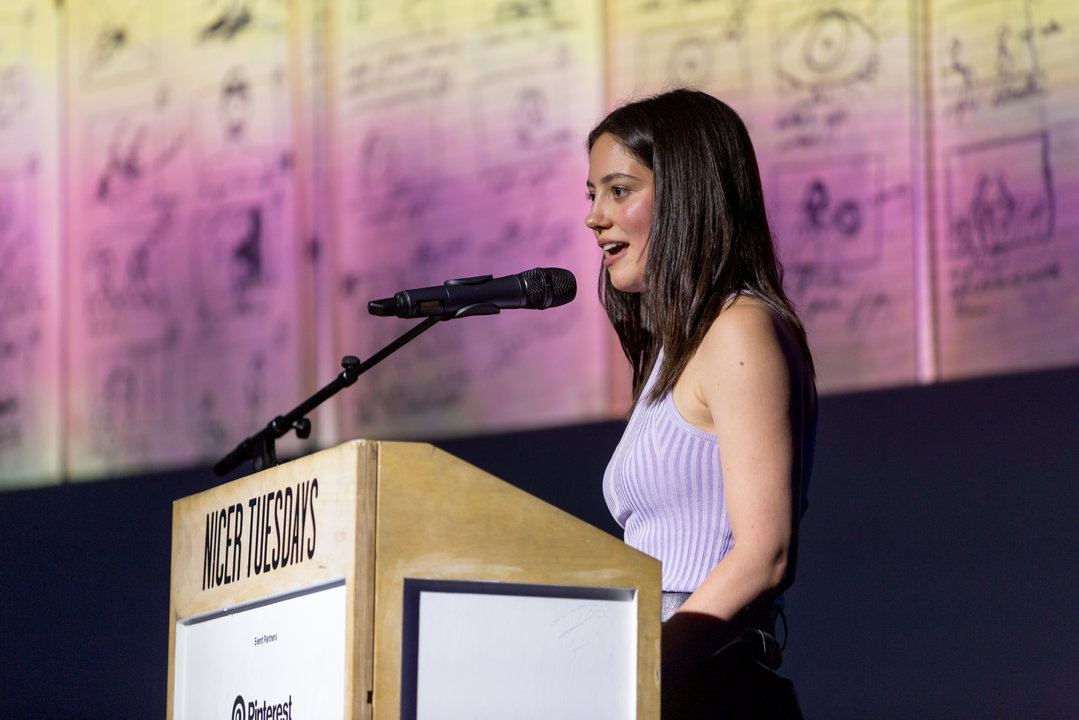
Ali Kurr
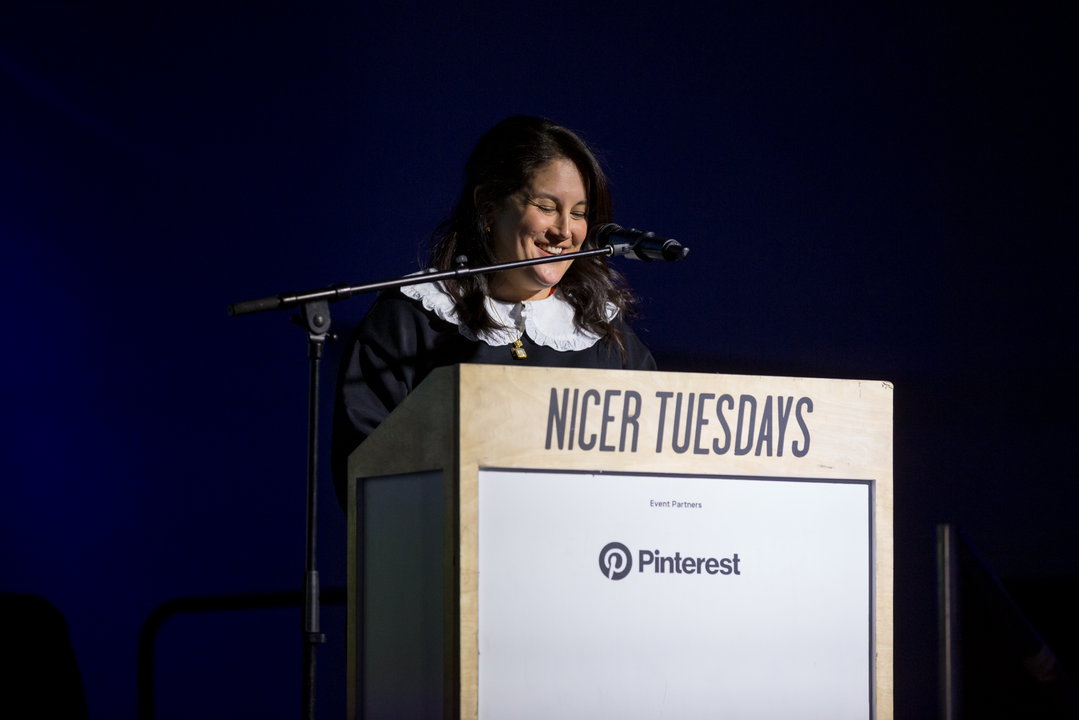
Rinchen Ato
Studio Lowrie
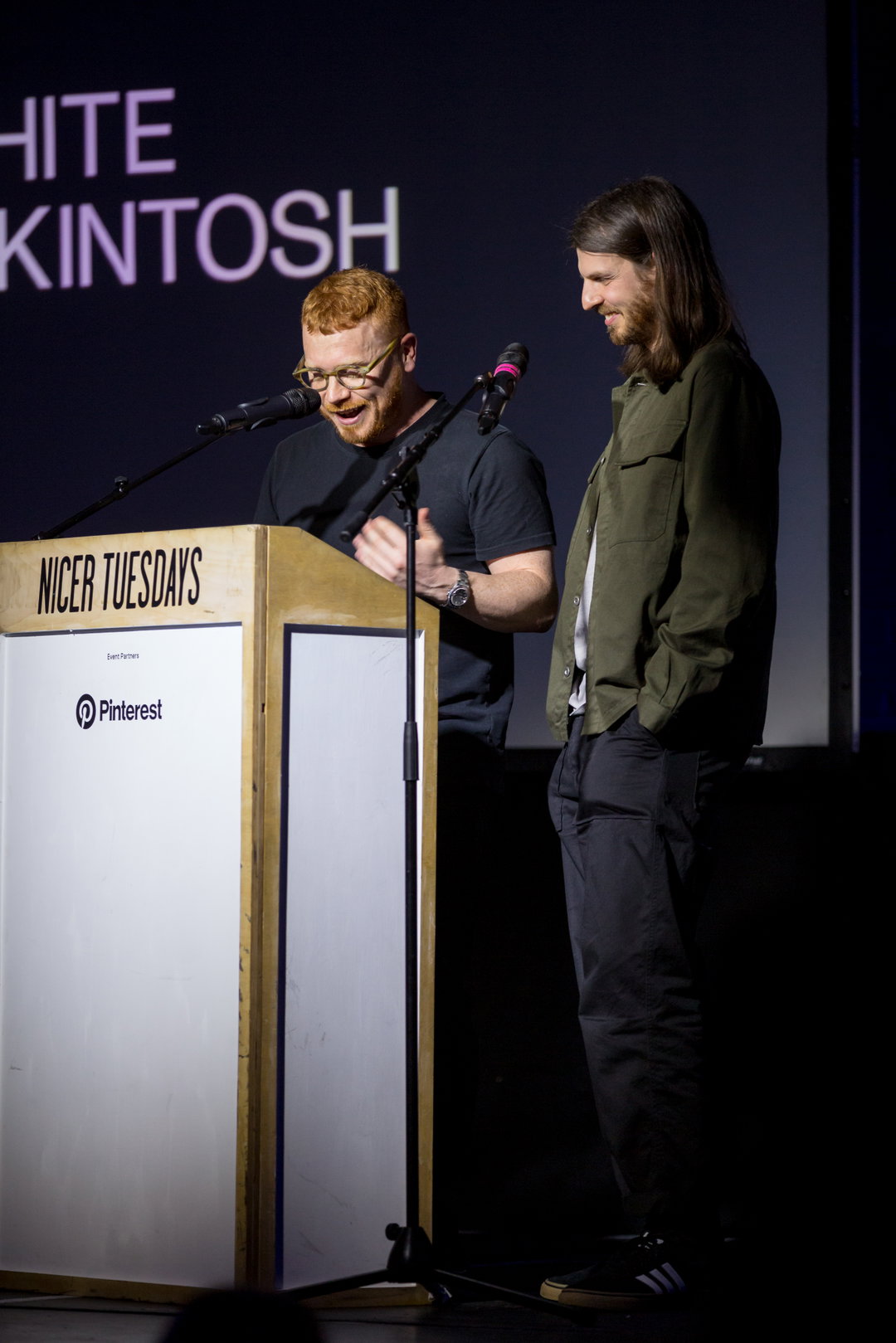
Studio Lowrie
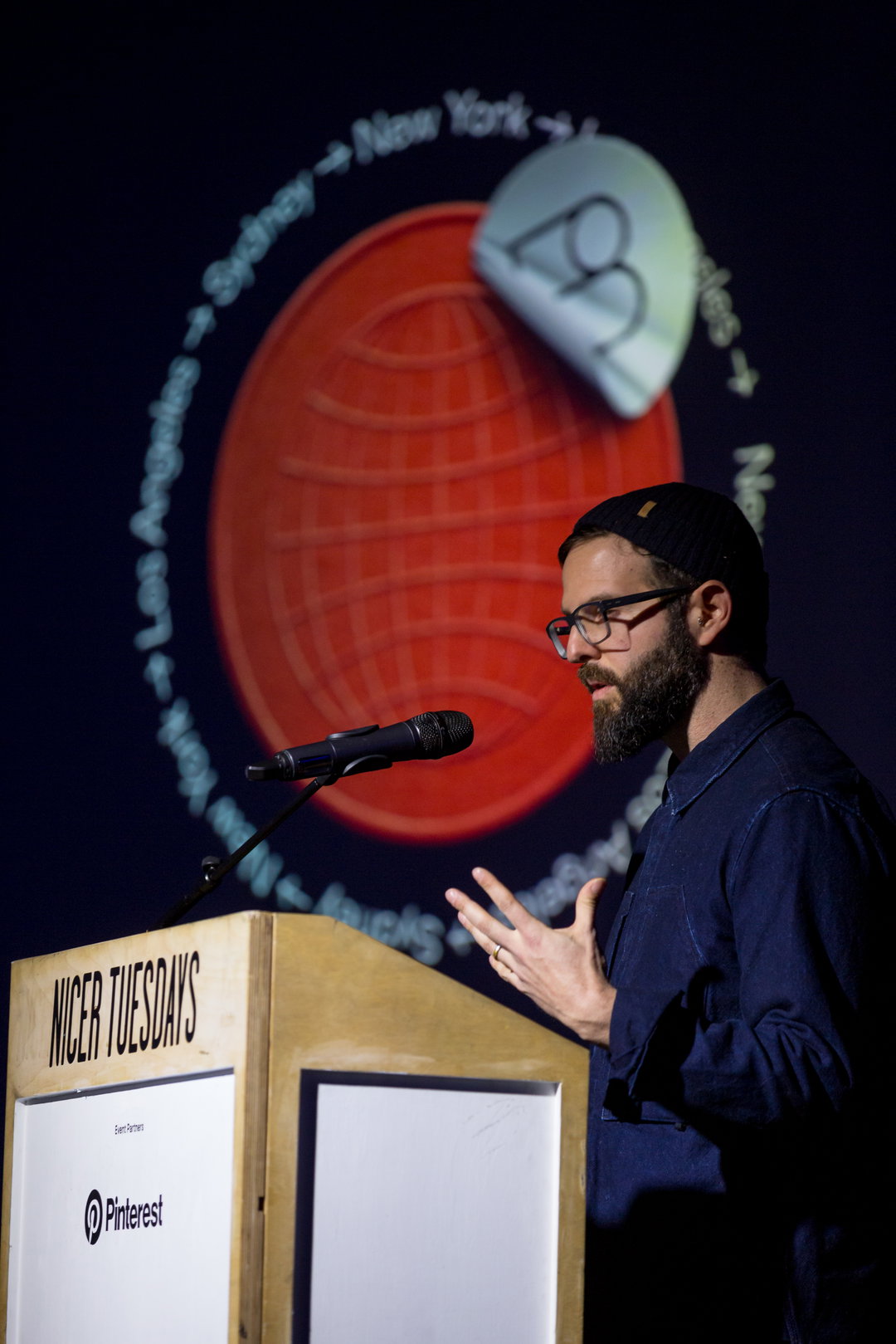
Benjamin Langsfeld
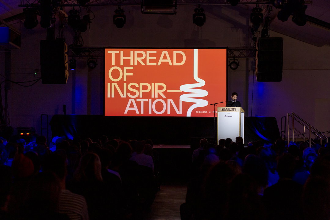
Event Partner
Pinterest is all about bringing creative inspiration to people’s lives. Graphic design. Photography. Boozy vegan breakfast... Whether you’re wooing a tricky client or feeding your friends, Pinterest has ideas to spark you into action.
Supported by
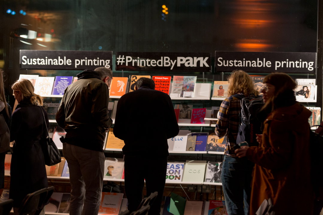
Park Communications
As one of London’s most respected printers, Park Communications is known for its creative input, attention to detail and high quality.
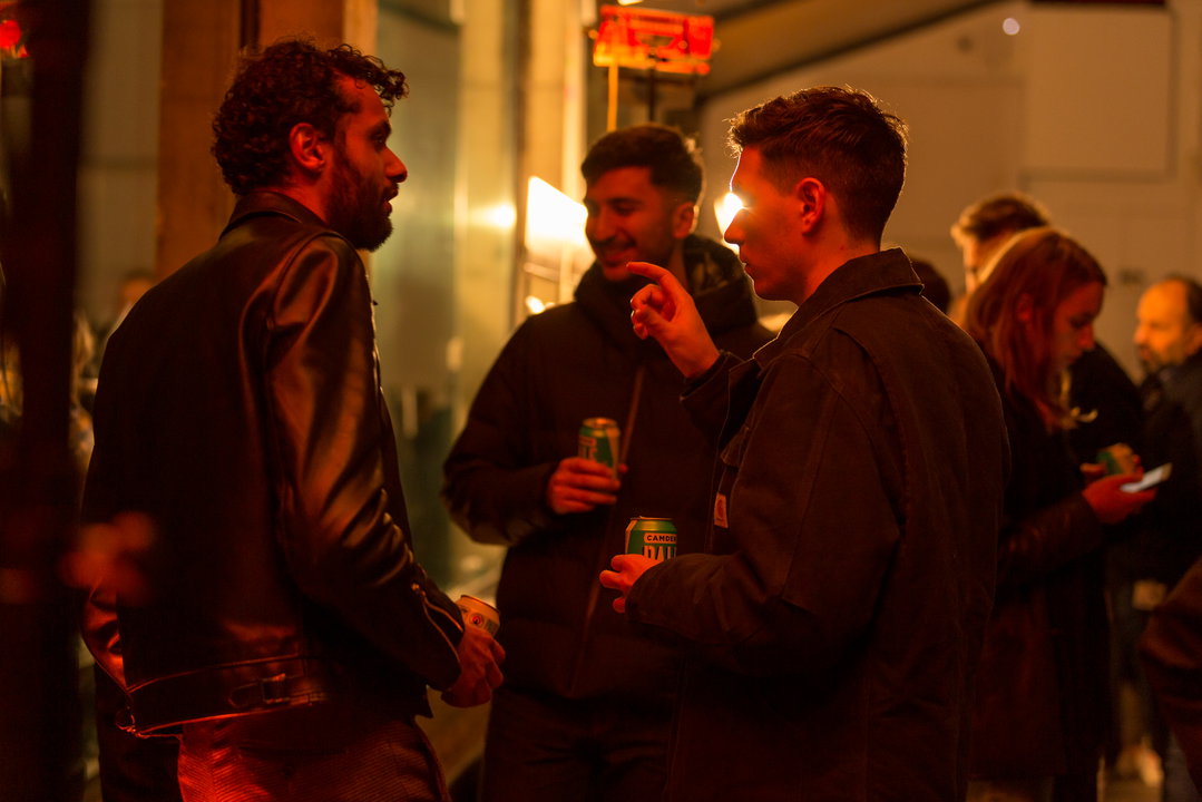
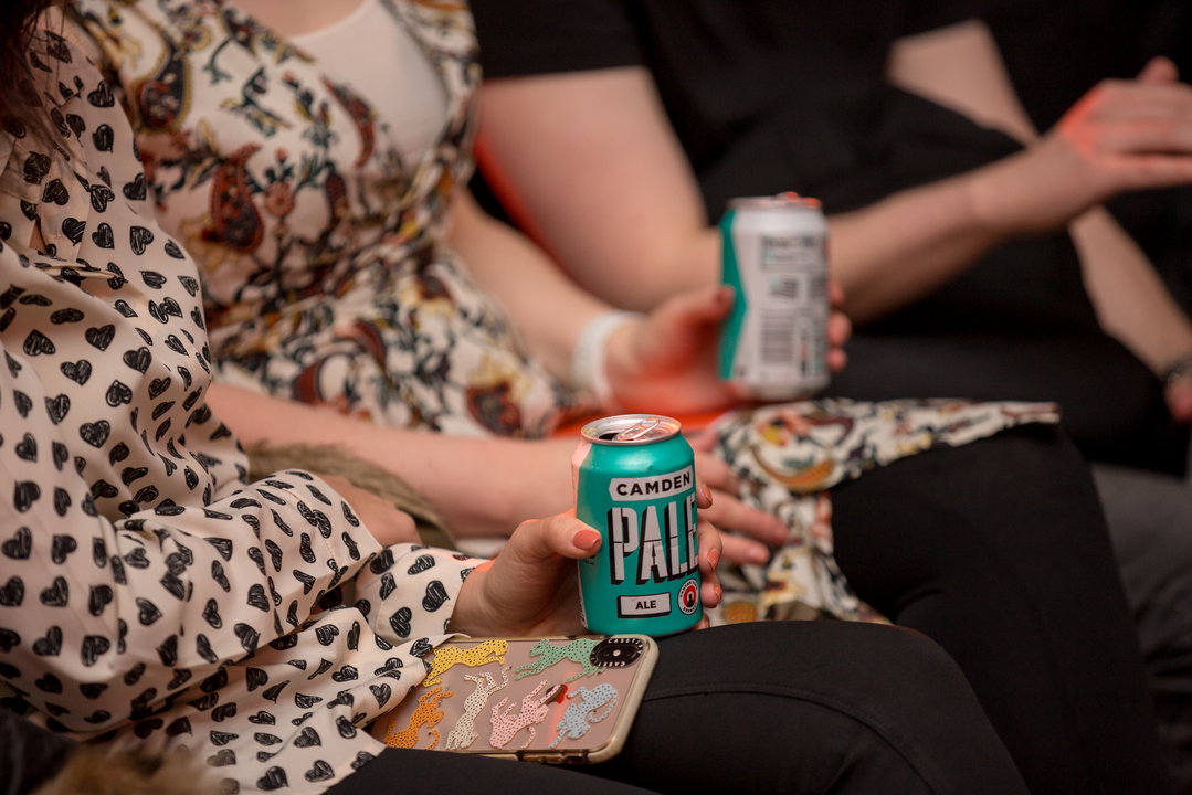
Camden Town Brewery
Camden Town Brewery was founded back in 2010 under the railway arches in Camden, with the aim of making really great lager.