- Words
- Lucy Bourton
- —
- Date
- 28 July 2020
- Tags
Louise Borinski invites you to decode and deconstruct her cryptic typeface
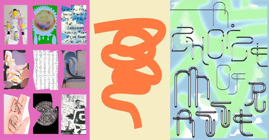
Using the mysterious narrative of Puzzleman Leung’s photographs as the starting point of her inspiration, the graphic designer creates a series of posters that are entirely open to interpretation.
Share
Share
In partnership with
Pinterest is all about bringing creative inspiration to people’s lives. Graphic design. Photography. Boozy vegan breakfast... Whether you’re wooing a tricky client or feeding your friends, Pinterest has ideas to spark you into action.
Thread of Inspiration is a series in partnership with Pinterest which explores how inspiration can come from unexpected places. Throughout the year we’ll be inviting a host of creatives to create amazing artworks, and sharing the intriguing stories behind how they come up with new ideas. Every other month a new creative will be introduced, tasked with creating new works inspired by the artist who came before them in the chain.
Berlin-based graphic designer Louise Borinski tends to always start her work with a wide range of visual references. Although the final outcome is usually refined – both in concept, colour palette and design – she starts a project with her plate absolutely full, arranging it together and chopping parts away when they don’t quite fit.
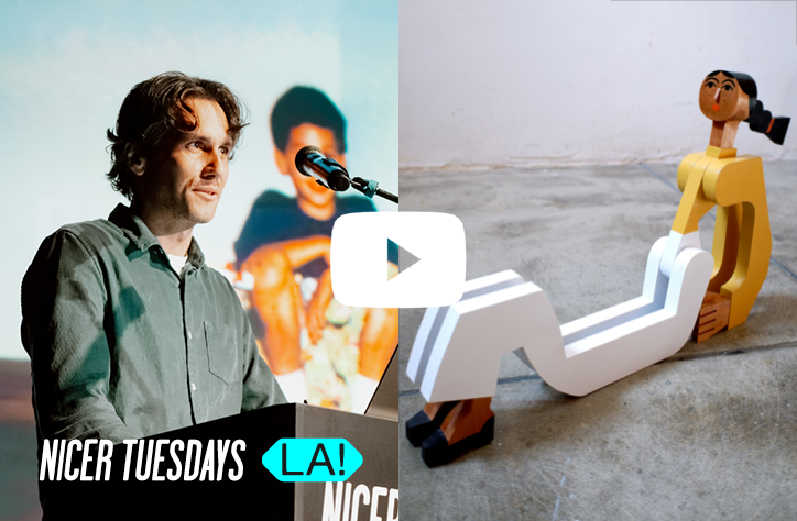
It was this approach that first attracted us to Louise for the next leg of our Thread of Inspiration project, a series of works developed through research and inspired by a different creative who came before them in a chain stretching across the year. We’re now on the third run of this creative relay race – first, a talk by Ricardo Bessa at Nicer Tuesdays inspired Maaike Canne to create a series of futuristic illustrations, which then inspired photographer Puzzleman Leung to create a set of mysterious photographic explorations, and Louise has now morphed this project into a graphic design-leaning one.
Thread of Inspiration
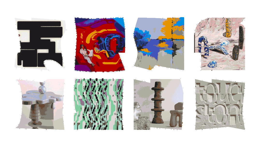
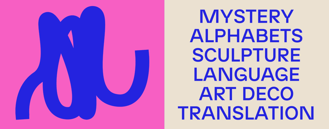
Initially happy to receive a brief which was “open and creative”, the scope of the project allowed Louise to let her mind travel as far as possible, trying at first to “decipher the stories behind the still lifes” in Puzzleman’s photography. Finding that this process of figuring out the work was what she “liked the most” about Puzzleman’s photographs, Louise too set out to create work in which the viewer would see “one image and try to imagine and unravel a whole story behind it,” she tells It’s Nice That. “I thought of his work like a riddle, with a mysterious touch to it. This part led me to the idea of making a cryptic alphabet and creating posters from it. Again, for the viewers to interpret on their own.”
With this in mind, Louise’s vast research began, utilising Pinterest as a platform to fall into deep inspiration scroll holes. Explaining how this process is typical to the creation of her works, Louise adds: “I think it can help to bring a certain structure to your visual thoughts, and you can always come back to earlier thoughts if necessary,” she says. “It’s also a great tool to share visual ideas with possible collaborators.”
Travelling down to the bottom of the designer’s Pinterest board, this practice is obvious, with pins jumping between sculptural references like Art Deco candle holders, through to the combination of visuals and typography in Nejc Prah’s works, or historical references of symbol-orientated alphabets. “But in the end,” adds Louise, “it’s only possible to refer to a few and maybe it would be easier with less visual content. I think in this project it was kind of a longer journey. It started with sculptures, and ended in hieroglyphs and deconstructed typography.”
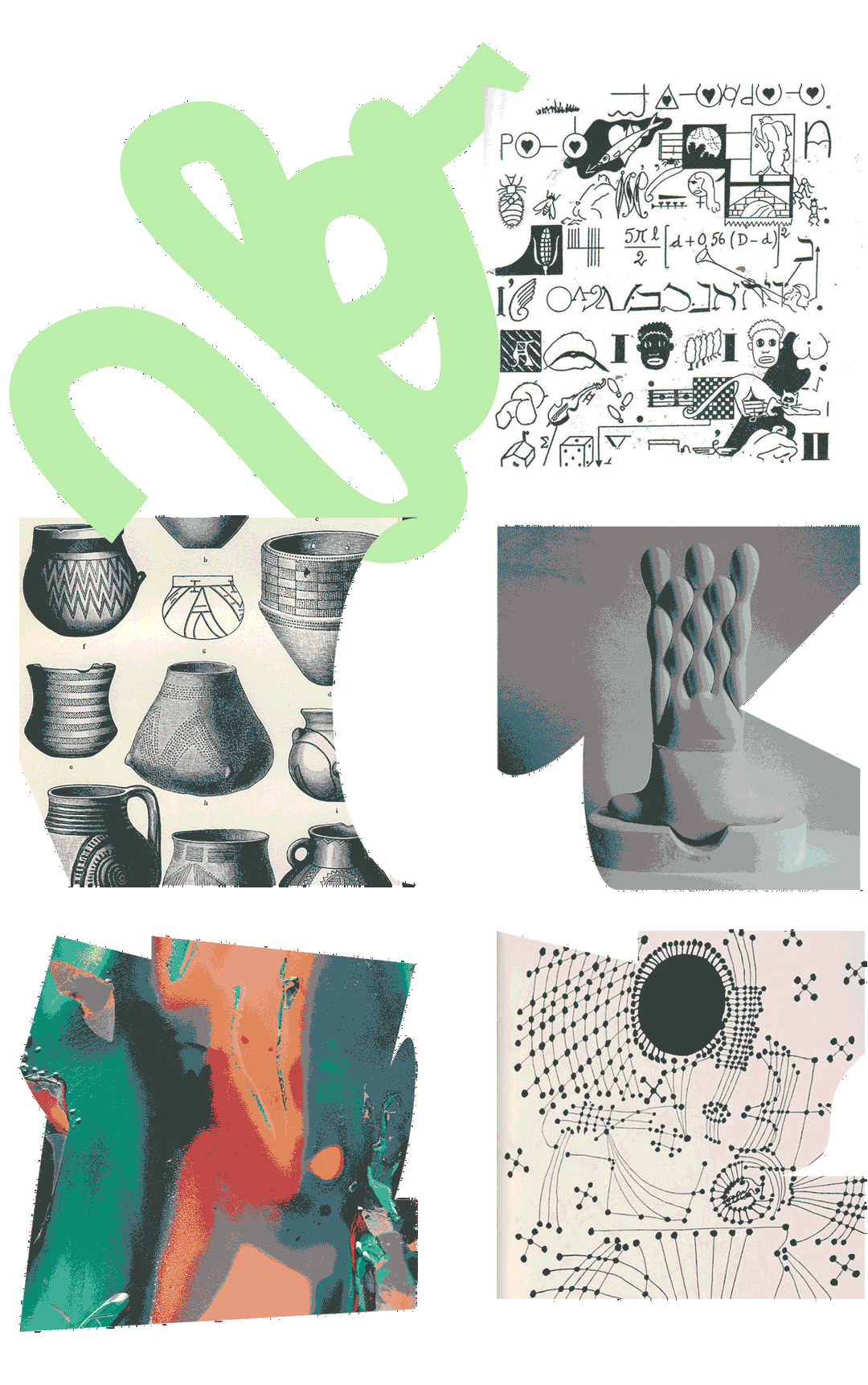
Taking us through this long journey, Louise points out a few objects that provided turning points in the project’s development. At the more sculptural end is an object by designer Dan Friedman, taken from his book The Radical Modernist. A decorative bowl structure with elongated looping handles, “the way lines and shapes are balanced caught me directly,” says Louise. Next, introducing the idea of a cryptic alphabet more visually was a work by Pablo Picasso titled Start Constellation, a piece in which Louise “could already see a cryptic alphabet”. Introducing colour and a possible texture is then a piece by the artist Daisuke Yokota, which is “very inspiring for its range of colours and its materiality (this almost chrome look) which I later applied to the typography,” describes Louise.
At this point, the research phase of the designer’s project jumped back to looking at sculptural works, when she stumbled across the works of Mike Goodlet, which “inspired me because of its simple but very organic shapes,” she tells us. Flitting back to more typographic works, Louise then got the urge to begin the project after delving deeper into movements such as hyphergraphy (a mathematics term where the edge of a graph can join numerous vertices), and lettrism (the French avant-garde movement established by Isidore Isou in 1940s Paris), both offering examples of “letters and symbols as a dominant form in a piece of art”. This – coupled with a more contemporary reference in Kobayashi Ikki’s work, who “inspired me through his very accurate but simple way of drawing shapes” – meant the project was ready to begin its making phase.
Thread of Inspiration: Discovery phase
1 of 6
1 of 6
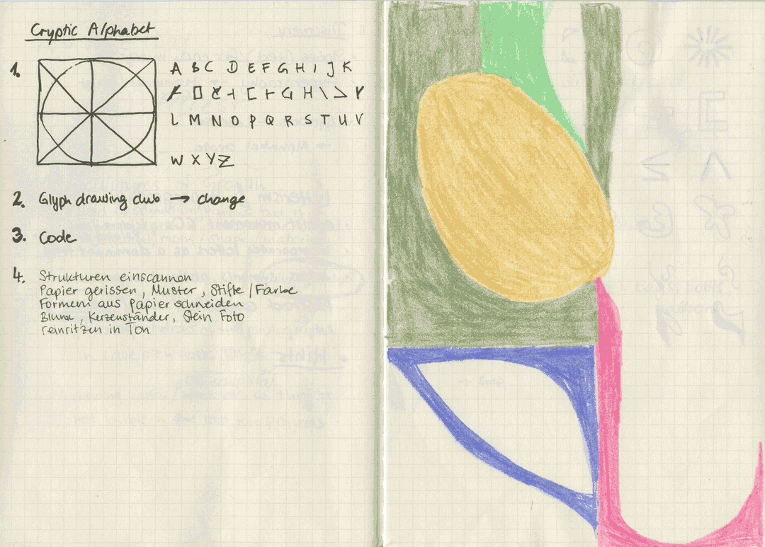
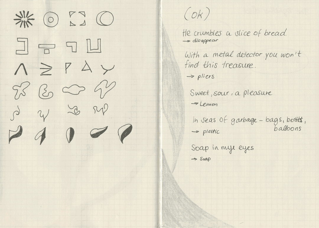
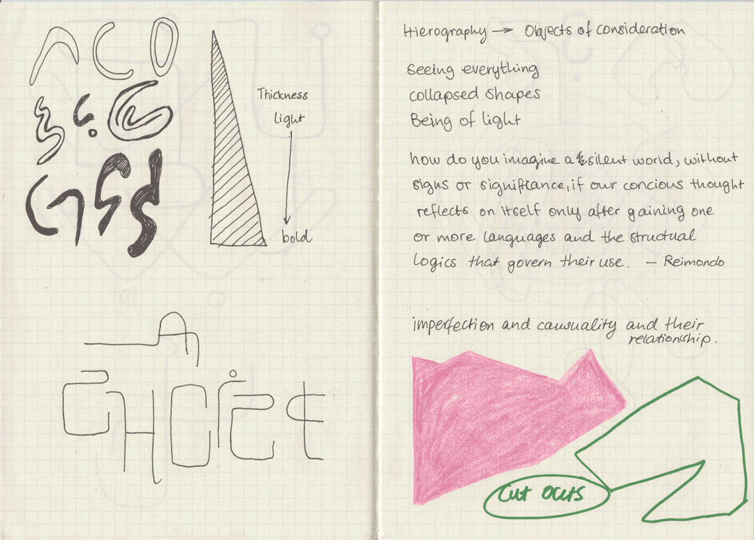
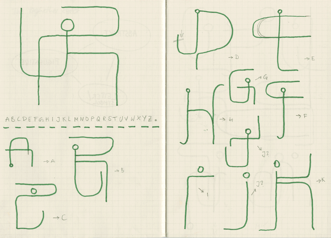
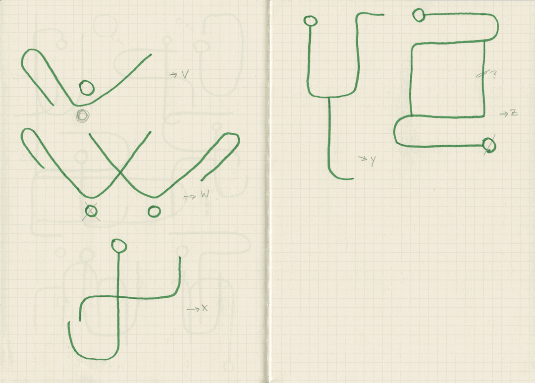
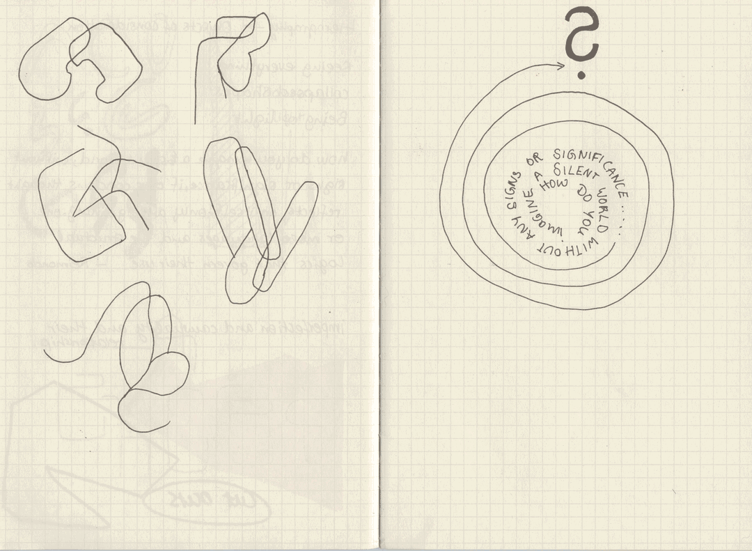
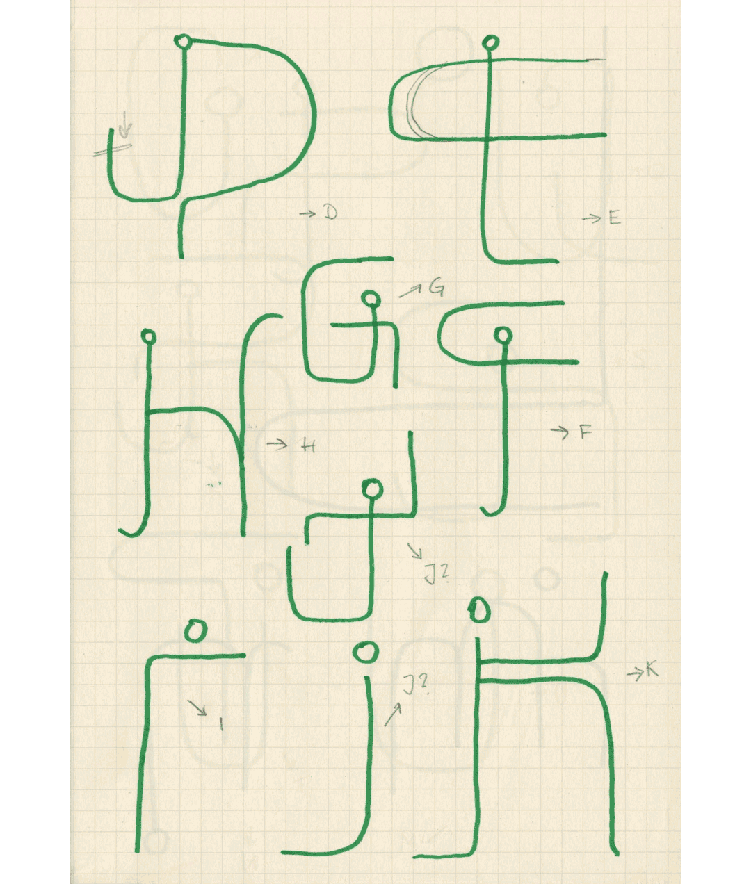
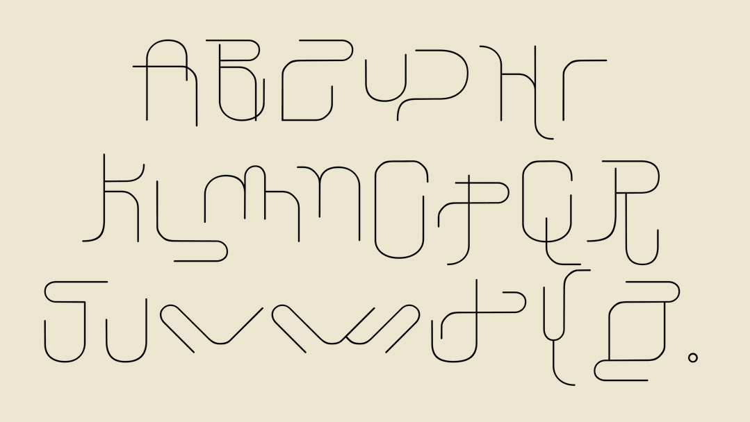
Although research, clearly, is a key part of Louise’s practice, “and actually with visual researching I could go on forever, if there wasn’t this itchy feeling in my hands,” it’s when she begins drawing that a project starts coming to life. She filled her Thread of Inspiration board with scans of her notebook sketches, and viewers can see how Louise’s cryptic typeface began to grow. First sketching glyph shapes on paper, Louise then translated these digitally, still pulling in the odd reference, such as metal clips from hardware stores inspiring certain shapes of her alphabet. This process was Louise’s favourite throughout the project, explaining how “it’s not one which comes near perfection and that was the fun part,” she tells us. “I really liked the balancing act between readability and abstraction.”
It was also during this stage of the project that Louise started to think one step ahead, pondering how the typeface would be used by her when designing the posters. Deciding to show its breadth by “using it in different kinds of variation on the posters,” again her reference points were wide-ranging. “I tried to look for examples with bold, big type, with smaller text and with playful, almost non-readable type,” she explains.
Thread of Inspiration: Create phase
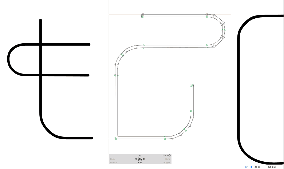
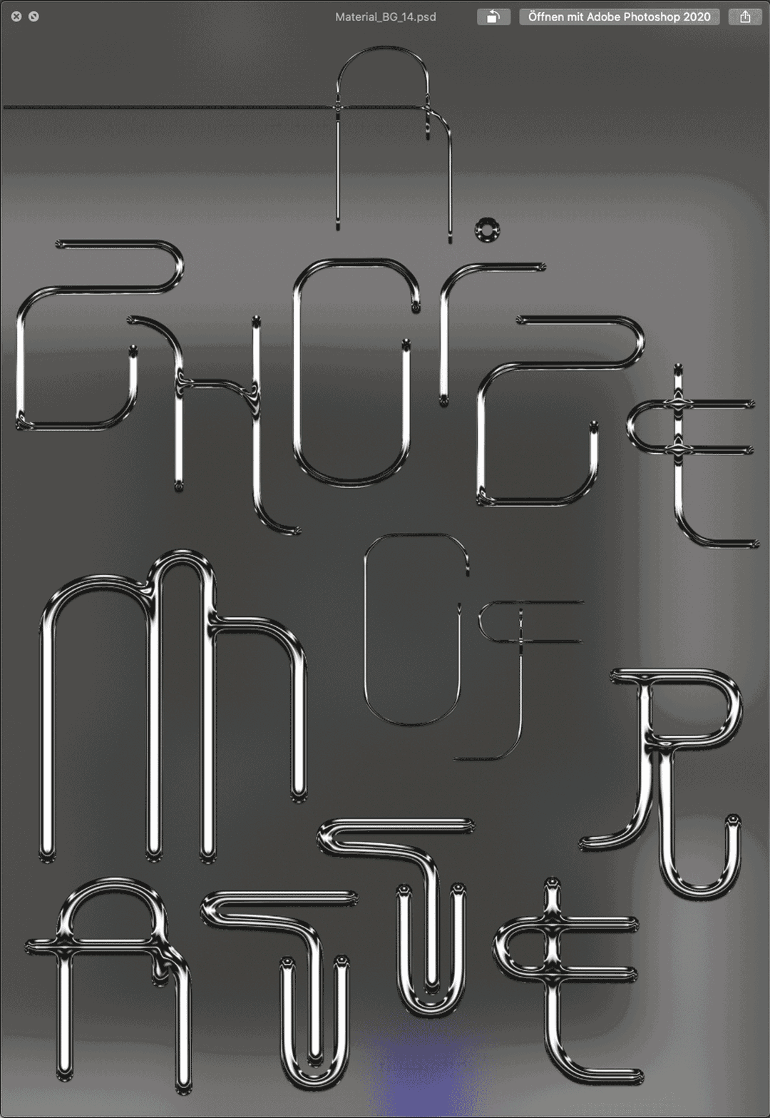
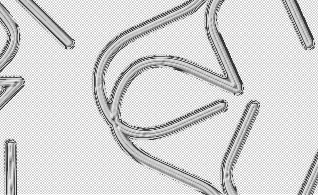
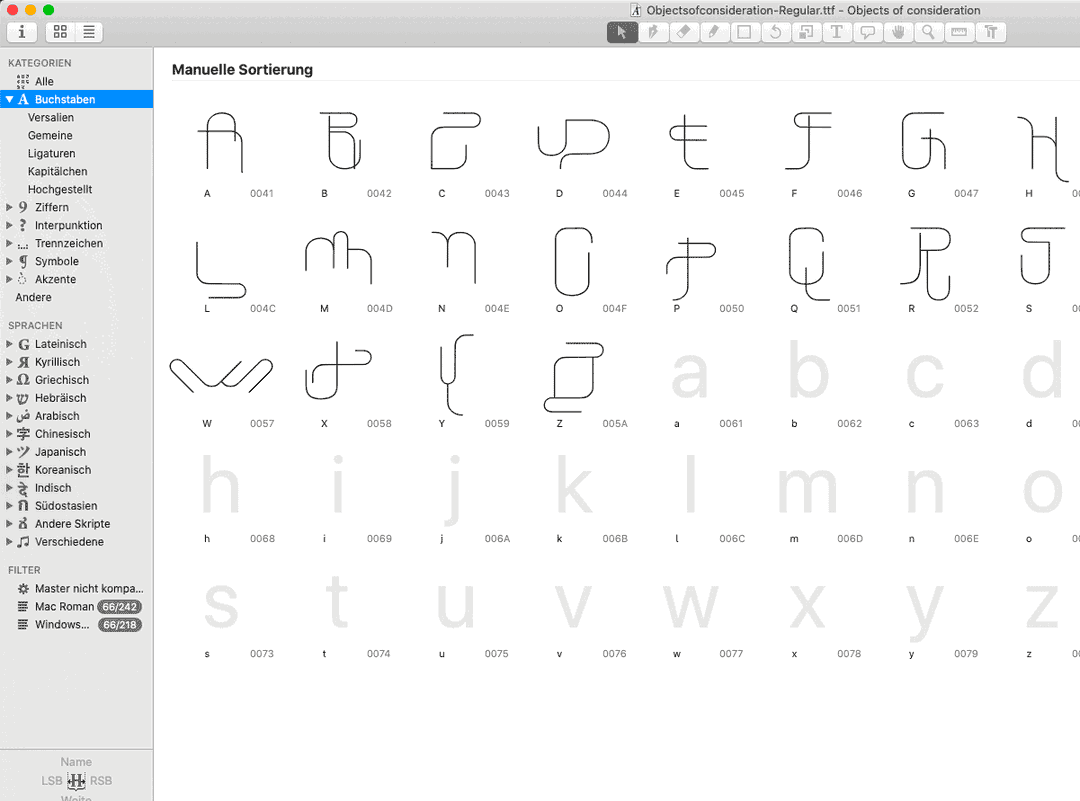
1 of 4
1 of 4
With the typeface then completed in all its tubular glory, to tie each variation shown across her final posters a tight colour palette was needed. Turning to what has become a trusted friend of many a graphic designer, Louise opened up her copy of A Dictionary of Colour Combinations (first developed by Sanzo Wada) to develop a colour series which could bleed from one poster’s background to the next. Largely looking at a section of the book in which possible colour combinations are presented in groups of three, the designer used these suggestions as jumping-off points, noting how “I didn’t use the exact colour codes, but I loved how unusual some of the combinations are,” she says. “I picked out a few of them and rearranged them so I would have a full colour palette,” presenting a rainbow of metallic greens, pinks, blues and purples.
Taking care to ensure a thread could be found between the final pieces, Louise adds that now “I am very happy that I completed a series of seven posters,” she says. “It’s not so easy to not repeat yourself,” but by ensuring that different statements were displayed on each poster to showcase the typeface’s many forms, a carefully constructed colour palette to differ one from another, and let’s not forget a vast range of references to begin with, a unique series of artworks developed.
Now passing over the project to the next creative contributor, Louise only hopes that they’ll be able to find as much room for experimentation and research as she was granted with Puzzleman’s works a few weeks ago. “I hope the next creative will find a little seed in my work,” she adds, “and grow something completely different out of it.”
Thread of Inspiration
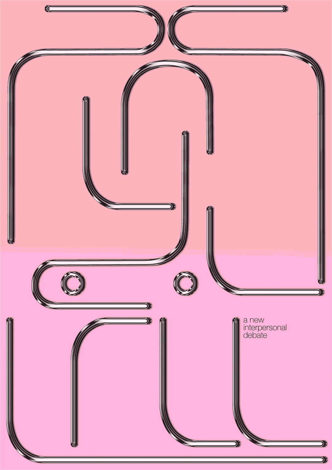
A New Interpersonal Debate
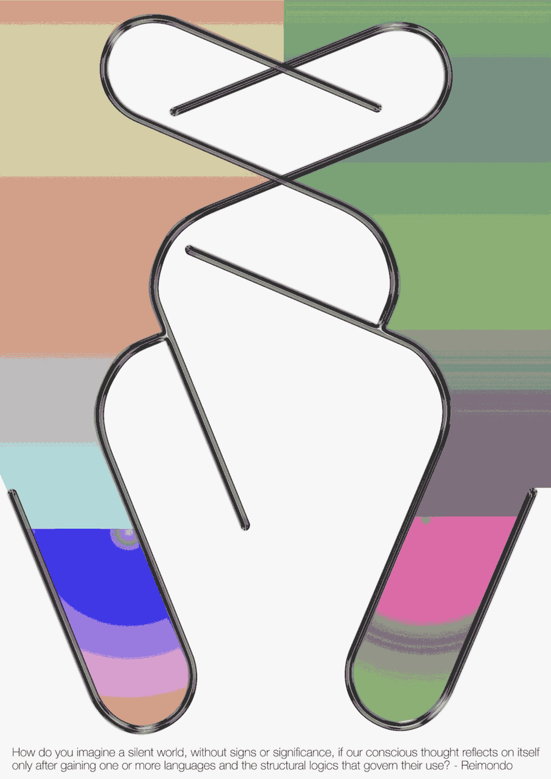
How do you imagine a conscious world?
Objects of Consideration
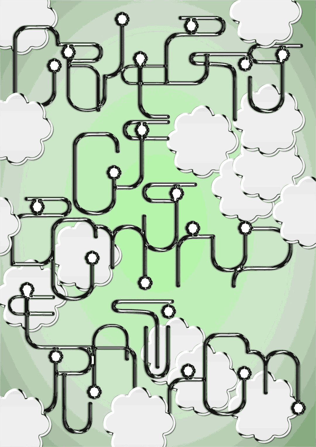
Objects of Consideration
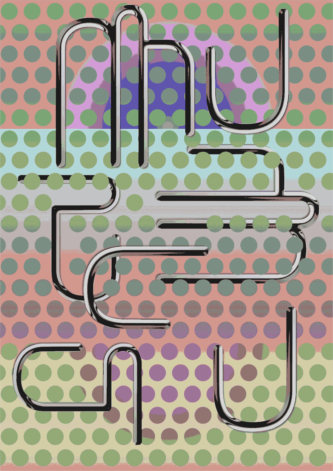
Language Muse
New Language Determines the Birth of New Worlds
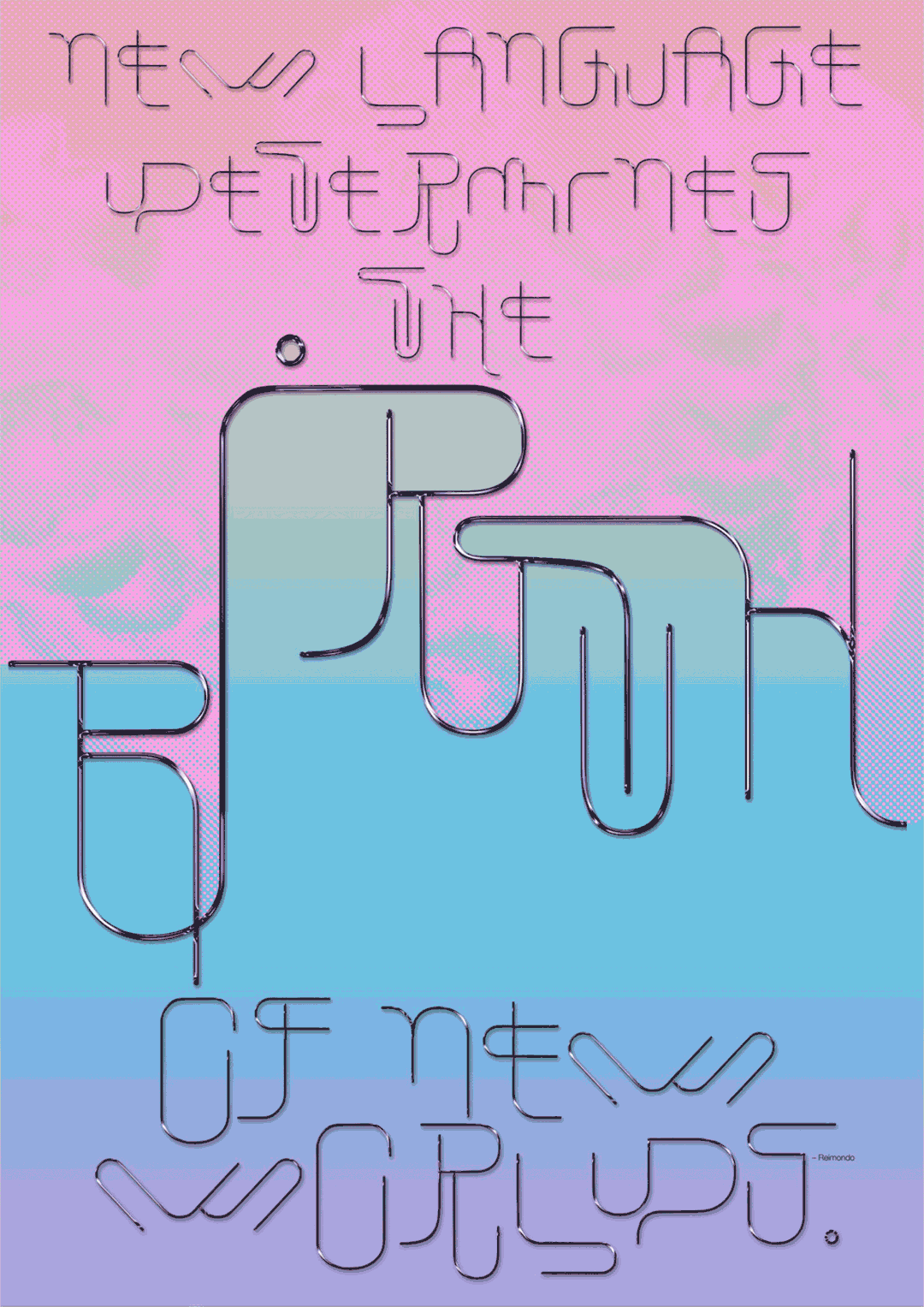
New Language Determines the Birth of New Worlds
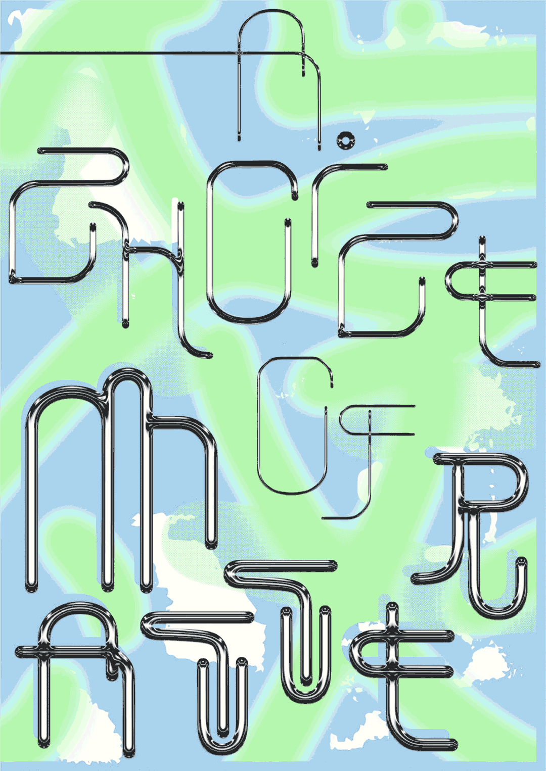
A Choice of Matter
Riddle-Solving Exploration
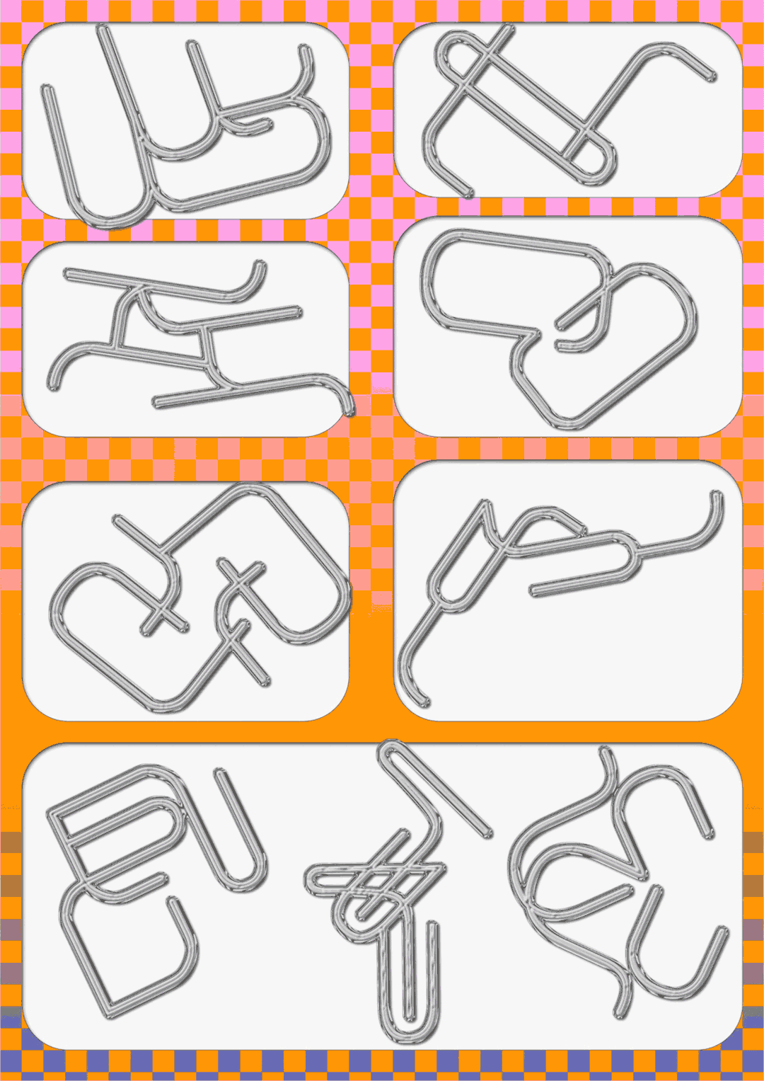
Riddle-Solving Exploration
Share Article
Further Info
About the Author
—
Lucy (she/her) was part of the It’s Nice That team from 2016–2025, first joining as a staff writer after graduating from Chelsea College of Art with a degree in Graphic Design Communication, eventually becoming a senior editor on our editorial team, and most recently at Insights, a research-driven department with It’s Nice That.