Graphic designer Zheng Kai’s work interrupts attentions and never gets too comfortable
The Singapore-based designer talks us through a couple of projects that have seen him build a rapidly growing fanbase.
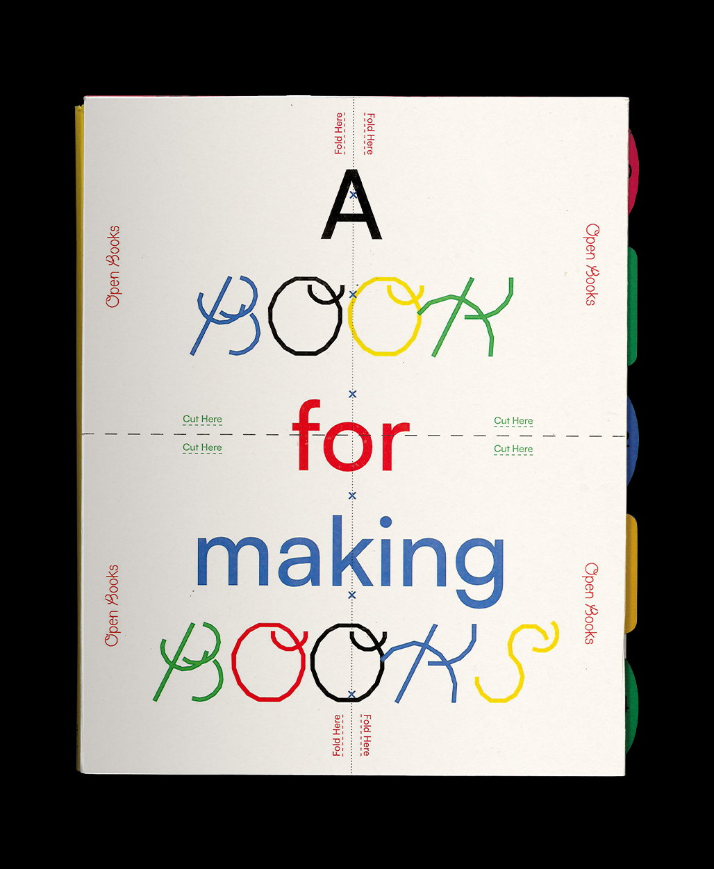
Meet Zheng Kai, the Singapore-based graphic designer positioning himself at the opposite end of minimalism. He tells us: “I tend to make my visuals scream while my words are usually used to fill up as much space as possible.” While he appreciates the pared-back movements within graphic design, this creative likes to make uncomfortable work. With the viewer in mind, he tries to design material which “interrupts their attention and slows them down.” Stopping viewers in their tracks, he draws out their sense of curiosity so they never know exactly what they’ll be faced with when it comes to Zheng Kai’s immutable works.
Given enough time to experiment, he likes to explore concepts that “oppose preconceived notions of what the subject matter was supposed to me.” He does this in either subtle or obvious ways, twisting the output from digital to analogue for example or introducing a new perspective to an old genre like still life. Zheng Kai has had an interesting creative path so far to arrive at this unique outlook on creativity. Born and raised in Singapore, where he’s still based, he realised early on that he wasn’t going to excel in academic studies. “I was never a fan of the textbook,” he says looking back, “and could only understand with images or visuals.”
From then on, art was the only subject that held his full attention. This was the early catalyst for pursuing a career in the arts. Still early on in his career, Zheng Kai is currently studying visual communication at Nanyang Technological University. There, he immerses himself in the fields of not only graphic design but also 3D and moving image. His studies have also introduced him to other mediums such as sewing, film and photography, providing him with a broad range of visual inspiration to further his interests.
During weekdays, he follows the strict schedules of university but on weekends, he experiments with more unconventional approaches to design which expand his mind in both a 3D and 2D sense. Influenced by artists and studios such as Darío Alva, Obby & Jappari and Theseus Chan (“they showed me unconventional methods can be used to approach design”), Zheng felt ignited to try something new and create something different. Ransacking the internet for myriad tutorials, he started experimenting with software and documenting his trials on Instagram.
To his surprise, many people started following his account and commented on how they really liked his work (including us – it’s how we discovered Zheng Kai’s work). He quickly gathered a fanbase, one that marvels at his unique take on design for someone so early on in their career. “I didn’t expect such positive feedback because back then I was just playing around with the software and just wanted to post my works on social media as a form of storage.”
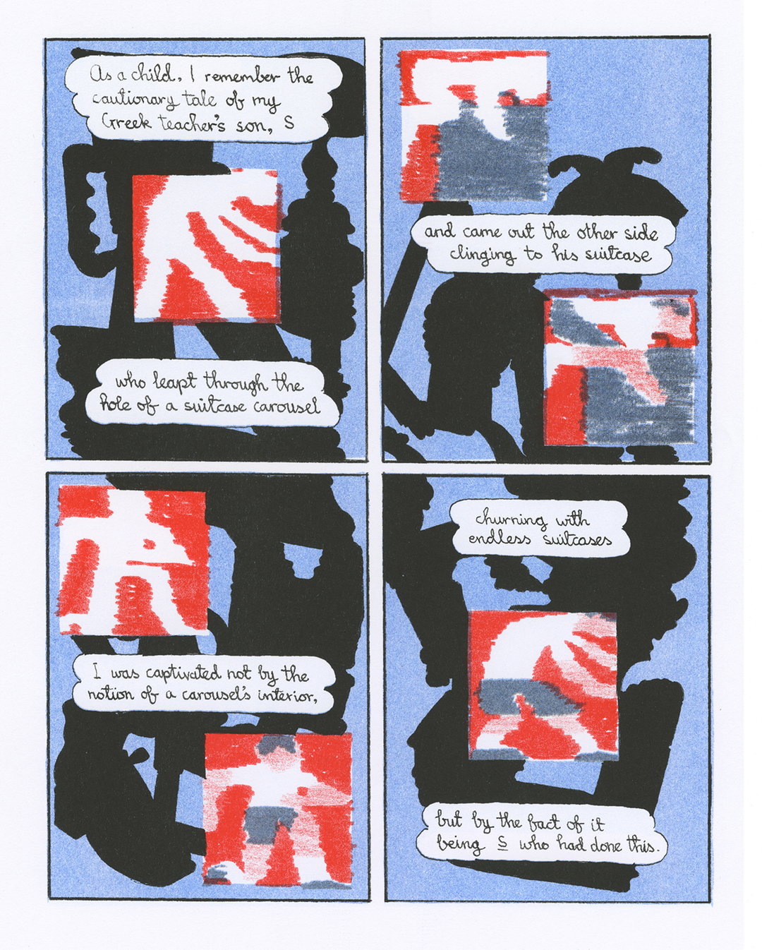
An example of one of the projects that went down extremely well with his audience is Cache. A mini-zine, Zheng draws attention to overlooked places in Singapore, documenting the visual details of these locations in the beautifully designed publication. He focuses specifically on the Woodland’s vicinity of Singapore and an area known as Fu Shan garden which holds a menagerie of dinosaurs for children to climb on and discover. The designer manipulates the shape of these dinosaurs, over-emphasising some of their features or distilling others. “The concept of the zine is inspired by the idea of change in the physical sense of a garden,” explains Zheng. One day, a garden might appear in one way but the next time you see it, it might be completely different. It may be riddled with dinosaurs. He hopes that some viewers find it familiar while others don’t, and that’s the beauty of the zine.
Elsewhere in Zheng Kai’s work, he explores the duality between order and chaos through lenticular printing in an artwork of the same name. While in Obsolete Conversations, he designs a zine that highlights the final replies from discontinued conversations, mainly on WhatsApp. Interested in how we “close” conversations on such communication platforms, he documents an alternative kind of exchange of words, one which rarely sees the word “goodbye” but runs onto the next conversation instead. “The zine was dedicated to all the conversations that were closed on my phone without a proper goodbye,” Zheng finally goes on to say.
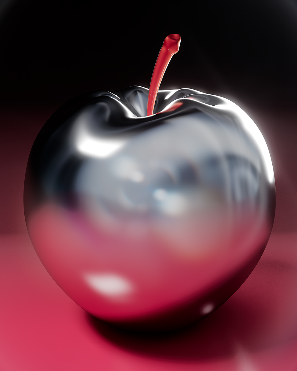
Zheng Kai: Apple of My Eye (Copyright © Zheng Kai, 2021)

Zheng Kai: Still Life As Moving Images (Copyright © Zheng Kai, 2021)
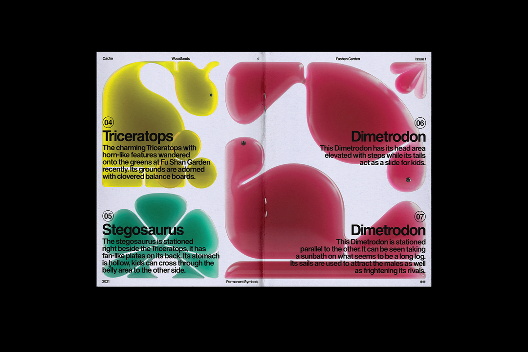
Zheng Kai: Cache (Copyright © Zheng Kai, 2021)
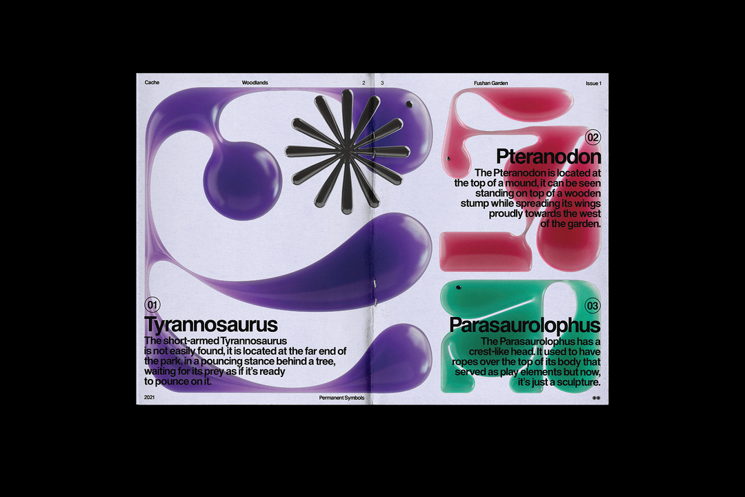
Zheng Kai: Cache (Copyright © Zheng Kai, 2021)
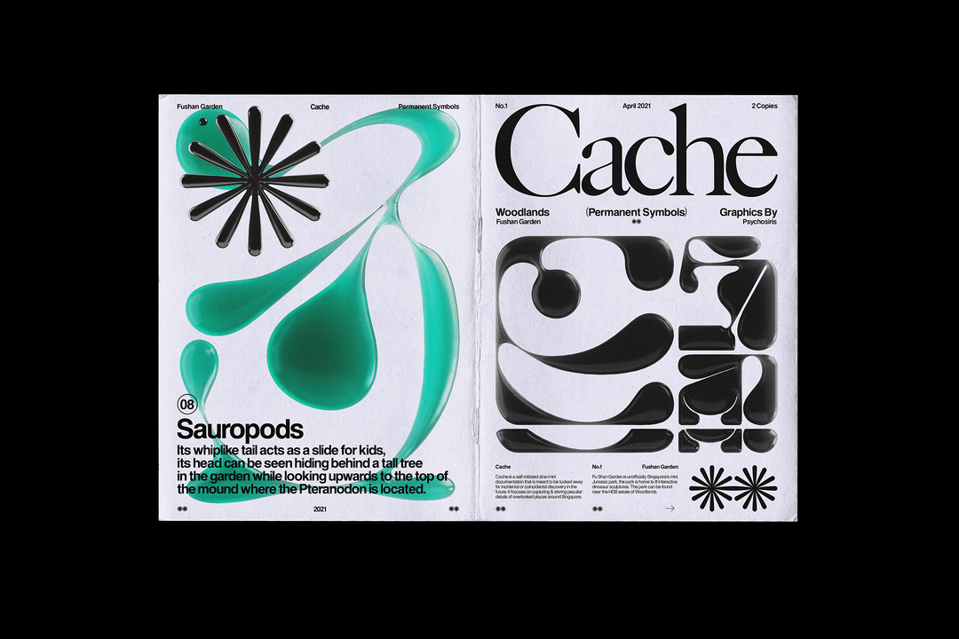
Zheng Kai: Cache (Copyright © Zheng Kai, 2021)
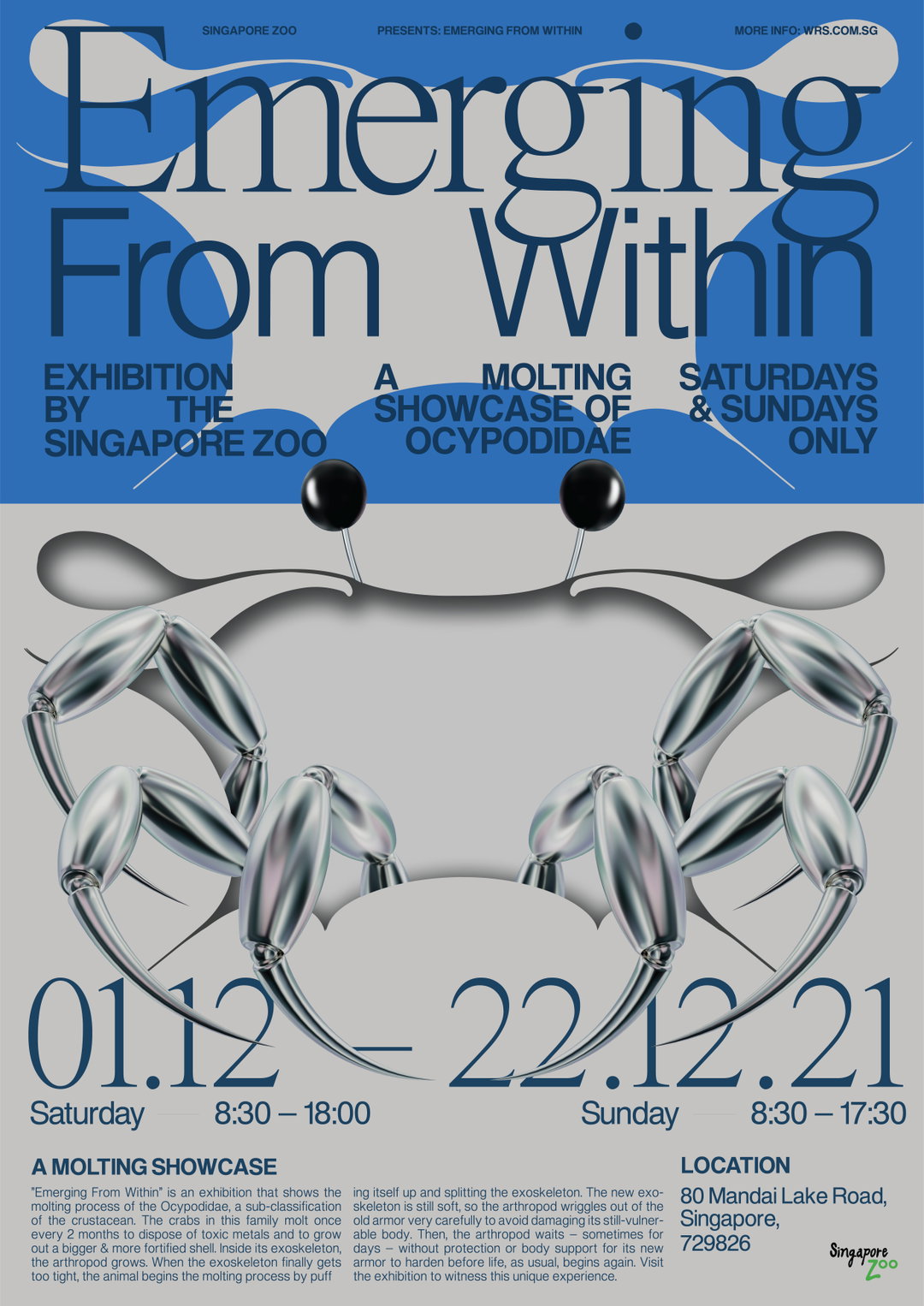
Zheng Kai: Emerging From Within (Copyright © Zheng Kai, 2021)
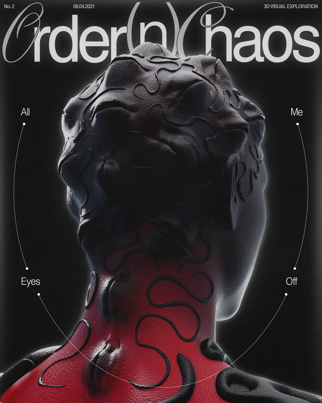
Zheng Kai: Order N Chaos (Copyright © Zheng Kai, 2021)
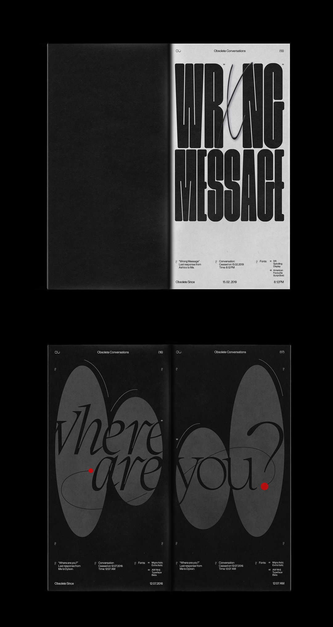
Zheng Kai: Obsolete Conversations (Copyright © Zheng Kai, 2021)
Hero Header
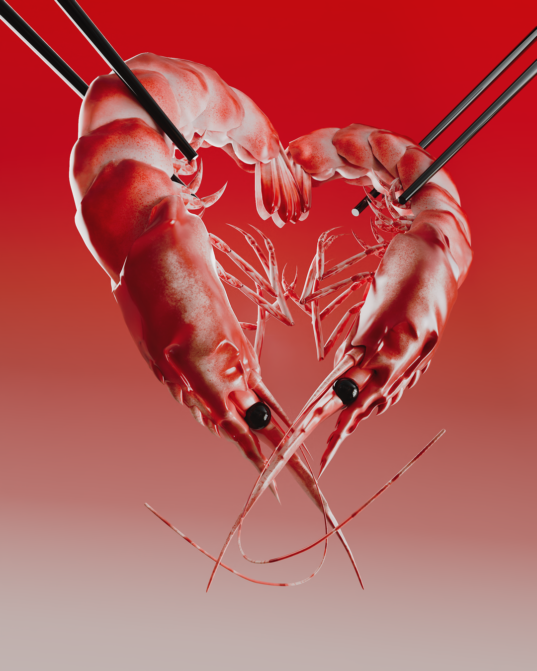
Zheng Kai: Til Death Do Us Part (Copyright © Zheng Kai, 2021)
Share Article
Further Info
About the Author
—
Jynann joined It’s Nice That as an editorial assistant in August 2018 after graduating from The Glasgow School of Art’s Communication Design degree. In March 2019 she became a staff writer and in June 2021, she was made associate editor. She went freelance in 2022.