Zara Picken’s archive of modernist illustrated ephemera is a window into a defining creative era
A decade-long love note to mid-20th century illustrators, this collection of leaflets, posters, stamps, matchbox labels, bookmarks and more, celebrates a time when illustration became a vital form of communication.
Like many figures in her field, illustrator Zara Picken was always drawing as a child. Just like dancers start tapping their feet from an early age, this penchant was a sure sign of her future in illustration. What Zara also liked to do from a young age was build meticulous collections of illustrated things: “As a child, I was something of a magpie,” she says, “I’d collect stickers, comics, free postcards from the cinema.” But it wasn’t until her art foundation course that the creative found that she could formalise her drawing skills when she discovered illustration, a medium she describes as “creating a single image to tell a whole story”.
Her lifelong habit of collecting and time spent studying illustration at Bristol eventually amalgamated into the creation of Modern Illustration Archive. A delightful corner of Instagram, the illustrators page archives all of her finds of mid-20th century (1950-1975) illustrated ephemera: leaflets, poster stamps, matchbox labels, bookmarks, and more, all to celebrate a period “when illustration became a vital form of communication”.
This beautiful collection of old printed ephemera has slowly been stacking up over the last seven years, but it first started on Christmas Day in 2009 when Zara stumbled across a set of 1960s matchbox labels in an antique shop in Prague. “Having recently graduated,” she says, “I was working mainly on editorial commissions, and I felt a clear parallel between my practice and these tiny designs – strong concepts expressed through bold, simple forms.” Spurring on a new collection altogether, these tiny but mighty matchbox designs gave Zara the idea to start a blog of mid-century design, before transforming it in 2018 to the Instagram account it exists as today.
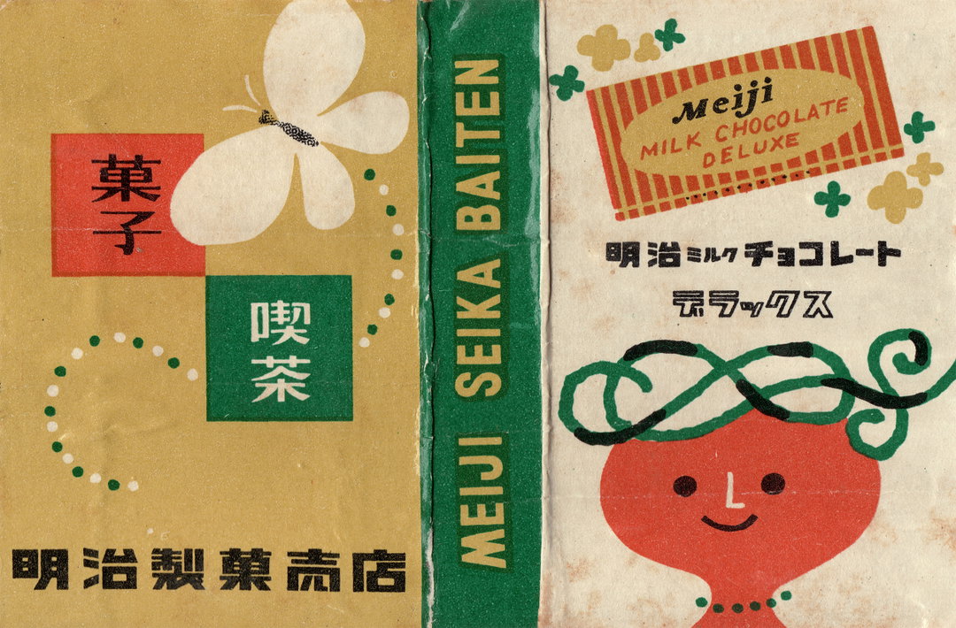
Tadashi Ohashi: Meiji 'Milk Chocolate Deluxe', Matchbox Label (Copyright © Tadashi Ohashi, c.1957)
For Zara, collecting ephemera from this wave of illustration has revealed the multiplicity of ways that the era left its mark on the contemporary scene. “So much of the work from this era is playful, stylish and full of personality. Despite printing constraints, artists still found ways to create illustrations full of wit and charm,” says Zara. “The cheerful optimism and embrace of character, combined with individuality and modernist values, led to impactful, vibrant designs that still resonate today.” According to the illustrator, its influence may be much more far reaching than we think: “Even illustrators who’ve never seen these originals are working in traditions these artists established.”
The move beyond conservative pre-war styles into more creative autonomy has had a residual effect on the stylistic choices in branding and marketing today: limited palettes, brand mascots, playful abstraction and the creation of anthropomorphic objects or shapes. “You see these approaches now on packaging, in advertising, on apps and in editorial work,” Zara shares. Despite its lasting impact, much of the illustrated work from the period has largely been overlooked, and with it, the illustrators that defined modern styles. “Cultural histories tend to focus on graphic design or poster art, which only tell part of the story,” Zara adds.
Collating the archive over all these years has led to more of a personal mission for Zara to spotlight these illustrators’ work and rebalance the history of our visual culture. Hours spent trawling eBay and flea markets for old cards, beer mats and booklets have all equated to an extensive open source educational resource for illustrators and designers alike to look back on. And now, Zara’s built a website to house it all and designed a database that will be searchable and usable by students and universities.
The illustrator is also looking to publish a book in the near future which focuses on character illustration from the archive, a study of “the emergence of personality during this era”, she says, “through stylised figures and distinctive approaches”. With each new brand of the project, Zara’s aim is adding to the archive and evolving a collection that helps us, she concludes, “connect the past with how we understand illustration today”.
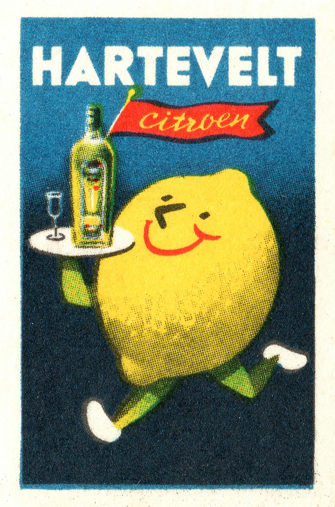
Frans Mettes: Hartevelt Citroen, Matchbox Label (Copyright © Frans Mettes, c.1955)
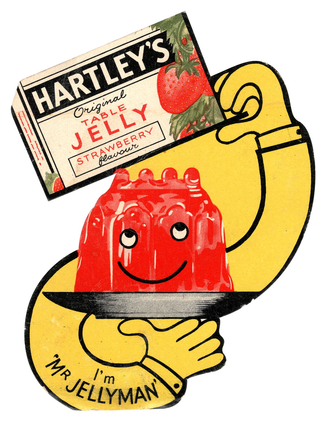
Patrick Tilley: Hartley’s Jelly, Display Card (Copyright © Patrick Tilley, c.1955)
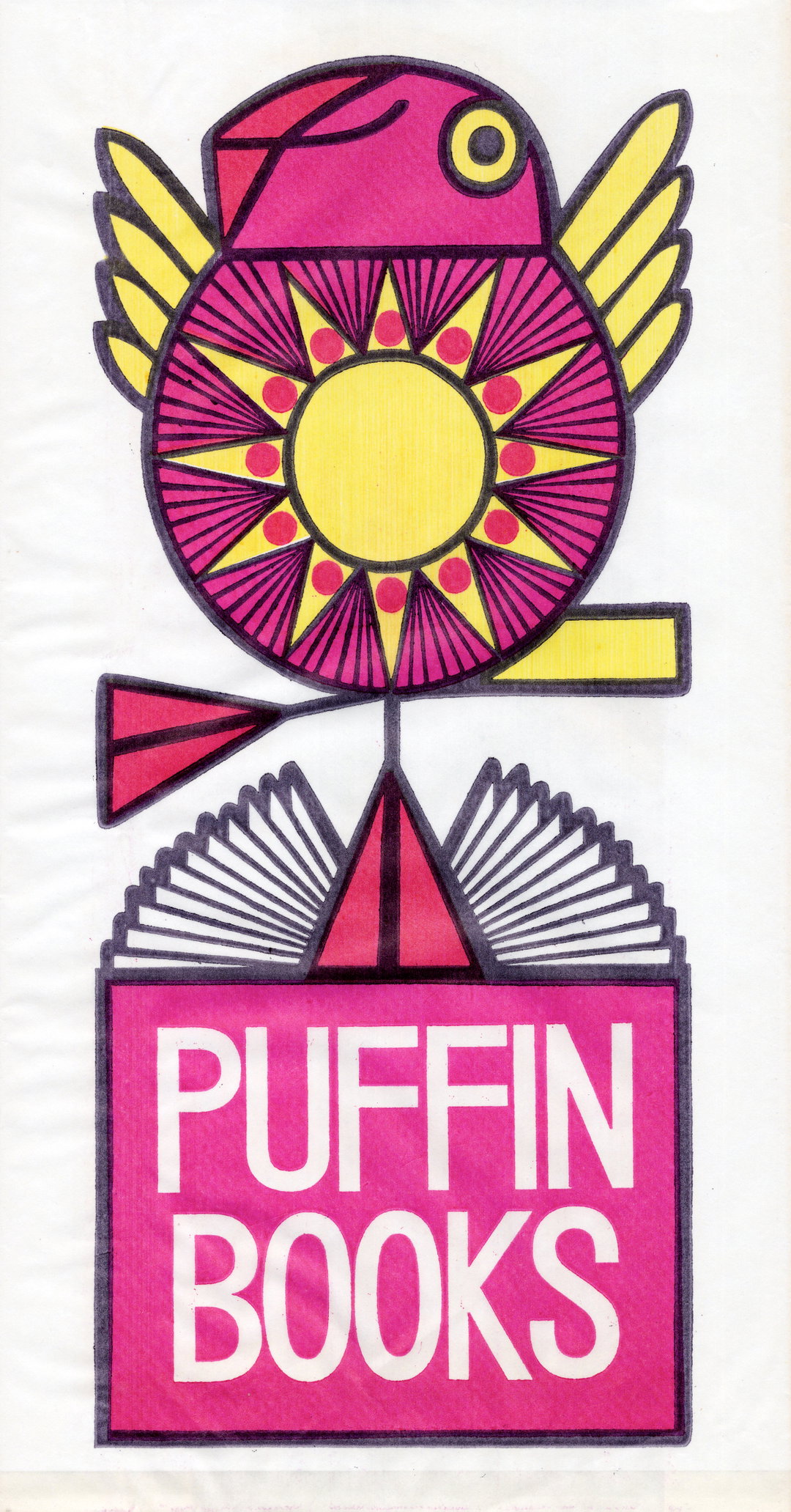
Jill McDonald: Puffin Books, Paper Bag (Copyright © Jill McDonald, c.1960s)
Unknown Artist: British Rail 'Runabout Rover', Leaflet (Copyright © Unknown Artist, 1970)
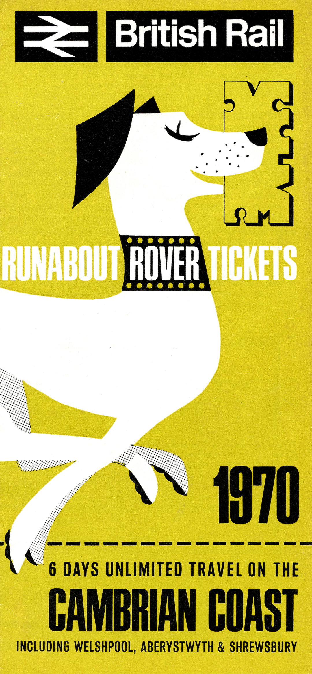
Unknown Artist: British Rail 'Runabout Rover', Leaflet (Copyright © Unknown Artist, 1970)
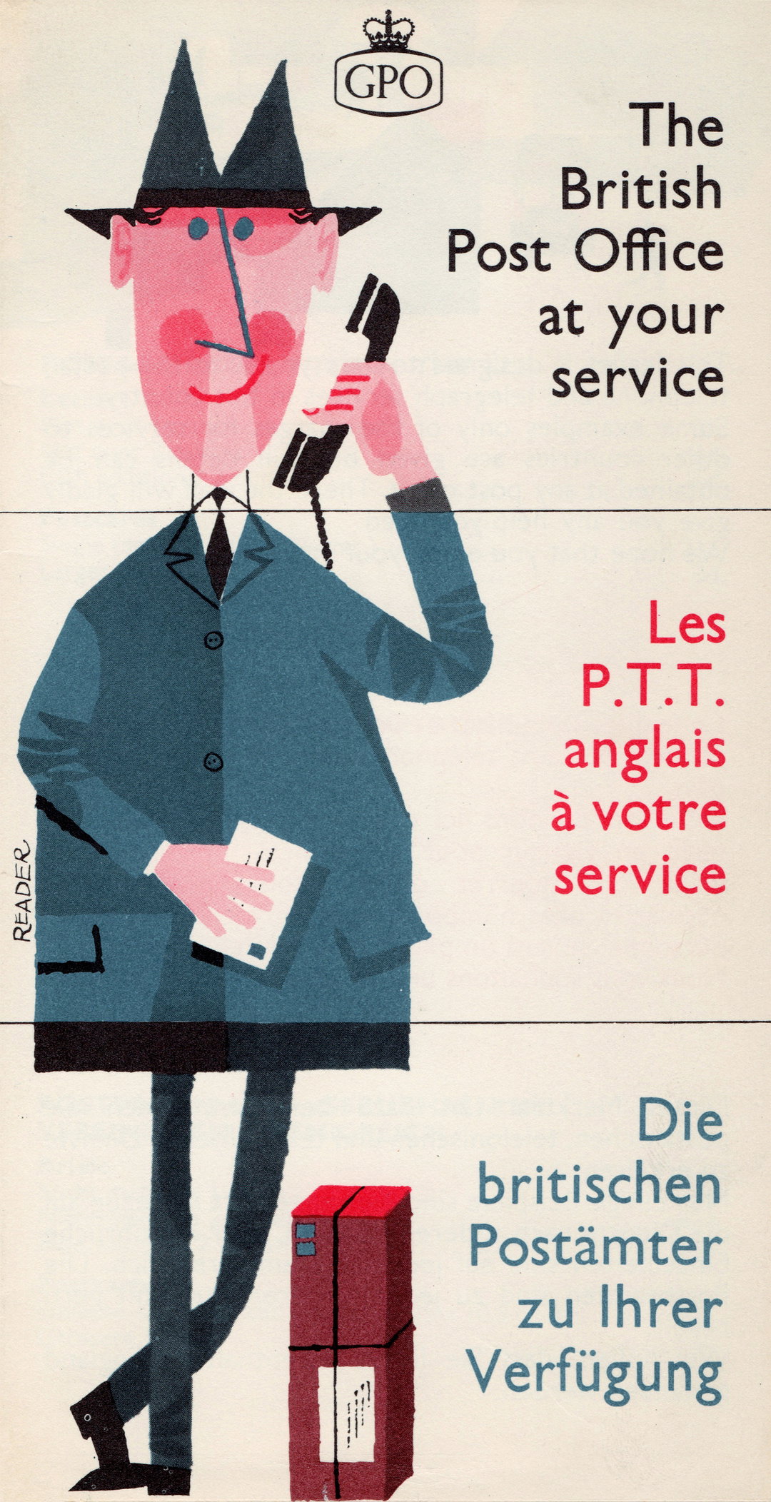
Reader: GPO 'The British Post Office at Your Service', Leaflet (Copyright © Reader, 1961)
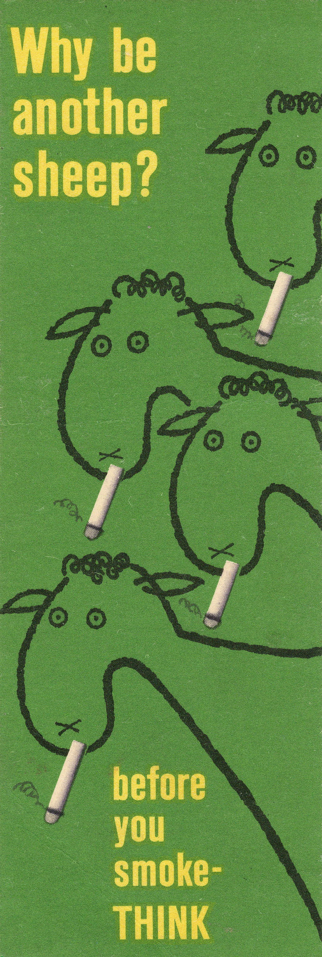
Reginald Mount: Ministry of Health 'Why Be Another Sheep?', Bookmark (Copyright © Reginald Mount, 1964)
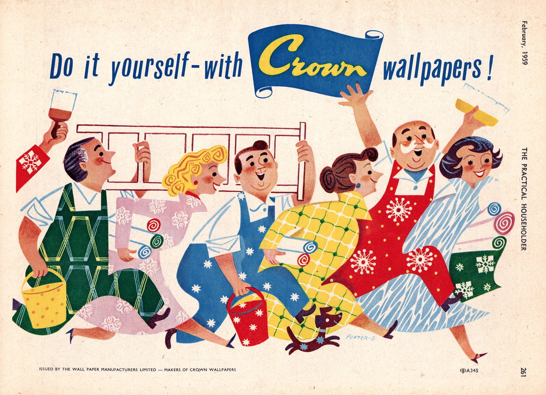
Porter-G: Crown Wallpaper, Print Advert (Copyright © Samuel Porter-Goldsmith, 1959)
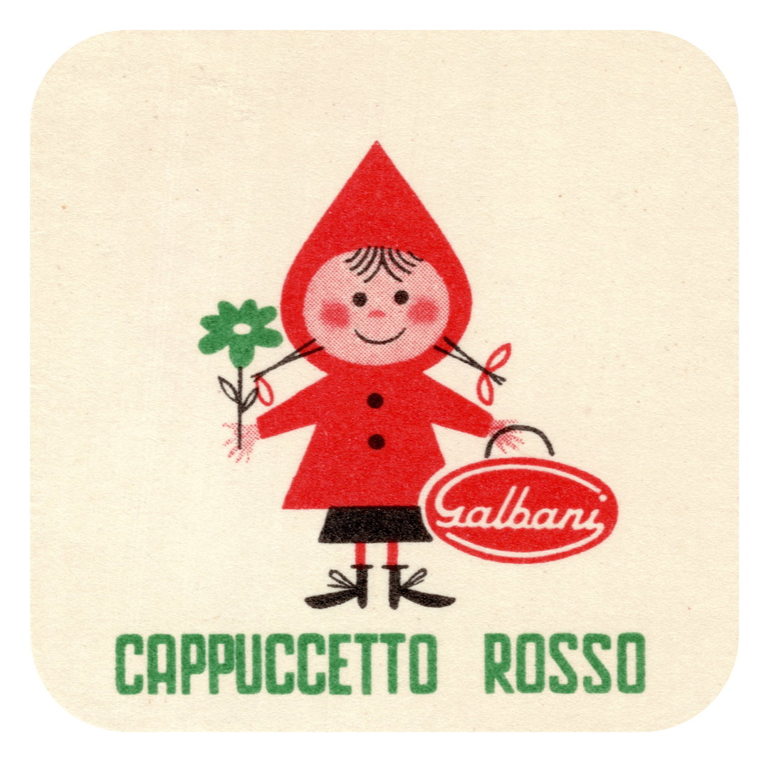
Unknown Artist: Galbani 'Cappuccetto Rosso', Cheese Label (Copyright © Unknown Artist, c.1960s)
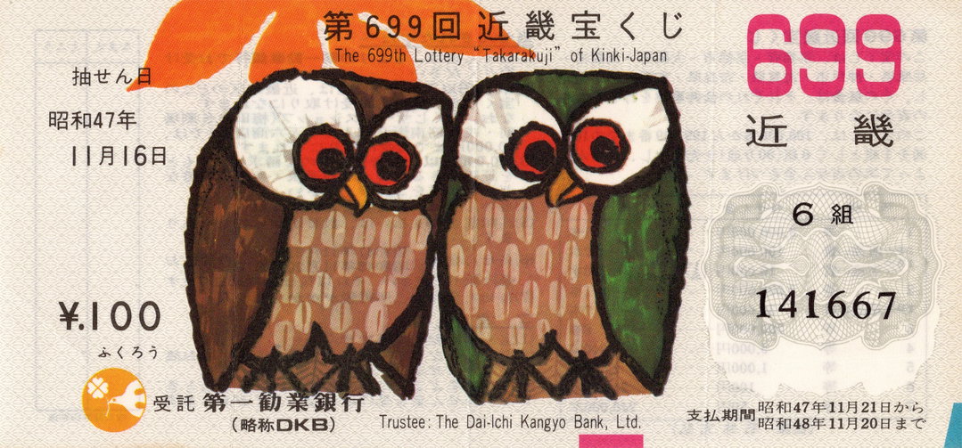
Unknown Artist: The Lottery ‘Takarakuji’ of Kinki-Japan, Ticket (Copyright © Unknown Artist, 1972)
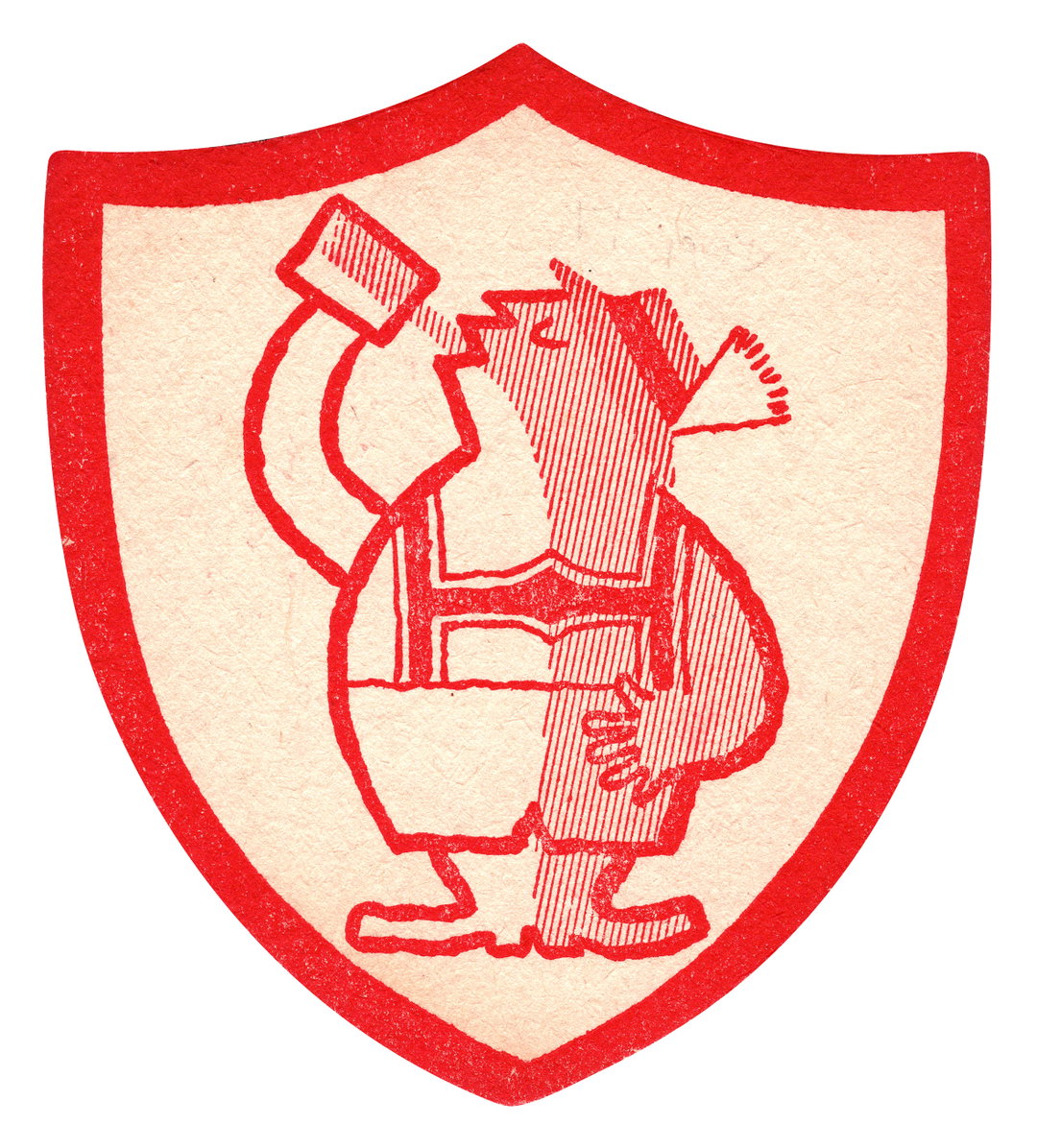
Unknown Artist: Barclay’s Pilsner Lager, Beer Mat (Copyright © Unknown Artist, c.1950s)
Hero Header
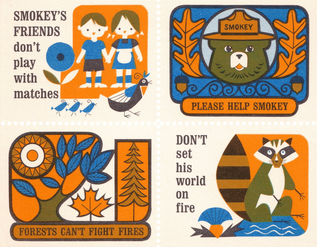
Unknown Artist: U.S. Forest Service 'Smokey’s Friends Don’t Play With Matches', Poster Stamps (Copyright © Unknown Artist, 1967)
Share Article
About the Author
—
Ellis Tree (she/her) is a staff writer at It’s Nice That. She joined as a junior writer in April 2024 after graduating from Kingston School of Art with a degree in Graphic Design. Across her research, writing and visual work she has a particular interest in printmaking, self-publishing and expanded approaches to photography. ert@itsnicethat.com
To submit your work to be featured on the site, see our Submissions Guide.