




Wolff Olins on the tech-fuelled future of the humancentric rebrand
- —
- Date
- 10 May 2018
As many companies rebrand in a way that increasingly seems generic and homogenous, the way we consider branding needs to change, argues Chris Moody, chief design officer at brand consultancy Wolff Olins. Chris suggests that we have come to a pivot point where virtual reality, augmented reality and voice-activation are changing the way we define brand presence. A brand identity must now be an ‘intelligent identity’, that uses responsive assets, new platforms and technologies to create a conversation on a human level, and at scale.
Bands often break up due to creative differences. The truth is many should be forced to break up due to creative similarities. Gently encouraged to down their axes due to the fact they were treading water and re-releasing the same tracks.
This is true of many brands right now who are churning out MOR identities. Brighter, flatter, simpler, gradient’er, boring’er, similar and, worst of all, polite graphics. What is perhaps most remarkable about some of the biggest ‘big name’ design rethinks over the last year or two is just how unremarkable they’ve been.
A recent meme showed how even tech’s finest have flattened and rationalised and softened. Like a botoxed face, each nip and tuck has made them indistinguishable, bland and homogenous in their friendliness. Sure, things look more produced and considered, but the output’s like one of those Ministry EDM albums where all the tracks blur into one.
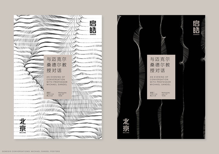
Wolff Olins: Identity for Genesis Bejing
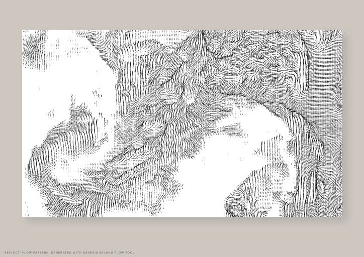
Wolff Olins: Identity for Genesis Bejing
I’m unwittingly guilty. I’ve driven teams to strip identities back, lose the skeumorphisim and make sure elements can work ‘coherently cross-platform’. And the approach worked. In fact, it’s helped create work we’re incredibly proud of. But times are changing. We can’t keep playing the same chords and assume people will keep listening.
Should we even care? Some would argue the word identity is outdated, dead even. Surely what matters is great product and experience? Well, yes and no. Thoughtful product and experience design are vital, but identity is just as important in today’s context – so long as we’re thinking about what it means in a progressive way. To do that, we need to know where we’ve come from.
One of Wolff Olins first jobs was for Apple records. Back then, the focus was to help organisations construct their corporate identity. Made up of words and pictures, it allowed a business to distinctively show the world what the people within that business did, and articulated the values it stood for. Corporate identity helped the people in big organisations stand out, for a while.
Things got noisier, and more complex, and over time this became brand identity. Brand identity went deeper, not just making a brand visible and desirable, but creating design assets in their own right. Each component could stand alone, and form part of a whole to tell a bigger story.
Motion and interaction became part of the palette, as standard. In the last decade, brand identities have become richer still, with whole suites of assets working together to help make a brand stand out and stand for. They didn’t have to be consistent, just coherent. Our work on London 2012 and AOL was designed to be deliberately incomplete, only coming to life when it came in contact with the people or the event it was built for. Our EE work was built around a ball of energy, rather than a wordmark. Today, identity is something else again.
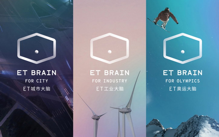
Wolff Olins: Identity for AI platform ET Brain, for Alibaba Cloud
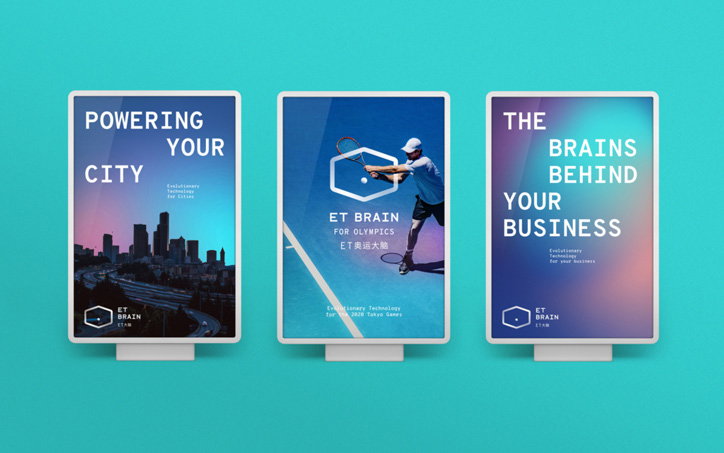
Wolff Olins: Identity for AI platform ET Brain, for Alibaba Cloud
Brands as a concept have changed. They can reach huge audiences, in an instant, and have influence like never before. In a world where trust in the establishment has all but completely eroded (our last report, Radical Everyone, is one of the many sources that proves this), they’re a force of enquiry. They’re political, even. Just look at Patagonia in the US, Jigsaw in the UK and Qantas in Oz. At the same time, they play a deep and intimate role in all our daily lives. They’re in our homes, in our faces, breaking out of the confines of their four walls. They touch people in diverse and uncontrollable ways. All this means we’re at a pivot point.
In this context, brands need sophistication and subtlety. An identity has to be a manifestation of an organisation’s soul, in a big, broad, ‘Bowie’ sense. It needs to listen, behave and react to users with human-like nuance and in real-time.
It needs to be thoughtful and distinct, come alive not just on screens, but through voice, VR and AR, and often delivered by algorithms. And it can’t constantly demand attention. It needs to be invisible at times, disappearing when it’s in the way, so people can do more. We call this intelligent identity.
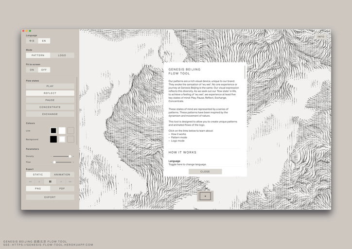
Beneath the surface of our work for Lafayette Anticipations, lies an intelligent typeface that both mimics the movement of the building it graces and responds to the user in a unique way each time it’s used. The identity for Alibaba’s adaptive technology platform ET Brain figuratively illustrates the brain’s behaviour, but will evolve to represent and react to the user data it feeds off. Our work for South American telecoms company Oi was built around an asset that instantly morphs around a customer’s voice, Qatar Museums let visitors play with its geometry to nurture their own creativity, and our work for Genesis uses a pattern generator to reflect people’s mindset.
Through unrestrained systems of smart, responsive, tech-based assets, these identities create a genuine, positive and lasting dialogue with people. Others – DesignStudio, Collins, Gretel, Netflix’s in-house team and IBM – are thinking along the same lines, and nailing it.
As creatives, we need radically new ways of working – and I shared a few thoughts on this at the D&AD Festival recently – alongside giant leaps of faith. The world is marching to a different tune, and it’s time for us to find some brand new beats.
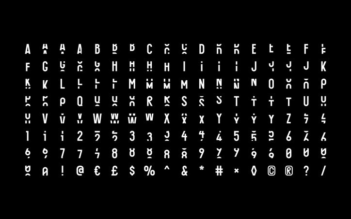
Wolff Olins: responsive identity for Galeries Lafayette
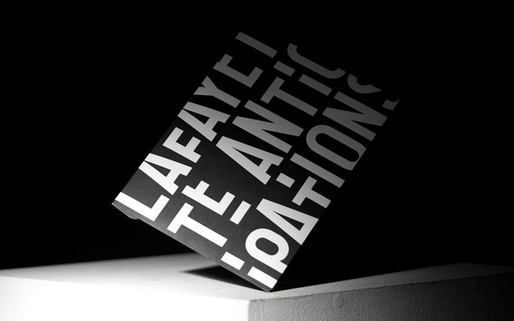
Wolff Olins: responsive identity for Galeries Lafayette

