




Walk a Thought’s identity for a flavoured syrups brand is sweet and stylish
The French studio used a variety of type, colour and illustration to ensure the bottles stand out on a busy coffee shop shelf.
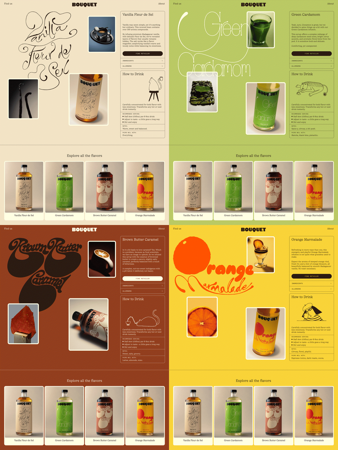
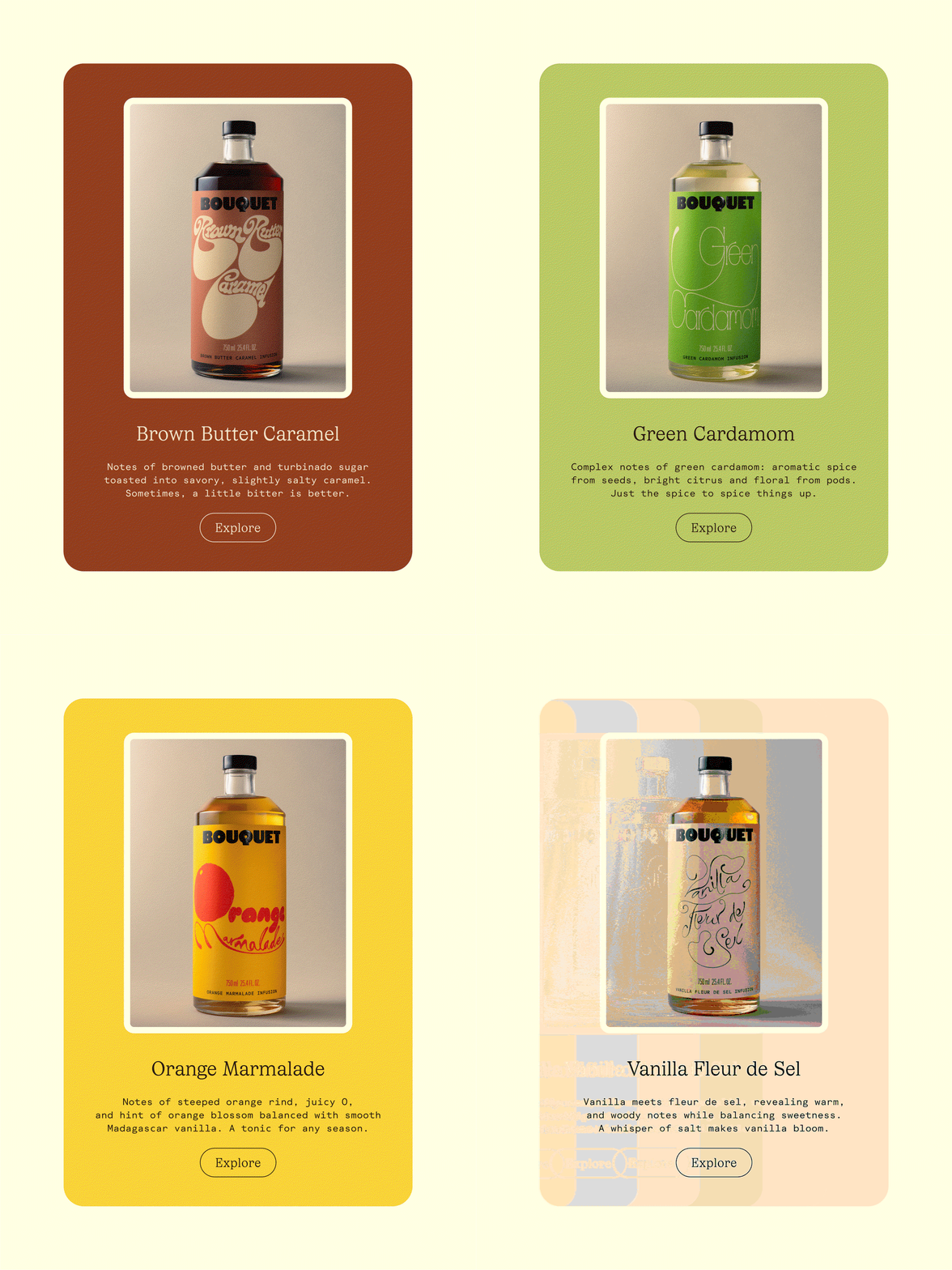
Bouquet, a collection of infused flavoured syrups for cocktails, coffees and more, is the brainchild of food scientist and innovator Caroline Lafleur. Recently launching the brand, Caroline needed an identity that matched the whimsical nature of the flavours and artificial-free ethos of the recipes, so she turned to the French studio Walk a Thought. As fleeting as flavour can be, gone in a bite, co-founders Rasmus Nilsson and Erik Berger Vaage have managed to make Bouquet’s tastes (orange marmalade, vanilla fleur de sal, green cardamon and brown butter caramel) tangible.
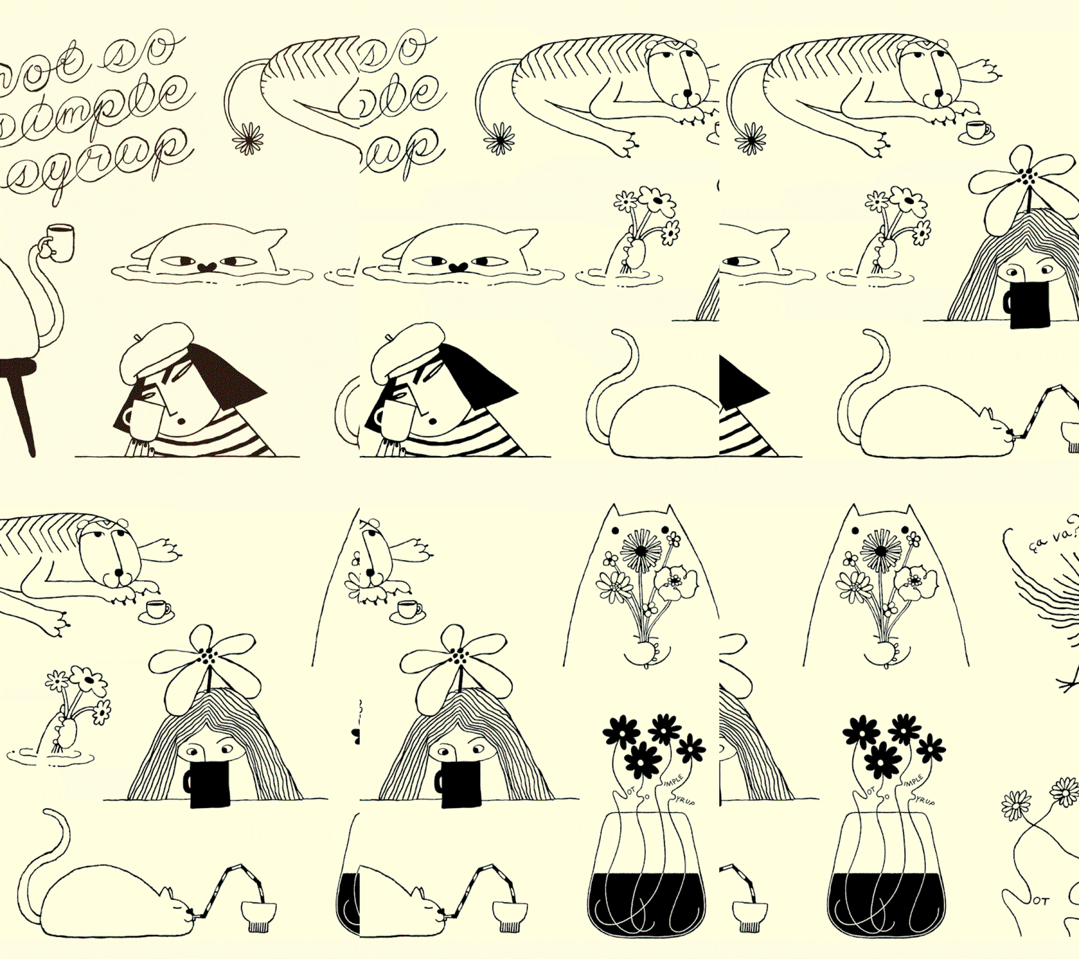
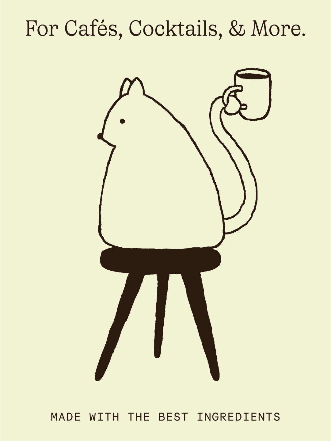
Caroline’s Bouquet puts forward the idea that “things are better when paired together – taking a bouquet over a lonely flower any day”, Rasmus says. Alongside Caroline partner, fellow designer Ben Crick, the pair envisioned the visual core of Bouquet to be equally as whimsical: “a vision of a coffee bar, somewhere in southern Europe, with hand painted signage, sleepy cats enjoying the sun, peculiar regulars, all steeped in warm sunlight,” Erik details.
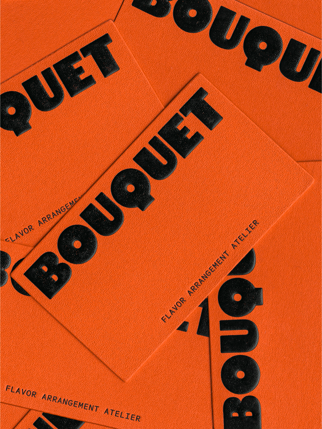
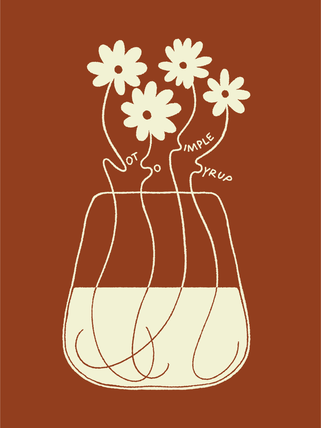
Nostalgia permeates the identity. A standout is the incorporation of the words ‘Not so simple syrup’ nestled inamongst a flower arrangement, a nod to the name. Walk A Thought does well in simultaneous distinction and incorporation – letters aren’t lost in illustration. “The embossed logo, distinct colour coding, and unique artwork help each bottle stand out on the shelf – while also making it easy to identify for baristas and mixologists in high paced environments like cafes and bars,” explains Erik. The studio balances both function and flair, with an “imperfect quality and enough character to hold its own on the page”, Rasmus continues.
Walk A Thought: Bouquet Infusions (Copyright © Walk A Thought, 2025)
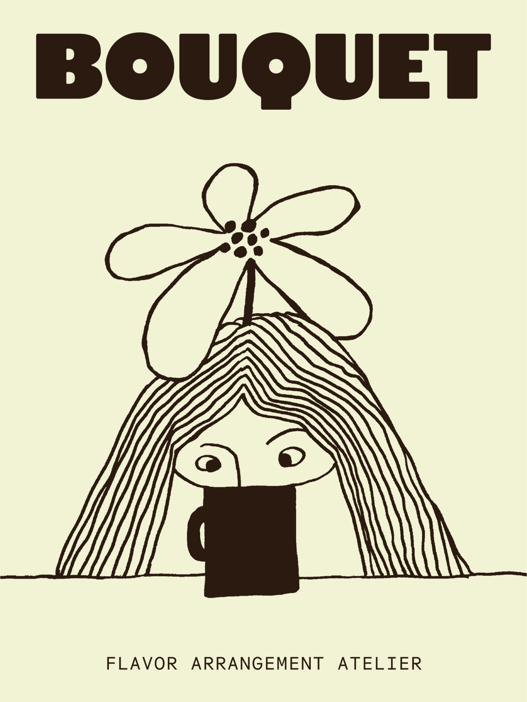
Throughout the identity, this soft tonality junctures with geometrical elements; the typeface retains a playful serif elegance alongside a monospaced font. While – much like a bouquet of flowers – each letter brings its own flavour, the star of the type show is Bouquet’s Q; wonderfully unique, resembling a magnifying glass.
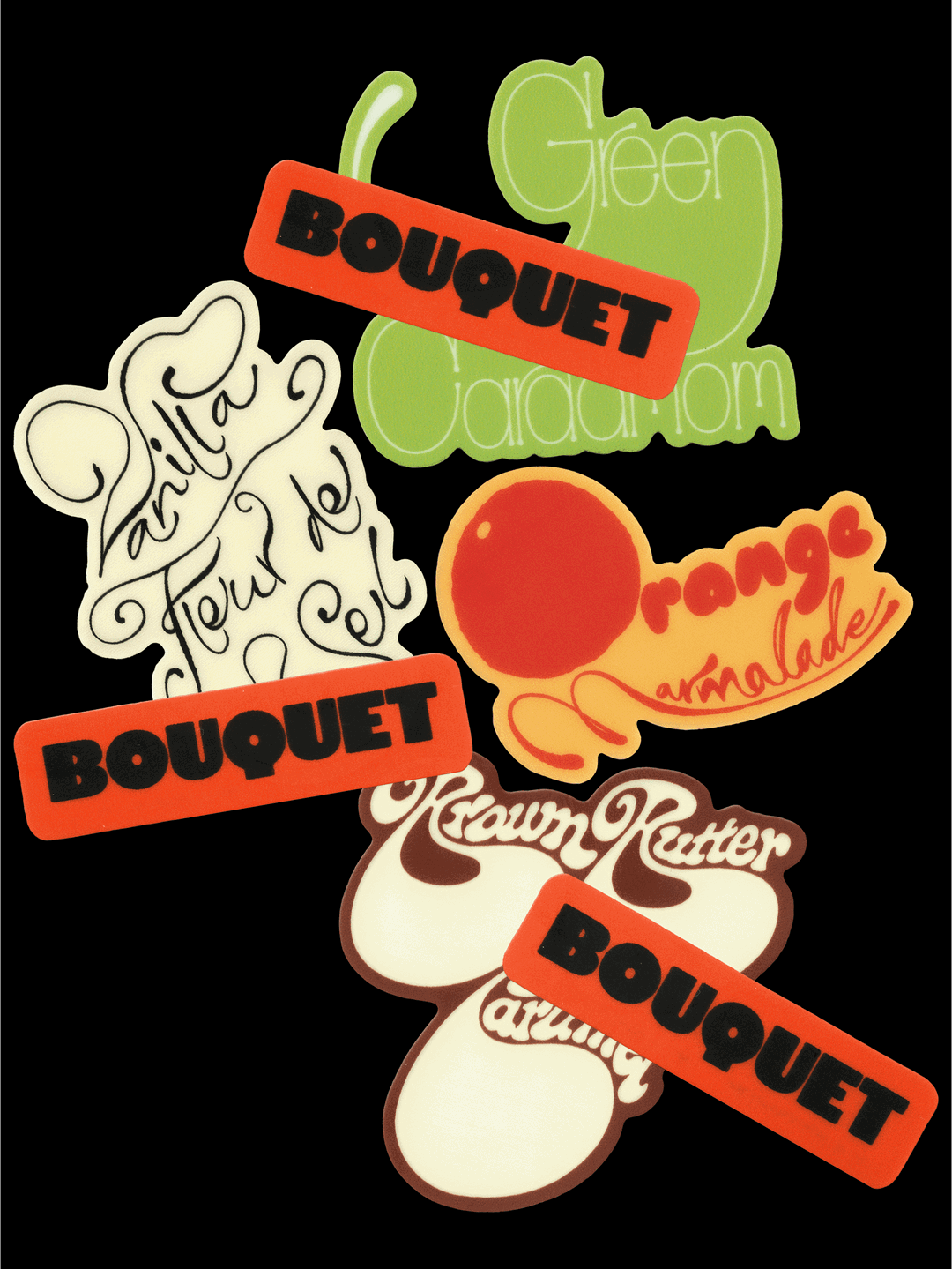
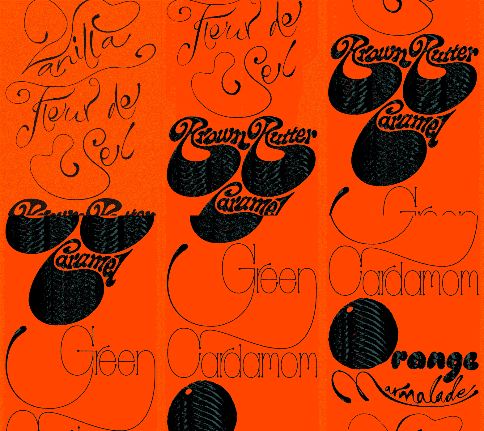
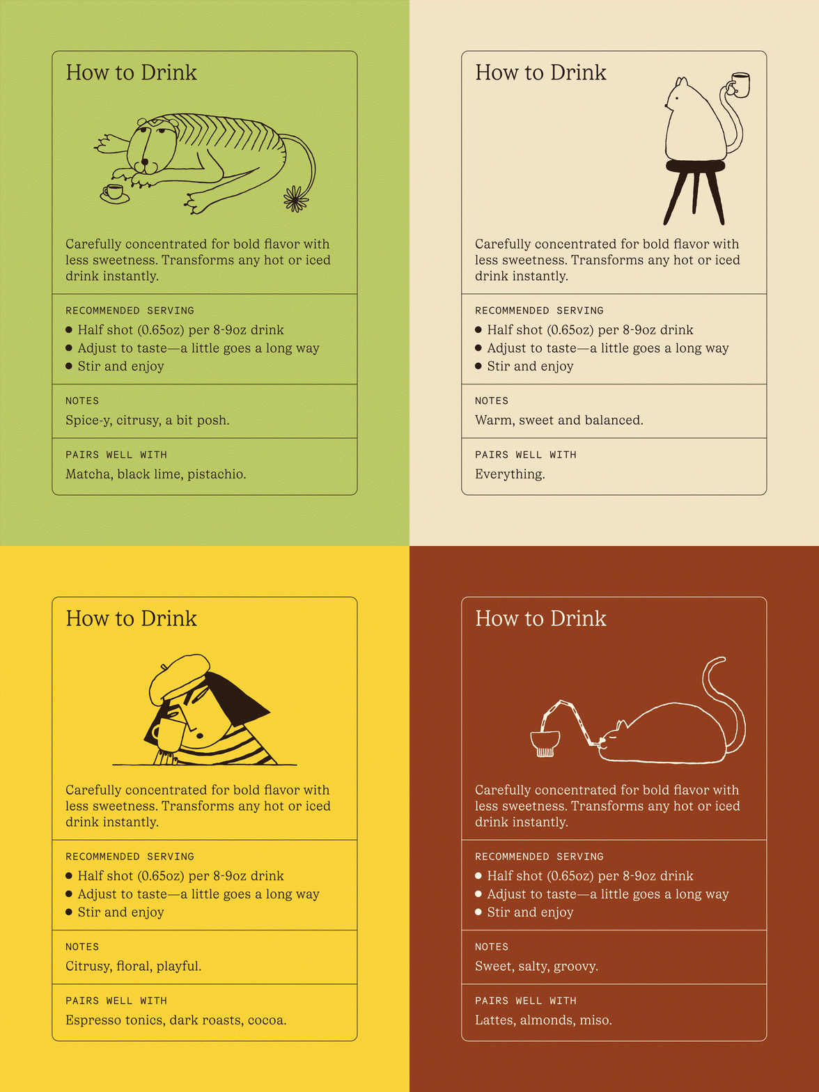
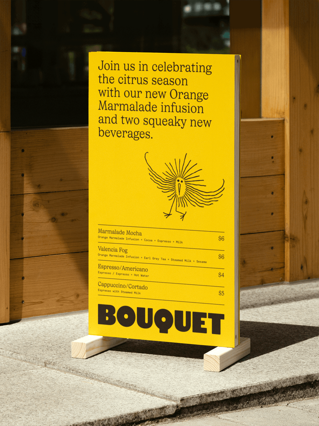
Taking experimentation further, Bouquet’s stickers – which index the flavours on. offer – are an exciting range, each one more characterful than the next. Lettering meanders around like vines around a building and are ripe as a glossy orange full of juice. The stickerts are just one part of the identity signifiers, which make each flavour recognisable and memorable, taking on the personality of each. “There’s always a challenge when you want it to feel personal drawing letters from memory, as opposed to making something derivative of an existing font,” Rasmus says. Fine line illustrations also help to add character and charm: “I’d personally hope that the espresso drinking tiger or the over-caffeinated bird will bring a smile to a barista somewhere,” Rasmus continues.
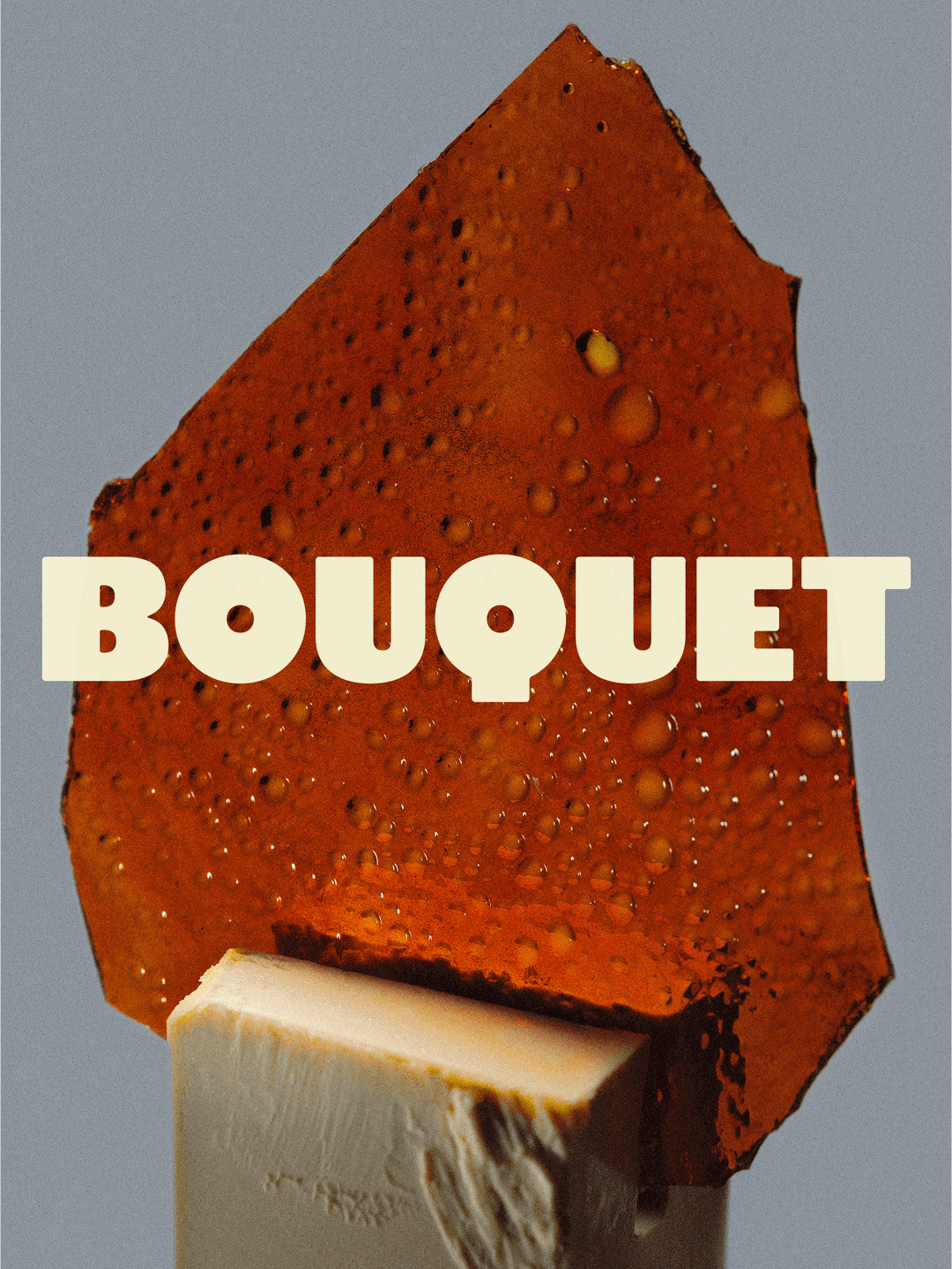
The identity’s imagery was shot by Sahra Jajarmikhayat, capturing the label work and ingredients to “highlight what’s inside and inspire possible uses”, says Erik. One particularly tongue-tingling image shows the logo positioned on piece of caramel wedged with a slab of butter. And to incorporate all of these elements onto one user experience the studio worked with developer Adam to create a website that articulates the identity by letting each element to breathe well on the page, while also allowing space for moments of fun. “Could the footer of a website be the logo floating in a sea of syrup, with a swimming cat holding a bouquet? The answer is yes,” ends Rasmus.
Walk A Thought: Bouquet Infusions (Copyright © Walk A Thought, 2025)
Walk A Thought: Bouquet Infusions (Copyright © Walk A Thought, 2025)
Walk A Thought: Bouquet Infusions (Copyright © Walk A Thought, 2025)
Walk A Thought: Bouquet Infusions (Copyright © Walk A Thought, 2025)

Walk A Thought: Bouquet Infusions (Copyright © Walk A Thought, 2025)
Walk A Thought: Bouquet Infusions (Copyright © Walk A Thought, 2025)
Walk A Thought: Bouquet Infusions (Copyright © Walk A Thought, 2025)
Walk A Thought: Bouquet Infusions (Copyright © Walk A Thought, 2025)
Walk A Thought: Bouquet Infusions (Copyright © Walk A Thought, 2025)
Walk A Thought: Bouquet Infusions (Copyright © Walk A Thought, 2025)
Walk A Thought: Bouquet Infusions (Copyright © Walk A Thought, 2025)
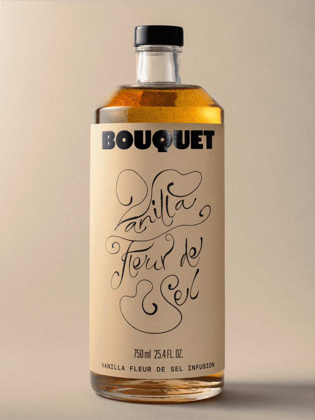
Walk A Thought: Bouquet Infusions (Copyright © Walk A Thought, 2025)
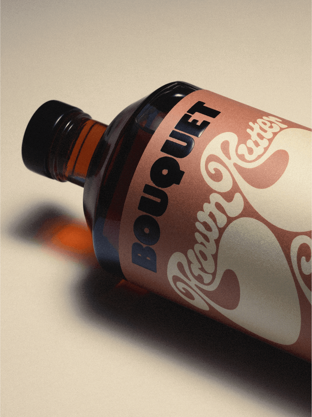
Walk A Thought: Bouquet Infusions (Copyright © Walk A Thought, 2025)
Hero Header
Walk A Thought: Bouquet Infusions (Copyright © Walk A Thought, 2025)
Share Article
Further Info
www.instagram.com/walkathought/
bouquetinfusions.com/
About the Author
—
Sudi Jama (any pronouns) was a staff writer at It’s Nice That from April 2025–January 2026, and is now a freelance writer. They have a keen interest and research-driven approach to design and visual cultures in contextualising the realms of film, TV, and music.



