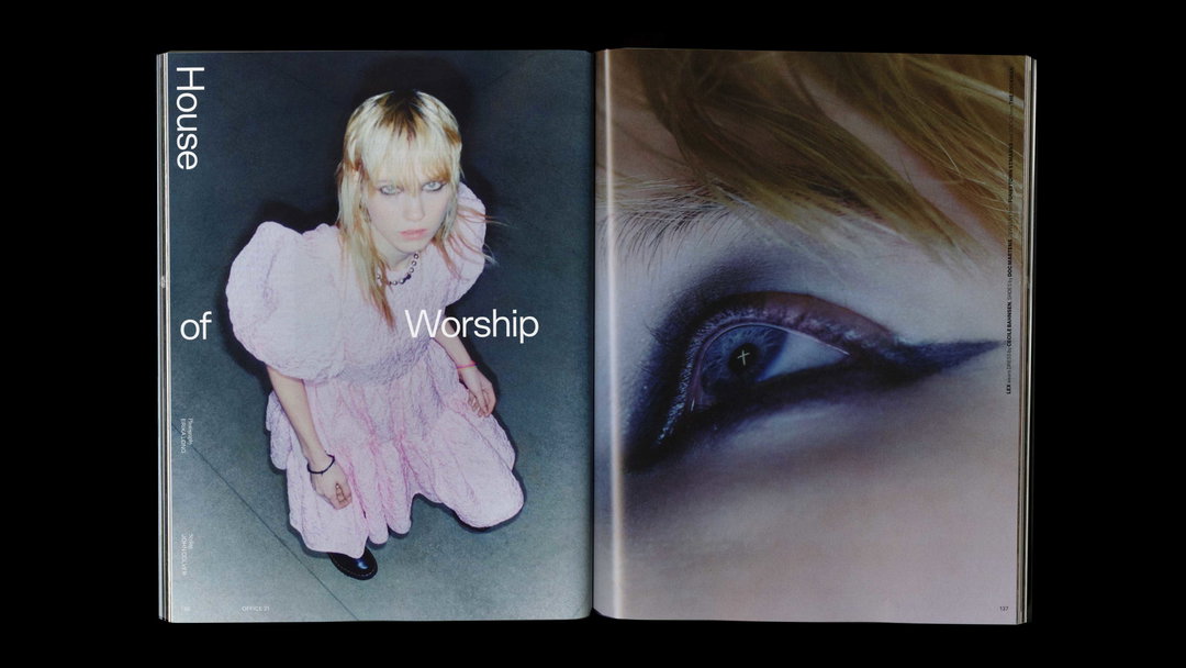
W—E Studio’s redesign for Office marks a final chapter for the magazine in print
Taking the editorial project from its 19th issue through to its final print run, W—E studio shares some of the process behind their editorial design and art direction for Office.
Share
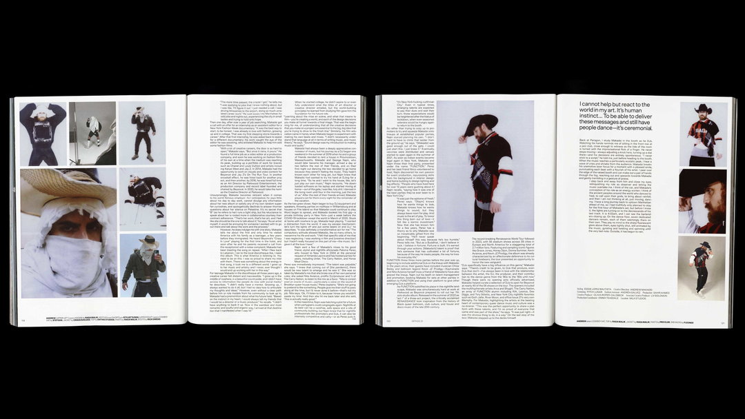
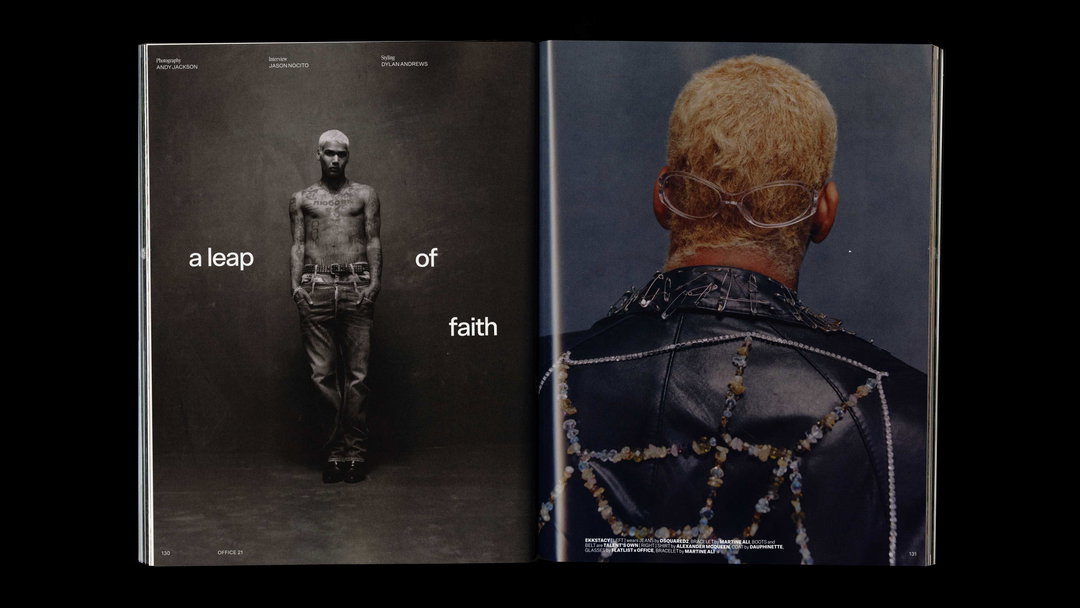
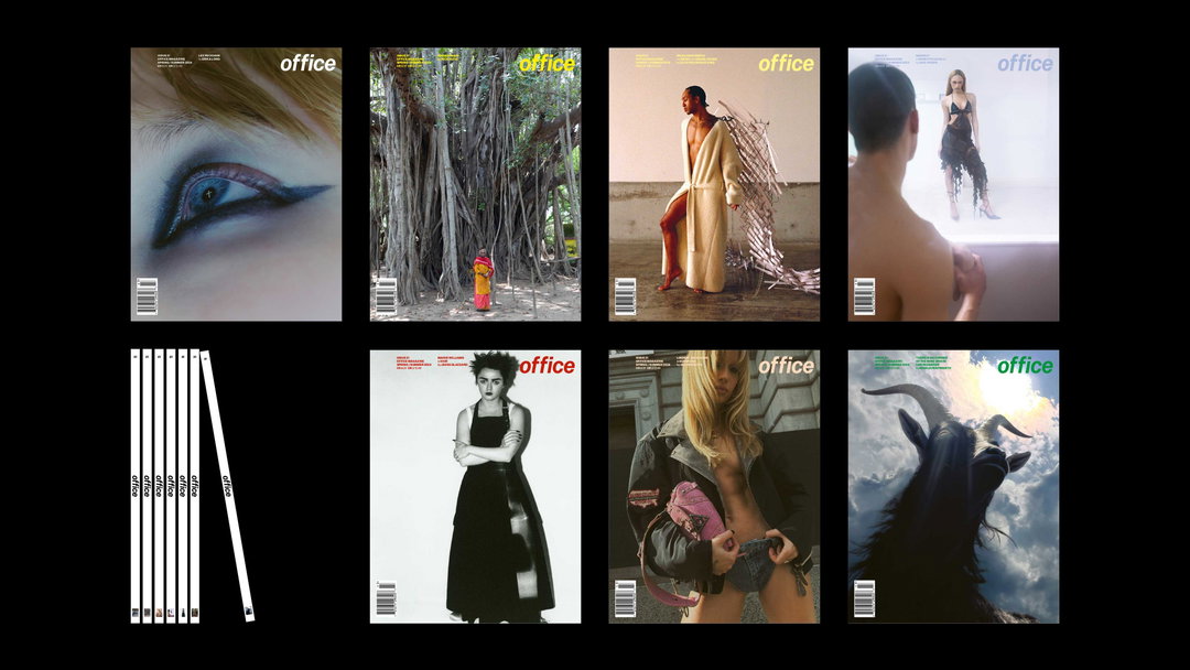
As an image-forward magazine, office pushes “an unorthodox approach to fashion and creative culture at large” often breaking the mould in its editorial layout with “consistently powerful visual content”. office’s strong brand signature, built up from a number of collaborators over the last 18 issues, was picked up by W—E studio: the multidisciplinary graphic design studio, and collaborative practice of Piera Wolf and Claudine Eriksson, in 2022. Approached by office Magazine’s co-founder Jesper D. Lund for a new editorial angle on the biannual magazine for its 19th issue, the duo were tasked to refine office’s identity whilst maintaining its distinct ‘default’ aesthetic. A creative pursuit that led the studio to a longstanding relationship with the project, as art and design directors of the magazine up until its recent 21st, and final issue – it became a journey and working relationship that Claudine describes as “passionate, beautiful, adventurous and chaotic”.
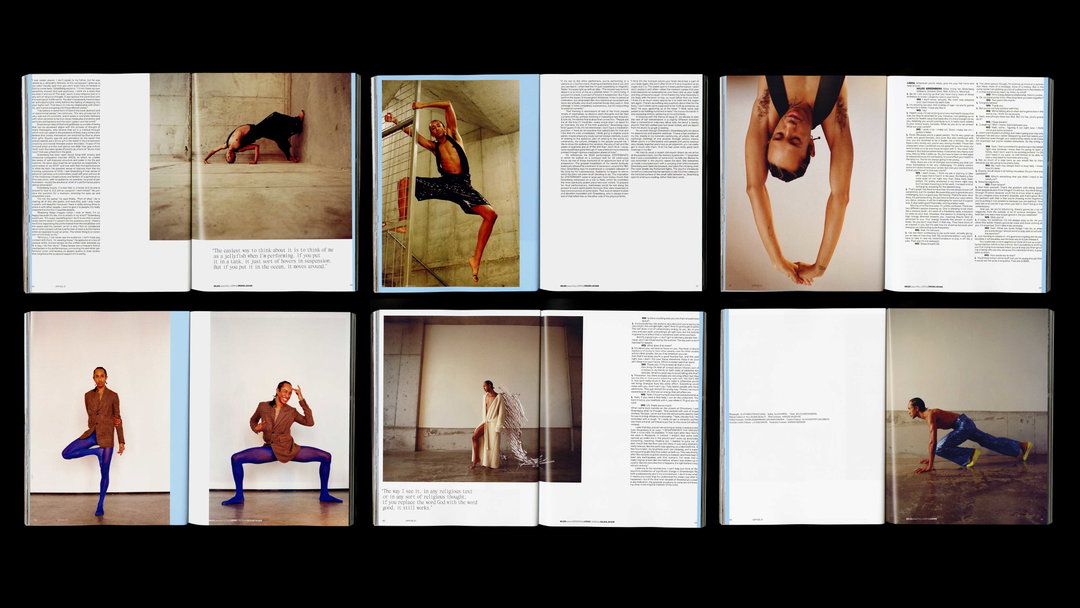
To streamline the editorial structure from issue 19 onwards, the studio started with “a deep dive back into the magazine’s past”, says Piera, looking at the use of typography, composition, and design in detail. The creative duo set out to define “the strongest moments, consistencies and inconsistencies” in the magazine’s history, in order to find areas that had room for improvement. Their findings? office’s visual approach had always been “unorthodox” but never overly designed. The magazine’s identity has been decisively “democratic, with flat hierarchy, selective and detailed curation, and images that speak for themselves”, says Claudine.
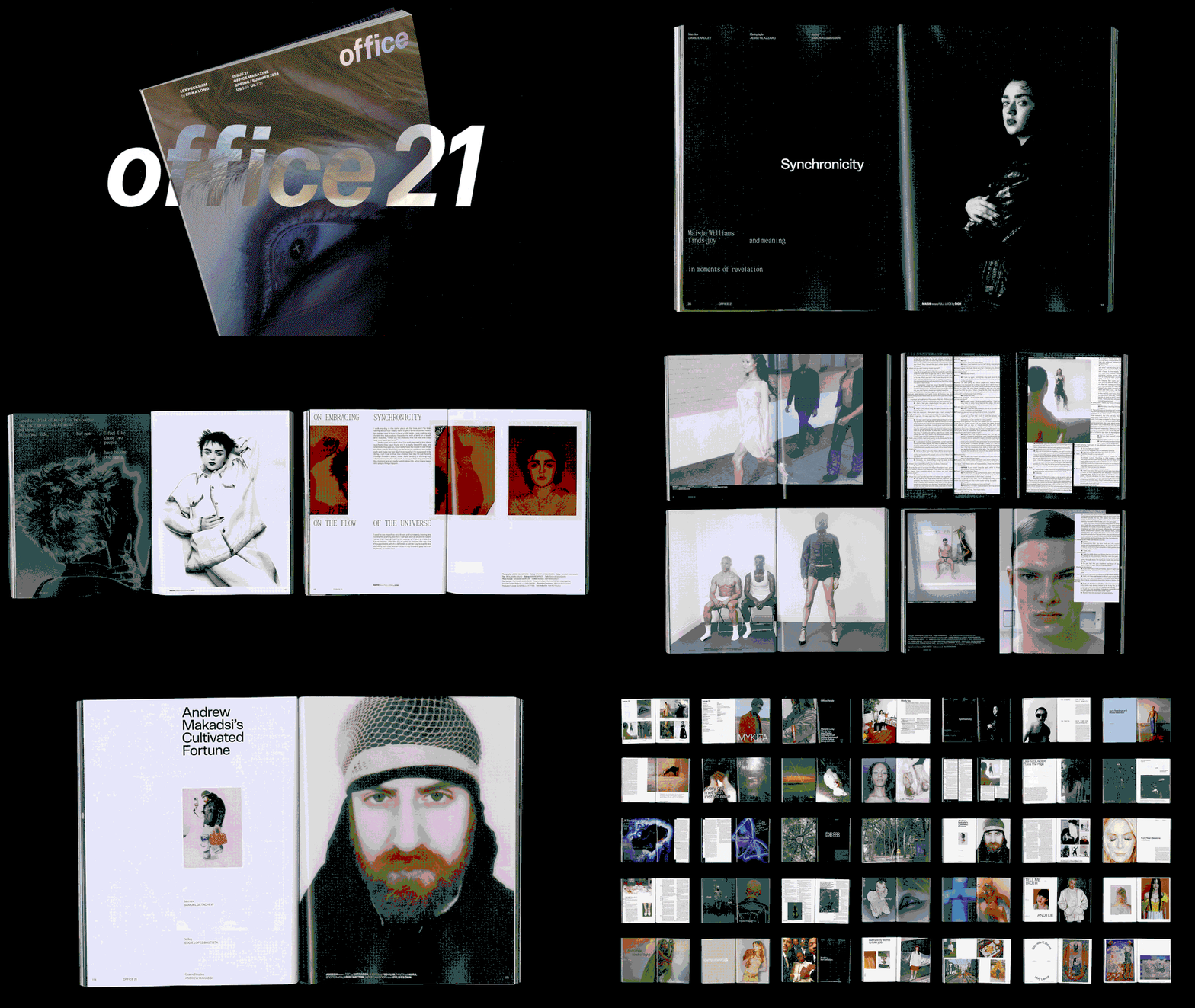
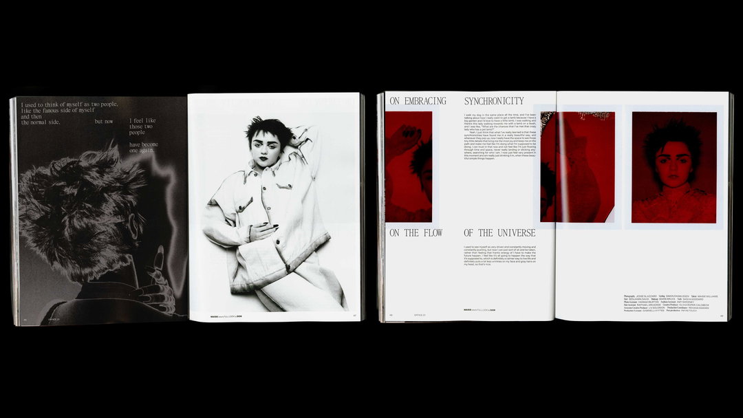
W—E studio: Issue 21 (Copyright © W—E studio, office magazine, 2024)
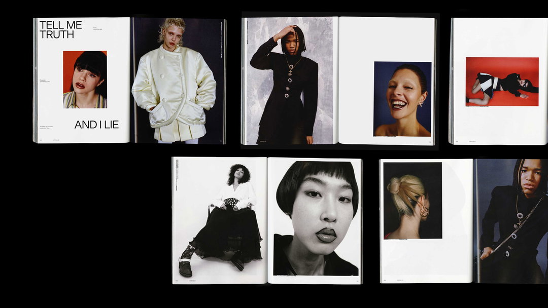
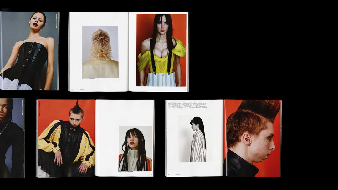
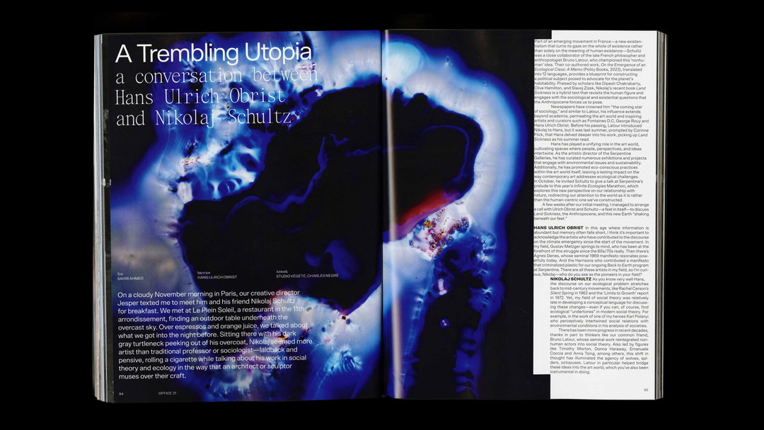
Guided by the team’s visual research, W—E aimed to build a flexible editorial system that would allow the content “to be whatever it needs to be, chaotic, pure and raw”, developing a grid system that acted as “a base and canvas that ties everything together even when intentionally breaking free” says Piera. With an updated sans serif typeface pairing of Scto Grotesk and Items both designed by Finnish type foundry Schick Toikka, the studio collaborated with graphic designer Hannah Nathans on the issue, carefully choosing when to stick to their established constraints and when to make more out-there design moves in their treatment of text and image. “We went tight, uncomfortably tight at times, to create tension” says Piera, with type skirting edges and overlaying images in the magazine’s 21st issue.
Celebrating its final issue in print (for now), office has “flipped the pages of both earthly and ethereal, delving into spirituality for issue 21”, says editor-in-chief Simon Rasmussen. Jesper and Simon collated the new issue alongside the office team: Mitchell Connell, Sahir Ahmed, Olivia Roper-Caldbeck, and Liv Solomon - its theme circling the subject of the numeral 777 as “a symbol of divine perfection and completion”. The final print run of the project fittingly embodies “cycles of growth and evolution; a dynamic, non-linear path, a quest for beauty, truth and inspiration”, says Claudine. A theme present in design elements such as the spheric holographic foiling on the issue’s spine and cover as well as the “inclusion of the abstract, natural objects photographed with aura-like electrical coronas emanating from them” in the magazine’s features, says Piera.
With office’s printed journey coming to a natural end, the team look forward to what the future brings with new thought-provoking narratives and images online at the magazine. They hope that the final issue is “evocative, disruptive and moving”, and marks the end of a chapter for office, but nonetheless a new future for the editorial project. A perspective which mirrors Claudine and Piera’s design approach across the journey, to consistently view the magazine as a “living organism set in place [...] that has legs to be agile, run, push boundaries and live on”.
GalleryW—E studio: Issue 21 (Copyright © W—E studio, office magazine, 2024)
Hero Header
W—E studio: Issue 21 (Copyright © W—E studio, office magazine, 2024)
Share Article
Further Info
About the Author
—
Ellis Tree (she/her) is a staff writer at It’s Nice That. She joined as a junior writer in April 2024 after graduating from Kingston School of Art with a degree in Graphic Design. Across her research, writing and visual work she has a particular interest in printmaking, self-publishing and expanded approaches to photography. ert@itsnicethat.com
To submit your work to be featured on the site, see our Submissions Guide.