Expressive reduction: Typography that gives the most impact with the least characters
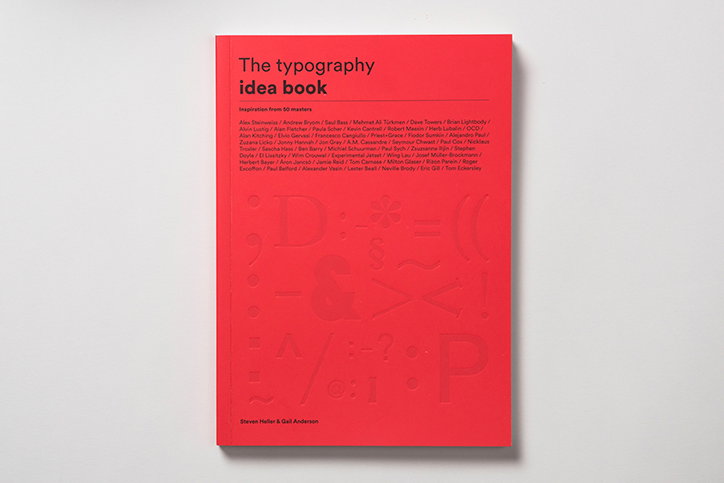
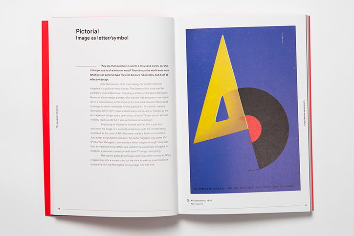
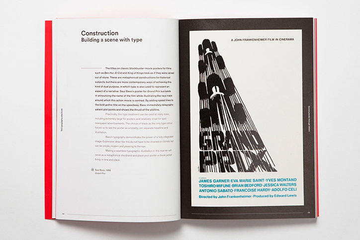
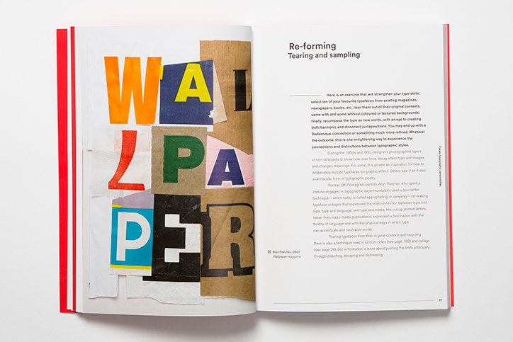
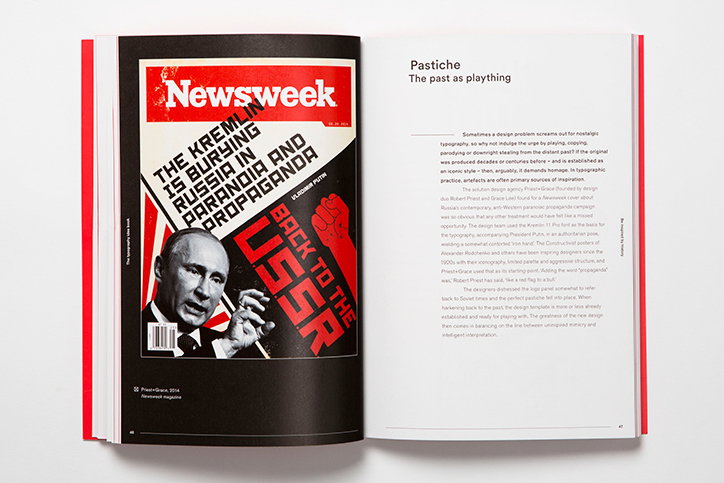
From pastiche to play to minimalism and rule-breaking, typography does it all. Describing how type can manipulate an audience by design, a new book by New York Times art director Steven Heller and graphic design expert Gail Anderson, The Typography Idea Book: Inspiration from 50 Masters showcases examples of iconic type, and how it was used to enhance understanding or manipulate readers. The publisher Laurence King has kindly let us reprint an extract from the book’s chapter Expressive reduction: Most impact for least characters.
Swiss typography (aka International Style) is considered cold, sterile and lacking in expression. Wrong! Although some of the emblematic sans-serif typefaces, Akzidenz-Grotesk, Univers and Helvetica, are reasonably neutral, and some corporate applications of the Swiss Style exhibit a visual sameness, the myth of monotony has been disproved in so many of the posters, brochures and publications under the International umbrella.
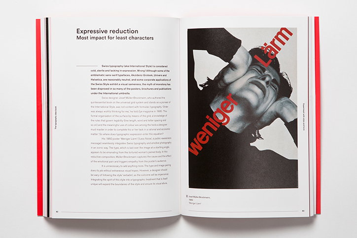
Swiss designer Josef Müller-Brockmann, who authored the quintessential book on the universal grid system and stands as a pioneer of the International Style, was not content with formulaic typography. ‘Order was always wishful thinking for me,’ he told Eye magazine in 1995. ‘The formal organization of the surface by means of the grid, a knowledge of the rules that govern legibility (line length, word and letter spacing and so on) and the meaningful use of colour are among the tools a designer must master in order to complete his or her task in a rational and economic matter.’ So where does typographic expression enter this equation?
His 1960 poster ‘Weniger Lärm’ (‘Less Noise’, a public-awareness message) seamlessly integrates Swiss typography and emotive photography in an iconic way. The type, which is laid over the image at a startling angle, appears to be emanating from the tortured woman’s pained body. In this reductive composition, Müller-Brockmann captures the cause and the effect of the emotional pain and triggers empathy from the poster’s audience.
It is unnecessary to add anything more. The type and image pairing does its job without extraneous visual tropes. However, a designer should be wary of following the style ‘verbatim’, as the outcome will be impersonal. Integrating the spirit of this style into a typographic treatment that is itself unique will expand the boundaries of the style and ensure its visual allure.
The Typography Idea Book: Inspiration from 50 Masters by Steven Heller and Gail Anderson is published by Laurence King on 15 August 2016. You can pre-order it on Amazon here.
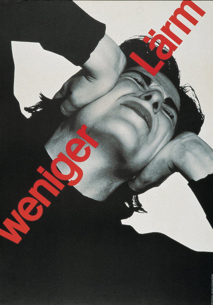
Josef Müller-Brockmann: 1960 Weniger Lärm
Typography Idea Book
Typography Idea Book
Typography Idea Book
Typography Idea Book
Typography Idea Book
Typography Idea Book
Typography Idea Book
Typography Idea Book
Share Article
Further Info
About the Author
—
Emily joined It’s Nice That as Online Editor in the summer of 2014 after four years at Design Week. She is particularly interested in graphic design, branding and music. After working It's Nice That as both Online Editor and Deputy Editor, Emily left the company in 2016.