




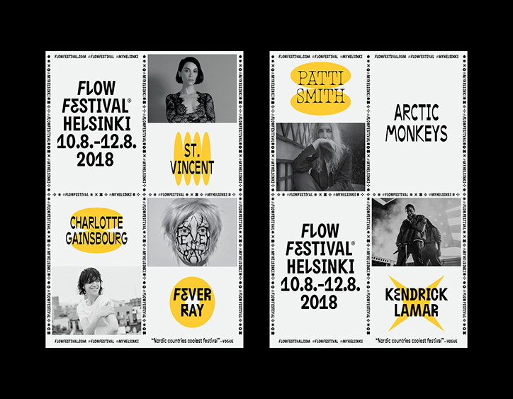
Tsto returns to design Flow Festival's identity, pushing and playing with its typography
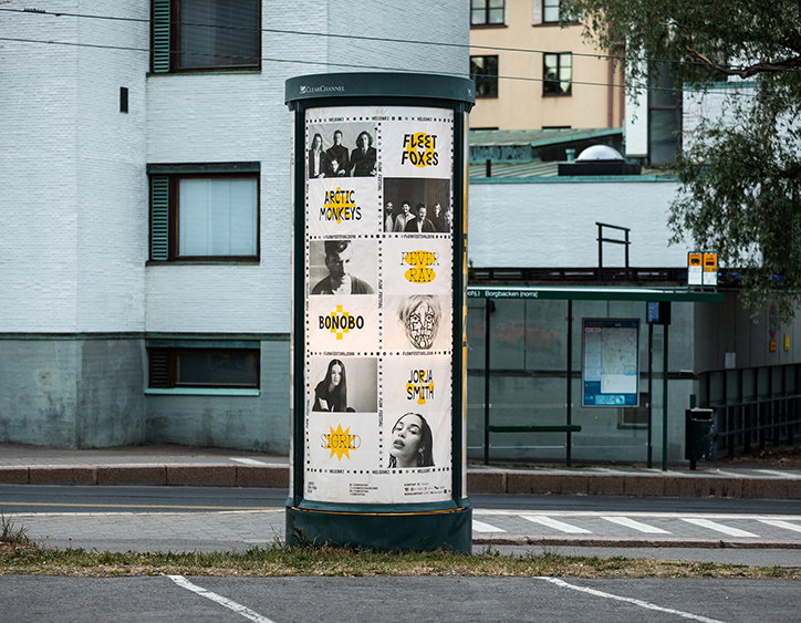
Back in 2011, Helsinki-based studio Tsto designed an identity for Flow Festival featuring a bold typographic treatment that has become synonymous with the festival’s name. Over the next five years the studio continued to roll out the festival’s identity under this visual language, before taking a three year break. 2018 marks Tsto back in the graphic design driving seat, and pushing the identity further seven years later from when it first sat down to do it.
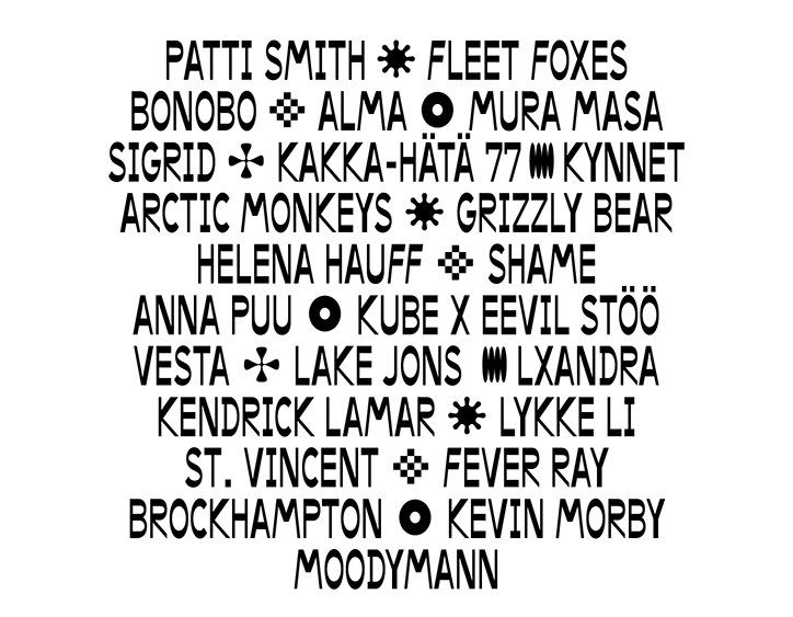
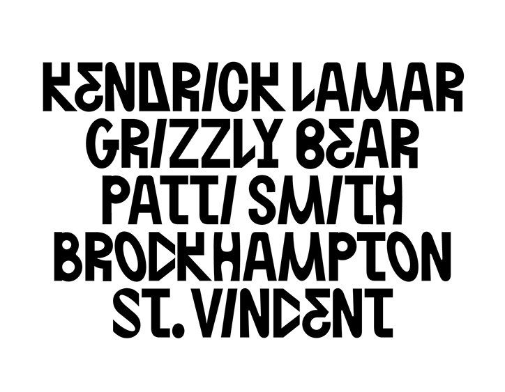
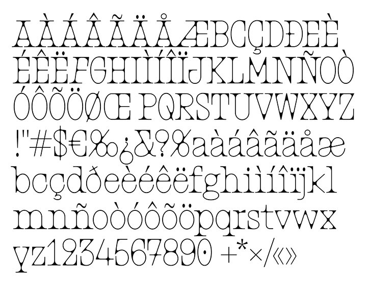
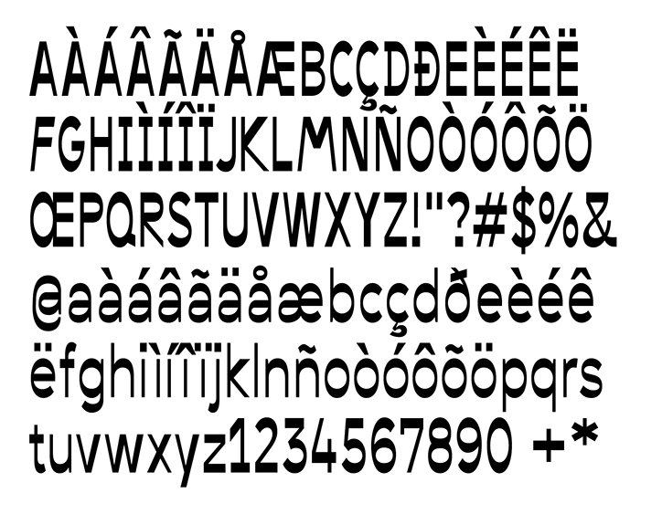
Typographically led, Flow Festival’s identity plays with two widths of serif fonts, full of tiny details expanding in corners at points and reducing in others. It was an identity that worked, instantly recognisable with the festival’s reputation and mirrored the collective of artists playing its stages. Yet, “on our new beginning, we felt like we’d want to extend the typeface and take the typographic system a bit further,” Tsto studio tells us from Helsinki. “For the Flow typeface, we added more alternative characters in the original hand-drawn style. In addition to drawing more characters ourselves, we commissioned type design duo Schick Toikka to draw derivative typefaces based on the original,” it continues. The result is two “more flashy display faces and one being a text face.”
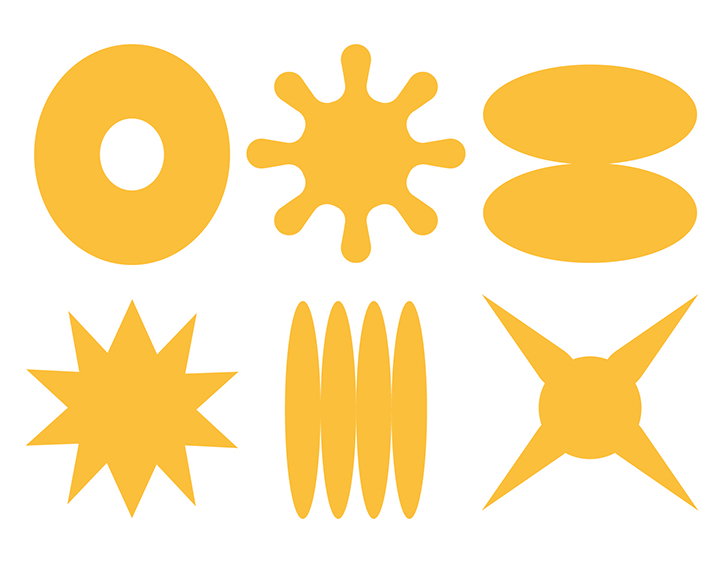
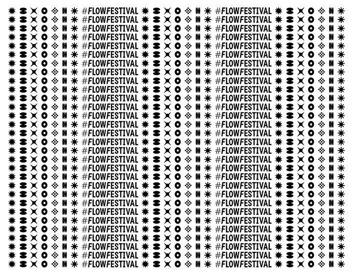
As well as this typographic extension of its original identity, the studio additionally added a “bigger gesture” extending the font to not only include lettering but a set of symbols “free of literal meaning,” it explains. “At Tsto we are often drawn to the typography and character systems of languages foreign to us, not for their exoticness, but how the characters create their own typographic colour.” For example, “how Japanese square-based kanji has a beautiful gridded patchwork rhythm, or how Cyrillic characters create wonderful diagonal movement inside a paragraph.”
To add this to the visual language spoken at Flow Festival, the studio used its intuition to “create our own character system running next to our existing typography,” it points out. “But we also didn’t want to have the ‘weight of being meaningful’ carried over to this system.” In turn, the studio found excitement when it started to think about “the set as something similar to Hermann Zapfs Dingbats," and add an extra playful layer to its original identity.
Using a typographic symbol system amongst and nestled within identities is a long standing graphic design trend, and a process Tsto had fun reminiscing “about how David Carson used Zapfs’ Dingbats for the layout of the Bryan Ferry article in Raygun," and applying it themselves. Consequently, the studio’s designers “included these dingbats in our typefaces to be able to ‘write out form’,” it explains. “It felt liberating to have this typographic element freed from content. In the final applications, the Flow Dingbats find themselves in all kinds of different roles, but the typographic nature carries over the 2018 identity."
Tsto: Flow Festival 2018
Tsto: Flow Festival 2018
Tsto: Flow Festival 2018
Tsto: Flow Festival 2018
Tsto: Flow Festival 2018
Tsto: Flow Festival 2018
Tsto: Flow Festival 2018
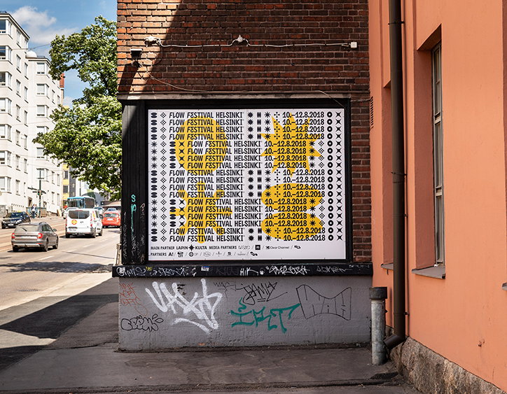
Tsto: Flow Festival 2018
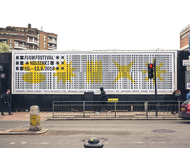
Tsto: Flow Festival 2018
Share Article
Further Info
About the Author
—
Lucy (she/her) was part of the It’s Nice That team from 2016–2025, first joining as a staff writer after graduating from Chelsea College of Art with a degree in Graphic Design Communication, eventually becoming a senior editor on our editorial team, and most recently at Insights, a research-driven department with It’s Nice That.