




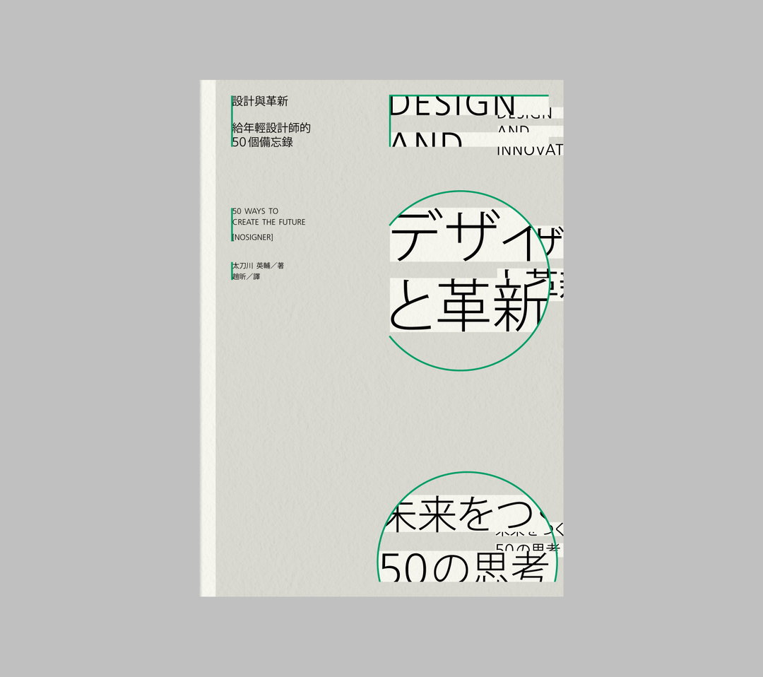
Taiwanese designer Tsai Chia-Hao on how he fine-tunes meticulous compositions
The designer’s fondness for intricacies has resulted in a portfolio filled with book and exhibition design, visual identities and movie posters.
Sometimes it can take some time to find your feet, and there’s no harm in trying out different avenues while figuring things out. Tsai Chia-Hao, a graphic designer based in Taiwan, studied advertising in school and, throughout this experience, started to realise a tension – and a growing adoration – for the medium of typography. However, as Tsai went to university, he found himself nurturing an interest in music through extracurricular activities. “It wasn’t until when I was about to graduate that I noticed the flourishing graphic design in Taiwan,” he tells It’s Nice That, “which aroused my enthusiasm in this field.”
Having landed on graphic design as his chosen medium, Tsai is now prospering in all of his design-related pursuits. Not long ago, he was nominated for Golden Bee Global Biennale, Graphic Design in China (GDC), Golden Butterly and Asia-Pacific Design. His works have also been included in various design books, published by companies such as Victionary, Sandu, Hightone and Sendpoints. Not only this, he’s also been featured by the magazine typographics t, published by Japan Typography Association. Most recently, however, he’s become engrossed in the business of graphic design, working in the realms of book and exhibition design, movie posters and so on.
Patience has been a great virtue for Tsai, and perhaps he wouldn't have ended up where he is today without his first dabbling in music. Either way, Tsai now thoroughly enjoys the process of designing and finds utter joy in meeting the need of a specific project at hand. “It’s one of the most enjoyable parts of designing, and maybe my work styles are quite diverse because of this,” he says, noting how he likes his work to take many forms. A harmonious blend of illustrative and stylised design, often you’ll see his creations grace the covers of books, but equally you’ll see it taking shape in a visual identity, branding and packaging design. “The proportion of these types of projects have gradually increased in recent years,” he adds.
Tsai’s days are usually spent in his well-lit studio, the type that lets the day’s natural light effortlessly seep through the glass as it sets the backdrop for a productive day – “especially in the afternoon when the sun shines in, which is often the clearest time to think,” he adds on the matter. He tends to use Adobe Illustrator as his tool of choice and the work really starts to take shape as he begins to hone in on his characteristically detailed practice. Tsai pays close attention to details and beholds a deep understanding of how each element plays an important part in a design's concept, only adding to the wider project on a whole.
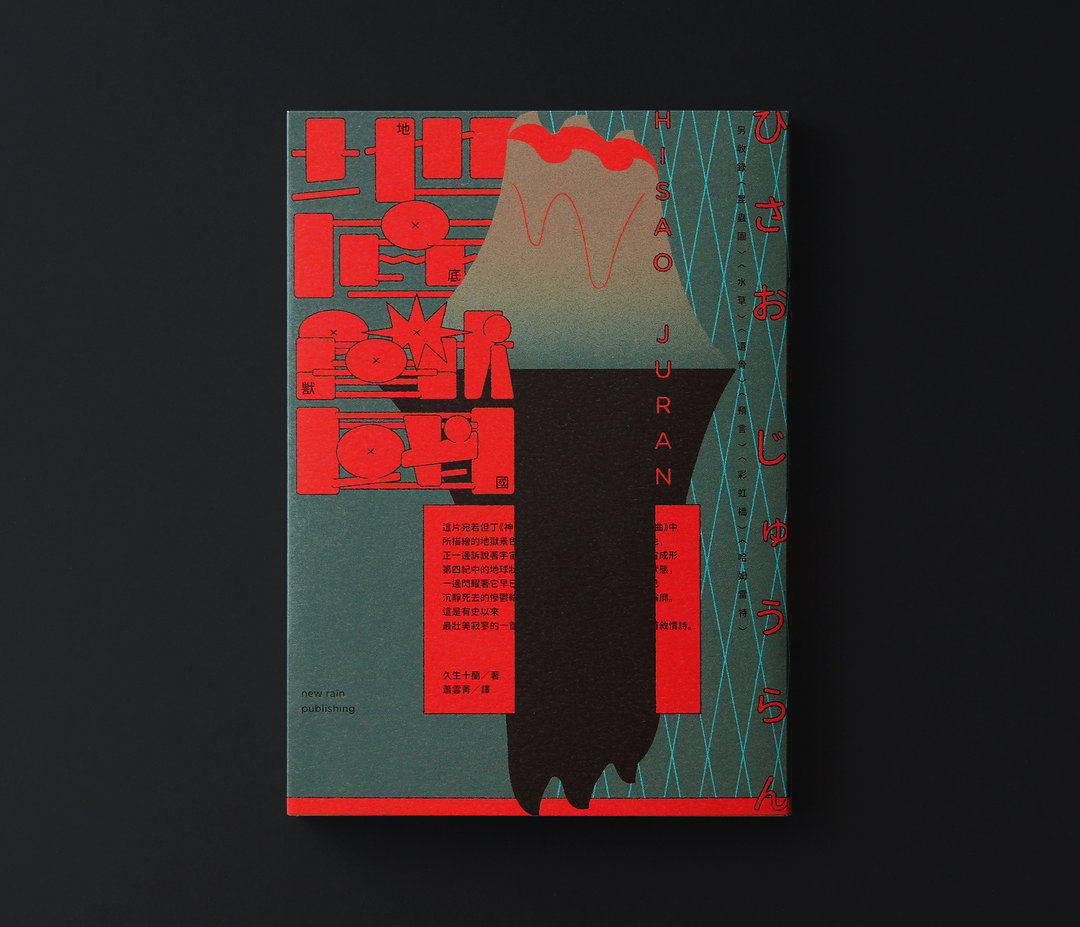
Tsai Chia-Hao: The Beasts Underground (Copyright © Tsai Chia-Hao, 2020)
An example of how Tsai has succinctly applied his balanced and meticulous practice can be seen in his recent work for The Beasts Underground [pictured above]. It’s a novel about the Soviet investigation team and Japanese captives that discovered creatures that should have been extinct in ancient times – think dinosaurs hidden beneath a volcano. “This is why I drew a volcano with the claws and sharp teeth on top,” he says, pointing to the sharp and garish exterior that frames this cover. “The reflection of the volcano intuitively symbolises the ‘underground’,” he continues. “The bottom of the reflection can be directly regarded as animal claws.” Abound with mysterious metaphors in the form of a comprehensive design, there are many finely tuned details running throughout this composition – including the text blocks that are cut off from both sides. A unique take, no less, Tsai explains that this reflects the state of “passing through the ground”. He adds: "The design is finally supplemented by a large mesh to create an atmosphere of imprisonment and isolation.”
Cinematography, on the other hand, sees the designer address the theme of film directing. The author of the book is also a director, driving the design to reflect such. “The director’s megaphone is used as the imaginative element, disassembled into the geometry on the front cover,” says Tsai, commenting on how the icon is placed on the back and inner covers, plus the “waist” of the book on purpose. Additionally, the repetition of the stills are used to signify the montage technique of film, while the geometric shapes and warping visuals reflect the various camera angles involved in film making. The characters’ expressions also play a key focus in the book design, used knowingly for the ways in which it evokes imagination.
Tsai is certainly excelling in all that he puts his mind towards, where his attention to detail and fondness for intricacies pays off with a refined piece of work. Of his plans for the future, Tsai can reveal that he’s excited to be launching the cover of a Taiwanese version of The Doors of Perception, the psychedelic novel by Aldous Huxley. This, plus a few more identities and packing designs means he’s certainly one to keep an eye on.
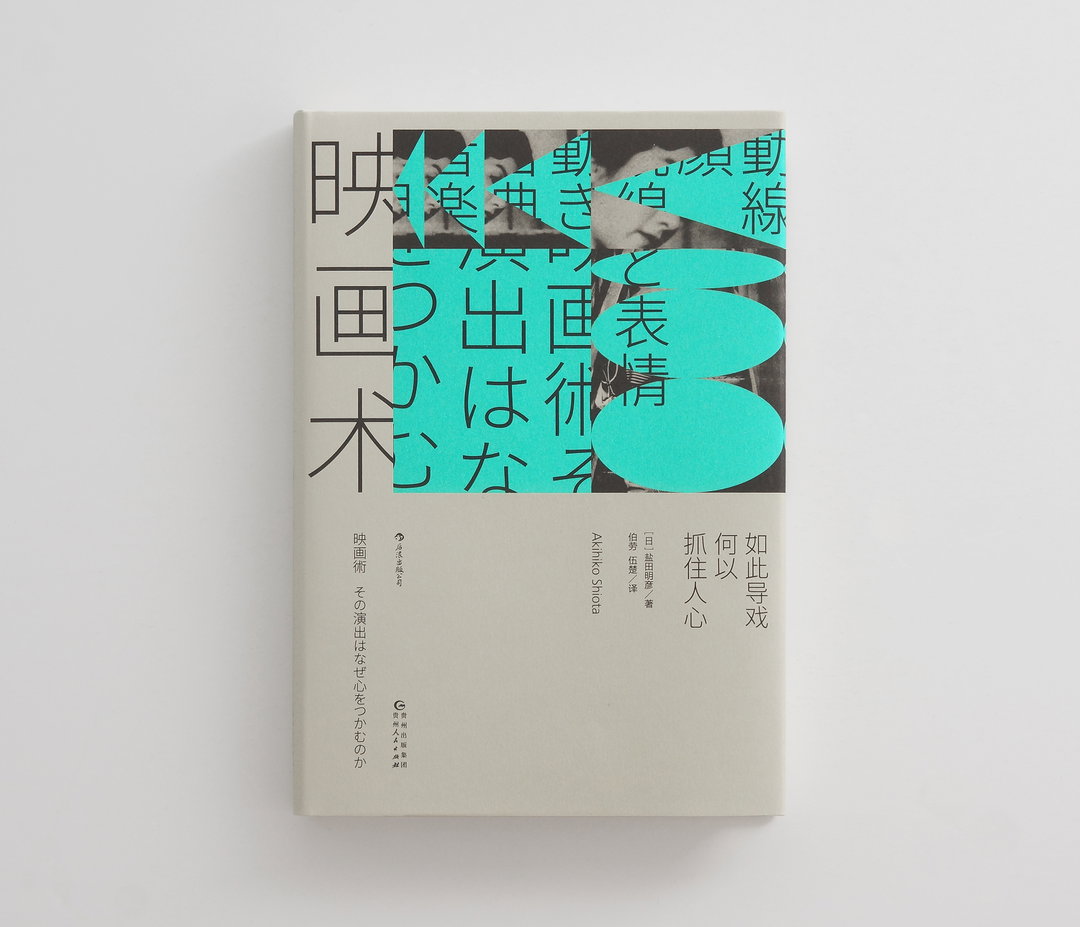
Tsai Chia-Hao: Cinematography (Copyright © Tsai Chia-Hao, 2020)
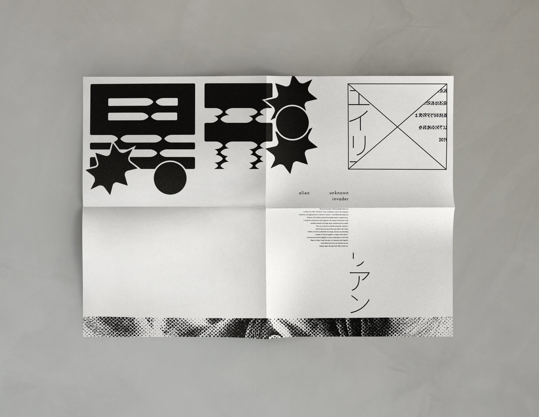
Tsai Chia-Hao: Alien (Copyright © Tsai Chia-Hao, 2020)
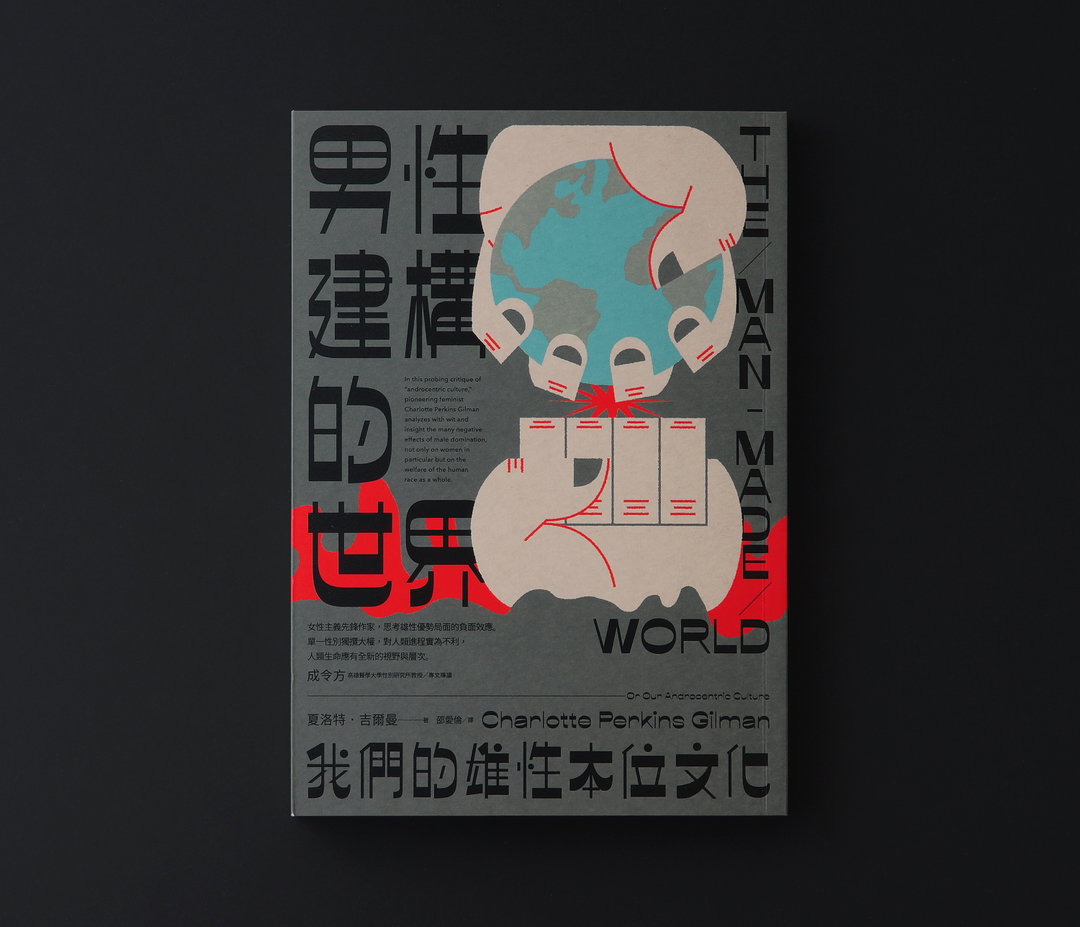
Tsai Chia-Hao: The Man-Made World (Copyright © Tsai Chia-Hao, 2020)
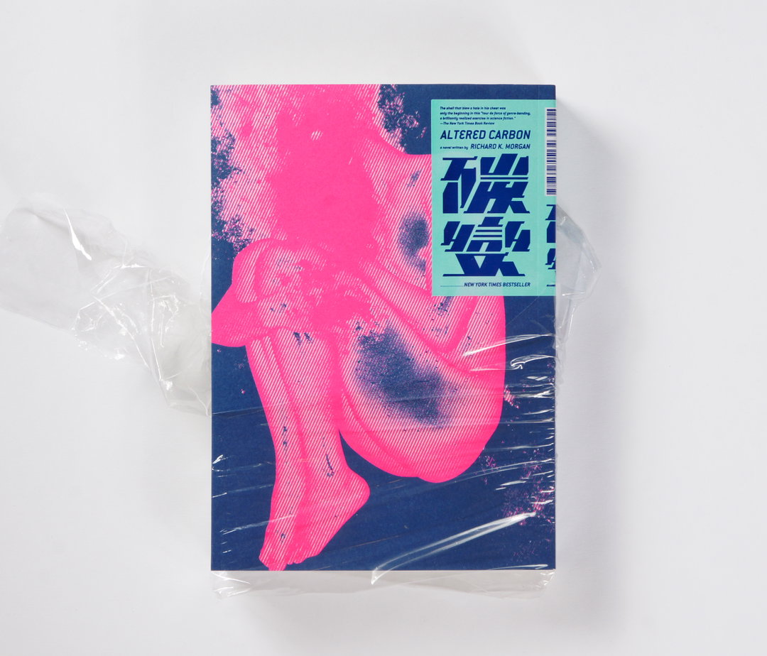
Tsai Chia-Hao: Altered Carbon (Copyright © Tsai Chia-Hao, 2020)
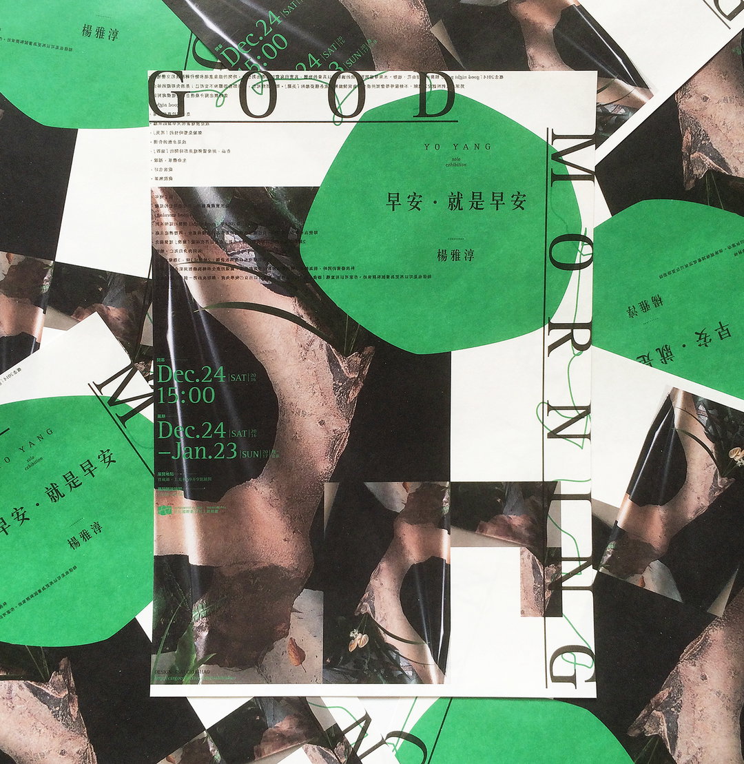
Tsai Chia-Hao: Good Morning, Yo Yang Solo Exhibition (Copyright © Tsai Chia-Hao, 2020)
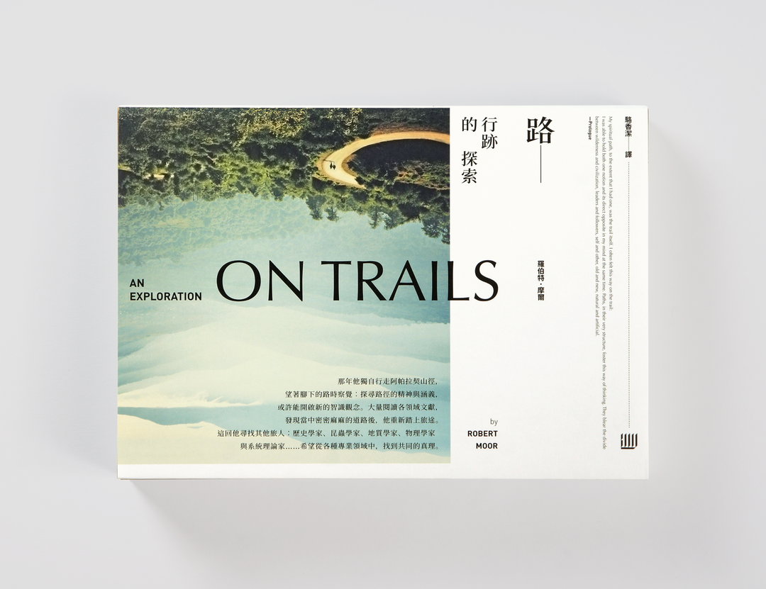
Tsai Chia-Hao: On Trails (Copyright © Tsai Chia-Hao, 2020)
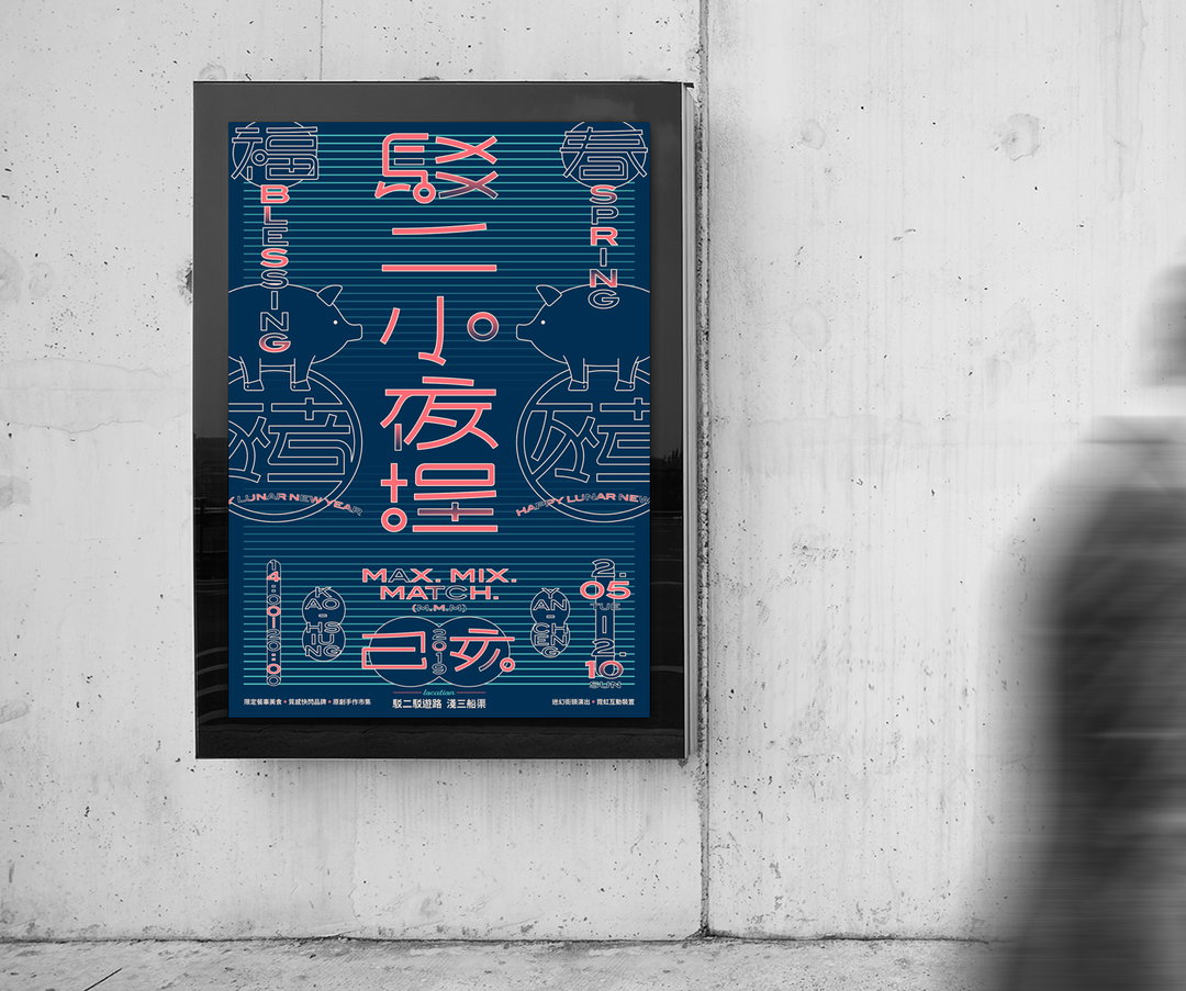
Tsai Chia-Hao: Pier-2 Night Market (Copyright © Tsai Chia-Hao, 2020)
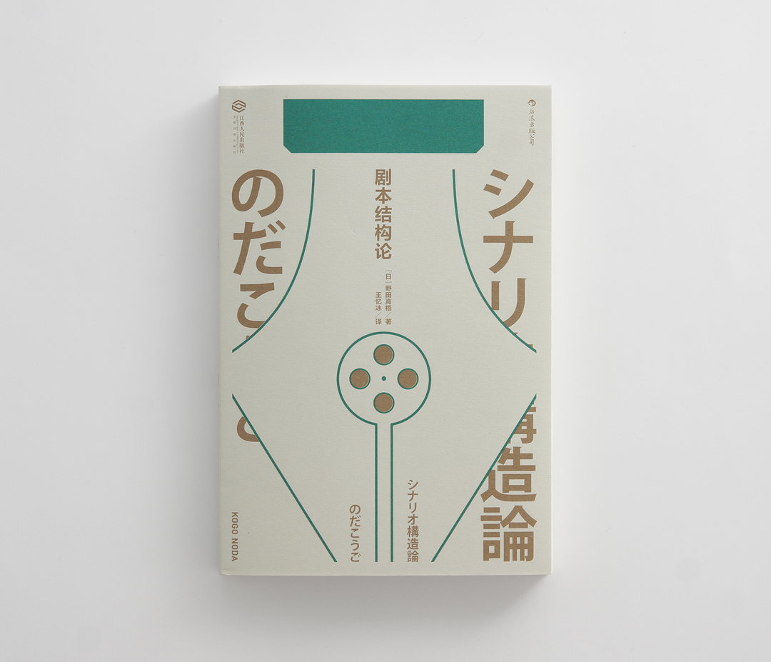
Tsai Chia-Hao: Script Structure Theory (Copyright © Tsai Chia-Hao, 2020)
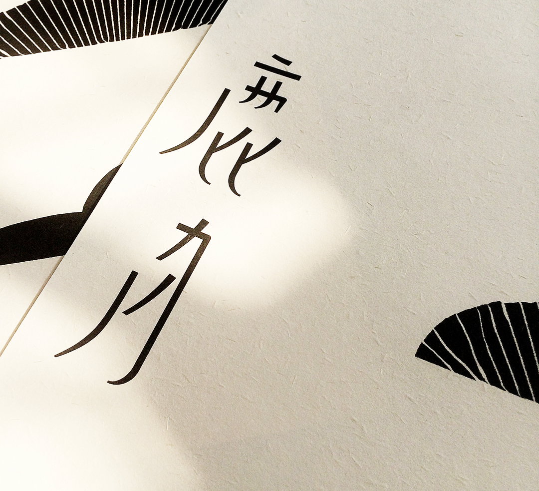
Tsai Chia-Hao: The Moon of Lukang (Copyright © Tsai Chia-Hao, 2020)
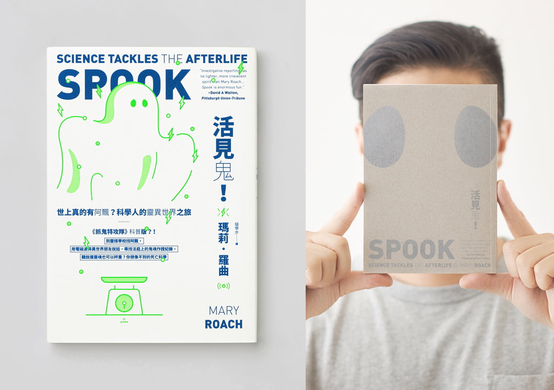
Tsai Chia-Hao: Spook (Copyright © Tsai Chia-Hao, 2020)
Hero Header
Tsai Chia-Hao (Copyright © Tsai Chia-Hao, 2020)
Share Article
Further Info
About the Author
—
Ayla is a London-based freelance writer, editor and consultant specialising in art, photography, design and culture. After joining It’s Nice That in 2017 as editorial assistant, she was interim online editor in 2022/2023 and continues to work with us on a freelance basis. She has written for i-D, Dazed, AnOther, WePresent, Port, Elephant and more, and she is also the managing editor of design magazine Anima.


