Runblock is the runners’ sun cream designed to look like it’s melted in the heat
Graphic designers Tess Lockhart and George Fletcher have shaped a new visual lexicon for sun cream that isn’t beholden to pharmaceutical or beach-ready aesthetics.
Share
Designers Tess Lockhart and George Fletcher have a specific way of bouncing off one another. The pair, who have a wealth of experience in other branding studios, lean on each other’s specific strengths – for George, typography and identity systems and, for Tess, editorial and material sensitivities. From this intersection, Tess and George utilise their combined experience and expertise to shape projects in a way they couldn’t independently. As is the case with the duo’s recent collaboration, Runblock.
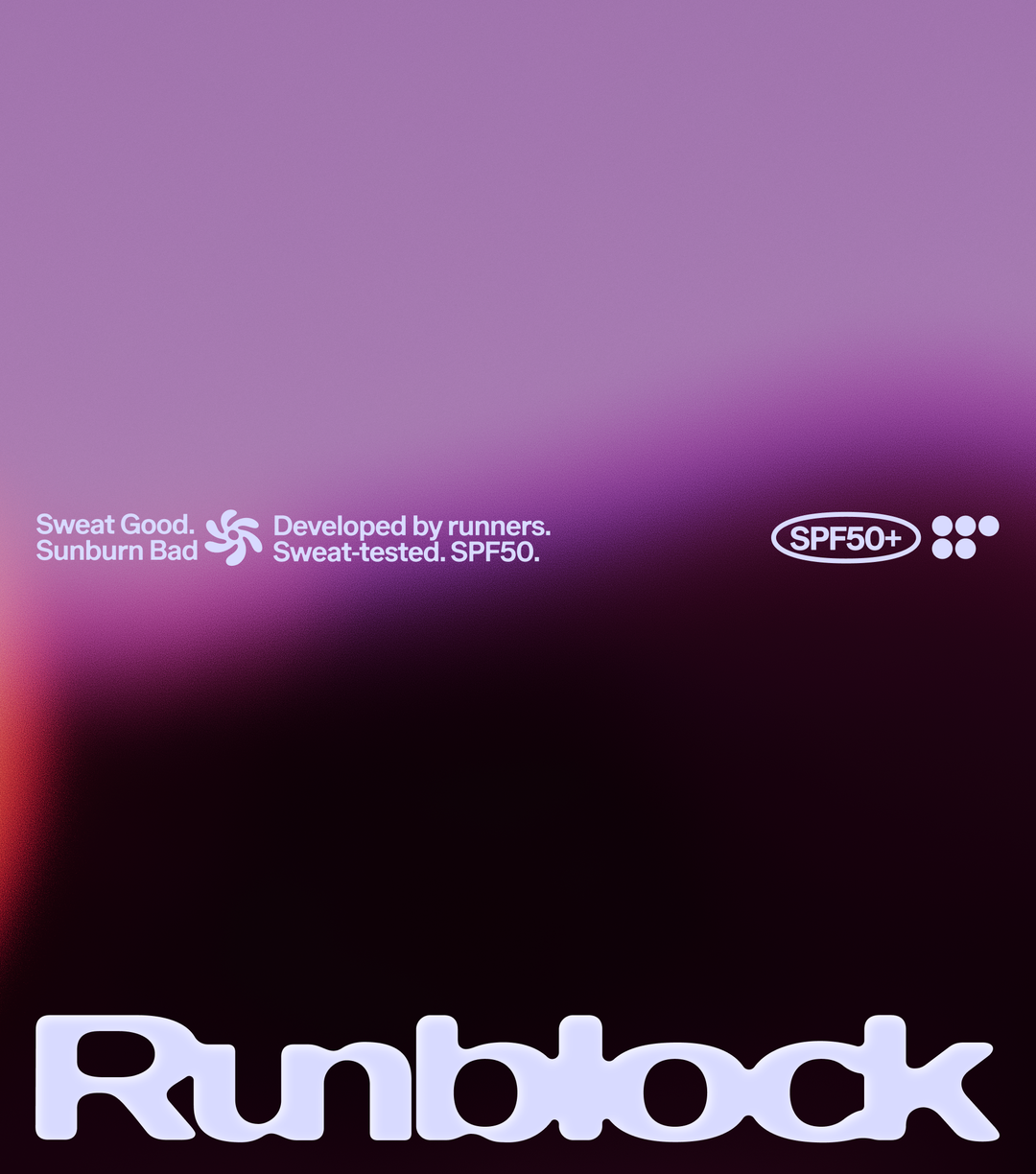
“It began with a simple observation,” Tess explain, “most sunscreen branding either looks clinical and pharmaceutical or belongs to a familiar world of beaches, holidays and skincare.” For Runblock, a sunscreen aimed at runners, neither of these worlds was appropriate. “Instead of looking to the familiar visual language of skincare or sports brands, we anchored the identity in the heat of the sun,” Tess continues. The pair drew from its connotations – sweat, heat, glare, shine – to forge an identity that feels reactive.
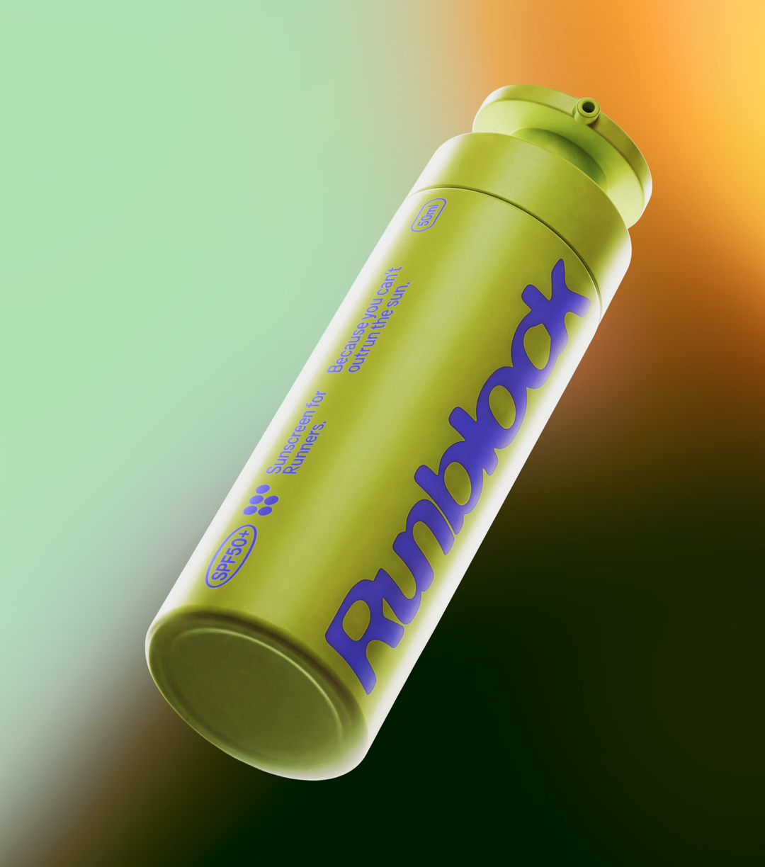
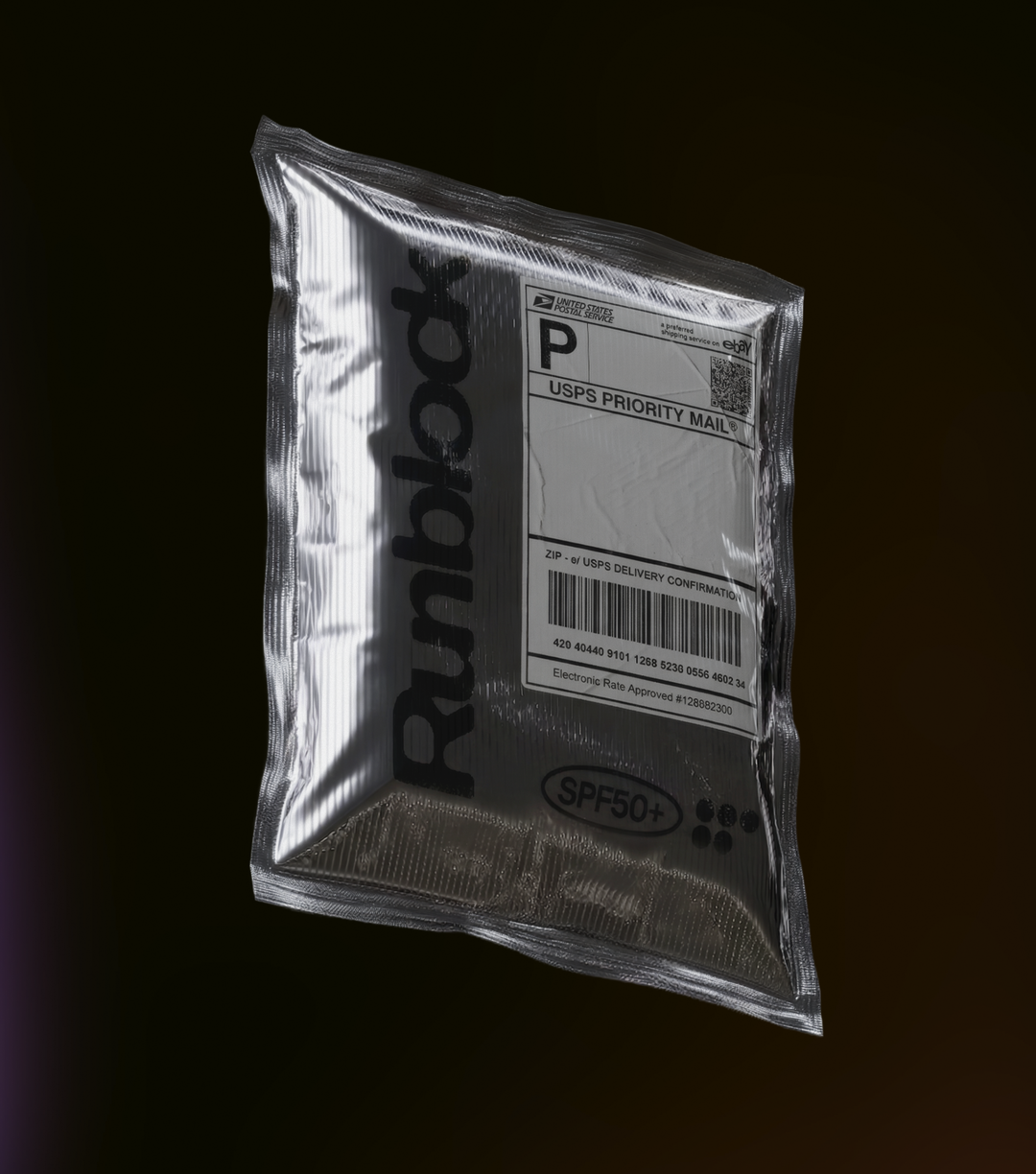
This sense of mellowing and distortion is prominently illustrated within Runblock’s wordmark, which seems to have softened in the sun. “Rather than applying a distortion effect afterwards, we wanted that pressure to be present within the construction of the type itself,” George details, building the wordmark from scratch on the basis of subdued, rounded letterforms. “Certain curves swell, stretch and begin to merge, instead of each letter sitting independently, they begin to pull into one another,” George adds.
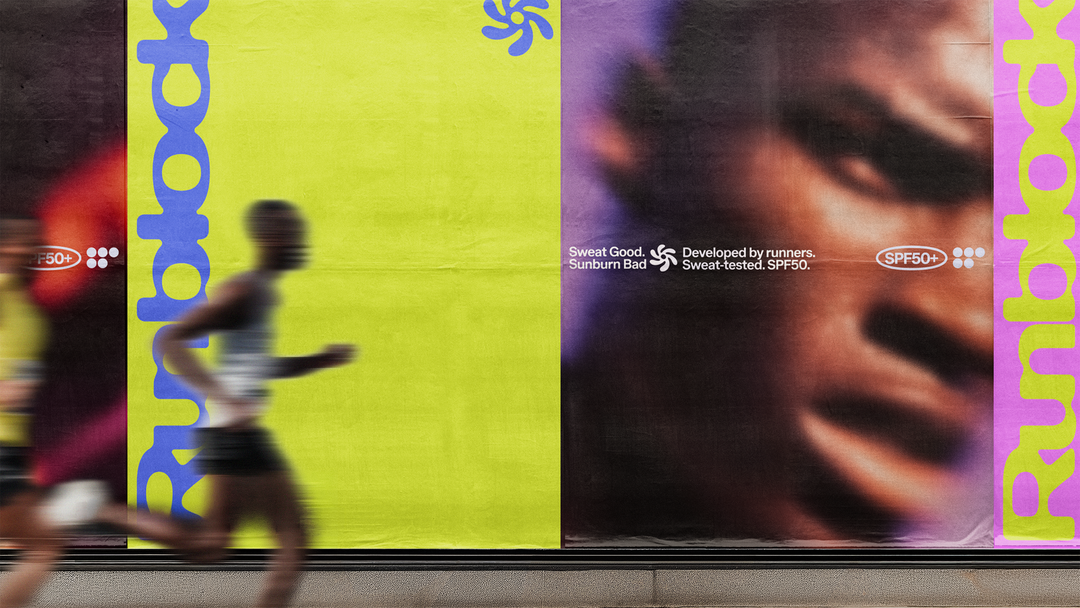
The fluidity of the brand is crucial to its success, with movement playing a key role in conveying its creative concept. “Movement was essential because the identity is built around the physical sensations of running in the sun,” Tess says, snd they harnessed motion and photography to translate “heat, exertion and shifting vision”, in place of just showing people running. To achieve this, Tess and George partnered with motion designer Lawrie Miller, who shaped the kinetic voice of the brand, creating an approach to movement that was neither mechanical nor overly polished. “It feels reactive and slightly irregular,” Tess says, “as though the identity is being affected by the runner, the heat and the surrounding light.”
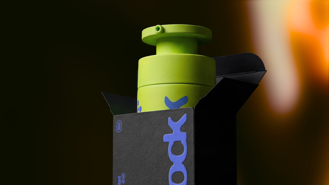
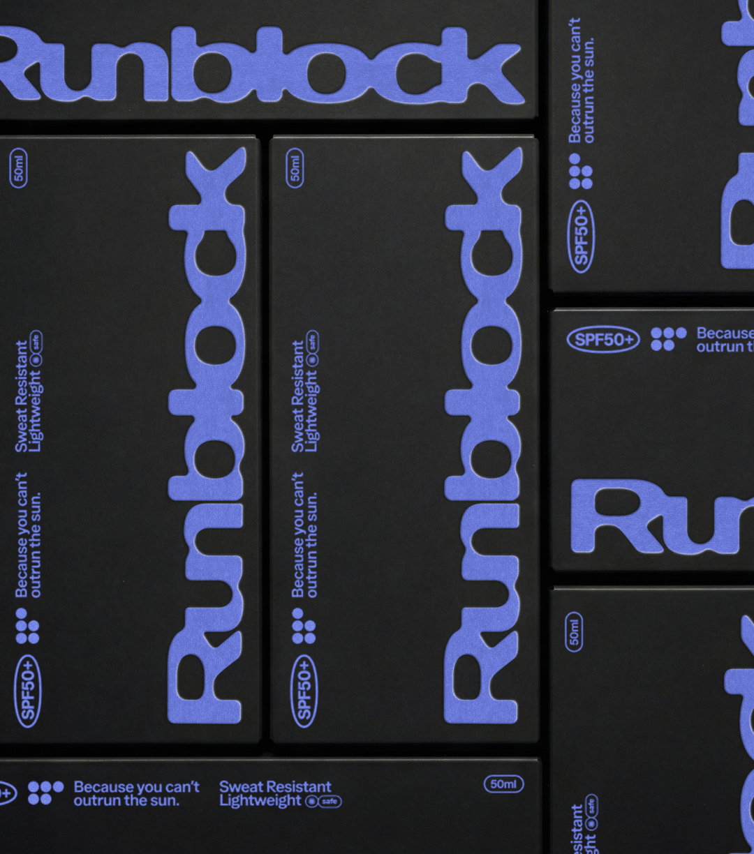
The brand’s motion embodies the tactility of Runblock’s offering, and mirrors the equally tangible product and packaging. Emphasis was placed on making a bottle that would feel highly functional and well-reasoned. “The surface, weight and finish all had to make it feel like a piece of running kit,” says George, whilst still feeling both premium and practical enough that people would covet it. “It needed to feel secure, durable and easy to use, rather than like a conventional skincare product.”
With the astute, editorially-led typographic system, fluid wordmark, visual dynamism and contemporary approach to colour combined, Tess and George’s brand for Runblock strikes a unique space, one that, yes, feels progressive and ripe with modernity, but also feels somewhat Y2K – both nostalgic and futuristic. “The starting point was less about a particular visual era and more about creating something that felt forward-looking,” Tess ends. “The result sits somewhere between sport, fashion and technology, it feels familiar enough to recognise, but distinctive enough to carve out its own space.”
GalleryGeorge Fletcher and Tess Lockhart: Runblock (Copyright © George Fletcher and Tess Lockhart, 2026)
Hero Header
George Fletcher and Tess Lockhart: Runblock (Copyright © George Fletcher and Tess Lockhart, 2026)
Share Article
About the Author
—
Hailing from the West Midlands, and having originally joined It’s Nice That as an editorial assistant in March 2020, Harry is a freelance writer and designer – running his own independent practice, as well as being one-half of the Studio Ground Floor.