Why a Japanese potato chip bag lost its colour
...and how economic and political turbulence is resetting the defaults of Japanese design.
Share
The other day, the snack aisle at my local supermarket in Shibuya looked less vibrant. Amid the puffed-up, brightly coloured foil bags designed to grab your attention, my eyes were drawn, ironically, to the one that wasn’t trying: a silver Calbee potato chip bag that looked as though someone had dragged the saturation slider in Photoshop all the way down. The bottom half of its packaging conceded to dead space in raw silver foil, its rosy-cheeked potato mascot apparently taking the day off. The only clue to the design’s severity was a small label in the top-left corner: 石油原料節約パッケージ, “petroleum ink-saving packaging”.
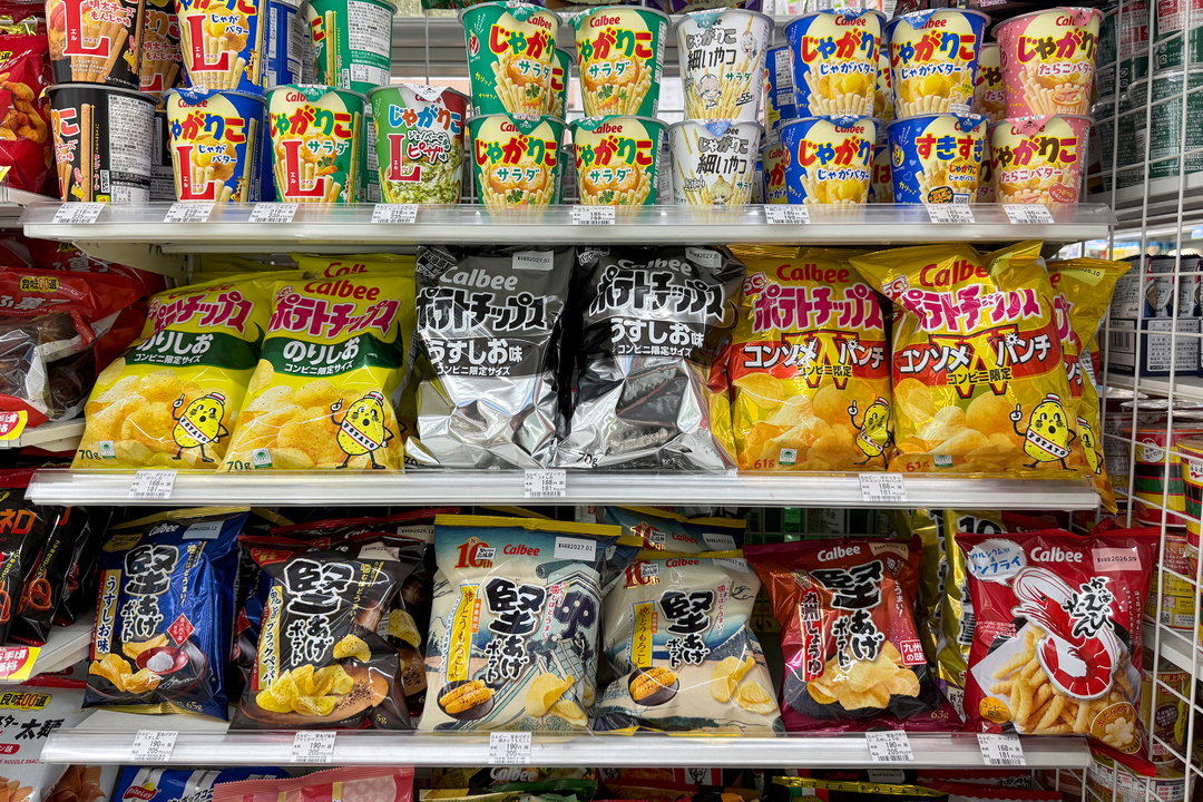
Calbee Potato Chips with monochrome ink-saving packaging next to their usual coloured ink packaging. Photo courtesy Ray Masaki.
Fourteen of Calbee’s products had gone two-tone from late May, after the war in Iran closed the Strait of Hormuz and squeezed supplies of naphtha, the petroleum feedstock used in coloured packaging ink. And Calbee isn’t alone – JA Nakanoshi, the largest mushroom producer in Japan, plans to cut its packaging from 110 varieties to roughly half, citing similar reasons.
In my time as It’s Nice That’s Tokyo correspondent, the common thread running through my stories has been that aesthetic output is so often determined by macro forces rather than by taste, regardless of however much our keyboard-shortcutting and mouse-moving feels like control. As I write this halfway through 2026, the yen has weakened by about 52 per cent against the US dollar since 2020, and that, together with stagnant wages and the rising cost of everything, is exactly the kind of pressure that eventually reaches the design of a potato chip bag.
It’s impossible to design in a vacuum; output, whether we’re conscious of it or not, is a product of its context. The bubble of the late 80s made art and design flourish in Japan: the animated film Akira, in 1988, burned through 1.1 billion yen and 160,000 hand-drawn cels at a time when that seemed reasonable. Money buys craft, and its absence can take it away. Economic turbulence doesn’t just lead to shrunken budgets – it’s consolidation, a retreat from risk, a gradual narrowing of options. It alters the defaults, and those changes tend to outlast the crises that created them, resulting in a world with a little less colour, a little less texture, a little less of the hardly-tangibles: subconscious cues that are felt more than they’re known.
“Aesthetic output is so often determined by macro forces rather than by taste.”
Ray Masaki
Paper Texture
I’d seen the same force at play a year earlier, though I didn’t recognise it at the time. I was on the stationery floor of Shibuya Loft, looking for a simple notepad for my weekly to-dos, when a sky-blue pad caught my eye. Its cover was austere: “WRITING PAD A5” set in Helvetica Bold, and beneath it, “TOMOEGAWA TOMOE RIVER”.
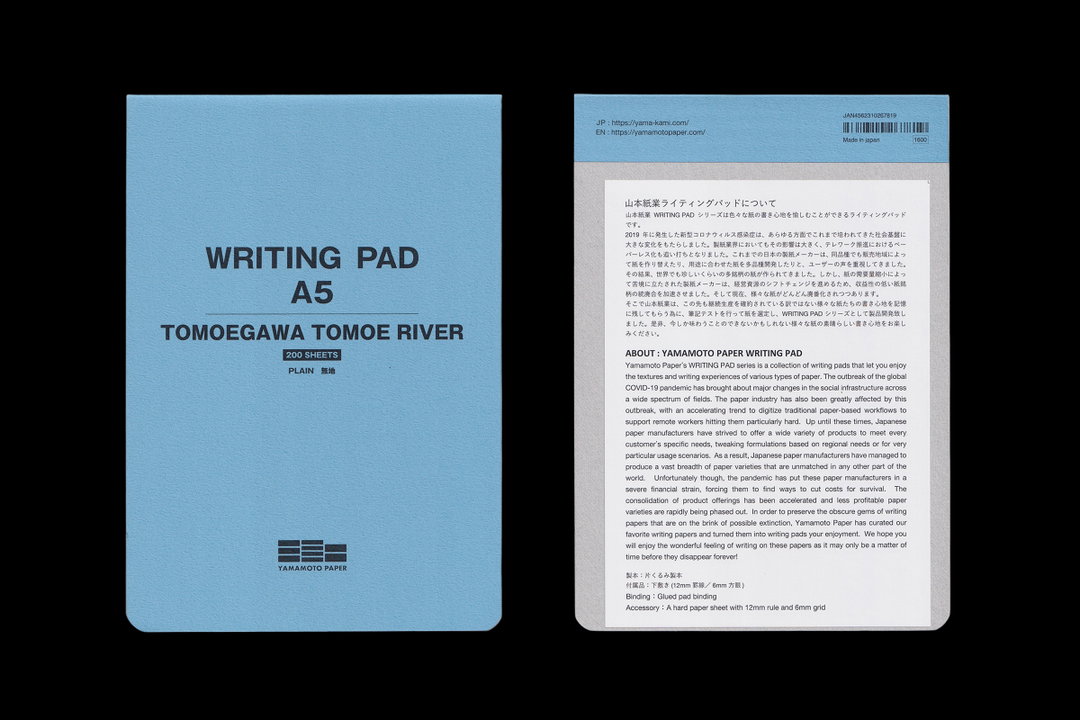
Yamamoto Paper Tomoegawa Tomoe River Writing Pad
Tomoe River is a thin, ultra-smooth paper stock with a cult following among fountain pen enthusiasts for the way it takes ink without bleeding through. It was originally produced by Tomoegawa Corporation, mainly an electronics company that ran a paper division to supply its own industrial needs, like electrical insulating paper. In 2021, as part of a restructuring, Tomoegawa phased that division out and transferred the formulation to Sanzen Paper Manufacturing, citing increased raw material and distribution costs. Online pedants argue that, though it’s similar, the new Sanzen version is slightly toothier than its predecessor.
The pad, put together by paper distributor Yamamoto Paper, came packaged with an almost comically earnest note. In it, the company presented its Writing Pad series as a plea for preservation: the pandemic catalysed a wave of digitisation that hit Japan’s paper industry hard, pushing manufacturers into financial strain and forcing consolidation, with niche, less profitable paper varieties discontinued in favour of best-sellers. Japan, it notes, has an unusually wide range of paper formulations, tailored to regional preferences and narrow use-cases. Now, with that range shrinking, Yamamoto is curating its favourites, especially endangered ones, as writing pads. The note ends: “We hope you will enjoy the wonderful feeling of writing on these papers as it may only be a matter of time before they disappear forever!”
The Printing Industry
Reading Yamamoto’s manifesto, I reflected on my own studio’s output. The same math that’s discontinuing paper stocks is quietly deciding which textures and techniques survive in print. For me, graphic design shines when the concept is reflected in the paper’s tactility or the printing technique, but print projects with real attention to material have become fewer and further between. Most of our recent work is digital by default, and when print is part of the equation, it arrives with a tight timeline and an even tighter budget. Which is why, like many small studios in Japan, I end up using online printing services. Companies like Printpack and Graphic keep prices low by batching everyone’s orders onto shared plates and narrowing the range of paper available. I’ve spent enough hours in Graphic’s sample book that I can often identify a magazine’s stock with a quick squeeze between my thumb and forefinger.
Wanting to learn more, I sheepishly contacted Watanabe-san, who runs production at an offset shop I've used on and off for years. When I asked whether the instability I’d been noticing was real, he answered before I could even finish my sentence: “Yeah, it’s hitting us head-on.” Ink, machine parts, and paper have been climbing for years, and his distributors, who had quietly absorbed part of the increase out of loyalty, finally told him they’d reached their limit. Meanwhile, the specialty shops that handle finishing processes like laminate coatings and foil stamping keep closing, squeezed as subcontractors who could never raise their own prices. Fewer of them means the survivors charge more. All of it lands on the client – a chain of costs that literally alters the surface of Japanese design.
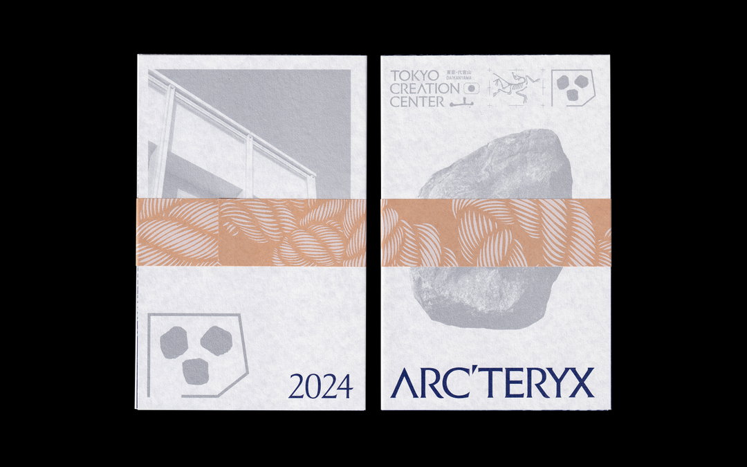
Pamphlet with many bells and whistles I made in 2024 with the help of Watanabe-san. Indigo and silver spot-colour offset printing on a fine-quality washi-like paper with a UV-printed white-ink kraft band. (Copyright © Ray Masaki)
That is not to say that everything is fucked, which even I’m a little surprised to say, considering I started this piece assuming it would be bleak. Mid-sized printers can no longer compete for thin-margin government and institutional projects, with runs in the tens of thousands that used to keep their machines at capacity. But Watanabe-san notes that his shop has shifted focus because, as he put it, smaller independent creators are having a moment. He told me about a hairstylist making a photobook – small enough that they printed digitally rather than offset, but he could offer bespoke colour correction to make it look great on a stock no online service would carry.
And constraints don’t necessarily mean a less creative design. My friend Taeko Isu, an art director, told me about a zine she designed for an Ema Gasper exhibition, where she bundled the pages with colorful ribbon instead of conventional binding, saving time on a tight print schedule while giving the zine the impact of an art object. The cover is printed in a single spot colour, another elegant cost-saving decision. With printing and finishing costs rising, she’s reducing the number of spot colours she uses and pushing the personality elsewhere in the design.
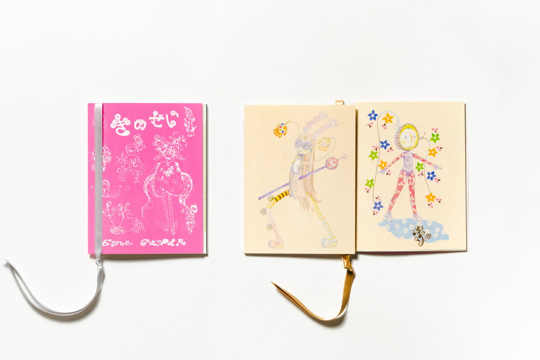
Taeko Isu: Ema Gasper zine (Copyright © Taeko Isu)
Rewriting Defaults
The same force is not only altering the surface of design but also reshaping the physical structures around us. When I asked Suzuno-san of Torafu Architects how the last few years had changed his practice, he described a shift in his process. He used to start by thinking freely about what kind of space he wanted to make, then reconcile it with the budget. Now it’s the opposite, where cost is taken into account from the first sketch. He told me that if you wait and make reductions once construction is underway, you end up diminishing the design’s intended appeal.
But he, too, was careful not to make it sound like a lament – on a recent project with tight costs and a tight schedule, he worked directly with the craftsmen, deciding how to build things on site as they went, and said the trial and error made him feel the joys of creation for the first time in a while. But of course, Suzuno-san is one of the top architects in Japan, afforded the privilege of creative problem-solving. The vast majority of development projects go with the most sensible, cookie-cutter, safe-bet options.
“The default is getting worse; caring is becoming a privilege.”
Ray Masaki
It’s not that people have stopped caring, it’s that care is stratified. The hairstylist’s photobook still exists. So does the artist’s zine with ribbon binding. So do beautiful, considered buildings and interiors. What’s changing is everything underneath: the mom-and-pop restaurant flyer, the enoki mushroom bag, the newly built apartment. The ambient state of design in Japan – the stuff nobody signs off on, because, frankly, nobody’s really looking. The default is getting worse; caring is becoming a privilege.
The world moves quickly, and even as I was writing this, Calbee announced a half measure: colour returns to the front of the packaging, the rosy-cheeked mascot reinstated, while the back remains monochrome. Yamamoto Paper has released the Sanzen version of its Tomoe River writing pad, which means the one on my desk is likely one of the last of its kind. And I just finished a printed invite through Graphic for probably the sixth time this year, picking an inoffensive nice paper stock from a drop-down menu like I often do, instead of working with Watanabe-san.
Does it really matter whether the paper is silky rather than super silky, whether it’s CMYK or CMYK plus a spot gloss? On its own, no. It matters because this is how a default gets rewritten: not by decision, but by one unremarkable compromise at a time, until nobody remembers there was a choice. Probably not in one or two years. But in five or ten, we’ll go looking for the hardly-tangibles and find that we quietly agreed to live without them.
Closer Look
Ray shares some more tips for Tokyo for all the print lovers out there.
- Printing Museum, Tokyo. A very underrated museum located in Bunkyo. The exhibition space operates as a timeline from early printmaking like ukiyo-e to more modern forms of printing.
- Takeo Paper Mihoncho Aoyama. Takeo is one of the top paper distributors in Japan, and it has a beautiful store in Aoyama designed by Tonerico to showcase its wide selection.
- Kakimori. Probably already familiar to stationery lovers, but this store has an amazing selection of products as well as a station for mixing your own custom inks.
- Think of Things. This is a really cool shop operated by stationery company Kokuyo. It has its own line of printed products, and serves a pretty good coffee too.
Share Article
Further Info
About the Author
—
Ray Masaki is a Japanese-American graphic designer, writer, and educator in Tokyo who runs Studio RAN. He studied illustration at Parsons School of Design, type design at The Cooper Union, and received an MFA in graphic design from the Vermont College of Fine Arts. He teaches at the Professional Institute of International Fashion in Shinjuku, Tokyo. In 2021, Ray published Why is the salaryman carrying a surfboard? — a bilingual book about the history of systemic white supremacy and Westernisation in the Japanese design industry. He is It’s Nice That’s Tokyo correspondent.