The Click’s clever university branding puts the ‘I’ in identity, individual and Imperial College London
UK branding studio The Click knows that universities don’t compete on logos, but on belonging – that’s why it’s designed a visual identity that is braver, not louder.
University branding can suffer from getting drowned out by the noise, a sea of sameness if you will. Students are attracted to universities based on location, the strength of the courses, success rate, and all sorts of other important factors. But sometimes it can be overlooked how much that universities should give students an identity and a feeling of belonging. When the UK-based branding studio The Click was approached with a brief from South Kensington’s Imperial College London (ICL), the objective was to make braver branding, not louder. ICL, according to Bobby Burrage, creative director at The Click, has an appetite to do things differently as higher education changes and universities inevitably evolve. “Our approach wasn’t to make Imperial louder, but braver. An identity system that flexes, belongs and earns loyalty rather than demands it. Universities aren’t competing on logos, but competing on belonging.”
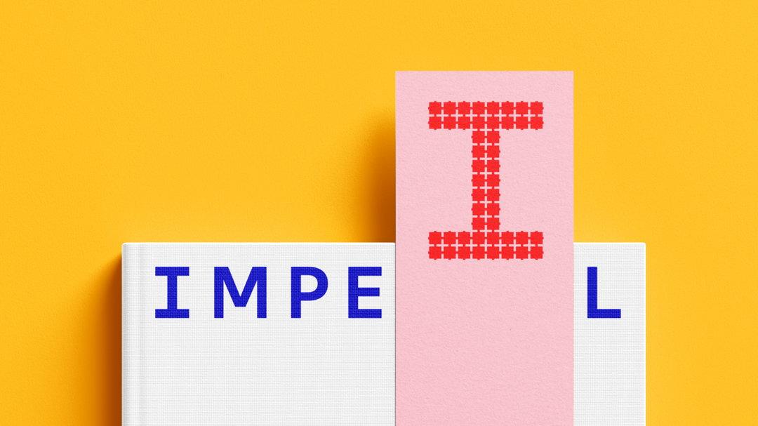
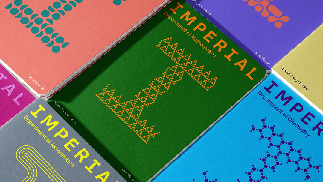
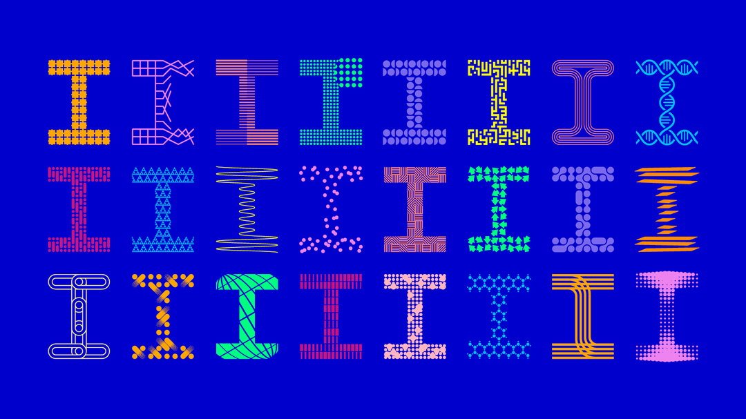
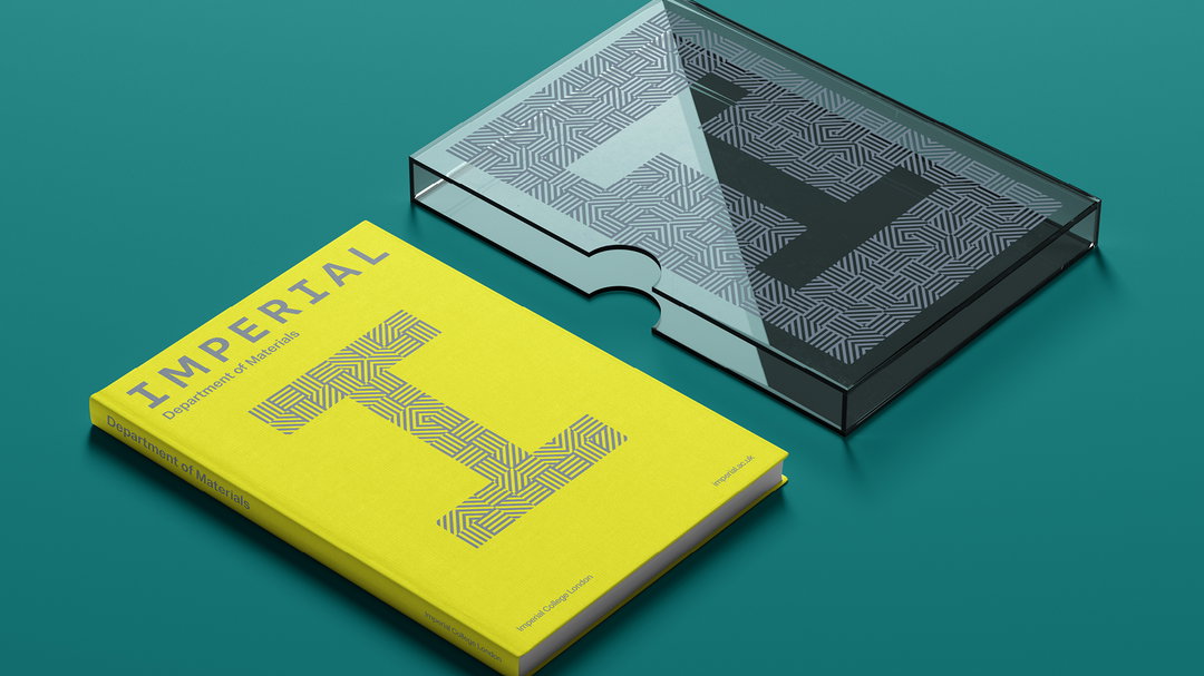
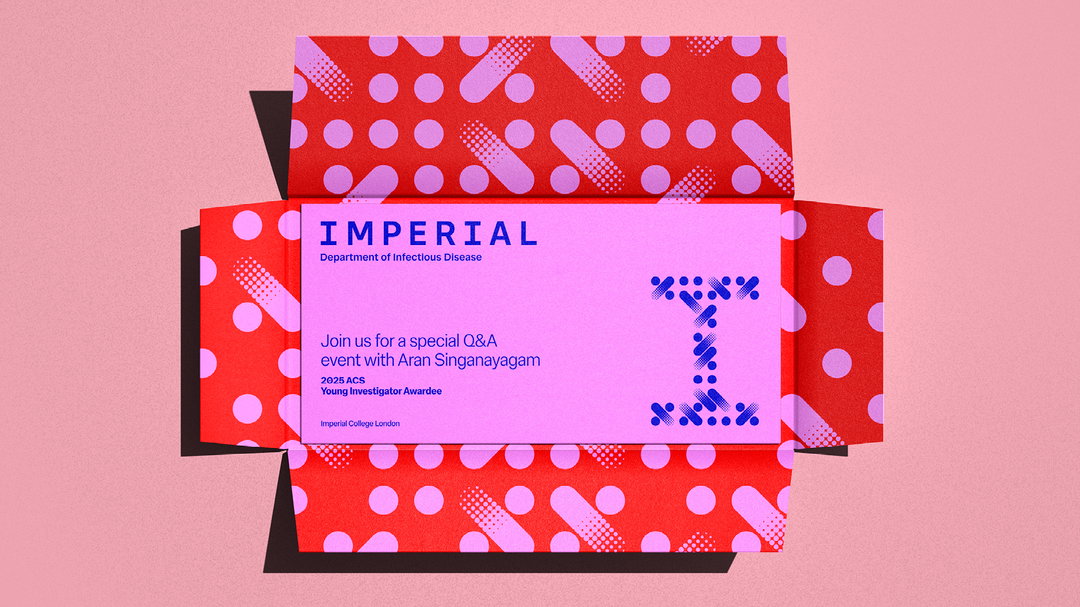
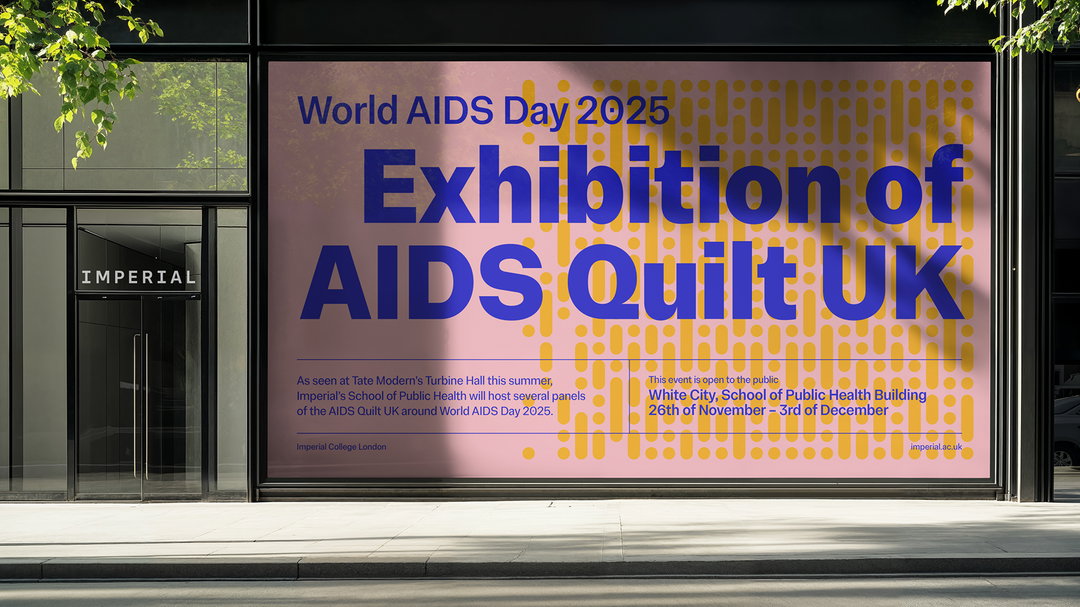
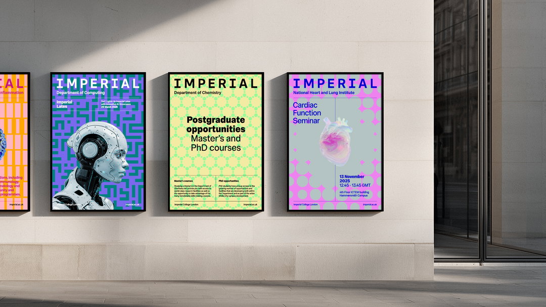
The visual overhaul of the historic university focuses on putting the ‘I’ in identity. Each faculty under the Imperial umbrella benefits from its very own bespoke I, characterised visually by the personality of its course. For example, the department of aeronautics is sleek and smooth, with an I that glides. The department of chemistry’s I is made up of polymers, chains of molecules that immediately communicate what the course is all about – and in the process, gives students a recognisable DNA. Expertly designed by Pentagram partner Domenic Lippa in 2024 and expertly rolled out across merchandise by The Click, the identity covers 24 different courses and represents 24 different identities.
GalleryThe Click: Imperial College London (Copyright © The Click Design Consultants, 2026)
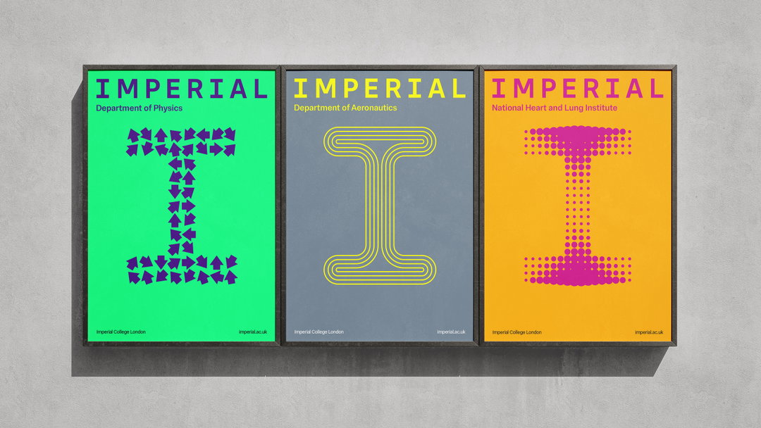
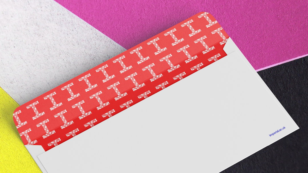
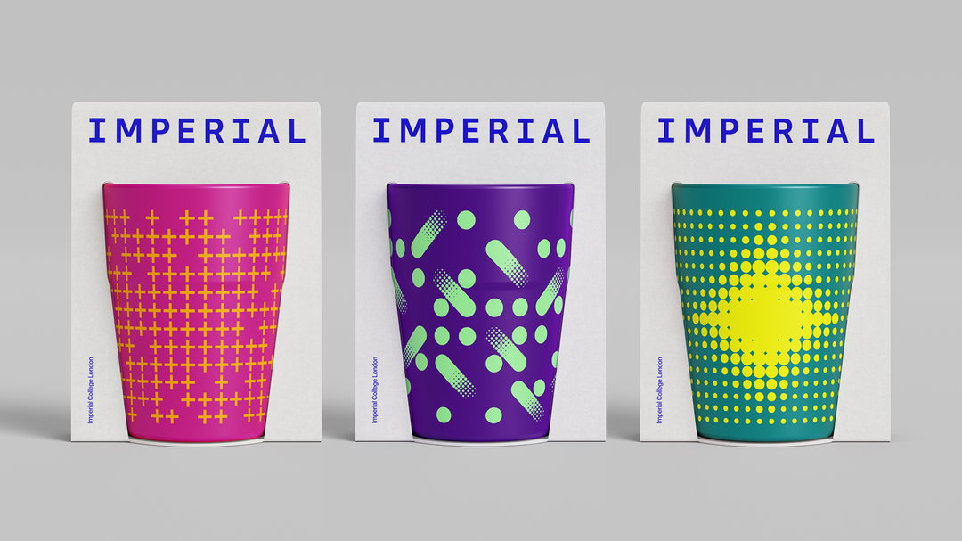
The work began as a conversation: “The primary objective was to create a brand for all – something everyone at Imperial would want to engage with and belong to, from students to academics to commercial partners, across every faculty,” says Bobby. “Just as important: portraying the cross-learning, collaboration and innovation at the heart of Imperial’s ethos and global impact.” Whether it’s environmental engineering or the study of the heart and lungs, the “creative I” aims to evoke a feeling of instant association whilst visually associating with one another through its physical form and footprint. The branding extends to merchandising too: notebooks, hoodies and mugs, common fixtures of student life – and those elements help to bleed branding into everyday life.
Impressively, The Click met and interviewed every single department across three facilities: engineering, medicine and natural sciences – and those conversations, coupled with visual references and wider research, informed the design exploration. “Some Creative I designs came together in a single sitting; others took multiple rounds of concepts, refinements and crafting. Each design was collectively signed off by the respective department in conjunction with the central brand team,” says Bobby.
One can imagine a posse of gangs from mathematics and a gang of students from applied paediatrics emerging from shadows, clicking their fingers like the Sharks and Jets from West Side Story with their respective uniforms and proud sense of individuality. Although said half in jest, that was exactly the spirit. “As with any branding project we work on, we hope the client’s employees, teams and users feel a sense of pride and ownership — but for this project, that objective was even more important,” says Bobby. “Each department has begun to create their own merchandise and embrace department-specific assets for everything from environmental graphics to digital expressions. We expect that passion and sense of pride to grow further as the wider brand embeds.”
GalleryThe Click: Imperial College London (Copyright © The Click Design Consultants, 2026)

Hero Header
The Click: Imperial College London (Copyright © The Click Design Consultants, 2026)
Share Article
Further Info
About the Author
—
Paul M (He/Him) is a Junior Writer at It’s Nice That since May 2025. He has a strong interest in graphic design, digital kitsch, multimedia painting, collage, nostalgia, analogue technology and all matters of strange stuff. pcm@itsnicethat.com
To submit your work to be featured on the site, see our Submissions Guide.