






How do you rebrand one of Europe’s largest football clubs? Smörgåsbord Studio shares its wisdom
Tasked with creating a new identity for AFC Ajax, the Netherlands world-class football team, the studio found a visual language that honours the clubs heritage whilst propelling it straight into the contemporary.
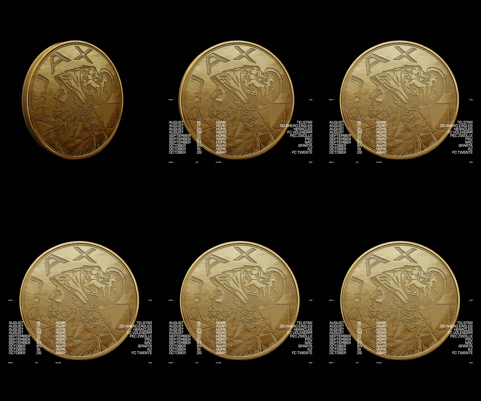
“In Amsterdam, and across the Netherlands, few names command more reverence than Ajax,” Dylan Griffith, creative director of Smörgåsbord Studio tells It’s Nice That. “So to be asked to rebrand AFC Ajax in their 125th anniversary year – coinciding with Amsterdam’s own 750th celebration – it wasn’t just a brief. It was a moment.” When the Amsterdam-based studio received a call out of the blue from the creative team behind the largest professional football club in the Netherlands, there wasn’t much hesitation, and they dove head first into the development of a comprehensive visual language around the re-introduction of the club’s heritage.
From the outset, the designers were privy to a fair few graphic design relics legendary to the team. “Ajax’s remarkable archive department proved invaluable, offering a wealth of beautifully preserved and meticulously documented material that guided our process from the very beginning”, Dylan shares, “from an extensive photography archive to match programmes, season tickets, vintage kits, and treasured fan memorabilia.” One thing was untouchable though, and that was the club’s classic logo – “it was sacrosanct”, he says.
Rather than seeing the necessary inclusion of this classic design as a limitation, Smörgåsbord looked to the logo as a catalyst for an entirely new design system altogether – one that would be flexible enough to stretch from the field to the screen and be impactful enough to support the original mark.
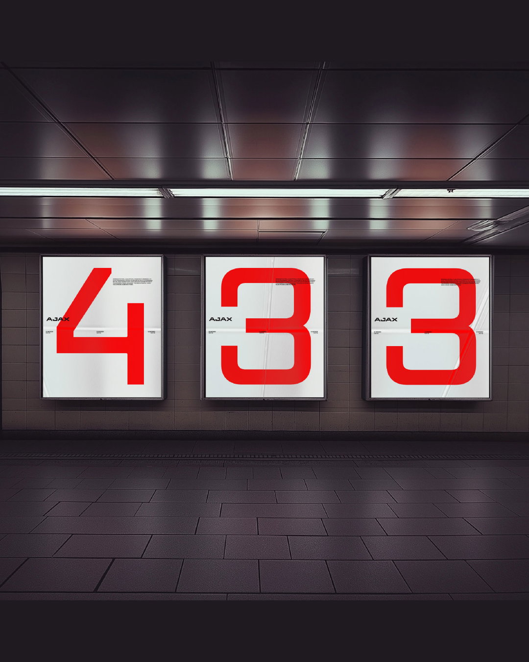
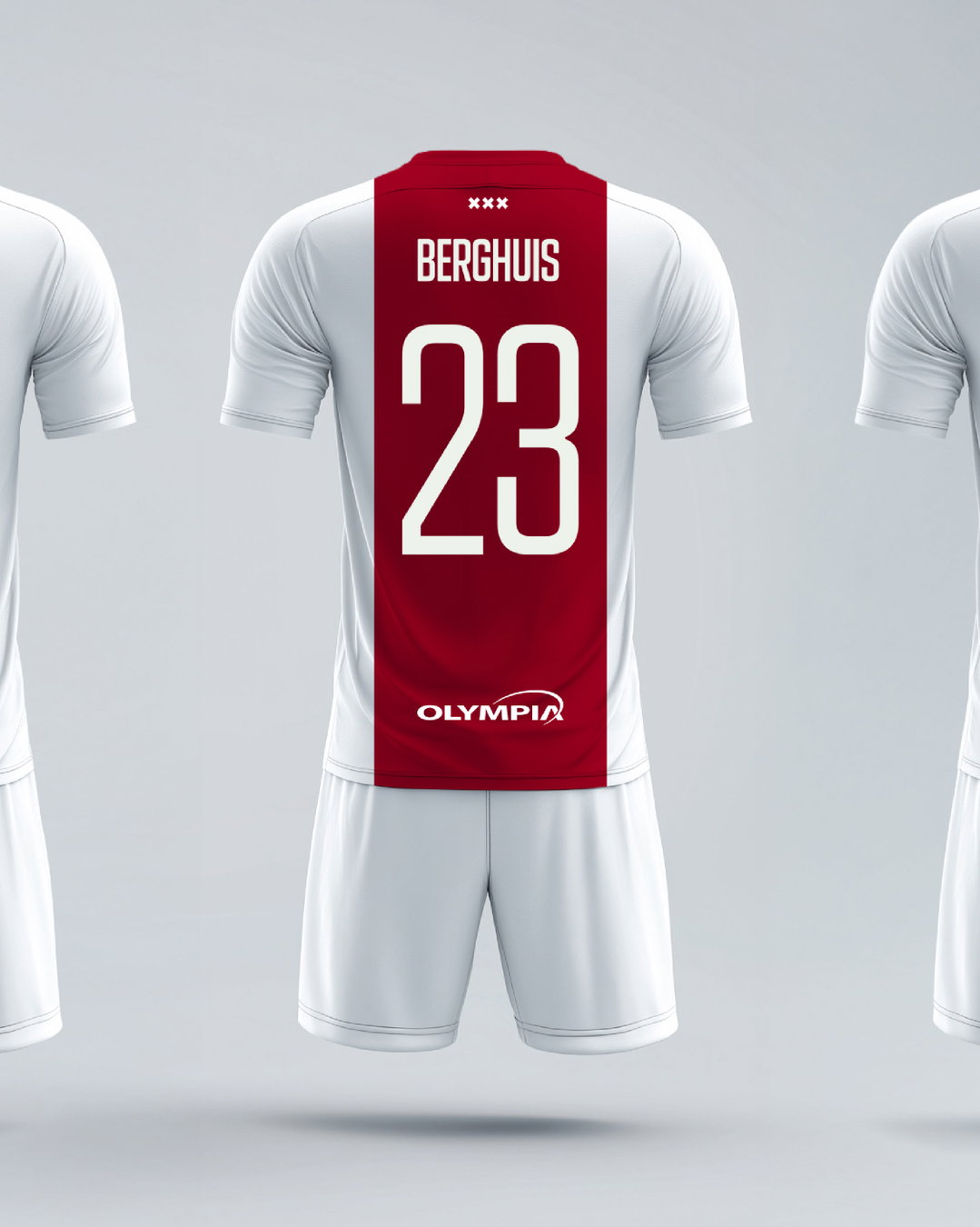
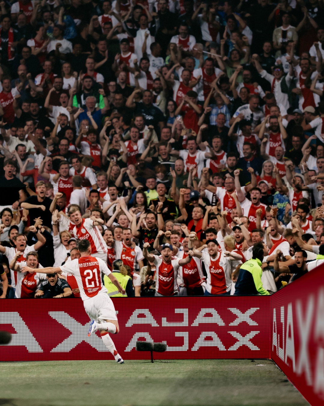
Starting with a new custom typeface that spoke to Ajax’s heritage, whilst bringing the club into the contemporary, the studio began to rigorously redraw the typography associated with the former logo. This process slowly turned into the development of a bespoke new font family for the football club in collaboration with Cotype Foundry that ended up with a total of 15 weights and cuts. “This offered us both versatility and consistency across all Ajax communications”, Dylan says, “from broadcast graphics and in-stadium screens to wayfinding and hospitality spaces, the system adapts seamlessly to every context.”
Whilst the studio had observed many sports brands defaulting to “bold italicised sans-serif” that were offering up a more “shouty and assertive style”, they saw an opportunity to shift the shape of letterforms in this space into something with a much more editorial feel, enriching a new typeface for the team with vertical cuts and off kilter characters. To situate the letterset, Smörgåsbord blended visual influences from the 1900s reflecting on the football clubs founding years, with further design cues from the 60s and 70s to converge the football teams past and present design iconogrpahy. “As you can imagine, the club’s history between 1900 and 2025 saw a wide variety of typefaces in use, so selecting the right sources of inspiration required both care and precision”, Dylan adds. “Our task was to uncover the true gems.”
As with many of the studio’s projects, typography sits at the heart of this visual system for the club but it was by far not the only ground that was covered, the studio developed an extensive graphic kit of parts; A lock-up that merges Amsterdam’s iconic St. Andrew’s crosses into a circular rendering of the new wordmark; expressive new colour palettes; football jersey designs; bespoke icons for signage and wayfinding; and a comprehensive set of digital templates for motion graphics that would surround the team.
“On the pitch, Ajax have consistently proven that by blending young talent with seasoned Ajacieden, they can take on – and beat – anyone. They do it the Ajax way: with attacking, intelligent, and beautiful football, infused with the spirit and creativity of Amsterdam”, ends Dylan. “Our goal was to reflect this philosophy in our approach to the rebrand. In essence, the team’s ‘Total Football’ became our inspiration for a form of Total Design—an adaptive, wide-ranging system unified by a consistent aesthetic, built for movement.”
GallerySmörgåsbord: AFC Ajax Rebrand (Copyright © Smörgåsbord, 2025)







Hero Header
Smörgåsbord: AFC Ajax Rebrand (Copyright © Smörgåsbord, 2025)
Share Article
About the Author
—
Ellis Tree (she/her) is a staff writer at It’s Nice That. She joined as a junior writer in April 2024 after graduating from Kingston School of Art with a degree in Graphic Design. Across her research, writing and visual work she has a particular interest in printmaking, self-publishing and expanded approaches to photography. ert@itsnicethat.com
To submit your work to be featured on the site, see our Submissions Guide.




