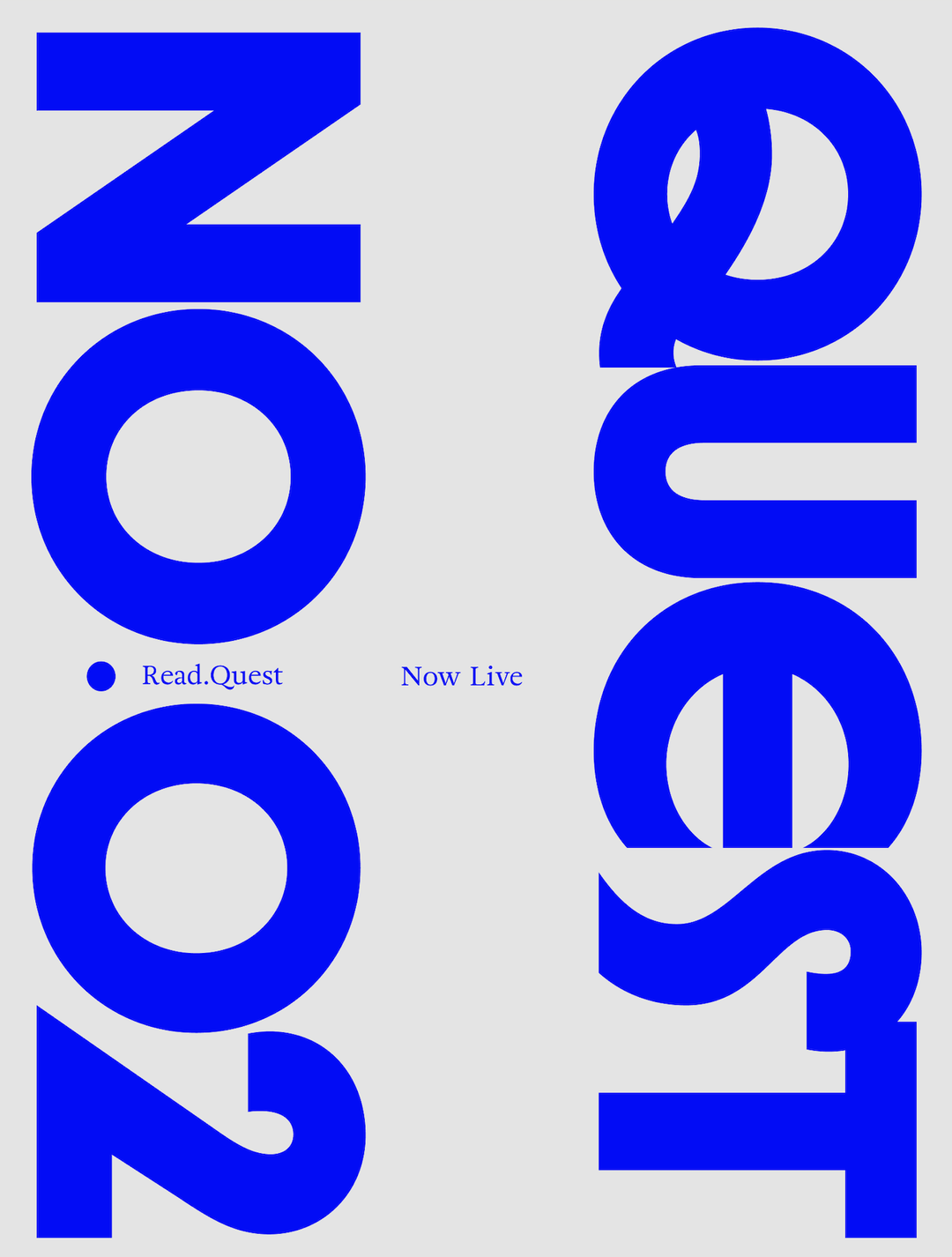
Reset is a gaming magazine for the first generation that grew up taking games seriously
You may accidentally take Reset for a fashion mag or an art piece, but it’s all of those and more. It’s for the first generation that grew up taking games seriously as an art form, and it’s here to subvert IP-slop with thoughtful journalism and cutting edge design.
Gaming magazines have long been the best friends of gamers. Issues of Nintendo Power are iconic, indie gaming zines like Funland merge nerdy interests with fusions of fantasy and punk aesthetics, online publications like IGN, Joystiq, Polygon and Rock Paper Shotgun pull in tons of regular readers who appreciate genuine insights and game reviews. On the edgier side, Aftermath offers no-bullshit commentary on gaming culture with socialist sensibilities sprinkled throughout. Needless to say, gaming magazines are the companion piece to any gamer – and nearly any game. For Simon Sweeney, creative director at Kepler Interactive and head of the brand new Reset Magazine, he’s seeking to create something that is as valuable as an art object as it is a gaming mag.
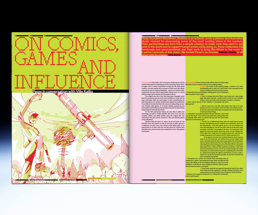
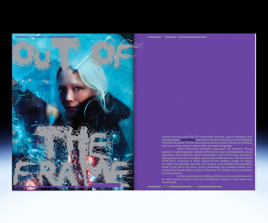
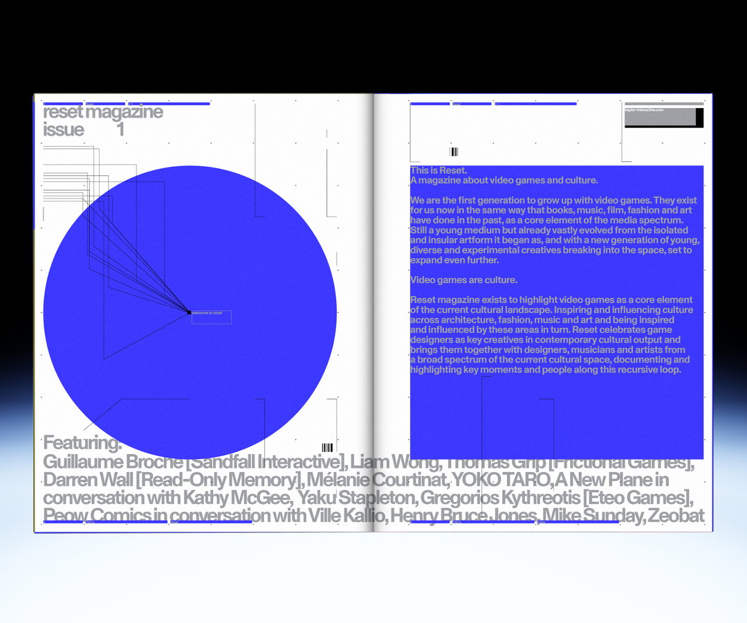
“We’re the first generation to grow up with video games. They exist for us now in the same way that books, music, film, fashion and art have done in the past, as a core element of the media spectrum,” says Simon. “Artists, architects, musicians, designers are all inspired by games and their work inspires games in turn, Reset exists to explore this space. To investigate video games’ position in a broad cultural context and to platform a dialogue that is less insular than how video games have been documented in the past.” It’s true, you don’t have to look far to see the inspiration of films that mimic the aesthetics of videogames – through first-person shooter perspectives, the narrative functions of macguffins or the enduring impact of films like Scott Pilgrim Vs The World. Reset Magazine exists to highlight video games as a core element of the current cultural landscape, bringing together game designers and developers as key creatives.
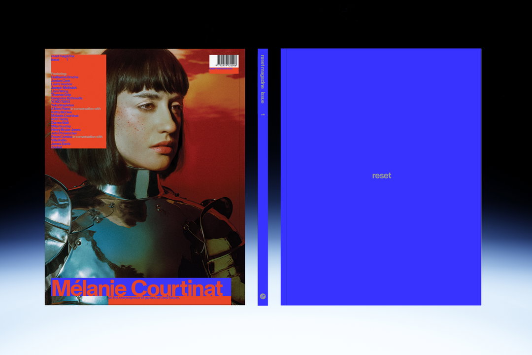
Kepler Interactive: Reset Magazine Issue 1 (Copyright © Kepler Interactive, 2026)
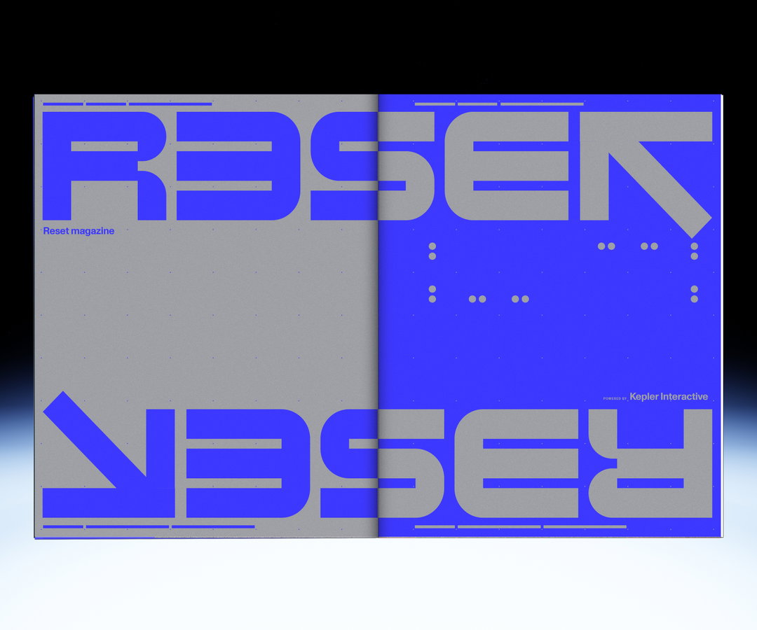
Inspired by classic video gamer publications like Famitsu and Edge, particularly when it comes to the magazine’s covers, the team behind Reset Magazine wanted to create something striking and modern for a generation where video games are no longer a childhood relic or a novelty, but a prevailing cultural influence. “There’s a PlayStation 2 issue of Edge, I think it’s Issue 83 from back in 2000, that with time has faded to basically being a blue rectangle with a centre logo, no masthead, no copy, just the PS2 logo. We wanted our first cover to feel just like it,” says Simon, speaking on the power of magazine cover shorthand. Inspired further by Kaleidoscope, 032c and Sabukaru, Simon says that the magazine should present itself “more like a fashion magazine”. Bi-annual, curated, handsome, something that would “fit in a gallery or a design studio as much as in the games space”.
Proving that great design is inspired by every sector of art and culture, the team admired the work of Wolfgang Weingart, whose specific type of experimental rigidity, formal structural experimentation and expressive type has always felt synonymous with video games to Simon. Thus, Reset Magazine’s debut issue focuses on subverting the IP-exhaustion of the current gaming industry.
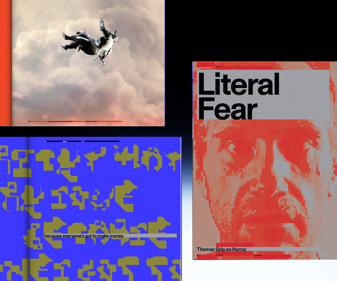
Kepler Interactive: Reset Magazine Issue 1 (Copyright © Kepler Interactive, 2026)
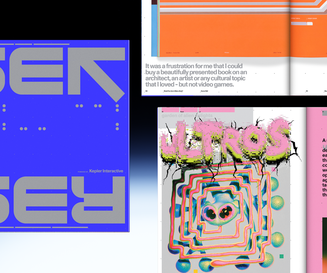
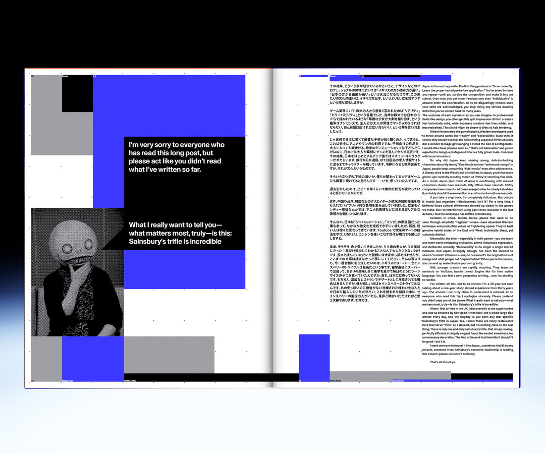
The magazine centres the iconic blue of a start-up or computer error screen, a shade of blue that is so rare in nature but instantly recognisable in technology. Pixels are aplenty in this gaming issue, but so are hints of the Corporate Grunge style seen so often in early 2000s gaming manuals, fashion shoots just like your average Comme des Garçons and writing that catches the zeitgeist of a new era of gaming.
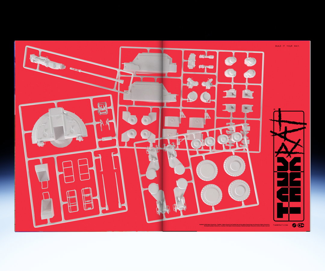
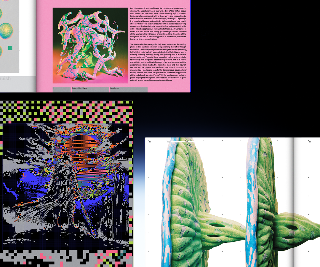
“At Kepler Interactive we work primarily with Kasper-Florio’s Monument Grotesk from Dinamo, it forms the backbone of our identity and so it felt appropriate that it carry Reset Magazine too,” says Simon. Reset Magazine uses typefaces from the team’s favourite designers, such as 8bitDo from Anne-Dauphine Borione, an experimental typeface designed on game controllers, as well as Karamon, a typeface that experiments with video game tools and aesthetics and applies them in perfectly symbolic and thematic alignment with the industry. Many of the magazine’s spreads include inventive visuals, such as graphic design based on runners (or spurs) that one may find in build-your-own Gundam kits, as well as the work of Joseph Melhuish and John Provencher – the former uses VR rigs to create his work whereas the latter centres “complex, dense images, often from video games, and algorithmically reducing them to beautiful, refined, pixelated ghosts of their former selves.” It goes without saying that Reset Magazine isn’t more of the disposable gaming slop one may find the internet swamped with – this is an art object filled with serious gaming journalism for those who take gaming and video game art seriously.
GalleryKepler Interactive: Reset Magazine Issue 1 (Copyright © Kepler Interactive, 2026)
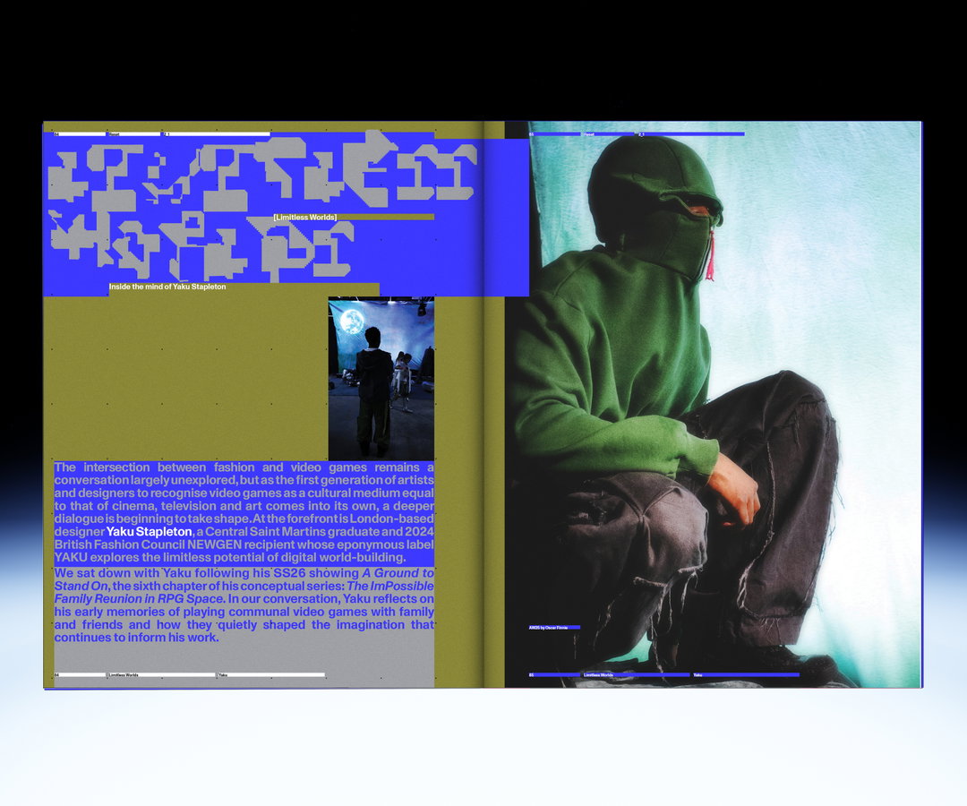
Hero Header
Kepler Interactive: Reset Magazine Issue 1 (Copyright © Kepler Interactive, 2026)
Share Article
About the Author
—
Paul M (He/Him) is a Junior Writer at It’s Nice That since May 2025. He has a strong interest in graphic design, digital kitsch, multimedia painting, collage, nostalgia, analogue technology and all matters of strange stuff. pcm@itsnicethat.com
To submit your work to be featured on the site, see our Submissions Guide.