Launch Recite Me assistive technology
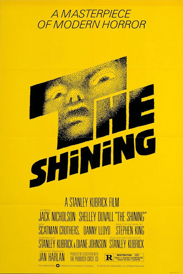
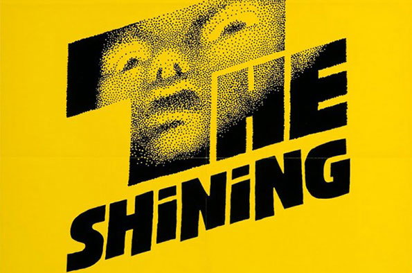
A yellow poster for the film The Shining. A halftone image of a person’s face is partially obscured by the bold black title “THE SHINING”.

Saul Bass' rejected designs for The Shining, with notes from Kubrick

—
Date
3 June 2015

It’s a rare treat to see rejected designs at the best of times, those glimpses at the inner workings of the projects we love and what the client and designer really think. When that client is Stanley Kubrick, and the designer is Saul Bass, it’s just brilliant. While we’re a bit late to the party on this, we had to share these images of Bass’ rejected designs for Stanley Kubrick’s The Shining, found on cinema website The Film Stage. The images were taken by Bobby Solomon, and capture the essence of the exchange between Kubrick and Bass tantalisingly. “Hard to read, even at this size,” scrawls Kubrick on one. “Hotel looks too sprawling,” and “not compact enough” he bemoans on the other, cementing his status as a true auteur. It’s like overhearing a conversation between two real masters of their craft, and my God we’d have loved to have been a fly on the wall for those “make the logo bigger” style conversations.
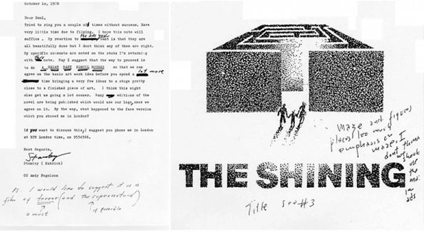
A typed letter from Stanley Kubrick to Saul Bass, dated 10 October 1978, sits beside a conceptual sketch for the film The Shining. The sketch shows a black and white 3D render of a hedge maze with small figures walking towards it, above the title “The Shining”.
Above

Saul Bass: Rejected design for The Shining poster. Photograph by Bobby Solomon.
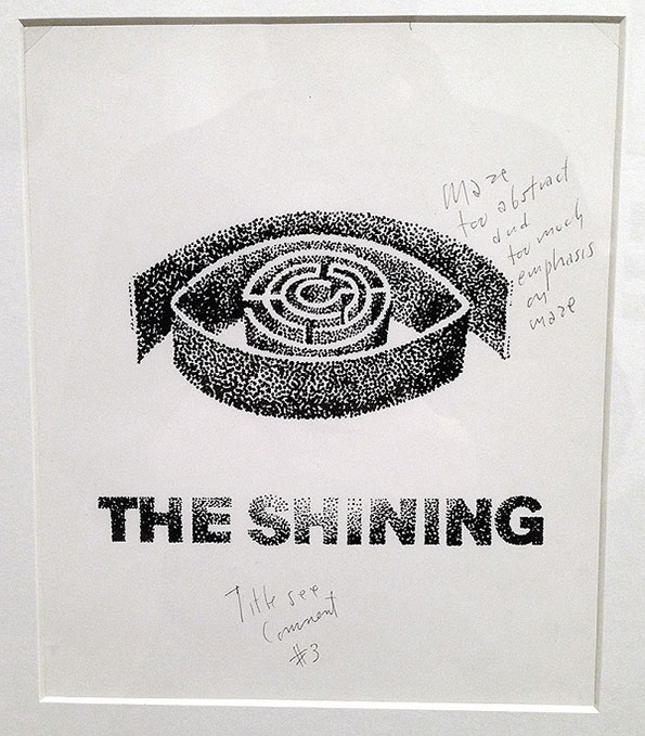
A stippled illustration of a circular maze enclosed within a thick, curved wall. Below the image, bold text reads “THE SHINING”. Handwritten notes to the right and bottom provide feedback on the design.
Above

Saul Bass: Rejected design for The Shining poster. Photograph by Bobby Solomon.
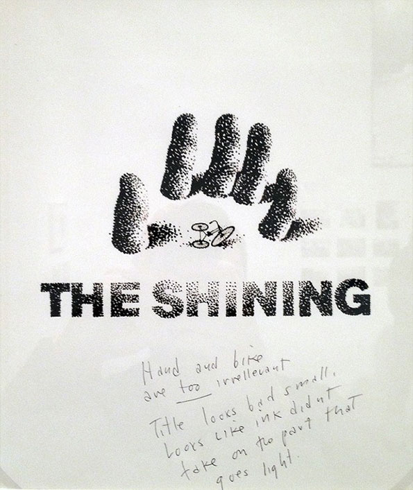
A black and white graphic for the film The Shining, featuring a stippled illustration of a hand and a tiny bicycle. The title “THE SHINING” is written in a bold, textured typeface below. Handwritten notes in pencil critique the design, stating the “Hand and bike are too irrelevant”.
Above

Saul Bass: Rejected design for The Shining poster. Photograph by Bobby Solomon.
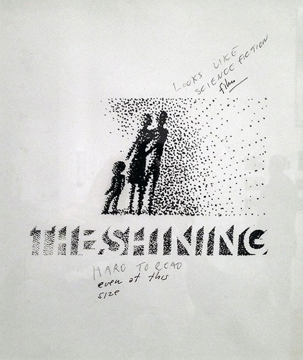
A stippled black and white illustration shows three figures standing together against a speckled background. Below them, the title “The Shining” is written in a textured, bold typeface. Handwritten notes around the image read “Looks like science fiction film” and “Hard to read even at this size”.
Above

Saul Bass: Rejected design for The Shining poster. Photograph by Bobby Solomon.
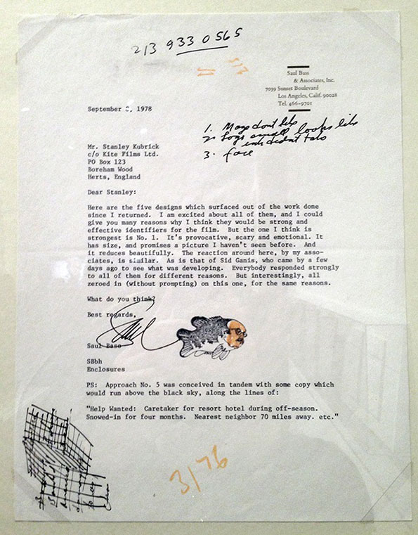
A typed letter from Saul Bass to Stanley Kubrick dated 2 September 1978. The page contains handwritten notes in the top right and a small sketch of a figure at the bottom.
Above

Letter. Photograph by Bobby Solomon.

A yellow movie poster for The Shining, featuring a halftone close-up of a person’s face. Bold black text reads “The Shining” across the centre, with “A masterpiece of modern horror” at the top. The bottom lists the film as “A Stanley Kubrick film” and names stars Jack Nicholson and Shelley Duvall. Credits include author Stephen King and producer Jan Harlan.
Above

Saul Bass: The Shining poster

Share Article

About the Author

Emily Gosling

—

Emily joined It’s Nice That as Online Editor in the summer of 2014 after four years at Design Week. She is particularly interested in graphic design, branding and music. After working It's Nice That as both Online Editor and Deputy Editor, Emily left the company in 2016.


It's Nice That Newsletters

Fancy a bit of It's Nice That in your inbox? Sign up to our newsletters and we'll keep you in the loop with everything good going on in the creative world.