Sam Winston’s concrete poetry project rearranges the dictionary to question our learnt definitions
Celebrating the 20th anniversary of the project, the artist is releasing new prints with created through the historic medium of letterpress.
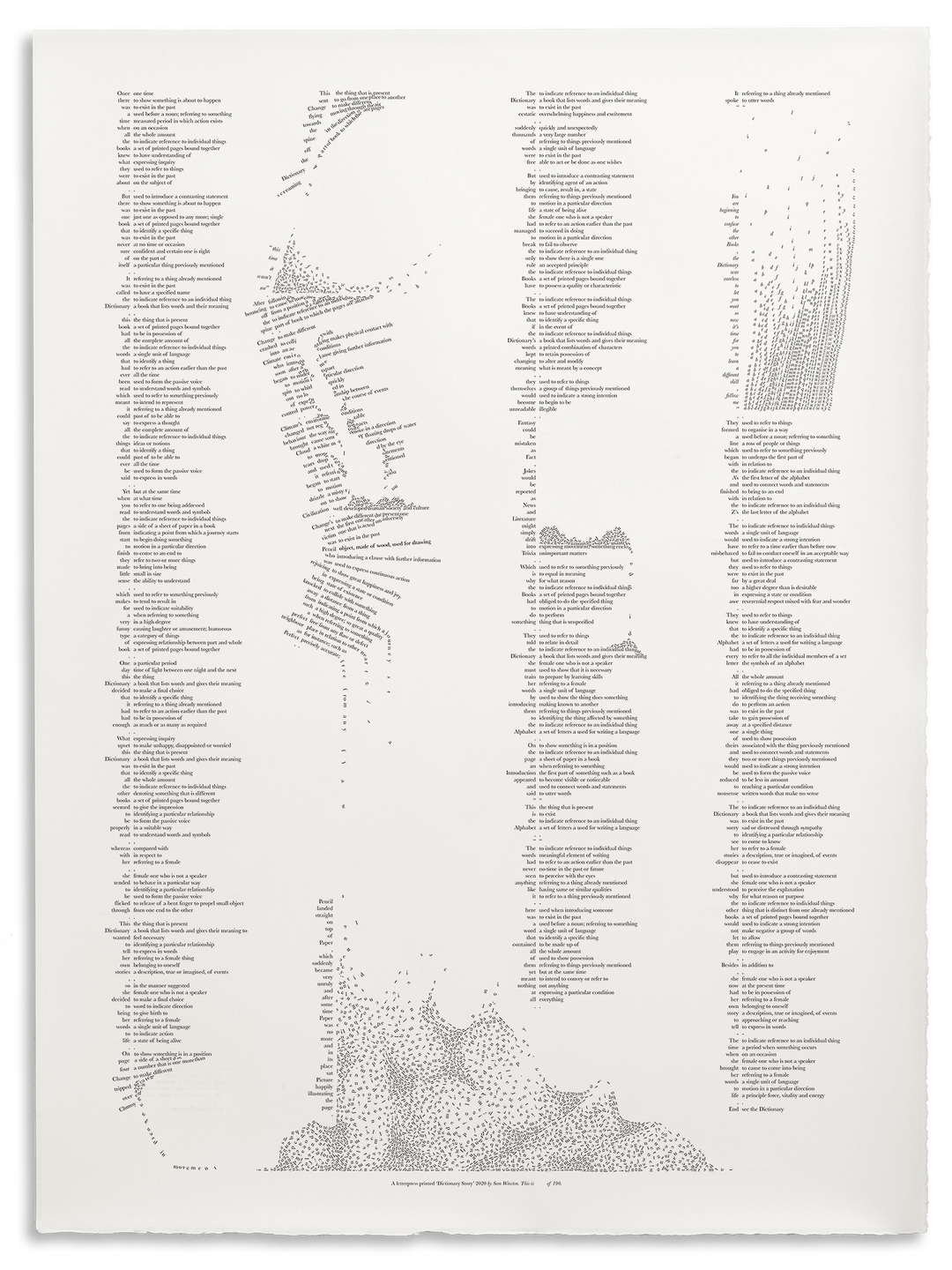
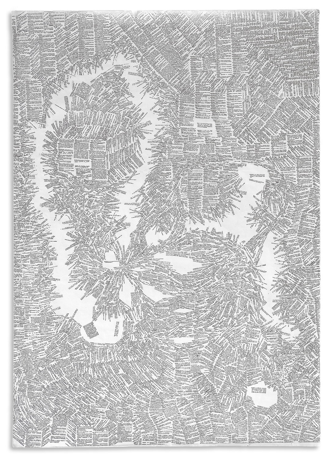
In his project Dictionary Story, London-based artist Sam Winston rearranged the words in the dictionary as a means to reflect on our understanding of words. The project recently celebrated its 20th anniversary, which saw Sam releasing new prints with Nomad Letterpress (home of Whittington Press) in Cheltenham which came about through a successful kickstarter campaign. “I am always trying to find new ways of slowing down the reader. To slow them down enough to get a sense of wonder about what’s actually happening,” Sam tells It’s Nice That. “In this instance, it means taking apart the reading experience to such a degree that it creates doubt about how it works. I usually do this by breaking down the form and structure of words or playing with grammatical rules.”
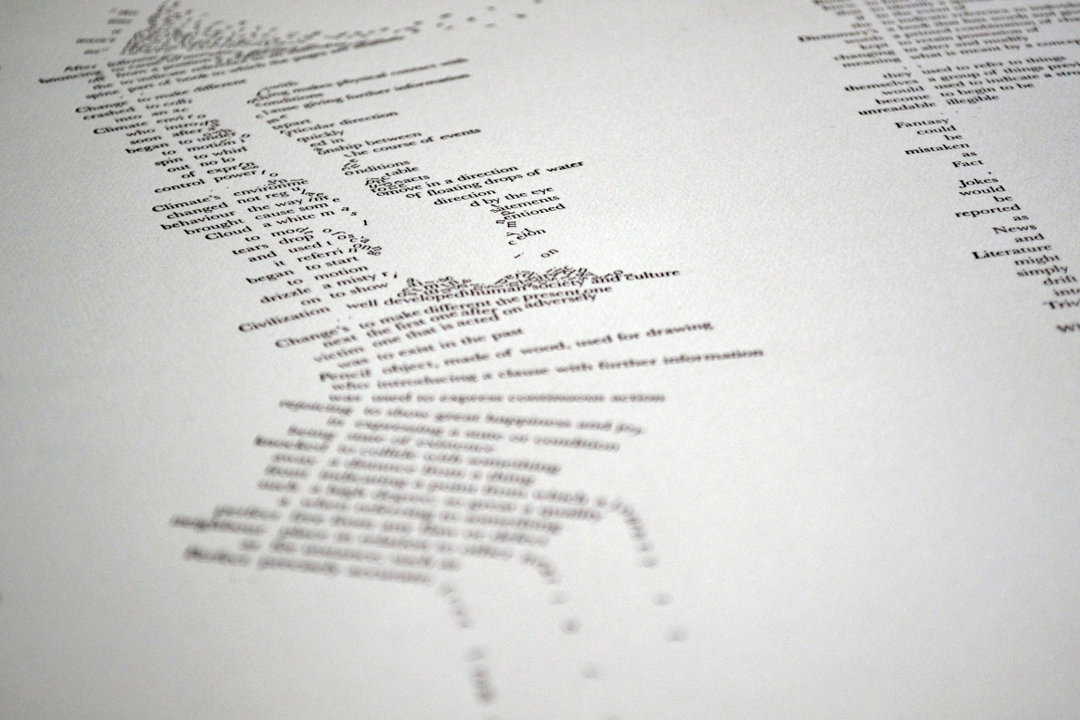
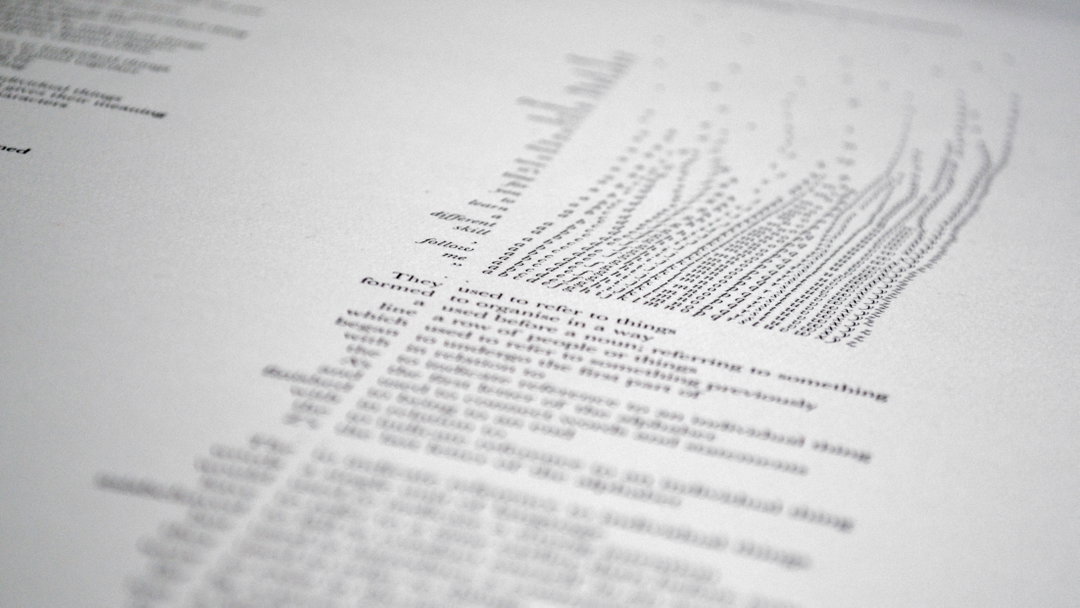
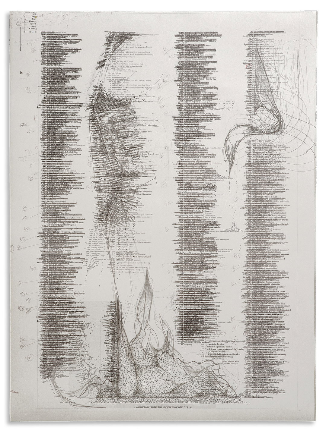
The best way to experiment with this was by using the words in a dictionary. Line after line, the definitions of words interrupt our otherwise smooth reading experience. The reader skips across concepts that are linked together only by their location in the alphabetical order. “It’s the perfect example of how mysterious comprehension is,” he says.
“My interest in typography came from an interest in language,” explains Sam. “The interest in language came from an interest in how we think and the interest in how we think came from growing up dyslexic,” Sam explains. “I wouldn’t have said it like that at the time, but that’s how it started — being a kid and simply not understanding how the 26 black marks of the alphabet related to the rest of my lived experience. That constant wriggling of letterforms has come to represent a certain visual language I have. I am also constantly trying to break that down.”
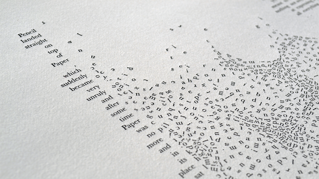
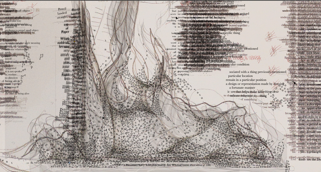
Sam Winston: Dictionary Story (Copyright © Sam Winston, 2020)
Speaking of his early foray into creativity, Sam reflects on his education. “I think an interesting question for me is, when did I stop being creative? Looking back, I realise I began to stop creatively exploring the world when I went to school,” he says. “Even though people say creativity is really important for young people, I never saw that being actively encouraged in my early education. By the time I was in my teens it was pretty clear to me that the arts weren’t seen as a valid career as, say, science or industry.” In his generation, Sam felt that taking up graphic design was a compromise to wholly creative pursuits “because it still alluded to getting a ‘real’ job.”
He also hopes that the project, in slowing down the reader, will make us more thoughtful about our choice of words. “I worry about how we treat words, especially definitions, as a waste product of our opinions. I worry about what happens when two cultures use the same word but have completely different assumptions over its meaning,” he explains. Sam alludes to the increasing difficulty in verifying meanings of sentences in a line from the book: “Fantasy has been mistaken as fact, jokes have been reported as news and literature itself has sometimes slipped into trivia.” And for the designer, this “fluidity of meaning” has only accelerated alongside screen culture.
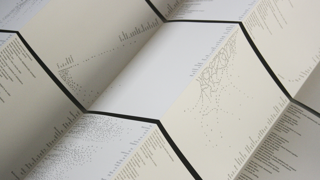
In the project, words, phrases and letters swell and shrink in a field of black and white text. The whitespace left between characters often meander like rivers and settle into ponds of blankness, while other pages see letters trickling down the page like crumbling ashes. The way Sam rearranged the words points towards the tender and poetic, finding moments of calm amongst the disorder.
GallerySam Winston: Dictionary Story (Copyright © Sam Winston, 2020)
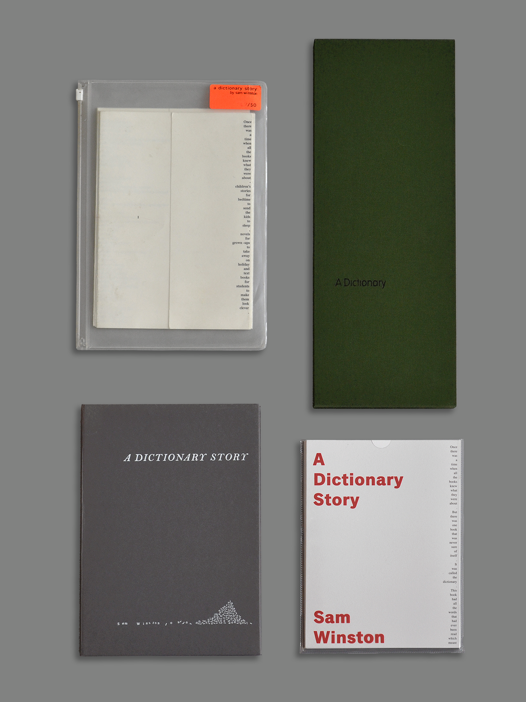
Hero Header
Sam Winston: Dictionary Story (Copyright © Sam Winston, 2020)
Share Article
Further Info
About the Author
—
Alif joined It's Nice That as an editorial assistant from September to December 2019 after completing an MA in Digital Media at Goldsmiths, University of London. His writing often looks at the impact of art and technology on society.